When the sun shines, the world around us feels happier, brighter and warmer; it’s an emotional state often signified by the sunny colour yellow. In yellow, we find an emotional colour that buoys mood and temperament: it is optimistic, outgoing, friendly and creative. Yellow is also a strong colour and one whose use should be moderated. Too much yellow is likely to grate, and can give rise to fear and anxiety (Source: Colour Affects). As a highly visible and distinct colour, yellow’s application in any one context warrants careful consideration.
Indeed, yellow is a colour that signifies caution: think about the significance of yellow (amber) in traffic lights around the world. Still, yellow is lively and fun, and a hue that partners well with certain colours: in design, yellow works especially well with blue, white and grey, as well as various wood types.
Arresting yellows
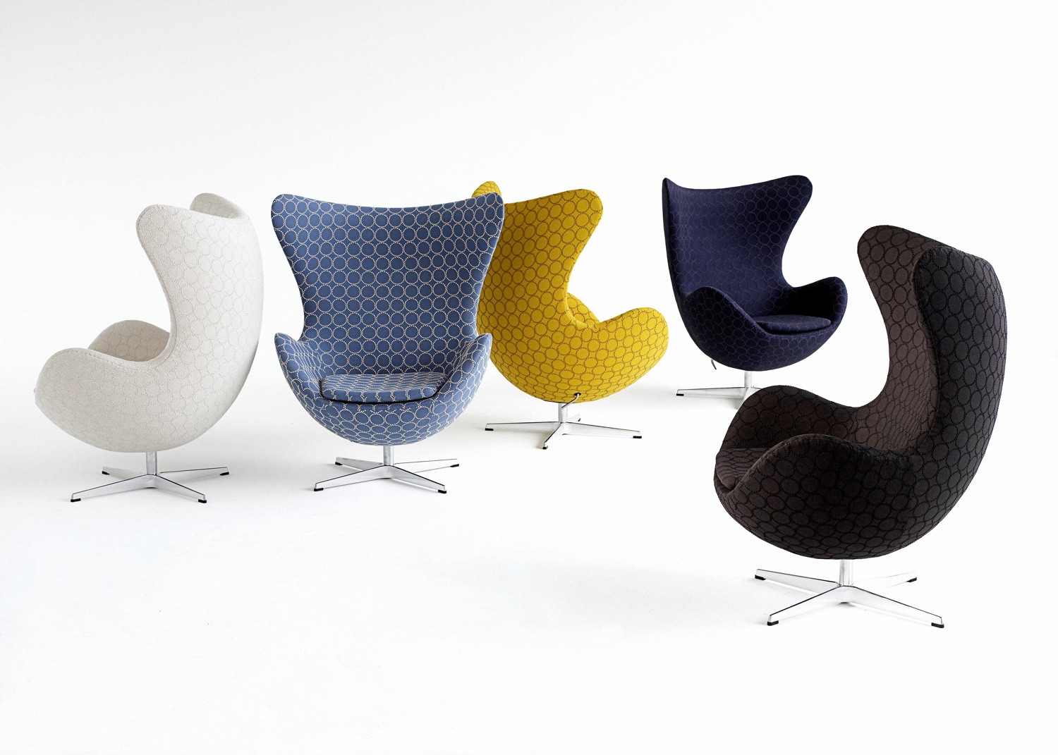
The Egg™ chairs presented in the following image are upholstered in Tambourine Hallingdal fabric, designed by Japanese textile designer Akira Minagawa for Kvadrat; the Egg™ upholstered in Minagawa’s yellow Tambourine Hallingdal fabric immediately catches the eye. An icon of midcentury Danish modern design and an enduring classic, the Egg™ chair was designed by Arne Jacobsen in 1958 and is manufactured by Republic of Fritz Hansen.
RELATED: Color Therapy: Quell Those End-of-Summer Blues!
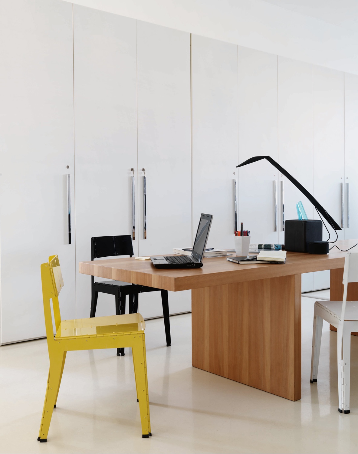
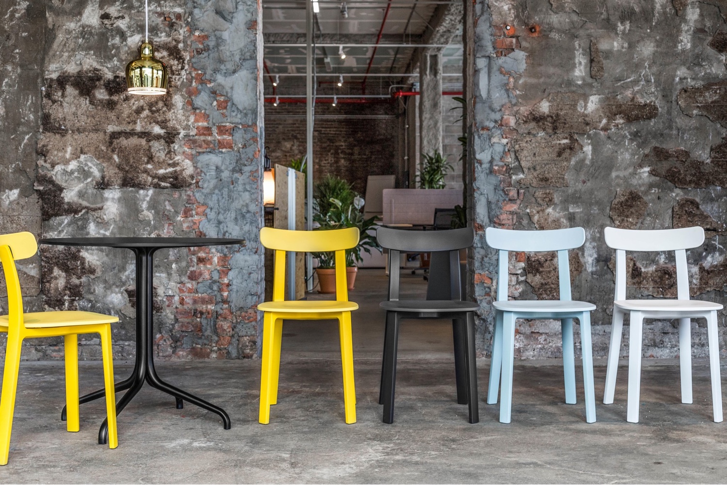
In similar fashion, the yellow ‘Stitch’ chair designed by Adam Goodrum for Cappellini and buttercup yellow ‘All Plastic Chairs’ designed by Jasper Morrison for Vitra, are eye-catching in their presentation.
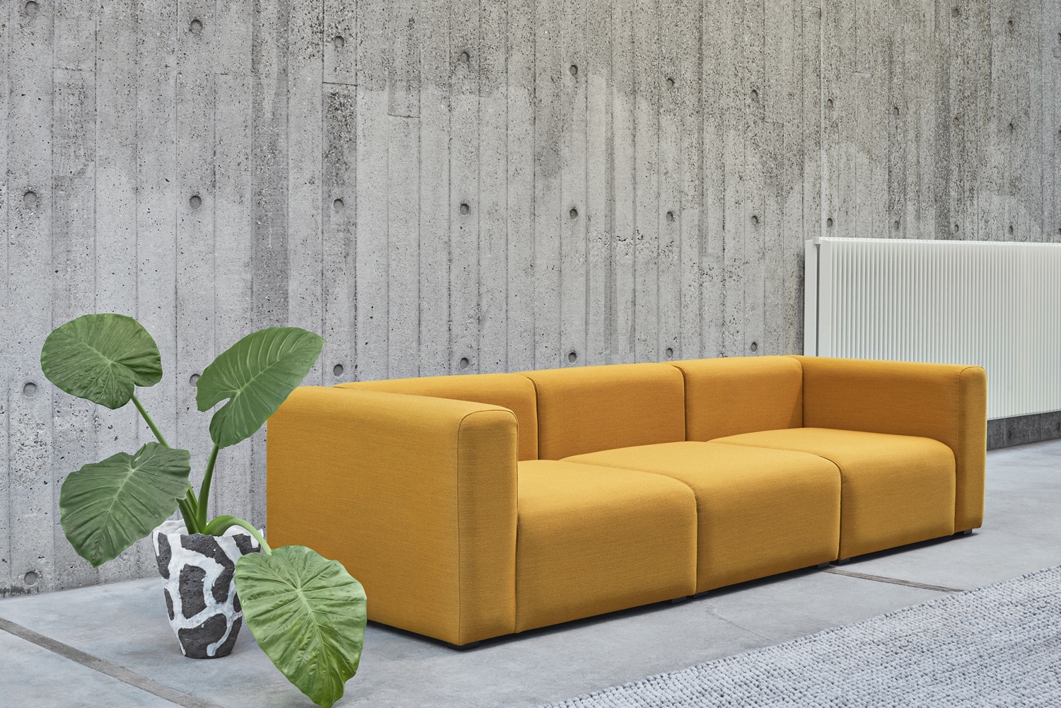
The handsome and modern Mags sofa by Danish brand Hay is particularly striking in this yellow Steelcut Trio 3 fabric from Kvadrat. Juxtaposed with a concrete wall, floor and grey rug, the yellow ‘pops’ without overpowering.
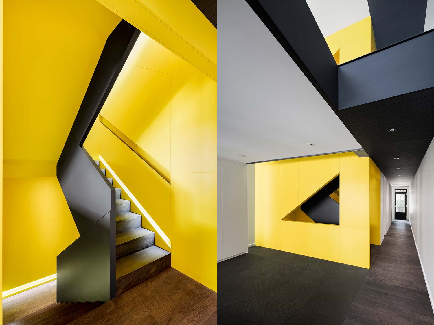
In Canari house, designed by Montreal-based architecture studio _naturehumaine, a vivid yellow is used to create a focal point in the contemporary home’s stairway.
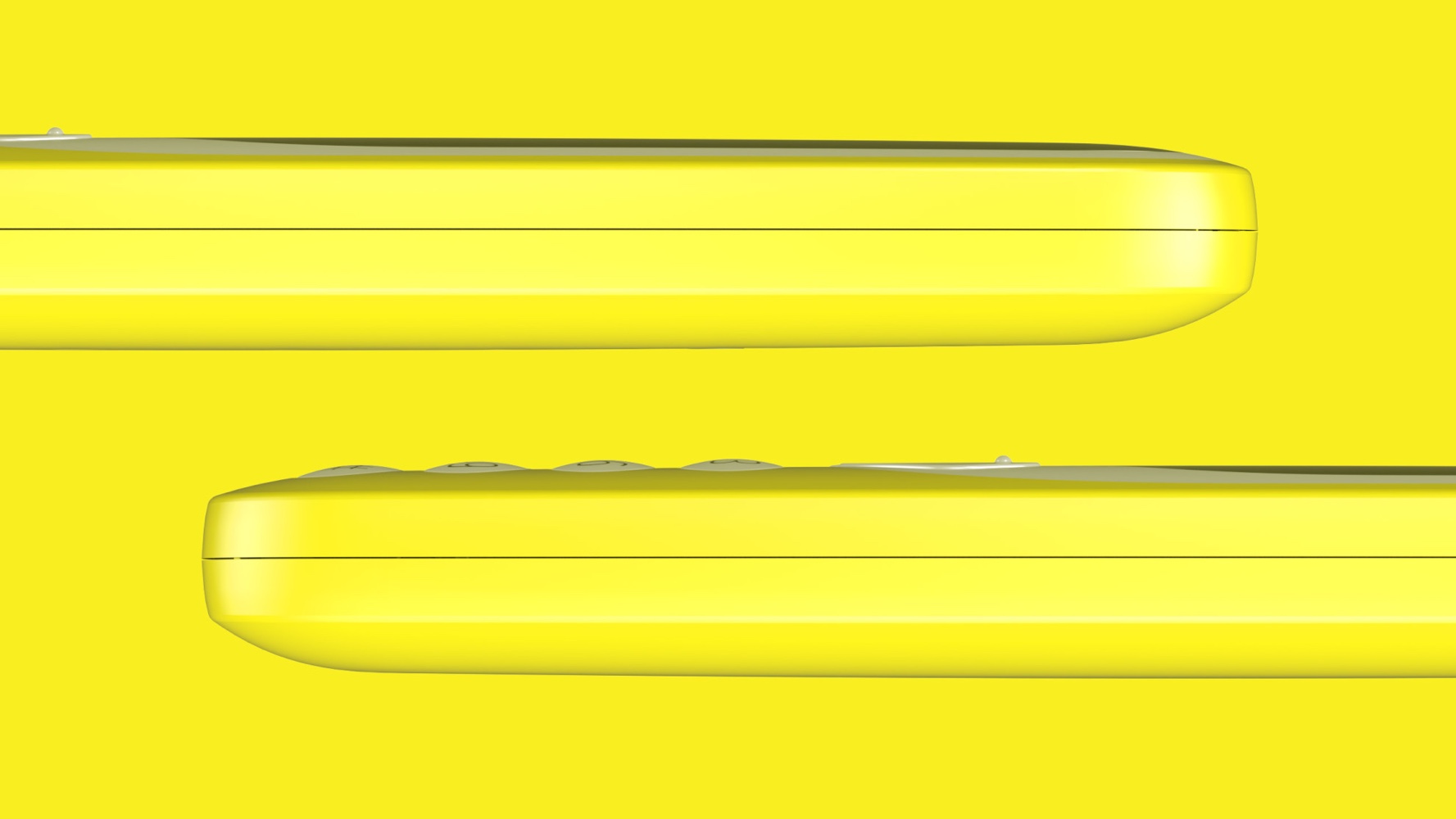
Nokia is reintroducing its iconic 3310 phone. A modern classic, this glossy yellow version is certainly conspicuous.
Yellow accents
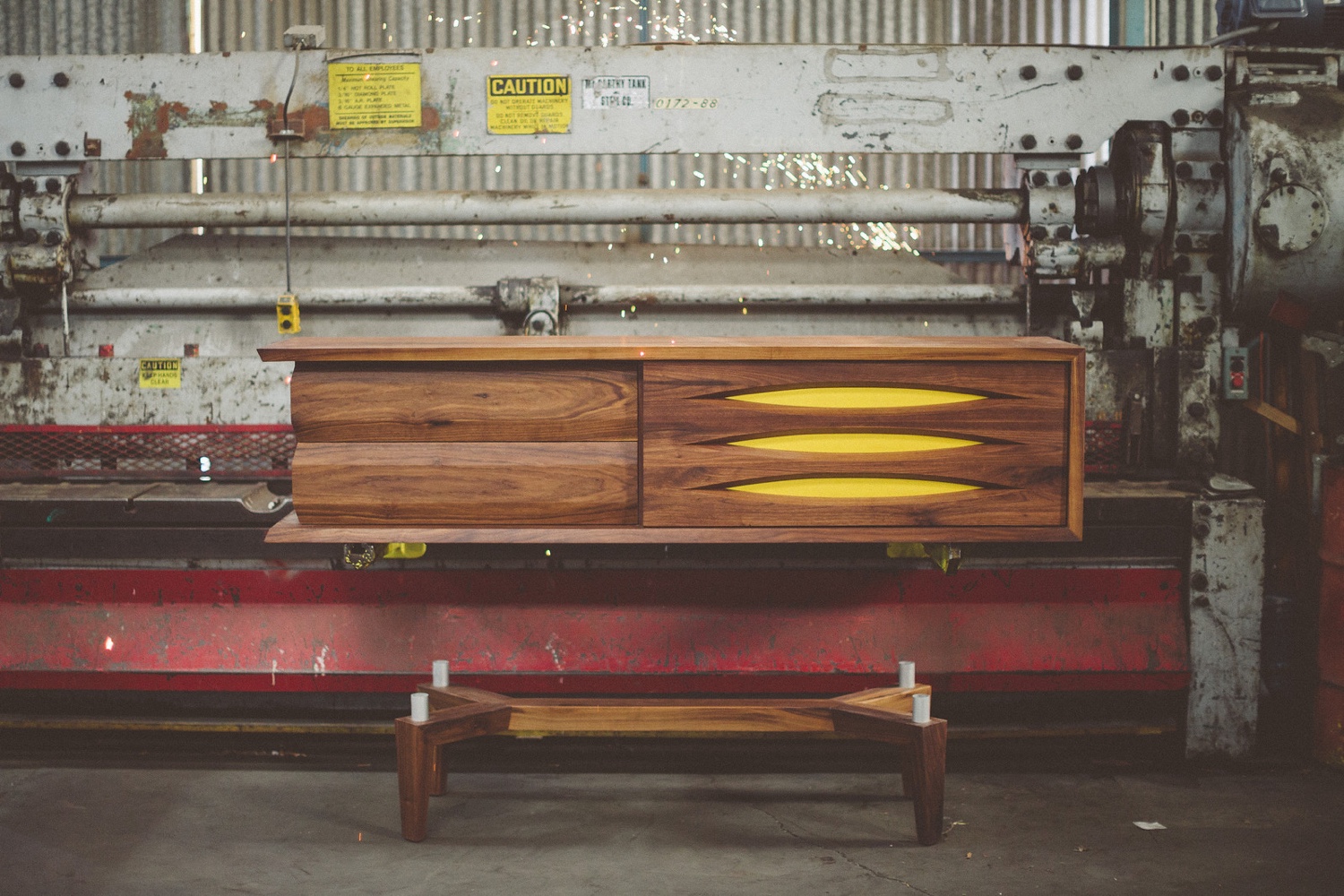
The use of yellow in this ‘Mack’ credenza by Jory Brigham Design is a bright, aesthetic detail.
RELATED: Color Therapy: Seeing Red
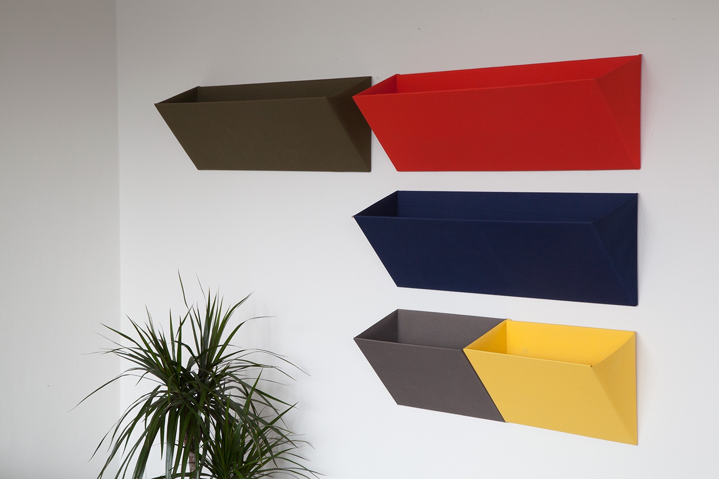
In these ‘Leaning’ storage wall pockets designed by Diane Sterverlynck for Begium brand Objekten Systems, the yellow pocket perfectly accompanies the grey.
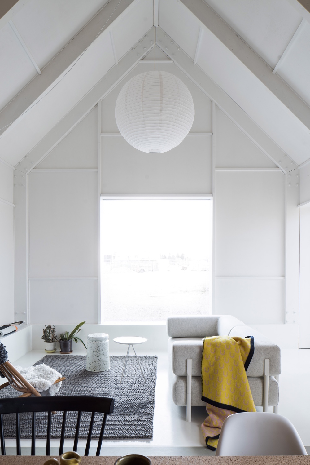
The yellow throw in this interior showcases attention to detail: simple and unfussy, the throw complements the grey and white furnishings and background.
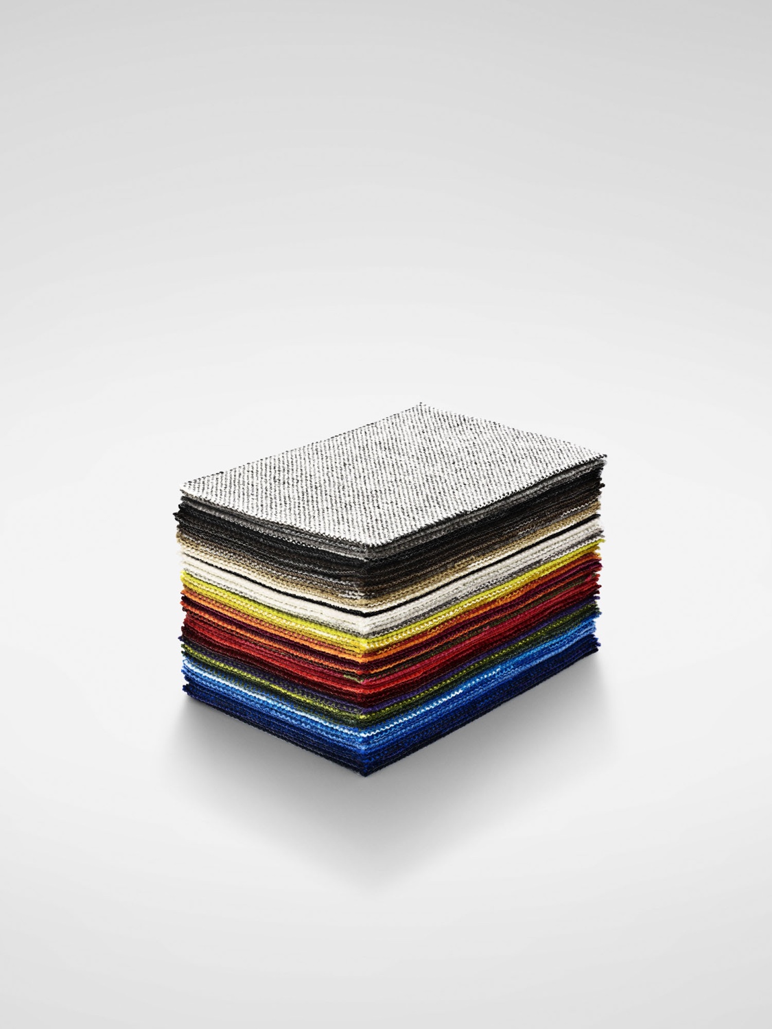
In this pile of Hallingdal 65 fabric samples, the yellow tones are easily seen. Hallingdal 65, the quintessence of woollen textiles, was originally designed in 1965 by Danish designer Nanna Ditzel—the ‘Queen of Danish Design’.
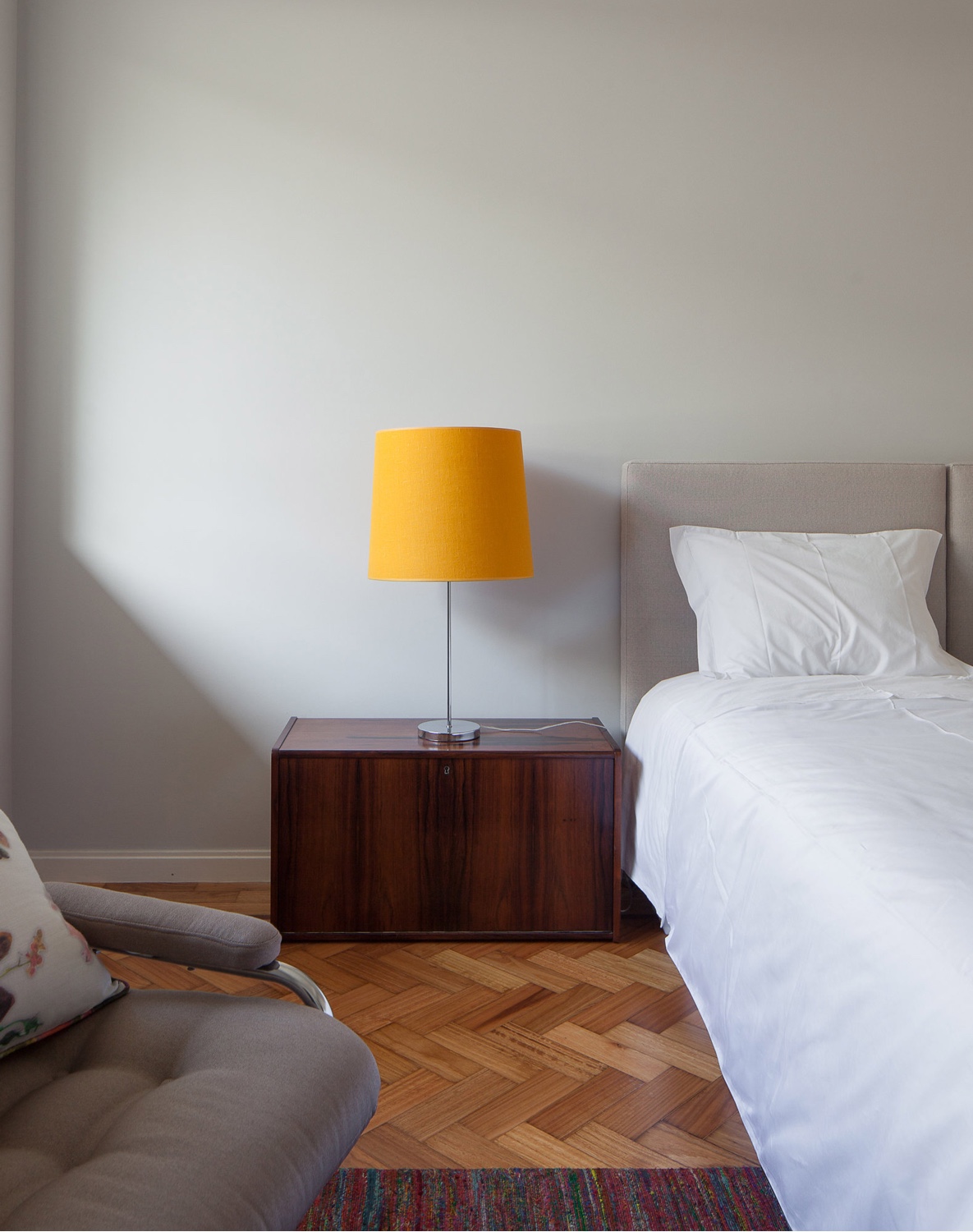
A plain lampshade in a vibrant yellow hue will call attention to one particular spot inside a room.
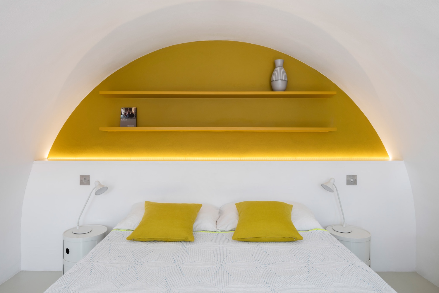
The block of yellow colour in this interior is framed by a clean, white canvas. The impact is graphic, yet modest.
Check out more ‘color therapy’ posts: green, red, grey, pink, white and blue.
