It’s not a secret that we all want that pretty magazine-worthy home. Our homes are the essence of who we are, and we want them to be expressions of ourselves, but we also want to convey style, design, and taste. Anyone can achieve the richness and luxury that come with a magazine-worthy home.
You have to be smart with your decor and know a few tricks of the trade! In this article, we will share 36 ways to make your house look expensive even if you’re working with a budget.
Paint Doors a Contrasting Color
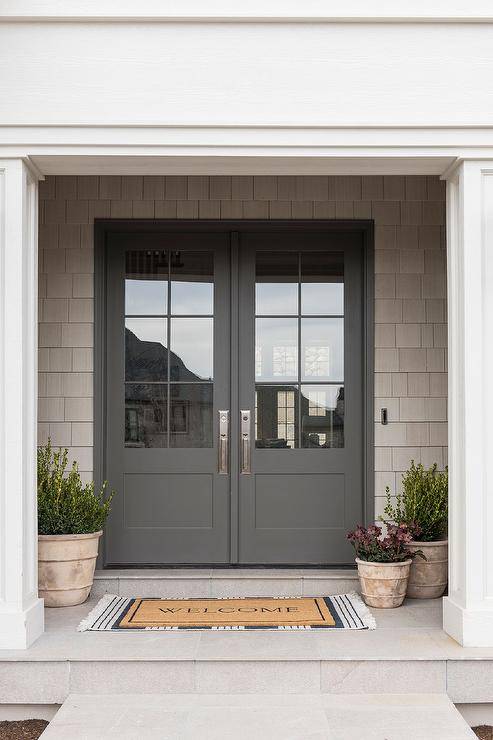
Instead of the standard, basic white, paint your doors differently. Add in a pop of dark contrast for a more luxe look.
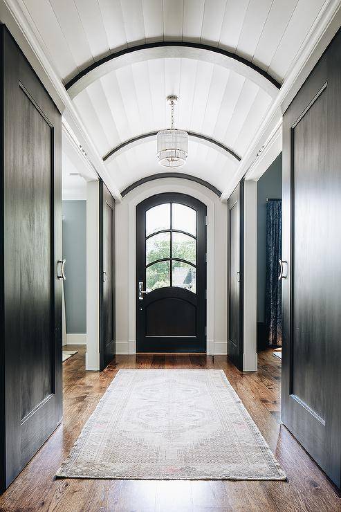
You could try a steely gray or a mushroomy taupe. Go bold with a punch of color if that’s your style. Choosing anything but plain white makes your home feel custom without spending a lot.
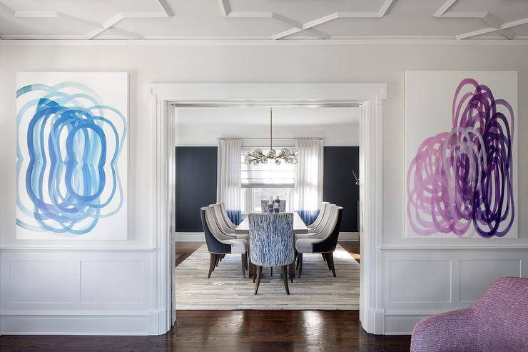
Add Molding, Wall Trim, or Architectural Details
There are many ways to DIY molding and wall trim. You can beef up your existing crown molding by adding additional molding around it. Adding millwork or some form of wall treatment to your spaces is a huge plus for adding a layer of luxury.
Declutter
If you really want to know how to make your house look expensive for free, decluttering doesn’t cost a thing. You don’t necessarily have to be a minimalist, but the goal should be to make a “home” for every item in a room.
Go Large with Wall Art
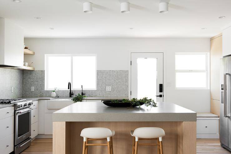
It doesn’t have to be expensive at all. There are so many DIY wall art options out there to inspire creativity. You can also visit the thrift store to find large canvases to paint over.
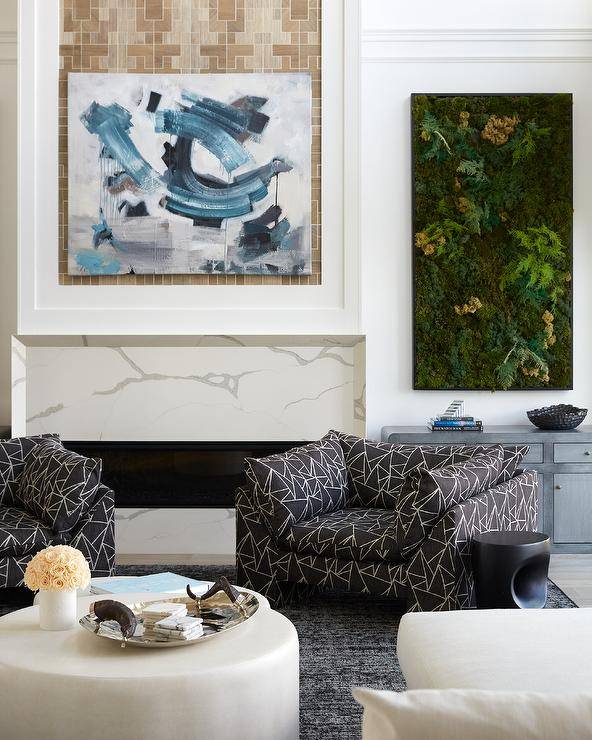
Even though it isn’t that expensive to create, large-scale art gives the illusion that it costs a couple of thousand dollars.
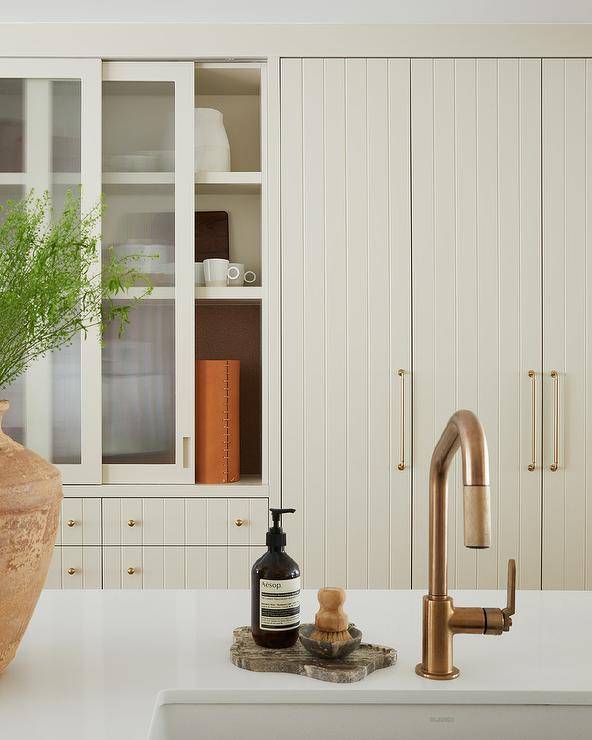
Change Out Your Hardware
It’s amazing how taking basic cabinets and adding unique knobs can create a major wow factor. Add some interesting drawer pulls to a plain dresser, or swap out your doorknobs around the house for ones with a vintage or ultra-modern vibe. That one small detail makes such a difference.
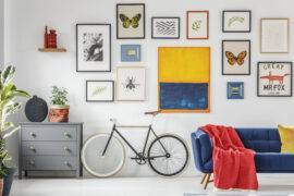
Streamline Your Gallery Walls
Creating colorful, eclectic, quirky gallery walls is so much fun, but if your goal is to create the illusion of “high end,” scaling back on the variety of colors, shapes, and textures achieves that look.
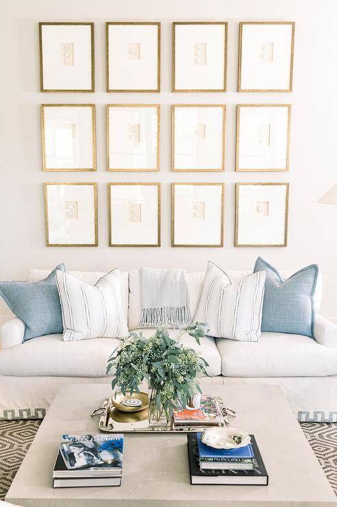
Choose art or photos that are within a similar color palette. Incorporate frames that are similar or identical in size and shape. Arrange them in a geometric layout like a grid or stair step.
Choose Natural Materials
Whenever possible, incorporate materials that are found in nature. Go with real marble instead of laminate, or pick solid wood furnishings rather than veneer.
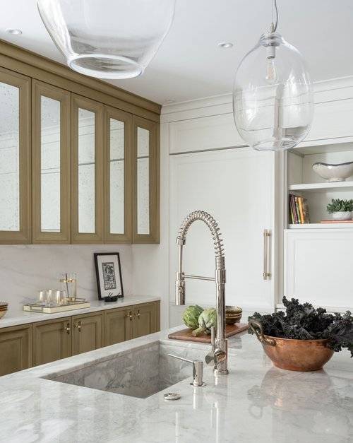
Leather, antique brass, and crystal are luxe compared to their cheaper alternatives, and you can often score them on Facebook Marketplace or at antique stores. Pulling these materials together creates the feeling that your house is luxurious and expensive too.
Add Flowers or Plants
Every room needs at least a couple of plants or flowers to add some life to a space. Think spa. Greenery adds that little bit of zen to a room. These are some of our favorite faux flowers that look realistic to place in a vase.
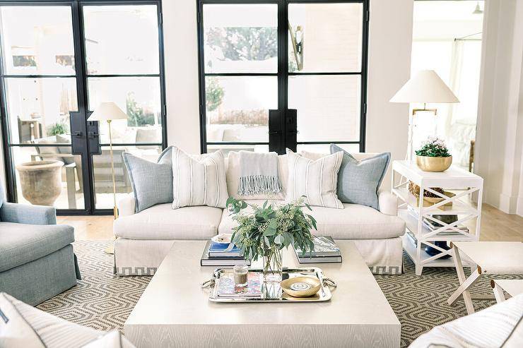
Use White Bed Linens
When you visit a luxury hotel, the sheets are always white. They feel clean and crisp, and bonus points: they can be bleached. By using white sheets and duvets in your bedrooms, you’re evoking that same luxury hotel feeling in your home.
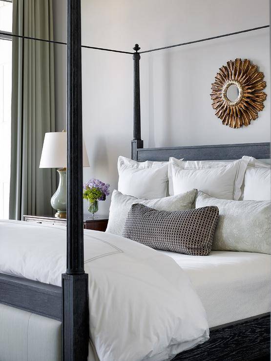
Use White Towels
Just like with white bedding, use white towels to create a high-end spa feeling in your bathrooms.
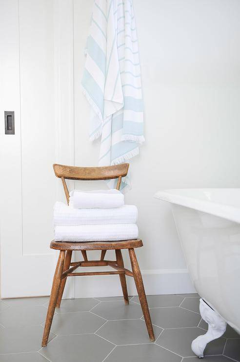
Use Two Duvets
There is a lot to be said about how to make a bedroom look and feel luxurious, and a lot of it revolves around the styling of the bed. It makes sense since it’s the focal point of the bedroom.
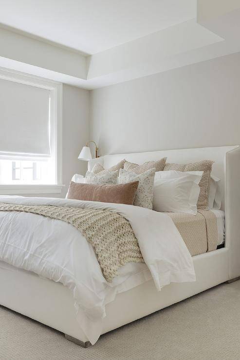
So, if you want your bed to look extra luxurious, try layering two duvets. You can put them both in the same duvet cover, and it will look like you have an extra fluffy, puffy duvet, or you can use two separate coordinating duvet covers. Pair this with nice plump king-sized pillows and a few throw pillows, and your bed will look like it came straight out of a luxury hotel!
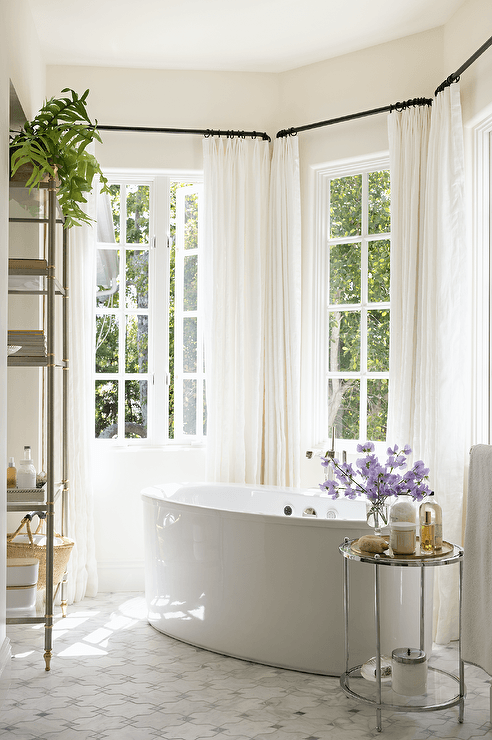
Hang Your Curtains High and Wide and Lightly Puddle the Floor
This gives the illusion of a more grand room by making ceilings appear taller, and windows appear larger. Make sure they’re long enough to hang floor to ceiling, so the hem of your curtains barely touches the floor or slightly puddle for a more relaxed, romantic look.
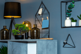
Customize Your Lighting
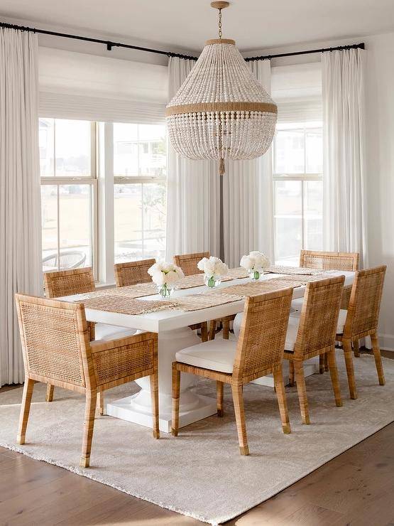
When in doubt, go oversize! If you don’t know how to make your house look expensive, start with the lighting. Swap out the dreaded “boob lights” and builder-grade lights for ones more definitive of your style. It’s better to choose a light fixture or chandelier that is slightly oversized than one that is too small for the room.
Add Built-Ins
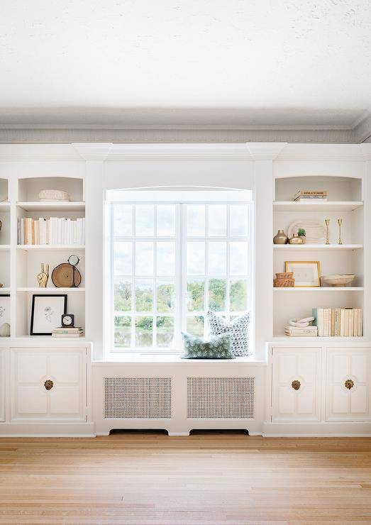
Built-in shelving, window seats, or closets can be expensive, but if you know how to make them yourself using IKEA hacks, they’re a great beginner-level carpentry project that can customize a room for way less than the real thing.
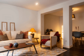
Use Appropriately Sized Rugs
When walking into a space that has a too-small rug, it immediately feels off balance. If you live in an open-concept home, rugs can help define individual living spaces.
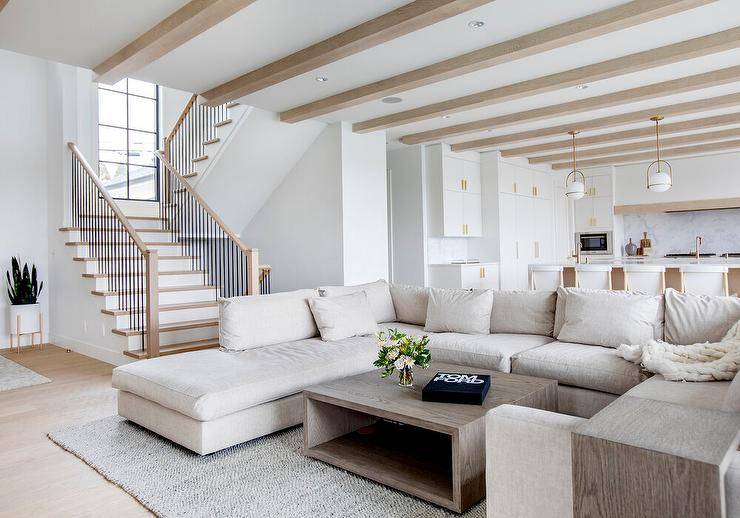
Check clearance sections on store websites for rugs, or set up notifications on Facebook Marketplace or Craigslist. Many people buy rugs and change their minds but can’t return them, so you can swoop in to get the deal.
Layer Your Lighting
Designers often recommend for a room have three types of lighting: ambient lighting, task lighting, and accent lighting. Layering these types of lighting adds depth to a room and helps set the mood.
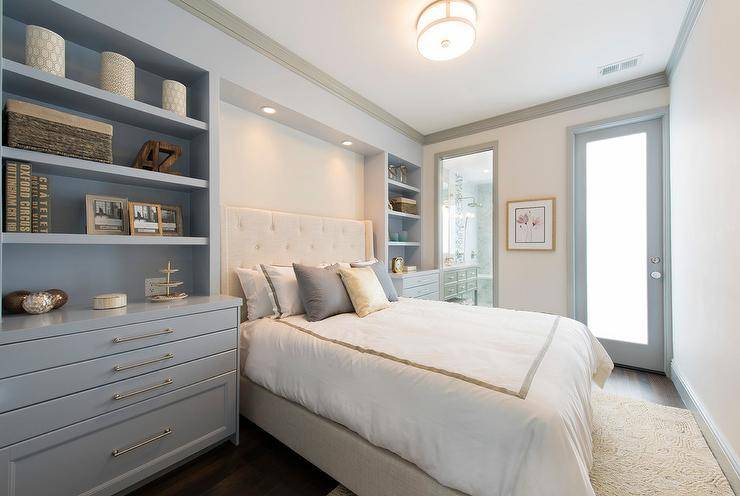
- Ambient or “general” lighting – canned lights, chandeliers, ceiling-mounted fixtures, buffet lamps, etc.
- Task lighting – lights to help you see tasks better, such as under-cabinet lights, desk lamps, reading lamps, etc.
- Accent lighting – lights that create a feeling of “atmosphere,” such as picture lights, candlelight, wall-mounted sconces, etc.
Go for Down or Down Alternative Throw Pillows One Size Larger
Ditch the floppy poly-fill throw pillow inserts for down or down alternative ones to make your beds and sofas feel a little more upscale. If possible, choose inserts one size larger than your throw pillow covers.
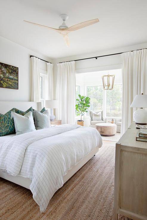
Paint Walls and Trim the Same Color
If you’re feeling extra brave, paint the ceiling too! The result is the illusion of a room with more square footage.
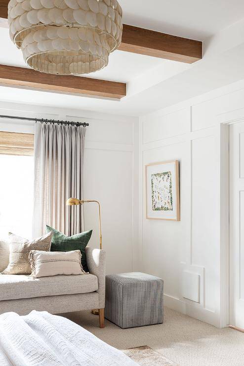
Incorporate Heirloom Quality Pieces
You can find high-quality furniture pieces at estate sales for a total bargain! And now that grand millennial style is “in,” that creates even more opportunity to grant vintage furniture a new lease on life.
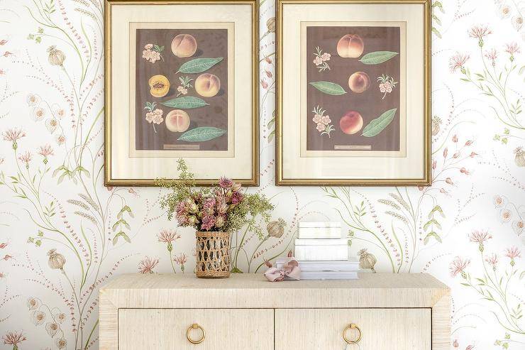
Update Your Lamp Shades
Lamps can date a room instantly, but simply swapping out an old lamp shade for one that’s more modern on the existing base, creates a whole new look without purchasing an entirely new lamp.
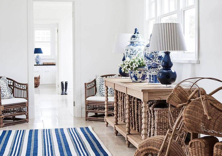
Use Neutrals Wisely
When the budget is tight, stick to neutrals as your “base” for sophistication- like curtains, furniture, area rug, and paint colors. Then, allow pops of color and trends to shine through your home decor accents. It’s much easier to change those smaller accents later versus changing an entire room of large bold, patterned pieces.
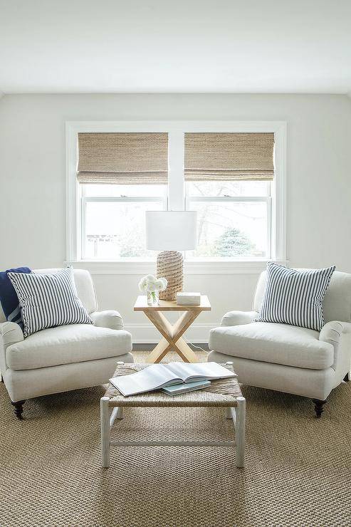
Don’t Hold Back on Bold, Rich Hues
On the flip side, don’t be afraid to punch a room with a hit of bold, rich color if your heart says to go for it! Navy blue paint is a good example because it’s dramatic and sophisticated but can still act as neutral when you want it to. If you’re going to go all in, go all in.
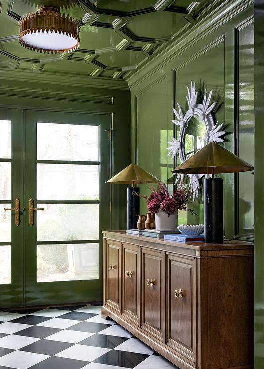
The best guideline for creating a luxe-looking home in case choosing paint colors scares you: pick the paint colors at the very top or very bottom of the paint color sample strip. There’s a feeling of sophistication when it comes to high-contrast spaces.
Mat Your Photos
There’s something about adding that thick, white paper mount around a photo that makes it feel special and important. You can find all kinds of picture frames already matted at Target or Walmart, or pick up a mat at the craft store for around $5-10 to fit any frames you already own.
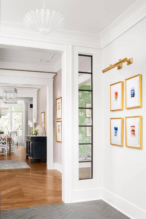
Make an Impact with Wallpaper
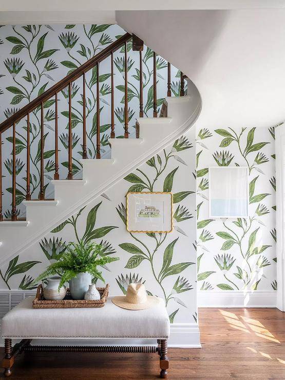
Nothing says custom in a house quite like wallpaper. If you’re afraid of commitment, go with peel-and-stick instead of the pasted type.
Add a Backsplash
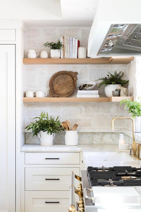
If you want to make your kitchen look more expensive for not a lot of money, add a backsplash to the drywall under your cabinets. If tile is too pricey or you don’t feel quite skilled enough, something like a DIY pressed tin backsplash is a fast, tool-free, inexpensive alternative.
Be Mindful of Your Home’s Scent
Run a diffuser with some of your favorite essential oils; warm wax melts, light a candle, and get a plug-in fragrance diffuser. Charcoal bags are great for absorbing old house smells and cooking smells.
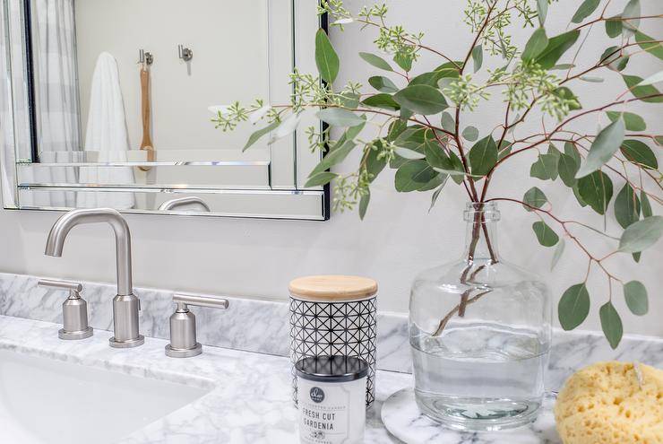
Whatever you choose, the smell in our homes creates a sensory experience unlike any other. That one change can do so much.
Mismatch Your Furniture
Resist the urge to buy all your living room furniture or bedroom furniture as one set from the furniture store. Instead, swap out one of the matching dressers with a dresser in another bedroom to allow variation.
Reflect Light in Dark Spaces with Mirrors
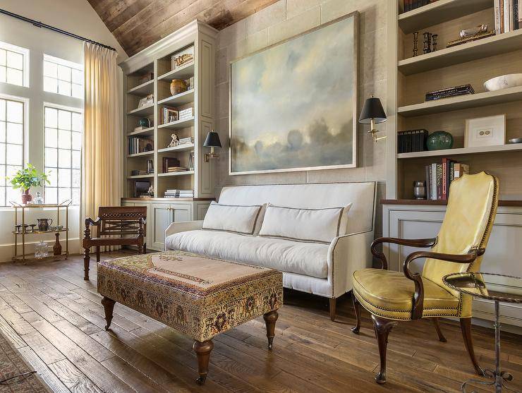
One of the best interior design tricks to make a house look expensive is by reflecting light on dark walls opposite windows with a mirror to help rooms feel bigger and brighter.
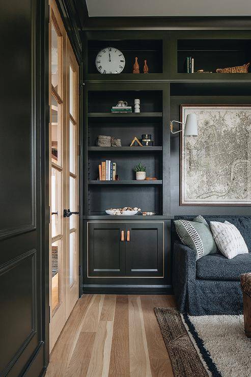
Put Toys In Cabinets and Bins When Not In Use
Utilize bins, closets, and cabinets to keep toys out of sight after playtime. Bonus: It teaches kids the responsibility of cleanup time too.
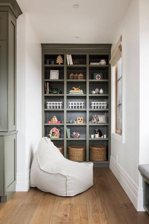
Thrift for Vintage Items
By mixing old and new decor, your home feels a bit more steeped in history and adds a layer of sophistication.
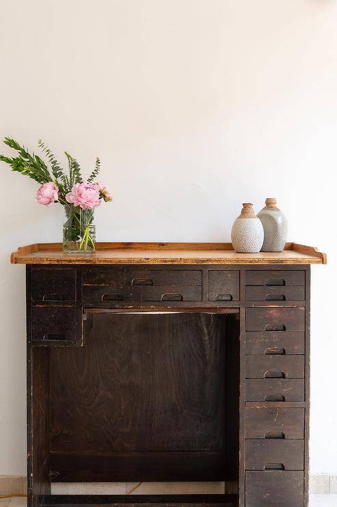
Be Intentional with Household Items
Decant hand soap into glass soap dispensers, keep cooking utensils in a displayable container, store Q-tips in an apothecary jar, pick a “pretty” toilet brush… it’s the little things you use all the time that add up to a better daily experience.
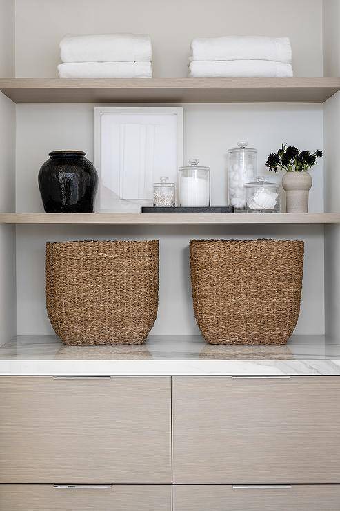
But it also reduces visual clutter by eliminating plastic packaging. Reducing clutter makes your space feel more inviting to you and others.
Add Fresh Landscaping
You don’t have to spend a fortune on landscaping for an expensive look. Invest in perennials for a flower bed that will come back year after year, along with some new mulch to give your home’s landscape a fresh update.
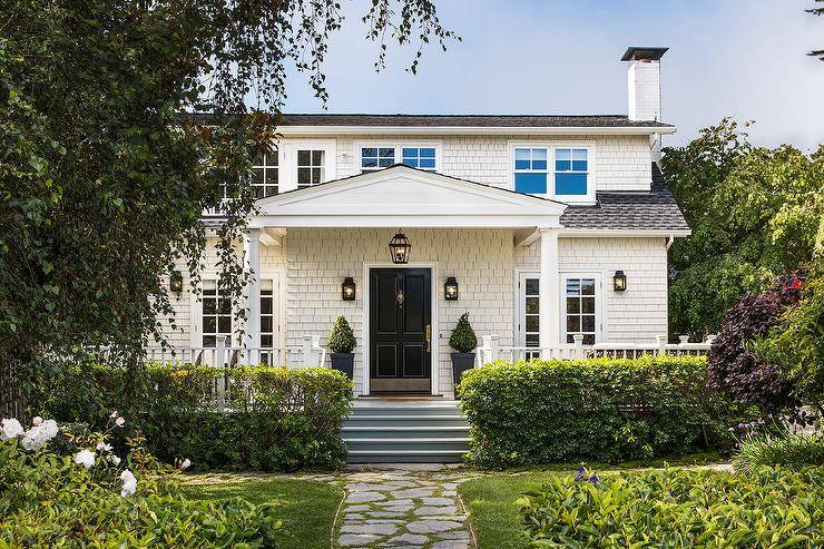
Update Your Entryway
Make the entry of your home a welcoming spot. Whether you paint the front door a bold color or add colorful flowers in planters or a wreath, simple touches go a long way.
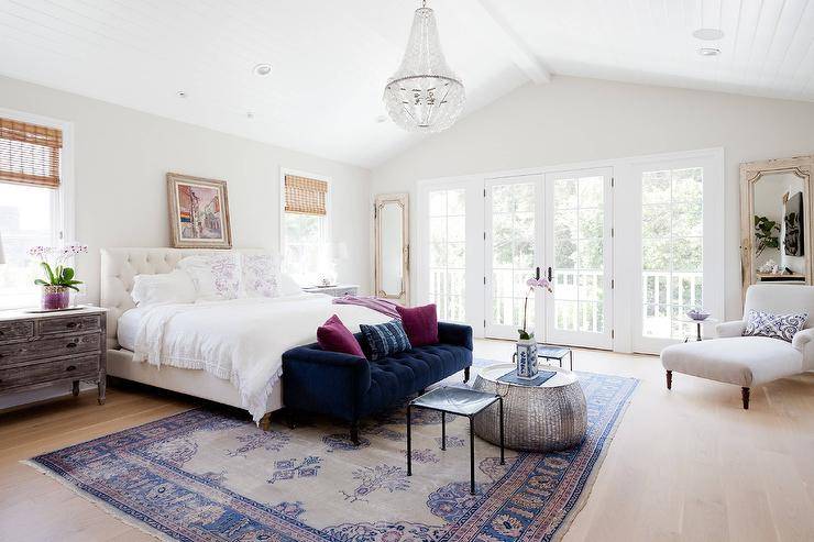
Mix Textures
By adding different textures to a room, you create a custom look. Try adding a Turkish rug with a wooden armchair and metal accessories. Add throw pillows in various textures, such as silk and velvet, to round out the look.
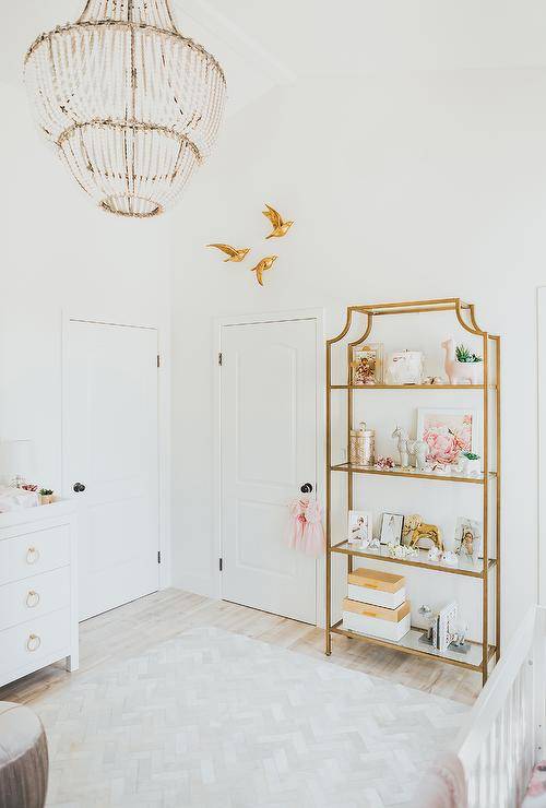
Go For Gold
For a big look that’s easy on the wallet, buy a can of gold spray paint to update the look of picture and mirror frames, trays, and vases. This inexpensive idea will add a bit of glamour to any room.
Maintenance
Generally, anything that is well-maintained will automatically feel more premium, which is why new stuff always feels so nice. It’s also why you feel better about yourself when you get your hair or nails done. It’s the same thing with your home. It needs care, and when it gets it, it makes everyone feel better!
Frequently Asked Questions (FAQs)
What makes interior look cheap?
How can I make my house feel like a luxury hotel?
Add luxury style to your home just like a hotel by investing in high-quality linens — bed sheets, duvets, and towels. Hotels put comfort at the top of the list, and when you go for a high-end comfort, you can’t go wrong.
What’s the difference between expensive and cheap furniture?
What makes a sofa look expensive?
Here are some other home-decorating articles you may enjoy:
- Decorating With Anthracite, the Popular and Versatile Shade of Gray
- Offbeat Decorating Ideas for Every Room of Your Home: Quirky Delights!
- 5 More Top Kitchen Decorating Trends to Embrace in the New Year!

