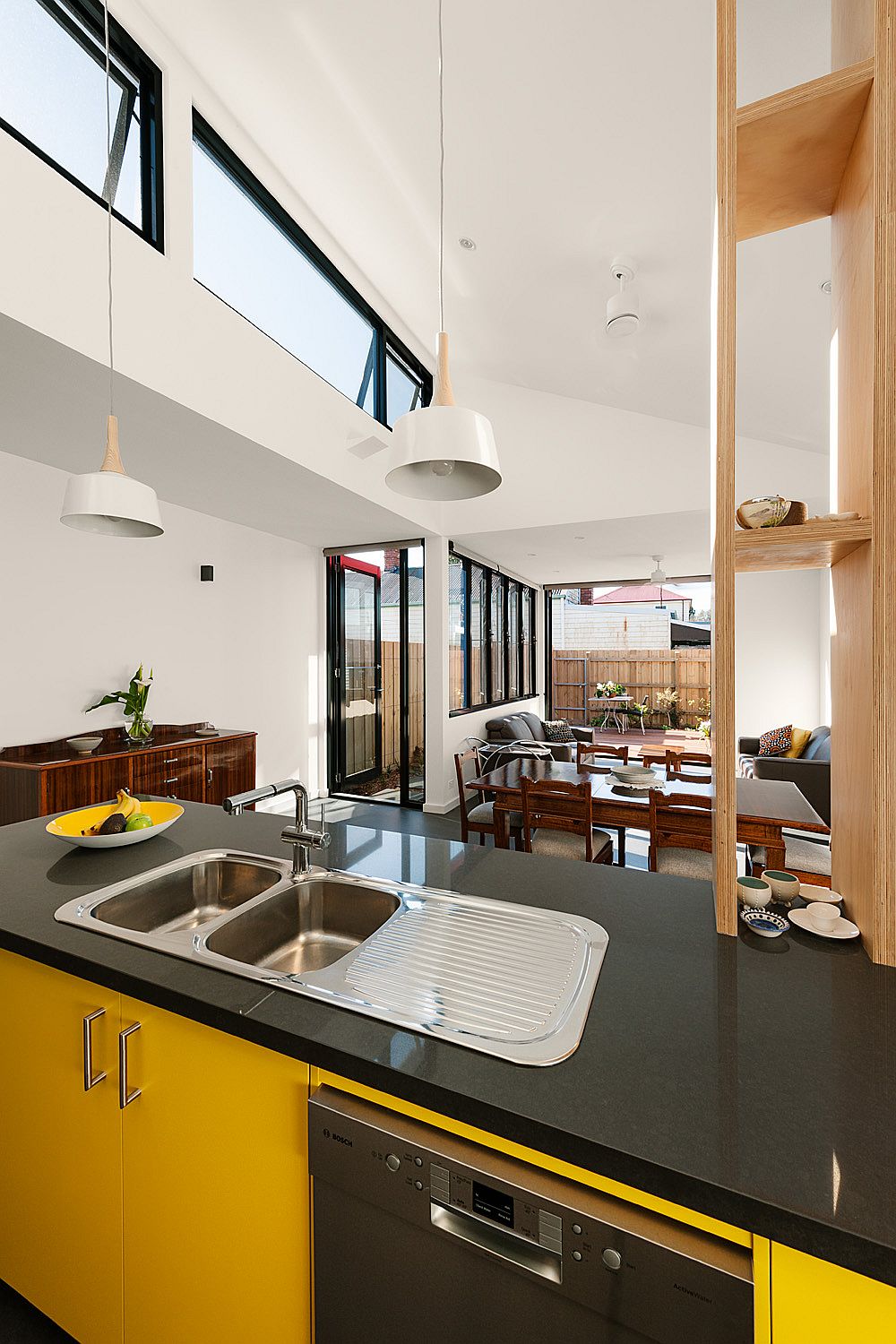
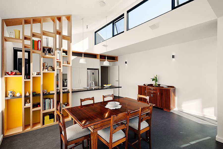
As with every Victorian home that has been burdened with poorly planned additions and unnecessary interior alterations, the Jill’s House was a dark and unwelcome space when time for its latest makeover arrived. A smart renovation carried out by Green Sheep Collective, the new interior is drastically different from its old counterpart as natural light flows into the new interior. It is the use of clerestory windows that adds to the cheerful appeal of the living area, which now also contains the dining area and the kitchen. Coupled with passive solar design and a neutral color palette the rejuvenated space looks vastly different from the original.
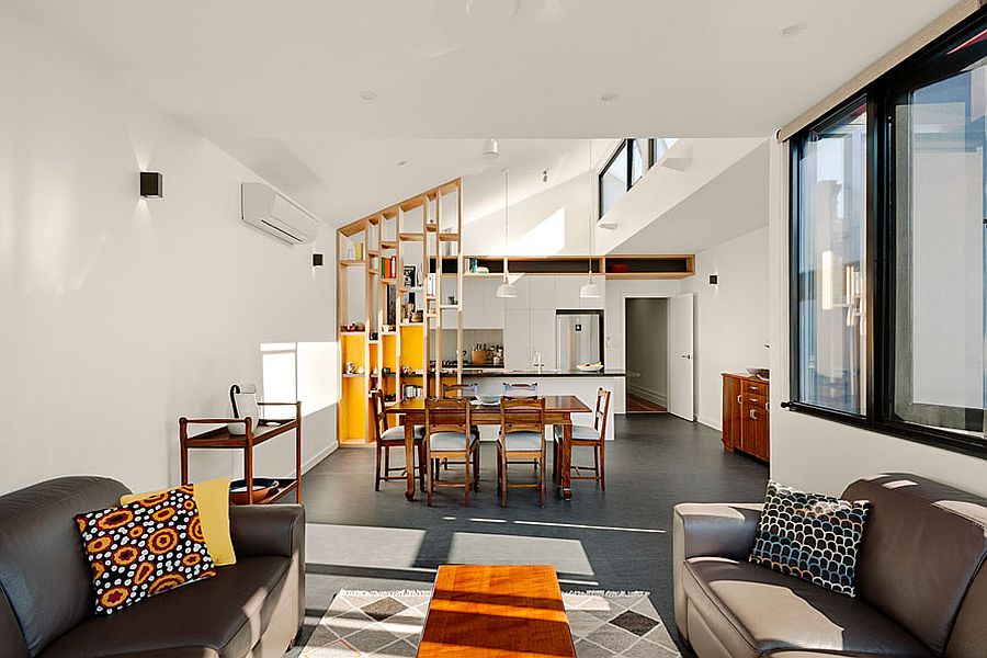
The north facing living area now feels a lot more inviting and a snazzy wooden shelf with a splash of yellow separates the ergonomic kitchen from the dining area. The new volume differs from the original Victorian home both aesthetically and functionally and yet the revamped interior of the older welcomes its contemporary vibe. The house is also now easier to maintain, far more energy efficient, far less dependent on artificial heating and cooling devices and also features a small rear deck and a lovely garden.
RELATED: Extended Heritage: Victorian-Style Armadale House Gets a Glassy Upgrade
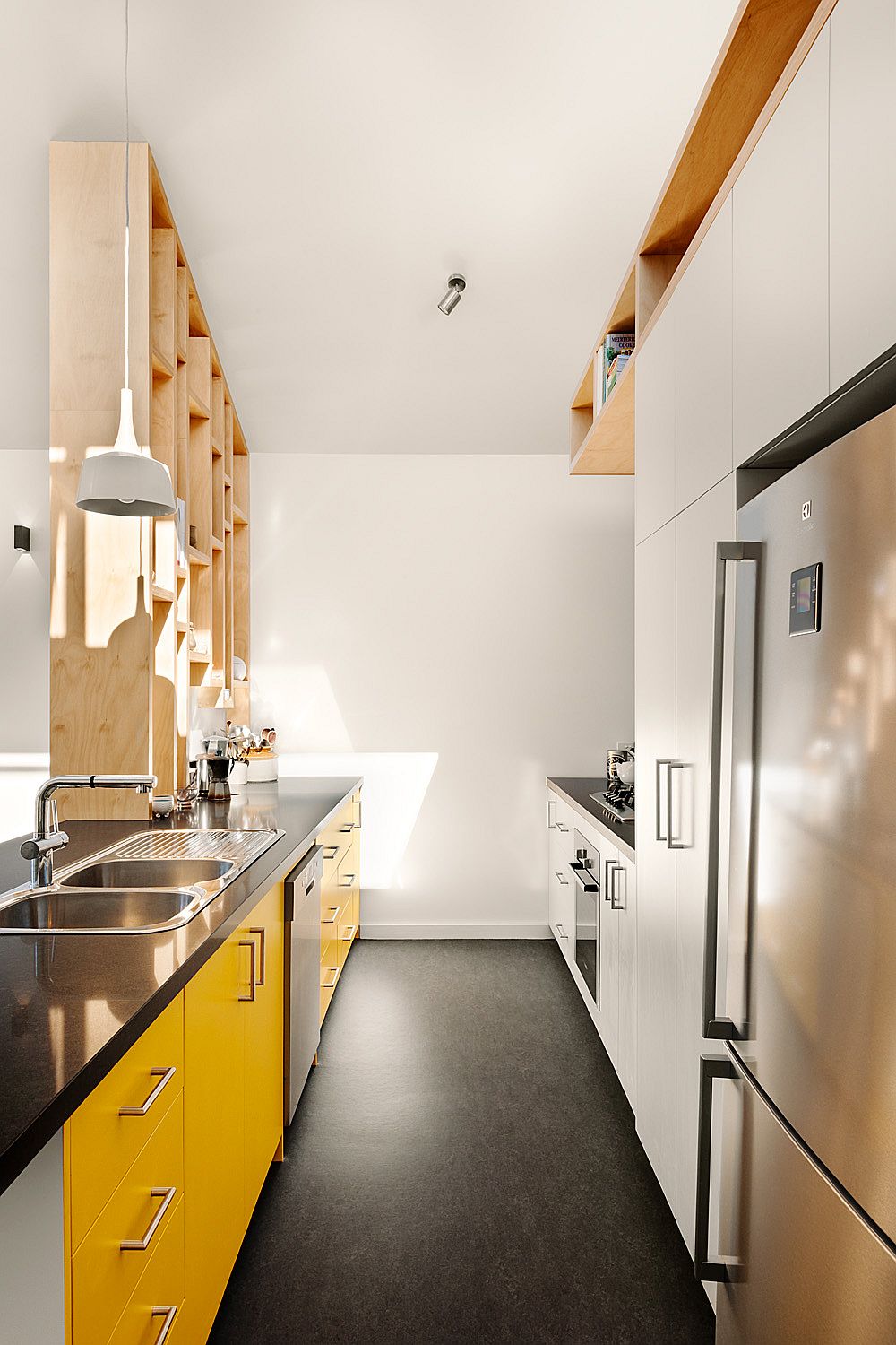
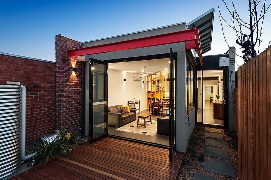
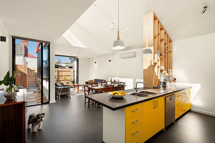
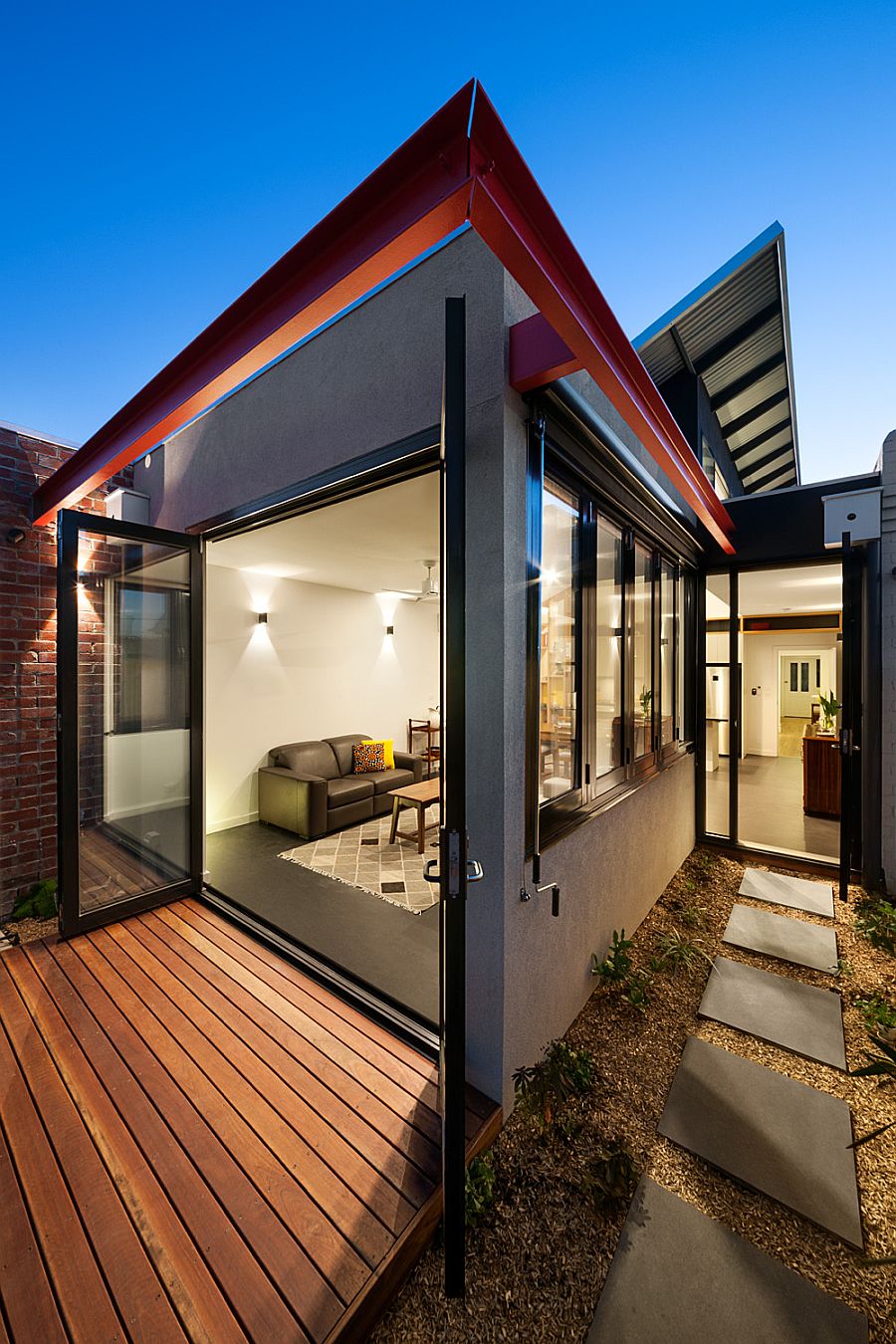
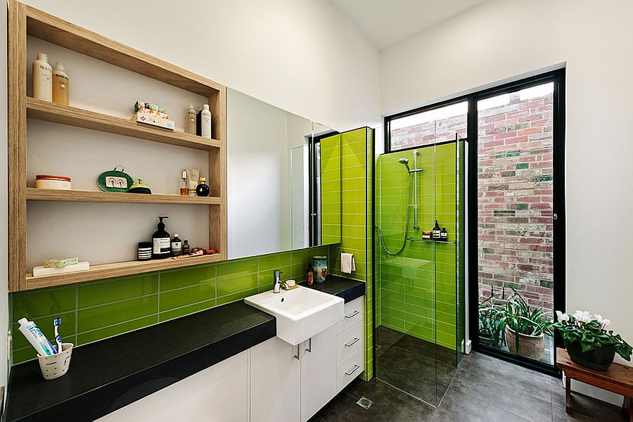
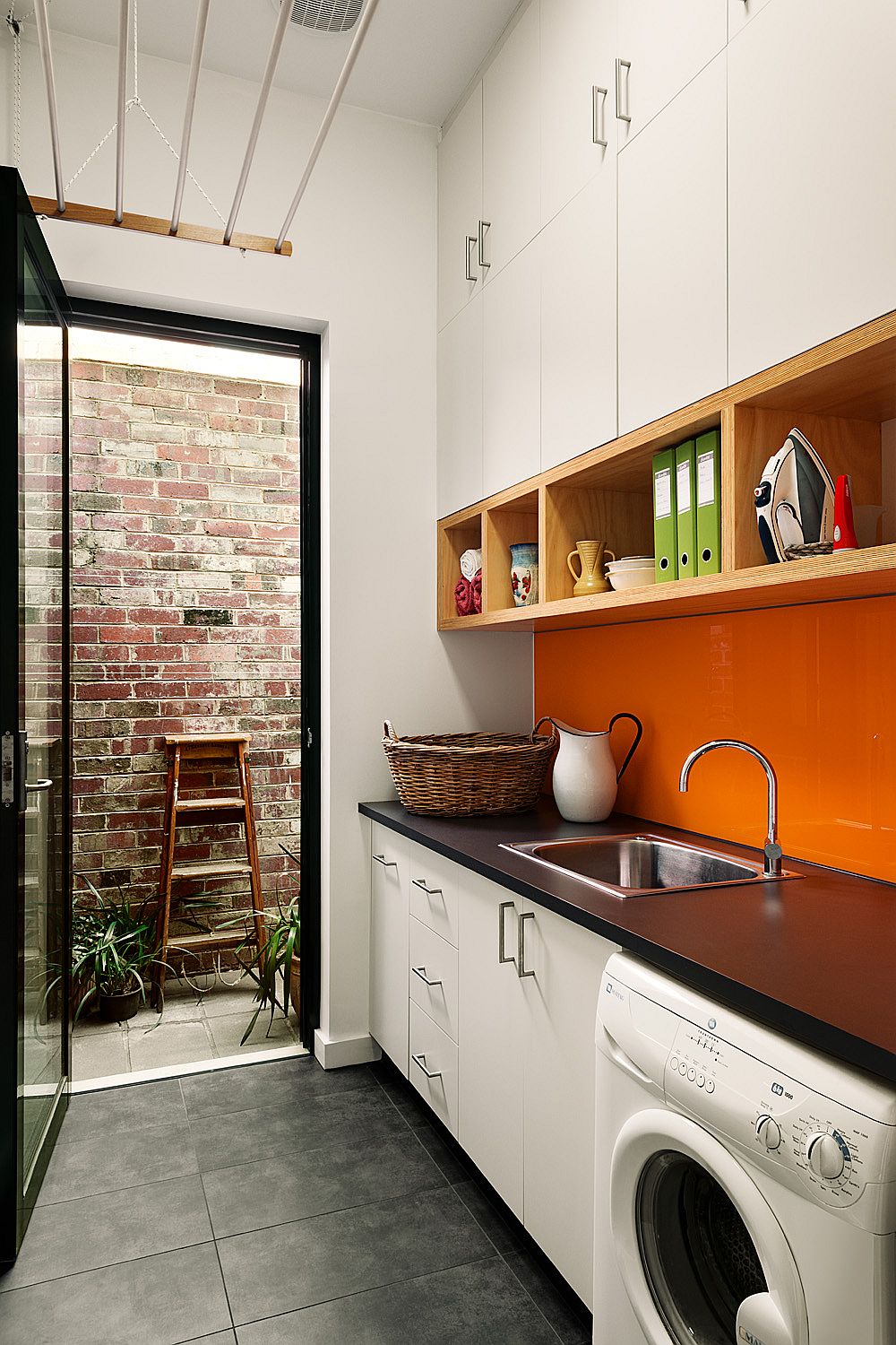
Bright blocks of color have been used throughout the house to bring freshness to the neutral color scheme. It is burnt orange that steals the show in the laundry space while delightful lime green charms you inside the light-filled modern bathroom. An eco-savvy transformation where less is more! [Photography: Emma Cross]
RELATED: Probably The Coolest Victorian House Makeover You’ve Seen!
