It is amazing how constrained our imaginations can be because of the way the world around us shapes our perceptions. When it comes to interior design and space, many homeowners tend to only look sideways and rely on a variety of space-savvy features and modular décor solutions to make the most of the limited square footage. Yes, these smart solutions do work well almost always. But the amount of ‘new space’ that they can add to a home is very little even when you really crank up your creative side. Instead, this ingenious ground-level apartment in Barcelona looks in an entirely different direction to discover new space – towards the ceiling! UP House designed by cumuloLimbo studio in Madrid feels cheerful and unique.
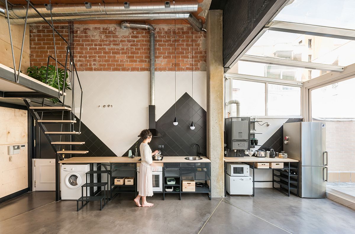
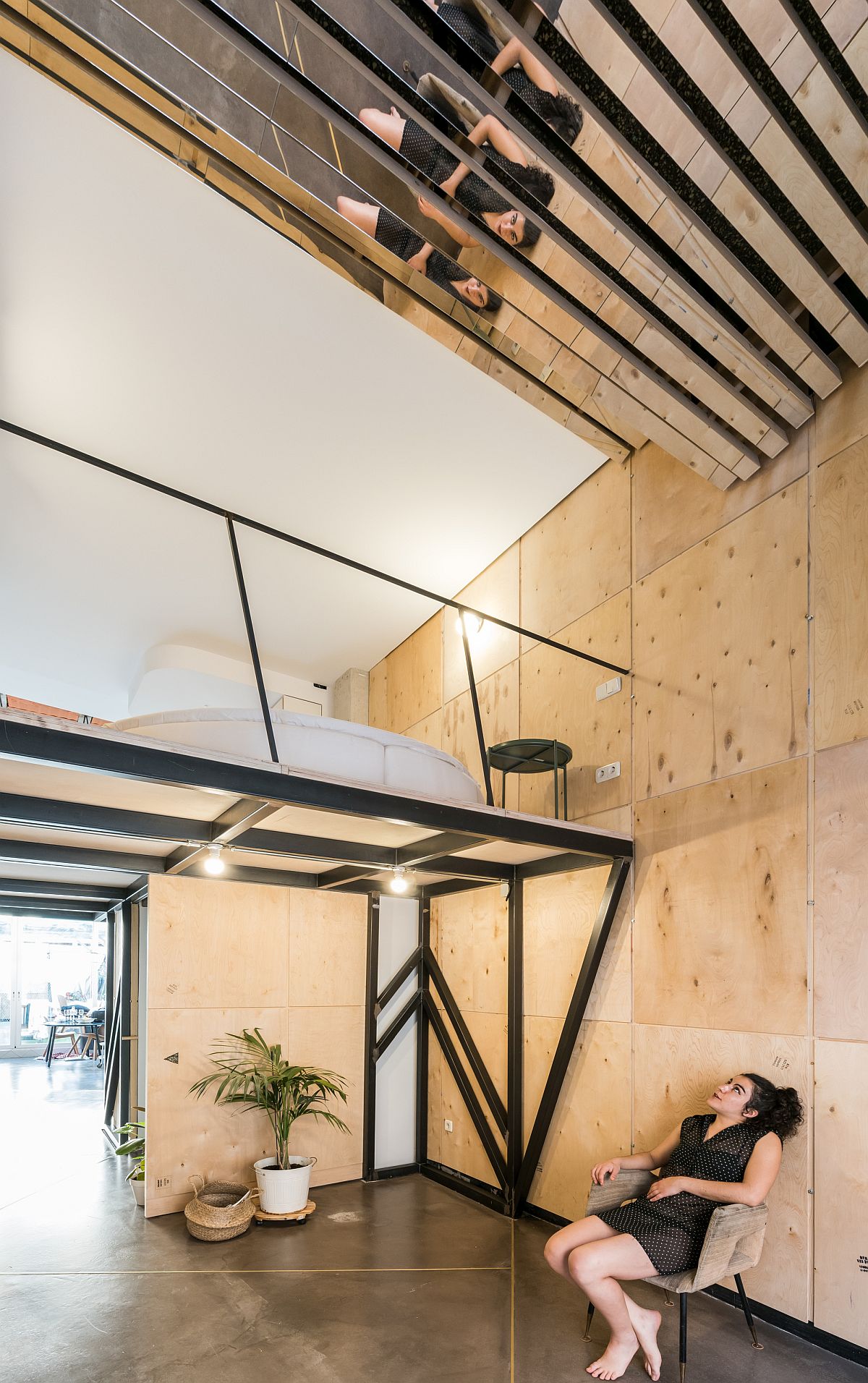
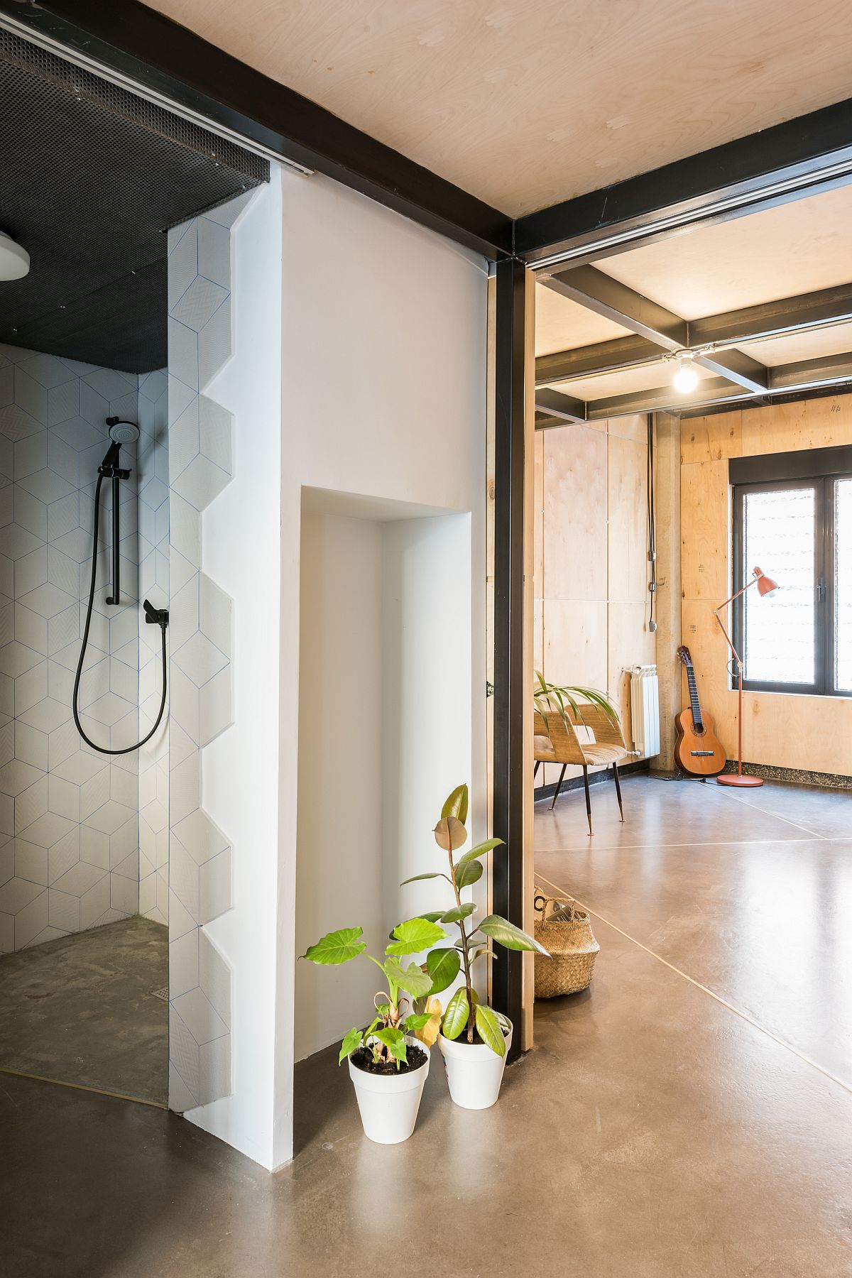
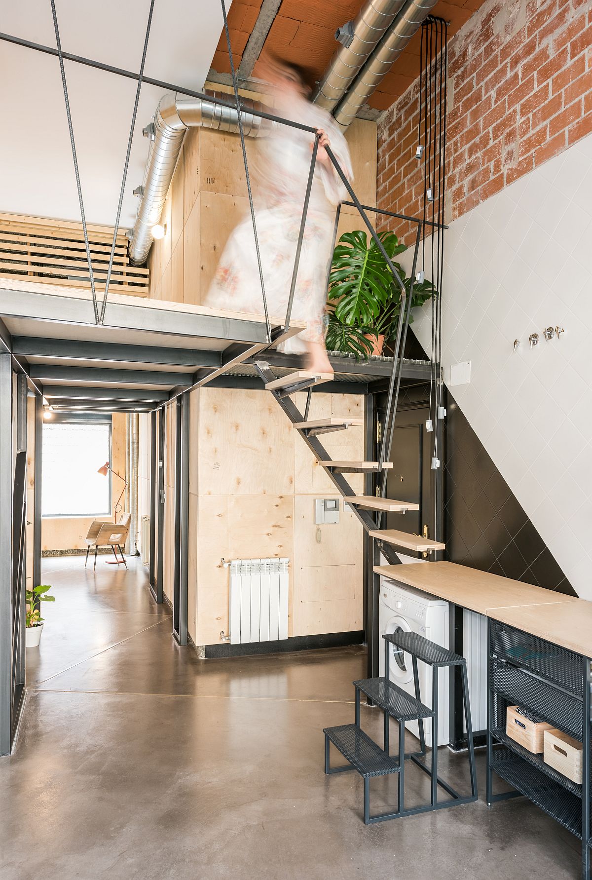
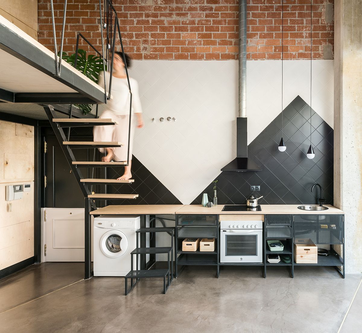
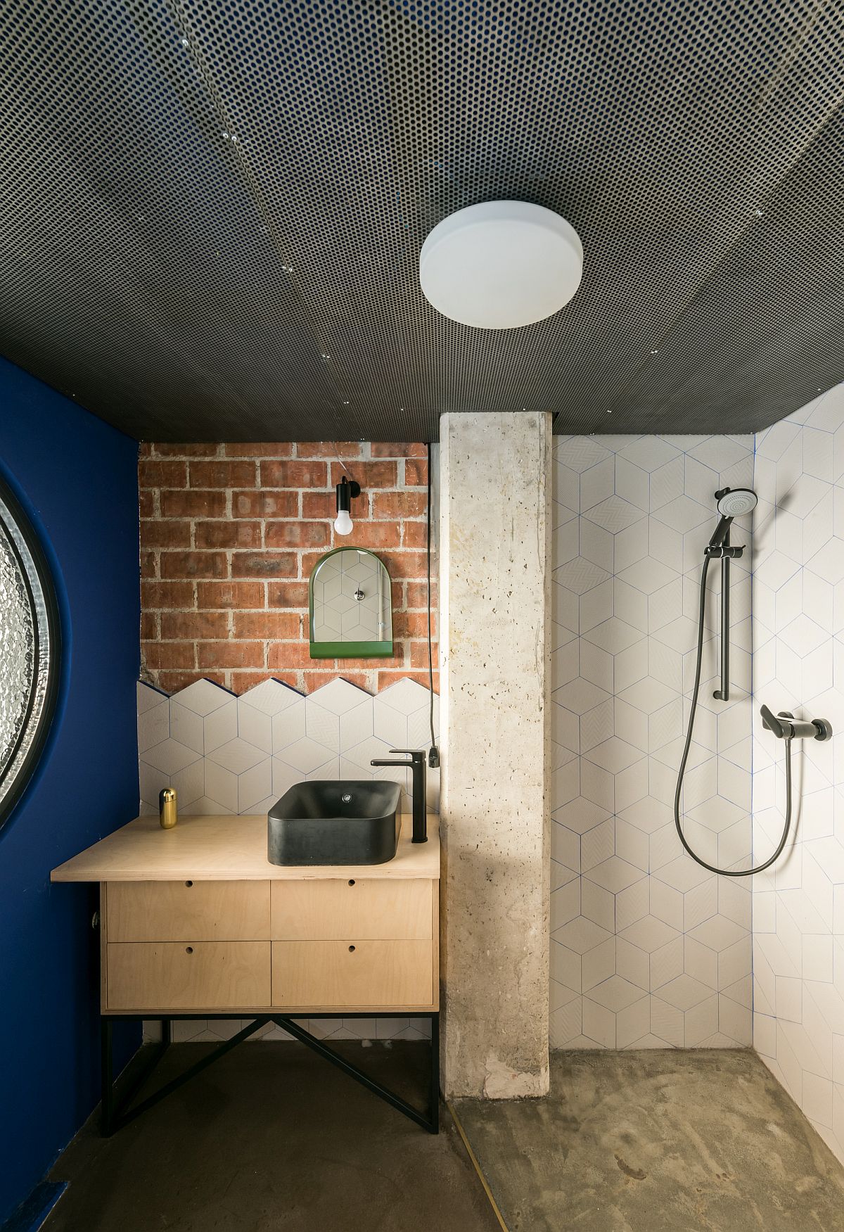
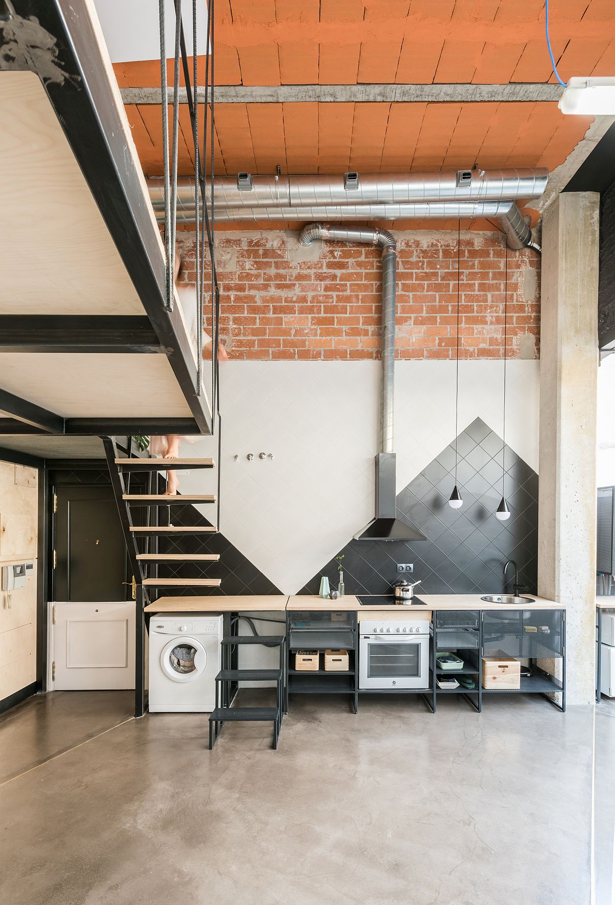
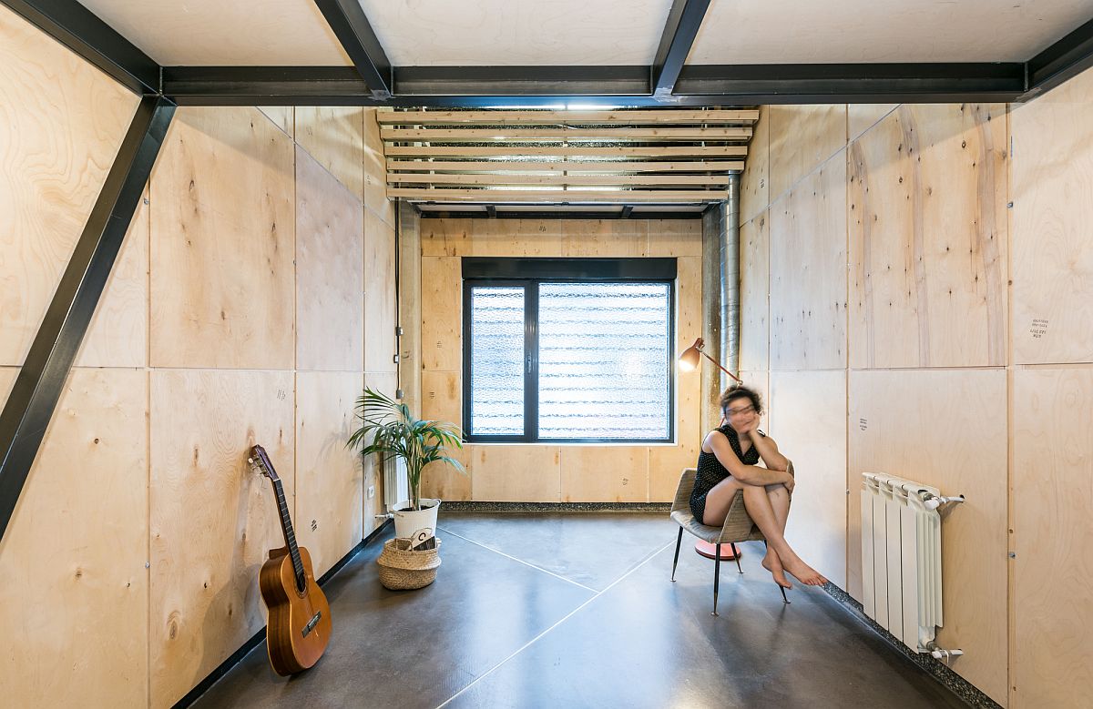
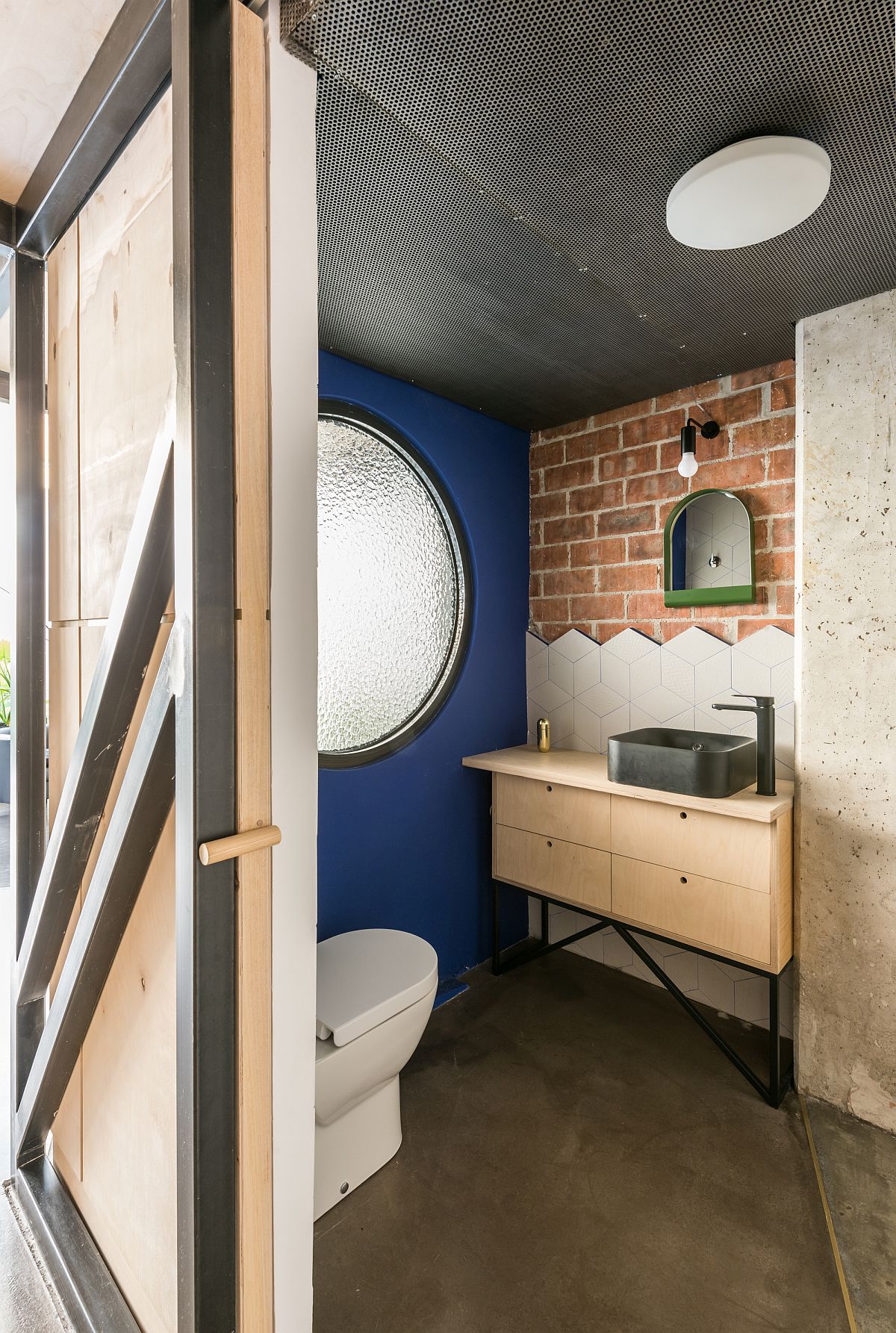
A new mezzanine style upper level of the home supported by six steel structures sits in between the living area and the bedroom of the house. The vertical addition perfectly delineates the public and private spaces – creating two large, double-height area on both the side. It is the bedroom section that is draped in recycled plywood while the kitchen, dining space and living space have a more modern industrial vibe with white, exposed wood and metallic surfaces all around.
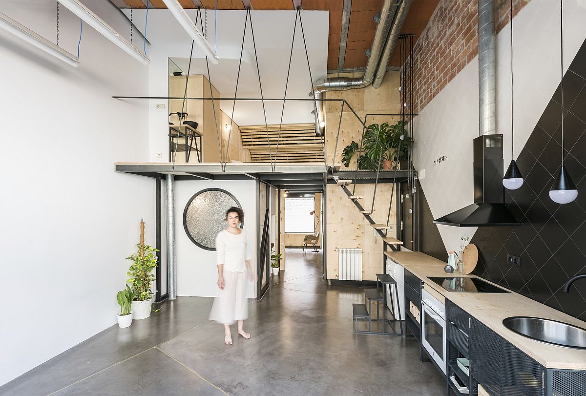
With the apartment sitting on the ground level, natural ventilation was a defining factor in the renovation. Large glass walls along with a glass roof section on one side and a ceiling vault with mirrored finish on the other ensure that every room in here gets ample natural light. Edgy, imaginative and still staying true to its industrial past, this Madrid home has it all. [Photography: Javier de Paz García]
