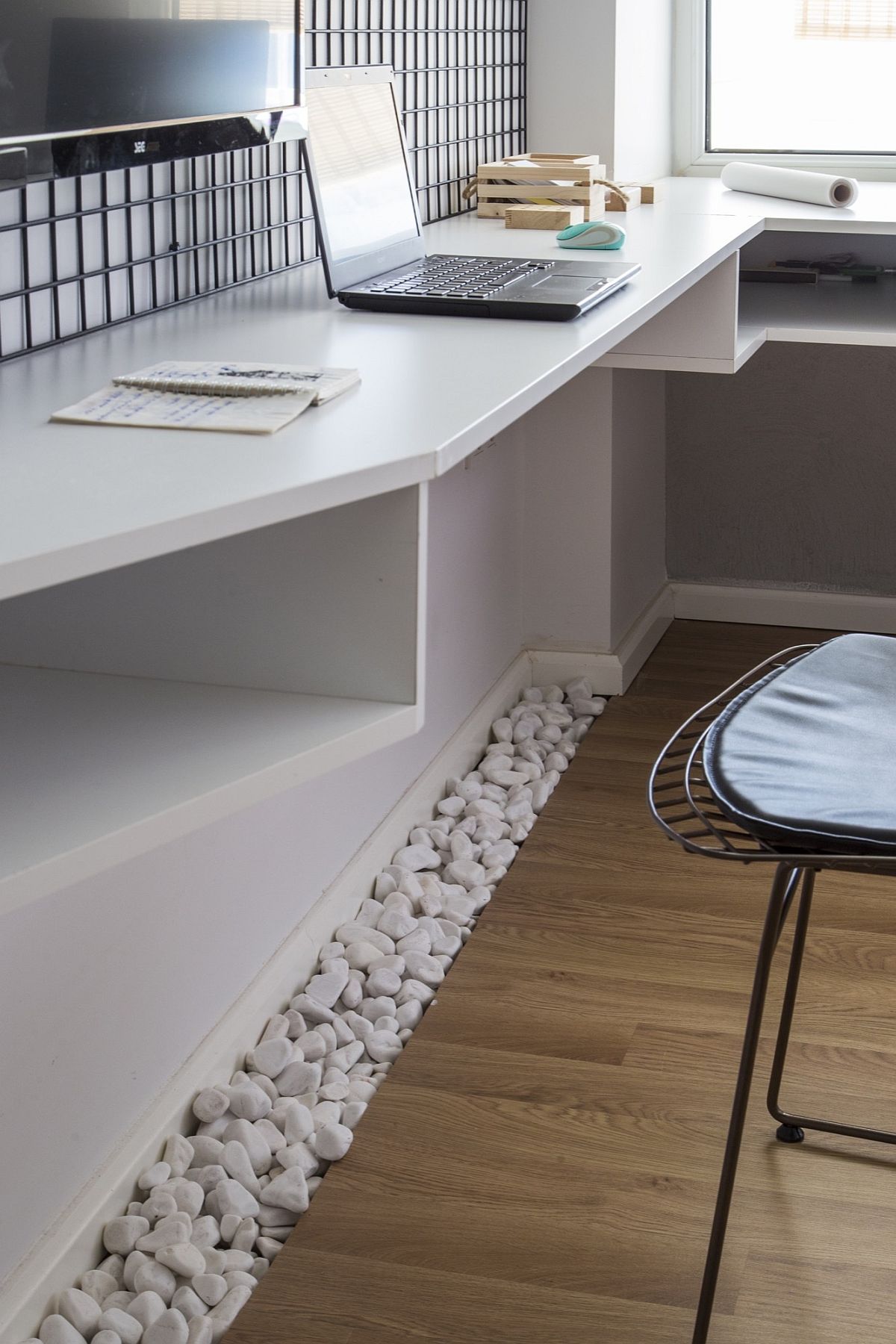
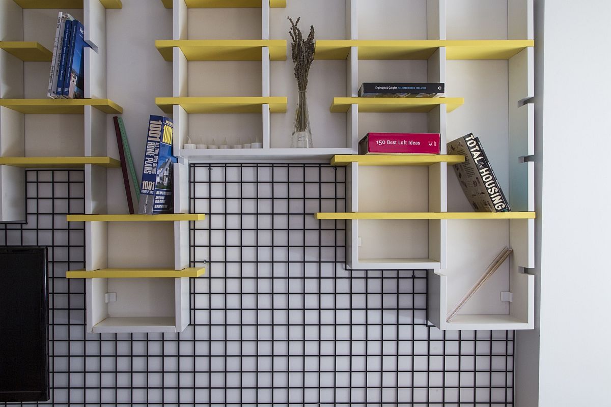
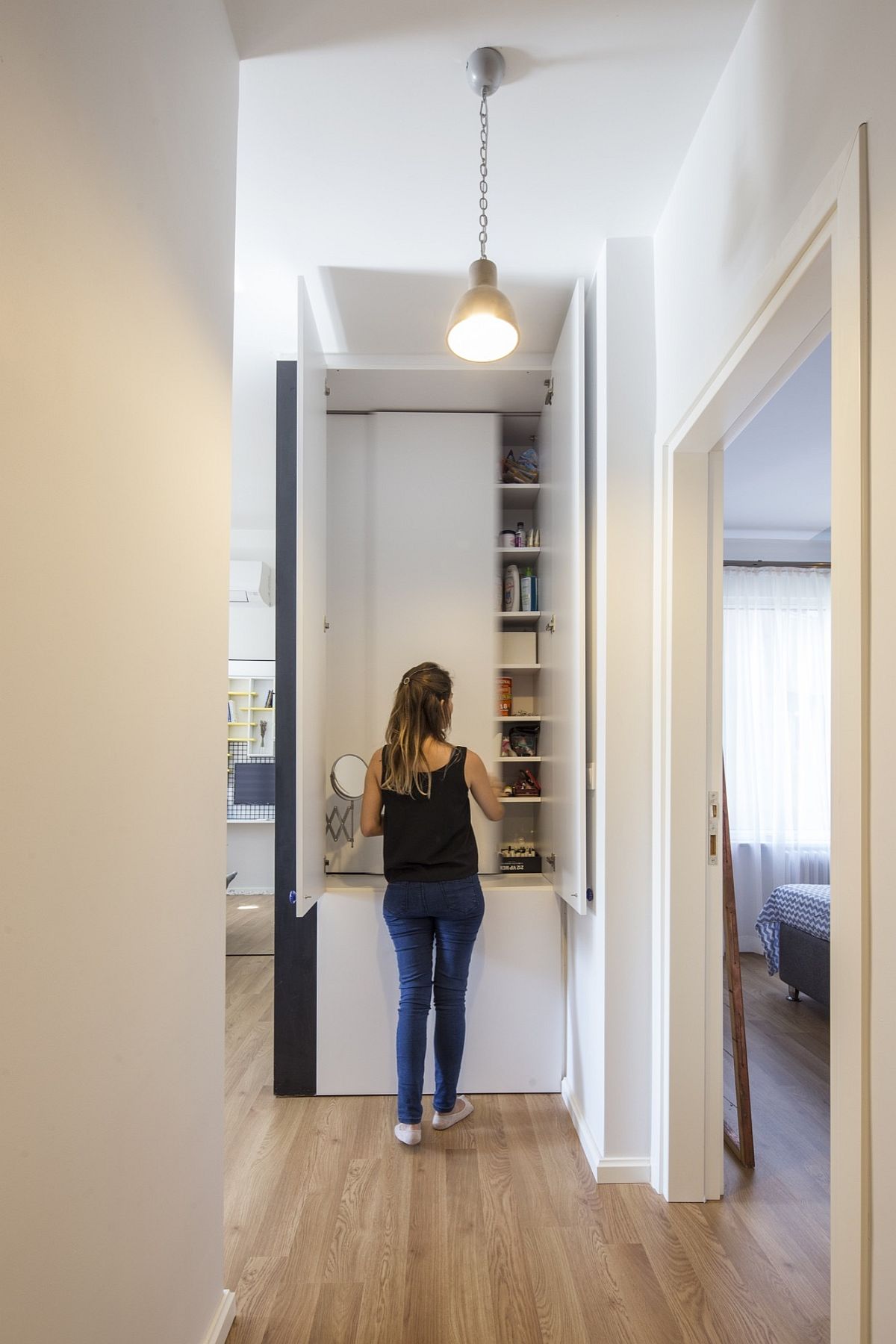
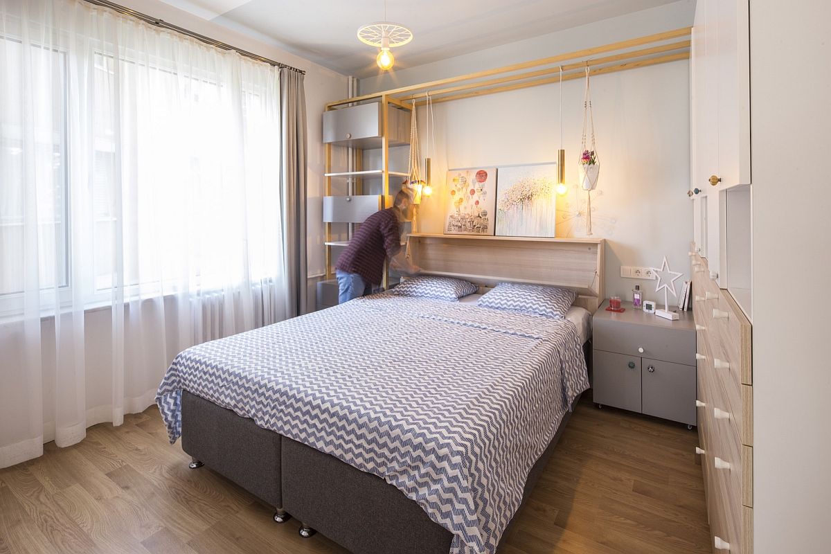
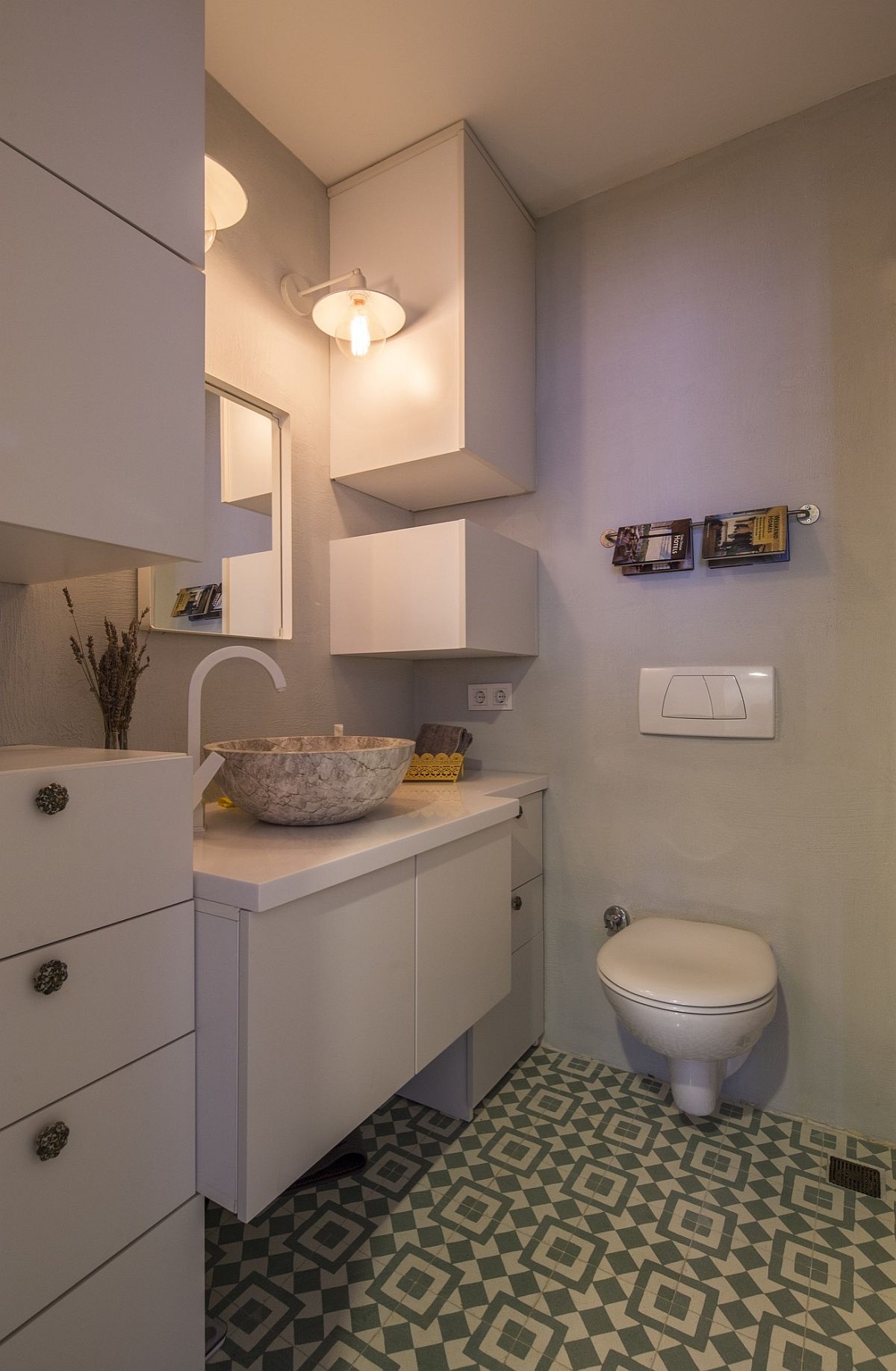
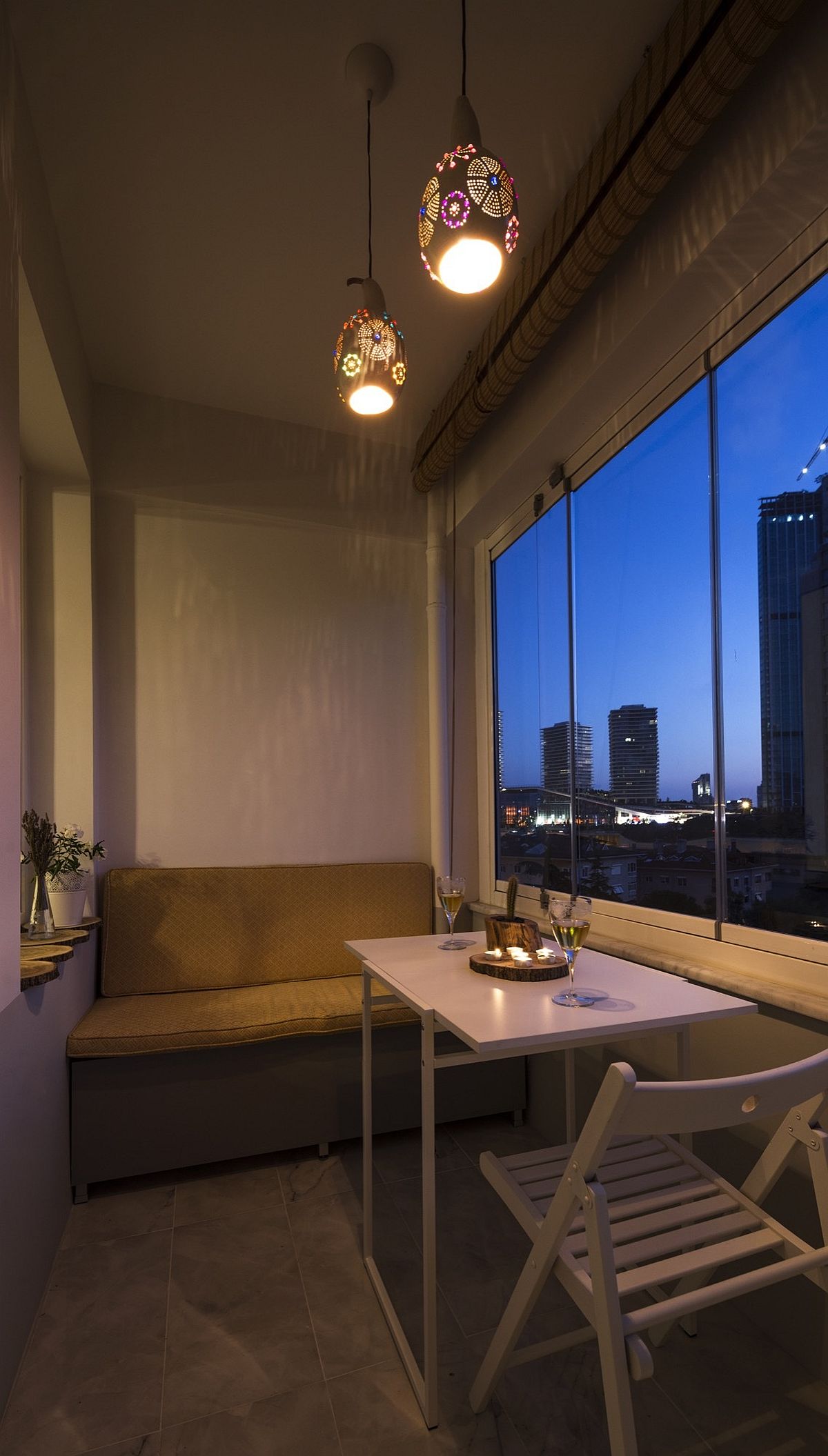
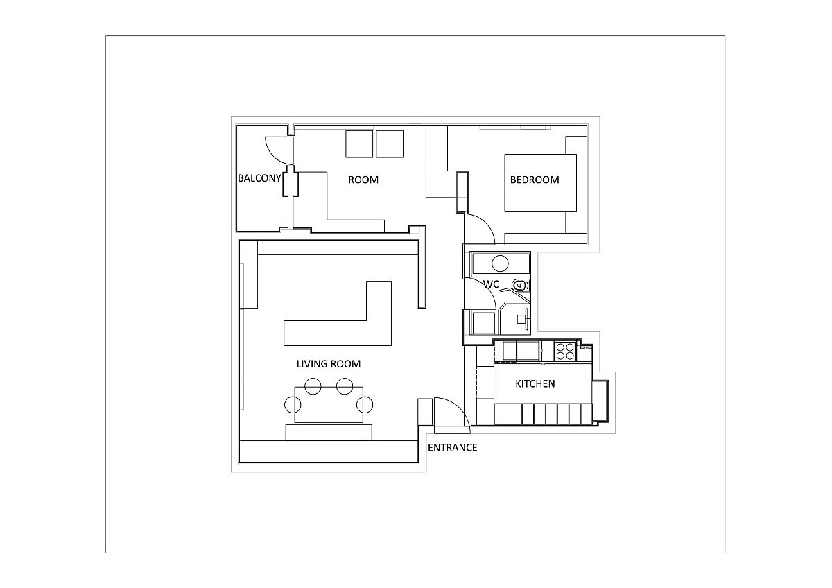
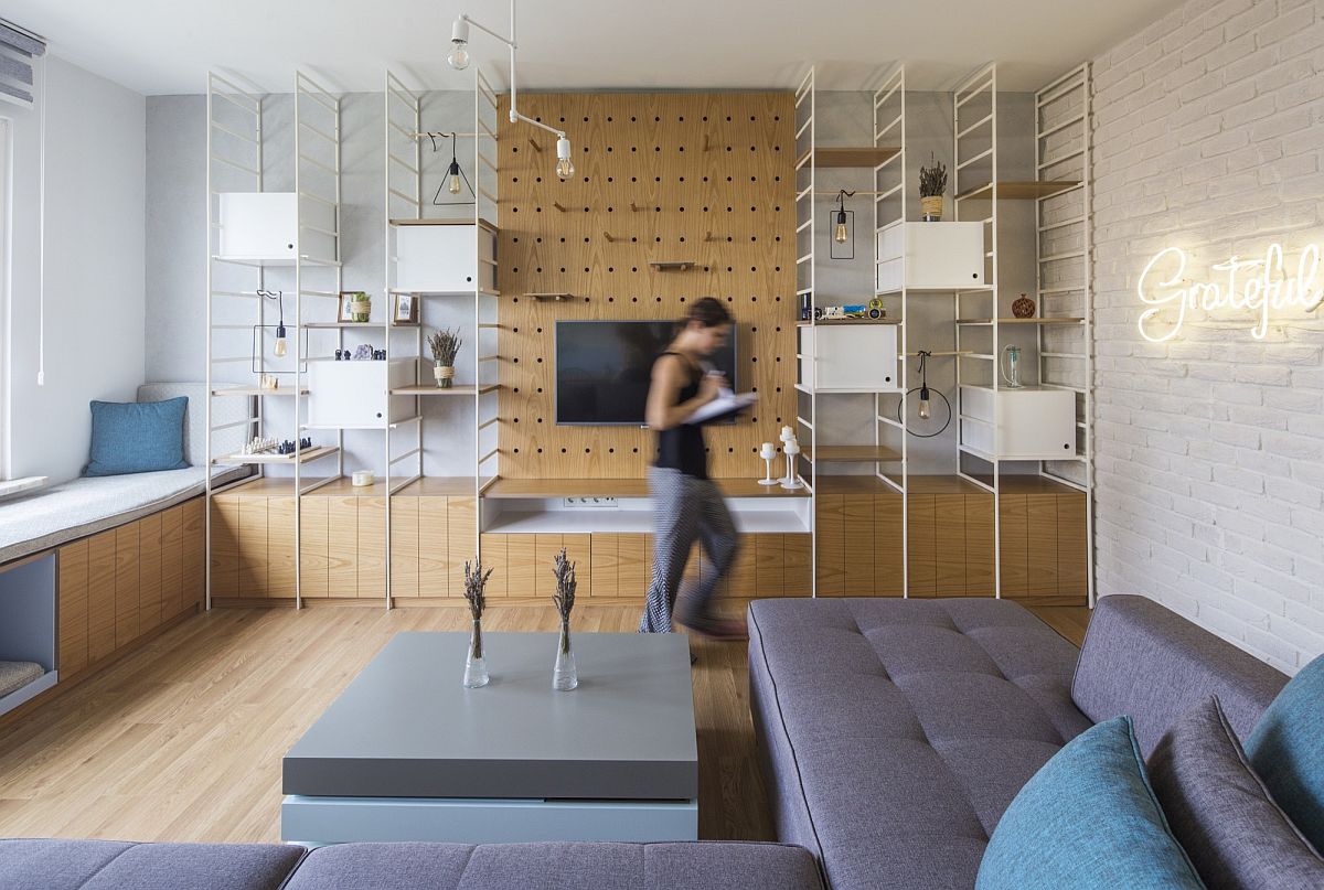
To turn an apartment in an old building into a modern hub that serves the needs of a young couple is a job that demands both precision and an understanding of the couple’s lifestyle. This 78-square-meter apartment in Istanbul might not be really ‘tiny’, but because of poor original design and unnecessary walls and doors, the interior was jaded, outdated and dark. It was the ingenious folks from COA Mimarlık who transformed the Levent House to fit the needs of its new homeowners, even while giving it a quick style and ambiance upgrade.
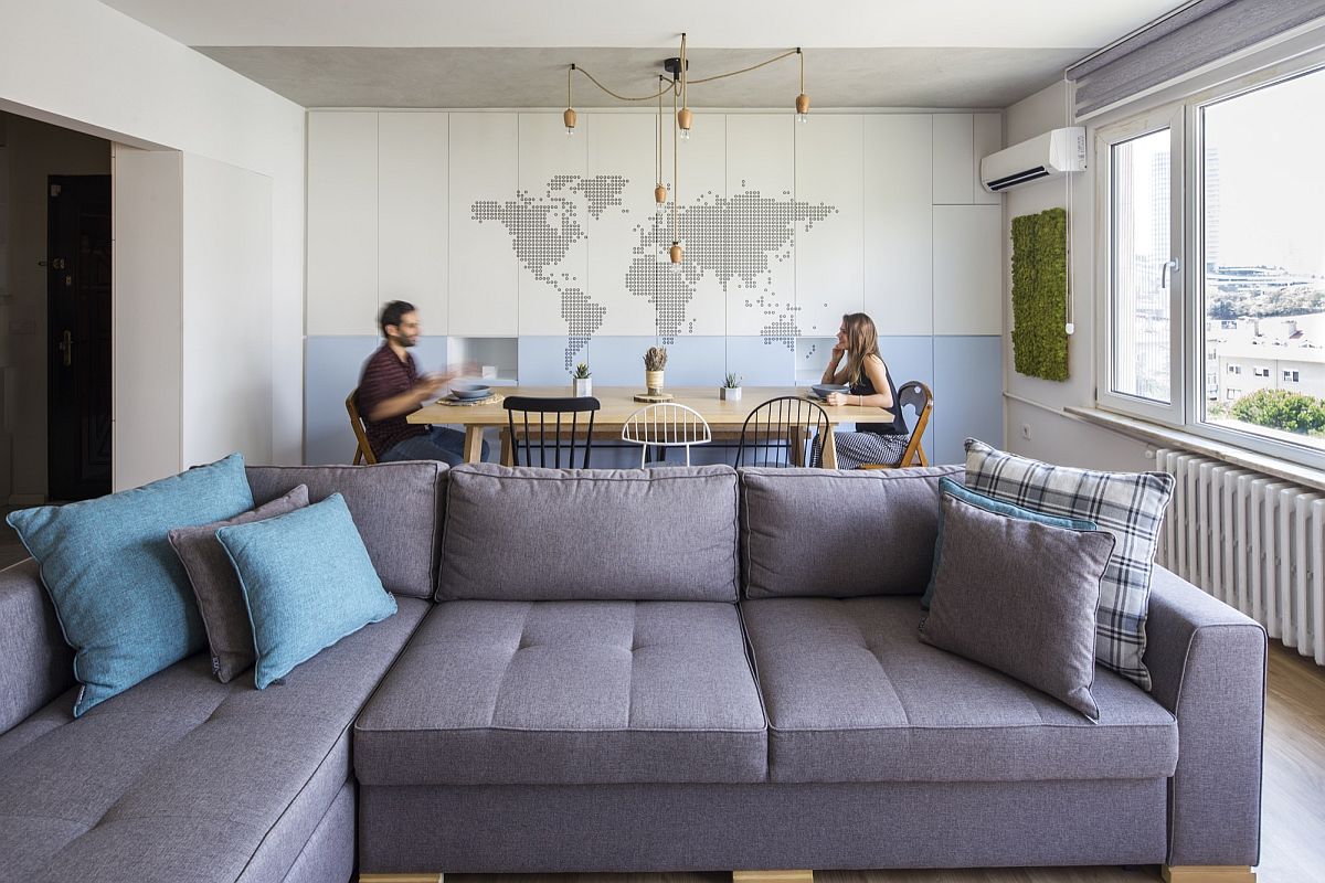
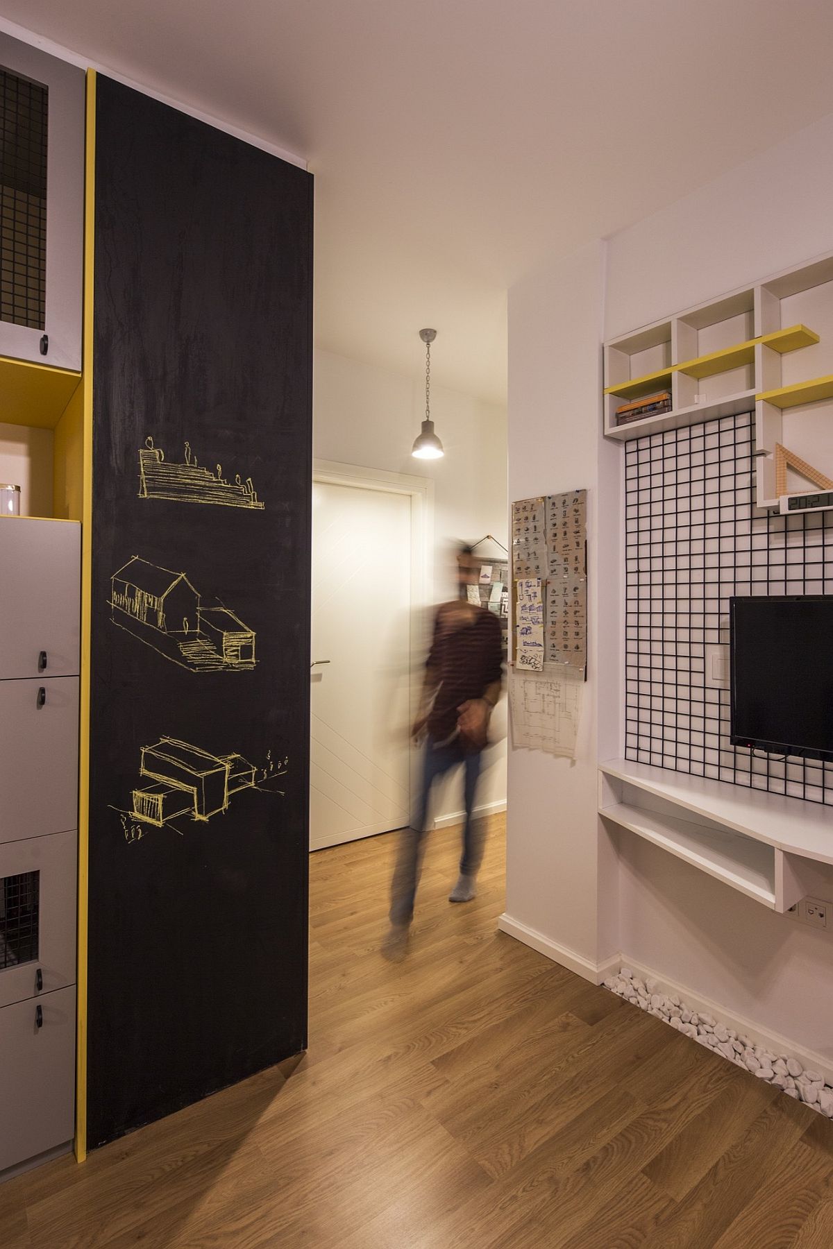
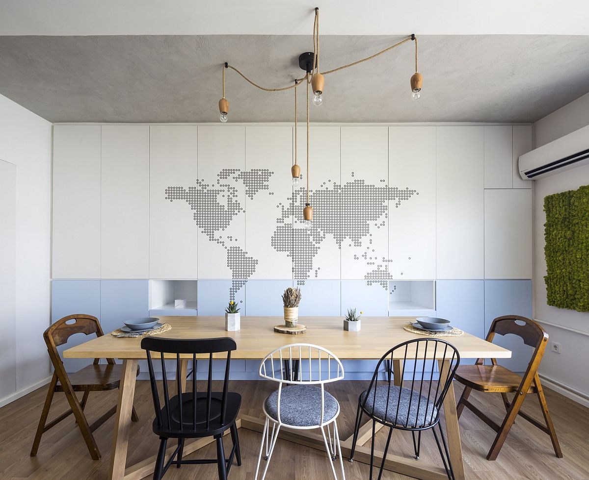
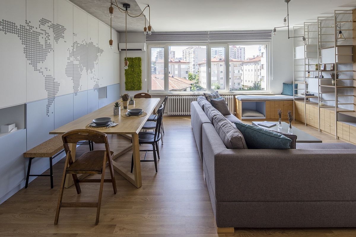
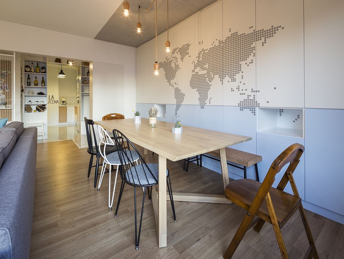
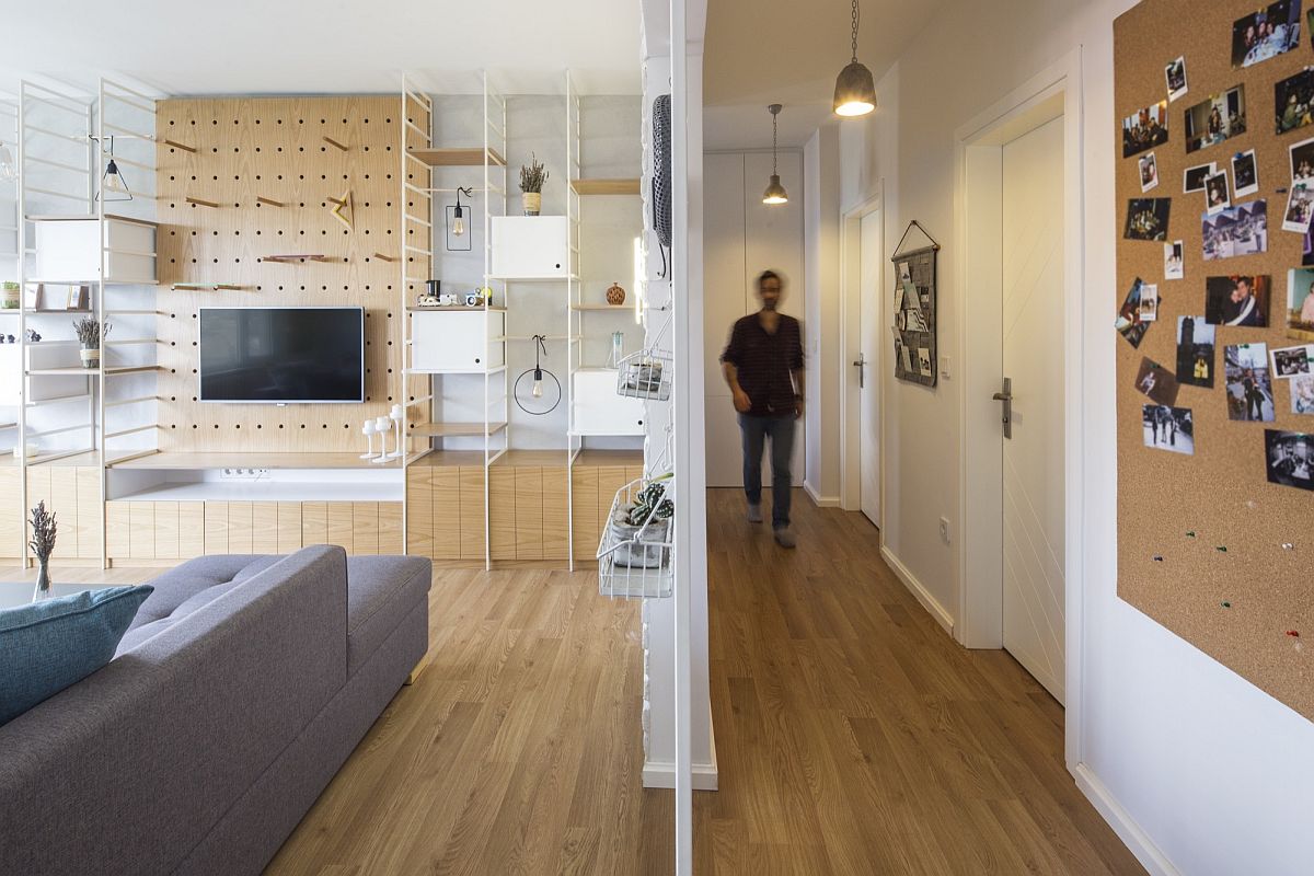
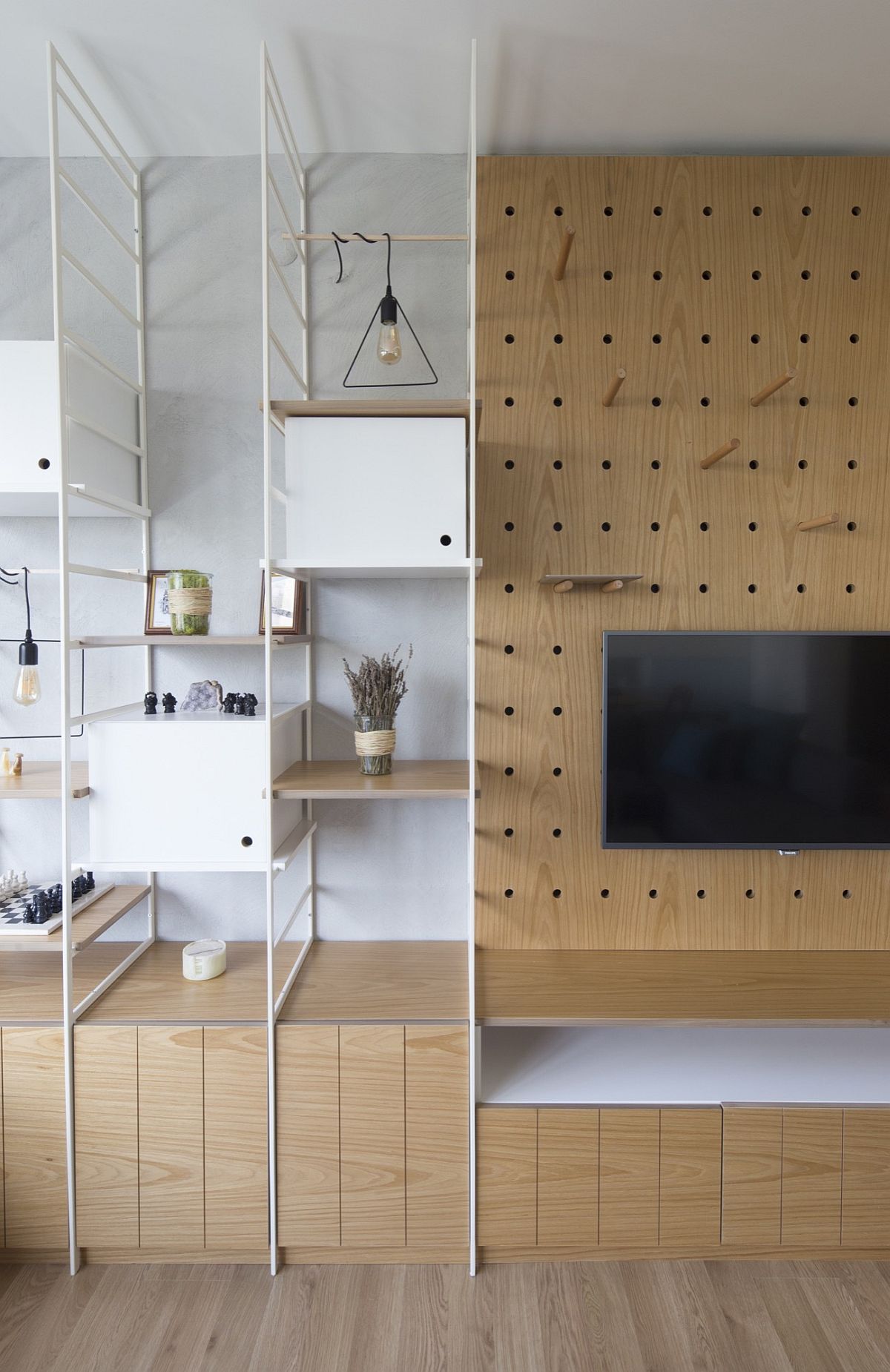
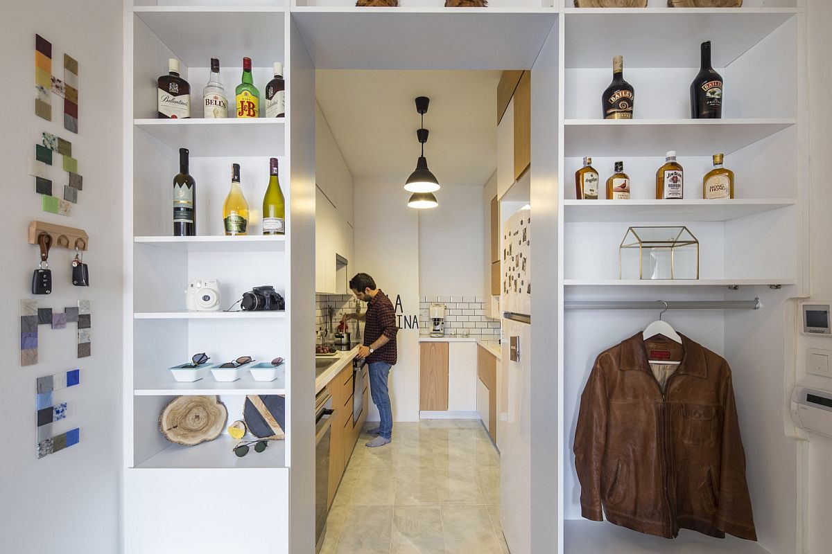
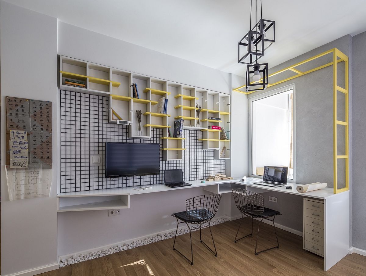
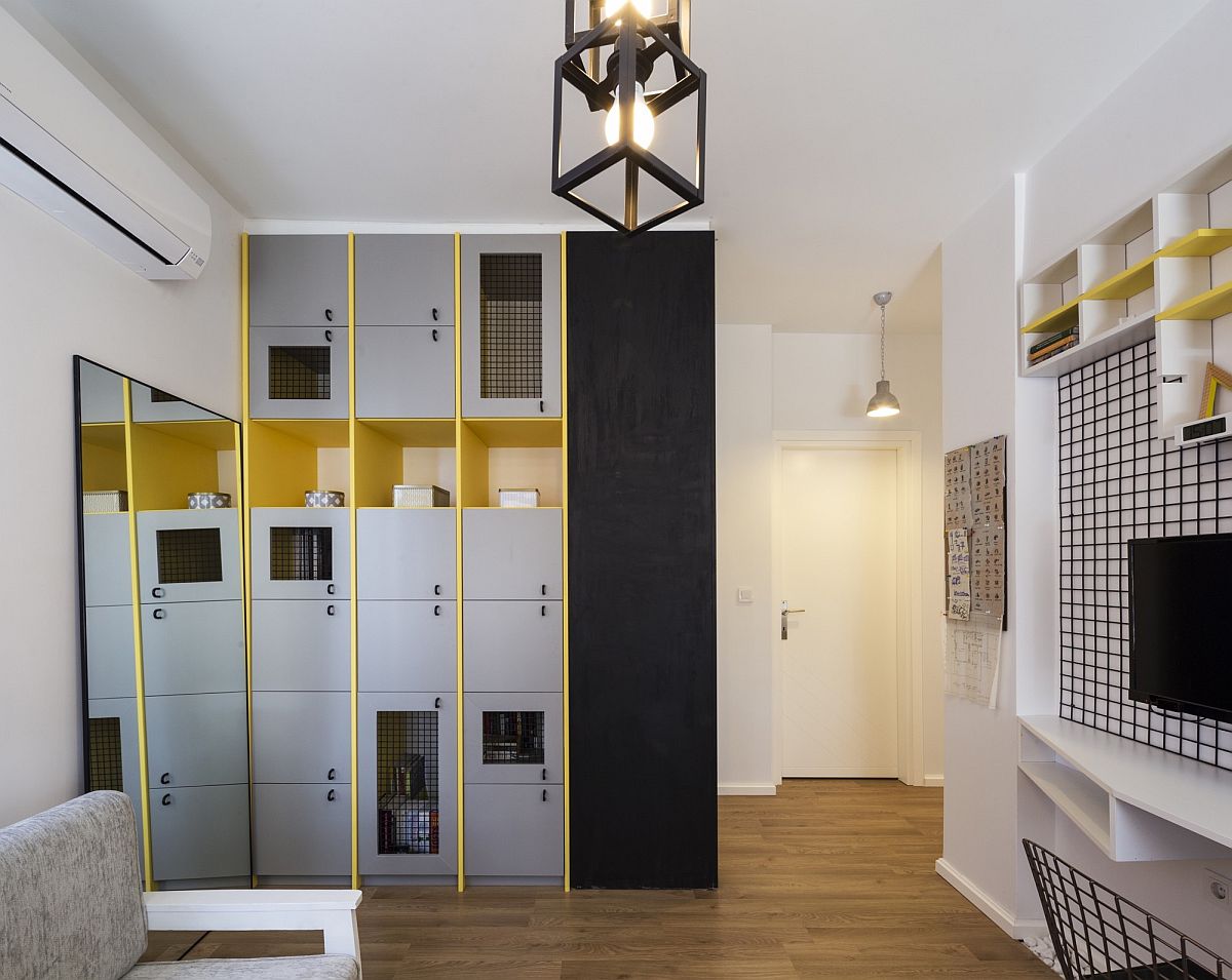
The new living area is far more open than the previous incarnation, and the dining room that sits behind it adds a touch of blue and whimsical charm to the place. The entire area seems inherently modern, breezy and inviting, with minimal décor and an unassuming color scheme that is anchored in white and blue. The kitchen that sits down the hallway is also clad in white, while the home office embraces a bolder look with gray, yellow and black as its primary colors. A dash of mint green brings refreshment to the bedrooms, while gorgeous pendant lighting and natural ventilation usher in a cheerful aura. [Photography: Alt Kat Photography]

We designed Levent apartment for a newly married couple. The most important issue for us, was to understand the design taste, need, lifestyle, timetable and activities of the couple together as well as by person. After we summarized the couple well, we gave importance to match this data with our interior design, products and materials…
