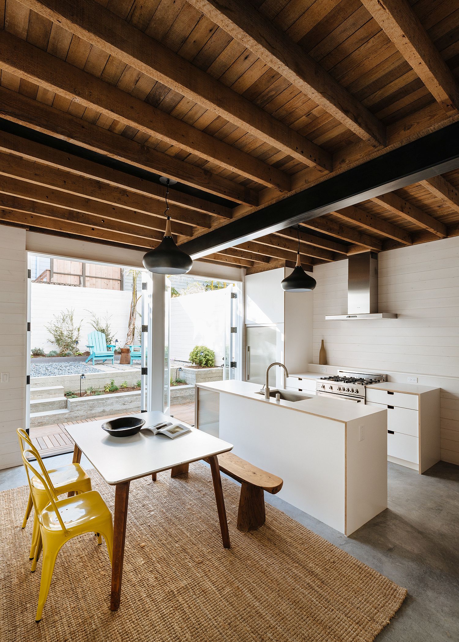
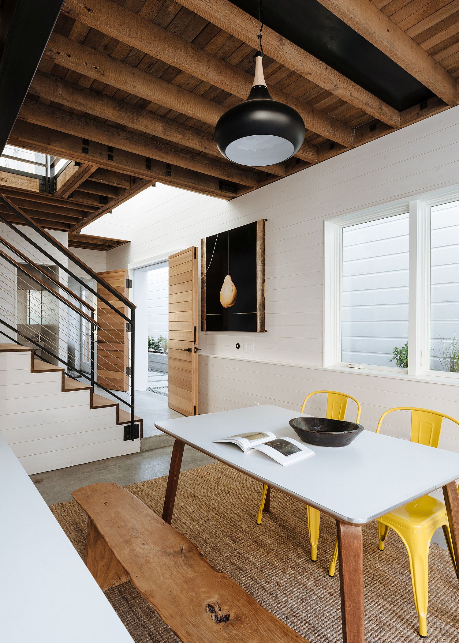
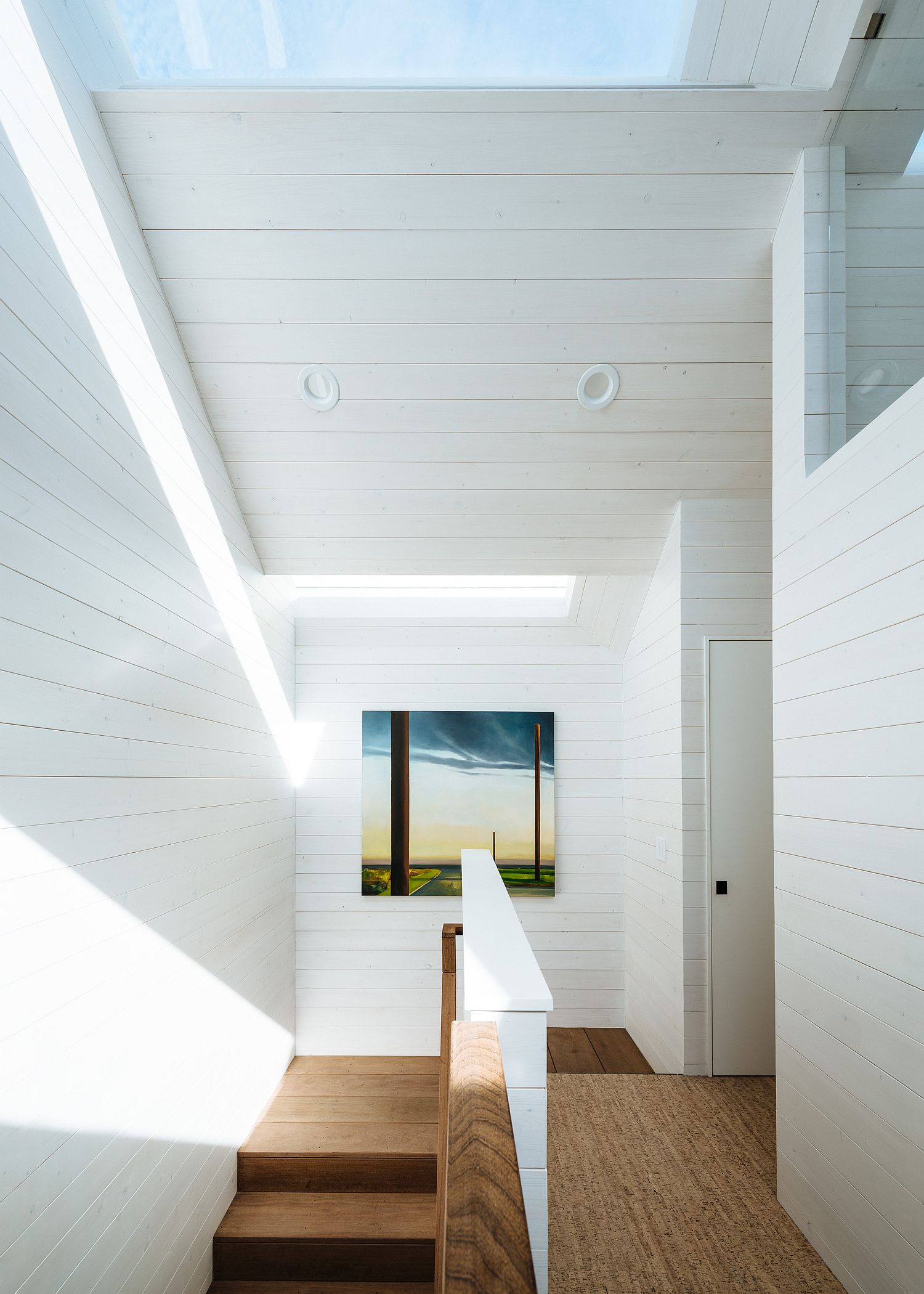
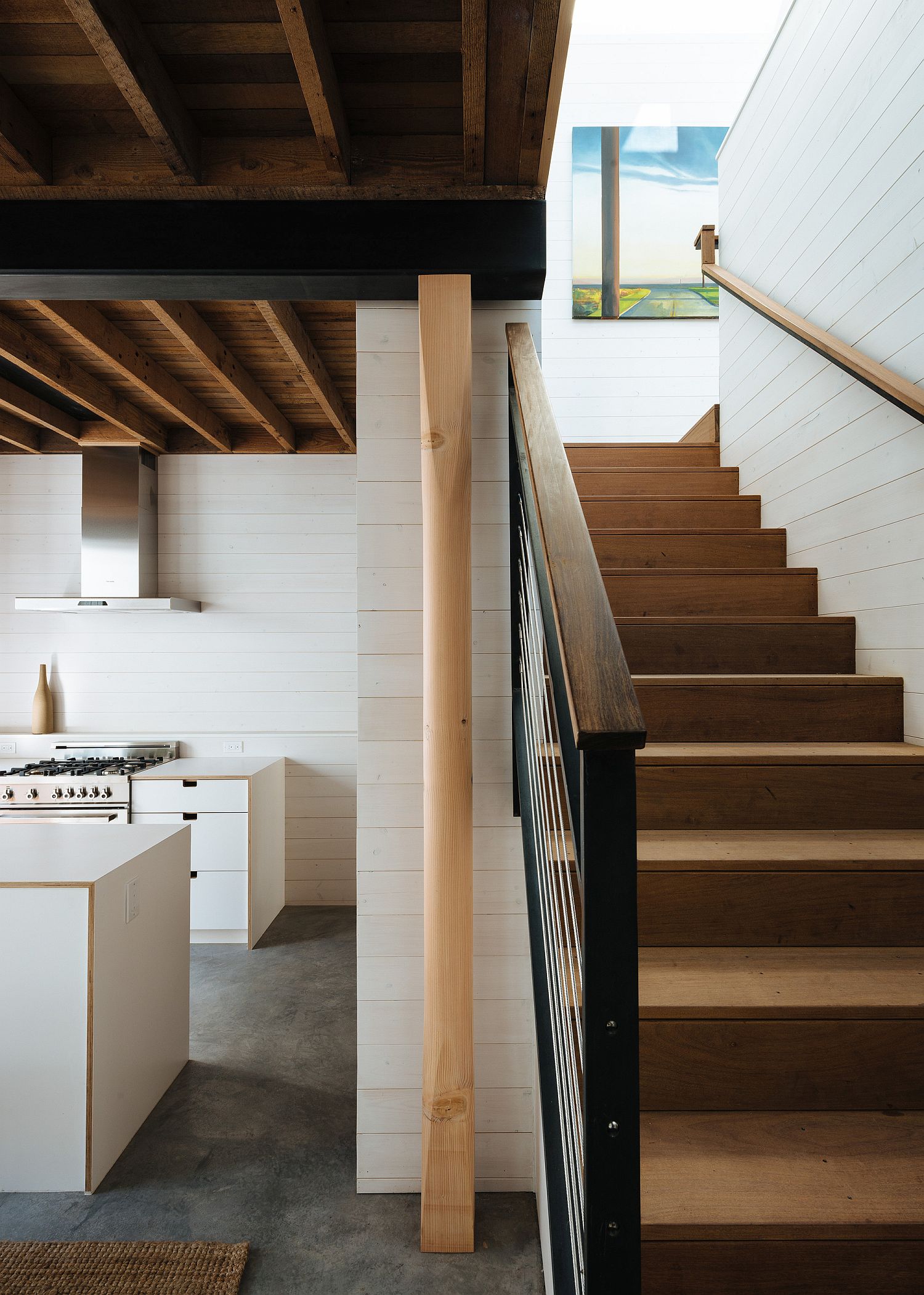
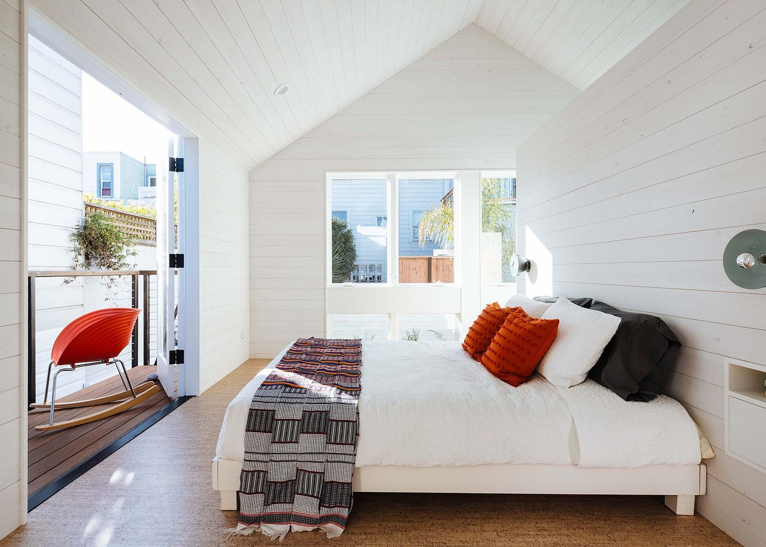
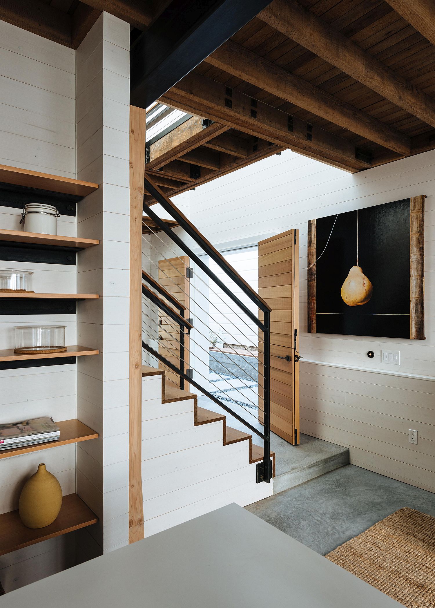
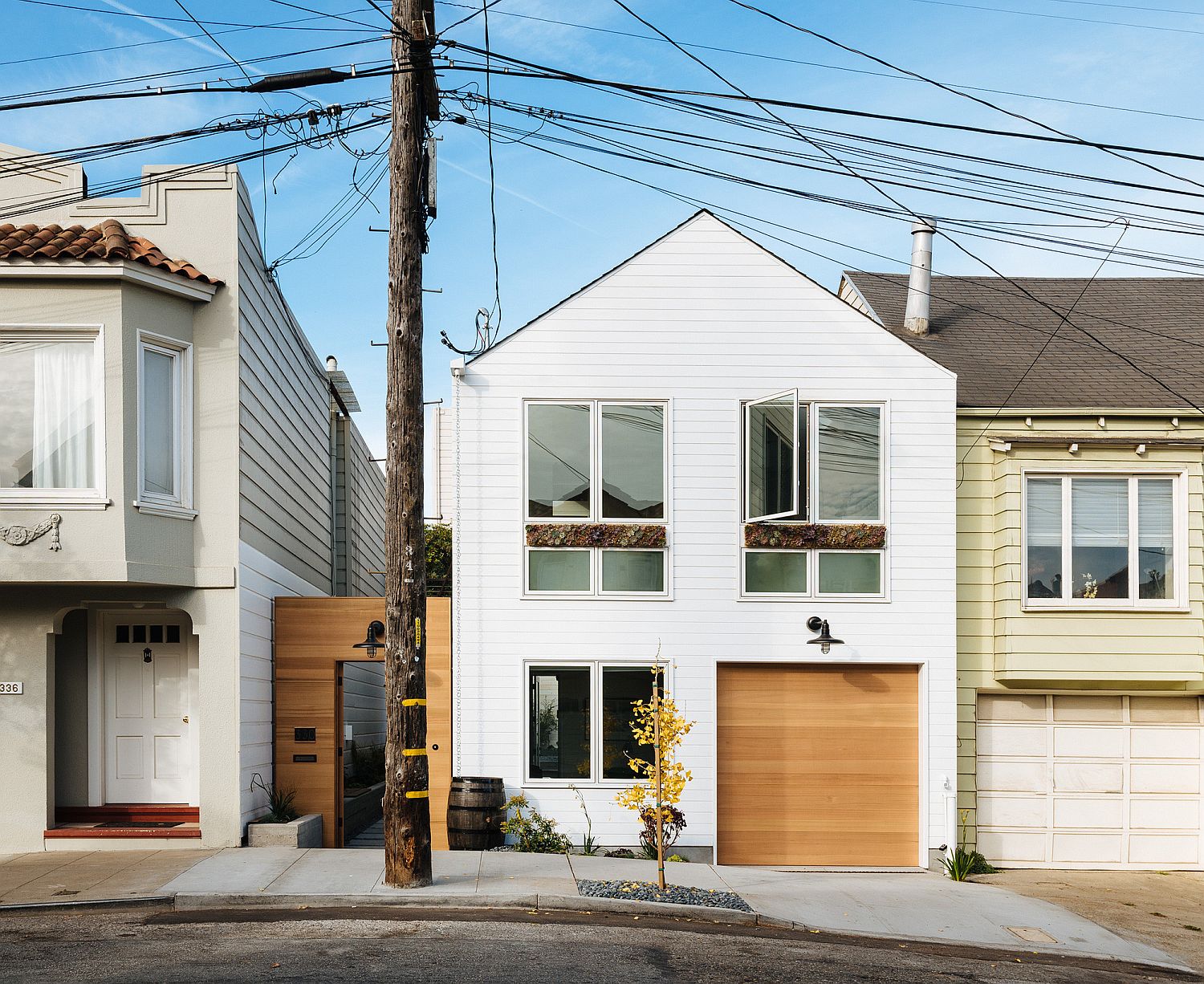
Giving an old home a brand new makeover is often an effort that involves both smart planning and the just the right space-savvy features. Nestled in a busy neighborhood of San Francisco, this family home was originally built in 1903 and has seen several smaller renovations alter it over the years. But its latest revamp is much more extensive with Red Dot Studio opening up the Bank Street House to usher in more natural light and create a modern ambiance. Wood and concrete create a gorgeous home where the exterior feels classic while the interior has a more contemporary appeal.
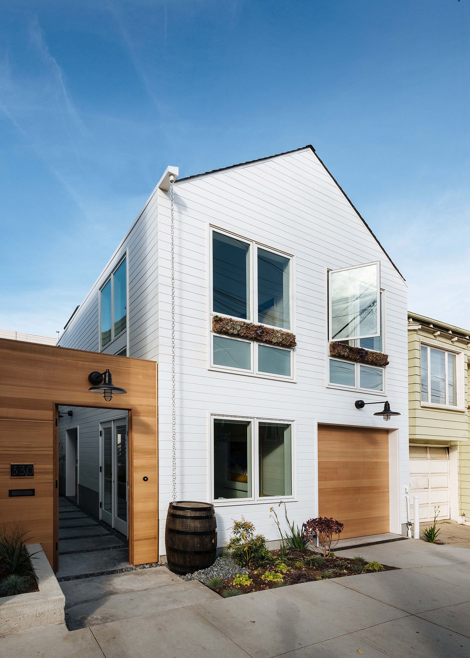
White is the color of choice in here with a neutral color scheme that utilizes wood and white in a nifty manner. Black has been sporadically in the living room and in the dining space with the accents anchoring the open plan area. One room flows into the next breezily and by removing internal partitions, light now flows easily illuminating every nook and corner. It is the upper level of the house that holds the three bedrooms along with other private spaces.
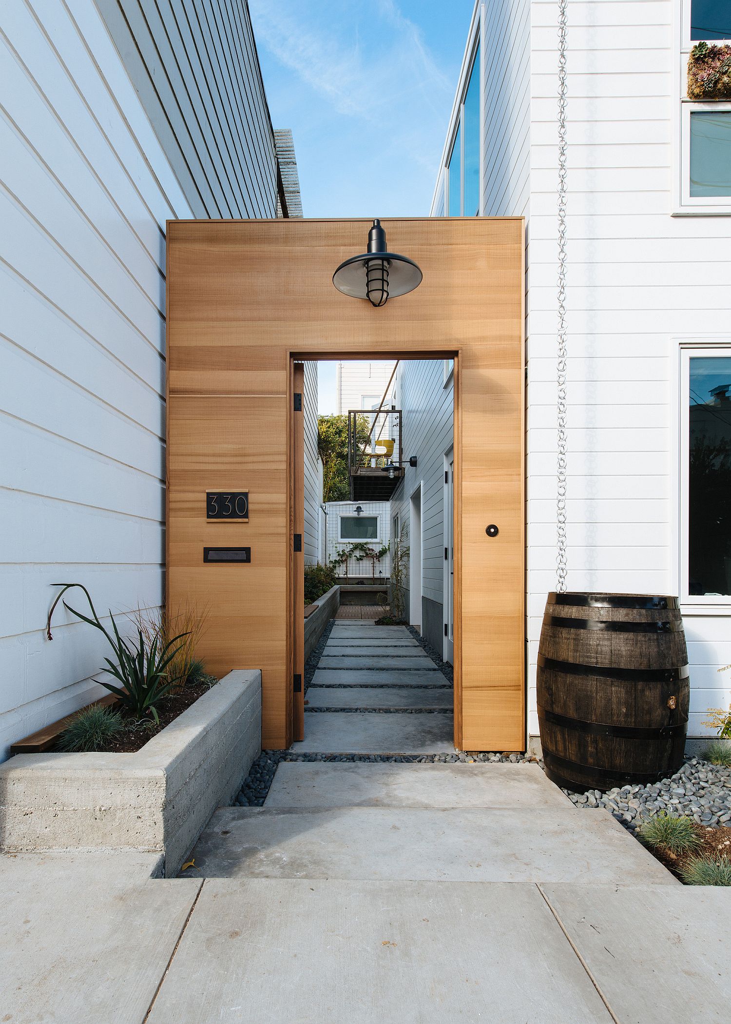
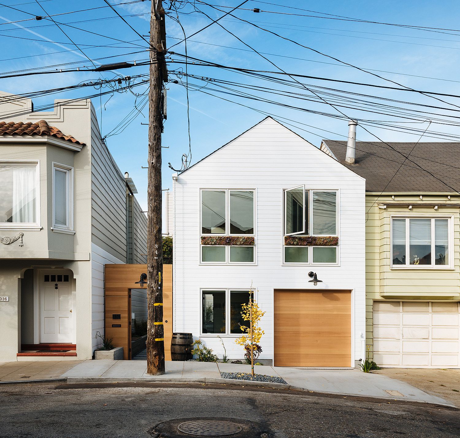
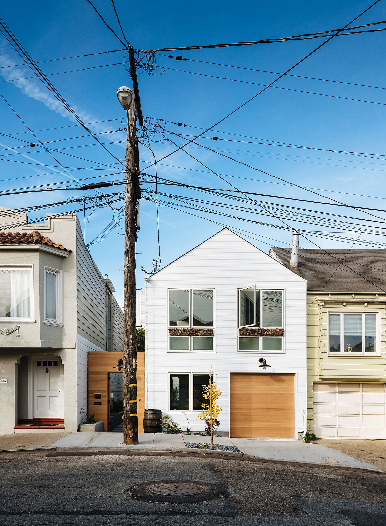
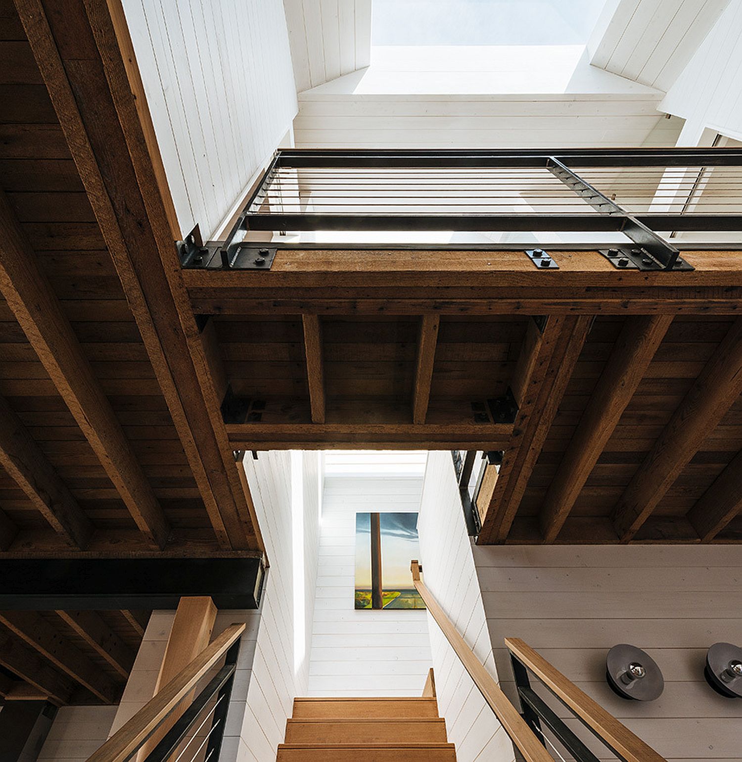
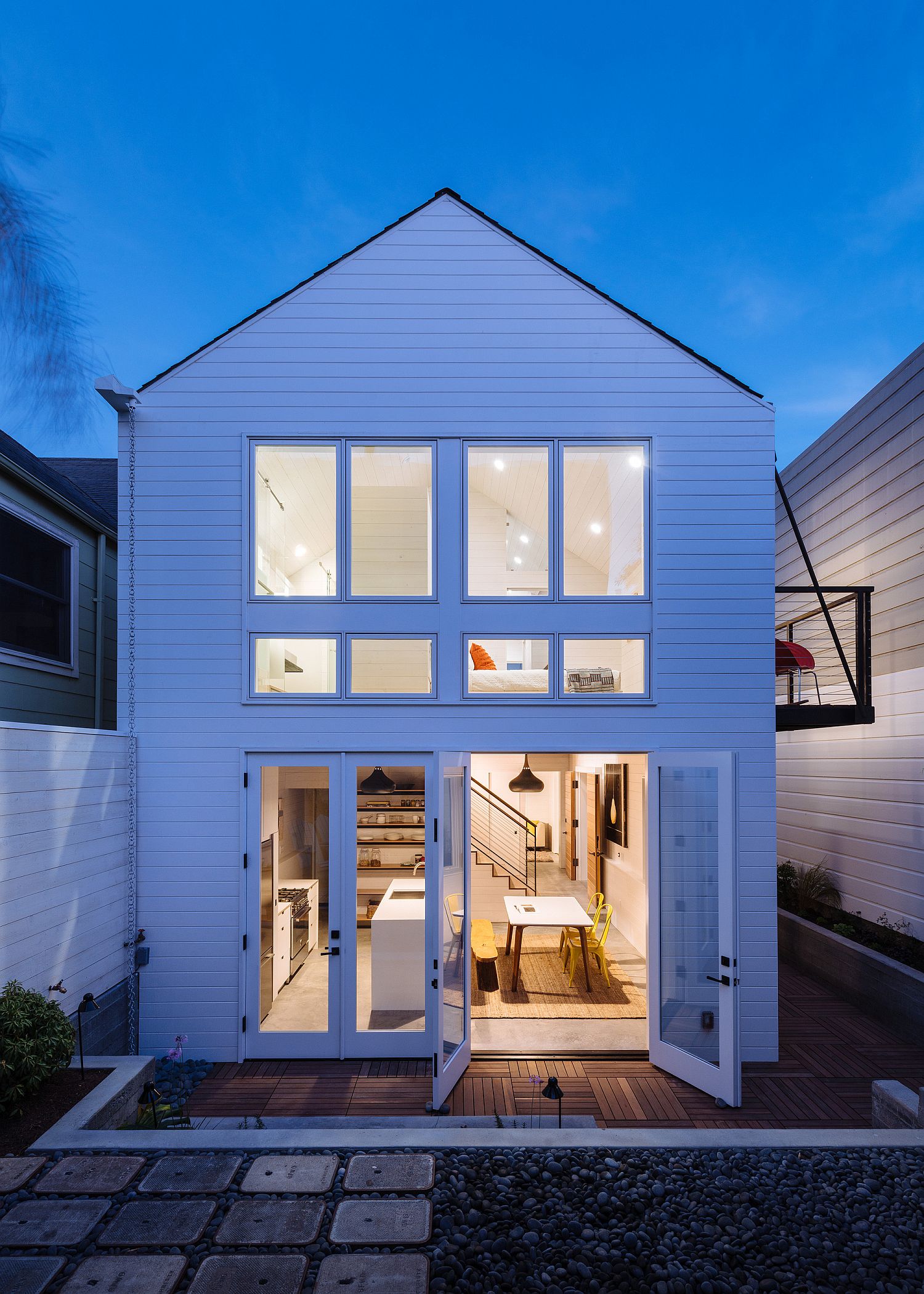
What was originally a one-bedroom cottage is now a three bedroom spacious residence that the entire family can enjoy. A private corridor leads to the living room and the corridor also offers a safe refuge that keeps away street noise and pollution. A perfect home makeover that blends style and space-saving design! [Photography: Joe Fletcher]
