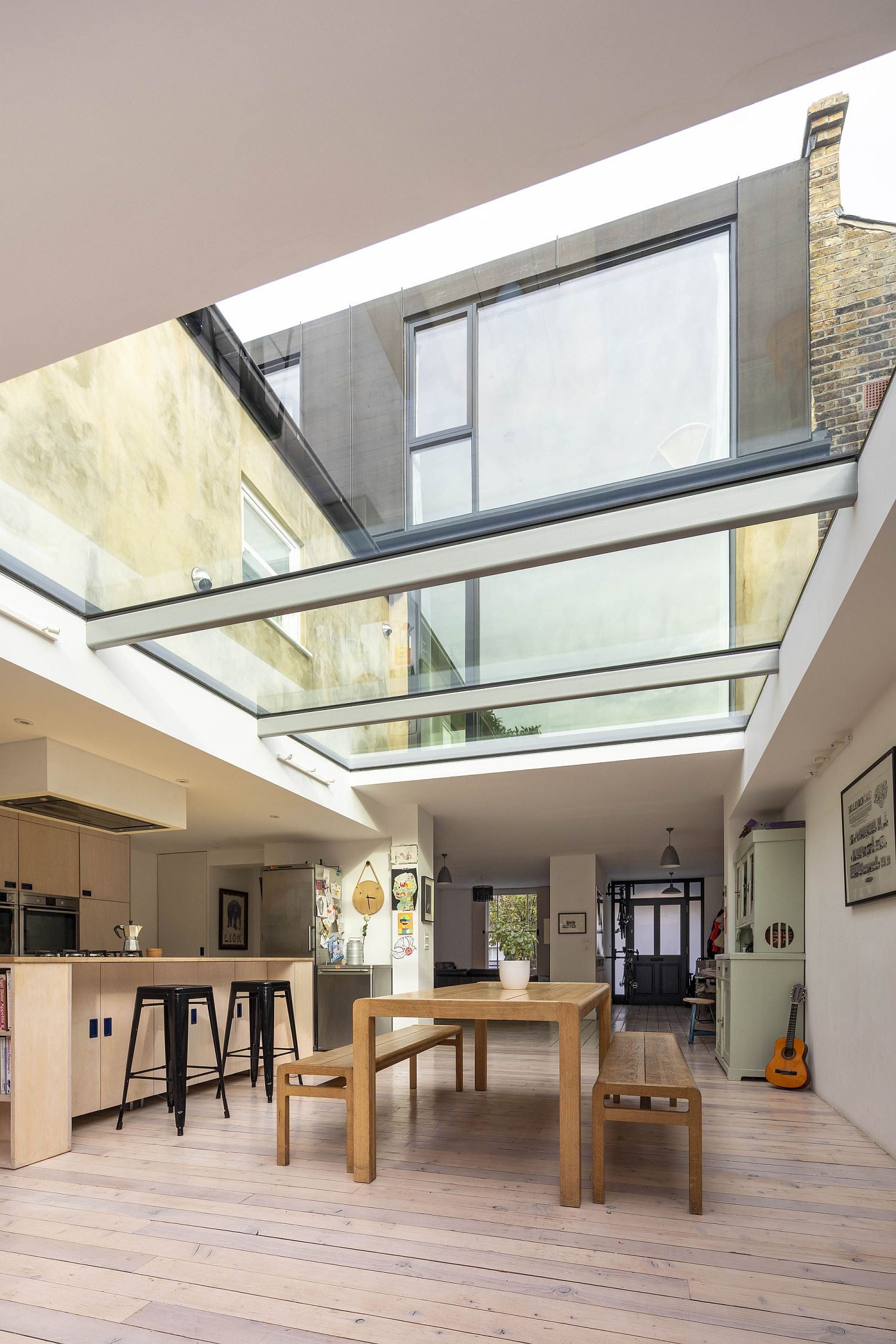
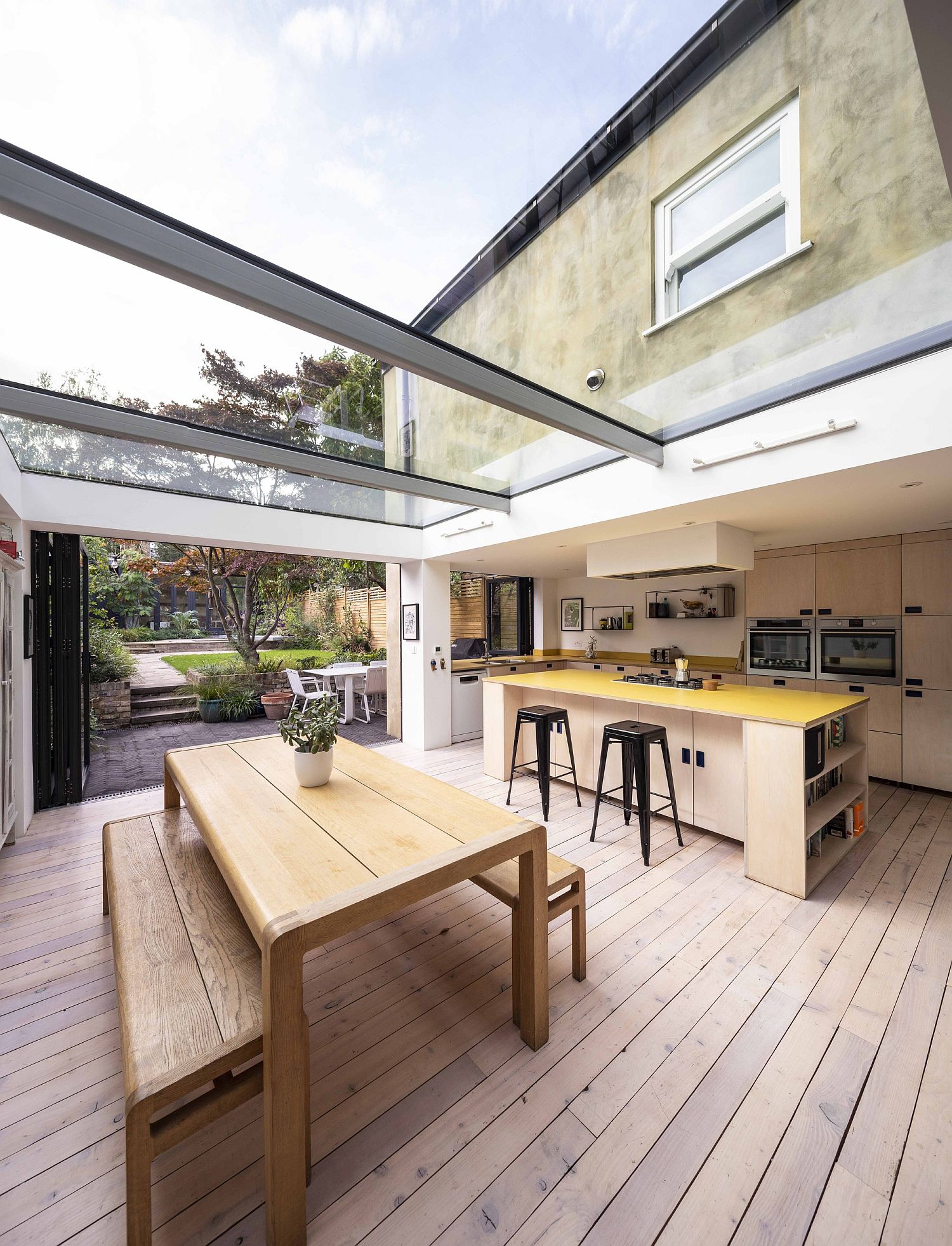
Revamping and giving an old home a new lease of life is something that saves both time and resources. It makes for a lot more practical choice to give the aging house a quick revamp and a smart extension instead of demolishing it completely and erecting a new residence. This is just what you get with The Coach House designed by Studio 30 Architects; a contemporary extension and makeover of a Victorian house that is anything but mundane. Since the homeowners wanted the transformation on a budget, smart spatial ideas and glass walls and ceilings were used to usher in natural light and alter the ambiance.
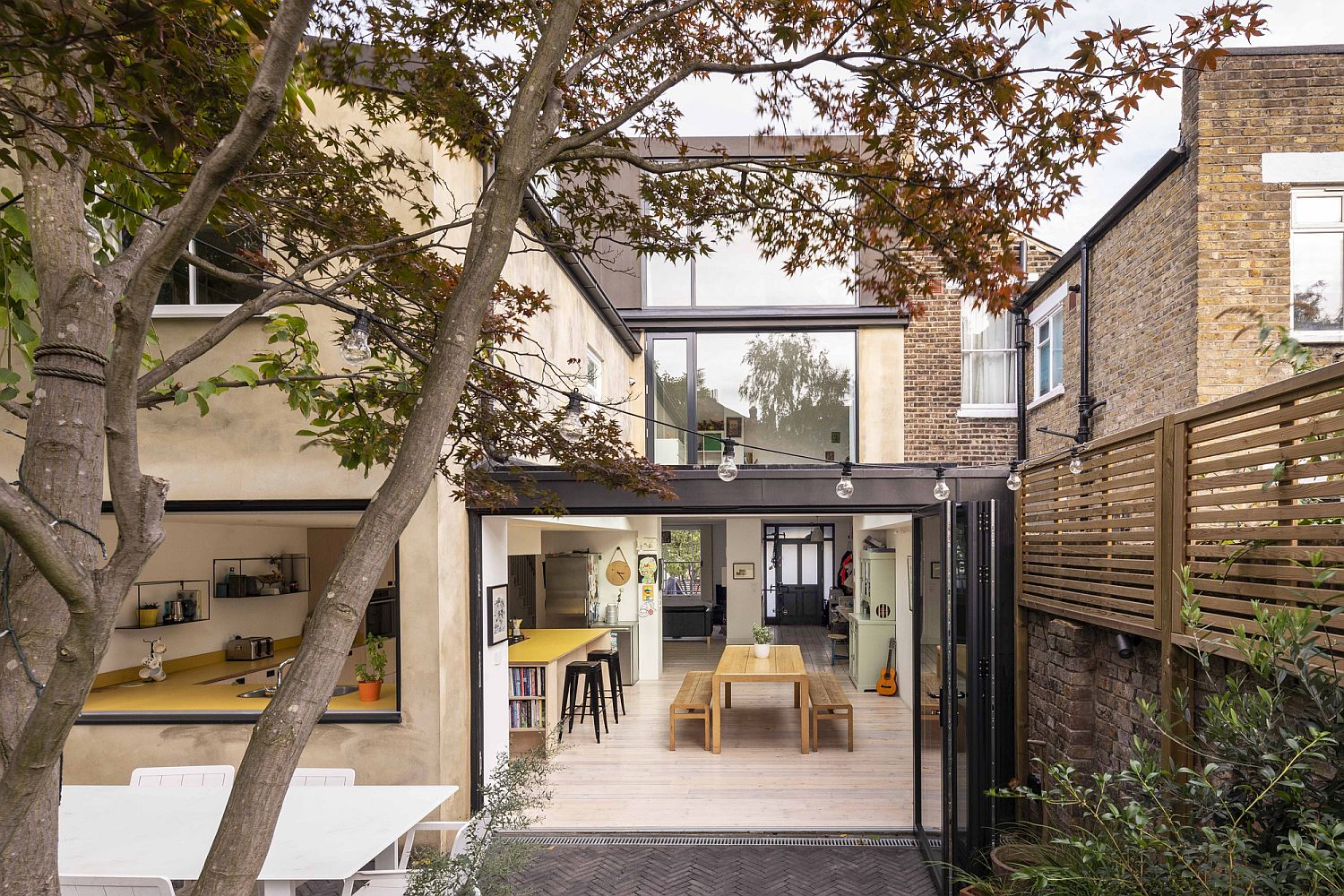
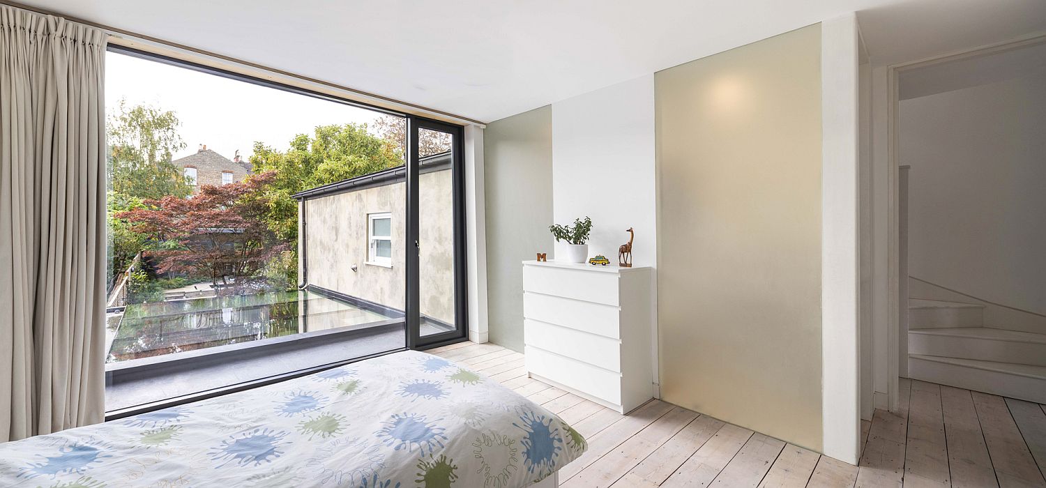
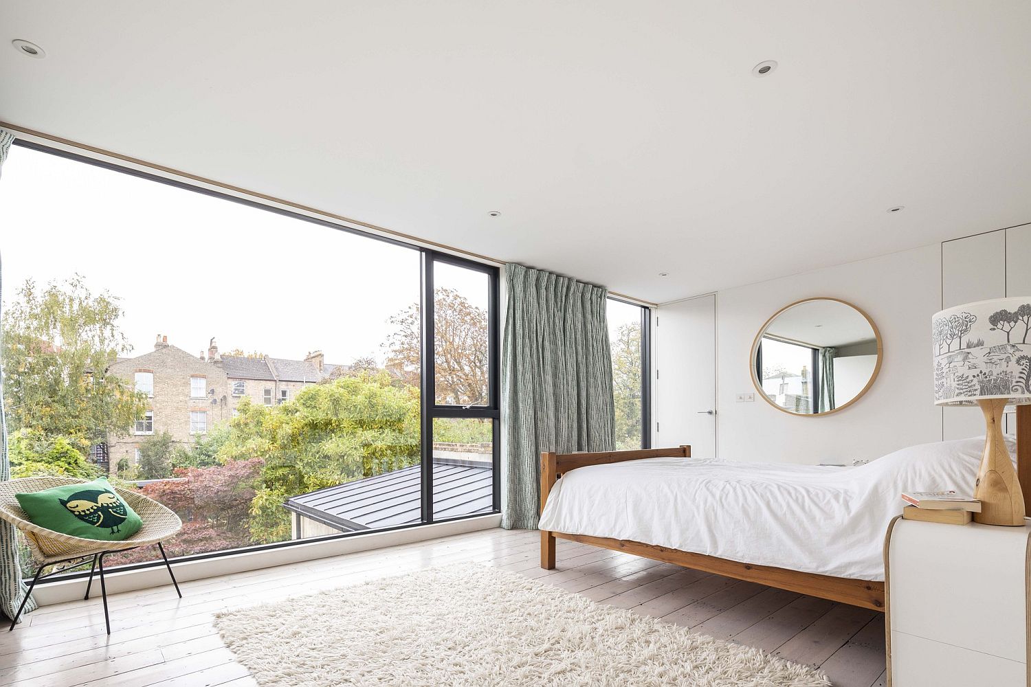
It is the kitchen and dining area in the rear that becomes the heart and soul of the new Coach House with even the front door getting a modern makeover. The lower level now feels fresh and beautiful with light flowing into even the deepest parts of the house. A glass ceiling has been used for the extension along with glass walls and sliding doors to ensure that the interior is always connected with the outdoors visually. Reconfigured outdoor areas also add to sense of spaciousness while the upper levels hold modern bedrooms and bathrooms in white.
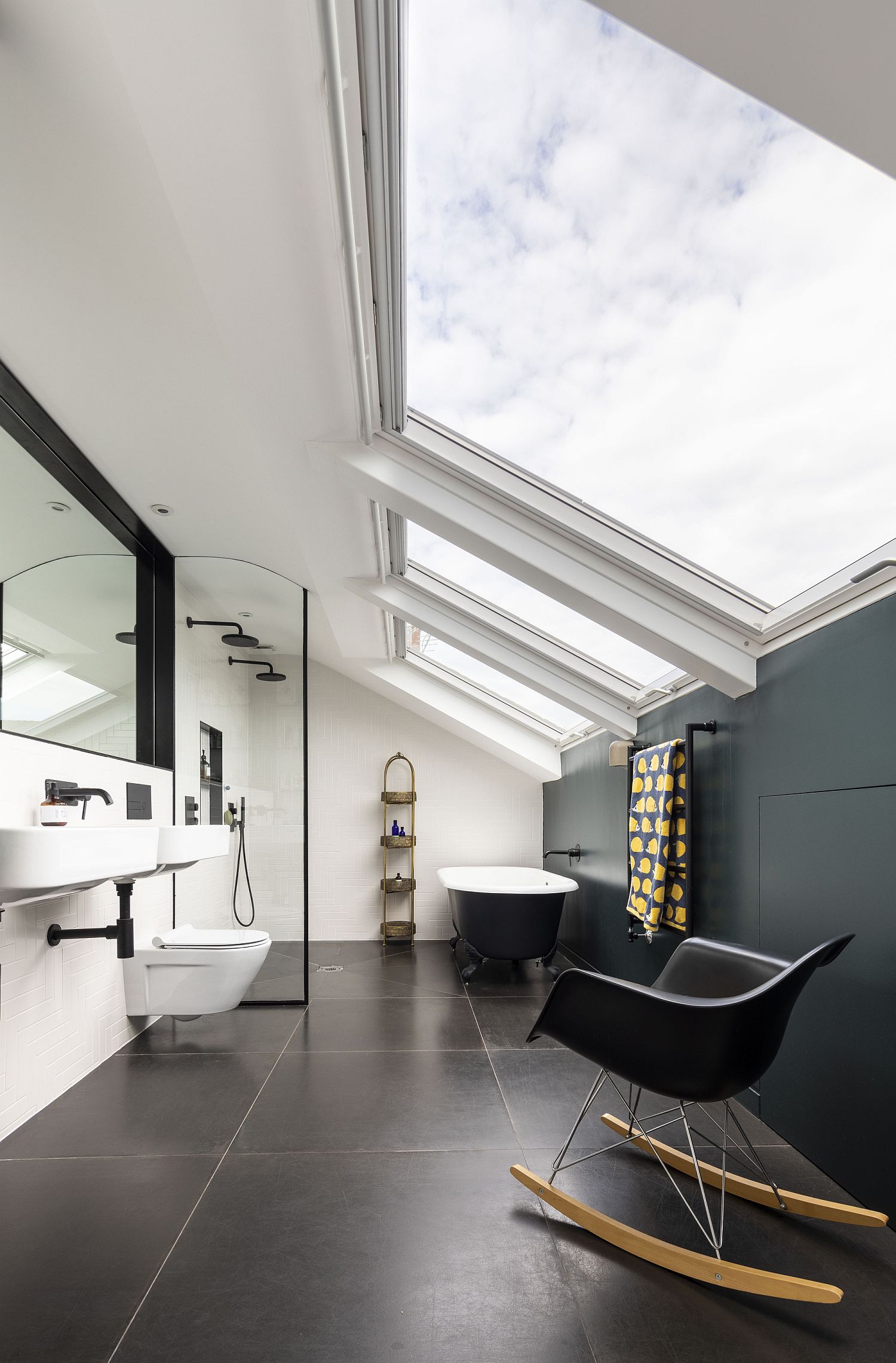
White is indeed the color of choice inside the house as well with the living room and the personal spaces also being clad almost entirely in white. Skylights in the bathroom and modern-classic décor choices complete the awesome transformation. [Photography: Salt productions]
RELATED: Big Little House: Classic and Contemporary Entwined with Light-Filled Functionality
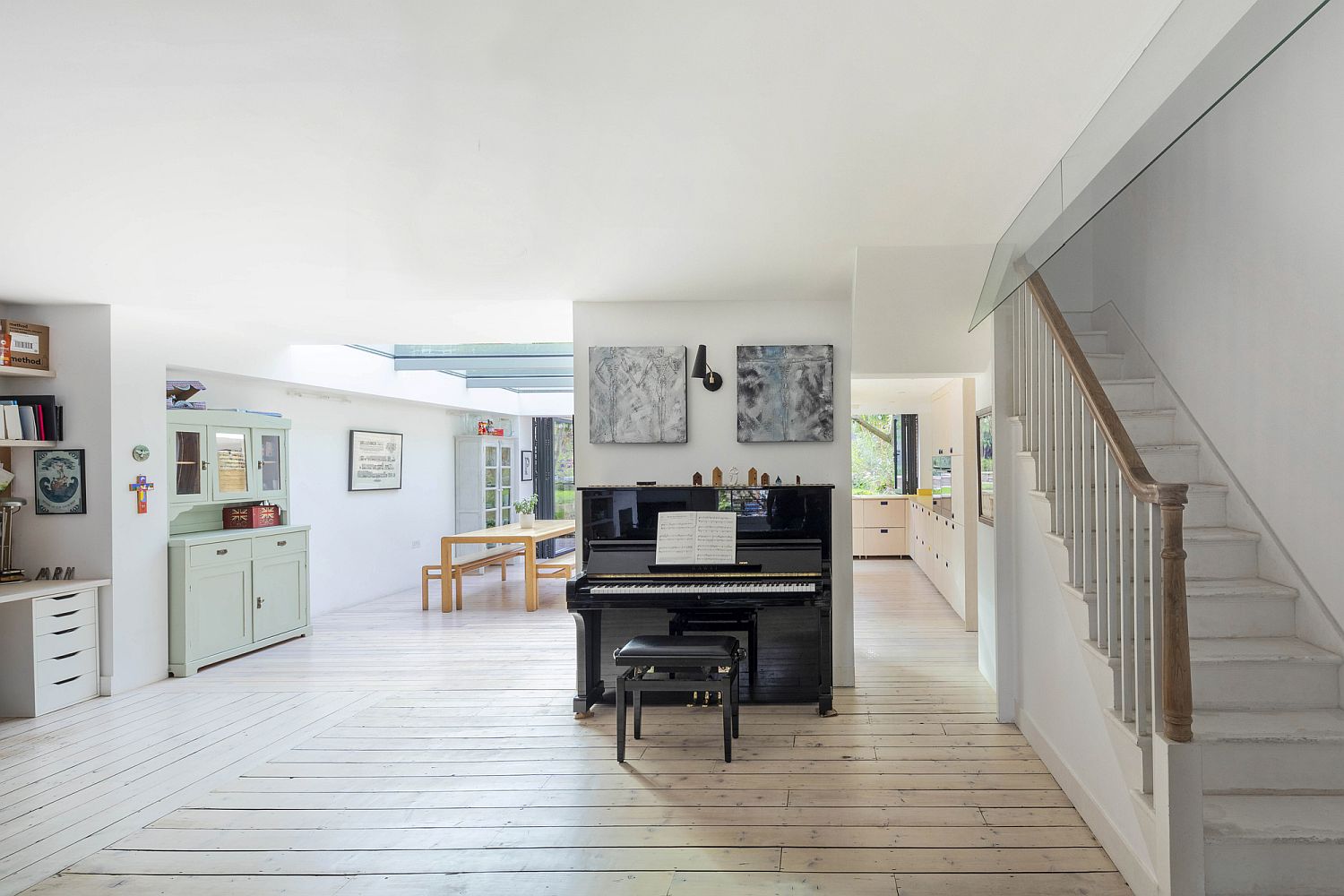
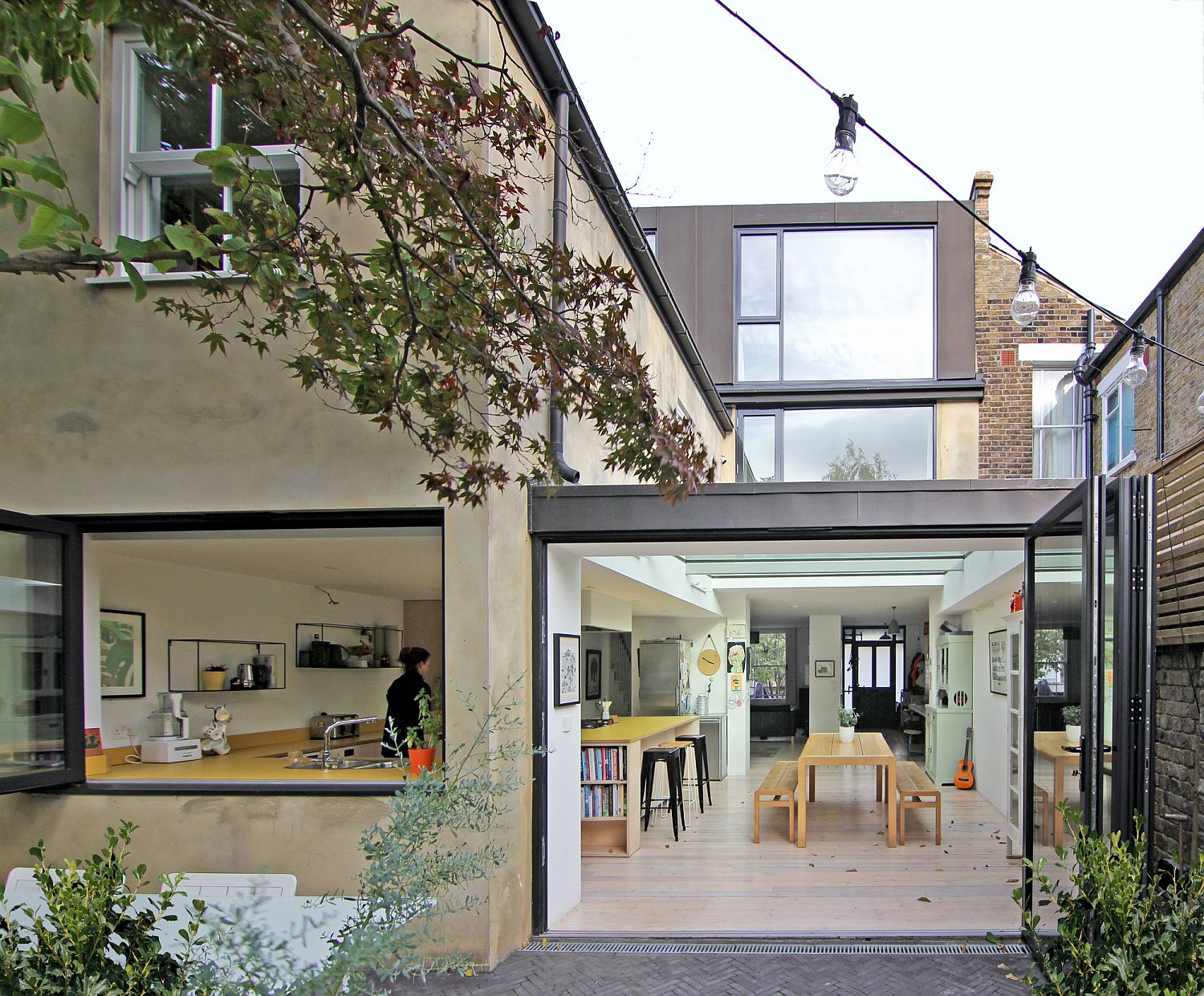
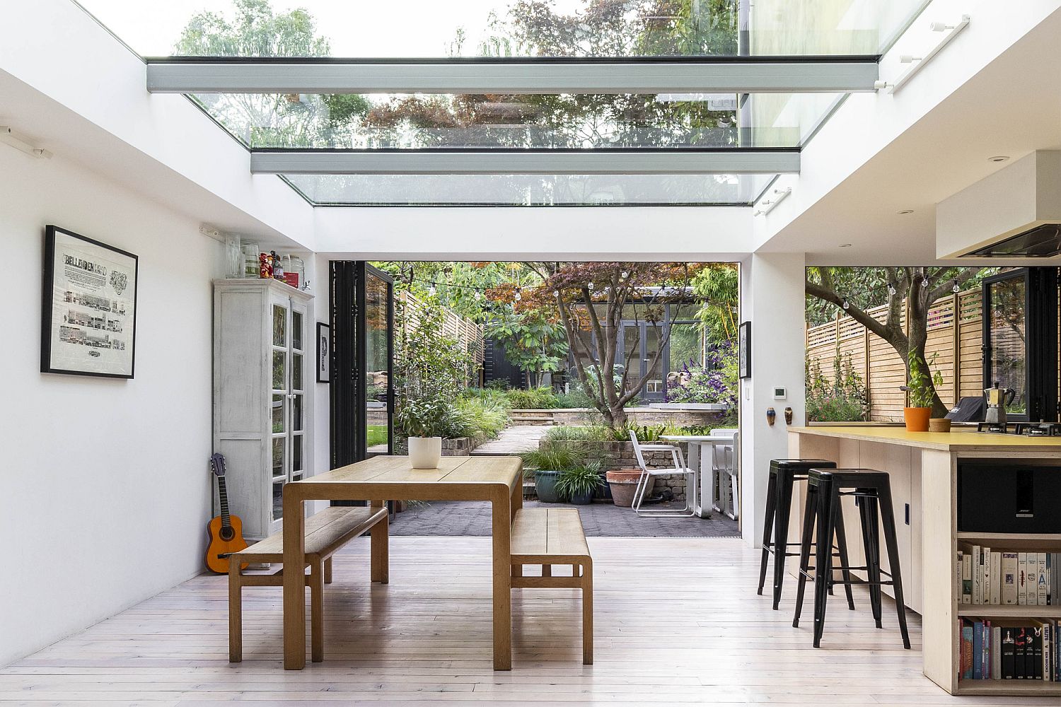
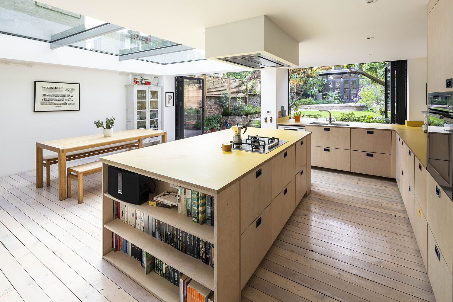
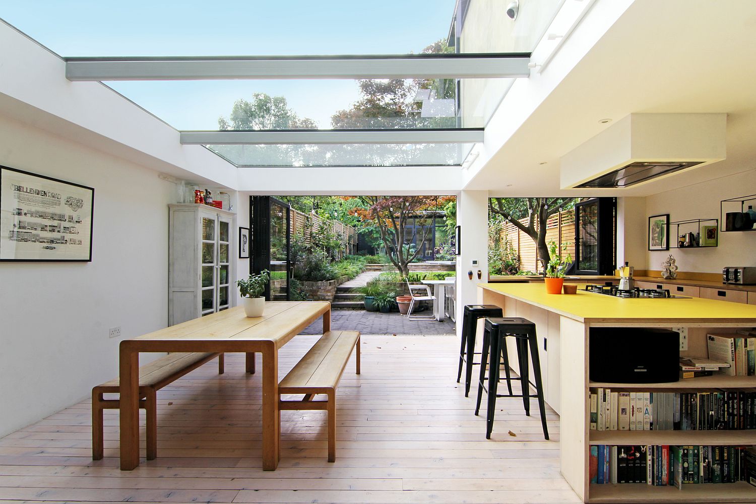
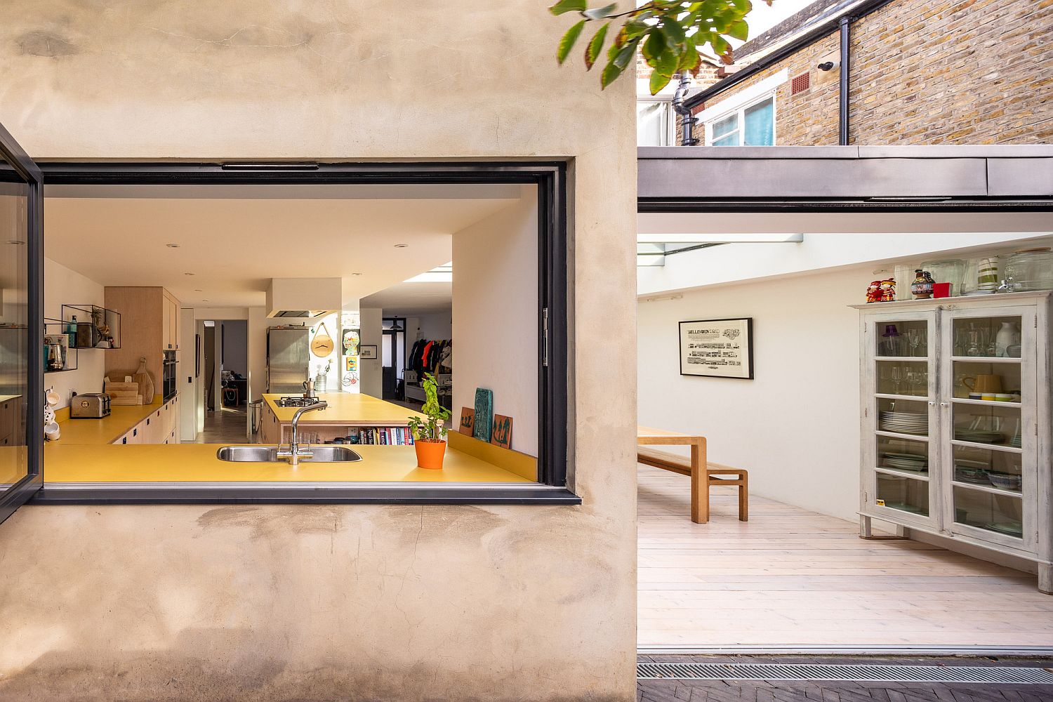
Perhaps the most remarkable aspect of this project was to create such attractive, generous, and light-filled spaces within a restricted budget. This was achievable thanks to a strong working relationship between the client and the design team; all working together to develop simple and elegant responses to a clear brief…
RELATED: Block House: Old Victorian Terrace House with a Colorful and Light-Filled Makeover
