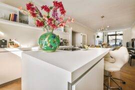
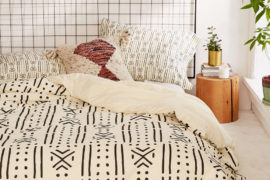
Red is a physical and quite visceral colour whose properties include strength and stimulation, fire and passion, energy and warmth. Too much red within an interior space can appear bold, even overbearing, stimulating the senses in a manner that is mentally demanding. Red is an attention-grabber and the colour we tend to see first. For this reason, its use is predominant in conveying caution and danger the world over: a red traffic light, a red ‘don’t walk’ symbol and a plethora of red warning signs are just a few examples.
Nevertheless, red is a colour that strengthens confidence and enthusiasm; an energising and emotional colour, red adds an element of vigour and fervour to our surroundings.
Accents
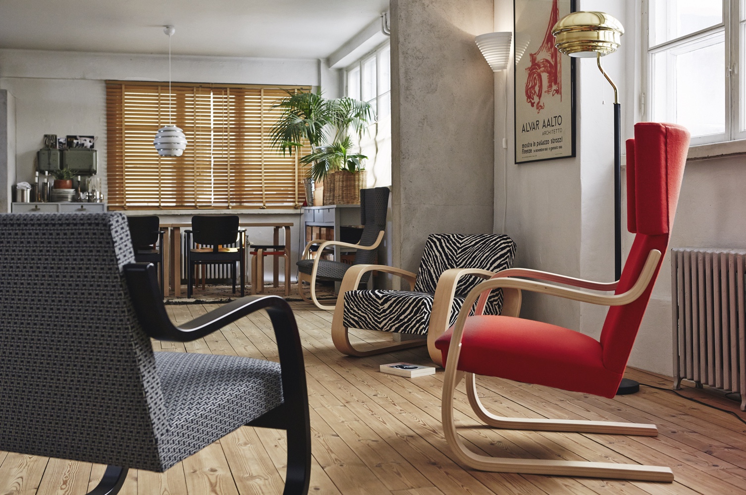
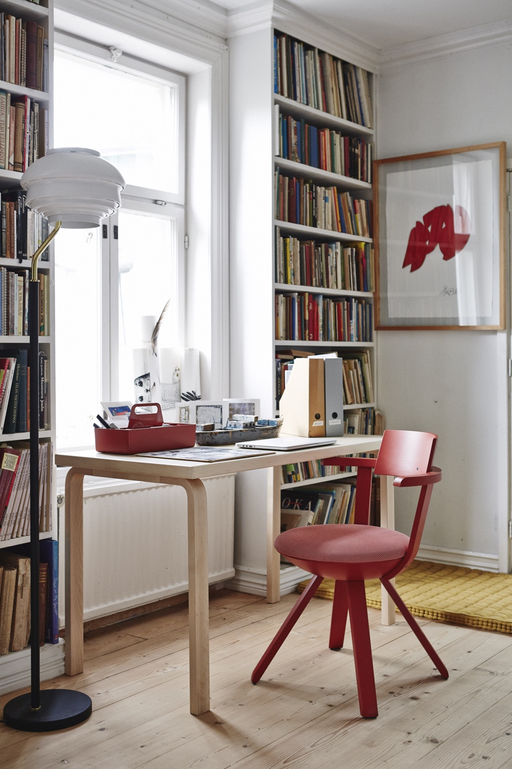
With thoughtful application, red is the perfect accent colour owing to its ability to focus our attention.
RELATED: Color Therapy: Go Green
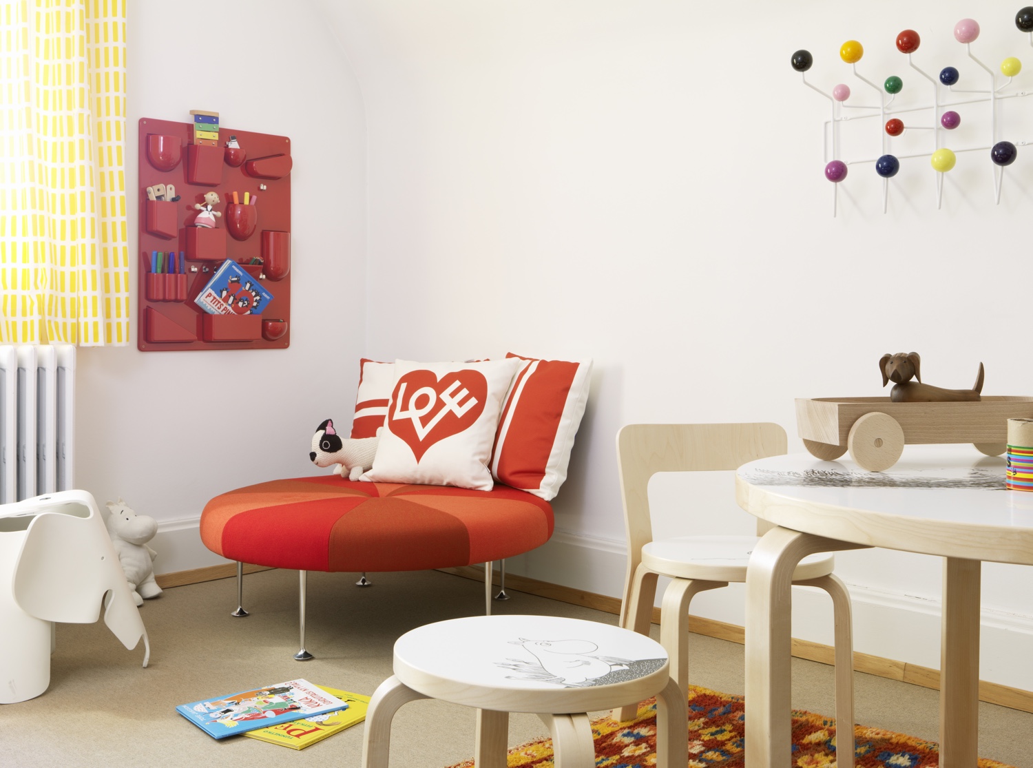
Images via Artek.
Strike a balance
In this Manhattan office design by Clive Wilkinson Architects, the main aim of the project was to “encourage movement [and] eliminate silos.” Accordingly, red—the dominant colour throughout—certainly excites the eye, but its application is excessively heavy-handed in this writer’s opinion. One needs to strike a balance when using red.
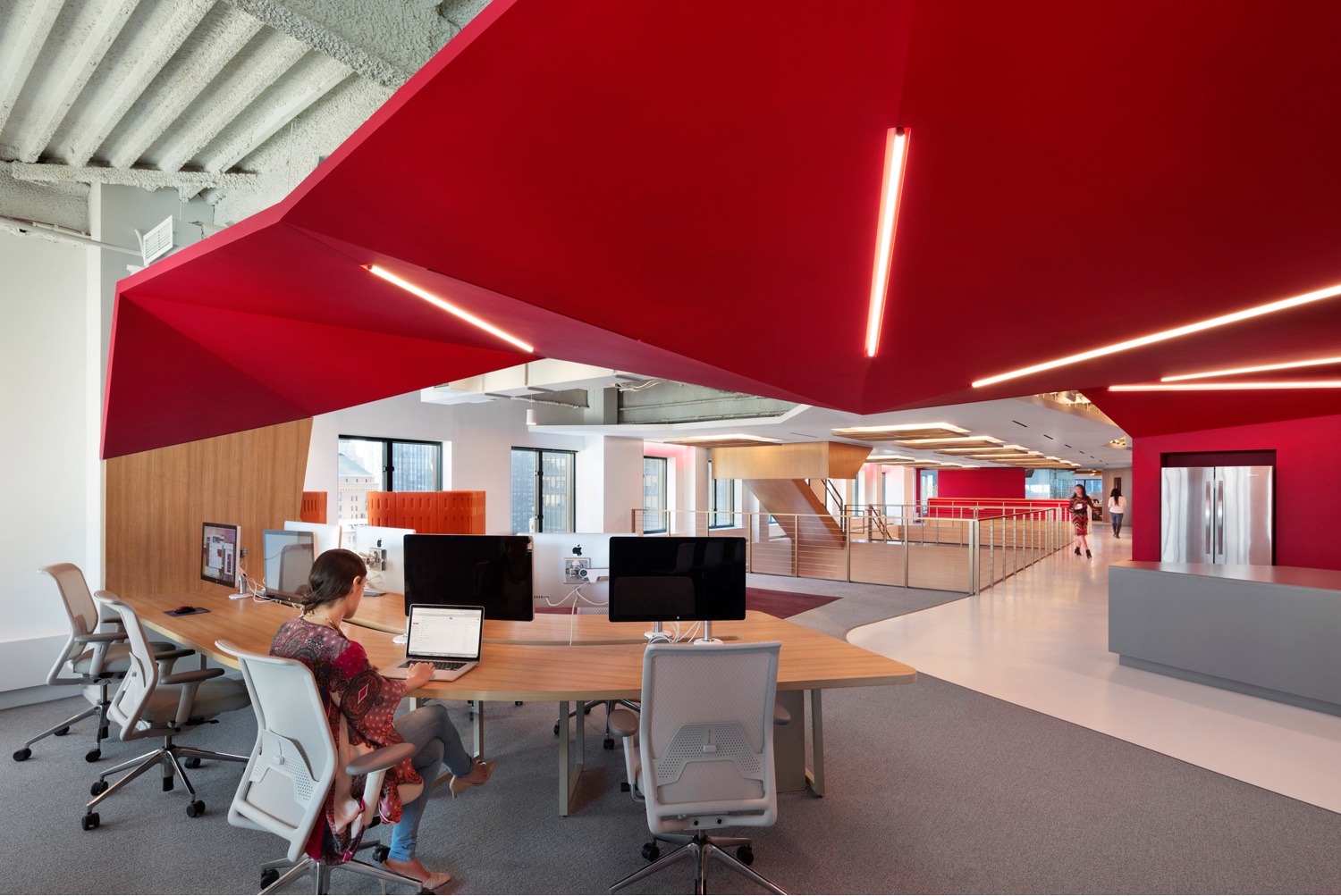
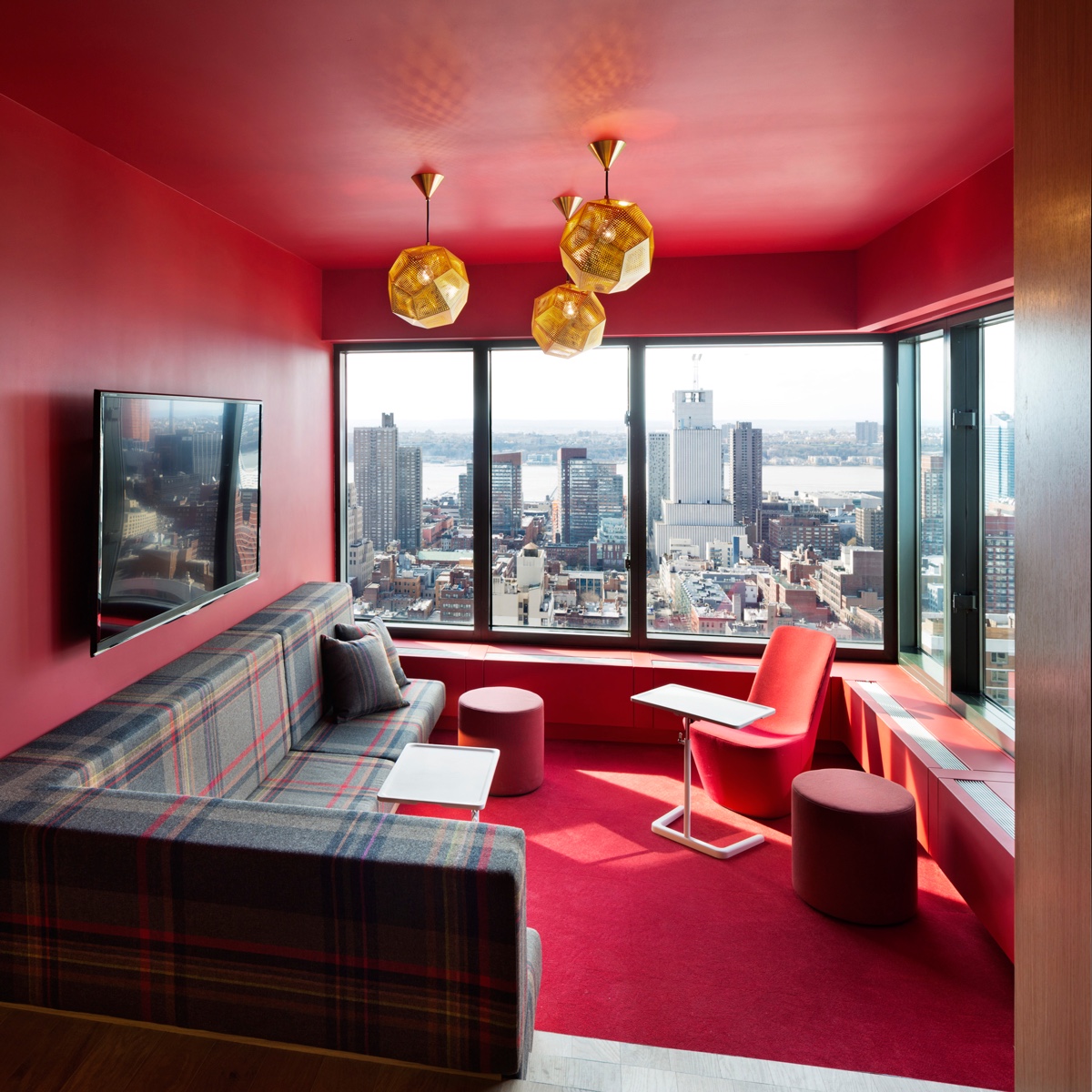
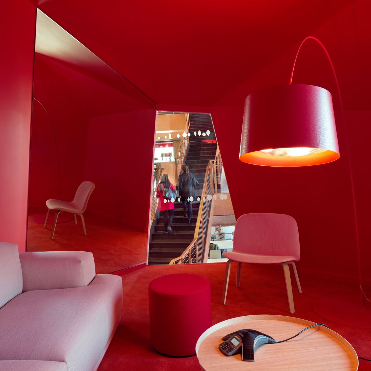
Photography by Michael Moran via Dezeen.
Standing out a mile
Often, red is a conspicuous colour, easily seen and obvious.
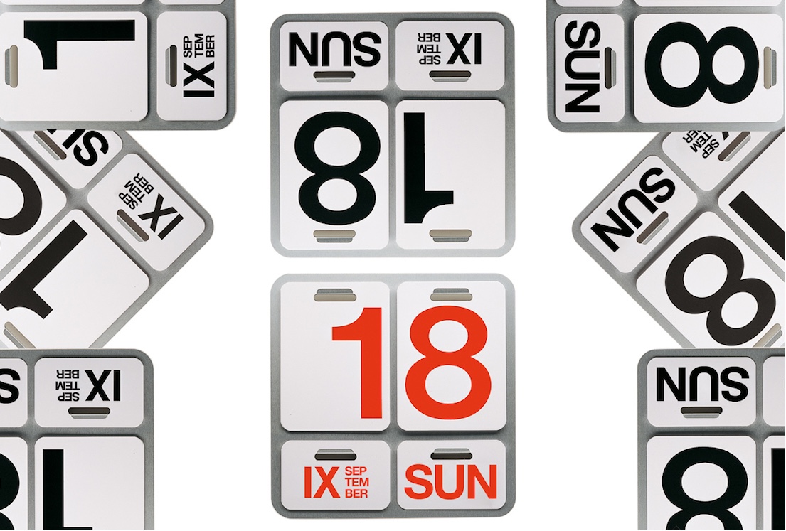
The Formosa Wall Calendar, designed by Enzo Mari in 1963 for Danese Milano, is a perpetual design classic. The red version is highly conspicuous in this image.
RELATED: Color Therapy: Quell Those End-of-Summer Blues!
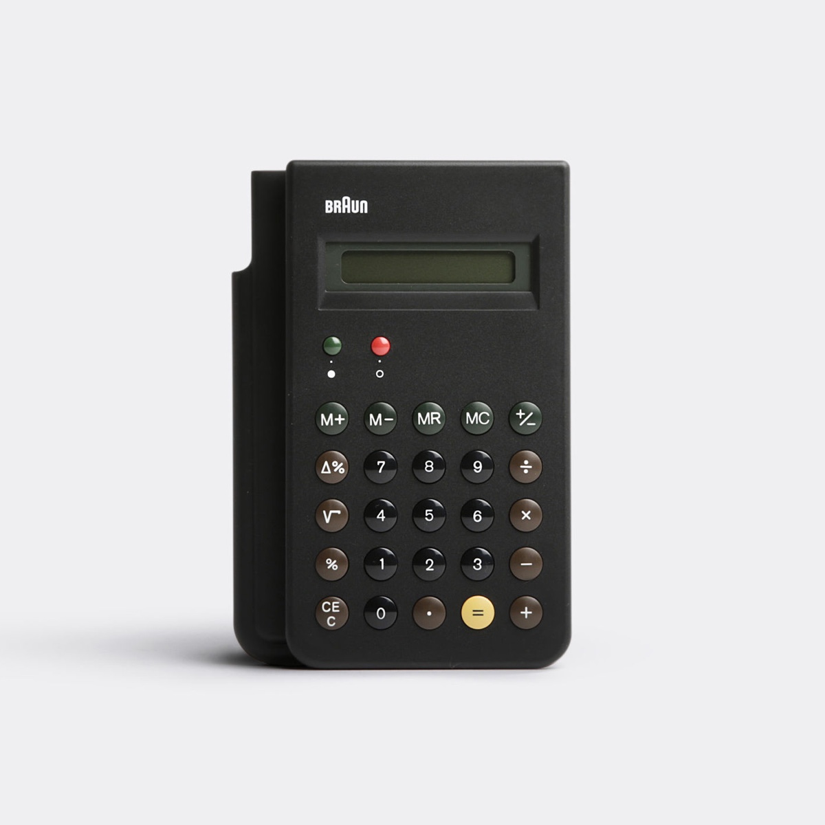
In this reissue of the Braun ET66 calculator, the red ‘off’ button is plainly visible and its function is crystal clear. Originally designed by Dieter Rams and Dietrich Lubs in 1987, the calculator is the quintessence of the ‘less but better’ philosophy.
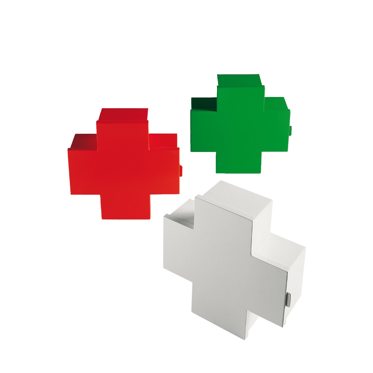
The Cross medicine cupboard was designed by Thomas Eriksson in 1992 for Cappellini. Lacquered in red, green and white, it is the red version that immediately stands out.
A red sky at night

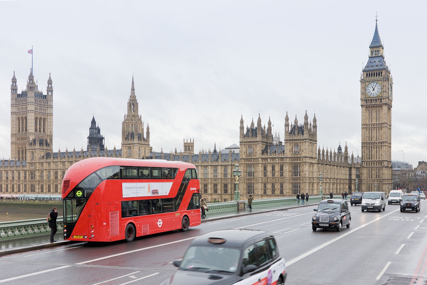
London’s Bus
In 2010, Heatherwick Studio revamped London’s famous Routemaster bus. A controversial commission (particularly for fans of the original and iconic 1950’s Routemaster), the new London bus design was sleek and well-groomed. Today, the bright red Routemaster traverses the city’s streets with style and aplomb (although the joy of jumping on and off at will has been removed, due to the predominance of health and safety killjoys).
Festive
Red is the colour most associated with Christmas and the festive season. It is also the uniform colour of choice for a certain Santa Claus.
RELATED: Color Therapy: Grey In Every Way

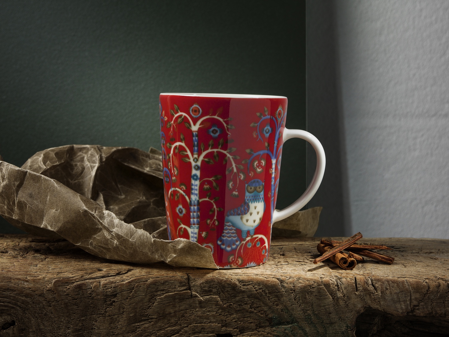
Designer Klaus Haapaniemi created Taika for celebrated Finnish brand Iittala. Taika (meaning ‘magic’) is depicted here on an Aika series mug, designed by Heikki Orvola for Iittala. Haapaniemi’s work embraces elements of fantasy, wonder and traditional crafts, with references to Finnish folklore and an artful contemporary edge.
Kay Bojesen designed this original wooden Santa, with his sack and walking stick, in the 1940s. A Christmas object to cherish and rediscover year after year, Bojesen’s festive toy will bring much merriment to kids young and old.
