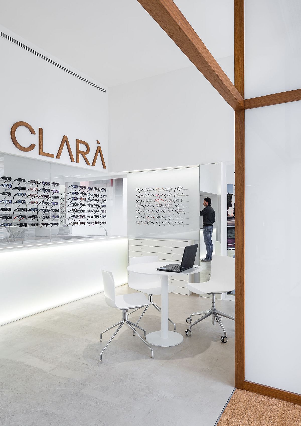
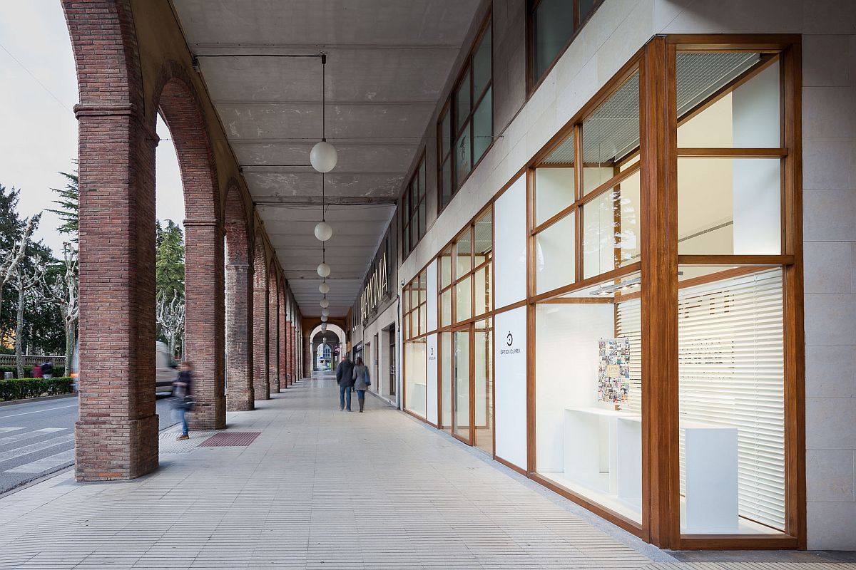
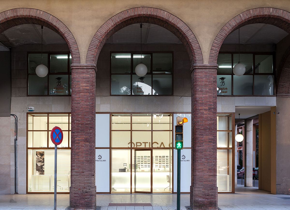
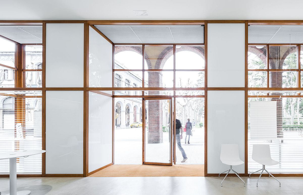
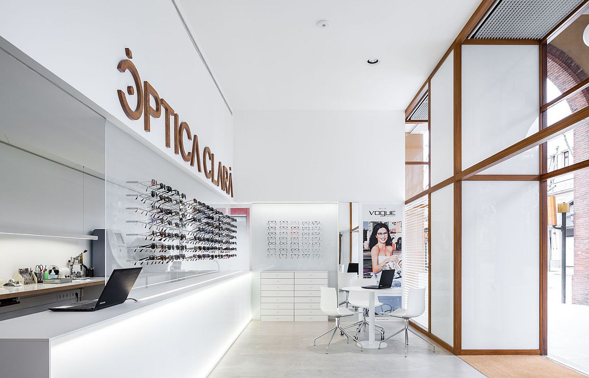
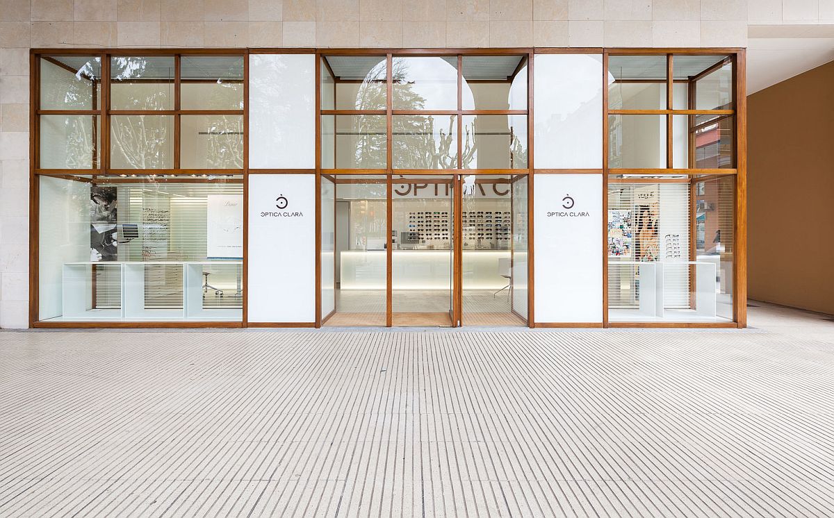
A trip to the optic shop might not come with great deal in terms of design expectations, but when you want your business to shine though and have an identity of its own, then it pays to be different! Set within the confines a lovely, classic building in Girona, Spain the Optic Shop Renovation is a project completed by Arnau Vergés Tejero and it delicately and diligently combines old world ham with modern sophistication and new-age minimalism. Apart from the gorgeous arches just outside the atrium, the shop also utilized that already-present wooden window frames, to give the all-white interior a warmer ambiance.
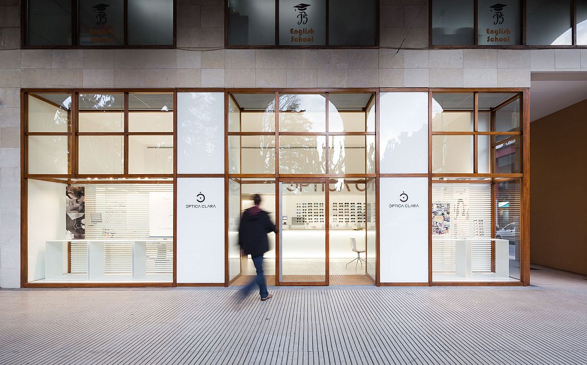
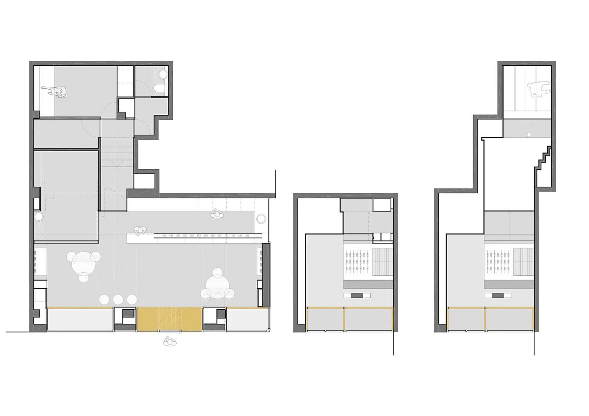
Step beyond the lovely exterior and one finds a beautiful, curated and polished interior where the focus firmly remains on your optic needs. Instead of tucking away the workshop in the back, as is often the norm, it is placed front and center and in view of the clients. It is the optician’s consulting room, the office, the storage and the service rooms that sit in the back while cool lighting and walls in white shape the backdrop for the display wall. It feels like stepping into an optic shop unlike any other where clarity in terms of both design and execution hold sway.
RELATED: Modern Renovation Of A Historic Apartment Brings Home Sweeping Sea Views
RELATED: Bullit Cyclery: Dark Bike Shop in Valencia Gets a Breezy, Cozy Revamp
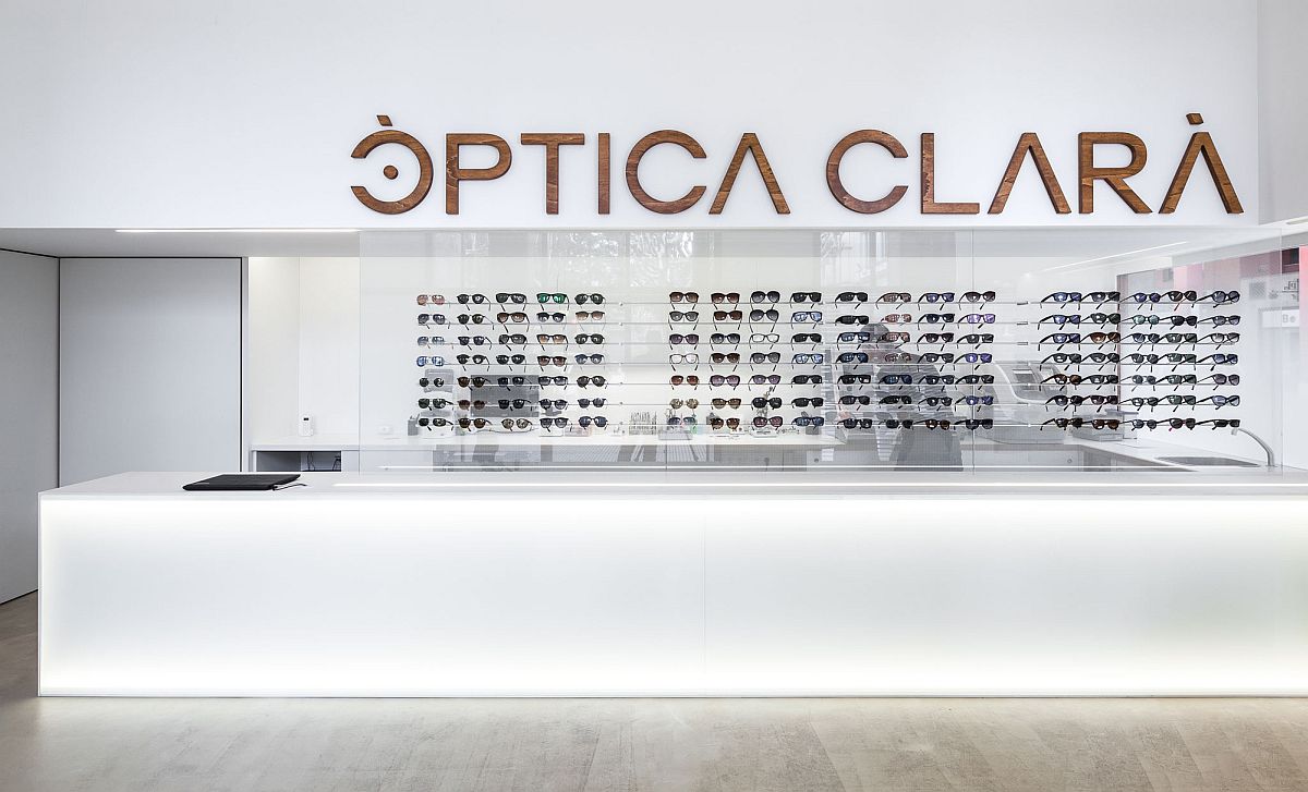
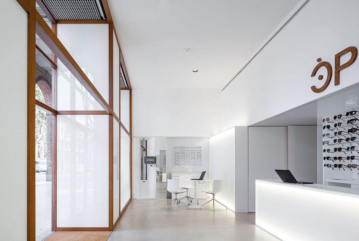
“It’s when I sleep that I can see clearly”, the poet said. However, all of us want to see clearly also when we are awake. When we receive a commission to redesign an optic center, we imagine a clear, bright, intelligent and rational space. We leave out any confusion or ambiguity, being conscious of the functions that are to be developed through the activity that we undertake.
