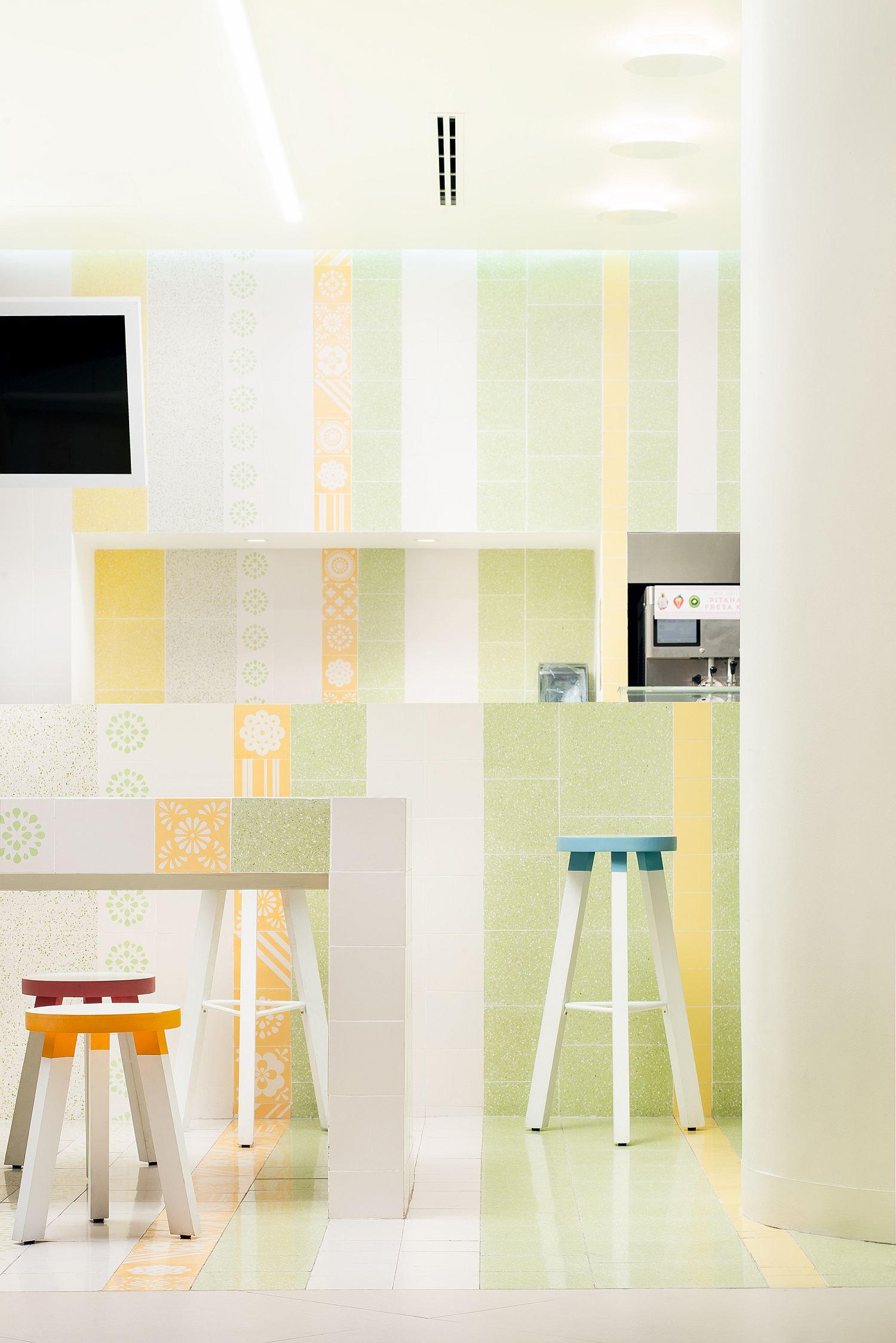
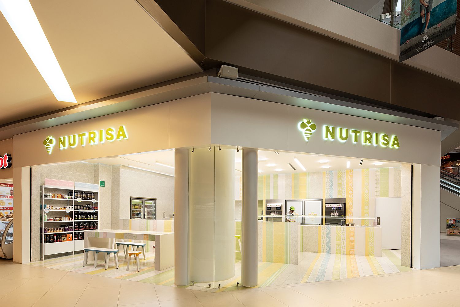
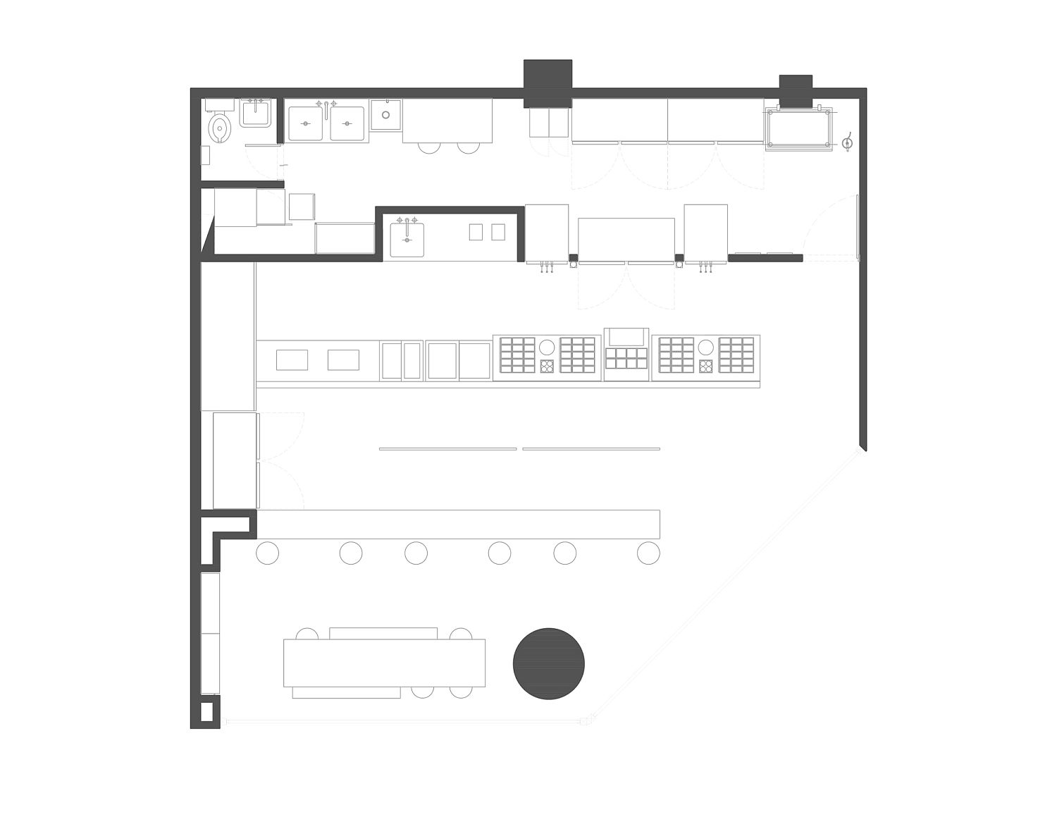
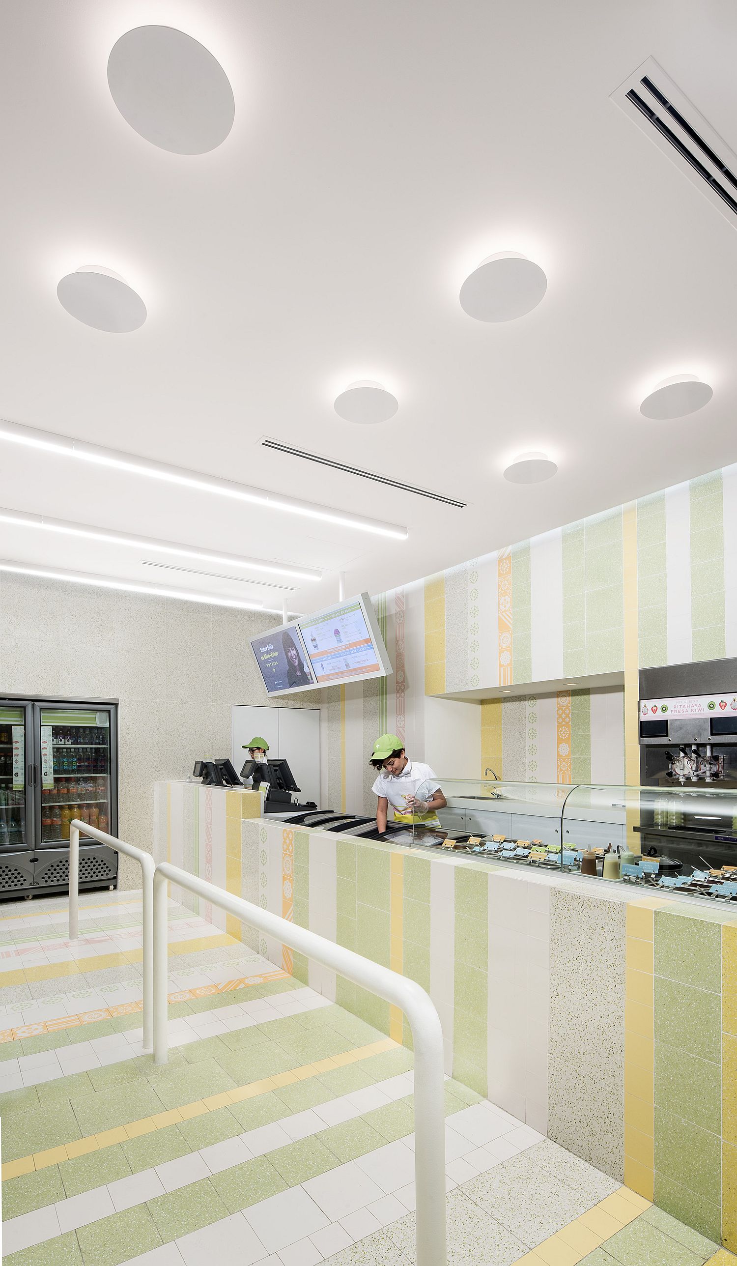
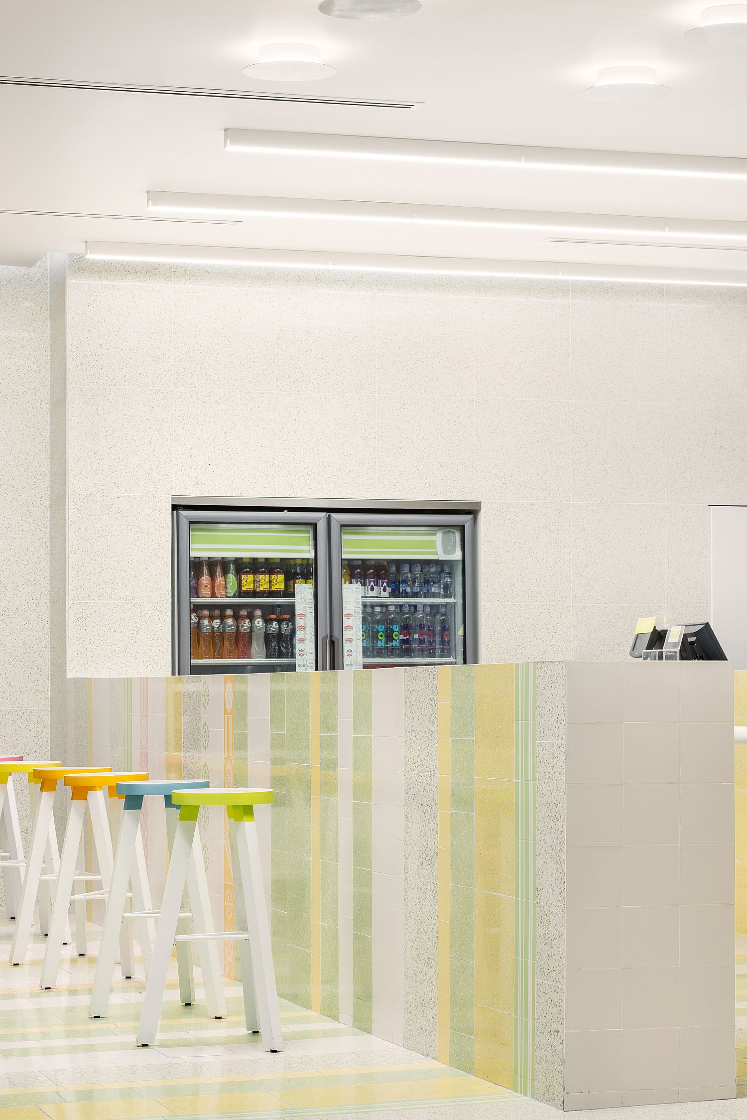
If you love a touch of design oddity coupled with delightful and natural ice cream and yogurt, then the new Nutrisa outlet in Mexico is something you will surely enjoy. In need of a makeover that extended beyond the interior, the store gets a facelift that combine sold Mexican charm with modernity that is anchored in minimalism. Surprisingly it is Mayan motifs and Mexican bee with its striped pattern that inspire the revitalized space! Designed by Cadena + Asociados Concept Design, light green and yellow stripes with geometric patterns now greet you at the Nutrisa store.
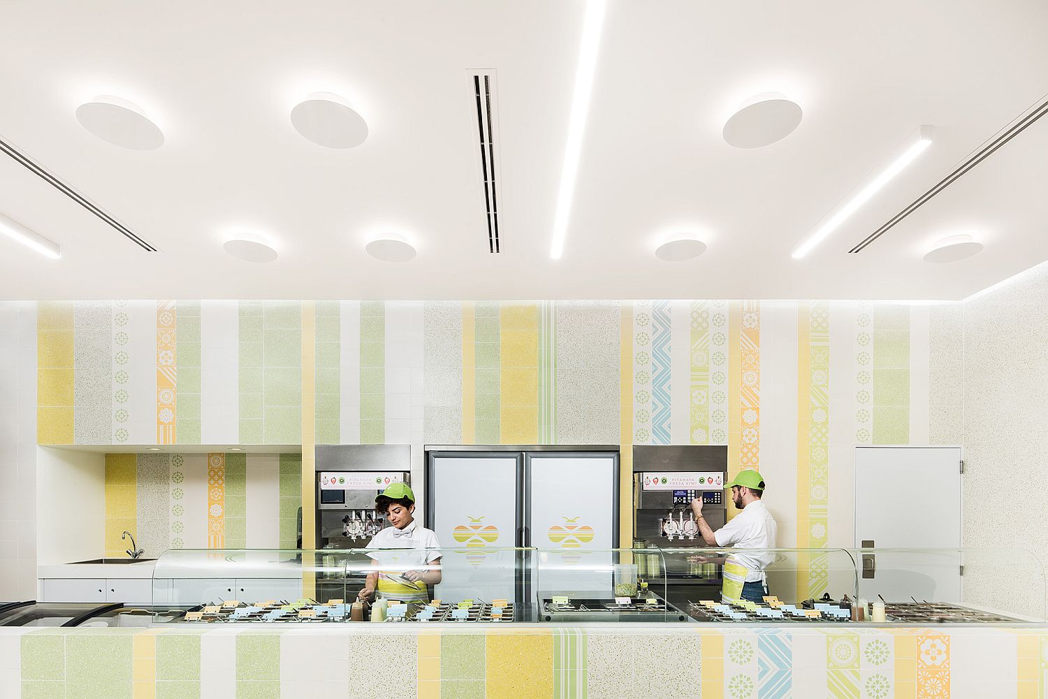
Cheerful and bright, the store in white feels welcoming and the pops of color make it a fun place to hangout and taste all the latest treats from Nutrisa. History, modernity and cultural past of Mexico find space next to one another here as neo-Mexican style takes over. Even and bright ambient lighting in white throughout the store make it even more attractive and you are pleasantly surprised by the unassuming sophistication of it all. [Photography: The Raws]
RELATED: Renovated Mexican Residence With A Home Office And A Garden Jacuzzi
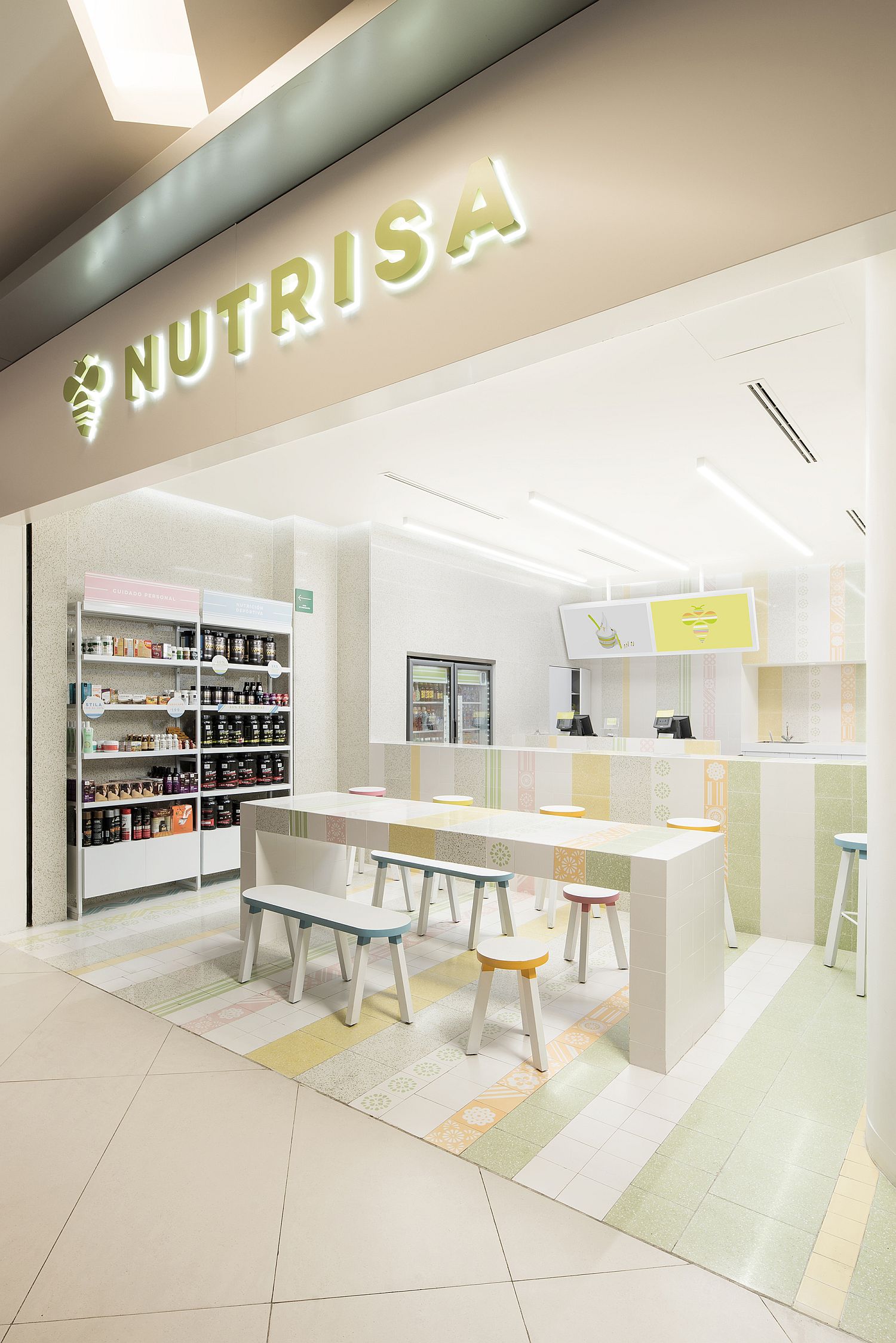
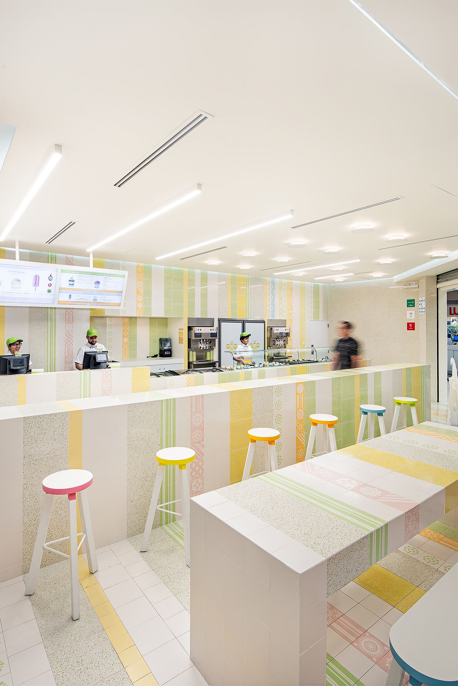
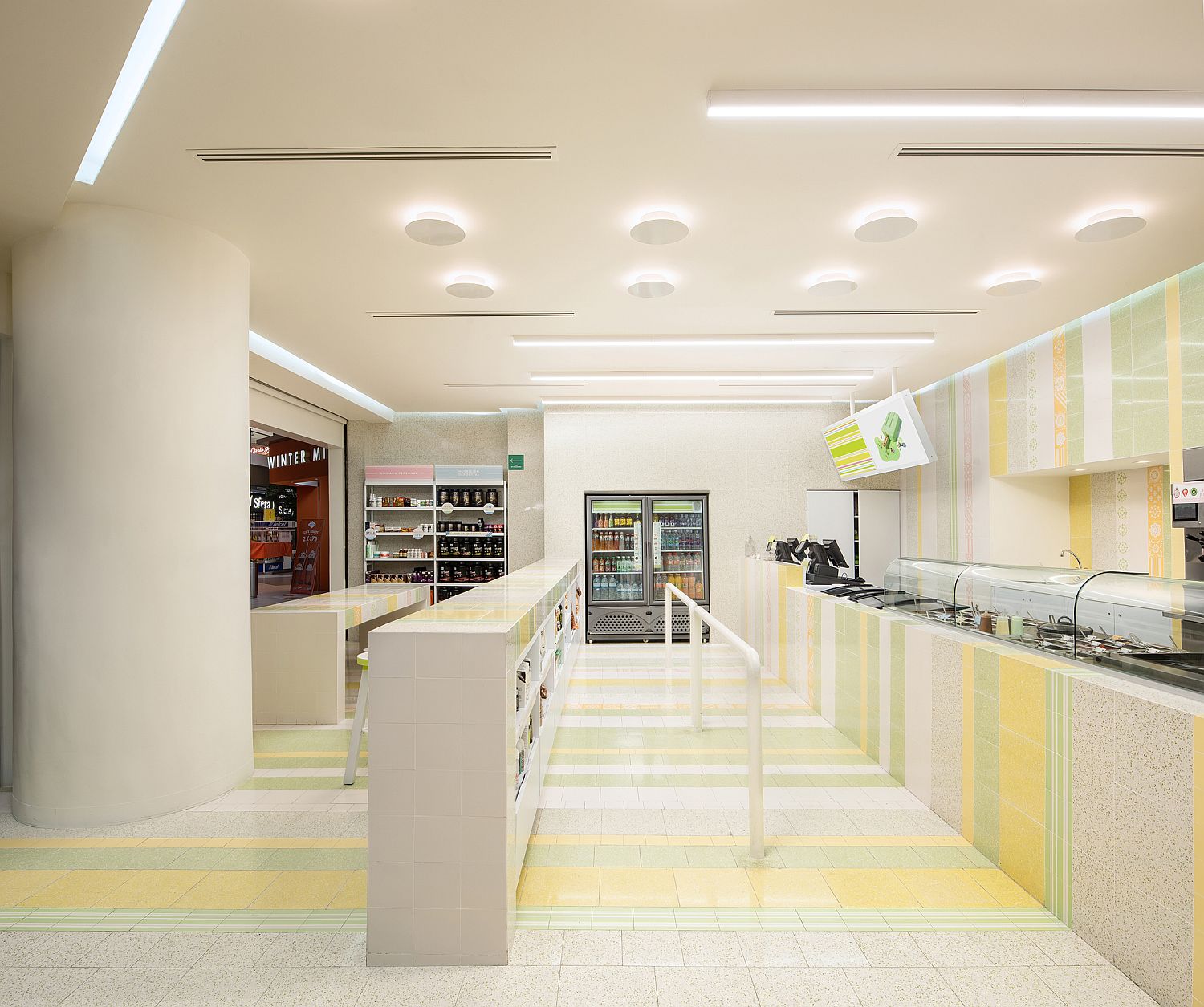
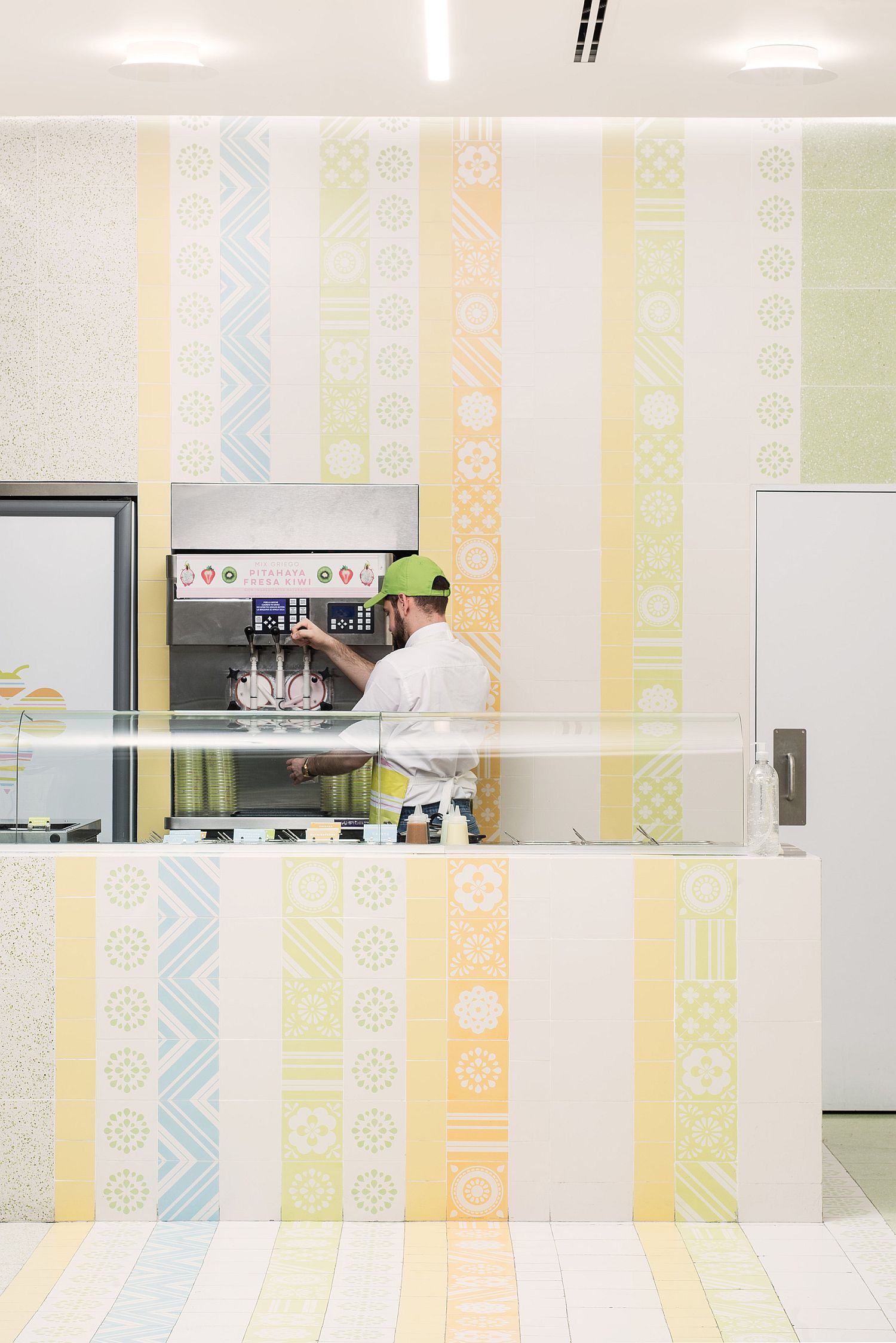
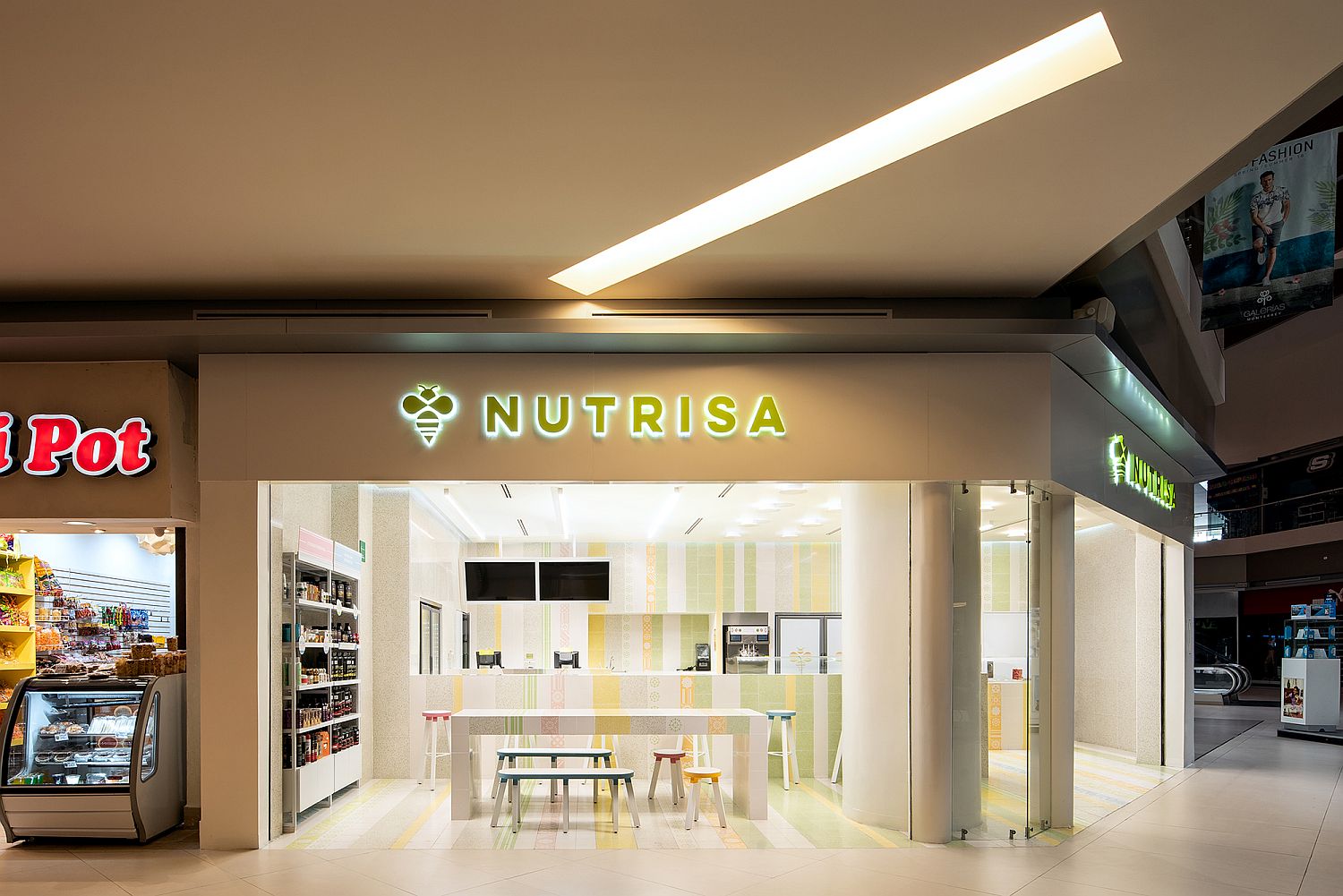
Re-defining the product as a natural ice-cream parlor enriched by quality and delicious products that make your life better, became the core of the project : Natural indulgence! Now, the brand will not only be successful, their mission statement will be to be promoters of wellness, conservation, quality and flavor and their basic goal… Create Smiles!
RELATED: Exquisite Mexican Home Charms with Smart Indoor-Outdoor Interplay
