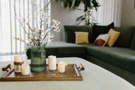
It is easy to get excited about bright and bold colors. They are obviously attractive and when you see lovely catalog images of homes full of bright colors and an eclectic mix of exotic décor, one might be easily tempted to think it is a look that works everywhere. But hold on for a while before buying that paint of bright blue or dashing red for the living room walls as we tell you why neutrals are a bankable and not a boring choice! Decorating your home with neutral colors has many advantages and they even extend beyond mere aesthetics at times.
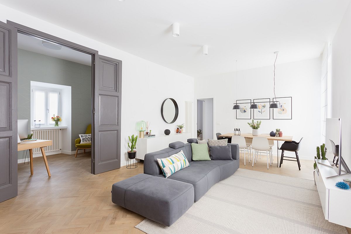
For starters, it is important to remember that there are a wide range of neutral colors to choose from. You are not limited to just white and brown alone. Beyond this, the way you use a color can also turn an obviously bright hue into a neutral color depending on the room and the backdrop created. Even if you want to move away from the 90’s trend of just beige and cream all around, there is still ample reason to stick to captivating neutrals even in the contemporary home. So, step in and discover the many reasons to fall in love with neutral colors along with some elegant inspirations –
1. Finding a Neutral that Works
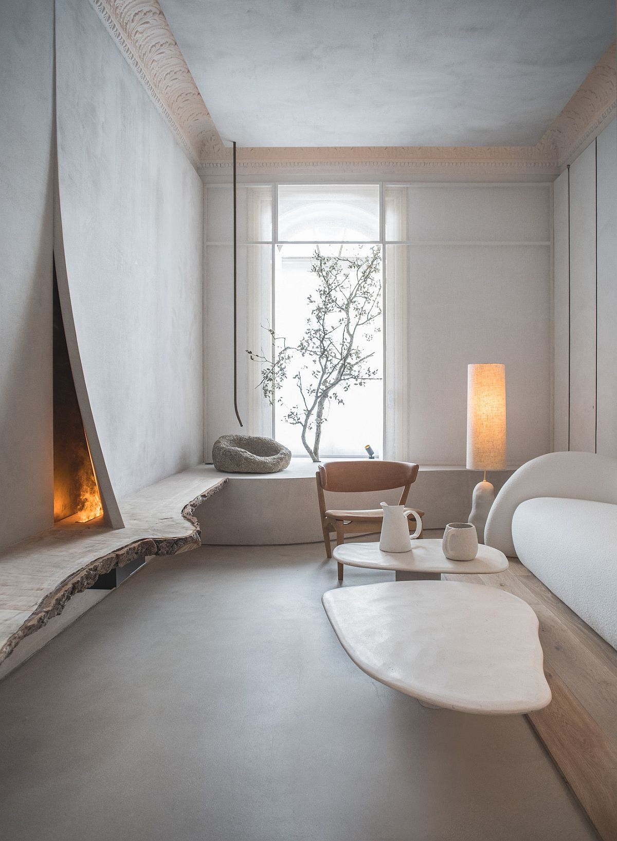
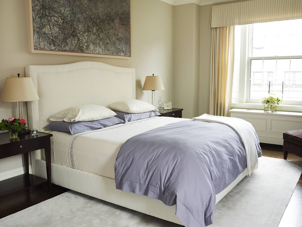
Start by finding a neutral that works specifically in your home and for the style that you have picked in the room. As we alluded to earlier, there are plenty of neutrals to choose from and when you consider the many shades, hues and tints that each color offers, options are truly endless! Gray is one trending neutral that has been on the top of charts for a while now and it is safe to say that it is not gong anywhere for years to come. Both hot and cool shades of gray work well in most interiors and with a wide range of themes. Combine it with white for an even more engaging backdrop.
2. Discover a Bolder Neutral
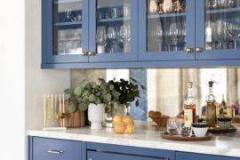
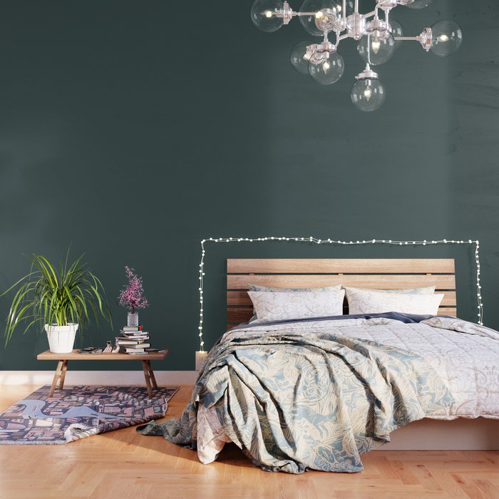
Yes, this is an idea that might be a touch controversial among those who are divided into different ‘color camps’. A color like blue on most occasions is not considered a neutral color. But use it in the bedroom or living space extensively and paint those walls blue and you start transforming it into one. It is one of those ‘bright neutrals’ much like mellow yellow or even light green which make an understated impact in the large, light filled room. If you want a ‘bright neutral’ then this is a great choice!
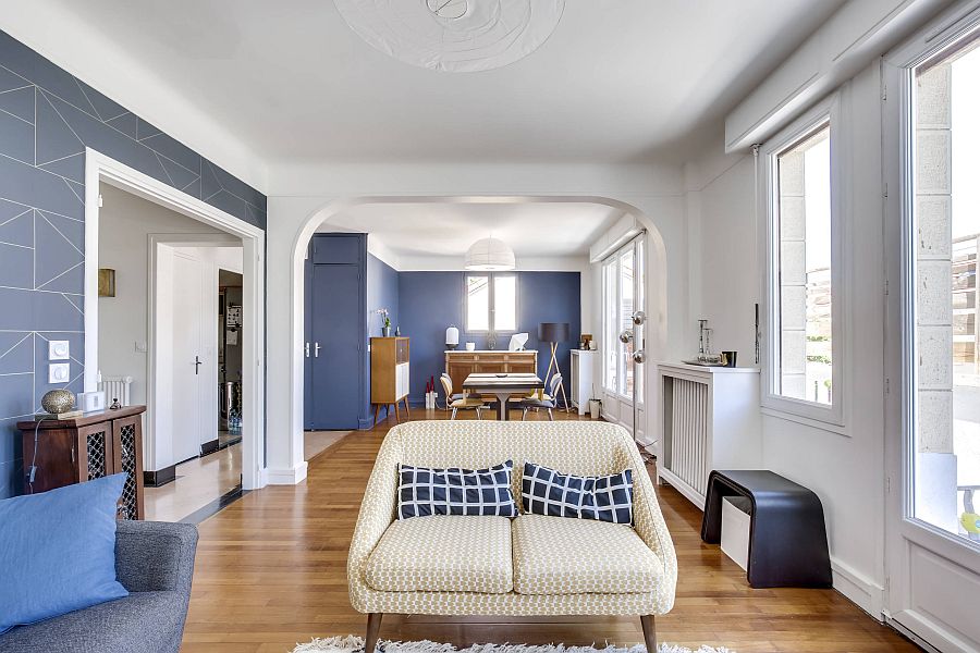
3. For the Open Plan Living
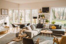
One of the reasons neutrals have become popular once again is how every modern home seems to embrace an open plan living space. Here, creating separate blocks of bright colors would just seem gaudy and a monochromatic, neutral backdrop just feels right. Each space in here feels like an extension of the next even as décor and accessories give it a sense of individuality.
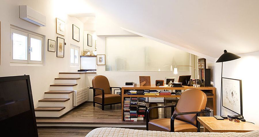
4. A Tone-on-Tone Approach
A neutral backdrop does not mean one that is always uniform. Try out combining different tones and hues of the same color to create varied layers in the backdrop. This is an approach that can also be used to delineate space in the open plan living.
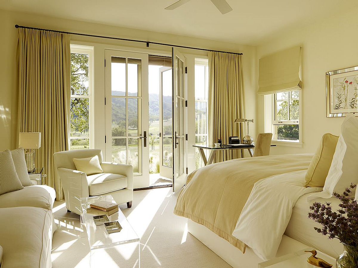
5. Switching between Seasonal Accents
Yes, we did suggest suing neutrals in your home; but that does not mean you use ‘only neutrals’. Once you have the neutral backdrop in place, us it to your advantage and usher in bright pops of bold color. Be it seasonal accents, your favorite recent buys or just accessories that you want to change to beat boredom – whatever your reason, combine splashes of color with the sea of neutral charm!
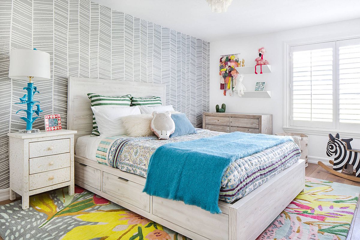
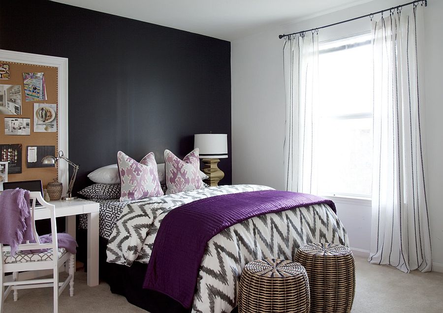
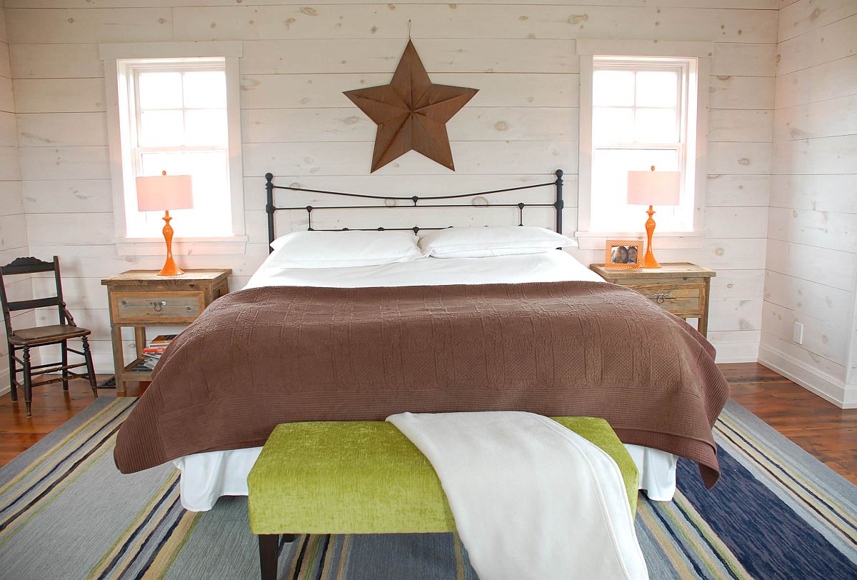
6. Geometric and Textural Contrast
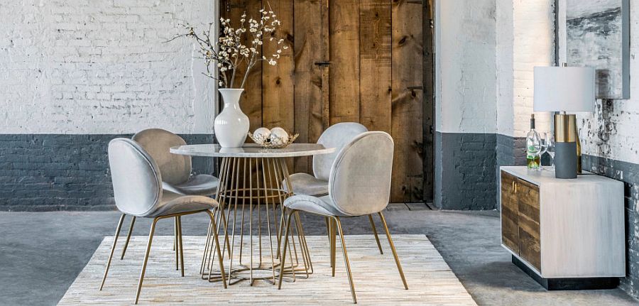
If you are not too happy with using bright colors in the neutral living space, try out geometric or textural contrast instead. Brick walls, concrete features or stone fireplaces can be combined with neutrals to beat the visual monotony. Pick ideas that work with your chosen style and move away from the mundane look.
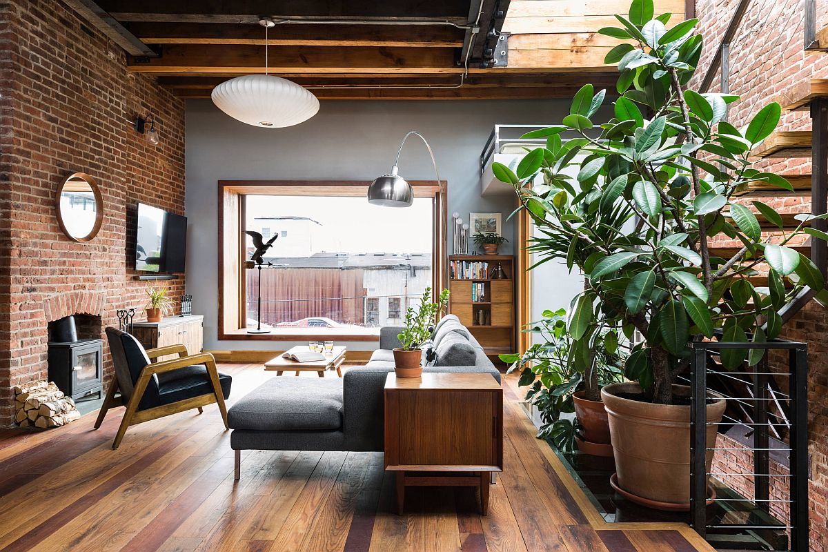
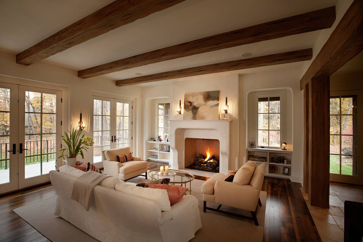
7. Different Styles and Sensibilities
Neutrals offer a safe middle ground where everyone is pleased. And in public areas of your house, this is the best option indeed. You might adore one bright color but others in your family could detest it. That is why it is best to stick to neutrals. It also allows you to change between styles without altering the backdrop drastically.
