Bookshelves are more than just functional storage spaces—they can also serve as a focal point in your home decor. A well-styled bookshelf can reflect your personality, interests, and taste. However, styling a bookshelf is an art that requires careful thought and planning. If done wrong, it can result in a cluttered and unappealing look.
In this article, we’ll delve into some common mistakes to avoid when styling bookshelves, helping you create a visually pleasing and organized space.
1. Neglecting Balance and Symmetry
One of the most common mistakes people make is failing to maintain balance and symmetry. If one side of the shelf is overloaded while the other is sparse, it creates an unbalanced look that can be jarring to the eye.
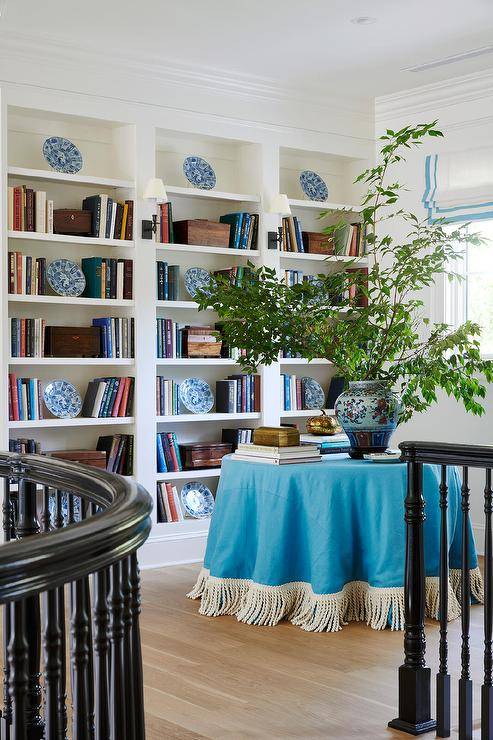
Aim for a harmonious arrangement by distributing items evenly. This doesn’t mean everything needs to be perfectly symmetrical, but there should be a sense of balance. For example, if you have a stack of books on one side, you can place a plant or a decorative item of similar height on the other side.
2. Overcrowding the Shelves
While showcasing all your beloved knick-knacks and books might be tempting, overcrowding the shelves can make the space look cluttered and chaotic. Less is often more when it comes to styling bookshelves.

Try to leave some breathing room between items to create a more open and airy feel. You can rotate your displays seasonally or whenever you feel like a change, ensuring that your bookshelves always look fresh and inviting.

3. Ignoring Color Coordination
Another mistake to avoid is ignoring color coordination. A well-coordinated color scheme can tie everything together and make your bookshelf look cohesive. Consider the colors of your books and decorative items and try to arrange them in a way that creates a pleasing visual flow.
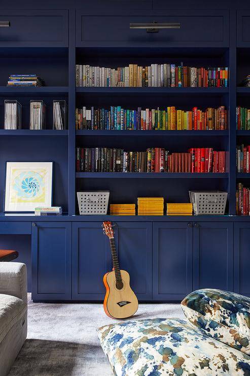
You can group items by color or create a gradient effect from one end to the other. Adding pops of color through accessories like vases or picture frames can also enhance the overall look.
4. Forgetting to Vary Heights and Textures
Monotony can be a bookshelf’s worst enemy. Forgetting to vary the heights and textures of the items can result in a flat and uninteresting display. Mix up the heights by stacking books horizontally and vertically, and use a variety of textures like ceramic, glass, and wood to add depth and interest. This will create a dynamic and engaging look that draws the eye and keeps things visually stimulating.
5. Not Incorporating Personal Touches
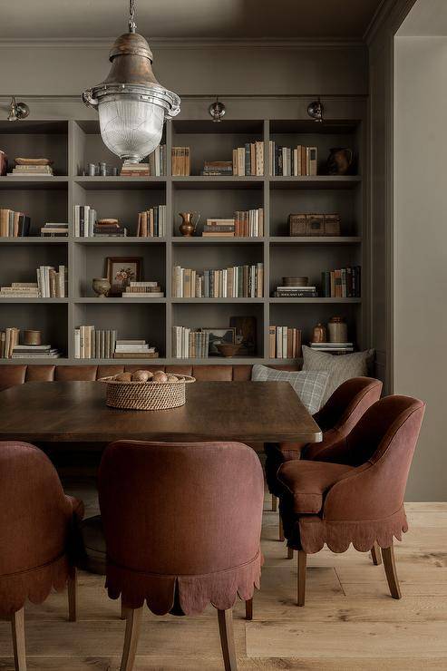
Bookshelves are a great opportunity to showcase your personality, but not incorporating personal touches can make the display feel impersonal and staged. Include items that have special meaning to you, such as family photos, travel souvenirs, or artwork.
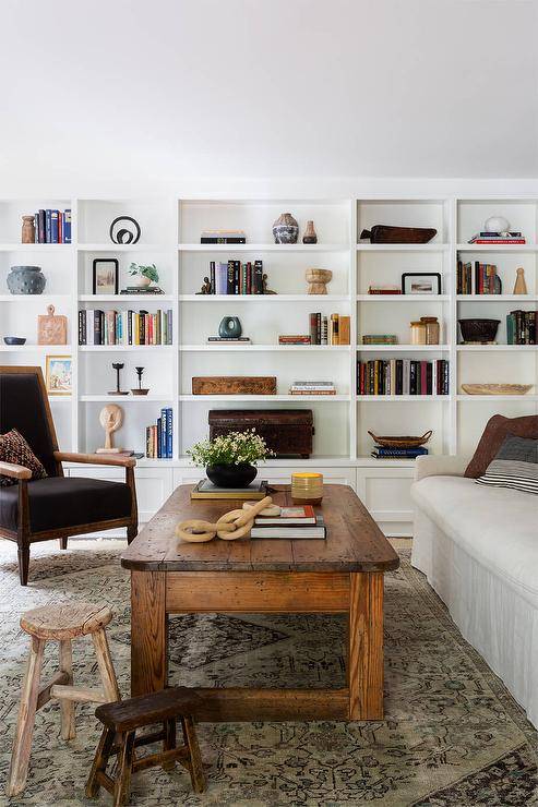
These personal touches can make your bookshelf not only a decorative element but also a reflection of who you are.
6. Overlooking Functionality
In the quest for aesthetic perfection, don’t overlook the functionality of your bookshelf. It’s important to remember that bookshelves are primarily for storing books and other items.

Make sure that the items you display are easily accessible and that the shelf remains practical for everyday use. Avoid placing heavy items on higher shelves where they might be difficult to reach or cause instability.
7. Neglecting to Refresh the Look
Finally, one of the biggest mistakes is neglecting to refresh the look of your bookshelf. Over time, shelves can become stagnant and dusty. Make it a habit to clean and rearrange items regularly to keep the display looking fresh and appealing.
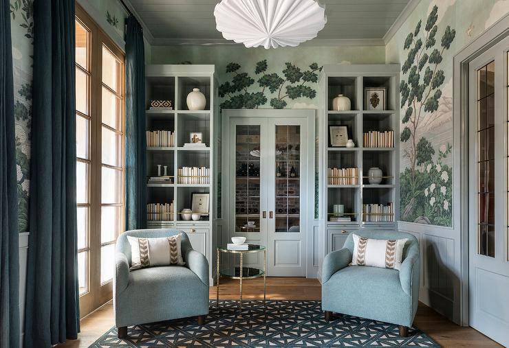
This can also be a great opportunity to introduce new items or switch things up according to seasons or holidays.
Related Articles
By avoiding these common mistakes, you can turn your bookshelves into a stylish and functional feature that enhances your living space. With a bit of planning and creativity, your bookshelves can become a true reflection of your personal style and interests.
Ready to bring new life to your home? Subscribe to our newsletter for exclusive interior design tips, trends, and ideas that will transform your space. Click here to subscribe!
