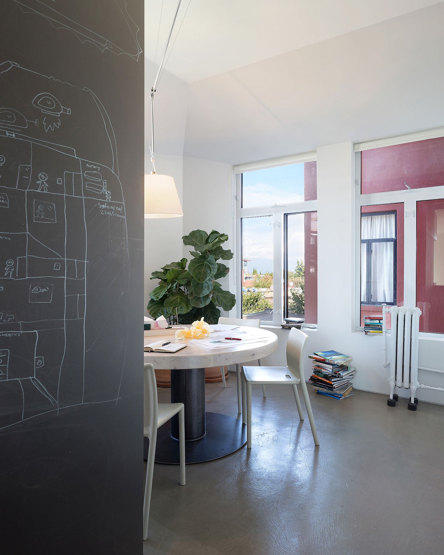
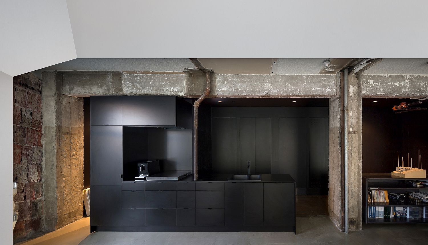
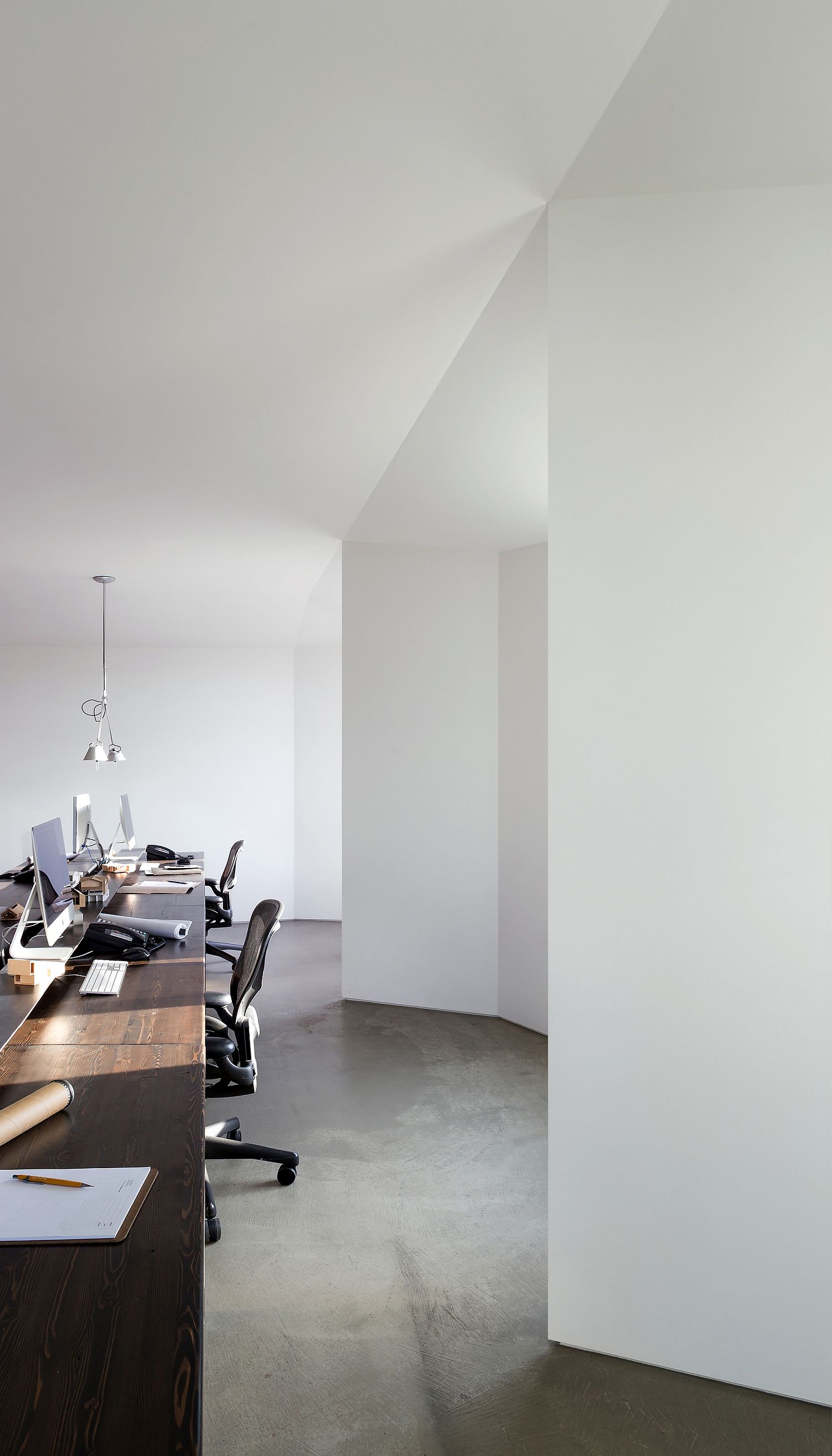
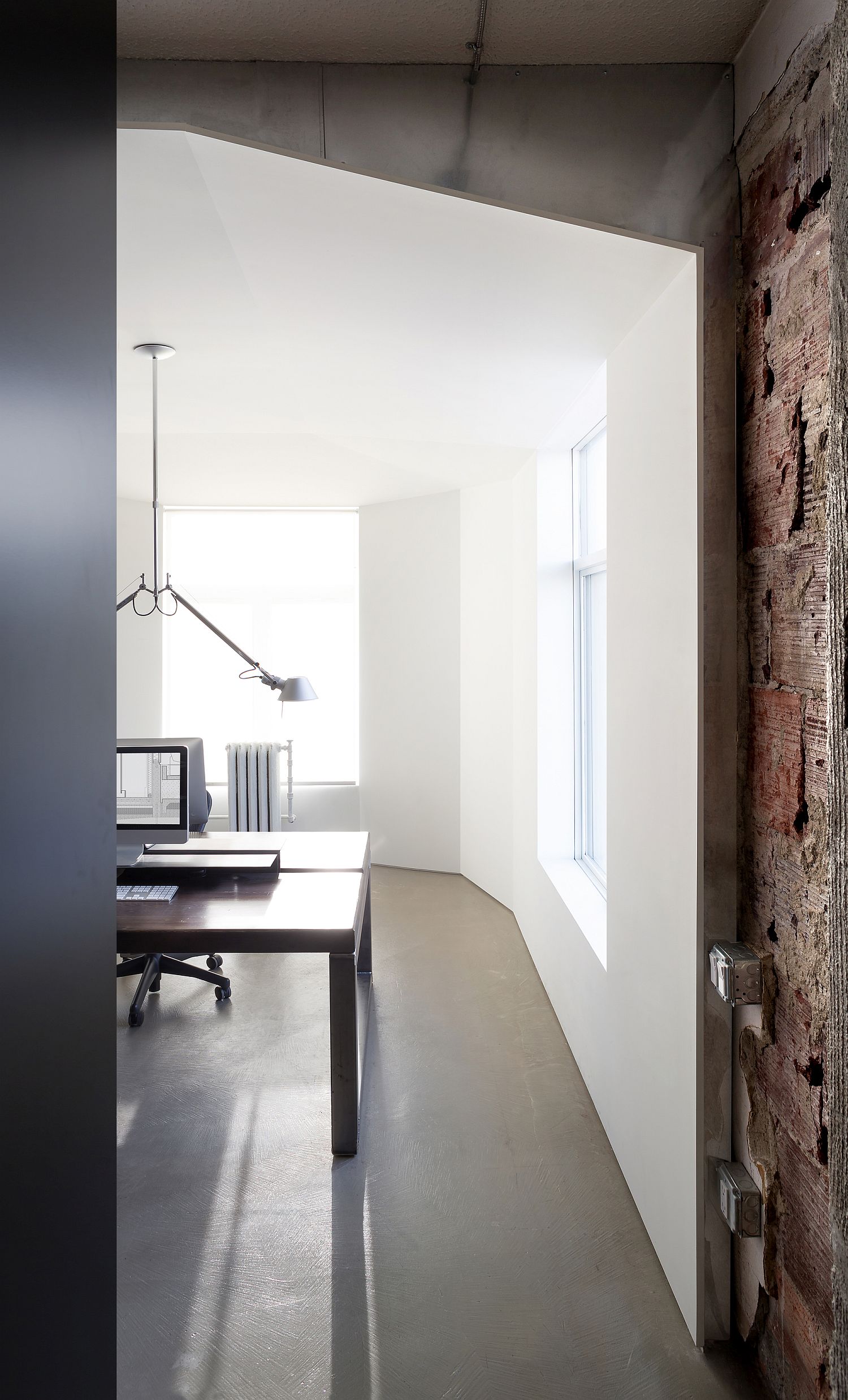
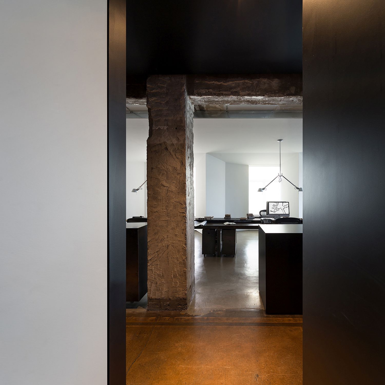
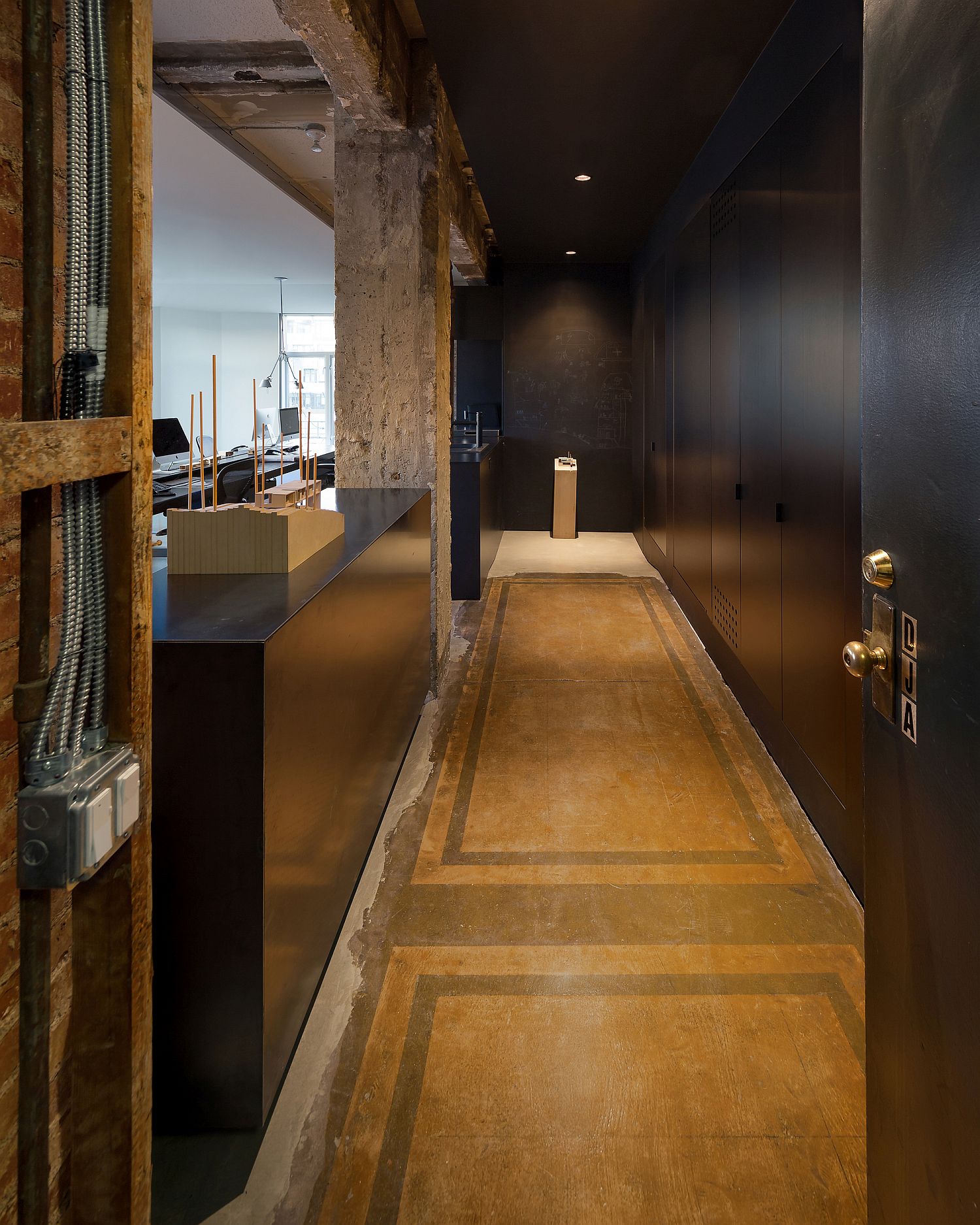
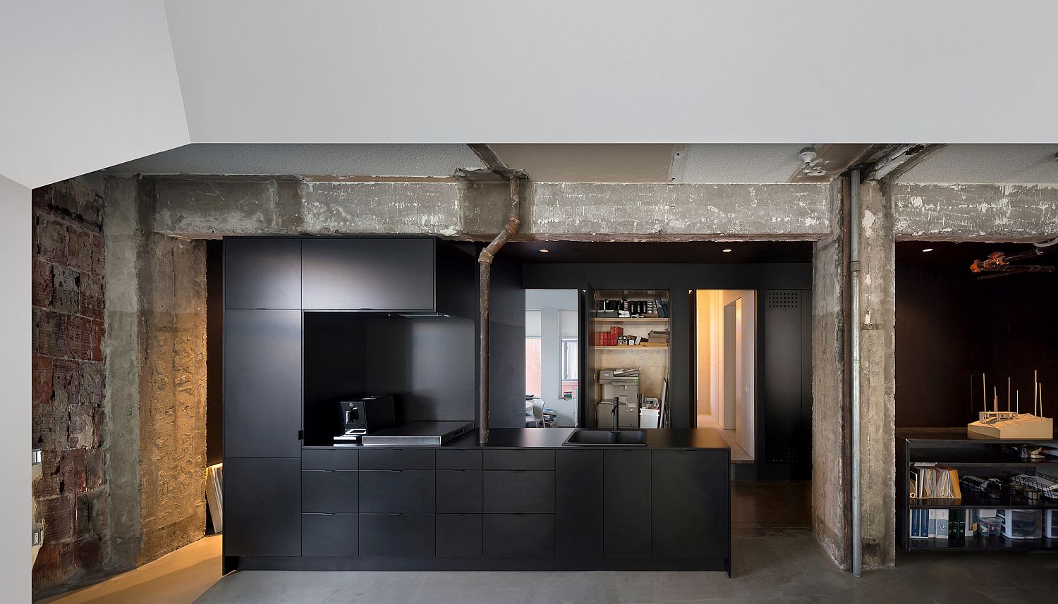
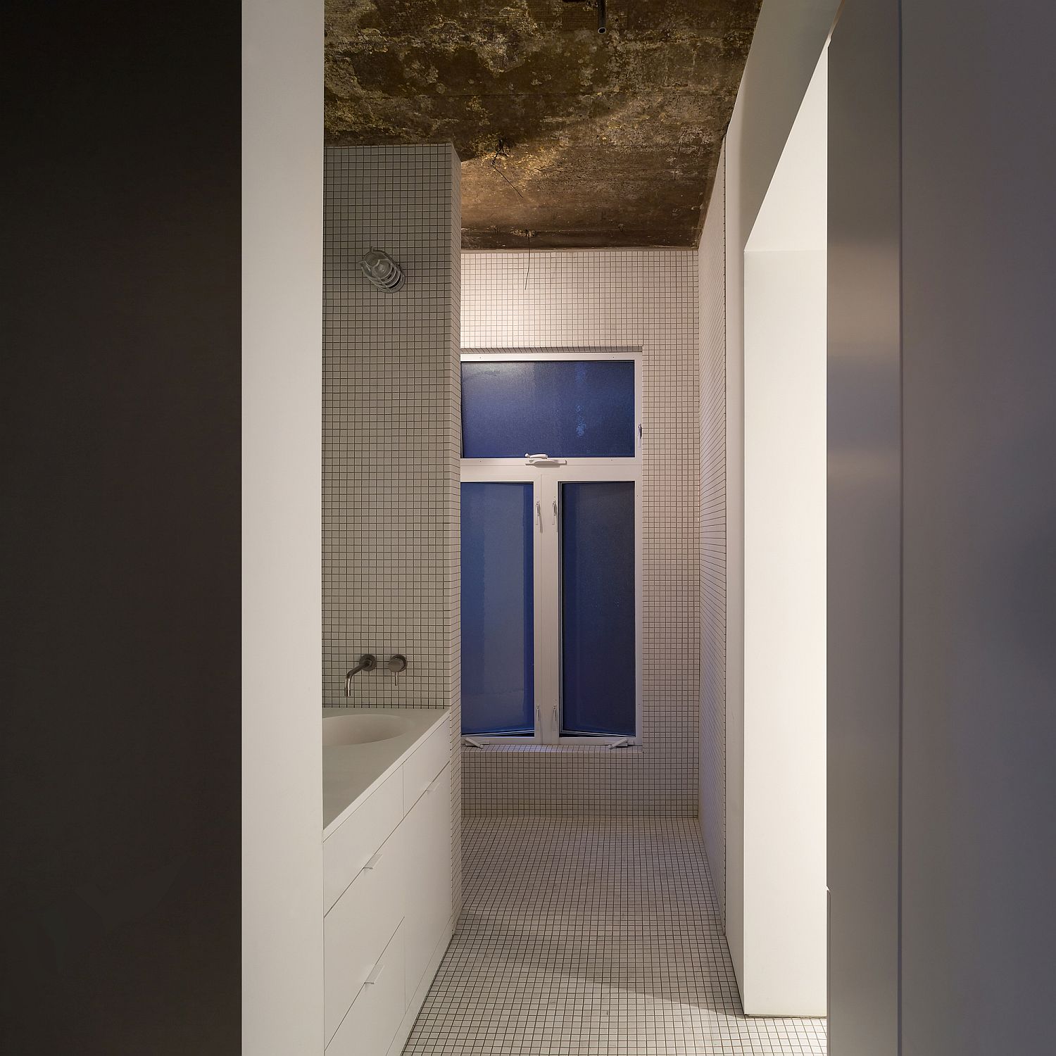
The idea of combining the old with the new to create a fusion of two contrasting styles might be nothing new in itself. But increasingly we are seeing architects and designers pull off the most audacious of blends in terms of both styles and finishes and this fabulous little office in Vancouver is a perfect case in the point. Designed by D’Arcy Jones Architects, Studio Three finds unique ways to place modern minimalism and sophisticated office interiors next to service spaces that are raw, industrial to the point where they might just seem plain crude to some of use. The variation in terms of texture and aura is staggering and yet it is a union that feels ever so pleasing!
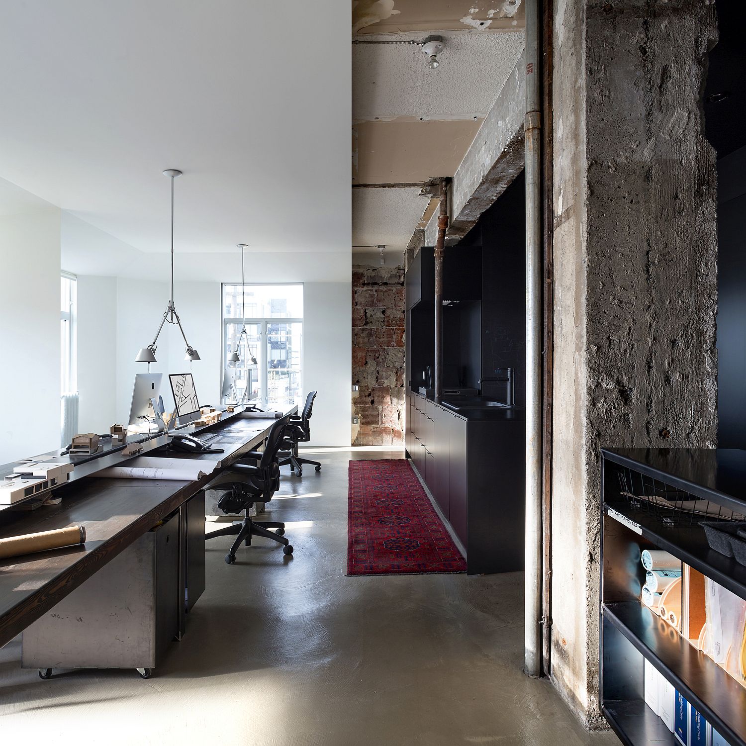
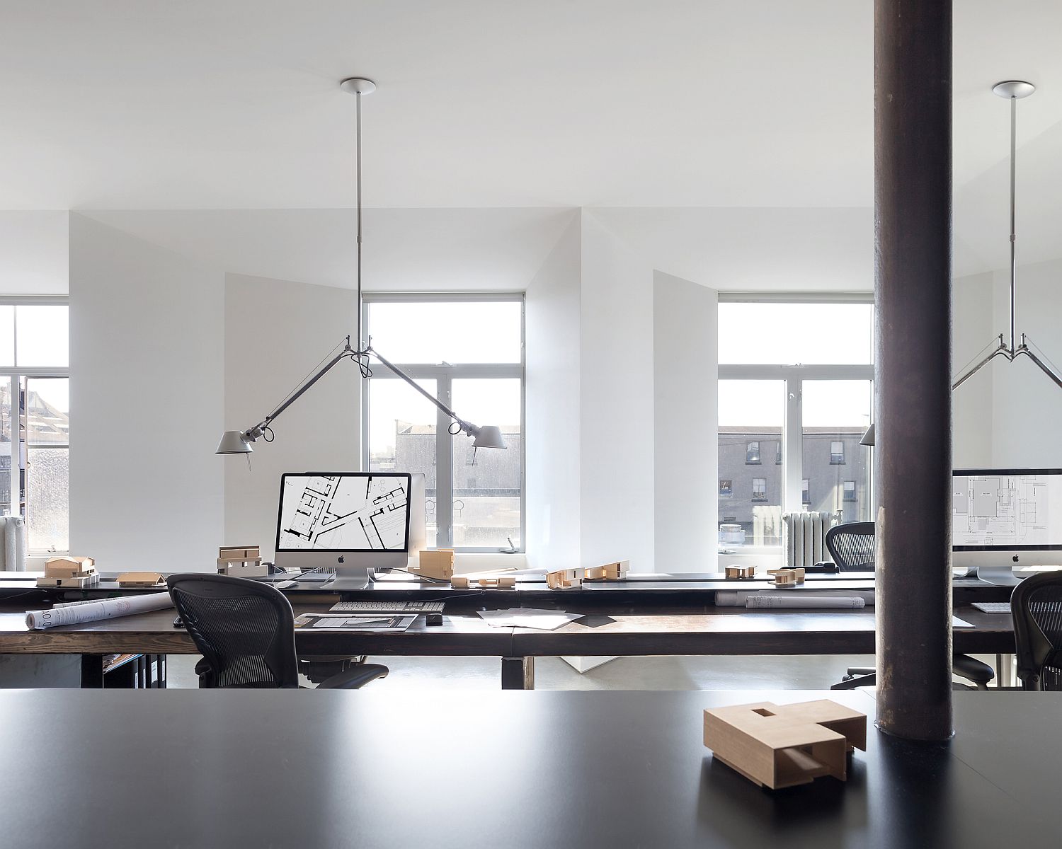
The first thing one notices as they step into this office is the way in which it is entirely filled with a flood of antural light. This is complemented beautifully with recessed artificial lighting and it is almost impossible to find a dark corner in here. The work areas have a monochromatic white backdrop with simple wooden desks, custom-made raw steel fixtures and monolithic cabinets creating an atmosphere that is all polished.
RELATED: Warm Ambiance Meets Modern Sophistication inside this Copenhagen Law Firm
Move away and you see the services areas with exposed concrete beams, darker sections that use black, chalkboard walls and raw metallic fixtures that are anything but contemporary. The makeove is cost-effective and accomplishes precisely what it set out to do – create a functional office area that puts ergonomics at the forefront. [Photography: Sama Jim Canzian]
RELATED: Burda Bebek’s Office in Istanbul: Polished with a Playful Splattering of Color
