It’s kitchen time! Looking to bring a new look to your culinary space? We’ve got you covered! As you read today’s post, you will notice that some of the top kitchen trends for 2016 sound a bit like our top design trends of 2016. After all, if mixing metals such as brass and steel is a strategy that’s growing in popularity, it makes sense that this tactic would find its way to the kitchen! The same thing goes for mixing materials like wood, marble and copper. Today’s stylish kitchens incorporate a range of items, materials and finishes. It’s not about being so sleek that everything matches. It’s about adding visual interest! Read on for a collection of kitchen trends that are set to put their stamp on the new year…
Mixed Materials
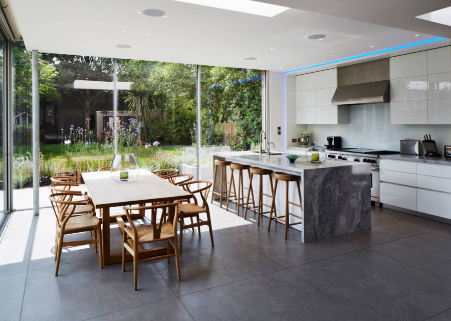
When we talk of “mixed materials,” we’re referencing the current trend of combining many different elements into a space, including wood, stone and metal. Many of today’s top kitchens are reveling in warm wooden tones. After all, wooden surfaces have a way of bringing those gleaming countertops and cabinets back down to earth! [from Stephen Turvil Architects]
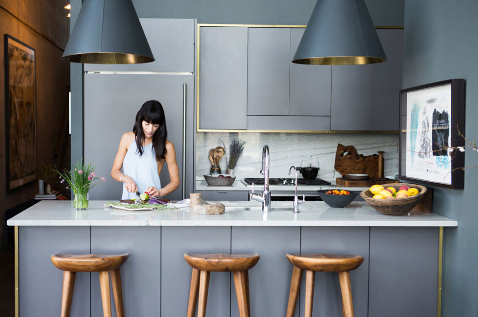
When we first spotted the kitchen of EyeSwoon founder Athena Calderone a couple of years ago, we were completely smitten! The thought of adding brass details to a space dominated by cool grey tones seemed shockingly refreshing and oh so elegant. Yes, Athena was ahead of her time! And now we’re all catching up as we mix brass with wood, marble, and silver tones. More on brass in the next section… [from Harper’s Bazaar]
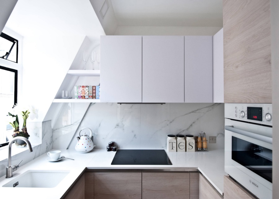
You can even re-create the mixed materials look on a budget! This gorgeous studio apartment kitchen from Black & Milk Residential features laminate with the look and feel of wood, as well as porcelain tile that channels the timeless style of Carrara marble:
Mixed Metals
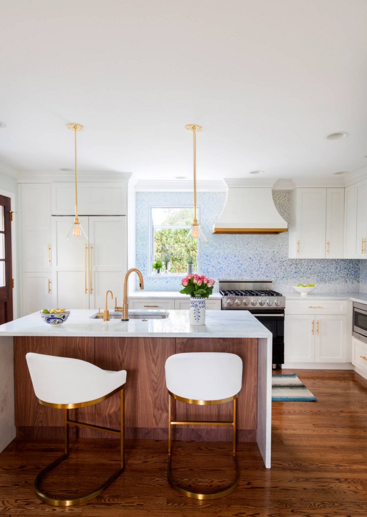
Just as mixed materials are becoming fixtures in today’s kitchen, mixed metals are increasingly making a statement in the modern culinary space. Just because you have stainless steel appliances doesn’t mean that the hardware has to be silver-toned as well! Below we see a stunning kitchen from Design Manifest, which includes a quartzite and walnut island, a tile backsplash, and lots of brass hardware You can find all the details and resources in the post:
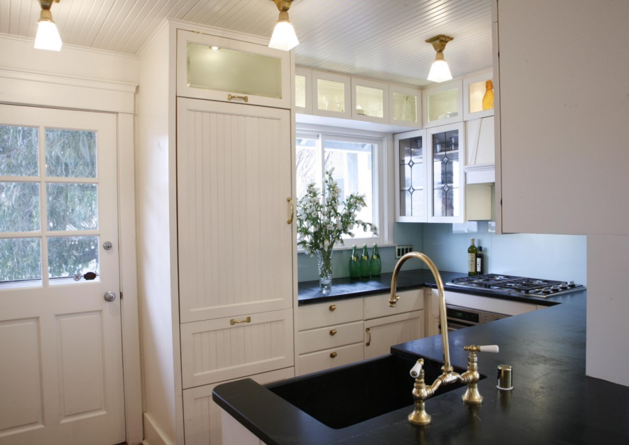
Brass is becoming a widely accepted kitchen staple, appearing on everything from lighting to flatware. Why go with brass when there are other silver accents in the room? Because it’s unexpected. Because it adds warmth. And because it’s interesting to mix it up! [from Lorna Saunders Interiors]
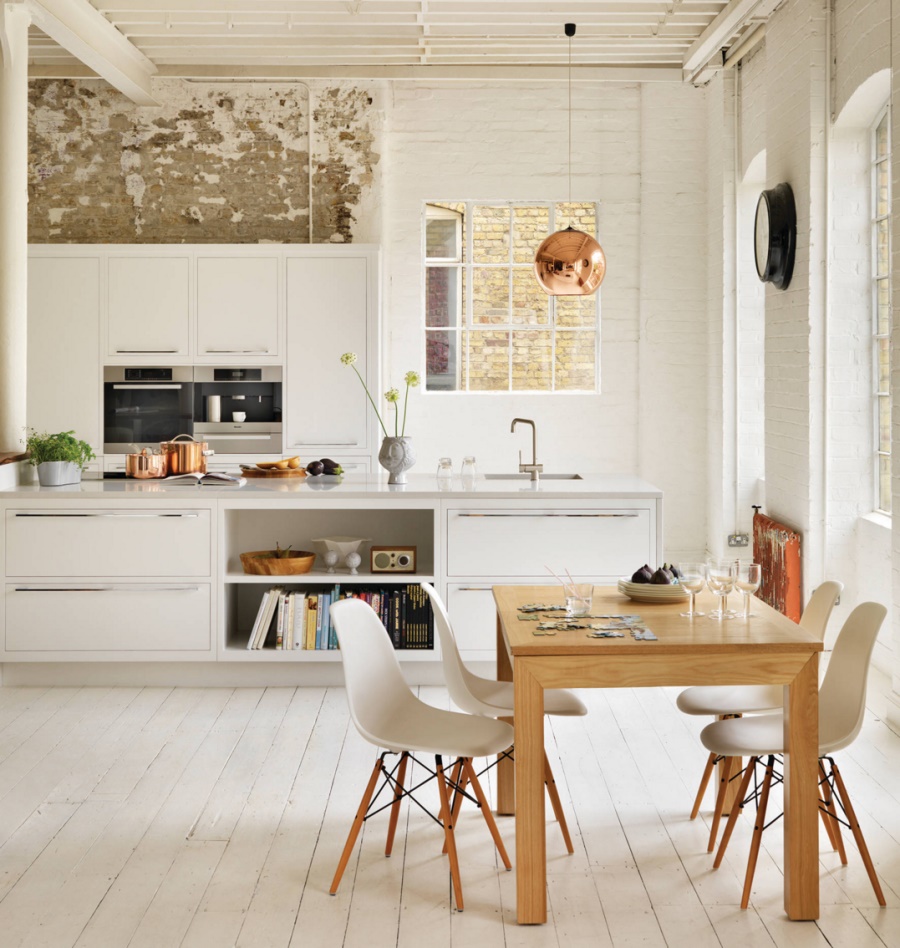
But it’s not all about brass! Copper is making a comeback as well, and the kitchen below proves that when it comes to modern eclectic style, a little bit of copper can elevate your culinary space. [from Harvey Jones Kitchens]
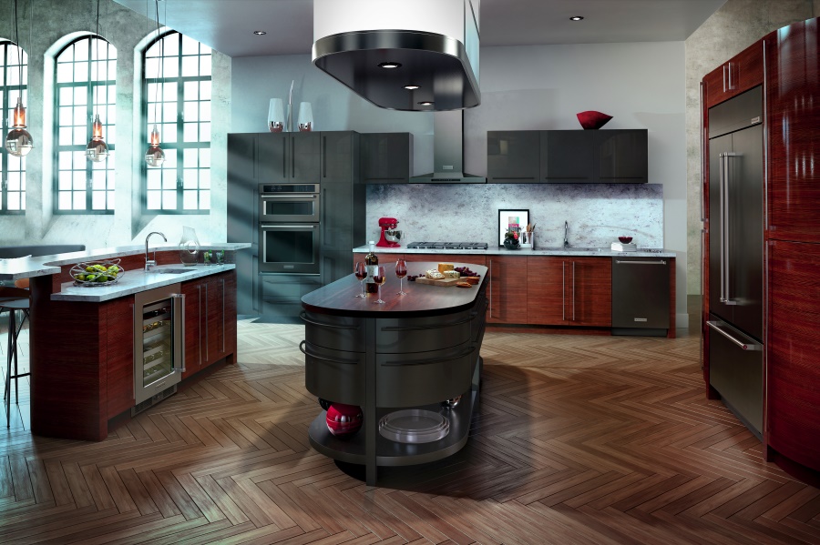
In their recent design trend forecast for 2016, Houzz showcased an up-and-coming trend that’s fresh and exciting: black stainless steel! Yes, we still love stainless steel appliances, but for a special touch, opt for black stainless steel, which adds a black satiny finish to your space. So decadent and sleek! [appliances and image from KitchenAid]
Tile Backsplashes
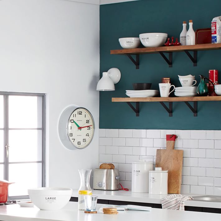
Backsplashes are nothing new, but since there’s a big interest in juxtaposing textures in the kitchen, more and more culinary spaces are showcasing tile backsplashes! Below we see a classic favorite: subway tile. [from West Elm]
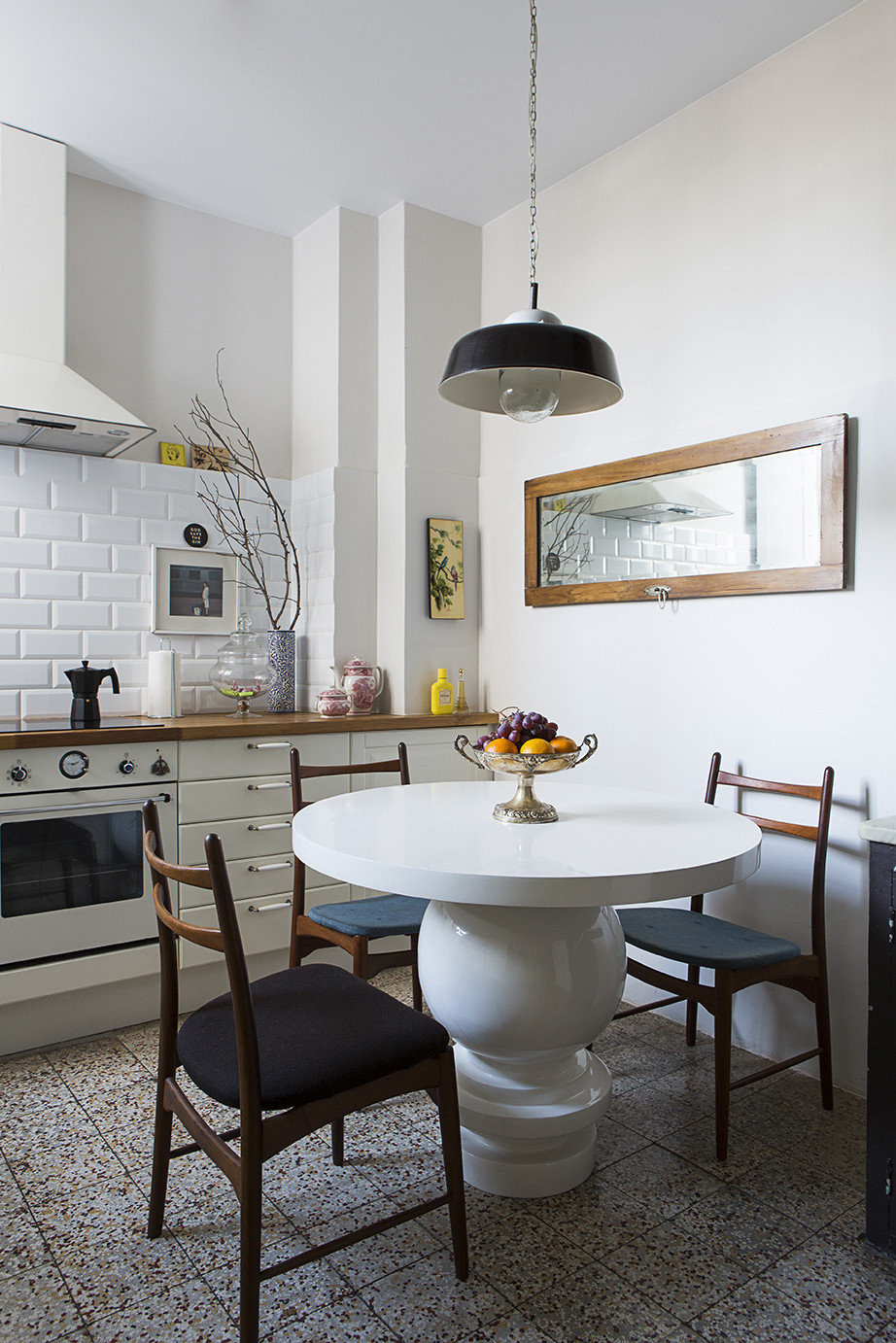
Note the range of elements in the kitchen below, from patterned flooring to interesting decor. Yet the space is crisp and light, thanks to white walls. The white tile backsplash adds the perfect amount of texture while keeping the look refreshing. [photo by Mari Luz Vidal for Lonny]
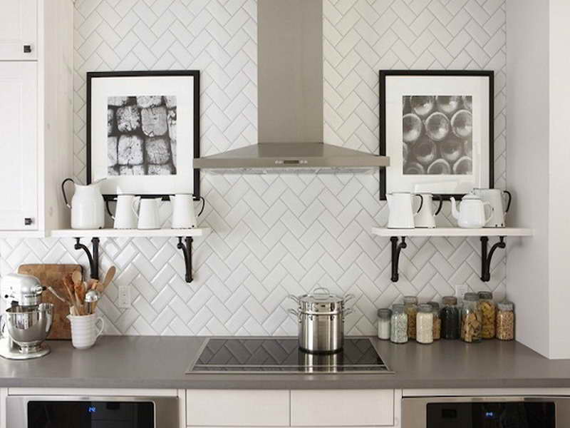
One growing backsplash trend is the use of unexpected patterning, such as the herringbone design below. [from Build Premier]
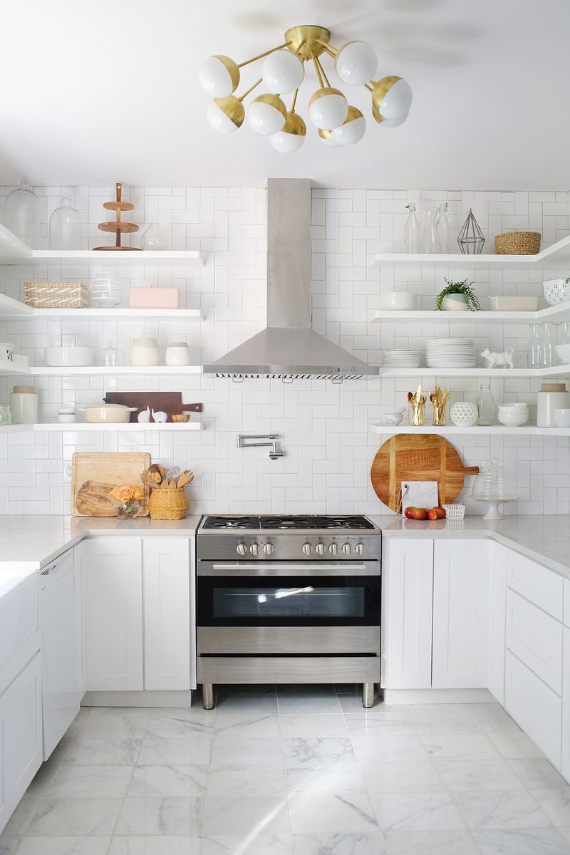
On a similar note, the modern kitchen of A Beautiful Mess blogger Elsie Larson features subway tile in the straight herringbone pattern. Note the right angles! Check out all of the fabulous kitchen details here and here.
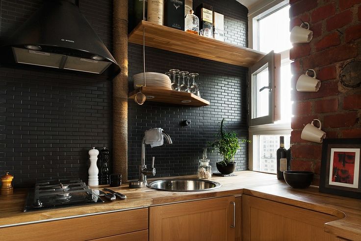
For a different backsplash statement, try tile in a color other than white. We’re fans of the black tile in the kitchen below, which adds richness and depth in this kitchen featuring wooden tones and a brick wall. [from Kitchen Decorating Ideas]
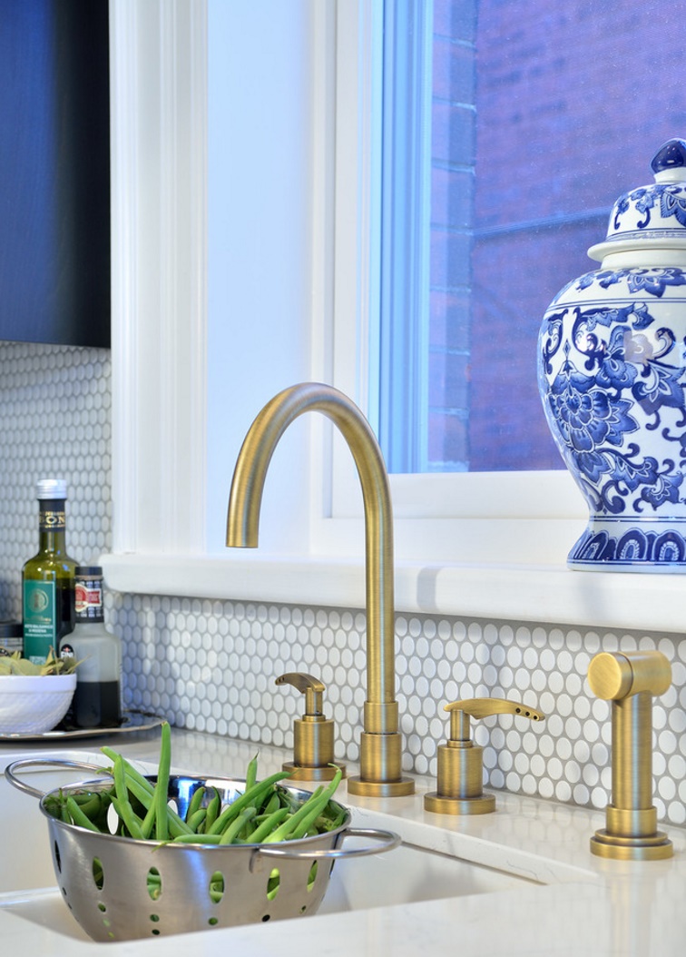
Penny tile is increasingly appearing on kitchen backsplashes, and the crisp look of the tile below is the perfect backdrop to standout features such as a brass faucet. [photo by Arnal Photography for Bedford Brooks Design Inc.]
Statement Lighting
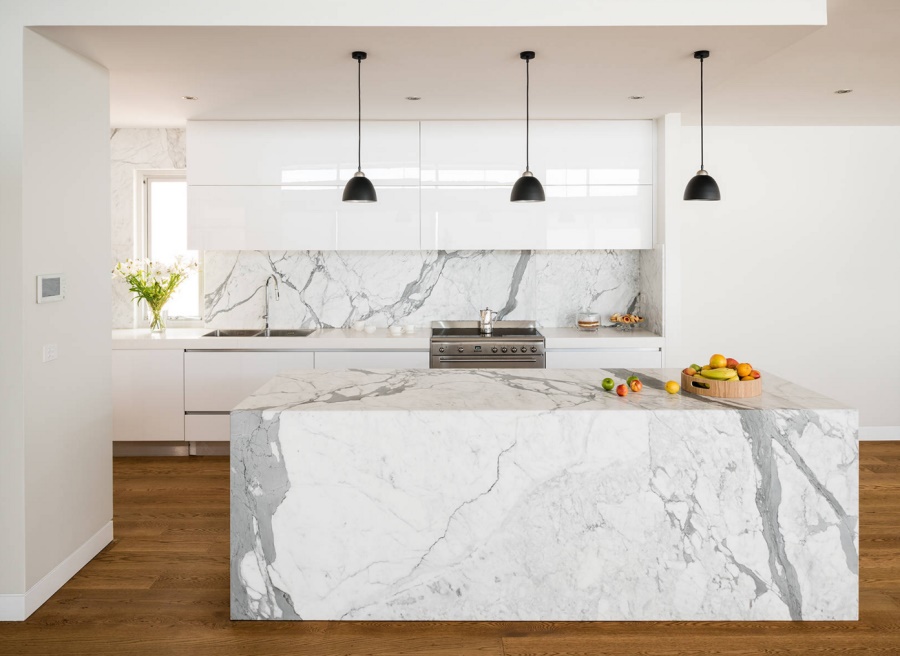
We end today’s post by shining the spotlight on statement lighting, such as groups of pendant lights. One popular strategy: hanging a series of identical lights over the kitchen island! [photo by Tim Turner for Urban Kitchens]
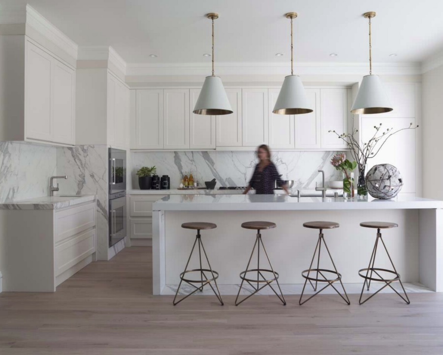
This trio of lights from Currey and Co. hangs over the kitchen island in the sleek culinary space below. Additional drama is added by sculptural barstools and a Calcutta Oro marble backsplash. [photo by David Duncan Livingston for Green Couch Interior Design]
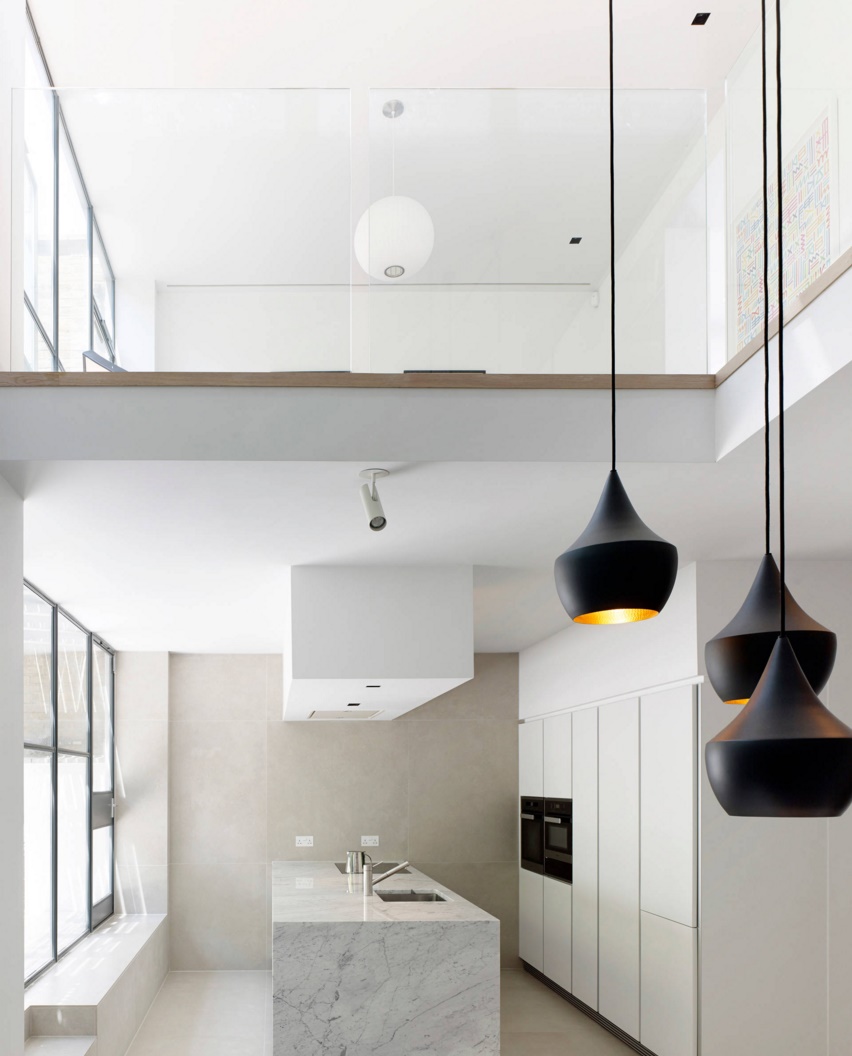
There’s nothing like Tom Dixon lighting in the kitchen! Instead of a row of pendant lights, try hanging them in a cluster for an unexpected twist. [photo by Kilian O’Sullivan for Stiff and Trevillion]
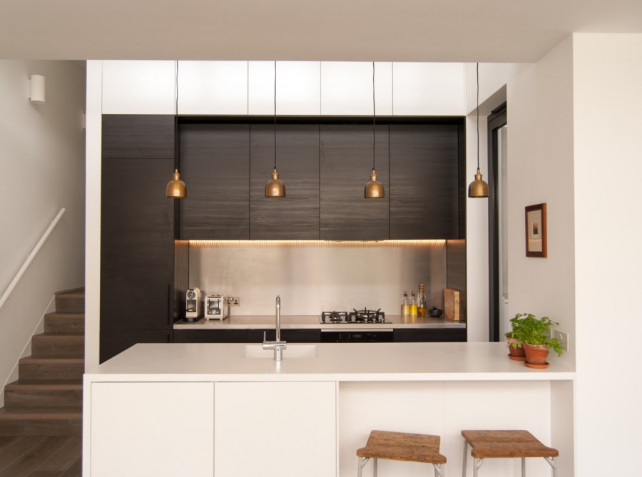
Last but not least, we see a row of Flori Brass Pendants in a kitchen that celebrates the art of dark and light contrast. Love the petite look of these pendants! Sometimes a little goes a long way. [from Flik Design]
Will you be incorporating mixed materials, mixed metals, a tile backsplash or statement lighting into your kitchen this year?…


