Pinterest boards about perfect interior design may make you feel self-conscious, but these fails are bound to make you question the integrity of the interior design field. These photos are evidence that there are some seriously horrible designs out there that just don't work, or it's clear that something went seriously wrong for it to be in existence.
With these examples, rules and blueprints are clearly just thrown into the garbage, never to be seen again. Maybe at home, your wall is the wrong shade of white for your liking, or your couch is just a tad too big for your living room space. But hopefully, after reading through, you'll realize that's the least of your home's problems.
A Glitch In The System
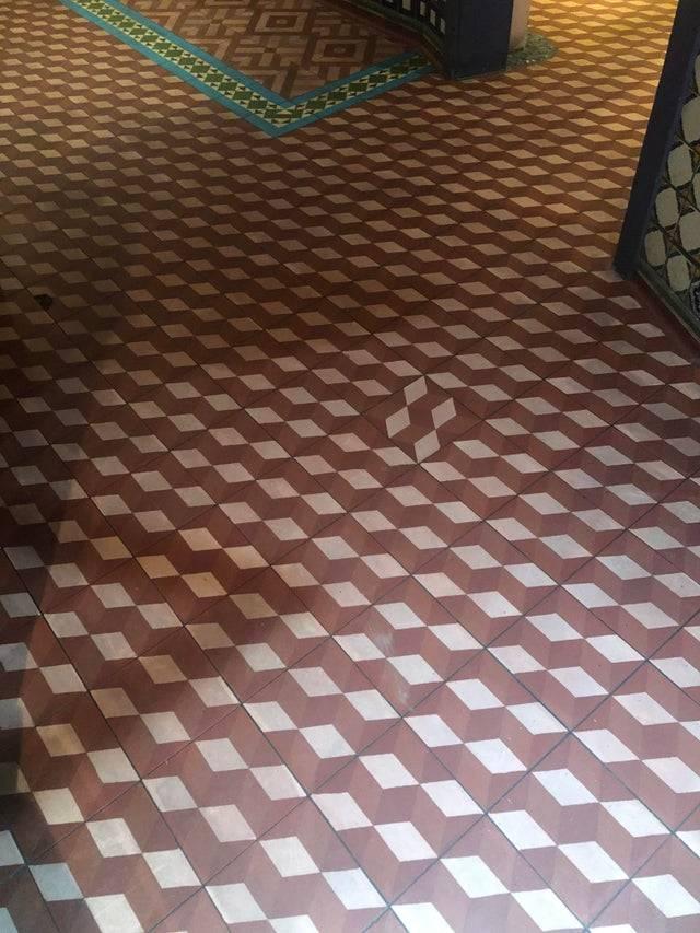
This person went into a Fajita restaurant and snapped a photo of this one frustratingly wrongly placed tile. It just looks so lonely and shy, I almost feel bad for it.
Stairway To... Absolutely Nowhere
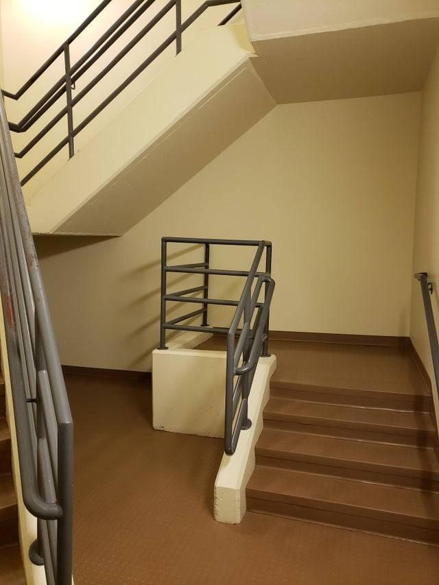
This looks like the pathway that I continue taking in life - the pointless one. All jokes aside, what is the point of this little stairwell? Is it used for mini-concerts, or perhaps it leads to a secret room beyond the walls like in Harry Potter! I'm on my way, Daniel Radcliffe!
So Many CFL Bulbs
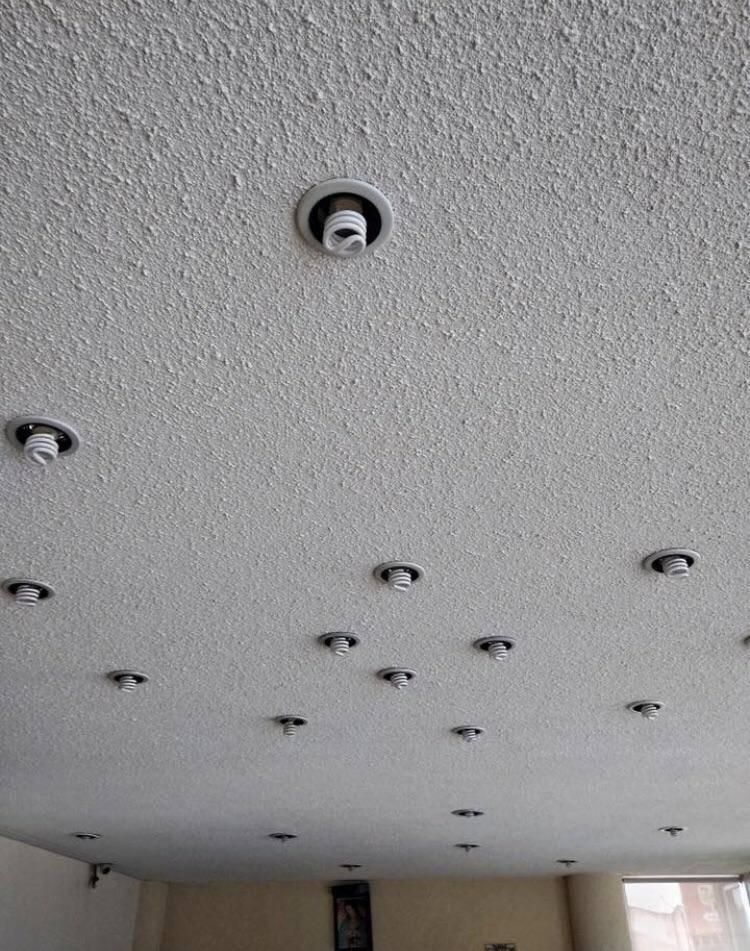
Why does one room need SO many lights, and why are they placed so chaotically? This honestly looks like a real-life version of my Sim's houses where I would just slap 17 lights on the ceiling for lighting and call it a day.
Seriously, Who Thought This Looked Good?
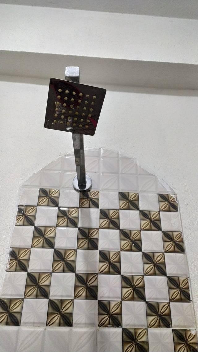
Something is WRONG here. The strange tile is only in one concentrated area, not the whole wall, and that crooked shower head looks like it is hanging on by a thread. I mean, come on. A shower should be a safe space, not somewhere that you go to get your eyes tortured.
Not Your Typical Bathroom
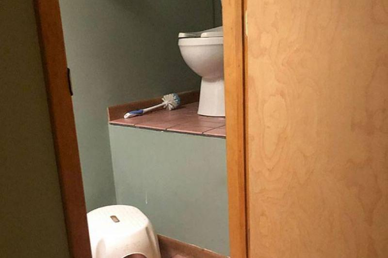
All I want to know is who in their right mind would want to do their business on what is practically a manmade cliff? Also, getting up in time is one thing, but for some reason, the idea of getting down makes me even more nervous.
Ogres Have Layers, And So Does Crown Molding
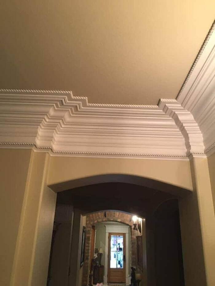
Looking at this makes me feel like my eyes are glitching. Photos like these show us that sometimes, it's best to keep your home design goals simple, as opposed to overdoing it.
A Really Tiny Bathroom Mirror
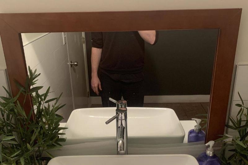
Okay, this one isn't exactly detrimental, but to those of us who like looking in the bathroom mirror, this is a serious problem. Why not just move it up a tad bit higher so it looks right, and so your guest's egos can be properly fed?
The Stair Vortex
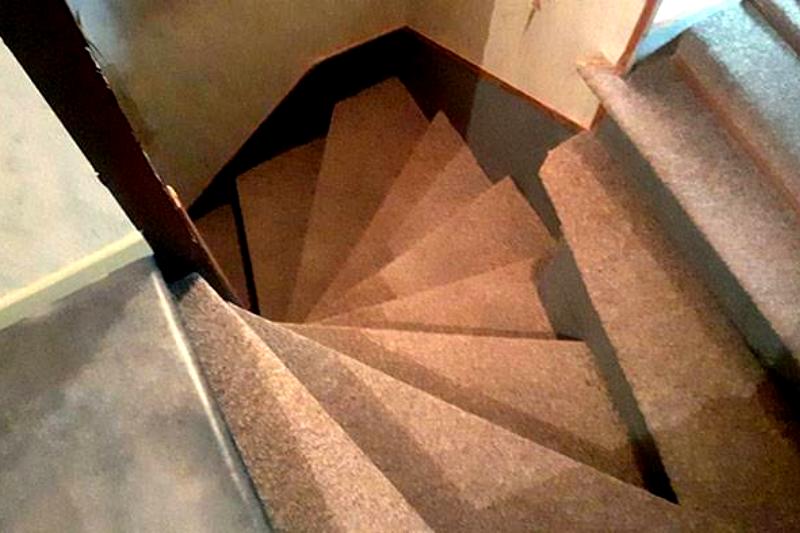
I can already picture myself wiping out on these stairs. With these, one fateful misstep or a case of step confusion, and you're practically a goner. At least it looks carpeted to cushion your tumble on the way down.
Only Slightly Unsettling
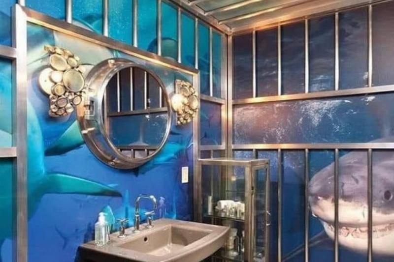
For a seafood-themed restaurant, maybe this would be acceptable, but I have a strange feeling that this is a residential bathroom. Who in their right mind would enjoy looking at this? The design looks like you're in a prison cell with terrifying sharks for your neighbors.
Trippy Stairs (In More Ways Than One)
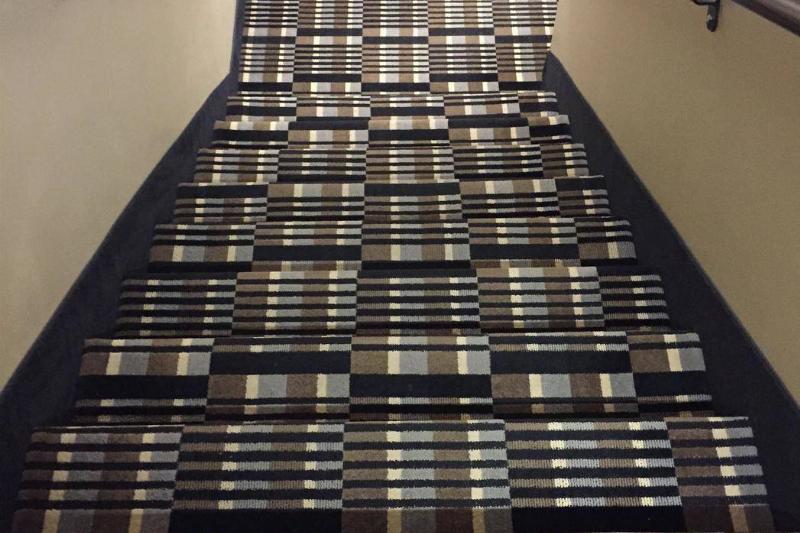
Who thought that this would be okay? I just wanna talk. Personally, I'm having a very hard time telling where exactly the steps even are. It seems like the designer honesty wants people to fall down these stairs.
This Could Have Been Prevented
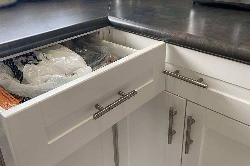
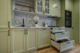
Picture this: renovations are done, and you finally get your dream kitchen, but the drawers don't want to properly open up to you, just like your significant other. It's impossible to open your drawers normally in this house, let alone opening more than one drawer at once.
Double The Doorknobs = Double The Fun
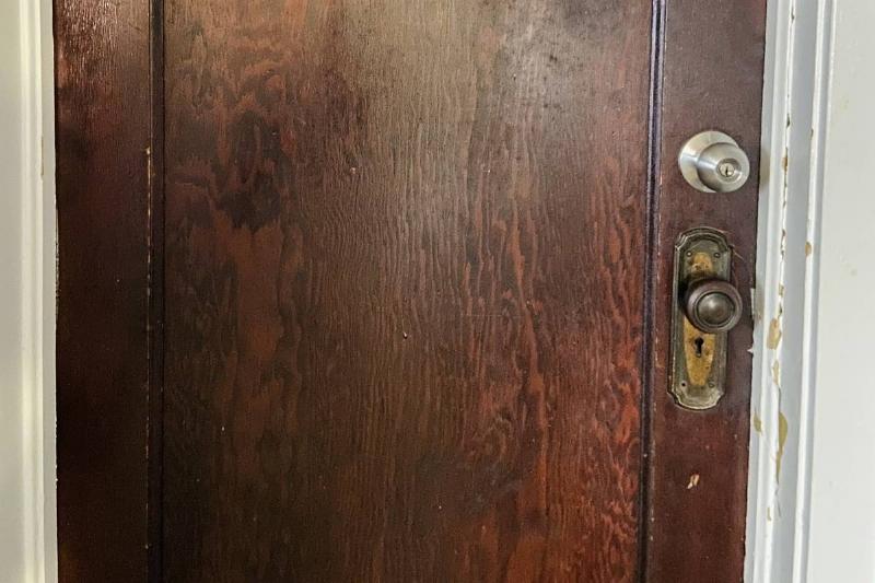
This is a perfect example as to why two is not always better than one, because sometimes it can be a little bit excessive. And, the second one is not just for show, you actually have to twist both of them at the same time in order to successfully open the door.
Now That's A Highly Suspicious Outlet
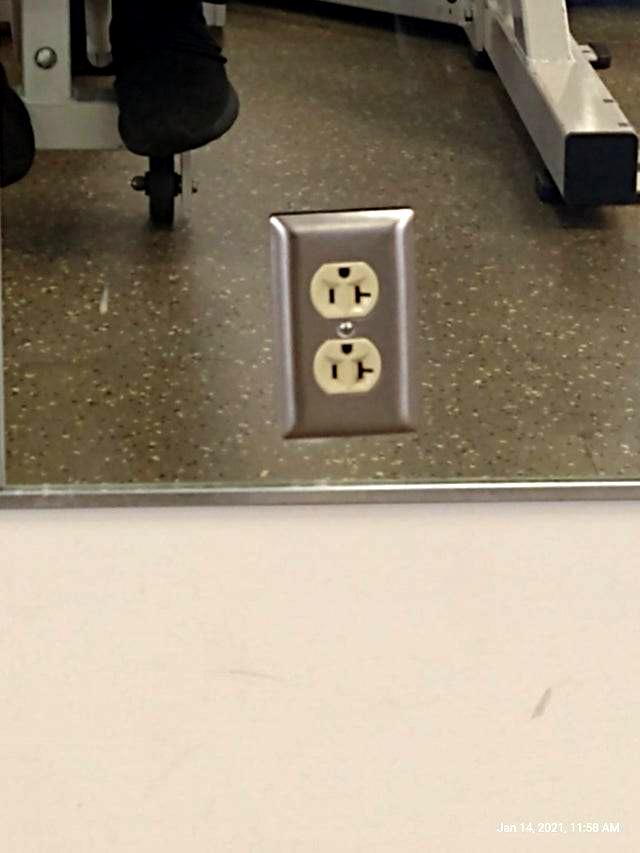
Everything about this outlet is just so suspicious. Not only is it weirdly placed on a mirror (how does that even work), when the outlet could have just been built on the wall directly underneath. It's also upside down and slightly crooked.
What Was The Reason?
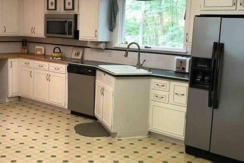
This upsets me in ways that I cannot even explain. It just looks wrong. Also, my toes already hurt from the hypothetical number of times that I would stub them on this strangely-angled sink.
So Close, Yet So Far
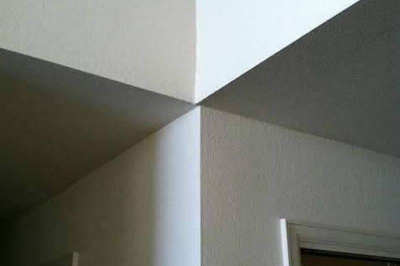
This photo makes me want to jump in there and try to push the walls back together with nothing but my manpower. This flaw is not the end of the world, but why though?
That Ain't Right
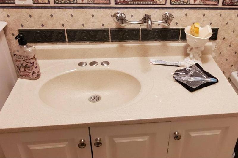
This is seriously unsettling to look at. I wanted answers for this one because I didn't understand how the bathroom doesn't just flood all the time. Turns out, before washing their hands, the homeowners have to physically rotate the faucet so the water is able to fall into the sink.
Skinny Legend
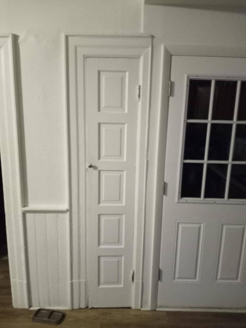
Not only does this thin door look mildly unsettling, but it is also placed directly beside the home's front door. If you were to swing open this tiny closet door just a little bit too fast or too furious, I have a feeling that that tiny knob would wreak havoc on those glass panes.
