Shopping events such as ‘Black Friday’ and ‘Cyber Monday’ tempt consumers with a plethora of price reductions, promotions and bargains. They tap into a certain form of materialism, that which is often irrational and irresponsible. In a world of increasingly scarce resources, we face a worrisome state of objectionable over-consumption. And yet there are many brands who knowingly exploit self-indulgent consumerists in a bid to satisfy inflated cravings and more importantly, to make themselves a profit. The demand for new, better and cheaper goods is one perpetuated by manufacturers and retailers, trapping consumers in a cycle of never-ending need. To break this cycle is to stop acting as a consumer of goods, acting instead as a user.
Well-designed objects will show respect towards the user, leaving room for their self-expression. In turn, the user will treat objects with respect and devotion, holding on to them for as long as possible. In effect thinking about design as something for keeps.
A shelf for keeps
Furniture manufacturer Vitsœ makes a straightforward promise: “there will never be a sale because our prices are always fair.” (Source: Vitsœ) Perhaps by way of protest, the company closes its New York shop on Black Friday. Essentially, Vitsœ values the consumer as an individual and not as a commodity. Its clean and classic 606 Universal Shelving System was designed by Dieter Rams in 1960 and has been made by Vitsœ ever since. Flexible, functional and aesthetic, the 606 is a lifetime companion.
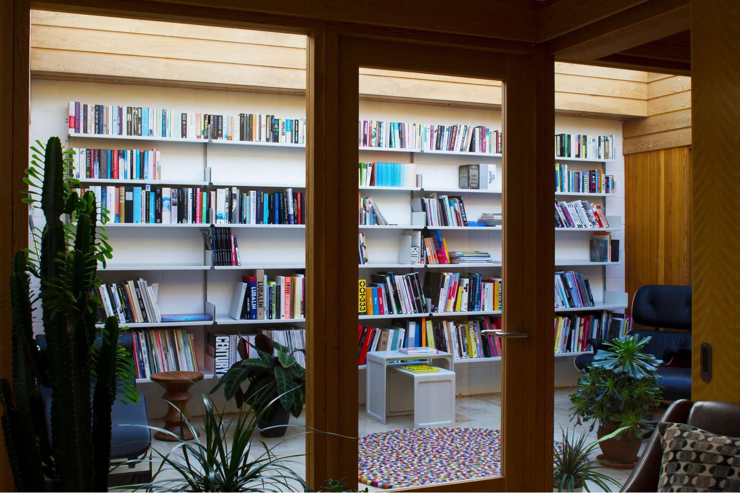
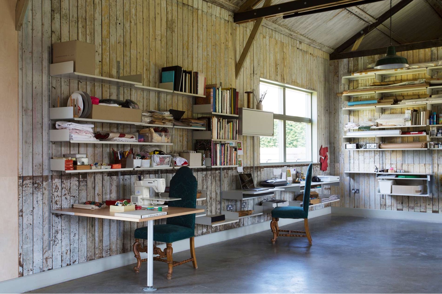
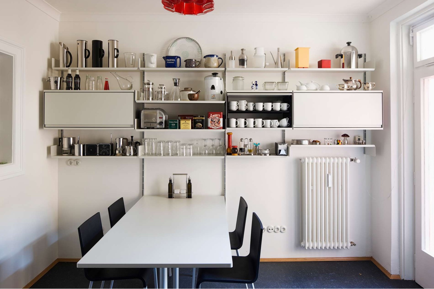
Images © 2016 Vitsœ.
A dining chair for keeps
A multimillion seller (with more than seven million chairs sold globally and counting), Arne Jacobson’s 1955 Series 7™ chair for Fritz Hansen is perfect for smart or casual dining.
RELATED: Iconic Chairs That Add Sculptural Style And Timeless Elegance To Your Interior
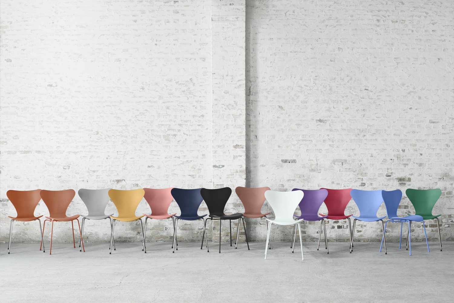
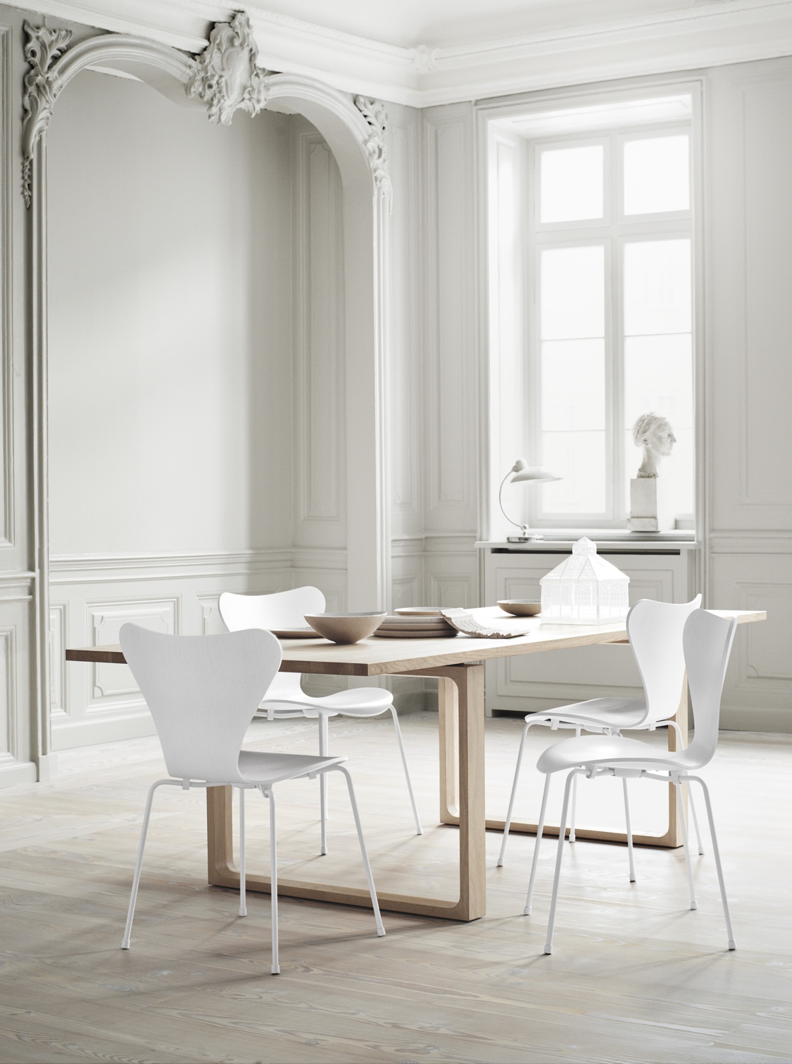
Images © Republic of Fritz Hansen 2016.
A lounge chair for keeps
Designed by Charles and Ray Eames and released in 1956, the Lounge Chair and Ottoman are, like the Eameses, a perfectly paired icon of American design. Having its origins in the Eameses exploration of moulding plywood, the Lounge Chair resembles a well-worn leather baseman’s mitt and is a good catch by anyone’s standards.
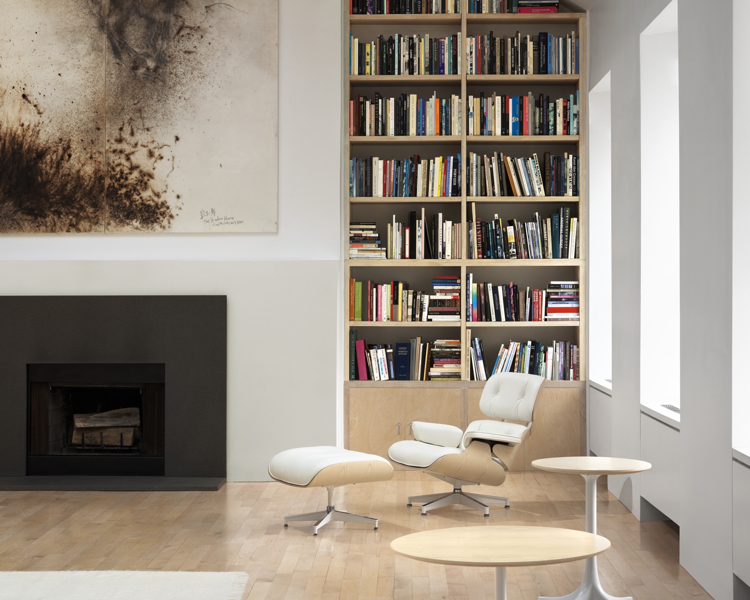
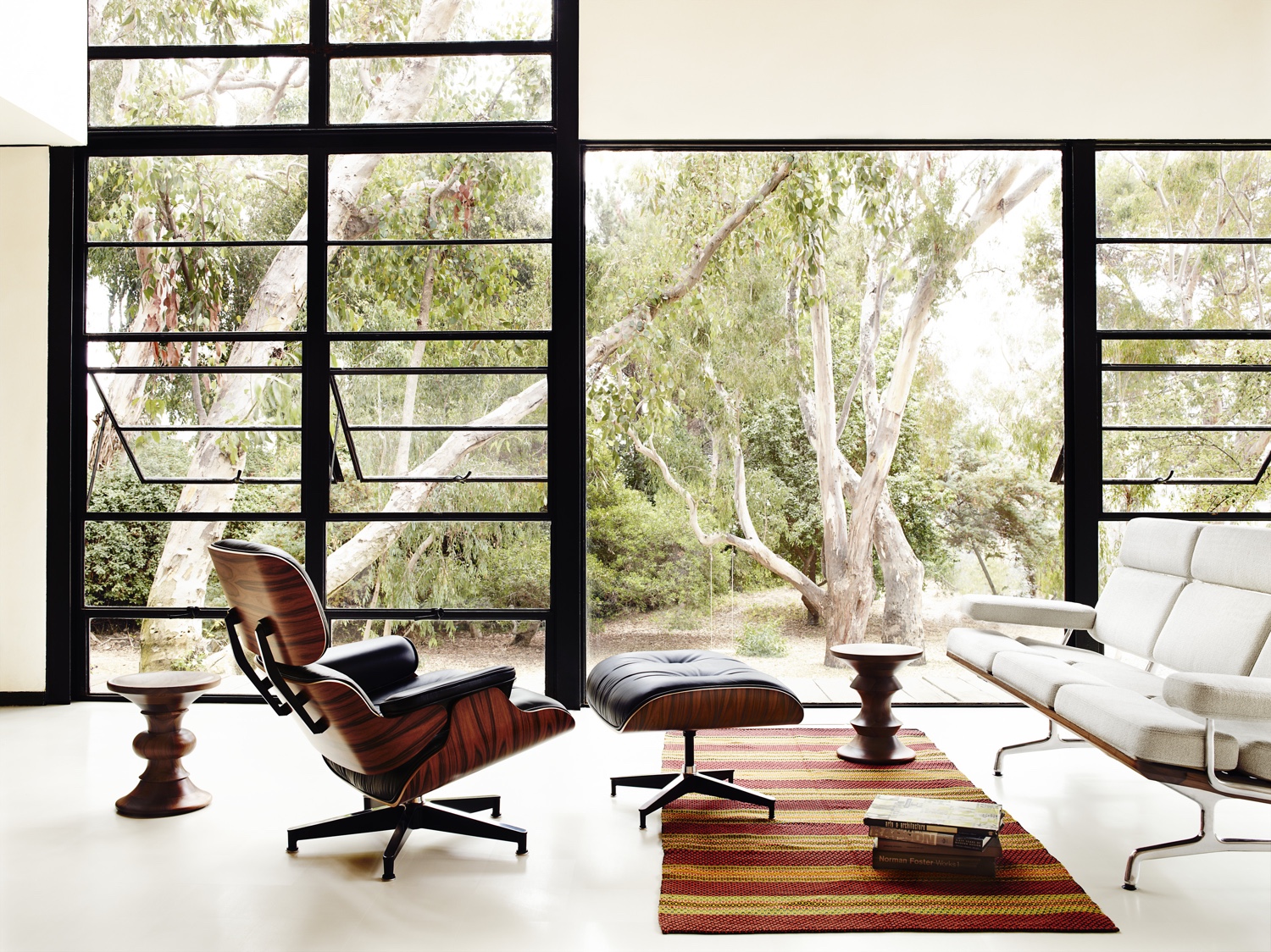
Images © 2016 Herman Miller, Inc.
A coffee table for keeps
Designed by Hans J. Wegner in 1970, the CH417 tray table was recently reintroduced by Carl Hansen & Søn. The tray table comprises a reversible round tray (in white/black and light/smoked oak variations) and a collapsible stainless steel base. Wegner incorporated a handle into the tray’s design, thus aiding functionality and adding a smart aesthetic detail.
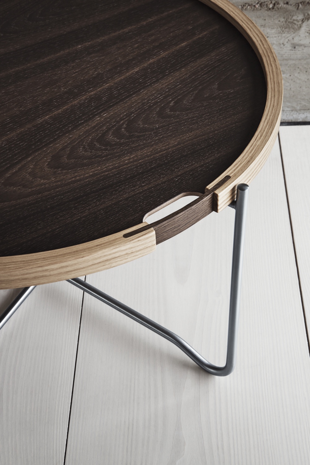
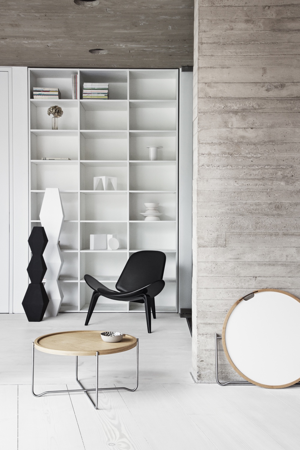
Images via Carl Hansen & Søn.
A bin for keeps
The Vipp bin that we see today is descended from the utilitarian waste bin designed and made in 1939 by company founder Holger Nielsen (for his wife Marie’s hair salon). The Vipp bin is a quintessentially classic industrial design and tool.
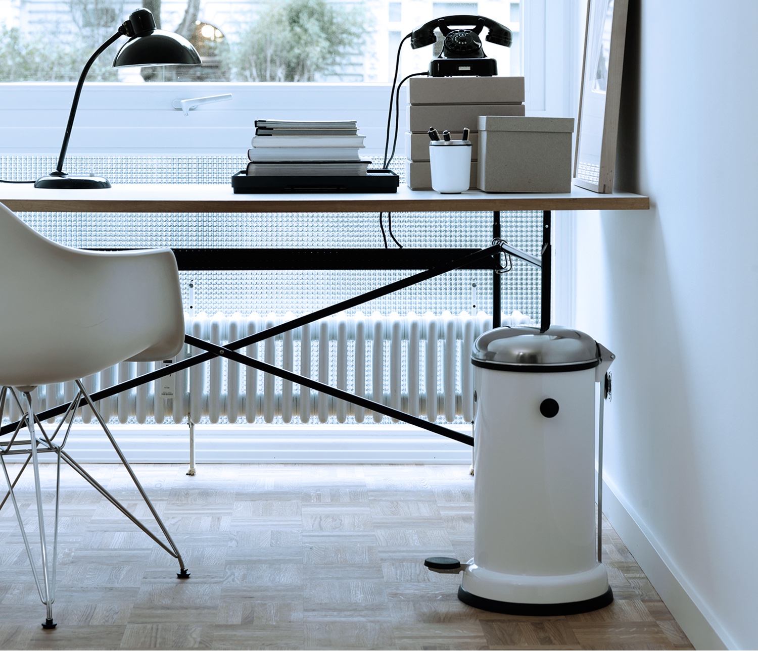
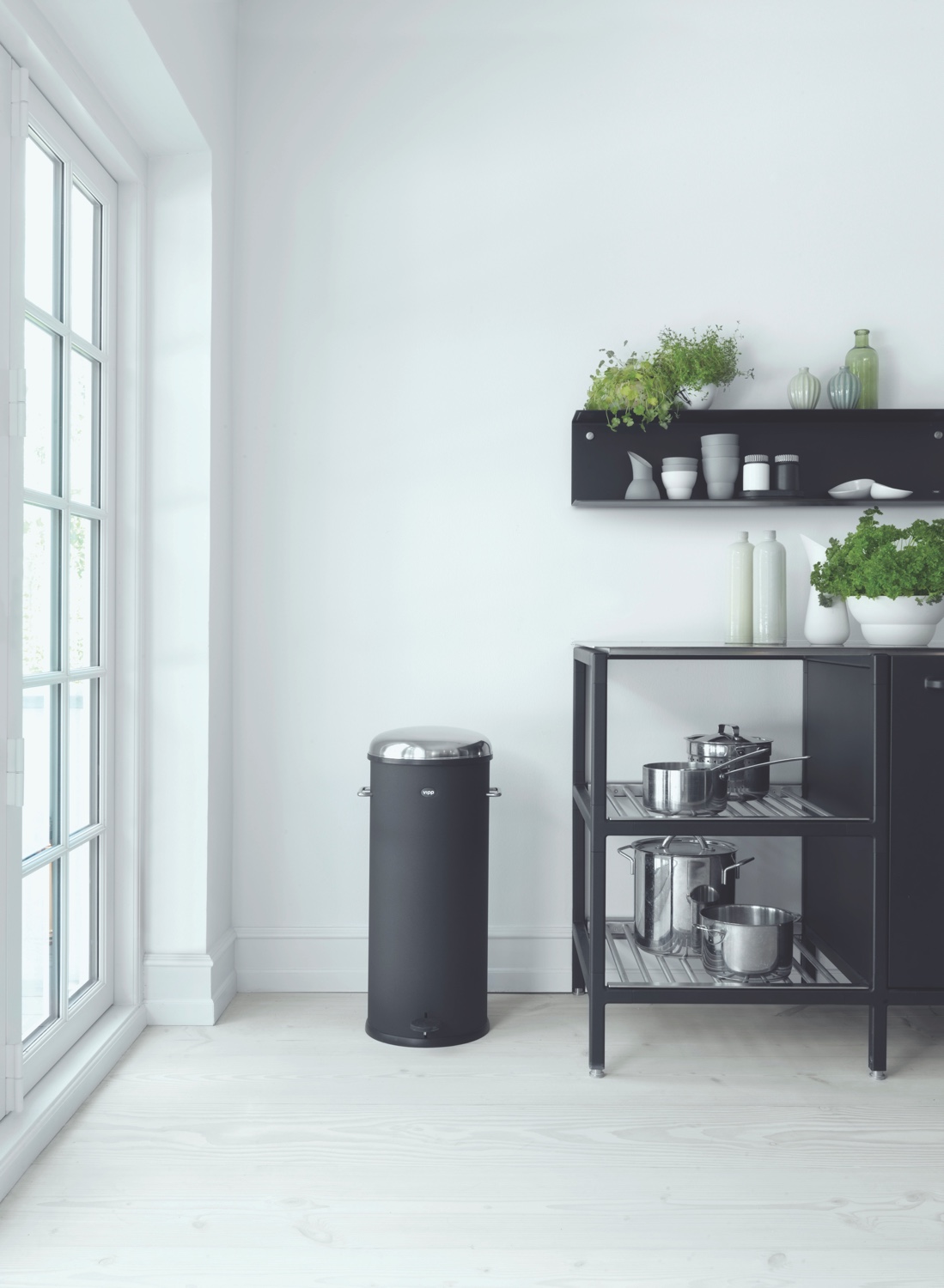
Images © 2016 Vipp.
A toy for keeps
In all likelihood, the cheeky and charming wooden monkey is Kay Bojesen’s most famous wood toy (he is certainly this writer’s favourite). With its sense of theatricality, knowing smile and ability to strike numerous poses, the playful monkey is a hit with both adults and children. A complex design, the wooden monkey is made up of thirty-two parts from teak and limba hardwoods. The monkey is crafted in three sizes for Rosendahl Design Group by Brdr. Krüger at its woodshop in Denmark.
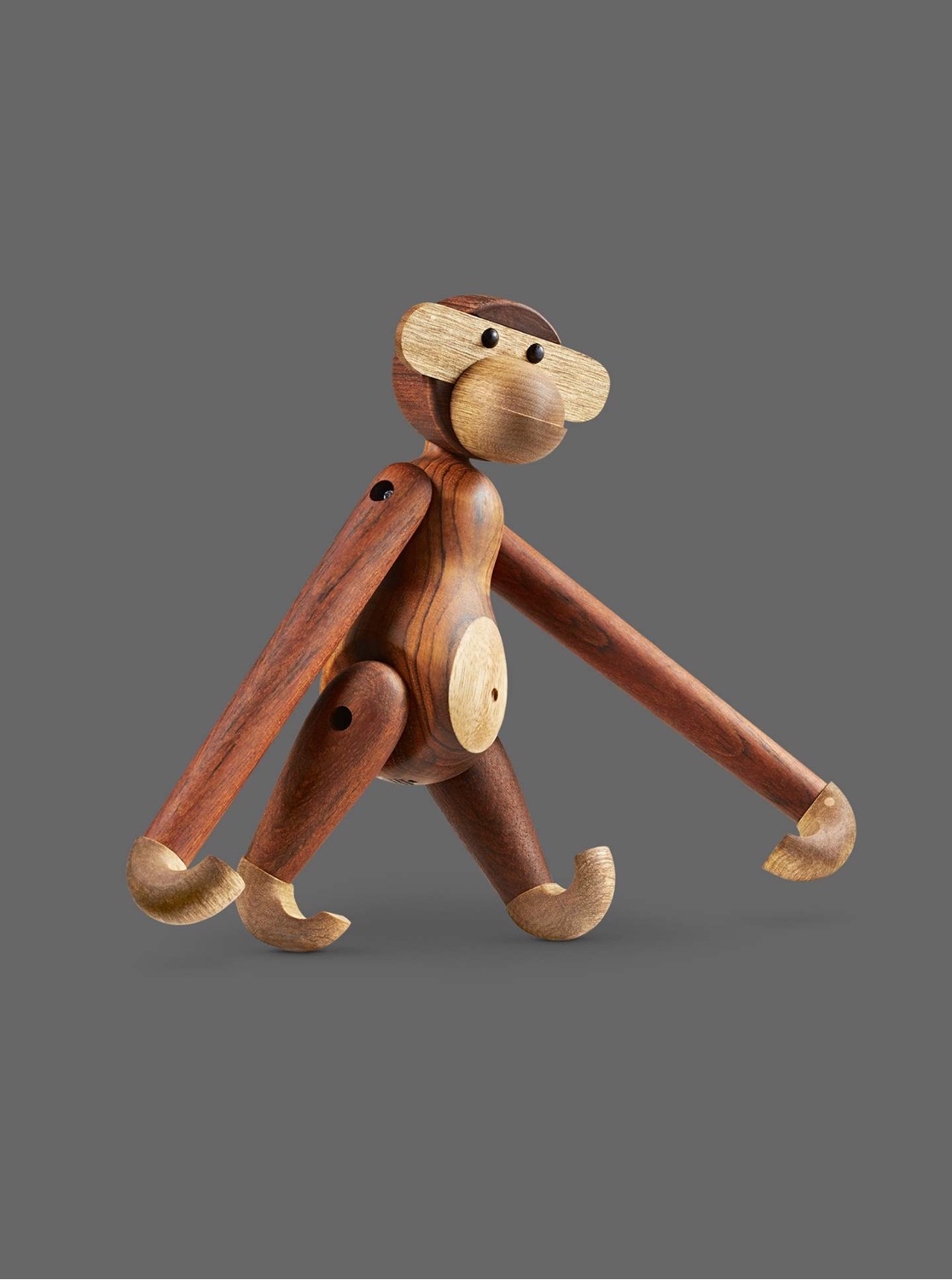
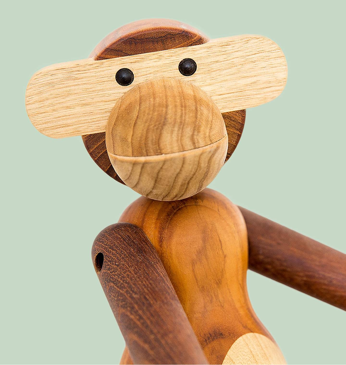
Images via Brdr. Krüger.
RELATED: Kay Bojesen: Smiling on Danish Design
A clock for keeps
The FJ Clock was designed by Finn Juhl in 1950 for the interior of the UN Trusteeship Council Chamber (also affectionately known as the Finn Juhl Chamber). The clock, made using teak wood and a numberless aluminum dial, is an expression of Juhl’s aptitude for designing with a minimal aesthetic. Today, the FJ Clock is crafted by ARCHITECTMADE.
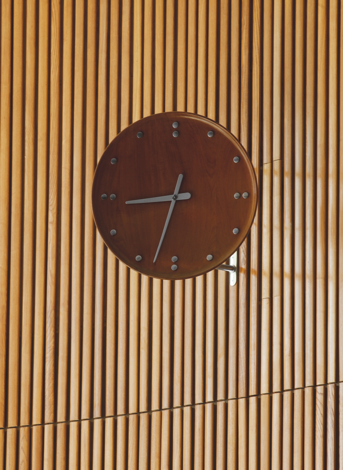
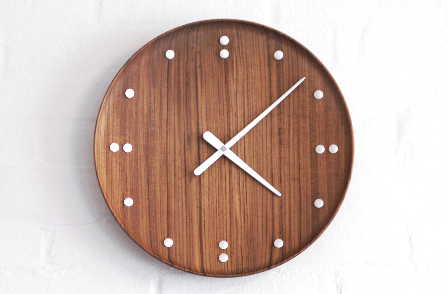
Images via ARCHITECTMADE.
A mug for keeps
Kaj Franck designed his Teema tableware series for Iittala from 1948-1952. The Teema mug is a key part of the series, remaining as pertinent today as when it was first introduced. Kaj Franck’s minimal aesthetic condensed his objects to their most basic form. Ergo, the Teema mug is both utilitarian and smart.

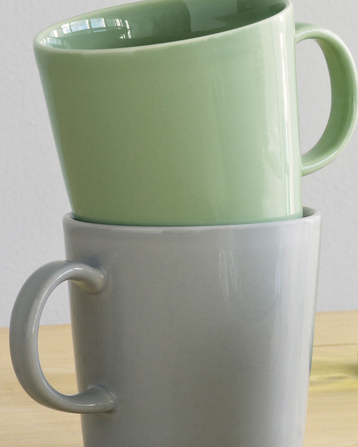
Images © Fiskars Finland.
A lamp for keeps
Kenneth Grange, the British industrial product designer, designed the notable Type 75™ for Anglepoise®️ in 2004. With its modern edge, handsome aspect and flowing form, the Type75™ is often the light of choice for designers and architects.
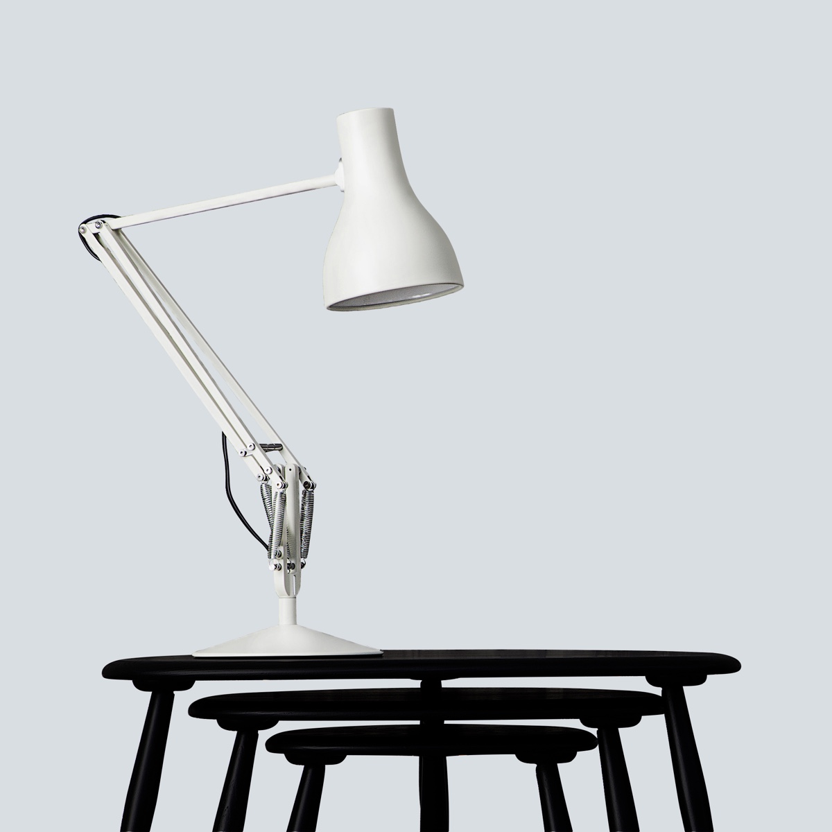
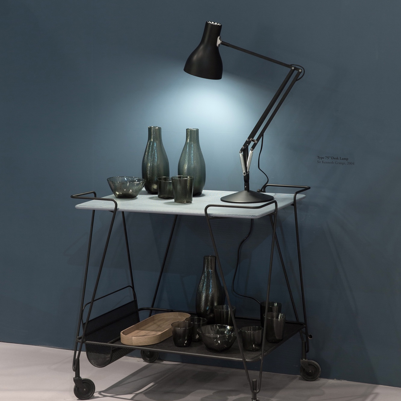
Images © 2016 Anglepoise.
A rug for keeps
The Mélange collection was created by Spanish designer Sybilla for nanimarquina. Mélange is a series of geometrically patterned rugs, offering an original perspective on the customary flat-woven kilim. Crafted in Pakistan, the kilims are handwoven using Afghan wool and dyed by hand.
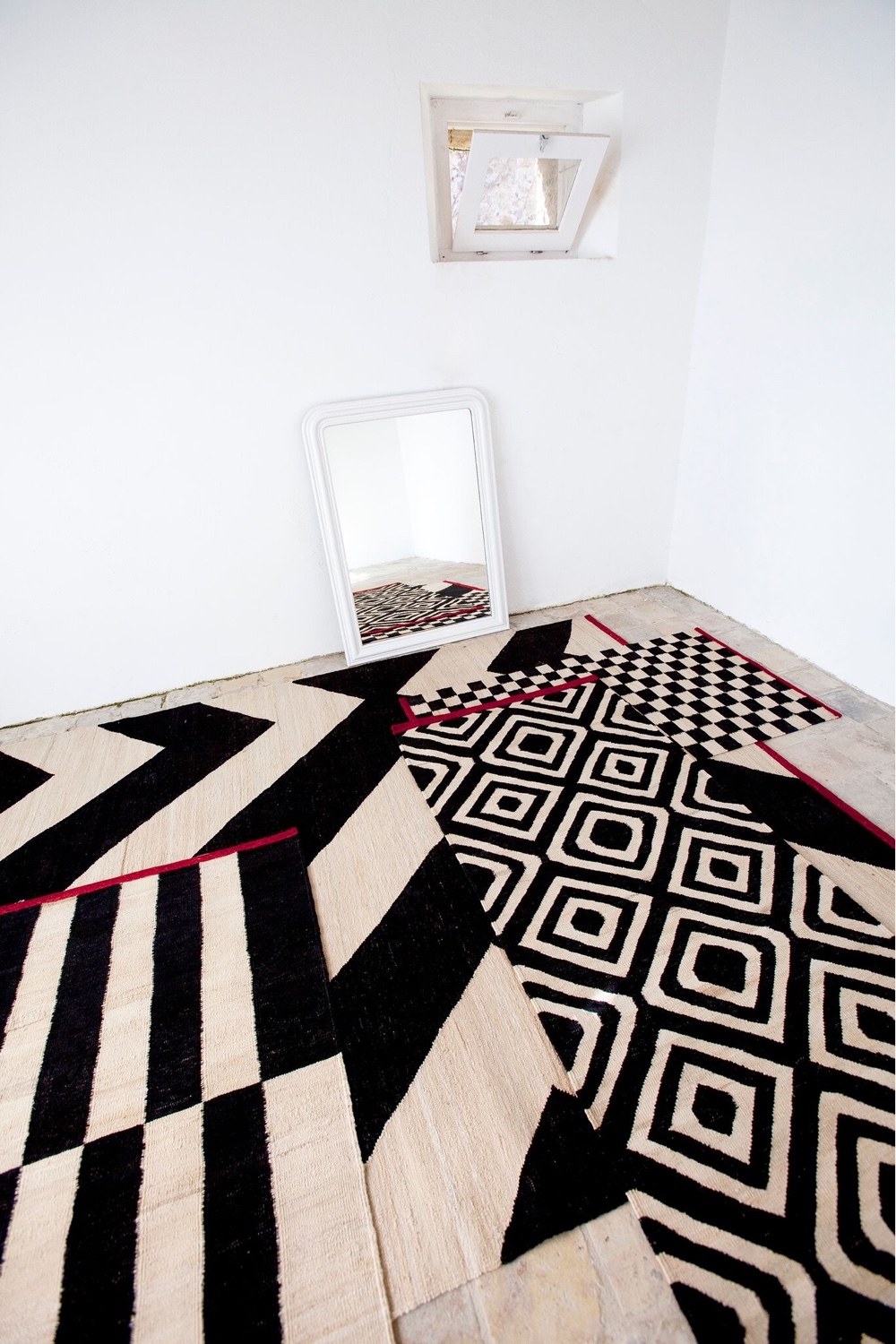
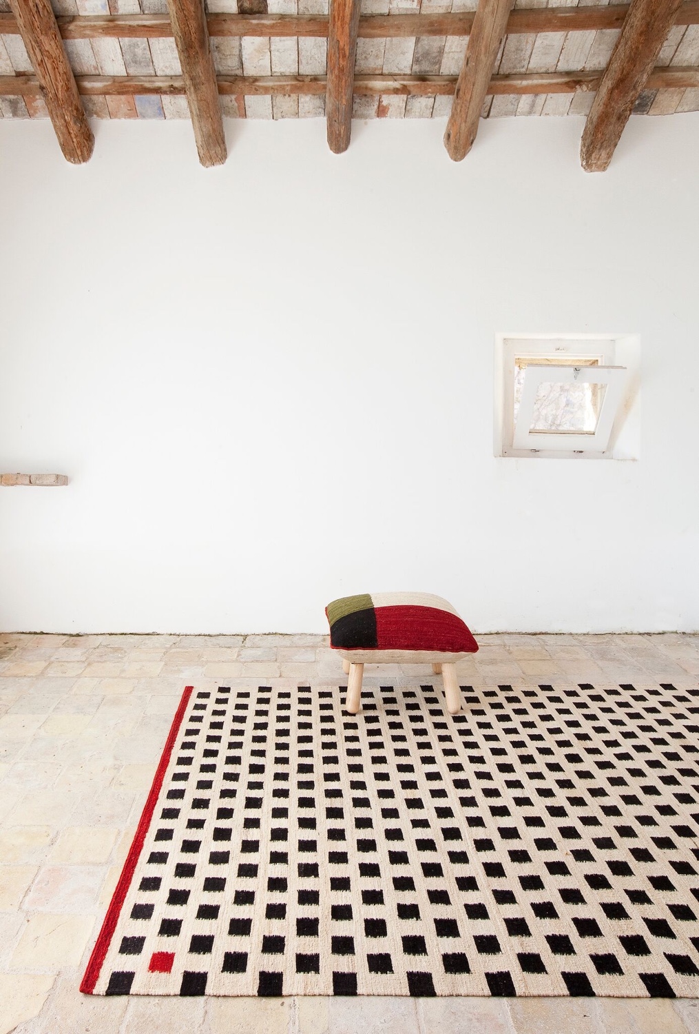
Images © nanimarquina.
