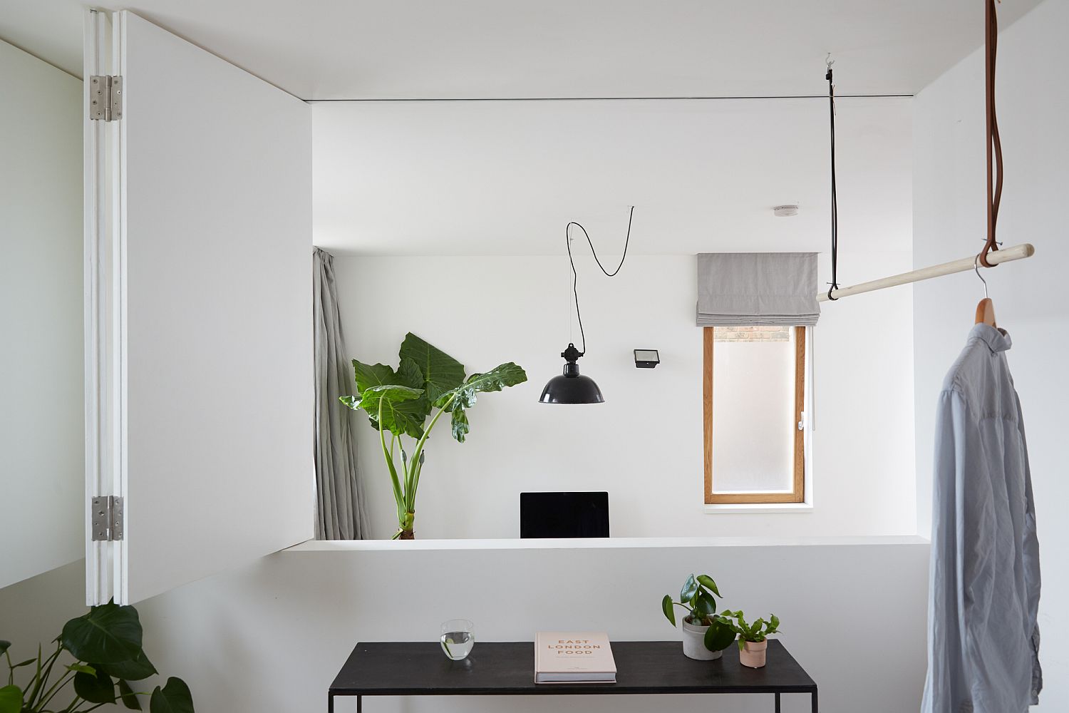
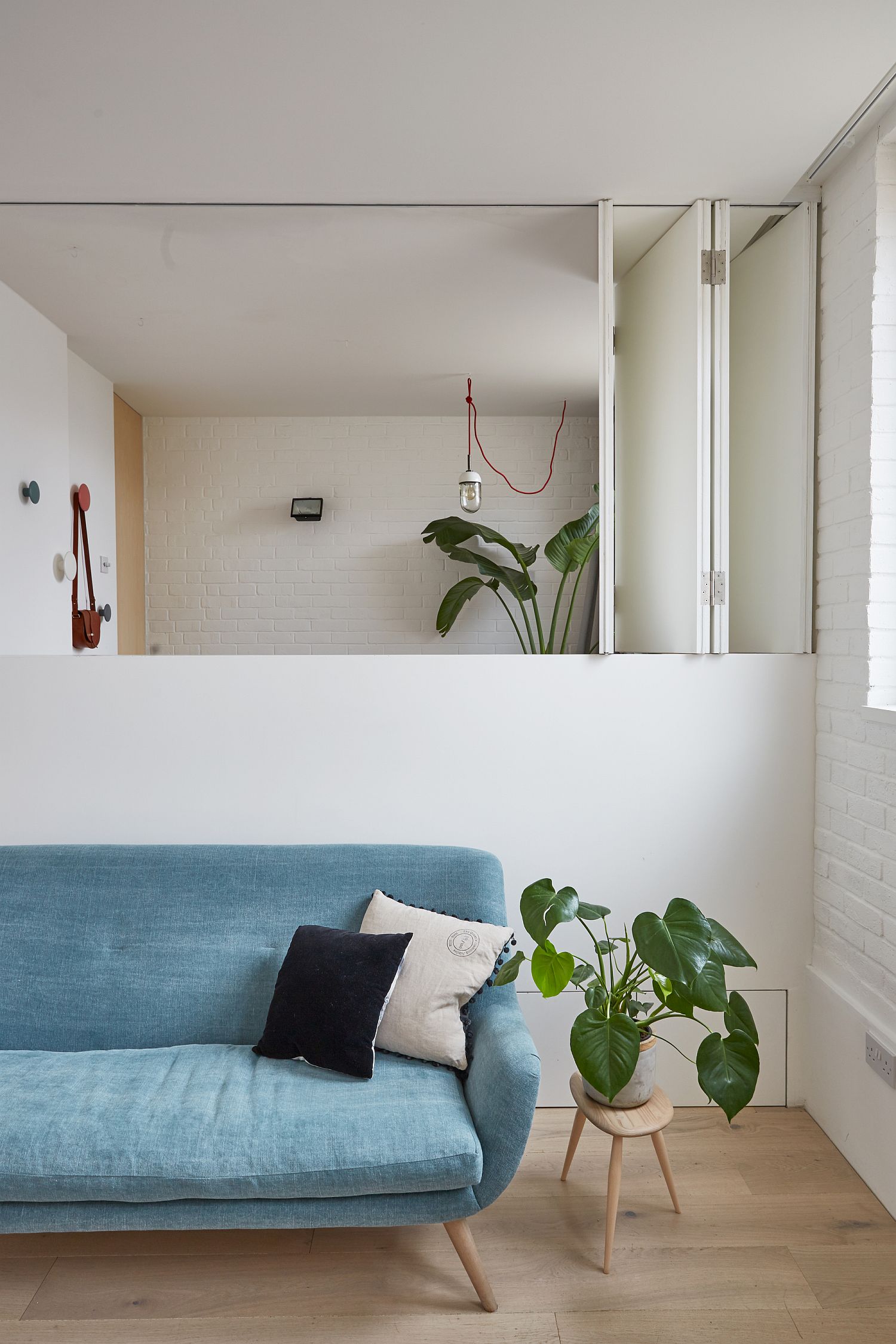
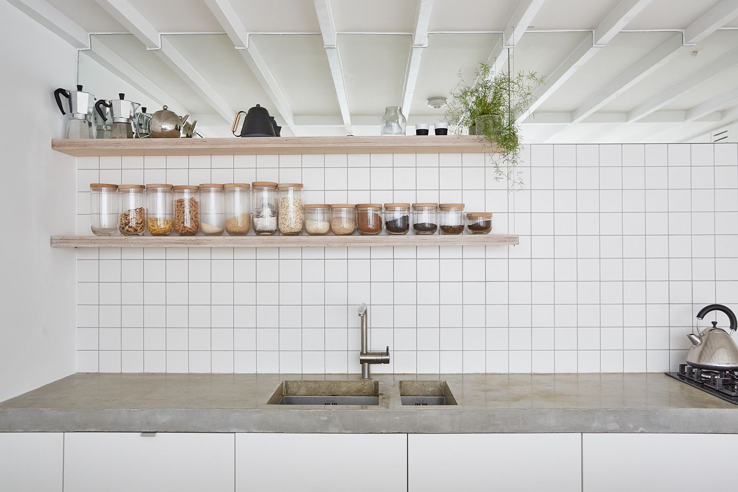
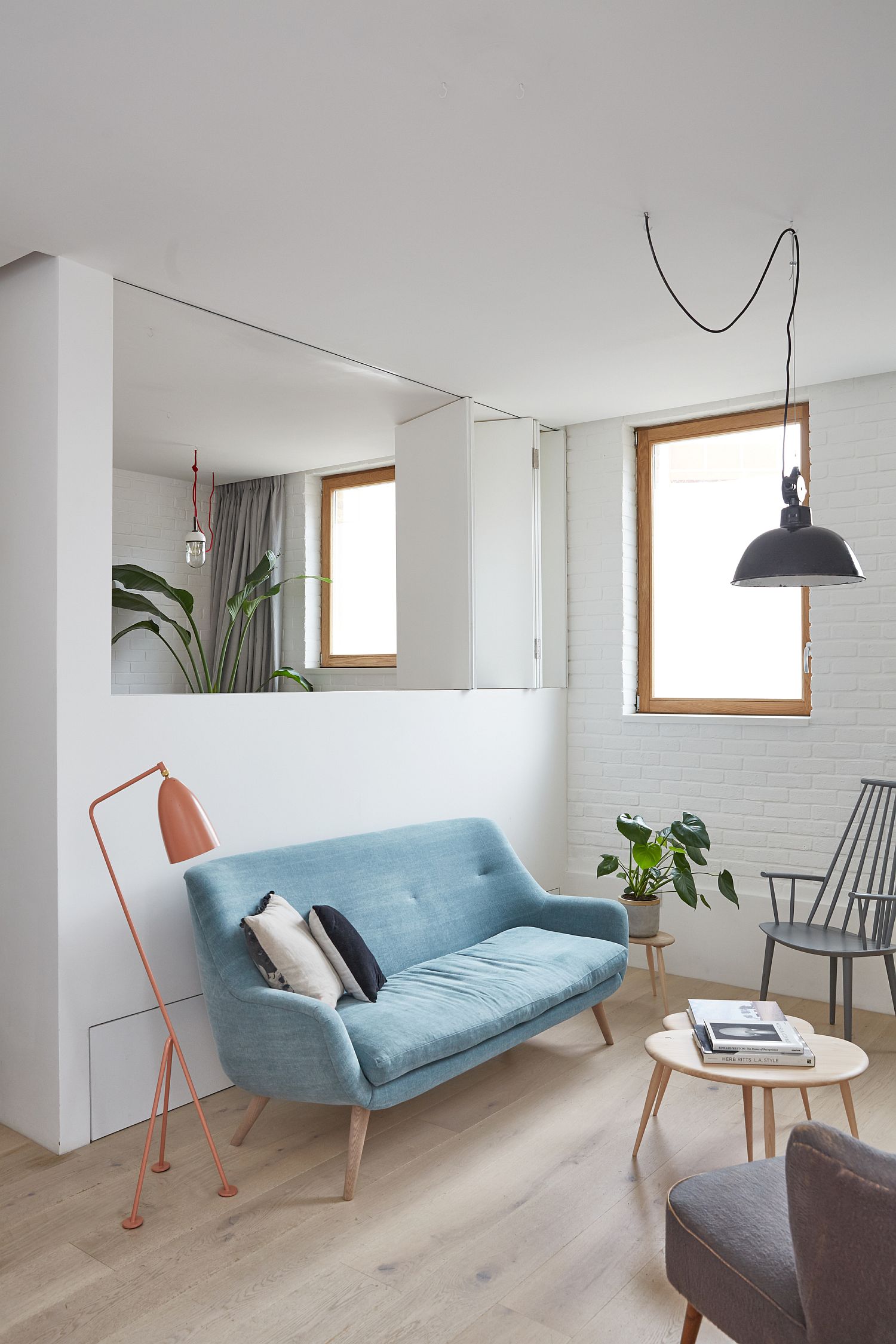
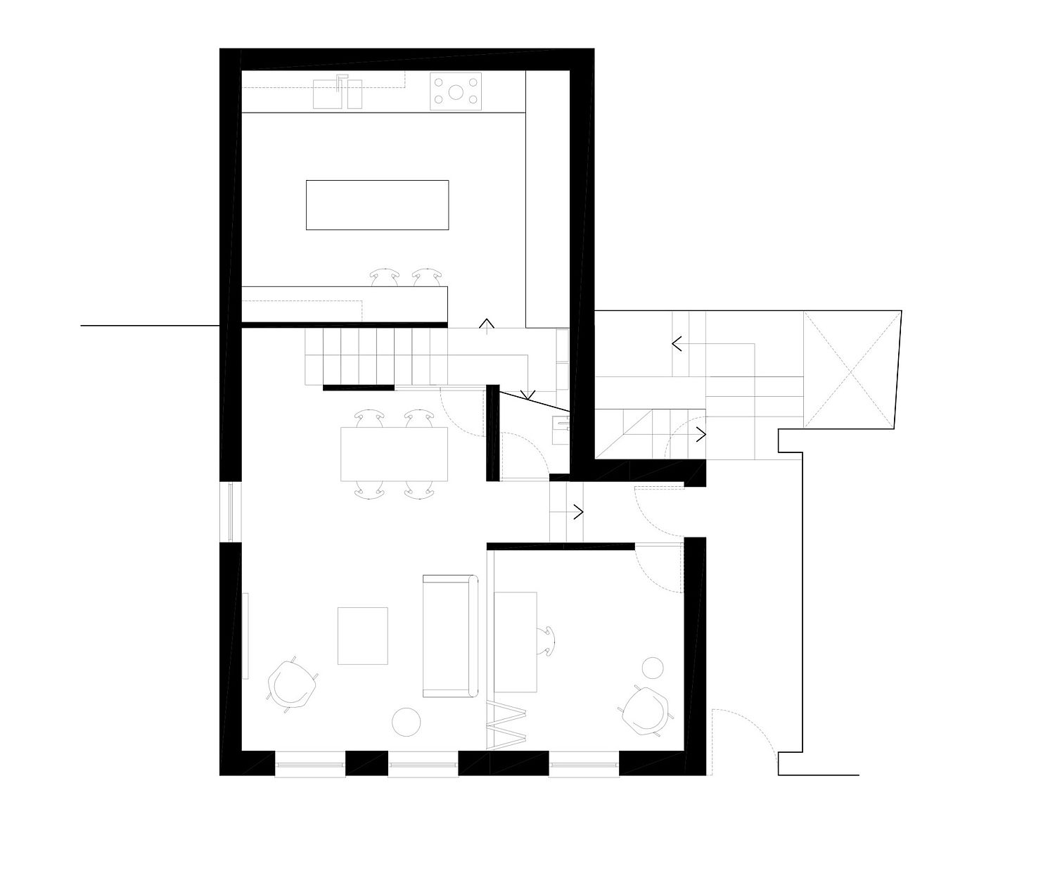
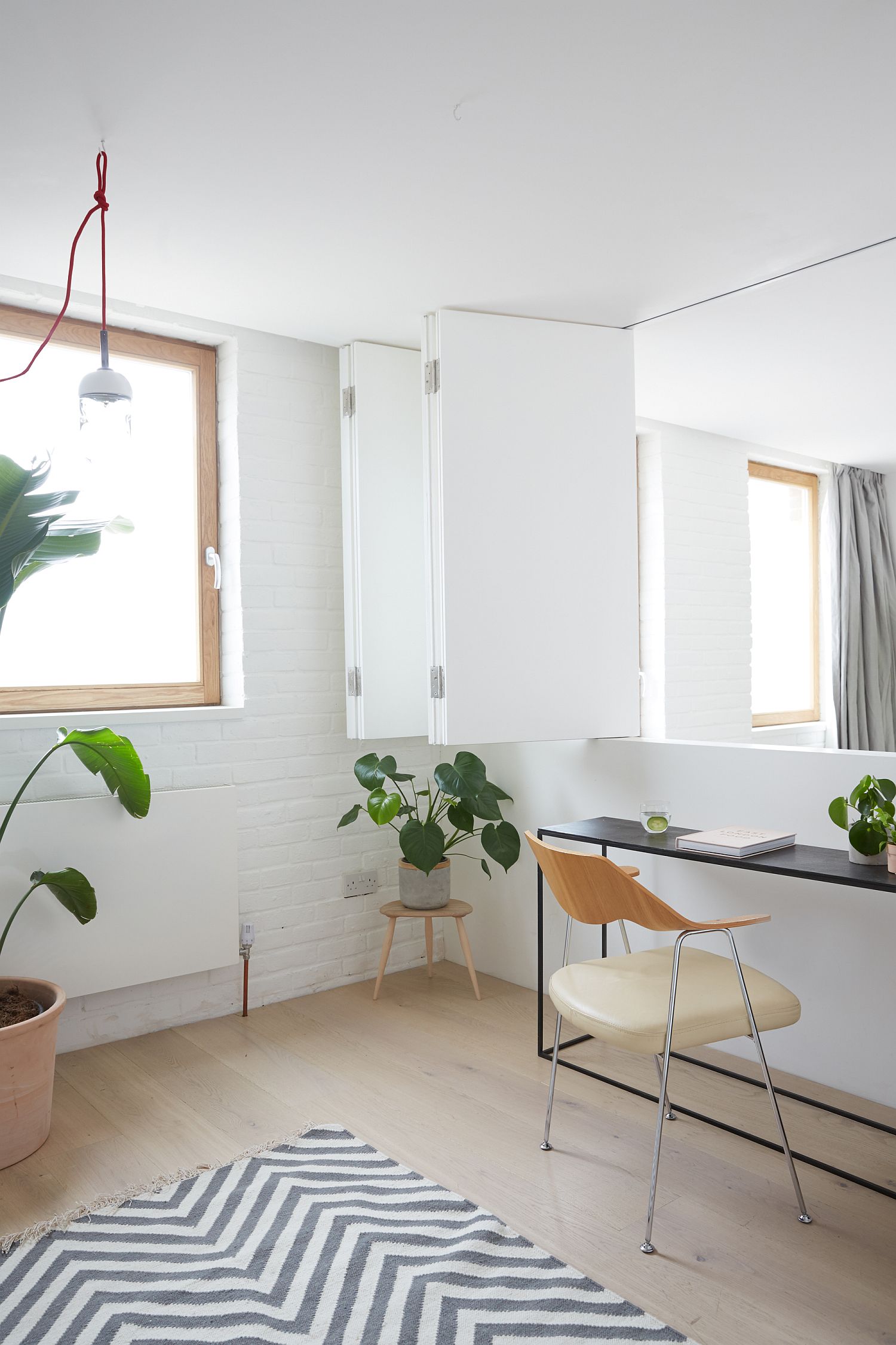
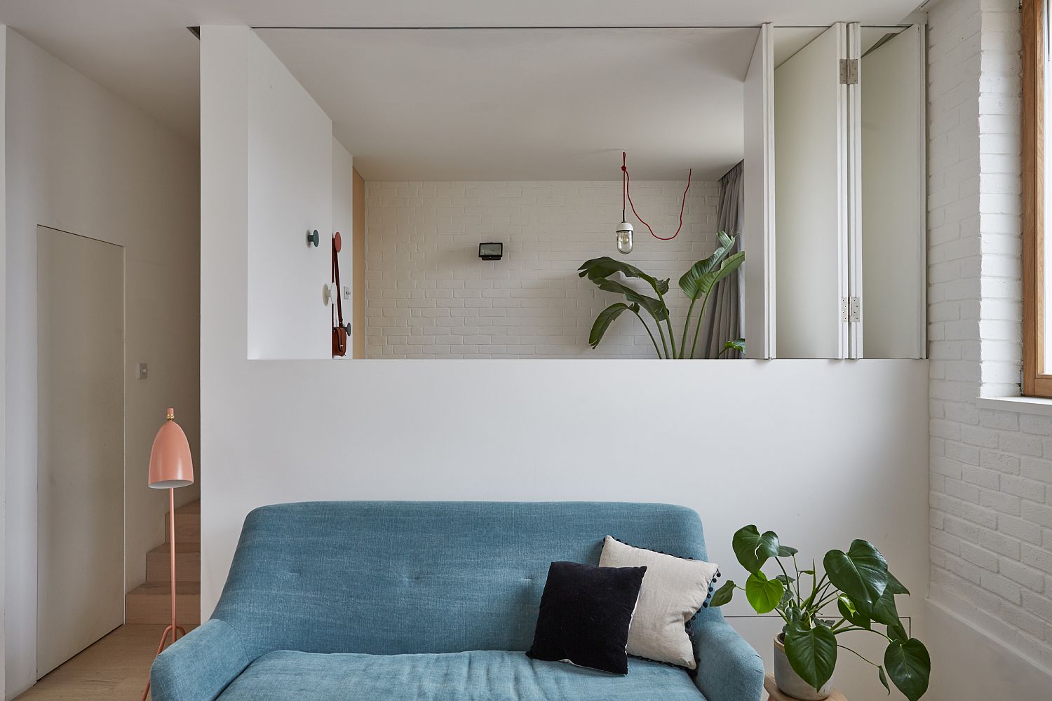
Finding a new lease of life along with an expression of breezy, modernity, the Hackney Mews House in London finds space and ventilation in a setting that was previously devoid of both. Revamped and reinvigorated by HUTCH design, the new interior of this once boring London residence has a floor plan that focuses on visual continuity, relaxing ambiance and plenty of natural light. It is easy to fall in love with the new lower level living area that has been separated into three split-level to demarcate space without the use of partitions. The living area and the home office make up one section of this floor while the kitchen overlooks these areas along with the dining room.
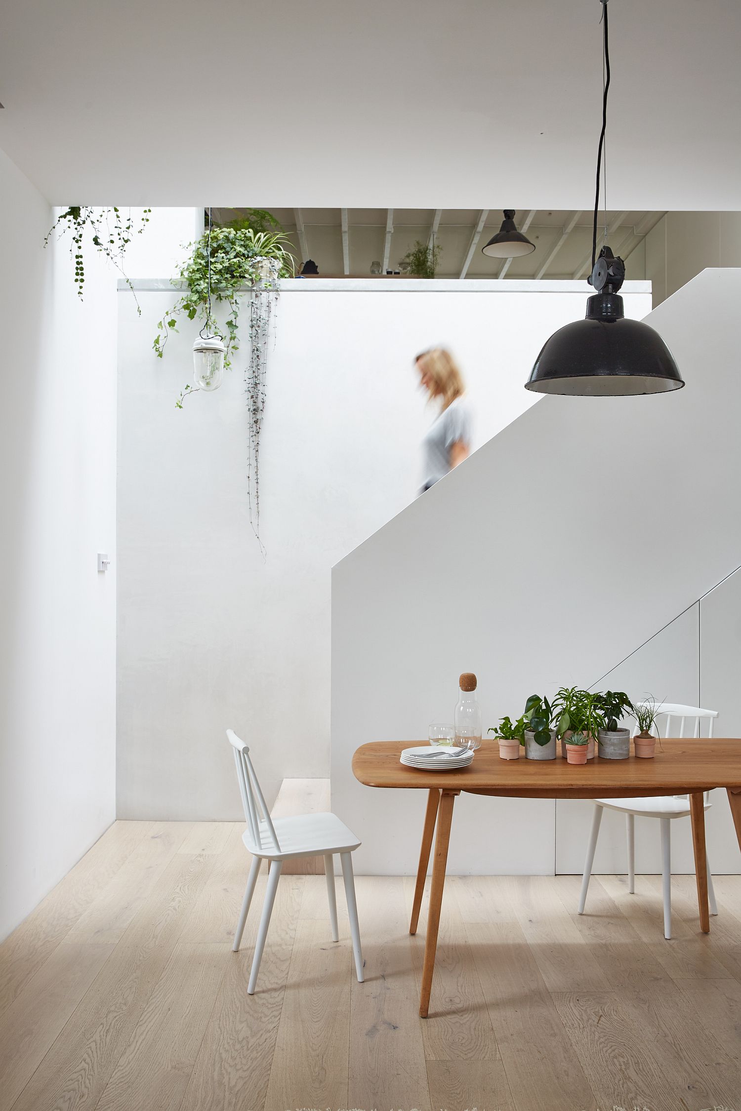
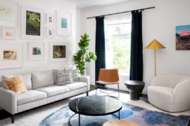
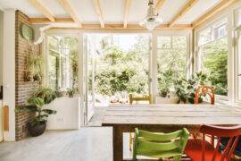
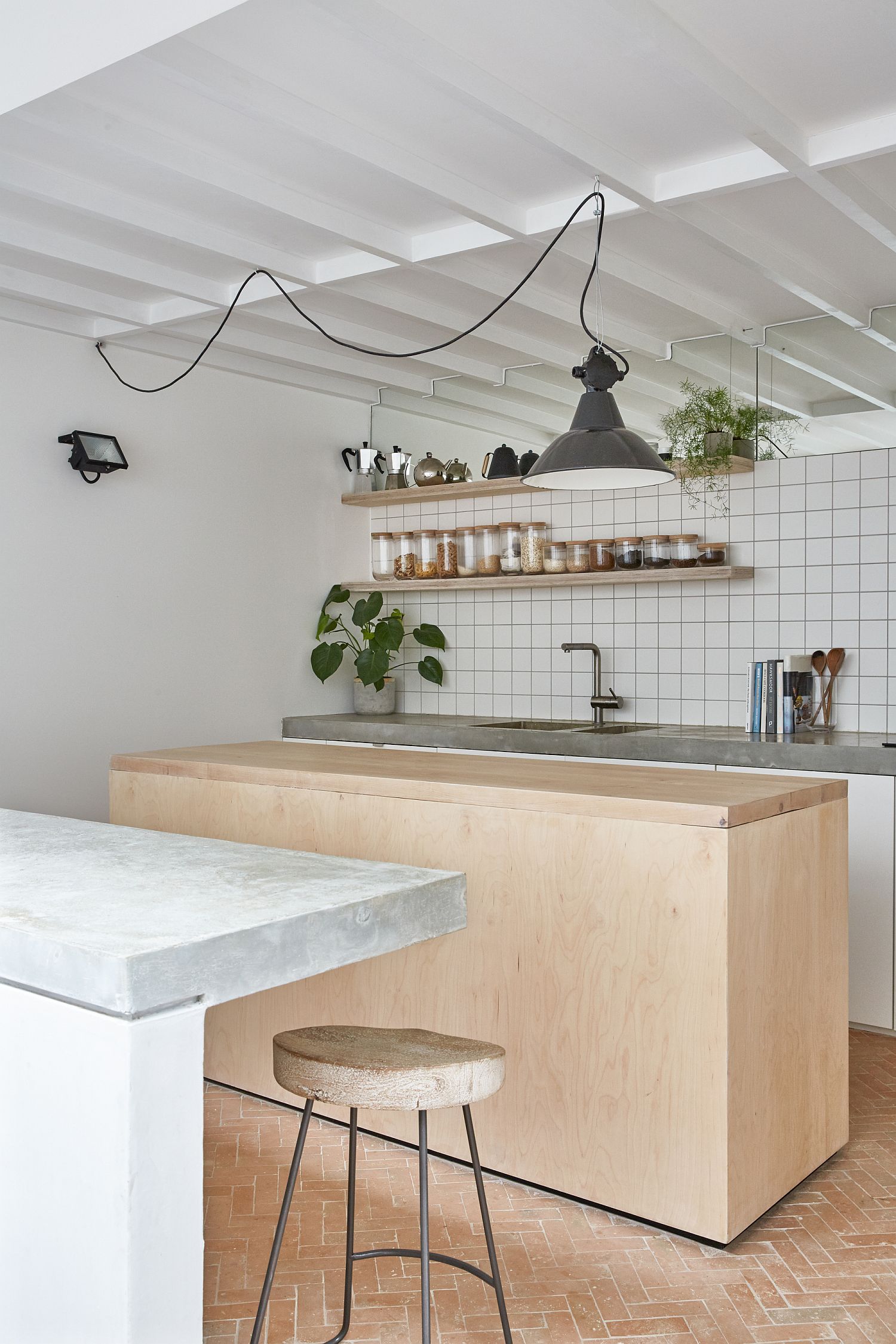
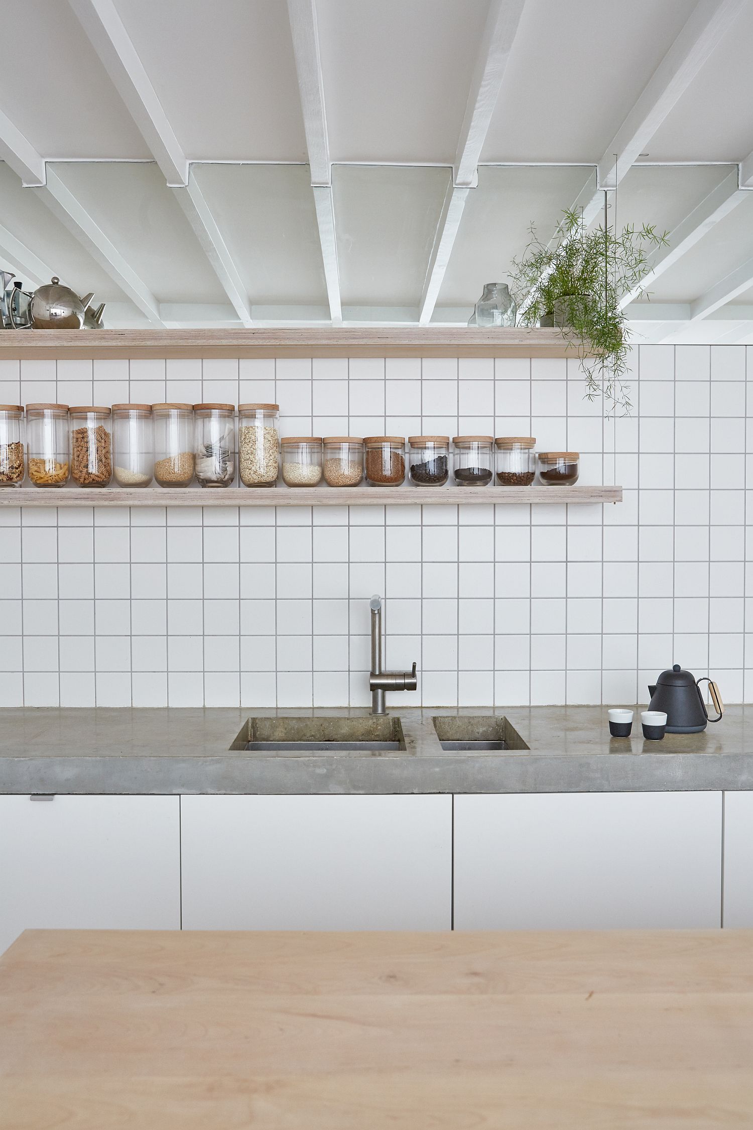
White is the color of choice for the backdrop inside the house with brick walls and modern finishes being painted white. Light-toned wooden surfaces add warmth without taking away from the sense of brightness while floating shelve sin the kitchen and living ensure space is not visually cluttered. Folding doors and windows provide further design flexibility with each room seeming like an extension of the one next to it. You never see any clack between the traditional and modern design aspects of the home with one complementing the other. [Photography: Helen Cathcart]
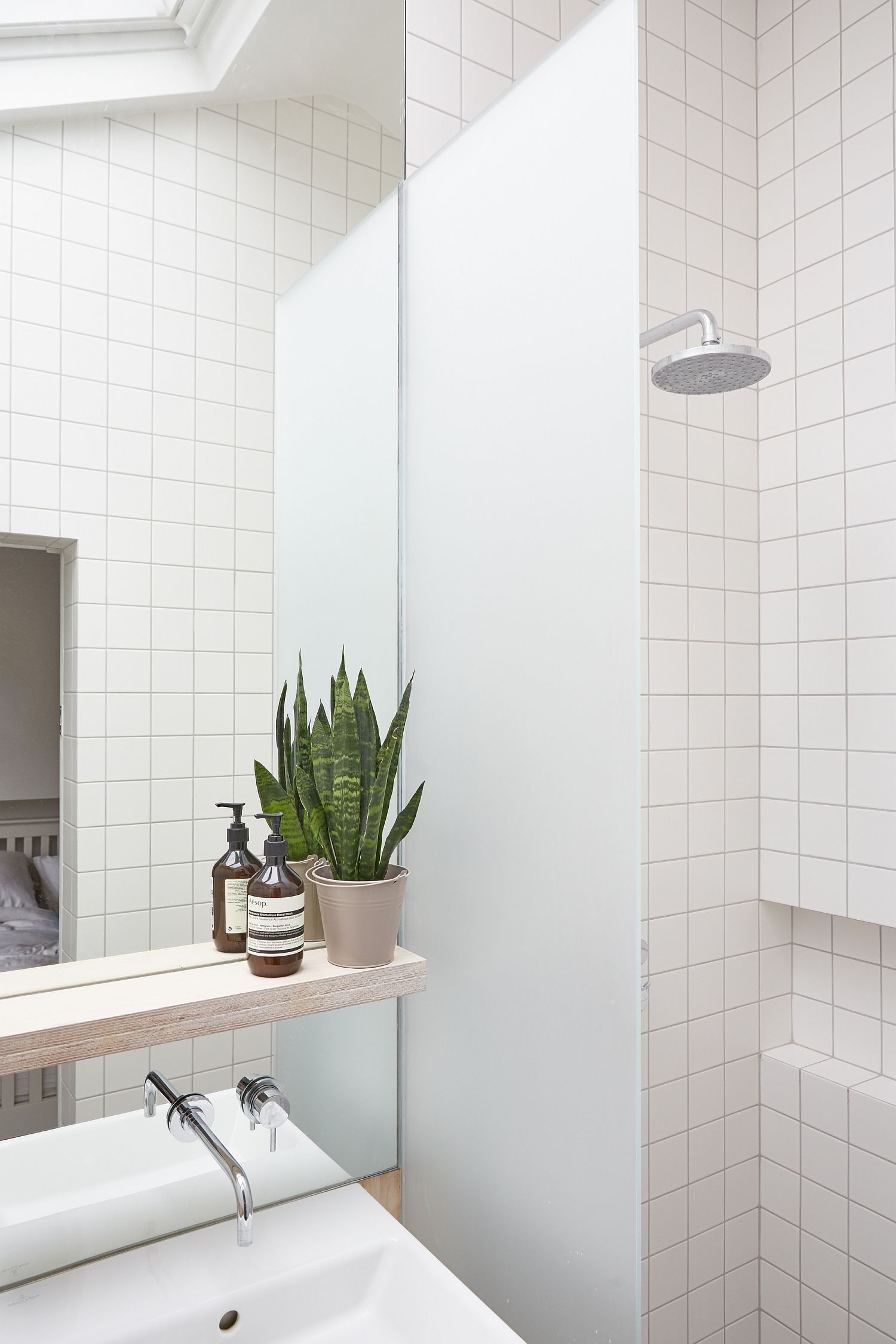
To create a calm, light interior we added larger timber windows and a full-width roof-light over the stair – bringing more natural light into the centre of the house and to the kitchen at the rear. In addition, storage, important to the family home, was maximised and concealed throughout.
