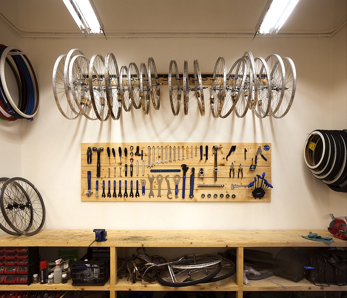
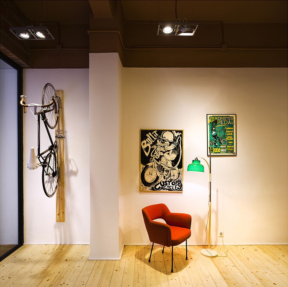
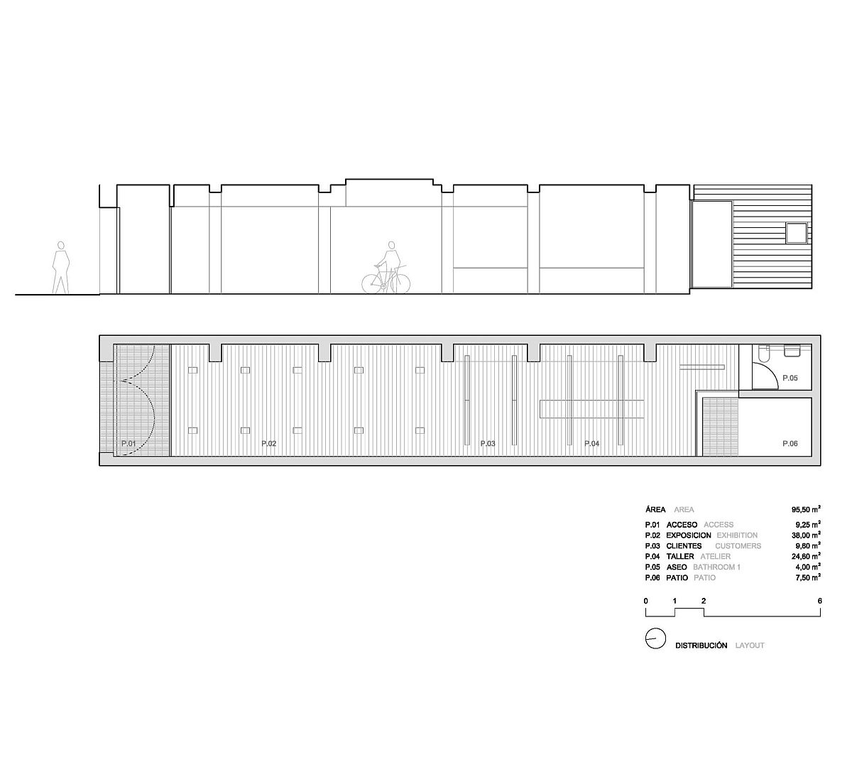
It is creative home renovations, budget makeovers and adaptive reuse of old, non-residential buildings that has given wings to a resurgent modern industrial style in the last few years. But smart revamps are not limited to homes alone and even commercial establishments can benefit from a dashing, yet sensible restoration. The Bullit Cyclery in Valencia, Spain found space inside a unit that was dark, constrained by numerous internal partitions and outdated in its appearance. Instead of just giving up on the interior, its owners turned to Hugo Mompó in an attempt to create a light-filled, modern and yet distinctly vernacular bike shop.
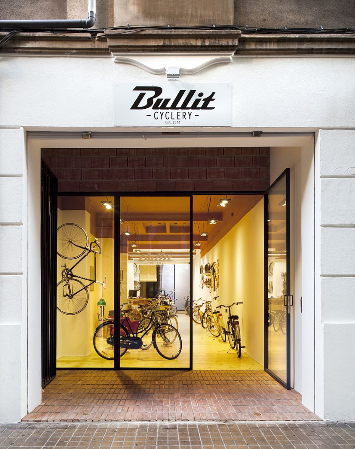
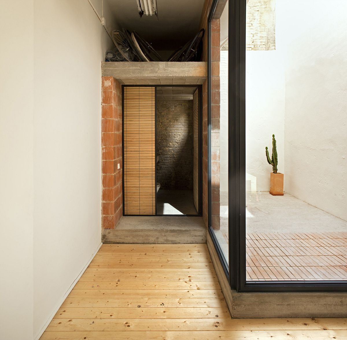
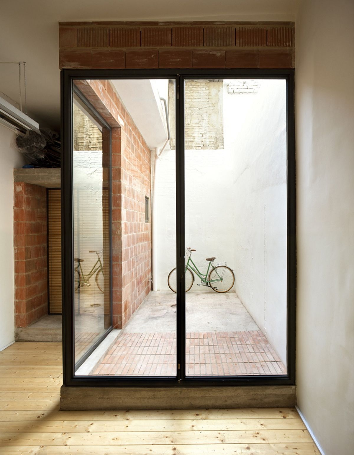
Instead of completely moving away from the original character of the unit, the new shop embraces its past with exposed brick sections, wooden flooring and a ceiling painted in warm, earthen hue that matches the color of the pavement outside the shop. A dark, metallic grill separates the shop from the street with glass doors welcoming you inside. To enhance the ‘coziness’ of the interior, wooden benches and furniture were used even as a flood of natural light streams through the small patio. A modest sitting space for customers and wall-mounted shelving and cabinets complete an exquisite transformation that puts a smile on your face!
RELATED: Shop Design: The Wonderful Sukha in Amsterdam
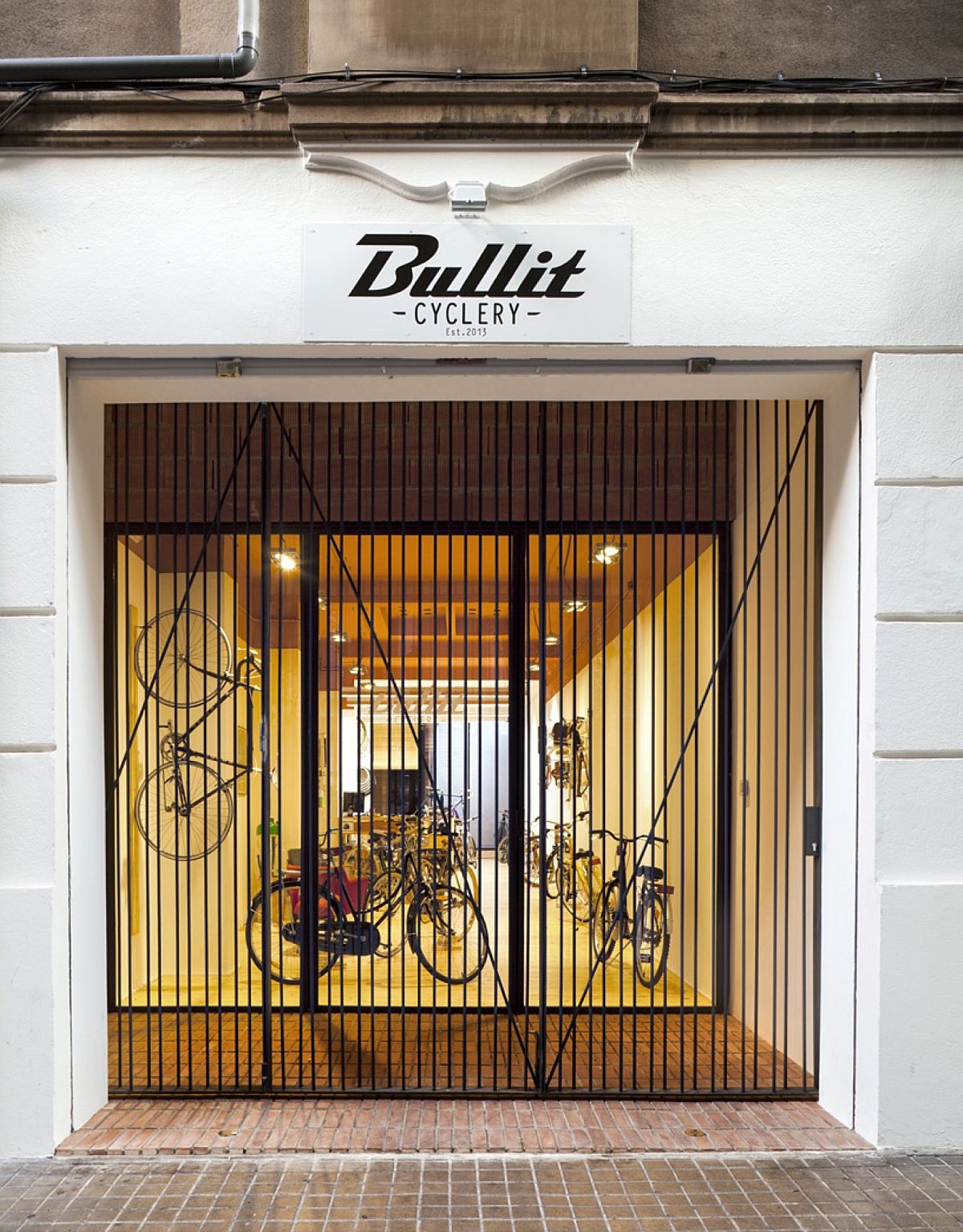
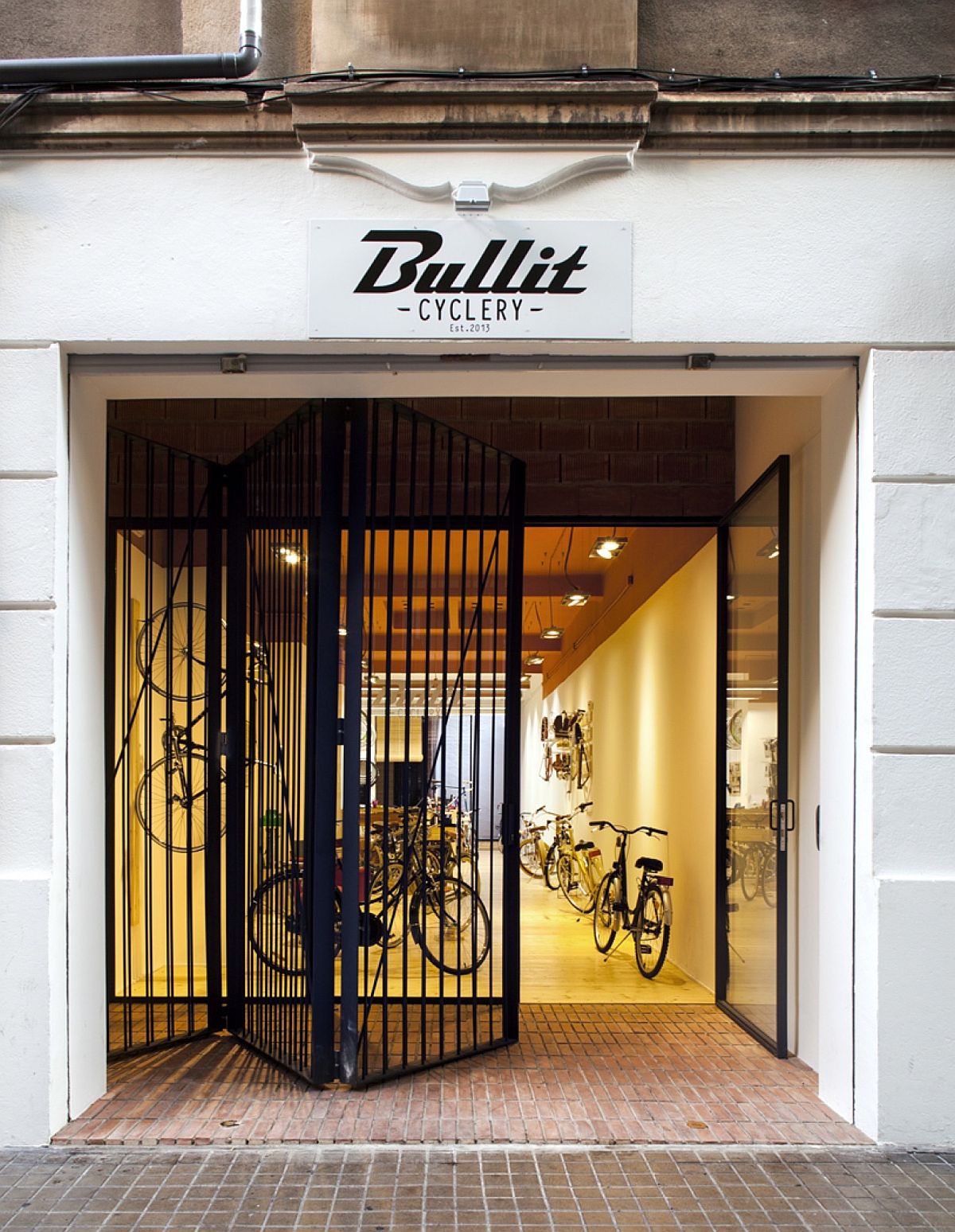
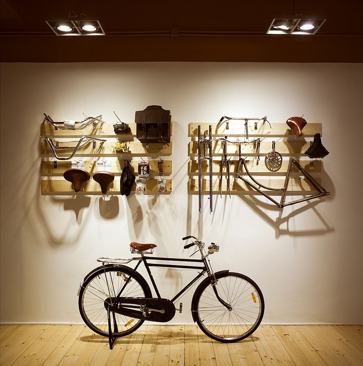
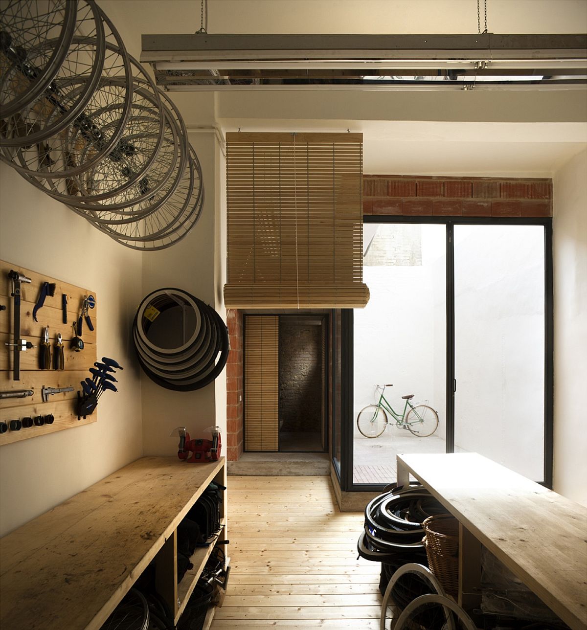
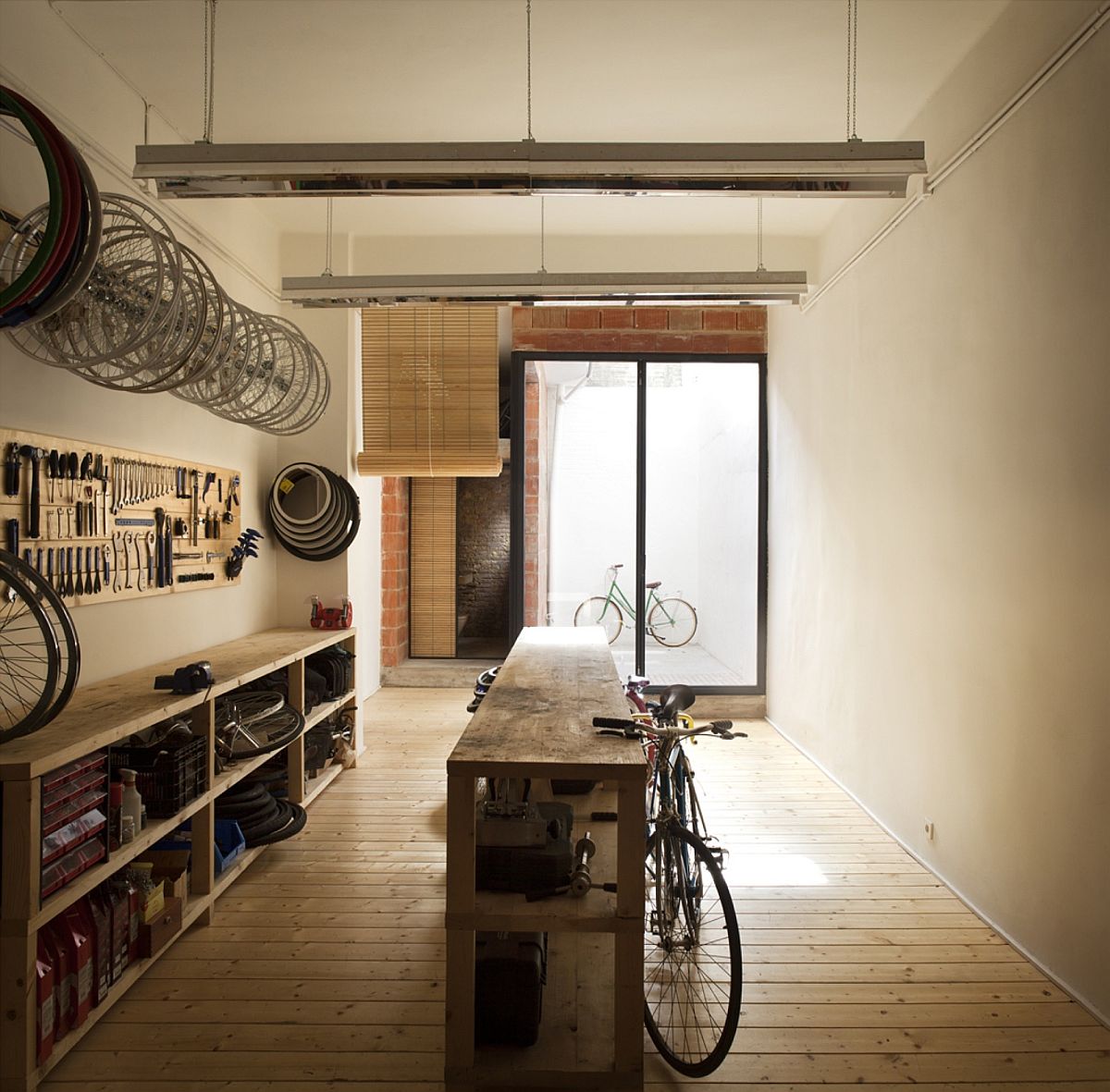
Removing the unnecessary internal partitions and clearing the false ceiling to create a sense of spaciousness was an essential part of the alteration indoors. Combining timeless, classic design traits with an air of modernity this bike shop in Valencia places emphasis on simplicity and functionality. [Photography: Mariela Apollonio]
RELATED: London’s Finest: High-End Revamp of 70s Townhouse Leaves You Enthralled
