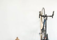
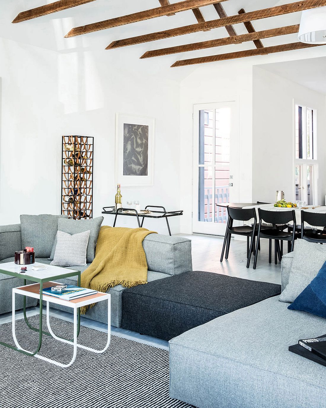
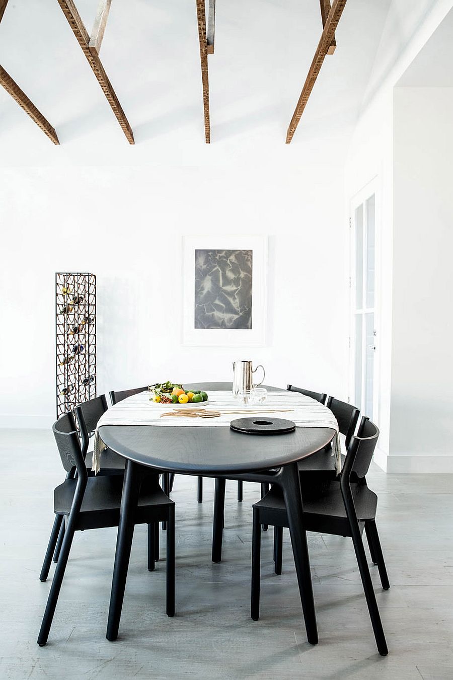
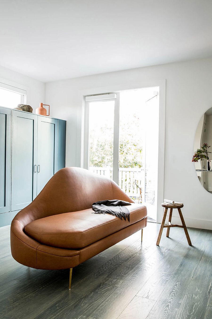
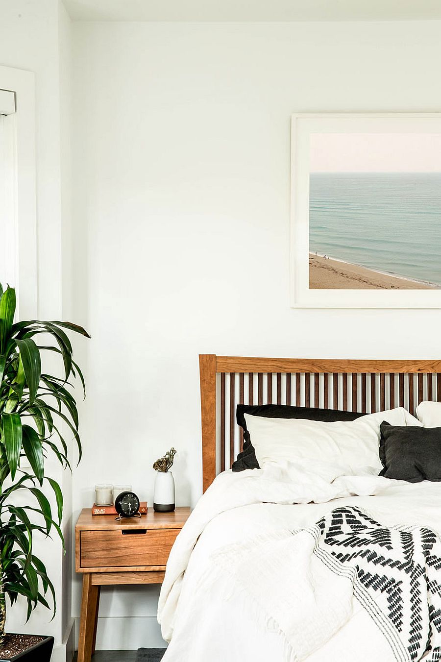
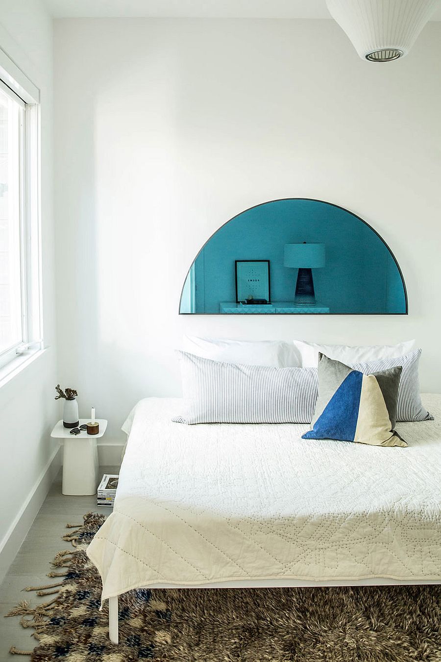
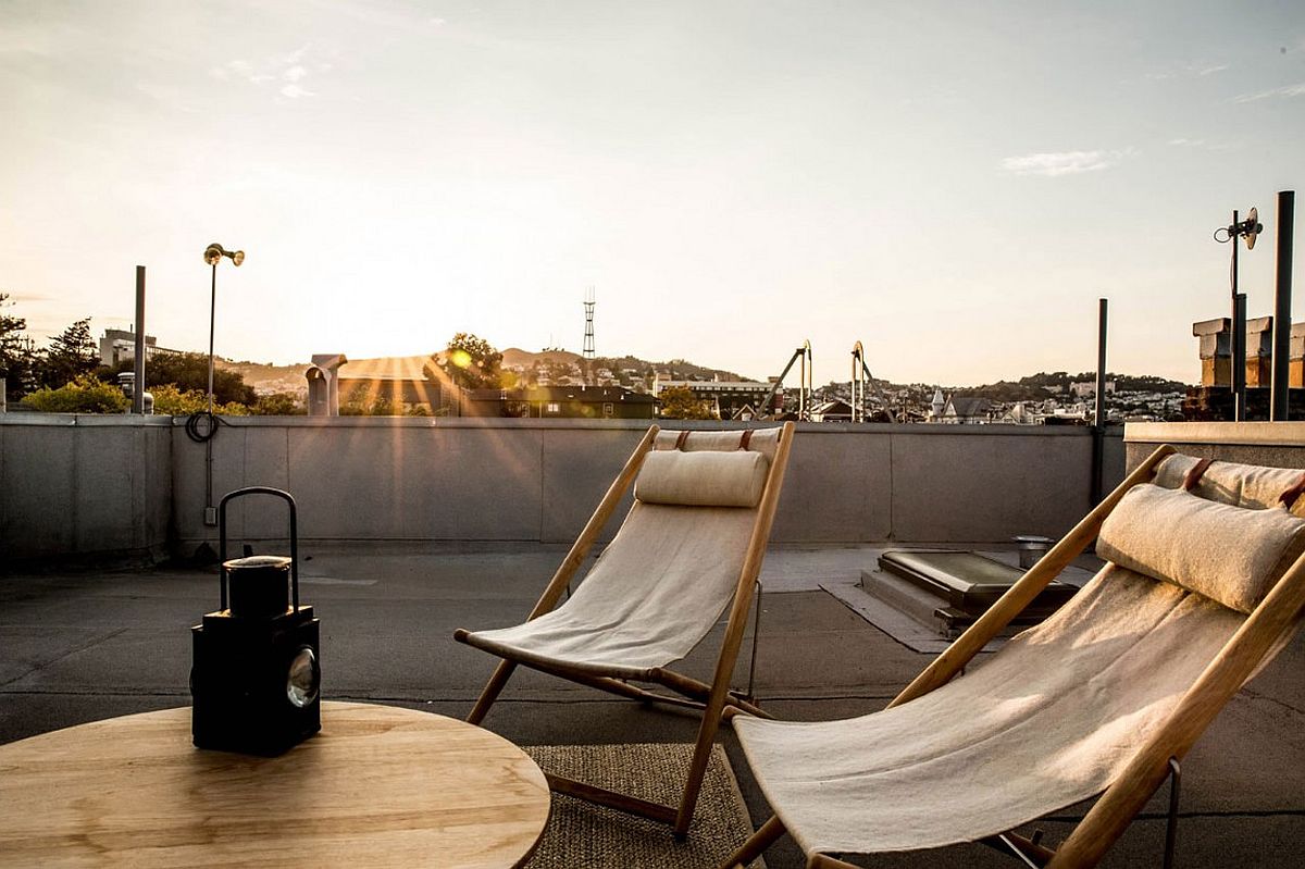
Top-notch bachelor pads are often filled with plush leather surfaces, dark tones that usually range from deep gray to black, a wide range of automated home systems, fabulous lighting, and of course an entertainment system at the heart of it all. Breaking this conventional idea of a modern bachelor pad and embracing Scandinavian design and simplicity, the 21st Street Residence by Geremia Design is definitely one-of-a-kind. Nestled in the historic neighborhood of the Mission District of San Francisco, the cool apartment perfectly reflects the chic style of younger locals moving into the district in the last few years.
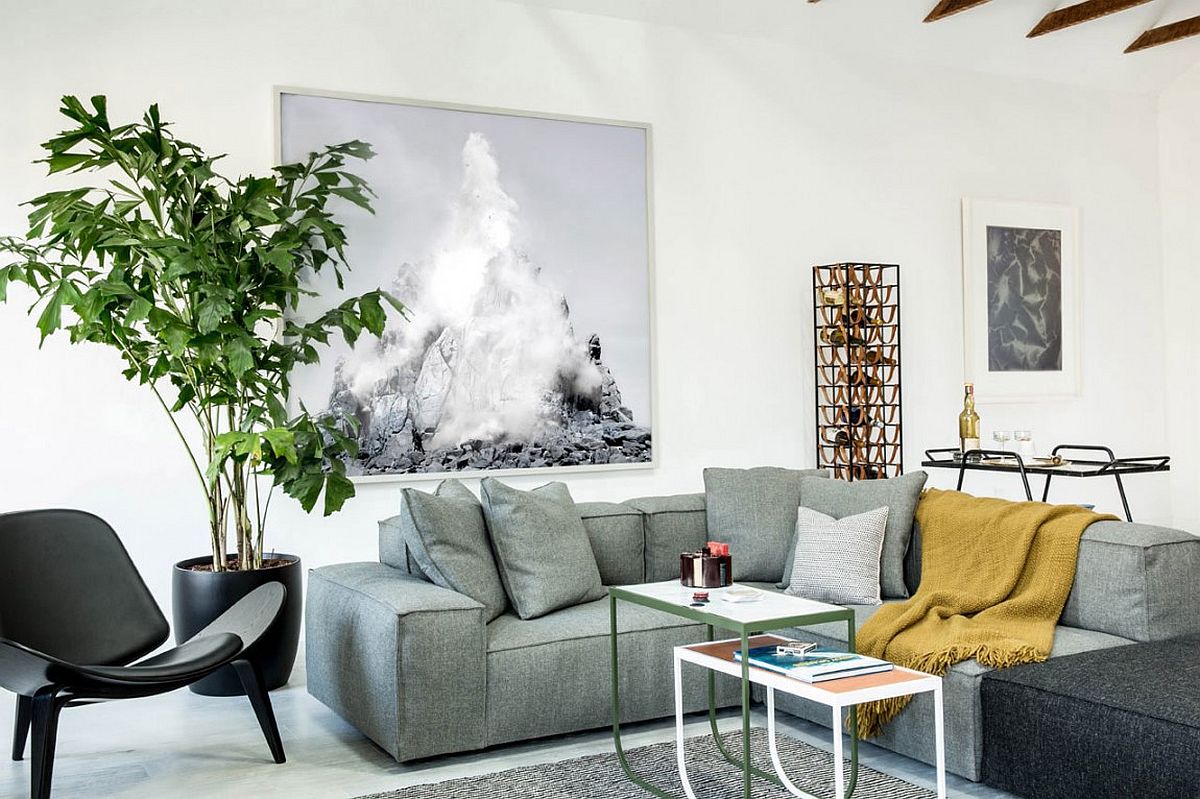
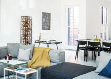
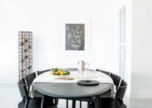
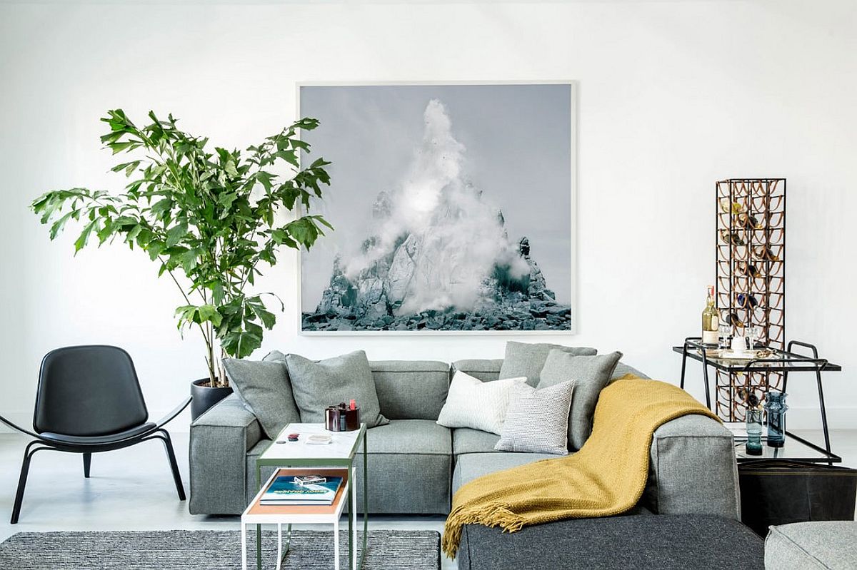
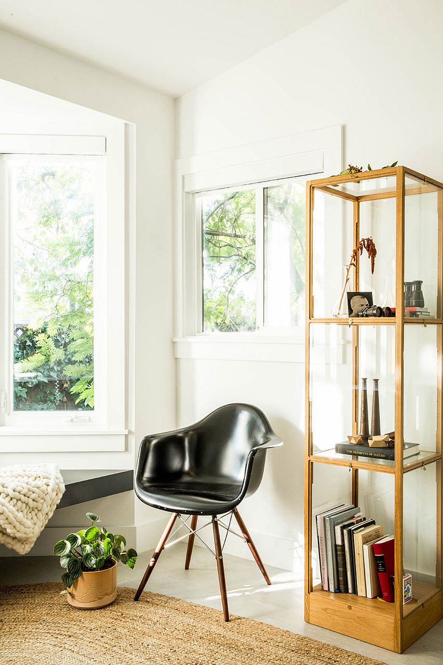
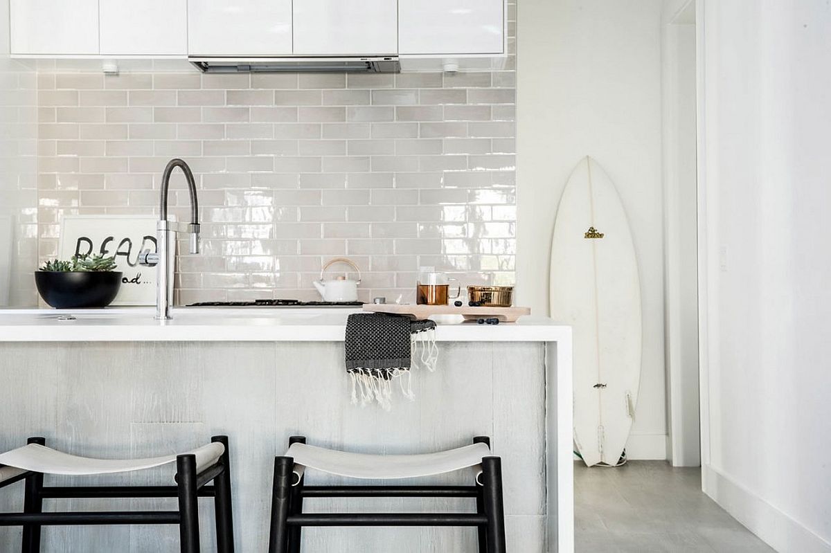
It is fascinating to see how the casual lifestyle of a free spirit has been combined with the elegance of Nordic design without ever missing a step. The simple and unassuming living space features a white backdrop and a light, bluish-gray sectional that can be easily moved around depending on the space requirements. Modularity becomes one of the key elements of the interior, as stackable dining table chairs, a vintage bar cart and beautiful bookshelf in glass give ample flexibility to redecorate when needed. This also makes weekend parties a lot easier to host, even as the white kitchen in the backdrop seems almost absent!
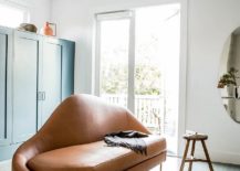
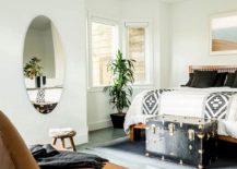
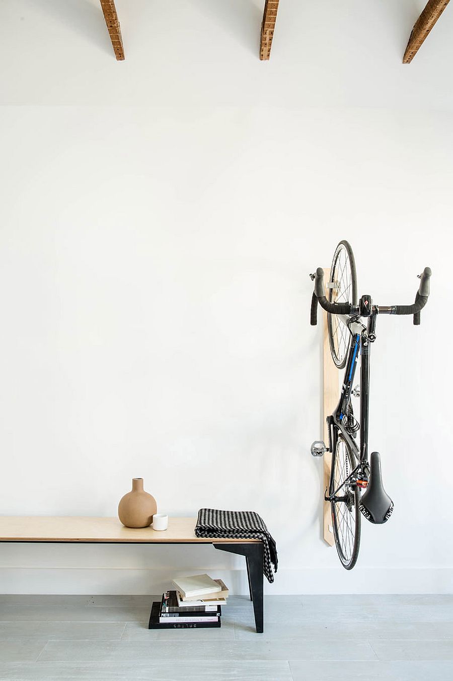
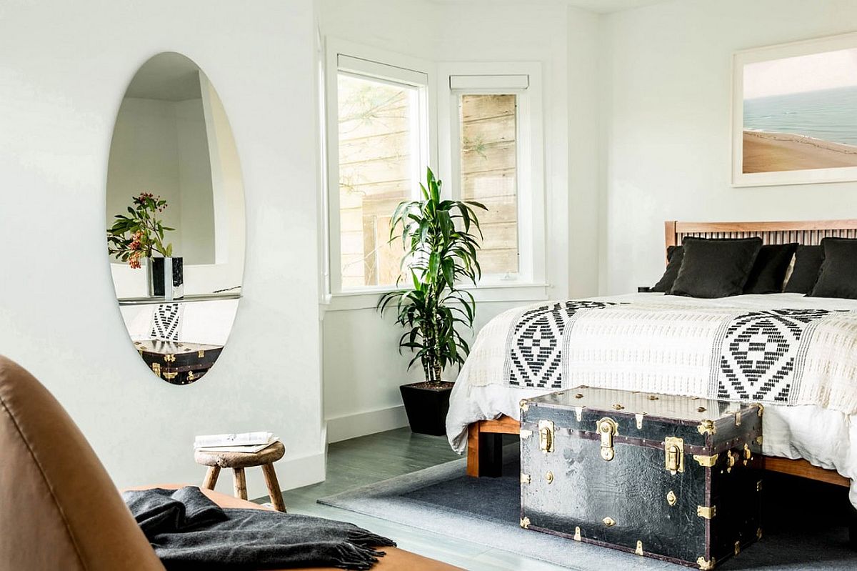
Add to this a collection of vintage pieces and lovely artwork, and you have an apartment that is both functional and aesthetic, all the while breaking the norm when it comes to bachelor pad design. [Photography: Aubrie Pick]
We curated a fresh and striking art collection by artists Noemie Goudal, Tauba Auerbach and Josef Hoflehner as a bold opposition to the subdued palette of the space. Masculine details and clean lines contribute to a casual aesthetic that complements the building’s architecture
