Today’s post is dedicated to the art of the room update. We’ve all been there—needing to breathe new life into a space, possibly on a budget. Today we’re sharing four rooms that take design to the next level! Some of the updates involve more work than others, but whether you’re looking to knock out a tile backsplash or to simply find that one perfect accessory to tie everything together, the spaces below will surely inspire you. We’re talking room design at its finest…
Lightening Up
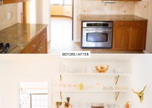
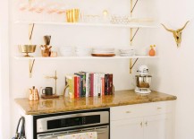
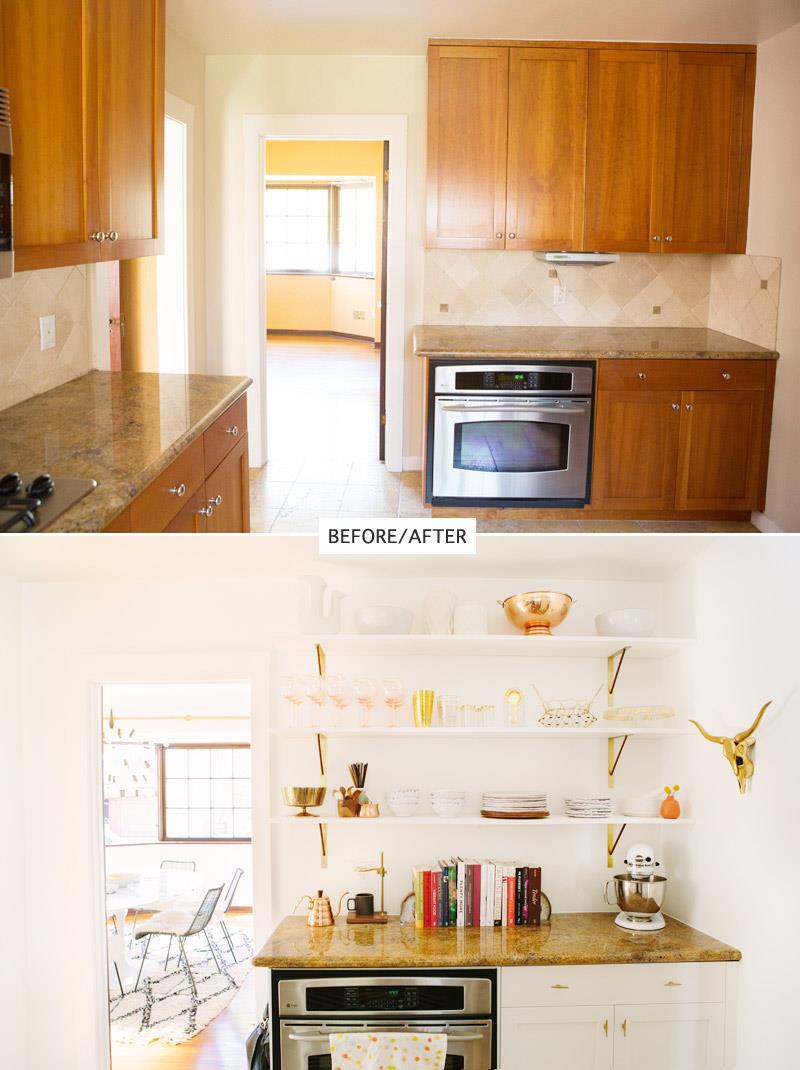
Sometimes breathing new life into a room is as simple as lightening it up, although sometimes the process requires great care and patience. But it’s well worth the work in the end! A House in the Hills blogger Sarah Yates Mora transformed the corner of her kitchen by removing cabinets and tile, then replacing them with a beautiful coat of white paint and open shelving. Here are the “before” and “after” photos:
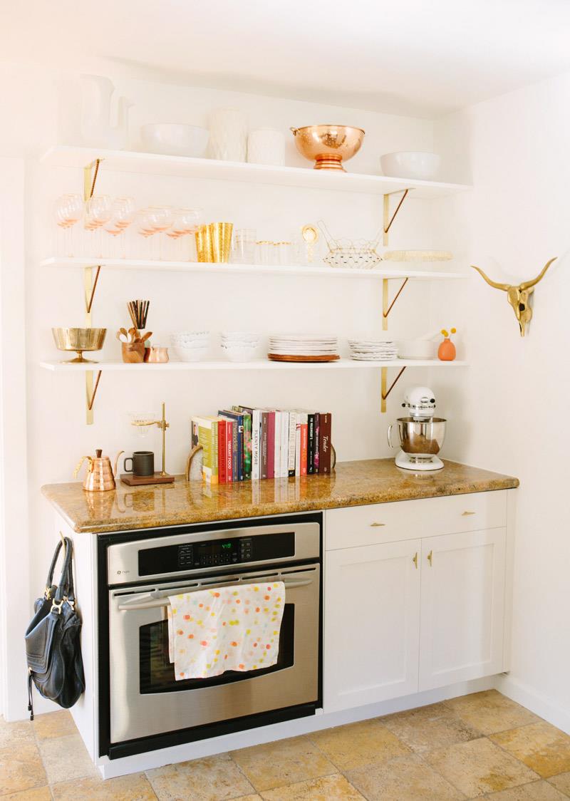
What we love most about this space is the way the warm tones of the room were downplayed with white paint, then played up in the best possible way with the addition of gold- and copper-toned accessories. A chic way to problem solve in a kitchen when a complete remodel isn’t possible! Learn more about this room update at A House in the Hills.
Countertops on a Budget
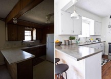
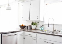
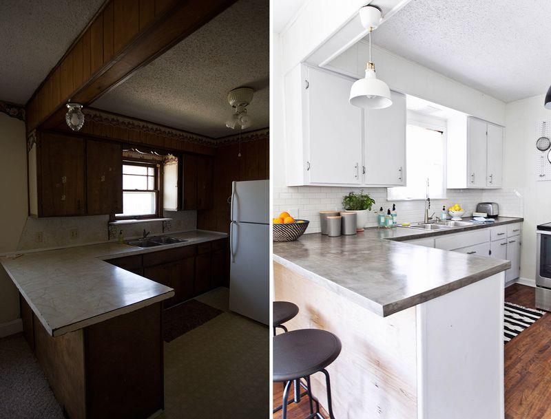
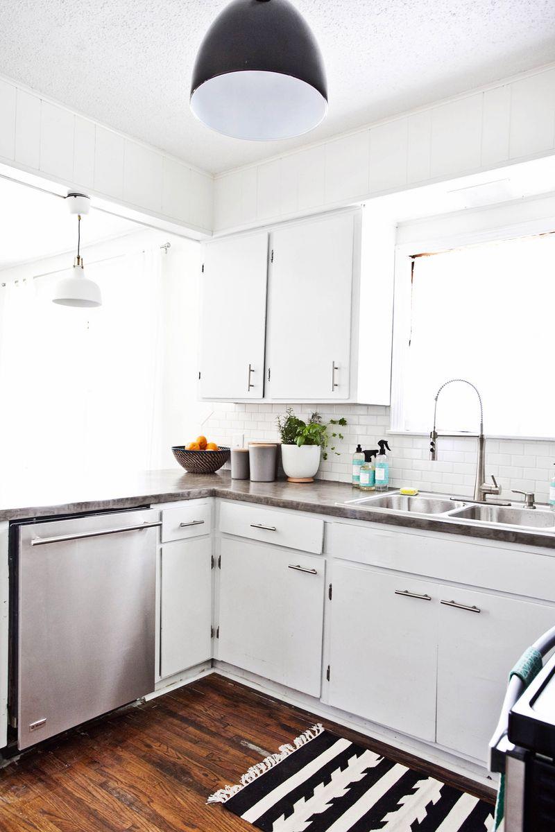
Have you ever had your heart set on a big change, such as new countertops, yet your budget didn’t allow it (or so you thought)?! Sometimes if we look hard enough for solutions, we can find a clever way to get just the look we’re after, and for the right price! That’s just what Elsie and Emma of A Beautiful Mess did in their Habitat for Humanity House project. We can’t get enough of these kitchen countertops:
Take a closer look and you’ll see that the old counters were removed and replaced with wooden ones, then skim coated with concrete. An affordable solution that’s big on style! View more pictures of the kitchen at A Beautiful Mess, and learn more about this Habitat for Humanity house project here.
A Fresh Coat of Paint
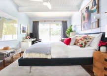
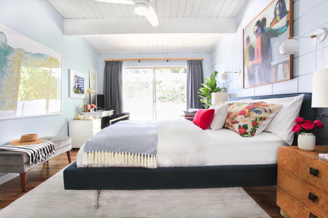
Next we witness the power of a fresh coat of paint, thanks to this elegant eclectic bedroom makeover from designer, blogger and TV host Emily Henderson. Let’s start with an “after” shot:
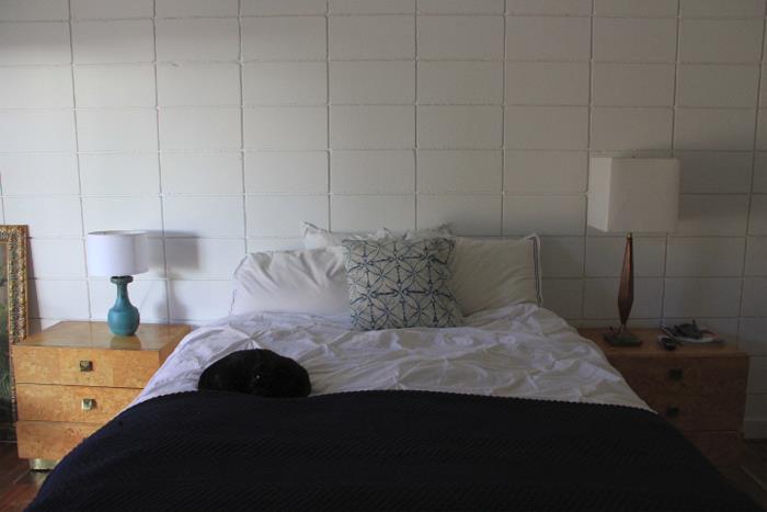
And here’s the before. This guest room previously featured white paint, and while the space was adequate for an overnight guest or two, Henderson was ready to update the room once she’d finished working on other areas of the house.
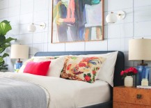
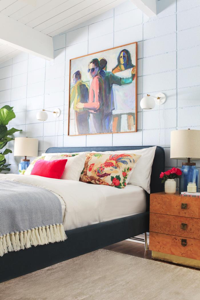
Let’s admire the “after” shot once again! In case you’re curious, that light gray-blue color is Old Faithful by Dutch Boy. And it provides just the right amount of color, as well as the perfect backdrop to brighter hues such as hot pink. So divine! And all the details (including a couple of colorful previous painting attempts) can be found at Emily Henderson:
A New Rug
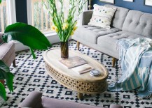
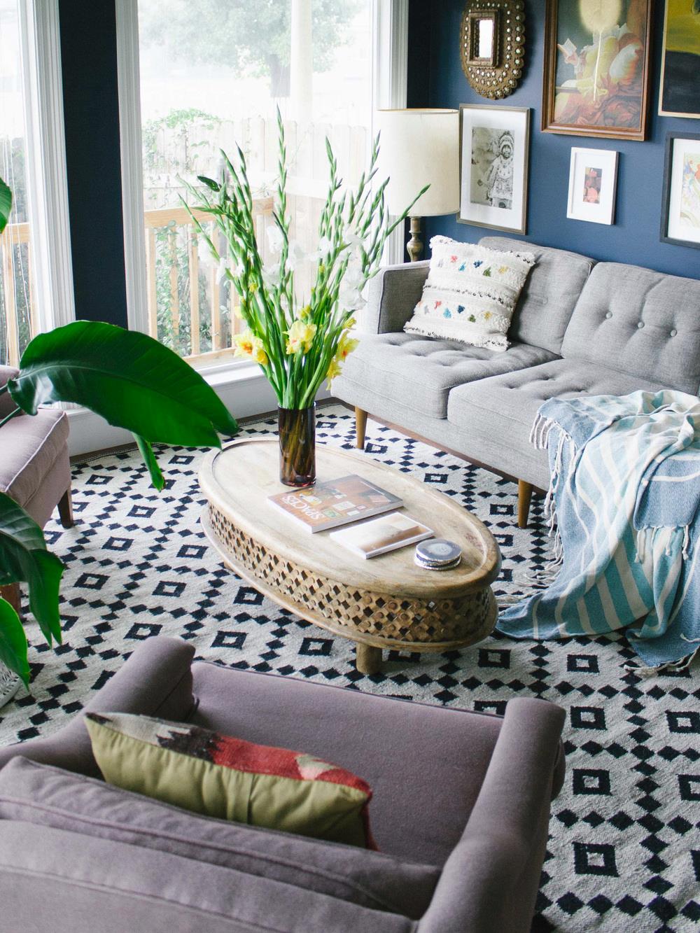
What a difference a rug makes! We end today’s post with an update that’s as easy as purchasing a new item for the living room. And yes, for Old Brand New blogger Dabito, that item is a rug. The Jaipur Scandinavia-Nordic rug from Rugs Direct, to be exact!
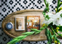
While Dabito refers to this addition as a small living room update, there’s nothing small about the end result. In fact, we admire the way it’s an affordable alternative to tile, and the effect is just as grand! See more living room photos at Old Brand New.
From ripping out cabinets to adding a fresh coat of paint, there are many ways to make a change in the room of your choice. Will you be trying any of today’s room update ideas in your own space? Share your thoughts by leaving a comment below…
