The front entrance is the first area of the home your guests see when they come to visit, and it’s also a welcoming breath of fresh air each time you walk through that front door. Not to mention, the entrance provides an amazing opportunity to make a fabulous first impression and to reflect your own personal style. Not sure where to start? Feeling stifled by the constraints of a small entrance? We’ve got some answers for you today…
Less Is More
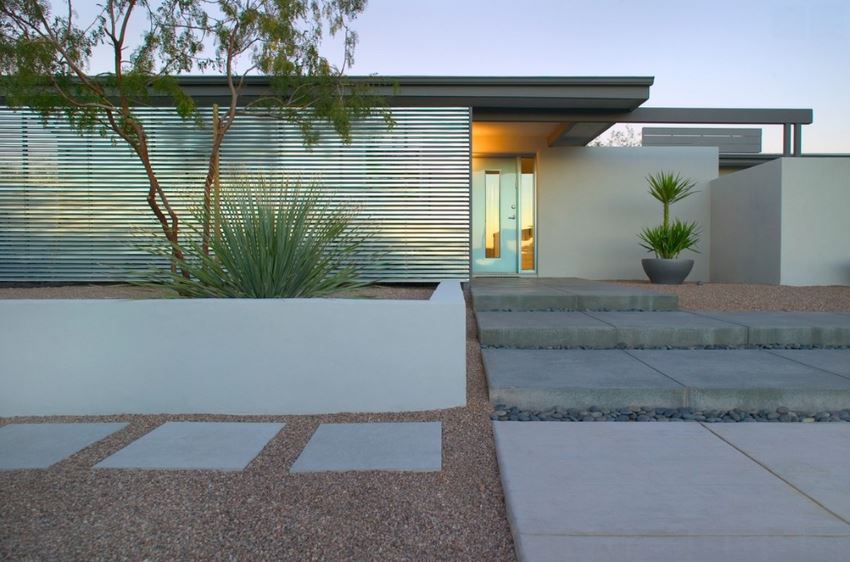
When it comes to the front entrance, one popular approach is to make a strong statement with a couple of simple accents. In other words, sometimes less is more! Below we see the bold effect of one sculptural potted plant against the backdrop of a stunning modern home. [photo by Bill Timmerman for Ibarra Rosano Design Architects]
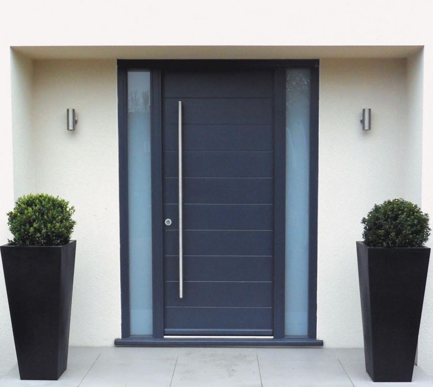
Matching planters on either side of a doorway can be an effective decorative approach, especially when you take the time to mirror the look and feel of your home’s architecture. Manicured plants in black pots couldn’t be more perfect for the sleek modern home below, especially since the black of the planters matches the color of the front door. [from Homedesigly]
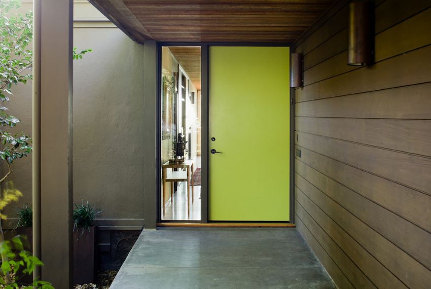
Sometimes a bold front door is all it takes! This yellow door is plenty for the front entrance it adorns, especially since an adjacent glass window gives you a peek into the stylish entryway. The plants to the left of the entrance are also a feast for the eyes, so simplicity works well in this setup. [from Koch Architects]
Something Unique
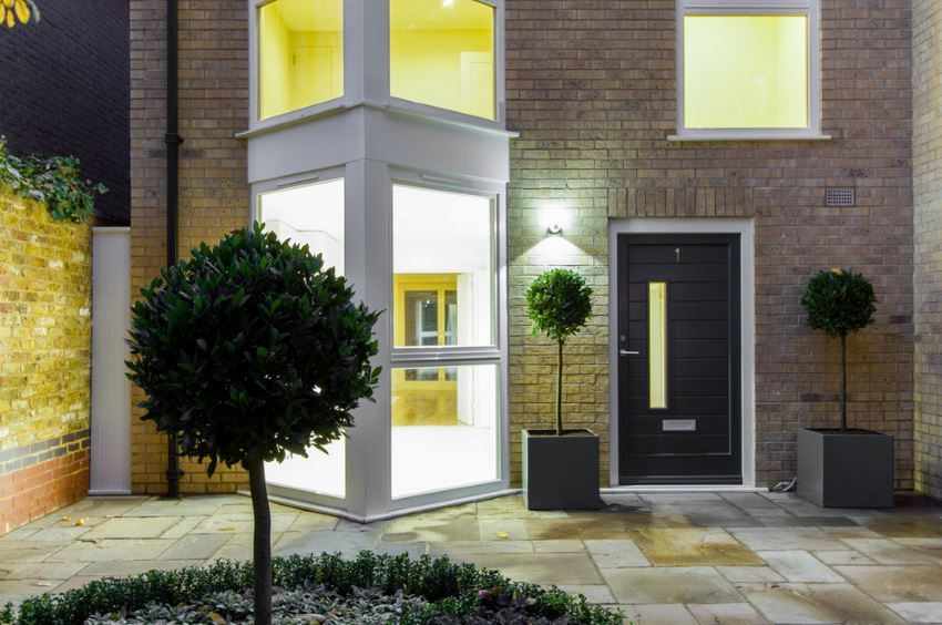
Whether you’re adopting a “less is more” approach or you’re going all out, choosing an unexpected accent or two can make all the difference. Topiaries are eternally charming, yet placing them in sleek modern planters is an interesting twist, as shown below. [from Chris Snook Photography]
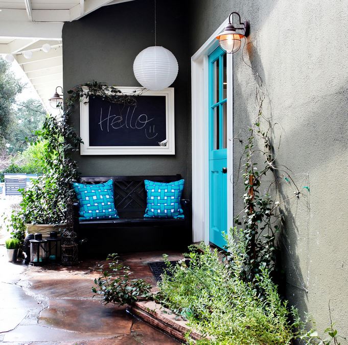
There are many qualities that make this next entrance special: the colorful front door (in Cool Aqua by Benjamin Moore), the porch light (from Lowe’s), the vibrant pillows, the chalkboard that welcomes guests as they approach! What other special details can you spot? [from Stephanie Wiley Photography]
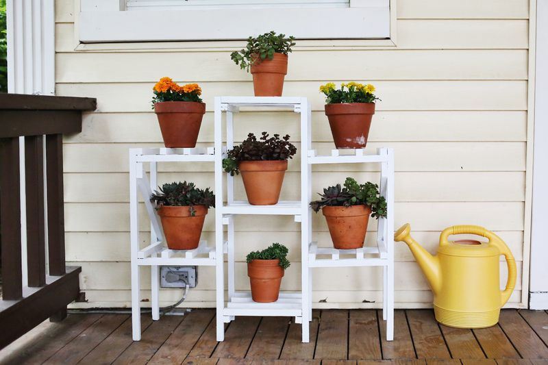
Don’t forget the allure of a unique treasure. Below we see the front porch of A Beautiful Mess blogger Elsie Larson, which features a fabulous plant stand that was a flea market find:
Asymmetrical Style
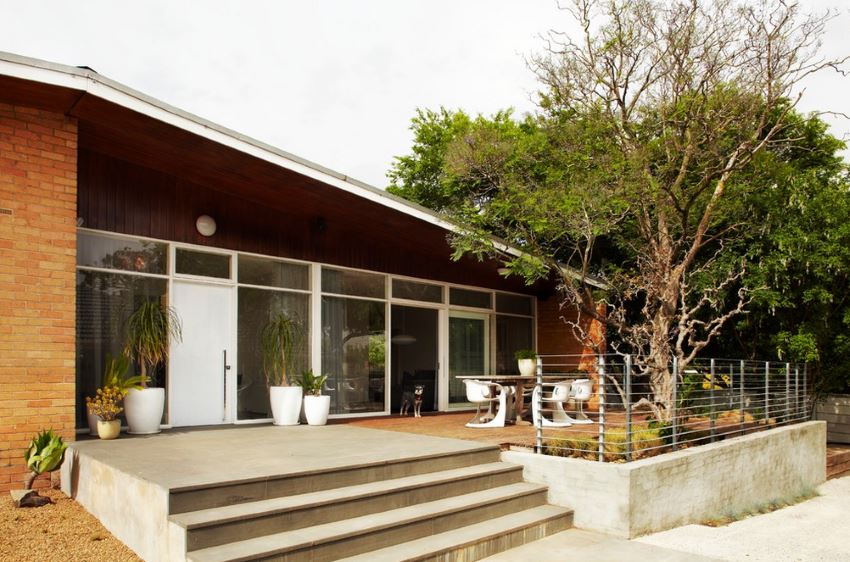
Speaking of unexpected choices, there is value in imbalance when it comes to design. We’re talking about asymmetry, folks! Instead of placing identical pots in corresponding numbers on either side of the door, try planters in uneven numbers, as shown below. [from Sharyn Cairns]
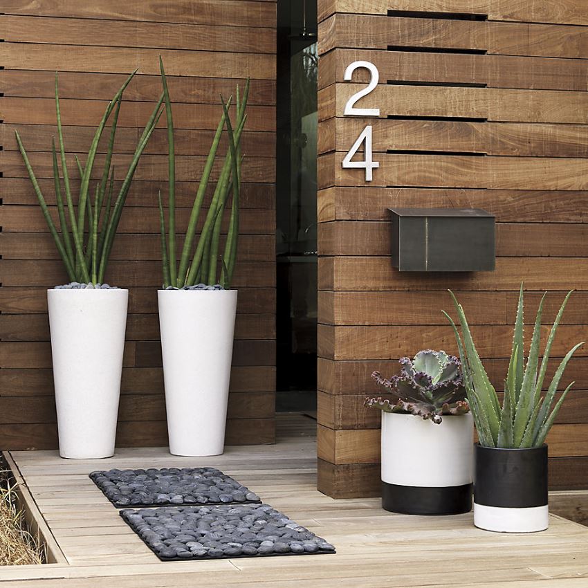
You can also opt for planters that aren’t too matchy-matchy. Below we see a front entrance featuring tall plants in Shore Polyterrazzo Planters from CB2. While the taller planters match, the shorter cylindrical planters are mirror opposites. Let’s hear it for black and white contrast! It’s also refreshing to see that not all four planters are alike. Doesn’t it make sense to place shorter planters under the mailbox?…
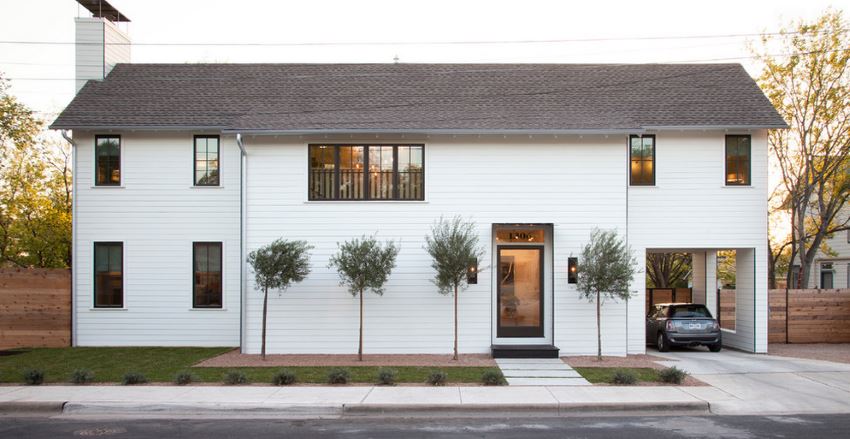
Make an asymmetrical statement with trees! While one tree can be found to the right of the next featured entrance, three trees line the front of the home to the left of the door. The look is crisp and modern, not to mention, visually interesting. [photo by Ryann Ford for Texas Construction Company]
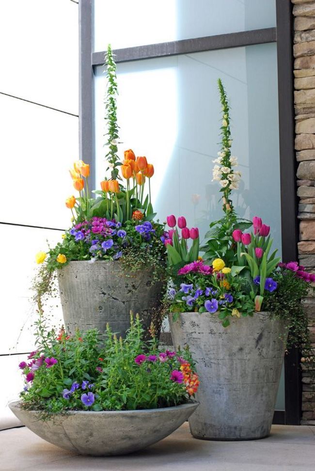
Don’t forget the power of groupings in odd numbers. While the three lovely cement planters below definitely go together, their differing heights are perfectly alluring, especially since they’re filled with beautiful spring blooms. [unknown source via Sweet Parrish Place]
Space-Saving Tricks
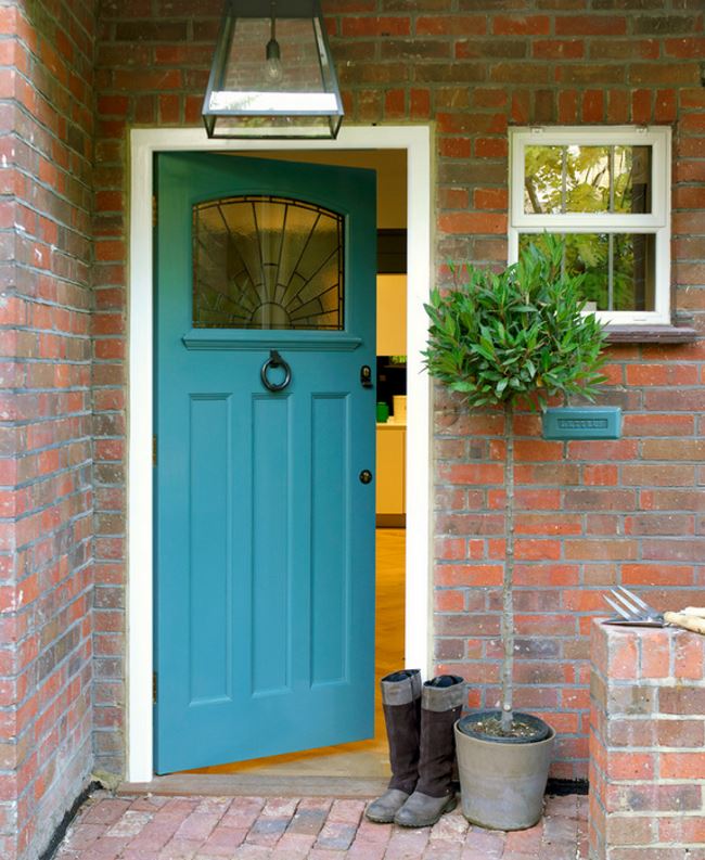
If you’ve given up on decorating your small entrance, think again. No front entrance is too small to embellish! Got limited space? Choose a tall, slender plant like the topiary below! [from Amory Brown]
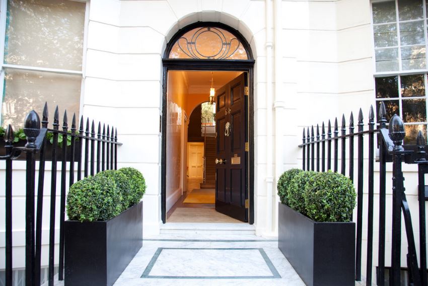
Another clever option is to line the walkway with lean planters. The black wooden planters (from The Chelsea Gardener) in the next featured image are filled with manicured shrubs that are a beautiful complement to the home’s charming exterior. [from Interior Desires UK]
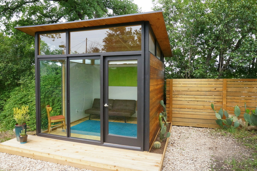
Remember when we featured the budget-friendly tiny house of Andy Pluta? While a compact cedar deck is the main component of the home’s entrance, Pluta still found creative ways to decorate the exterior. A couple of glazed pots hold sculptural succulents, and a hand-built cactus planter ensures there’s a modern garden to the right of the door as well:
Will you be decorating your front entrance using any of the techniques in today’s post? Leave a comment below and let us know if you give any of these strategies a try!
