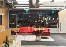
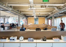
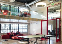
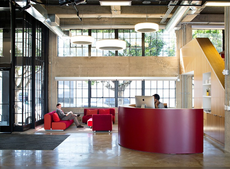
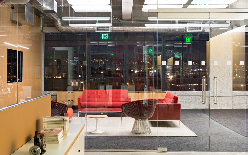
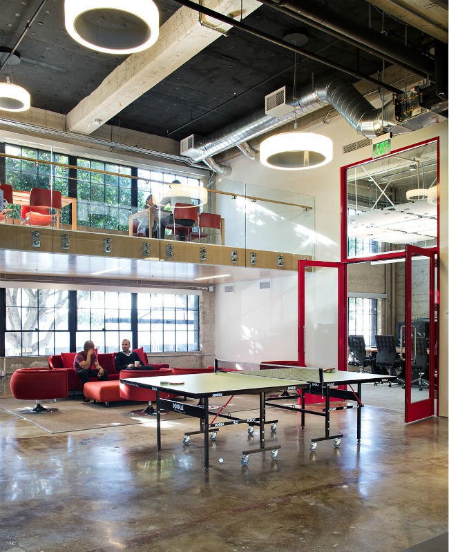
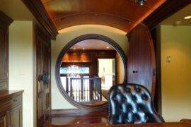
PCH International‘s offices in the Potrero Hill neighborhood of San Francisco are a knockout. Modern without the chilly hauteur too common too many new offices, fun without being childish, innovative without being flashy, they are the kind of space many dream of working in.
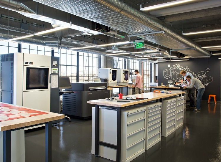
The company is a design-leader, so it makes sense that their workspace is gorgeous, but it’s highly functional as well, which befits a company that produces actual things—prototypes for designers and engineering assistance.
The building has a long history before PCH took over the space: Built in 1925, the three-story, 30,000 square-foot building was originally home to Berger and Carter Company, an iron, steel and machinery warehouse—then it housed the Hockwald Chemical Co., a soap manufacturer 1940s-60s. Next came the Reed Candy Company in the late 1960s, and then from the 1980s-1990s the Bay Guardian newspaper had its offices there.
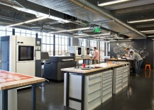
The creative new design was put together by ChrDAUER Architects, who included not only offices and meeting spaces in the building, but also worked in a state-of-the-art prototyping lab and a full engineering bay.
“We provide design engineering and development here at the PCH innovation hub, as well as meet with startups and large brands to help them make products,” says Claudia Ceniceros, VP of Corporate Communications for PCH.
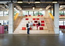
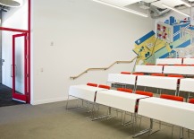
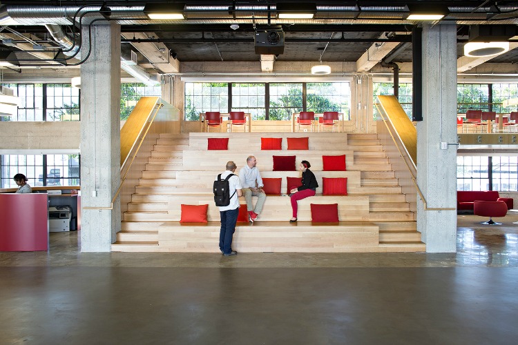
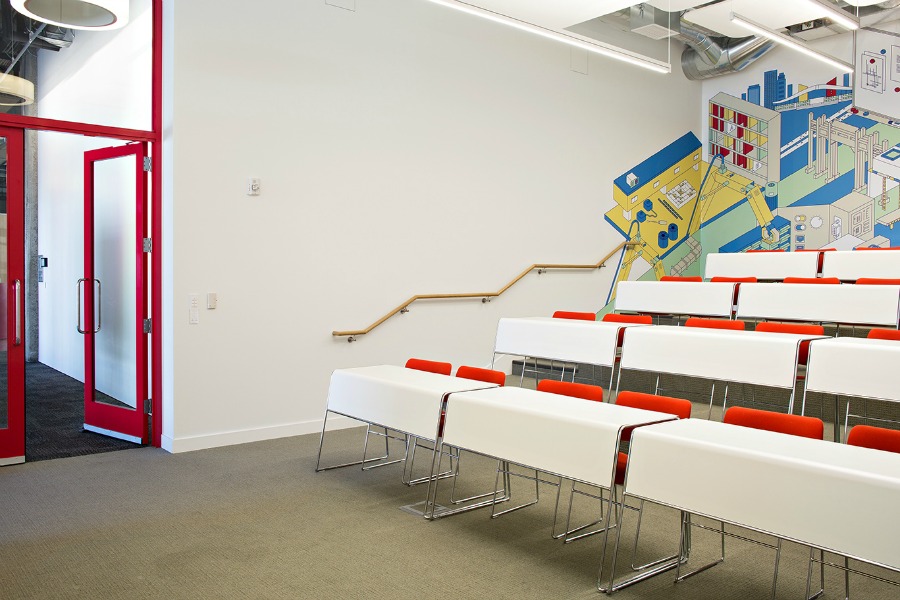
“We also host a variety of community events—hackathons, design school senior shows, industry events and panels, etc. here. Hence the open space and stadium seating,” says Ceniceros.
The design is energy efficient and sustainable too: It’s been submitted for USGBC LEED Gold Certification.
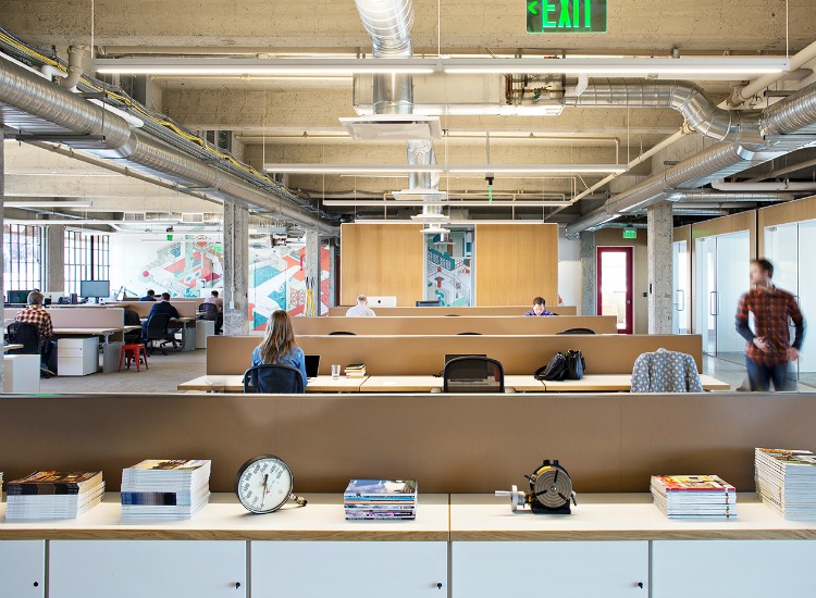
It’s clear that worker happiness is a priority at PCH, as the office areas are as thoughtfully designed as the engineering and more public spaces.
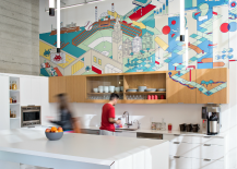
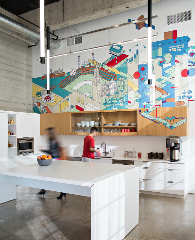
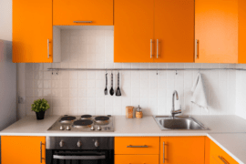
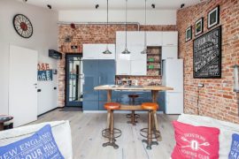
The design of spaces maximizes transparency and personal interaction so as to directly illustrate PCH’s multi-faceted operations and capabilities “without dumbing it down,” according to PCH’s founder, Liam Casey. The kitchen is an important crossroads for employees from different parts of the company.
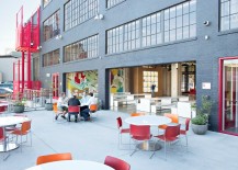
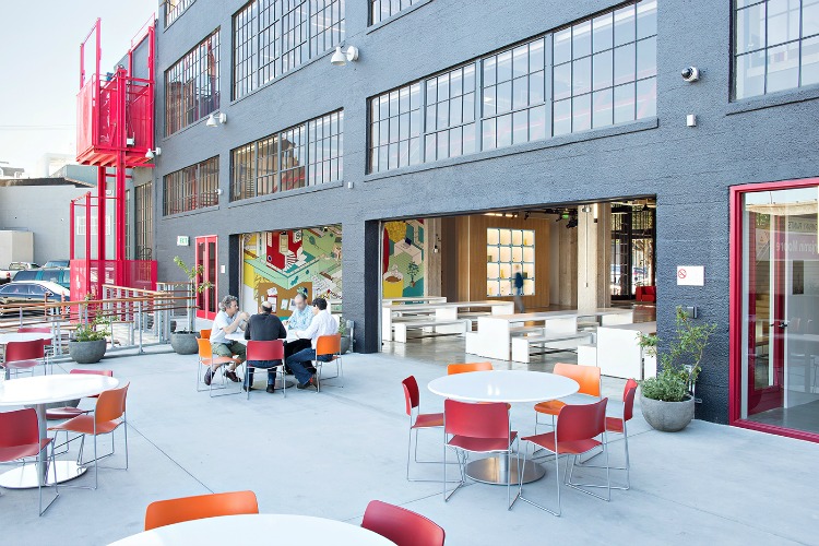
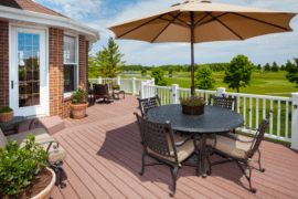
The rear deck and plantings have been added so there’s an outdoor area for staff and visitors to enjoy.
“We wanted a very open and transparent environment that would be welcoming and make a statement,” says Ceniceros. Looks like they’ve certainly succeeded in both the former and the latter.
