As a design blogger, one of my favorite ways to gather inspiration is to admire the room makeover projects of other design bloggers! Whether you’re a design enthusiast yourself or you’re simply looking for makeover and styling ideas, today’s post is for you. Below you will find photos from 6 different room makeovers, and within each makeover, I’ll focus on one special feature of the space at hand. You know, in case you get inspiration from specific details. I know I do! Ready to have a look?…
A Living Room Makeover
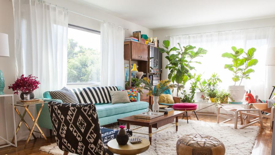
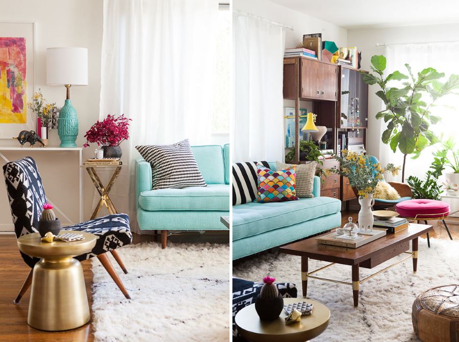
Let’s start with the living room, as it’s the space in the home where many of us spend most of our time. In fact, I’ve been known to work for hours with my laptop on the couch! Below is the living room makeover of Design Love Fest blogger Bri Emery. [photo by Laure Joliet for the Los Angeles Times]
Interior designer Emily Henderson was at the helm of this project. With a budget of $12,500, Henderson redesigned Bri Emery’s living and dining rooms, and in return, Emery redesigned Henderson’s blog! Read more about the makeover at the Los Angeles Times and Design Love Fest. Reupholstering select furnishings and adding bright pops of color gave the room a new look, but keep reading to find out Decoist’s favorite feature…
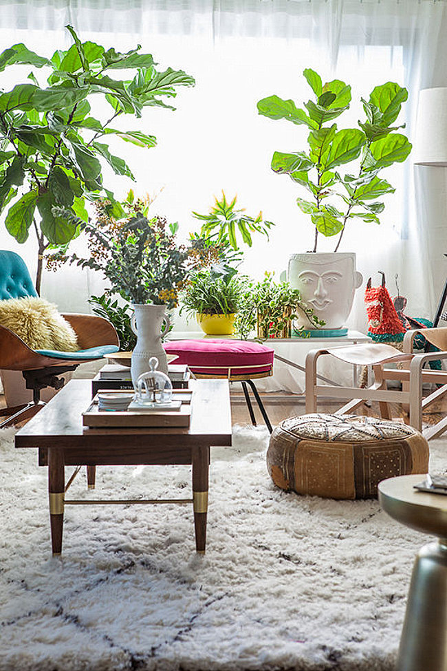
We’re loving: THE PLANTS! Plants are an easy way to breathe new life into a space. In fact, I plan on completing two of my current room makeovers (in progress) by adding some plants. With a fresh coat of paint, you an easily give a few pots and planters an easy DIY update. Fill them with some eye-catching greenery and you’re set. Bri Emery’s living room definitely sets the bar high:
A Kitchen Makeover
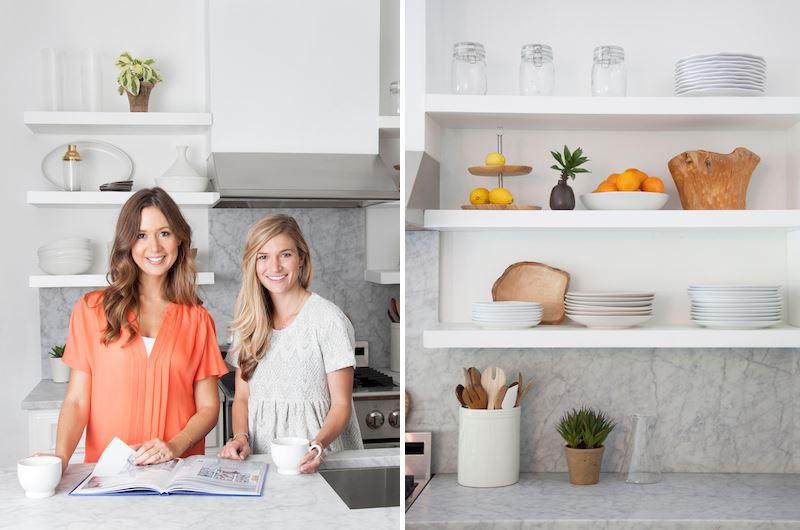
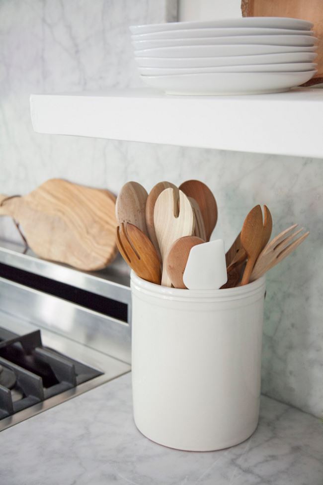
Next we shine the spotlight on the kitchen makeover of lifestyle blogger, author and entertaining expert Camille Styles. I’m consistently inspired by Camille’s projects and endeavors, and this light and airy kitchen in her new studio is no exception. [photos in this section by Jessica Pages]
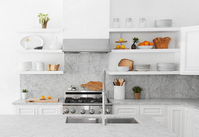
To create the kitchen’s classic, modern look, Camille worked with interior designer Claire Zinnecker. From tearing out cabinets and replacing them with floating shelves to carefully crafting a sleek blend of marble and wood, the design updates created a chic, earthy vibe.
We’re loving: THE “MIXED MATERIALS” LOOK. By grouping like items, a carefully curated display was achieved, and the contrast between white marble and earthy wood is nothing short of stunning. Learn more about how Camille Styles organizes her studio here.
A Bedroom Makeover
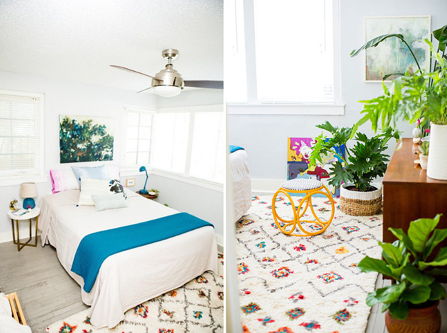
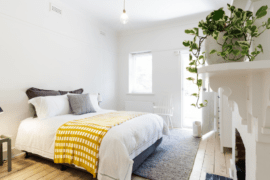
The bedroom is a place to unwind, relax and rest after a long day at work. No wonder so many design lovers are giving their sleeping spaces eye-catching makeovers. Below we see a master bedroom makeover by Brittni Mehlhoff of Paper & Stitch. Redesigning the bedroom of her friend Jordan, Brittni started by repainting the mustard yellow space a crisp shade of light grey. [photo by Sarah Eddy of Sarahdipity Photos]
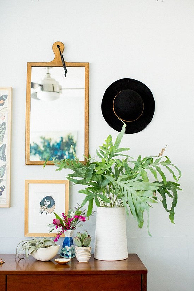
This bedroom makeover was completed on a budget of $1,200, thanks to Mehlhoff’s creativity and strategic use of DIY projects. The space is infused with bright pops of color, and plants add a welcoming touch. You can read even more about this project on Curbly.
We’re loving: THE VINTAGE STOOL MAKEOVER. The vintage footstool below was brightened by a coat of cheerful yellow paint and a quick reupholstery job. It’s the perfect special touch to a space that should absolutely be all about fun accents and decadent additions! Plus, this stool makeover is a great reminder to all of us that vintage pieces are a wonderful place to start. Giving them a modern update is a budget-friendly way to create truly unique finished products.
A Nursery Makeover
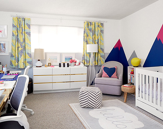
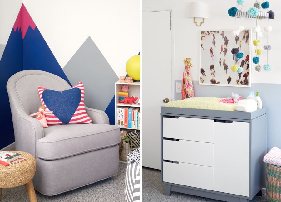
I love a good nursery makeover! Nurseries can be tricky spaces to decorate, as matchy-matchy themes are no longer the norm, yet people tend to embrace a few trendy ideas until that’s all you see – the same trendy nursery ideas over and over again. Which is why it’s so exciting when something original pops up to inspire us all in the area of nursery design! This nursery/office makeover by Emily Henderson for Joy Cho of Oh Joy! is nothing short of fabulous. [photo by David Tsay]
Using items from Target, Henderson transformed this space into a bright, gender-neutral room. From a blue, pink, white and grey palette to modern touches like the artwork over the changing table, the nursery is filled with unexpected flourishes. Read more about this makeover at Oh Joy! and Emily Henderson. [photos by David Tsay]
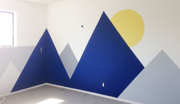
We’re loving: THE WALL MURAL! How amazing is it?! Below we see a photo of the mural in a near-finished state (hot pink details were later added to create a snow-capped mountain effect). The best part: you can read all about the painting process here! You know, in case you want to create your own awesome wall mural at home.
An Art Room Makeover
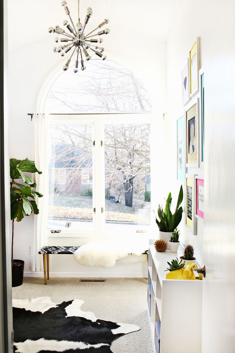
Creative spaces in the home are a growing phenomenon. This art room makeover from Laura Gummerman of A Beautiful Mess gives a practical space a glam-eclectic upgrade. The first thing that caught my eye: that fabulous pendant light!
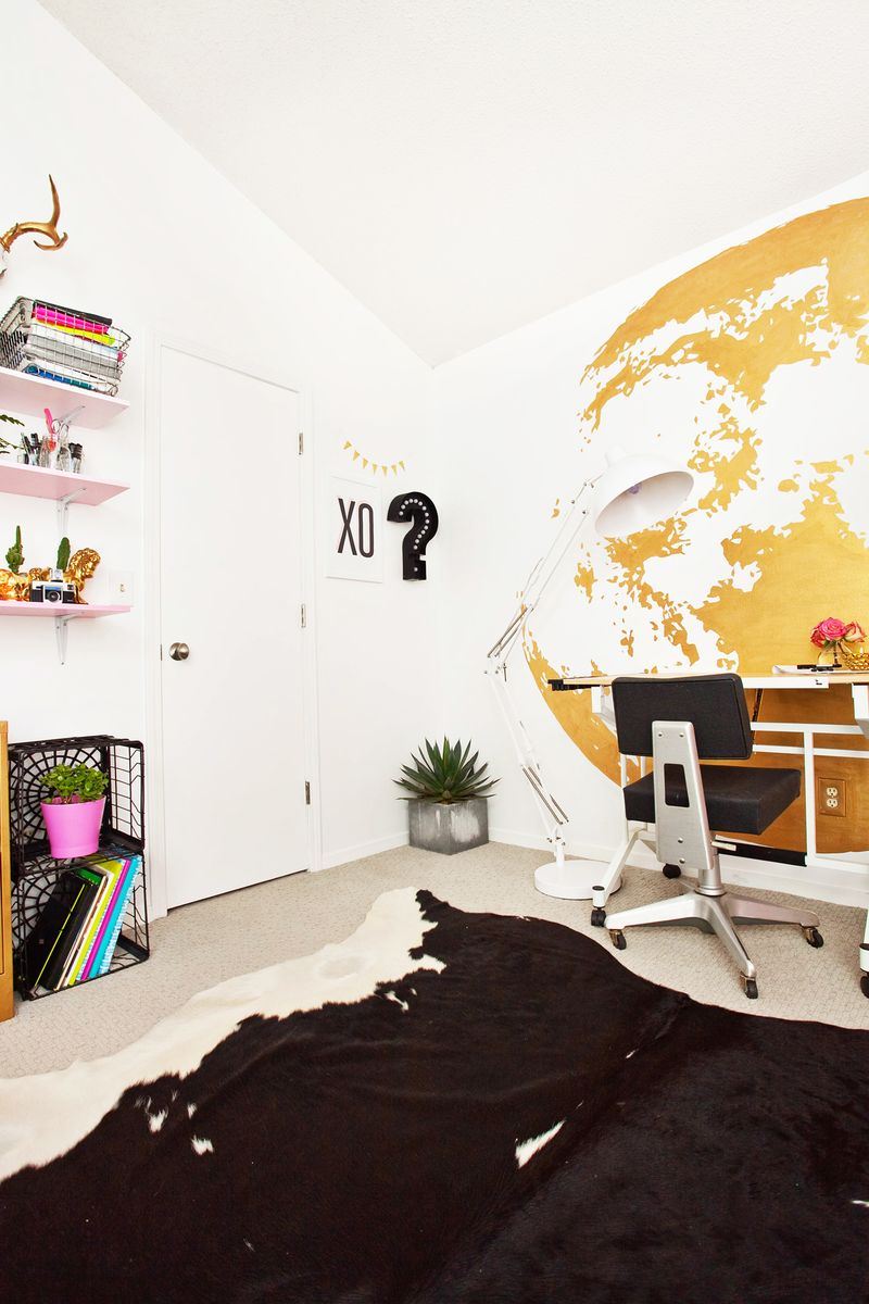
But at a closer glance, it becomes very clear that this room is filled with an array of unforgettable details, including numerous DIY projects. The gold moon wall below is undeniably awesome. Check out the full art room makeover post at A Beautiful Mess. There are definite details you won’t want to miss, like a pink set of lockers and some fun planters.
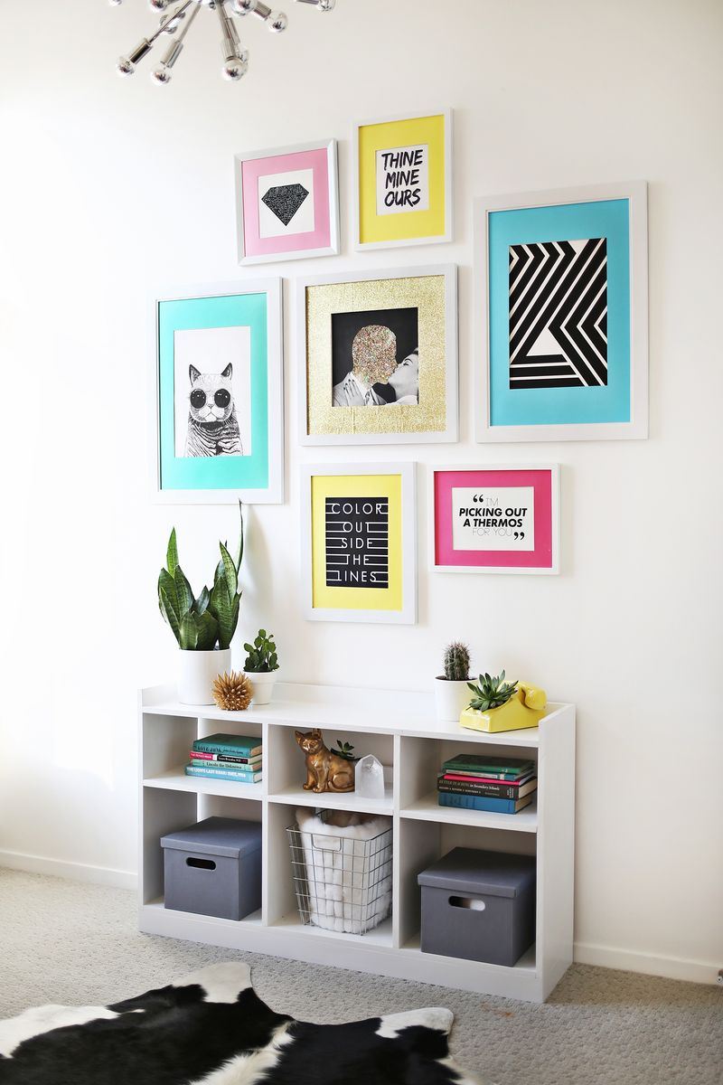
We’re loving: THE COLORED MAT GALLERY WALL. With colorful card stock or mat board, you can add a punch of personality to a framed grouping of your favorite images. Luckily A Beautiful Mess has a handy tutorial to help us all create our own!
A Sewing Area Makeover
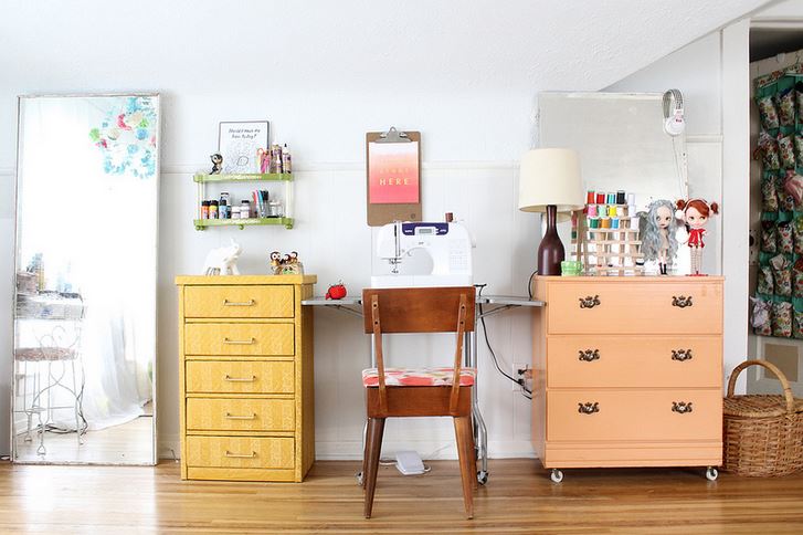
What I love about this next makeover is that it proves there’s power in setting aside a special area in your home for creative endeavors. Even if you don’t have an entire room to devote to your talents and hobbies, you can use a section of a space (such as a bedroom) to prioritize the things that rejuvenate you. This sewing area makeover from Skunkboy blogger Katie Shelton is filled with interesting details:
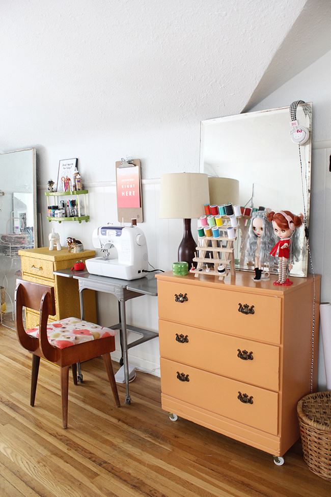
Special touches like a spool holder and a duo of quirky dolls add personality. Not to mention, plenty of drawer space is essential for holding sewing fabrics and supplies. View additional images of Katie’s sewing area at Skunkboy.
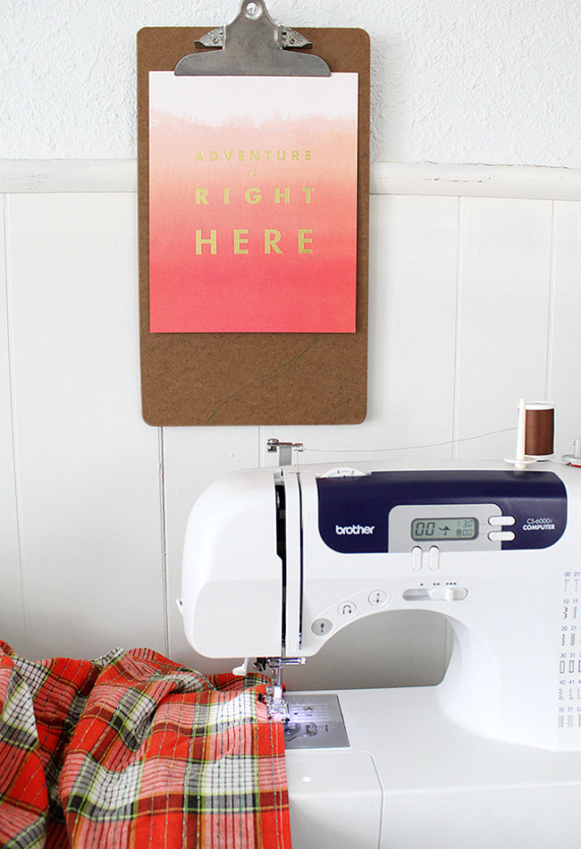
We’re loving: THE CLIPBOARD “FRAME”. Because it’s affordable. Because it’s whimsical. Because it’s easy to hang on the wall. And because it’s holding an awesome piece of ombre artwork with a motivating message! Are you tempted to use a clipboard to “frame” your favorite piece of art?
Did you notice that all of today’s room makeovers feature light-colored walls as the foundation? Plenty of radiant details are scattered throughout each space, and ample greenery is a popular accent in multiple rooms. Not to mention, each and every space reflects the creativity of the people who inhabit it. Feeling inspired? I know I am!
