How many different ways can you think of decorating your own home? While we might alter hues and styles ever so slightly once in a while, it is not very often that the same home is decorated in a delightfully different manner with a few smart changes. This studio apartment in the Chelsea neighborhood of Manhattan, New York City has been designed in two different ways in less than a year. Evan Schwartz, Homepolish designer, was the man behind this unique and imaginative twin transformation as he redesigned the very apartment that he had shaped only a few months earlier!

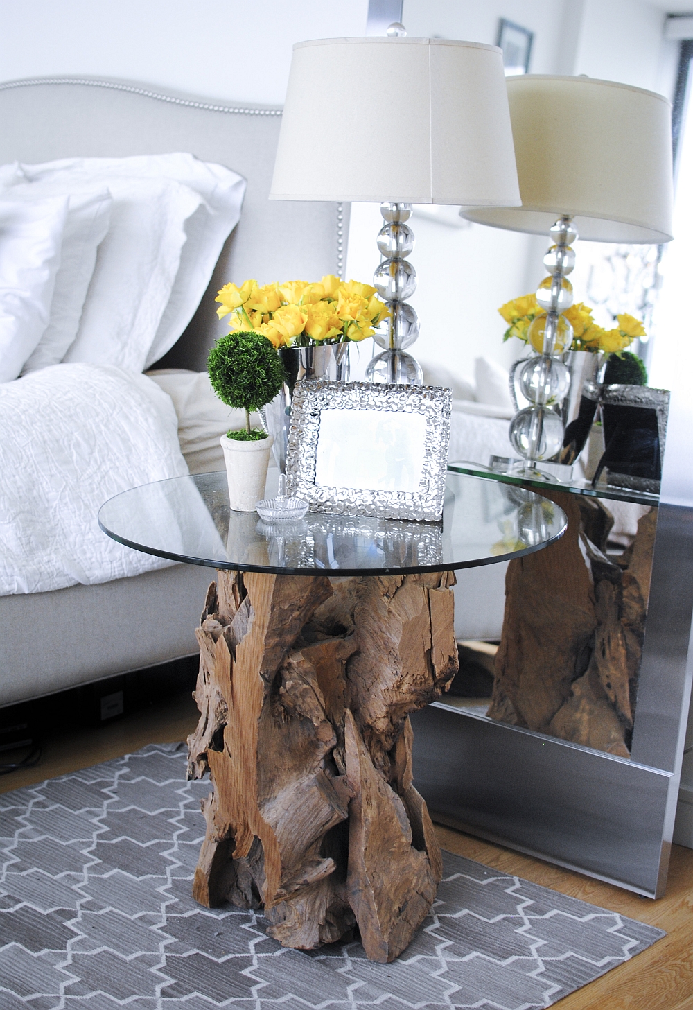
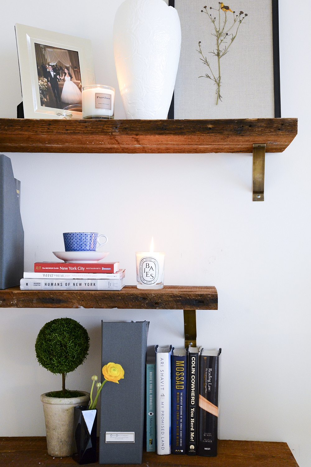
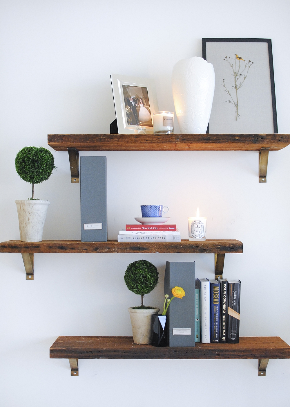
The first couple that owned the apartment (Drew and Jessica) wanted a light, cheerful space with a pristine white backdrop and an underlying feminine charm. Their love for a relaxed California lifestyle, yoga and a serene ambiance was translated by Evan into a balanced interior filled with natural wooden tones and unassuming decor. The dark wood coffee table, plush couch in white, and the exceptional bedside table reflect this style beautifully. Smart space-saving solutions were added to ensure that every inch of space was put to use.
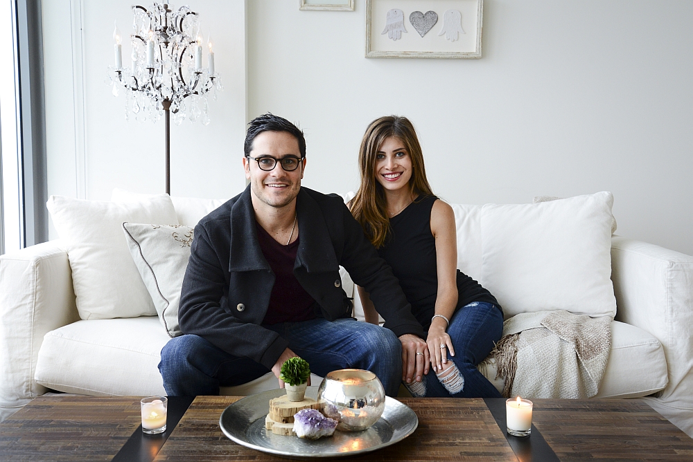
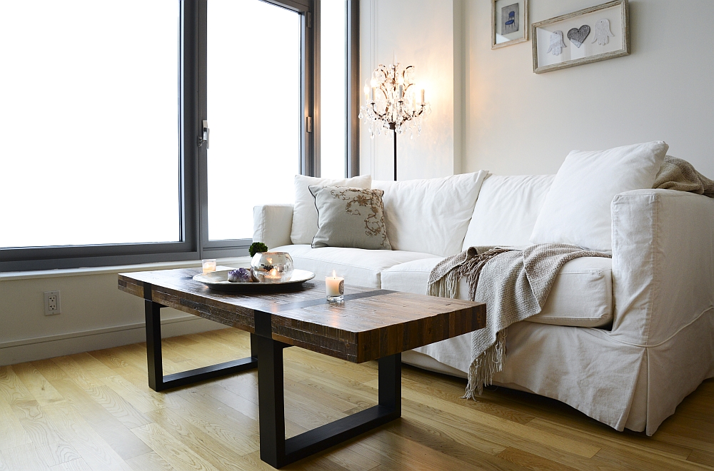
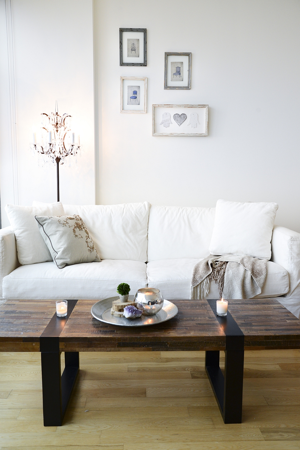
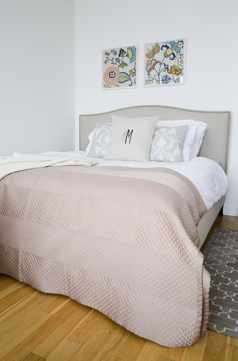
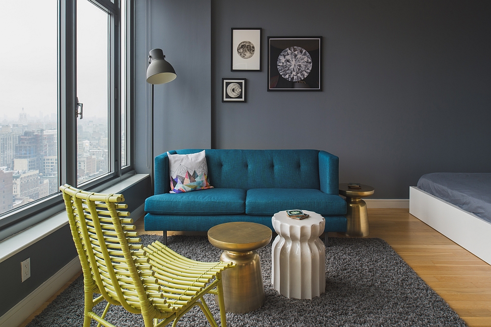
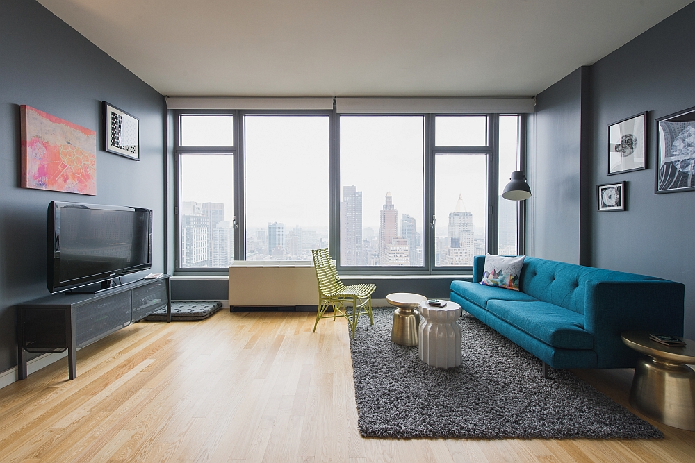
But soon the couple had to move back to California, and was fate would have it, the new owners of the apartment also turned to Homepolish for a design makeover. It was once again Evan who had to visualize a whole new backdrop and design style for the small apartment to fit the requirements of the new owners, Kim and Jaime. The old coffee table was replaced by the ever-popular Martini side table in gold from West Elm and a cool white table from One Kings Lane.
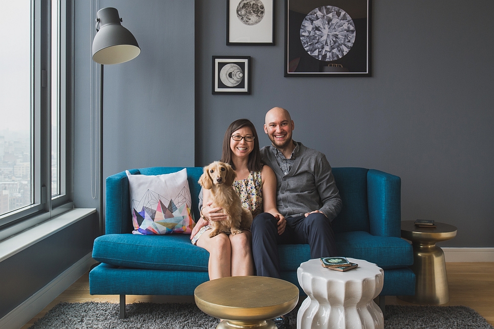
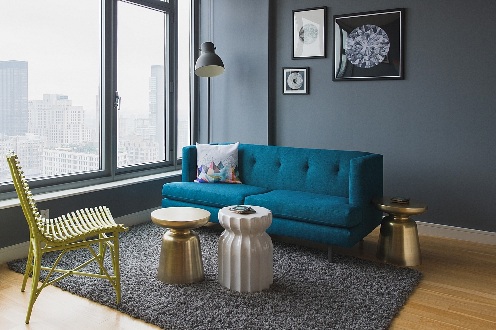
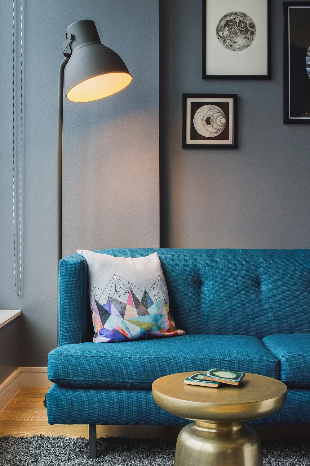
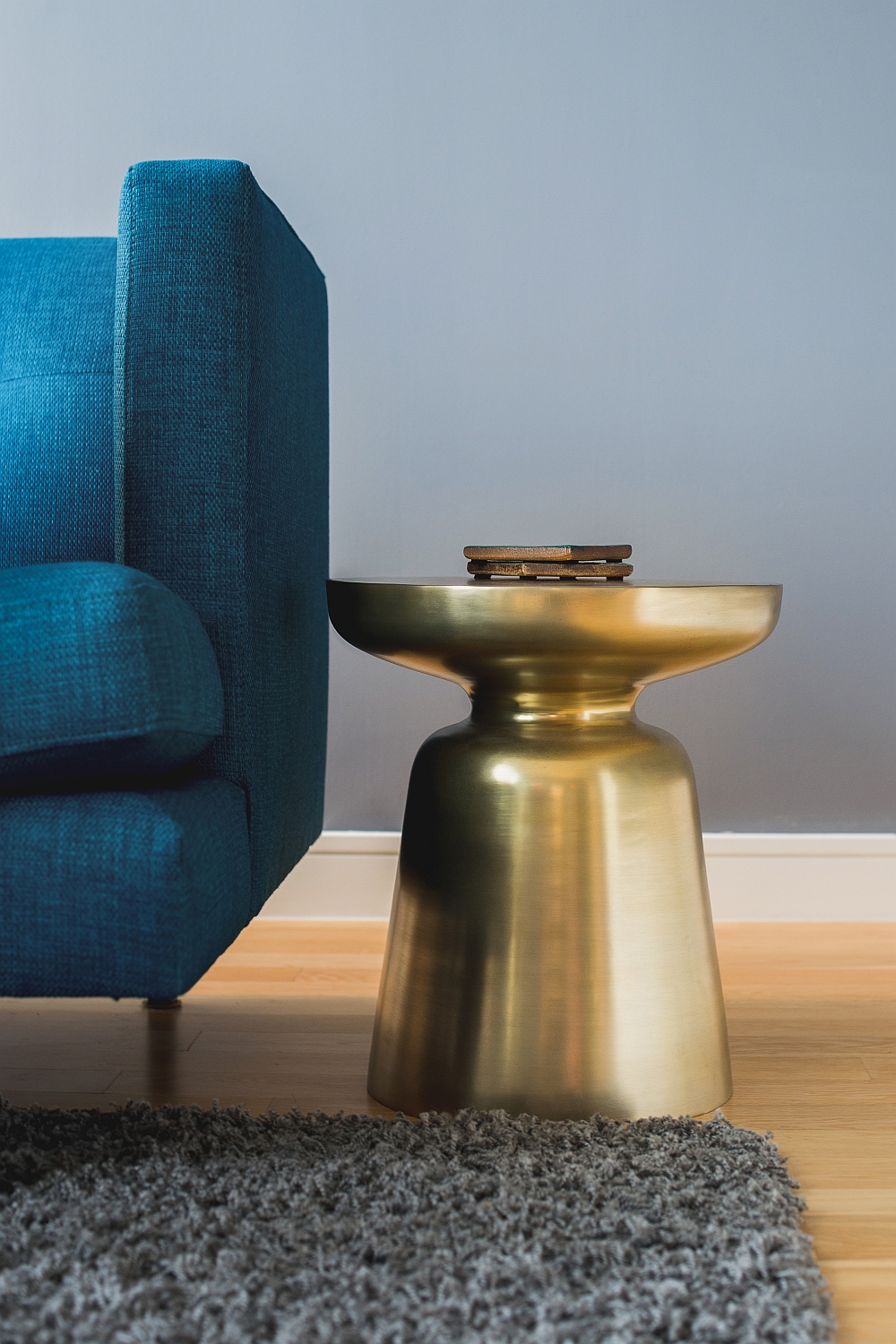
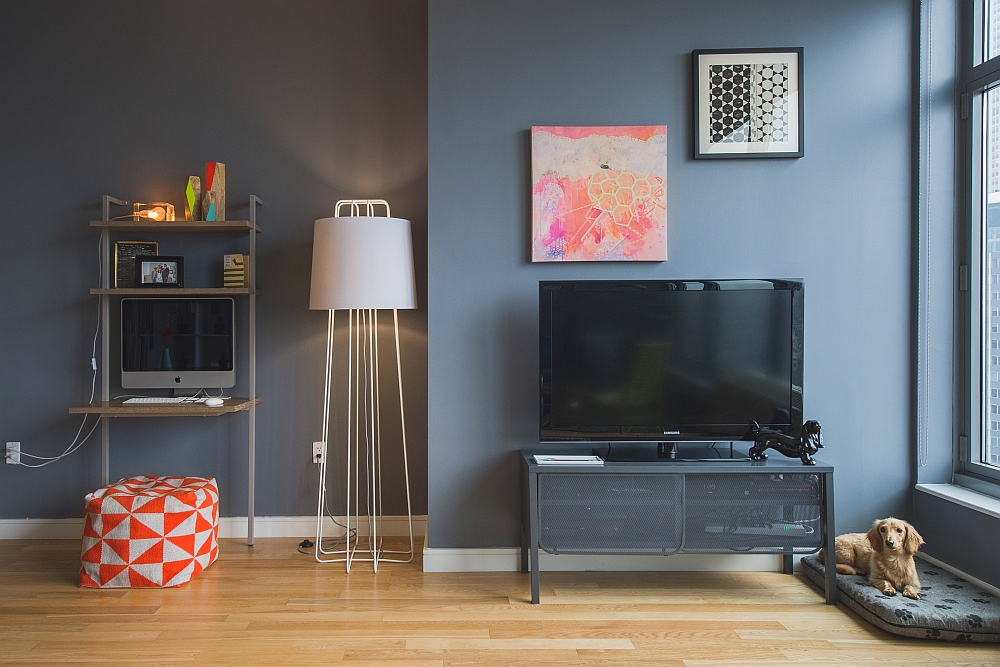
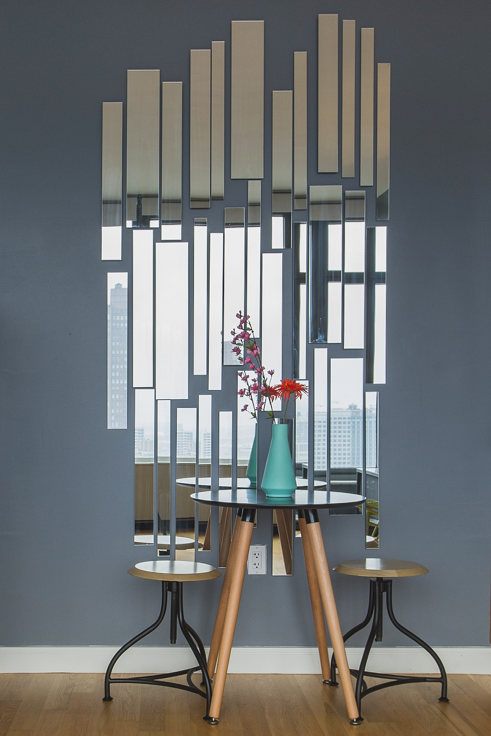
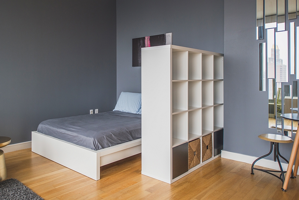
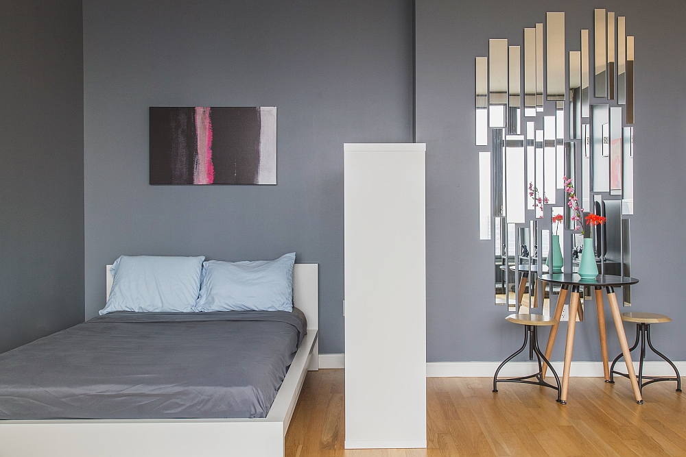
Since both Kim and Jaime wanted a more modern, bold interior, the walls acquired a trendy gray look, while bold furnishings like the CB2 Peacock Sofa were added to bring in brighter pops of color. While the apartment previously had an underlying feminine appeal, the revamped home has a more masculine vibe with simple straight lines and contemporary aesthetics.
[Photography: Samantha Goh and Claire Esparros]
It is not very often that we see the same studio apartment go through two fabulous makeovers, with each one being as appealing as the other. Yet both versions have their own flavor and flair and even showcase how light and dark backdrops look equally elegant in a small studio apartment! Which of the two do you love the most?


