Do you remember those days in art class when you created a vignette using a book, an apple and a flower, and then you painted it? That still life lesson has come and gone, but when it comes to modern design inspiration, the still life has once again returned to our radar. In a big way! A recent resurgence in still life photography has brought geometric shapes, bold colors and sculptural forms to the forefront, elevating everyday items and artistic groupings to new heights!
In today’s post, we take a look at a few highly innovative still life artists, designers and photographers, and we explore what their talent can teach us about being creative in our own interiors…
The Modern Still Life
The modern still life ranges from bold and colorful to muted and minimalist. Let’s meet a few artists and photographers who are taking the still life in new directions:
Eric Trine
In discussing his work, talented artist and designer Eric Trine shares, “I design by making, rather than drawing, and personally design and build everything that bears my name. My projects vary from small scale design/build for commercial clients, to furniture, to sculpture, and decorative objects for the home. I would locate myself inside the middle of a triple venn diagram of art, craft, and design, which can be really exciting and really confusing at times.” We’re in awe!
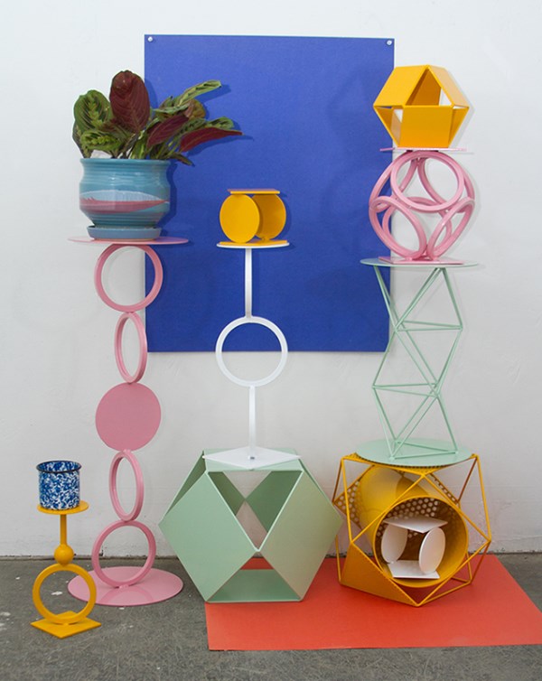
Above and below we see photos of a variety of pieces Trine completed for a collaborative project called Alley-Oop:
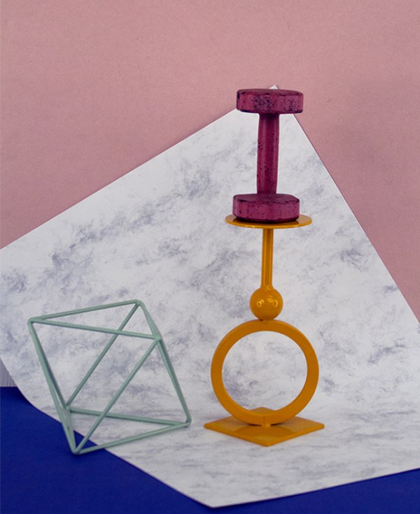
Featuring an array of forms and colors from the geometric to the candy-hued, these pieces were displayed in an installation at Poketo. They also became the subjects of a series of photo shoots that were later turned into prints and postcards. Today we celebrate those very photos!
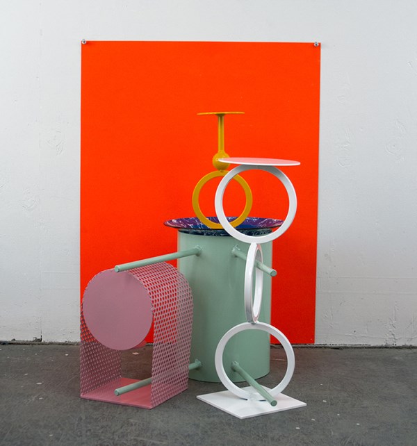
Interested in learning more about Eric Trine? Visit his website, which also features a shop.
Richie Talboy
Brooklyn-based photographer Richie Talboy incorporates an array of retro-meets-modern motifs into his striking work. For example, the two still life photos below are from his After Memphis series, which channels the vibrancy of Memphis-Milano design. Memphis pieces were popular in the 1980s and are definitely experiencing a major revival as we speak.
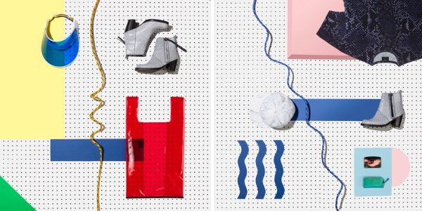
Talboy also brought a retro feel to his Summer Olympics series, created in collaboration with NYC art direction, design and creative consulting studio gg-ll. In fact, the concept, art direction and prop styling for this next duo of images was provided by gg-ll.
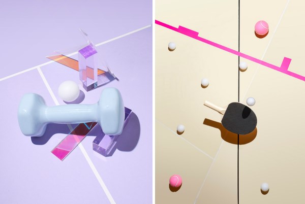
Talboy’s work is crisp, vivid and playful, a combination we can’t resist. View more of Richie Talboy’s photos here.
Alexander Kent
London-based photographer Alexander Kent focuses on the modern still life, exploring elements such as color, angle, and boundaries. From his advertising work to his personal projects, Kent’s images are stunning and bold. [via Ignant]
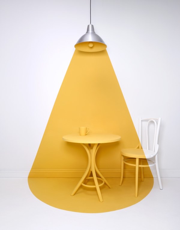
In the images above and below, a backdrop of white provides a clean slate for the powerful design that graces each space. Color flows freely yet precisely from light source to wall, furniture and floor.
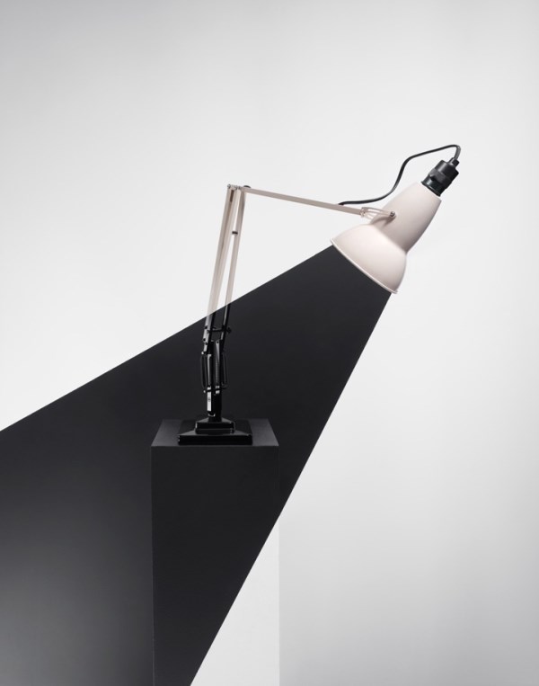
The result: an alluring interplay of light and dark that challenges our definition of organized space. Learn more about Alexander Kent here.
Still Life Style at Home
Are you as hooked as we are?! We can’t help but be inspired by these talented individuals’ fearless approach to design. And we also can’t help but notice how modern retailers are adopting the still life look in their photo shoots. Do you remember these cushions from ferm LIVING? We’ve featured ferm LIVING in a variety of posts, including this piece on design celebrating materials and simple forms.
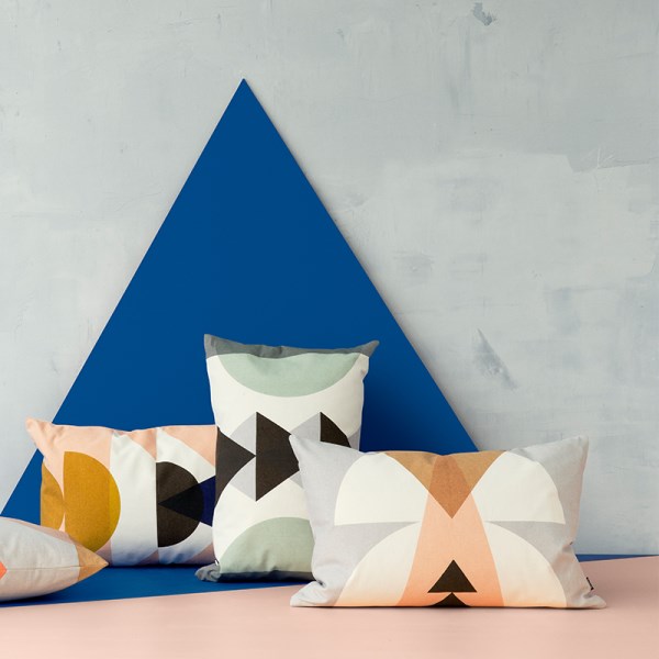
There’s definitely a still life quality to the product photos of ferm LIVING, and these pics often feature geometric shapes and unusual color combinations. Below we see a series of black and white cushions against a backdrop of pastels and royal blue:
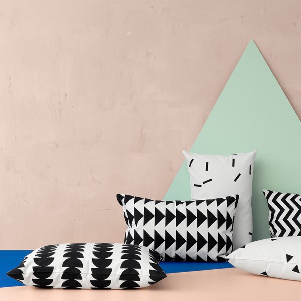
What can these images (including the still life examples at the top of the post) teach us about design at home? For one thing, it never hurts to think of each vignette as an artistic grouping, as shown by the wooden candleholders in the next featured image:
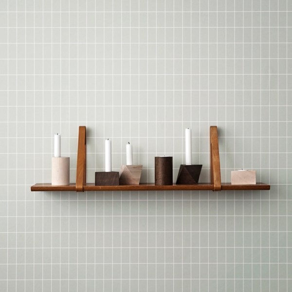
Don’t put your decor (even kitchen supplies) behind closed doors. Display them with pride and thoughtful curation. Below we see a series of cutting boards from ferm LIVING:
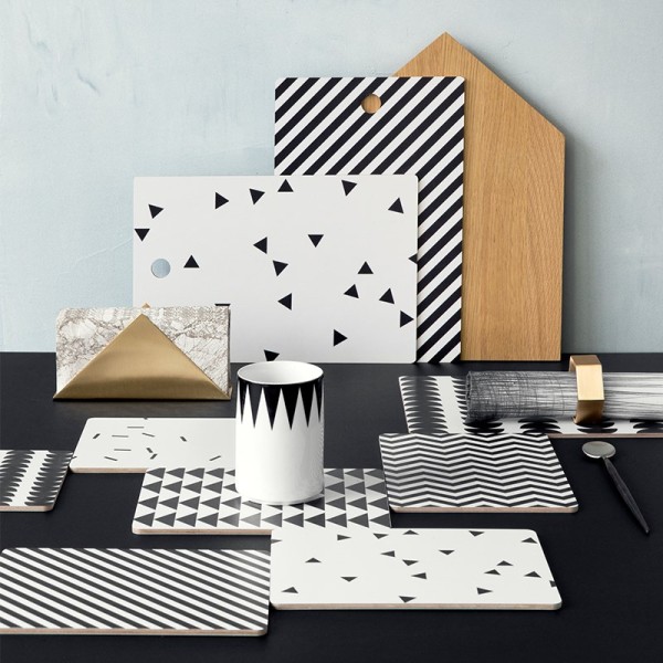
Another design studio with a flair for still life-inspired vignettes is Ladies & Gentlemen. Their products are true works of art, and their photos are filled with contemporary design ideas. Since we’re already fans of tropical plants, geo forms and mirrored surfaces, the image below (featuring Mirage Shelving) instantly piqued our interest:
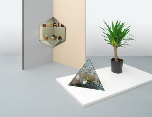
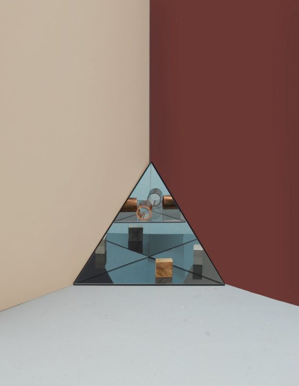
In the next image, we see the Tri-shelf, set against a dual-tone backdrop. This photo is a great reminder to pay as much attention to what’s behind your decor as the decor itself.
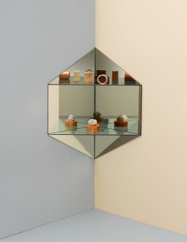
This Hex Corner shelving is breathtaking. Not only is the design amazing, the photo is a testament to the fact that there’s undeniable value in two-toned walls and interesting arrangements of simple materials, such as wood, metal and stone.
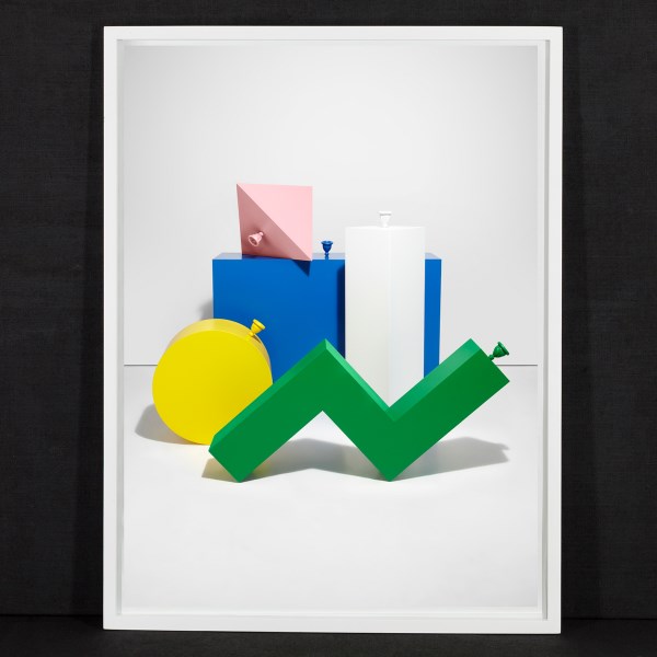
We end with a trio of items for sale at London-based Darkroom, including this signed photographic print from Gemma Tickle, titled Pop Print 1. Looking to add a little bit of still life style to your abode? Why not buy a modern still life photograph or print?!
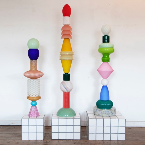
These Totem Lights by Jamie Julien-Brown celebrate the art of innovative sculpture. Crafted from glass and ceramic lampshades from Julien-Brown’s personal collection, these pieces inspire us to create some sculptural art of our own. Not that we could duplicate the artistry involved here. But Julien-Brown’s work can’t help but encourage us to find the artist within, especially when it comes to our own spaces.
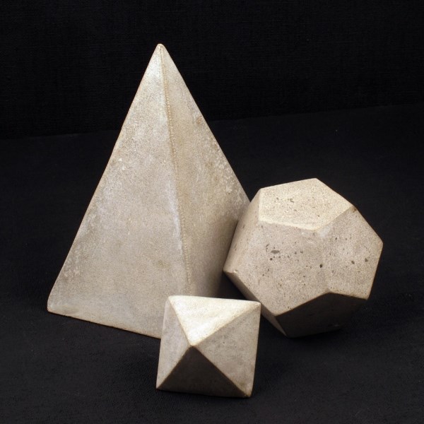
We end by featuring these Cement Geometric Objects from Serax, available at Darkroom. Interested in creating still life-inspired vignettes at home? Purchase objects that encourage you to combine sculptural pieces in modern groupings! These geo forms are a great place to start.
We hope today’s post has inspired you to seek out the work of talented artists and designers. And of course, to make your home a place that reflects your true creativity!

