When you experience the work of interior designer Rafael de Cárdenas, it’s hard not to notice the unexpected touches that permeate each and every space he creates. Perhaps it’s an unforgettable lighting statement or a piece of custom-built geometric furniture. In fact, you can’t take in this designer’s spaces without studying them, because the visually interesting details are so abundant. Yet rather than being overbearing, they live in perfect harmony.
When it comes to my own creative endeavors, I consistently return to the work of Rafael de Cárdenas for inspiration. His aesthetic is completely unique and ever-evolving. Through his design firm Architecture at Large, he has shaped a multitude of interiors, from spectacular residences to commercial spaces for the likes of Nike, HBO and OHWOW. Below I feature a few of my favorites and highlight some signature elements of this talented designer’s work.
The Bold Use of Geometry
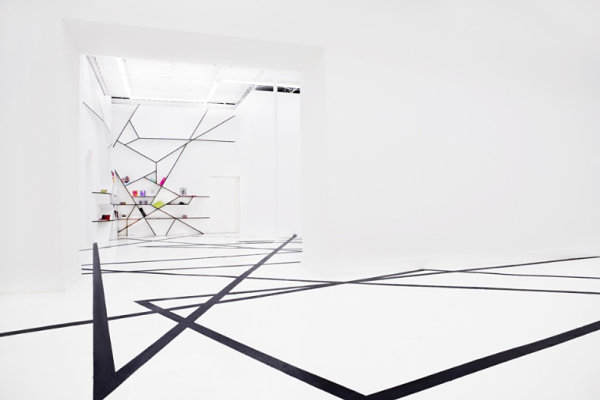
What initially drew me to the interiors of de Cárdenas is the designer’s striking use of geometric forms, as shown in his work for OHWOW Gallery in Miami, a space used for public events. In addition to an impressive fractal floor pattern, the gallery boasts a wall display unit that celebrates abstract design while displaying an array of colorful items.
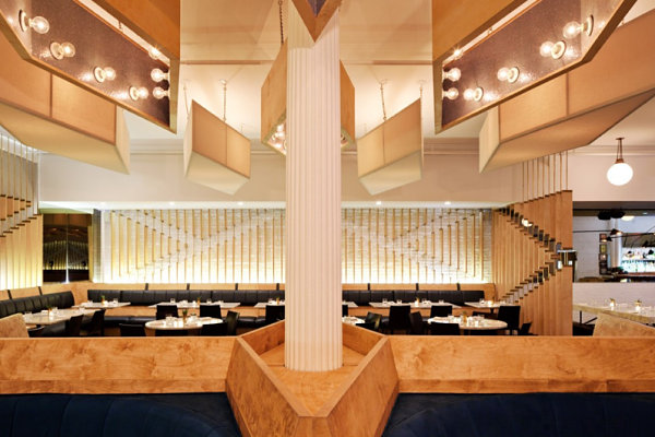
The designer’s use of geometry can also veer into elegant territory, yet his spaces are never too formal or stuffy. Below we see Kutsher’s Tribeca, designed to be a modern interpretation of Kutsher’s Country Club in upstate New York. In addition to the neutral palette featuring an array of golden tones, we see an assortment of lines and angles that converge in stunning formations.
Retro-Meets-Modern Design
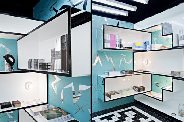
The very first de Cárdenas space I ever laid eyes on: the OHWOW Book Club, shown below. I featured this interior in a design post for my own blog Mirror80, then again in a Decoist post on unforgettable retail space design. Not only does this interior showcase pre-war New York City bathroom tile arranged in updated patterns on the floor, it boasts an abstract wall pattern created by brush strokes and mylar shapes. The result: an ’80s-meets’50s-meets Deco space that incorporates hints of retro design while remaining undeniably modern.
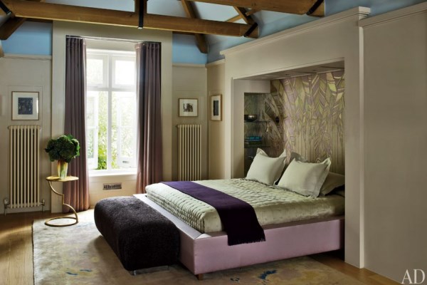
The glamorous bedroom below incorporates shades of purple and beige, and the area behind the bed is covered with a design that evokes the gilded geometry of Art Deco style. Once again, we have a space that references the past without living in it. [featured in Architectural Digest]
A Striking Use of Color
Another memorable feature of Rafael de Cárdenas’ work is the bold use of color. And what better way to show the designer’s commitment to vibrancy than with pictures from his own apartment, featured at Sight Unseen?!:
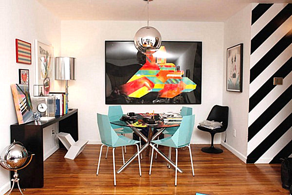
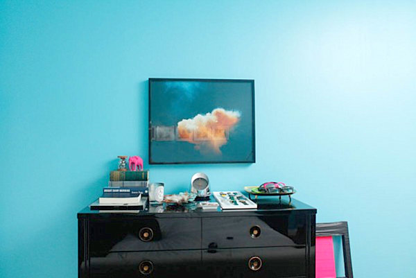
Diagonal stripes, radiant artwork and geometric furniture are standout elements, as is the juxtaposition of turquoise blue, hot pink and black lacquer, shown in the designer’s artfully arranged bedroom below. The thoughtful yet fearless display of color is a good reminder that when it comes to interior design, some risks are well worth taking. [photos by Mike Vorrasi]
Patterned and Textured Surfaces
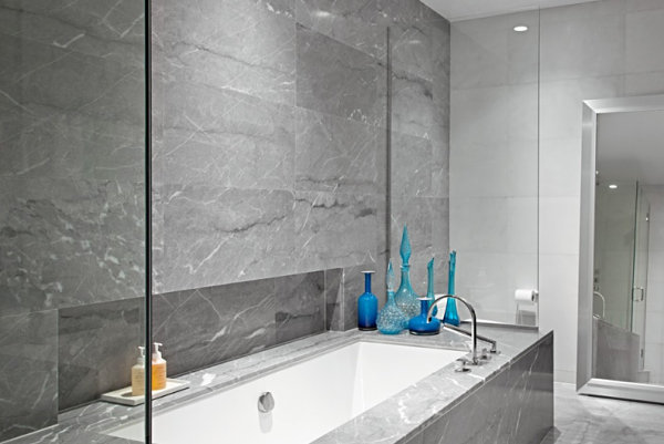
Rarely do de Cárdenas ‘ interiors lack a sense of texture. The designer’s use of marble is strategic–the veined gleaming surfaces of his interiors are often juxtaposed with other key features, such as the collection of cerulean glassware in the master bath of this East Village apartment in New York City:
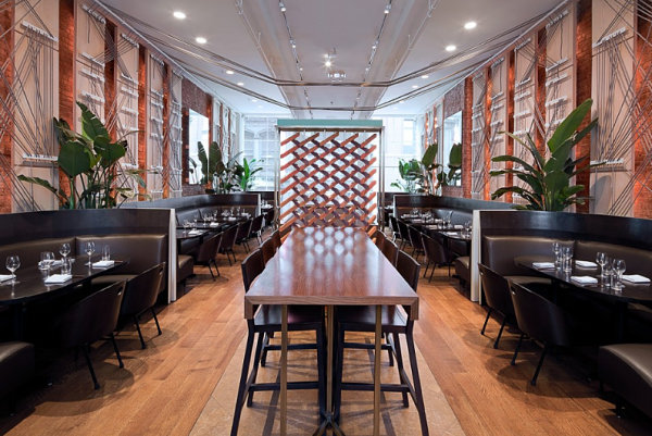
Texture jumps off the walls at Soho’s Niko, a restaurant de Cárdenas decked out with an angular network of ropes. In fact, the geometrically stitched roping takes on a Deco vibe, as well as a contemporary one.
New Life for the Outdated
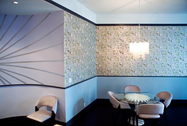
If you think it went out of style years ago, don’t be surprised if you see it brought back to life with a new twist by Rafael de Cárdenas. In this 4th Avenue residence in New York City, we see vintage French silver-leafed wallpaper that looks anything but dated, thanks to the dreamy use of feminine colors and the bold definition created by black trim:
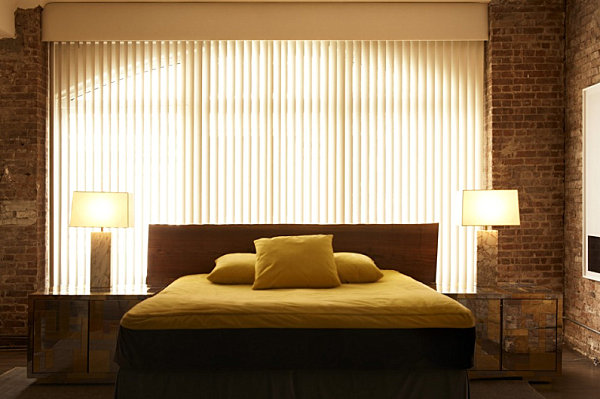
Remember when vertical blinds were a bad thing? I knew my life had turned the corner when I stopped living in apartments that featured dented, nicked window dressing of the vertical nature. Suddenly, I would give anything to have the vertical blinds back. Maybe they could have been fabulous if I’d dressed them up with mirrored furniture, marbled lamps and other clean-lined flourishes, as shown in the Soho Wooster Street Residence below:
Standout Features
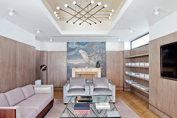
Even rooms bathed in neutral tones include an array of standout features once Rafael de Cárdenas has put his stamp on the space. The modern metallic light fixture below (featured at Ford Models Women’s Division) is one case in point.
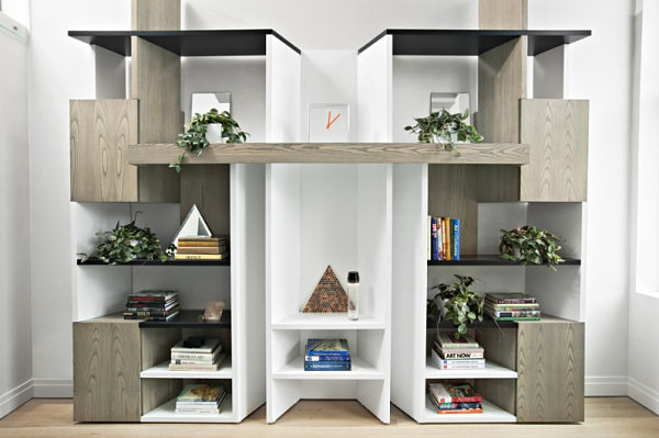
So is the custom-built bookshelf he designed, which takes center stage in a modern residence in New York City’s iconic Printing House building. Even the bookshelf itself is layered with statement pieces, from the triangular to the verdant:
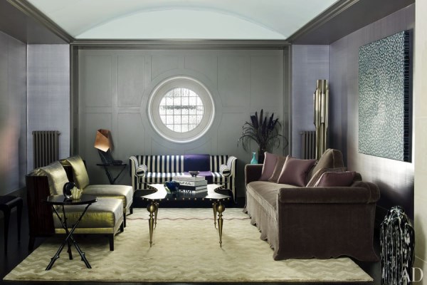
It’s hard to know what to look at first in this living area from a de Cárdenas-designed London home. My eyes are immediately drawn to the striped sofa, but each piece clearly has a unique story to tell. [photo by Simon Upton for Architectural Digest]
Gallery-Style Retail Spaces
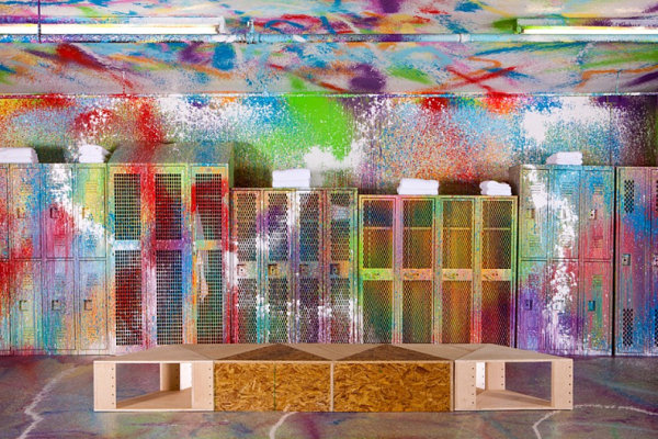
I’ll end today’s post with two retail spaces that blur the line between commercial interior design and high art. At Nike Bowery Stadium, the free use of color meets geometric design, thanks to splatter patterning and modular boxes crafted from pegboard and plywood.
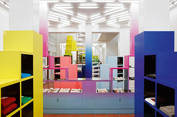
This next retail space designed by de Cárdenas is Unknown Union, a boutique in Cape Town, RSA. Bright colors and an ombre effect combine with shelving to create true works of art that double as functional display pieces.
It doesn’t take much to fall in love with the work of Rafael de Cárdenas. If you’re hooked like I am, visit Architecture at Large to see many more inspirational images and stunning interiors.
