Though I have never planned for or decorated a nursery myself, I have plenty of family members and friends who have had babies in the last year, and I have definitely learned a few things should a little bundle of joy ever be in my future. One of these things is that there seems to be a shift in how people decorate nurseries. Gender neutrality is making a comeback! The result: some brilliant and beautiful nurseries that any parent and baby are sure to love!
Sharing the Space
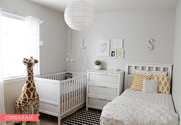
Sometimes, baby may just have to share a little space with an older sibling for a little while, and this certainly calls for some neutrality if the room is for a boy and a girl. Using black, white and yellow is ideal, because it makes everyone happy and doesn’t force you to have a rainbow explosion in the room with too many colors. [Via Cin Sarah]
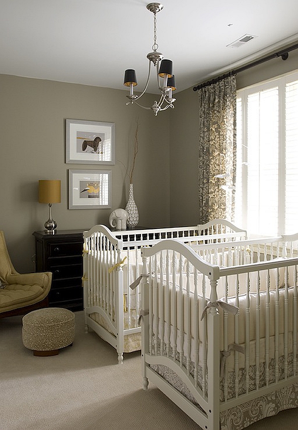
Having twins? Well this is another perfect opportunity to have a large space that can fit in well with either a boy or a girl or both! I love how chic this nursery is without trying too hard. Details like the chandelier and the luxe curtains bring this design up a few notches! [Via Decor Pad]
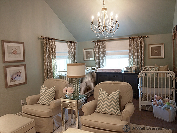
Another example of a shared space for twins, this room is also full of luxurious items. The cribs themselves are quite amazing, but my eye goes straight to the mirrored table between the two stuffed chairs. Nursing your crying babies in the middle of the night has never looked so good! [Via A Well Dressed Home]
White and Bright Nurseries
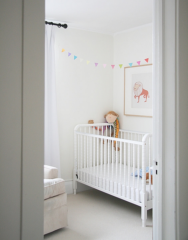
There is a certain sweetness about this light nursery, and it has a lot to do with the fact that the colors, added in small doses, pop against the white backdrop. This blank canvas is sure to become a real masterpiece once a sweet little baby is added into the picture! [Via Aubrey and Lindsay]
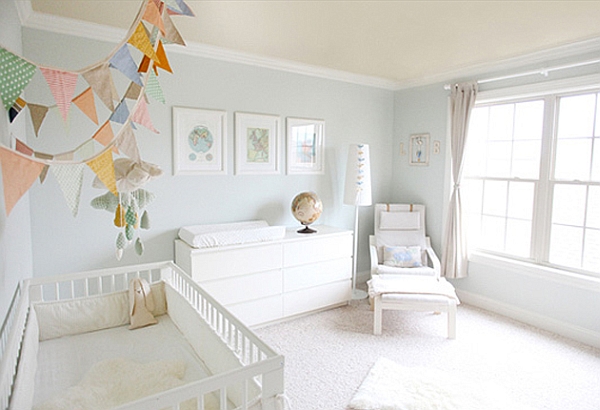
The walls are a soft grey-blue in this room, but so much of the furnishings are white that they look like clouds in the sky! I love how all of the colors used tie into one another – from the artwork, to the globe, to the pillows and the bunting above the crib. [Via Onto Baby]
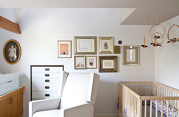
It would be hard to imagine this room without accessories, because in this case, the accessories bring all of the warmth to the space. The use of gold and warm wooden tones brings the room together and adds such a great soft glow to this nursery! [Via Onto Baby]
From Beige to Taupe – Neutral Nurseries
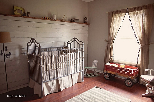
This nursery definitely has a more masculine flair, but I think the coolest little girl baby could also love this space! There are some soft details like the white rocking chair and the beautiful drawer pulls on the dresser, but overall, this space could be loved by either a boy or a girl! [Via S.B. Childs Photography]
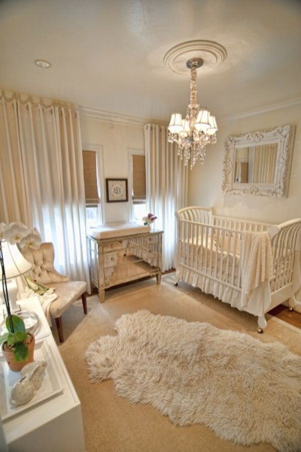
This is a room fit for either a king or queen! There is so much chic happening in here it’s hard to know where to start looking – the sheepskin rug, the velvet chair, the mirrored dresser, the ornate mirror… luxury is everywhere with this one! [Via Luxe Finds]
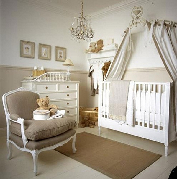
My favorite thing about this room has to be the whitewash finish on the floors…and the canopy over the crib… and that fabulous chair! OK, so I love everything, but that’s because this room looks so grown up and classy, it’s easy to forget that a baby lives in there! [Via Apartment Therapy]
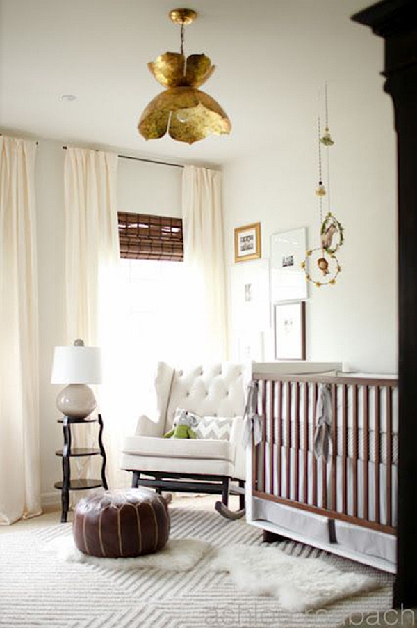
Ivory, brown, black and gold is not a combination that sounds like it should go together, especially not for a baby’s room, but looking at this nursery, it all works so well that I am officially a believer! That chandelier is divine… and I want it in my own house please! [Via Me Oh My Mama]
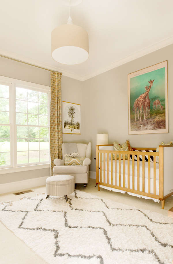
This is such a refreshing take on a safari theme for a nursery, and I love it! Rather than plastering the walls with cartoon decals, these parents went for a fun and colorful print that brings some life into the room. The curtains also give a nod to the theme while tying all of the colors together, and the mix of beiges and taupes is a real win! [Via Lay Baby Lay]
Nurseries with Unique Colours and Patterns
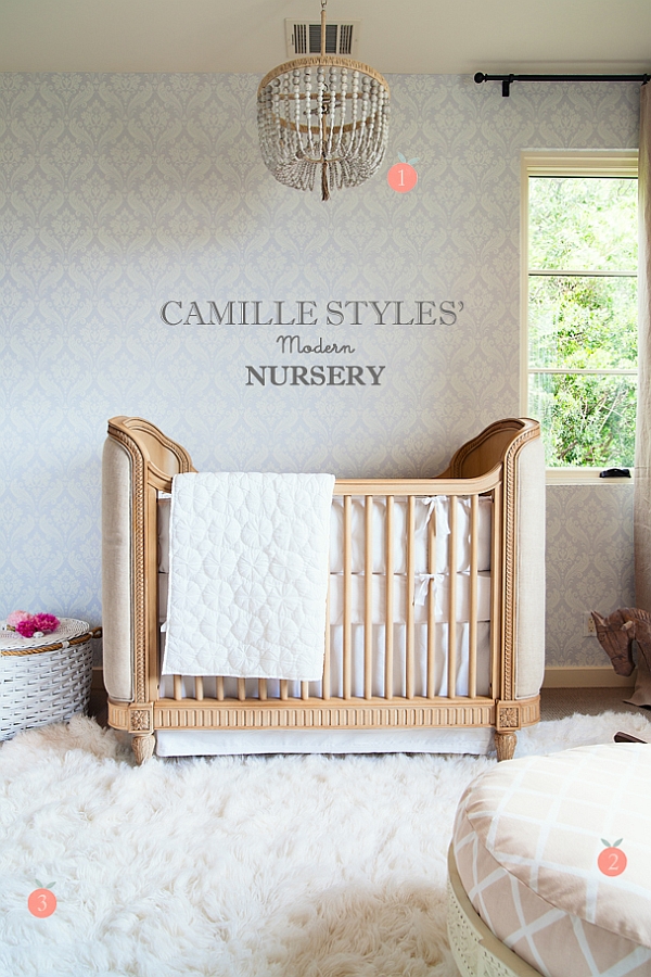
There is an element of classic beauty in this room that makes me think it belongs in a different era. The details of the chandelier and on the crib are beyond perfect with the classic pattern on the wallpaper, and an unexpected touch for a nursery. [Via Project Nursery]
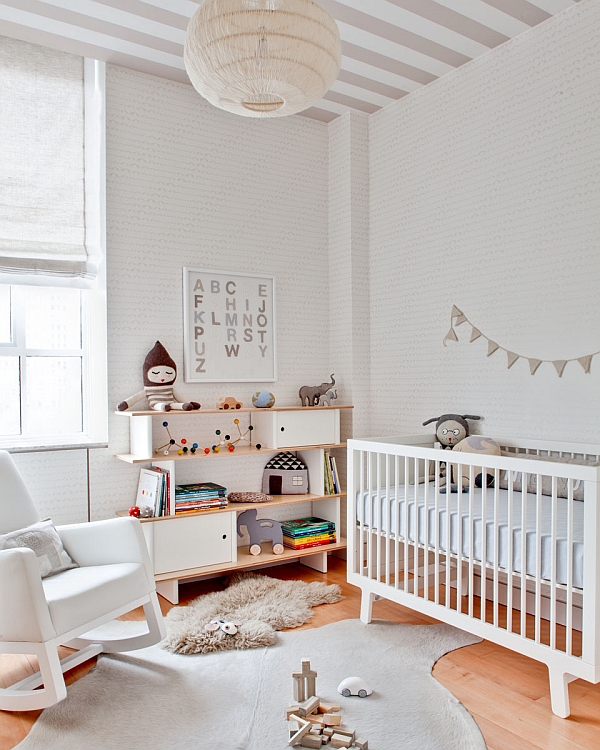
I just adore how fun and playful (though completely neutral) this nursery is! The patterns on the ceiling and on the walls are so perfect together because they are in muted tones, and repeating those colors throughout this nursery makes the whole design come together beautifully! [Via Design Sponge]
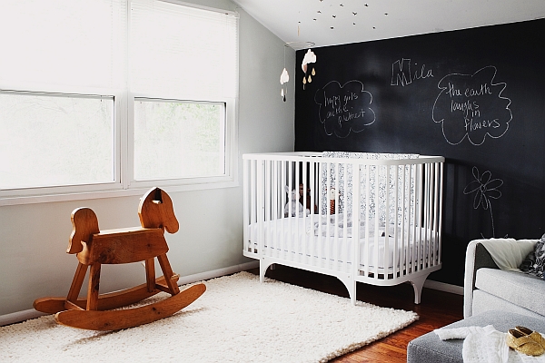
My mother would probably collapse if I ever told her I’d be painting a wall black in a child’s room, but chalkboards are just so much fun! With the white and natural wood throughout the room, this looks a little Scandinavian and a lot cool! [Via Project Nursery]
So have I changed your mind about having either a blue or pink nursery? I do know this: some of these designs are inspiring me to move towards a more neutral space that can still be fun and playful without being too obvious and in your face.


