There are two powder rooms in my new place, and they are both clean-lined spaces that would benefit from a touch of minimalist design. When we moved in, my hubby and I took down the gilded mirrors, changed out the countertops and added some modern fixtures. But I have to admit–I’m still struggling with each space. I’ve kept these rooms uncluttered, but the accent colors just don’t seem quite right. Neither does the wall art. I’m on the hunt for new ideas.
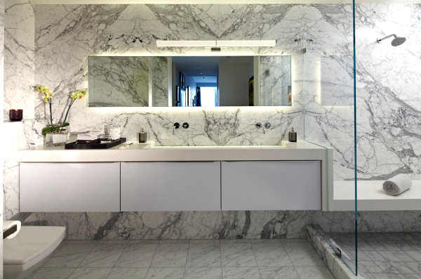
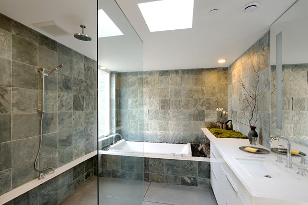
Today I thought I’d share some of the most stunning spaces I encountered on my search. As I began to amass a large collection of inspirational images, I noticed that these powder rooms had a variety of key elements in common, such as unfussy displays of grooming products and the strategic use of plants (as shown in the image above from Studio Becker). And I got some great ideas for how to make a big statement in my powder rooms while still honoring a minimalist approach. Check out the images that follow, and then tell us about your favorites by leaving a comment at the end of the post!
Fixtures and Features Become the Decor
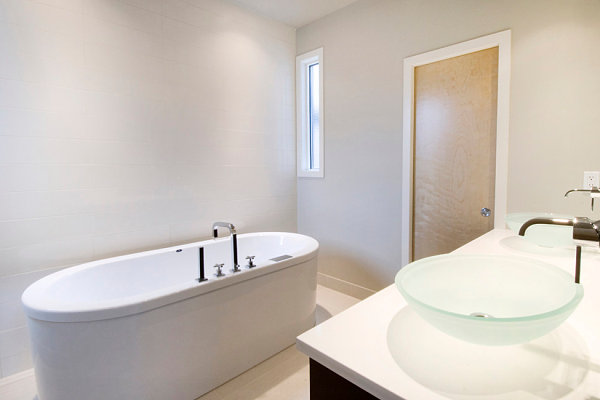
The most minimalist of powder rooms do away with decorative touches such as countertop flowers and bottles of bubble bath. In fact, in these clean-lined bathrooms, the fixtures and features themselves become decorative statements. This strategy is not a design rule–just one possible approach. In the contemporary powder room below, we see how modern faucets and statement sinks steal the show. [from Fifth Element Homes]
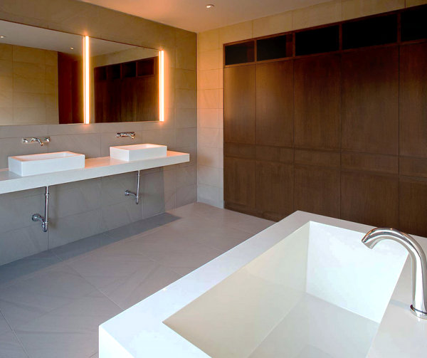
Some spaces rely on the walls to set a designer tone. It’s hard to take your eyes off stunning wooden cabinetry, mirrors with built-in lights and high-quality stone! [from Specht Harpman Architects]
Sometimes one key decorative feature is added for impact, such as the towel rack in the image below. Keep in mind that this item is as functional as it is stylish! [from Glen Irani Architects]
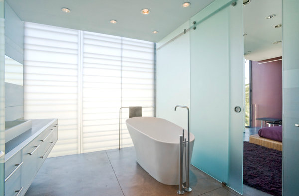
A soap dispenser, a thoughtfully chosen mirror, or strategically a selected accent color can also do the room justice without relying on embellishment from countertop accents! [from Lea Bassani Design]
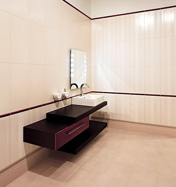
If you go with this “no countertop decor” approach, make sure the features in your powder room are true standouts. While I’ve updated a few features in my minimalist bathrooms, there are no showstopping elements, such as a modern tub or an unforgettable mirror. This approach may not be the best for my powder rooms, but it might do just fine in yours!
A Few Well-Chosen Decorative Statements
A lacquered tray filled with jewelry, perfume bottles and soaps. A trio of vases displaying flowers in pastel tones. A countertop display of grooming products, such as hair gel, deodorant and face wash. These are NOT the type of features you will find in a minimalist bathroom. Not that there’s anything wrong with them! But no-fuss spaces keep the bulk of the grooming products and cushy details hidden, instead choosing to highlight a few key pieces. Like a clear vase filled with one or two blooms, or lotion displayed in a crystalline canister. [Photography by Alexia Fodere for DKOR Interiors]
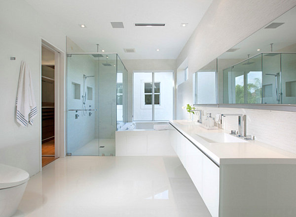
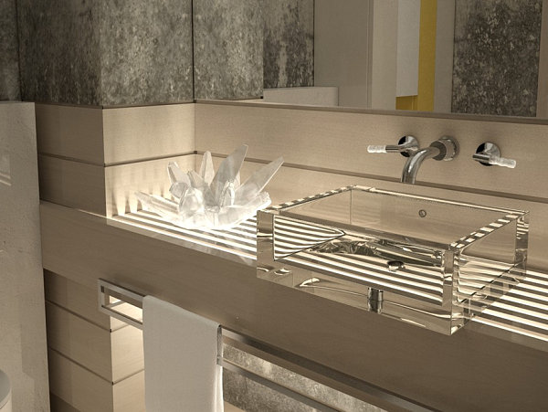
Sometimes one really unusual piece does the trick, like the quartz-y specimen below. That transparent sink is pretty unique as well! So are the towel rack, the faucet handles and the use of yellow as an accent color in the space. Can you see why less is more in terms of small decor here?! [from Gemini Guild]
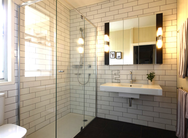
If you have no counter space, it may be important to keep accent pieces to a minimum. A small plant can do wonders, as shown in the tiled bathroom below. [by Skyring Architects Brisbane]
Note the bathrub terrarium in the next featured image. A horn bowl and a simple rectangular soapdish are other thoughtful details. When it comes to the minimalist space, choosing wisely is important. [from Tatum Brown Custom Homes]
A pendant light, a stack of towels and a couple of unique display pieces are standout features in the bathroom below. So is the silver backsplash! Note how the black rug ties in the dark countertops, anchoring this well-designed space. [from See Materials]
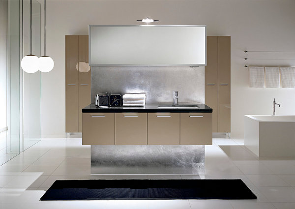
This “less is more” approach could work well in my bathrooms. Less stuff on the countertops. More thought into each piece. I’m keeping this strategy in mind!
Welcome the Plants
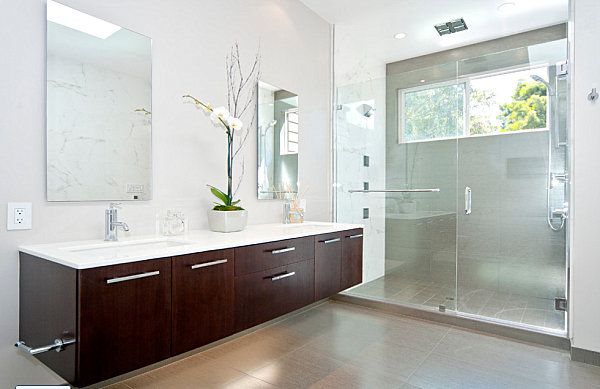
When it comes to minimalist design, plants are your friend. Some of my favorite interiors feature an assortment of plants for a lush effect. In a minimalist bathroom, there’s no need to crowd the room. One interesting plant can set a high standard, as shown with the tall orchid below. [from Cabinets & Beyond]
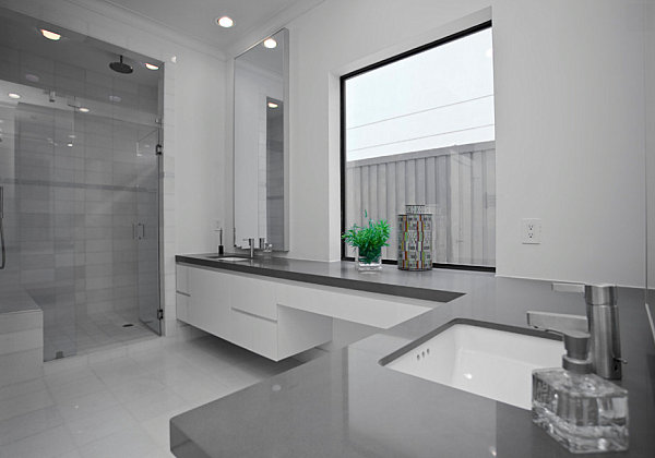
Sometimes it’s the color of the plant (rather than the size) that makes a difference. The cool-toned bathroom featured in the next image is brought to life by a vase of greenery in a radiant emerald shade. [from Dallas Interior Renovations via Houzz]
You can even get elaborate with a plantscape featuring moss, branches and other blooms. But make sure you know what you’re doing, or seek the advice of an expert before making a go of it at home. An arrangement like this is tough to pull off! [from Will Austin Photography via Gary Gladwish Architecture]
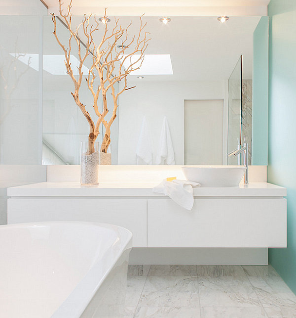
You can always add drama using a vase filled with branches. In a clean white and aqua space, do you need anything more than one bold arrangement?! Well, maybe a bar of soap… [from Leslie Goodwin Photography]
The addition of plants is a must for my powder rooms. These areas of my home don’t get a ton of light, so I’ve got some research to do. But I definitely love the way plants can wake up a room without overpowering it. Plus, they’re refreshing, and they improve air quality. I’m sold on this minimalist design strategy!
Colorful Accents That Make a Difference
Don’t be afraid of color. Even the most minimalist of rooms can use color to its advantage. For example, the bathroom below features a shower lined with blue tile. And that’s just the dose of radiance this space needs! [from Ibarra Rosano Design Architects]
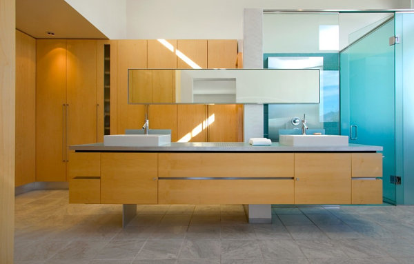
In fact, tile is a popular way to add color to the powder room. Use it to set a striking modern tone, then return to the shade with other accessories, such as flowers. [ModCraft Collection tile from Filmore Clark]
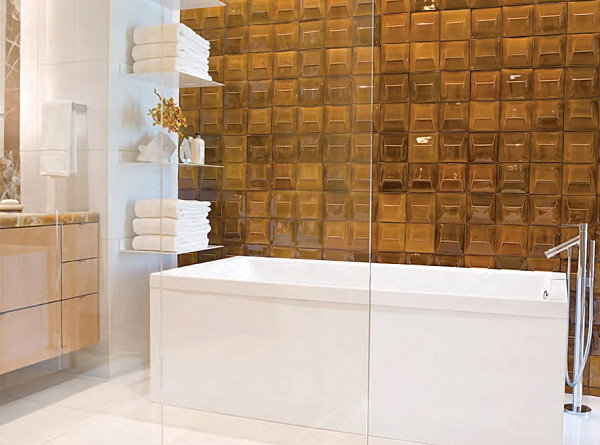
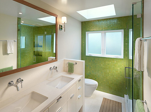
On that note, check out the next featured bathroom, which showcases green tile and matching towels! Little else is needed to embellish this space, aside from elements such as wall-mounted faucets by Grohe, available through AllModern. [from Rossington Architecture]
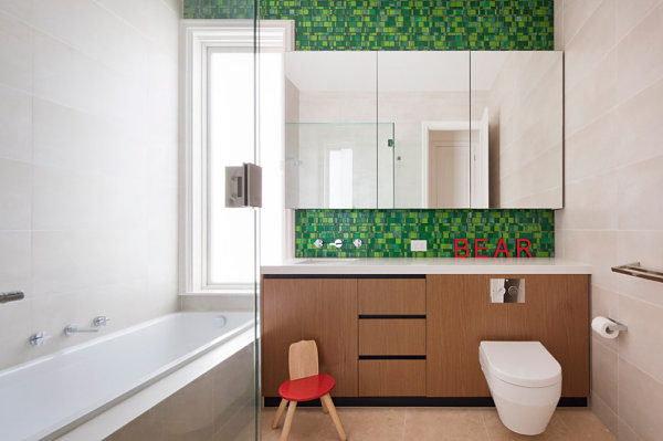
You can also pick out a contrasting color. Vivid red-orange is the perfect counterpart to the green tiles below. Special touches such as a child’s chair and countertop letters are an ideal way to introduce the second hue. [from Chan Architecture]
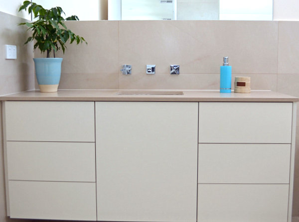
What if your minimalist bathroom doesn’t feature a tile wall, backsplash or shower and you still want to add color? No problem! Accessories are a great way to brighten your space. Below we see an eye-catching blue soap dispenser, as well as a ceramic pot in a similar shade. Again, less is more. These two items do the trick, and they are just what this beige bathroom needs. [photo by Jennie Hunt for Houzz]
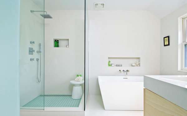
Small touches can be powerful ones. For example, green is the color of choice in this last featured powder room. We see the shade on bath products that stand out against the white backdrop. When the containers are pretty enough to display, there’s no need to hide them. Especially when they reinforce a unified color scheme. [from S.M. Contracting Inc.]
I’d like to keep one of my powder rooms neutral (aside from a plant), but I will definitely be adding an accent color to the other one. I’m thrilled that there are so many strategies for designing a chic minimalist space. From adding no features to enhancing the room with well-chosen items such as colorful accents, the possibilities are endless.
Is there a technique that captured your interest today? Share your thoughts by leaving a comment below…
