If you are a fan of Robert Frost, then you would describe the design philosophy behind the new Pinterest headquarters in San Francisco’s SoMA neighborhood as “miles to go before I sleep”. In simpler terms, the brand new office tells its employees that the company is still a ‘work in progress’ and the current office is just a stepping stone in a larger journey ahead! Beautifully bare and a touch industrial in its approach, the stylish and chic Pinterest headquarters is a reminder from Evan Sharp, the company’s co-founder, that it has sights set firmly on larger goals.
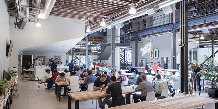
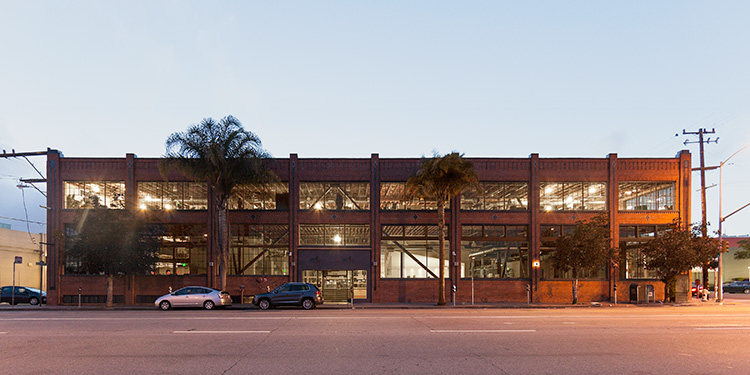
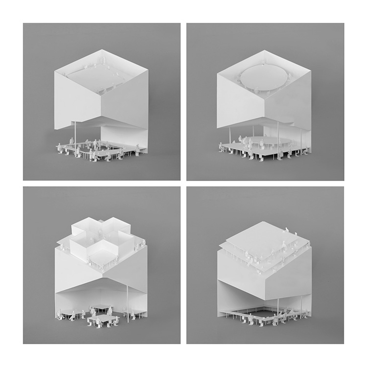
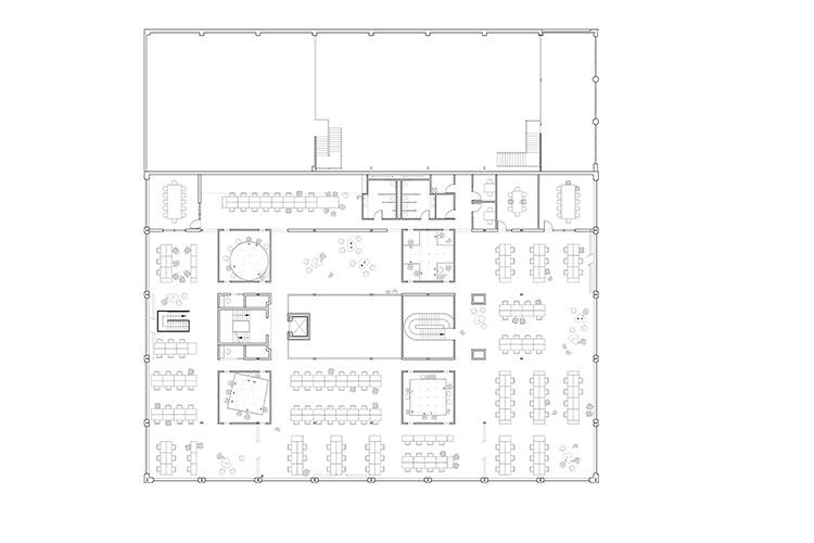
Research has suggested that office design plays a huge role in employee psyche and architects Janette Kim, Anna Neimark, Andrew Atwood and Neal Schwartz turned the old warehouse on 7th Street into a fabulous modern office, while keeping the industrial chic overtones intact. Four large white structures were inserted into the existing 45,000-square-foot to create a combination of personal and public space for over 150 Pinployees.
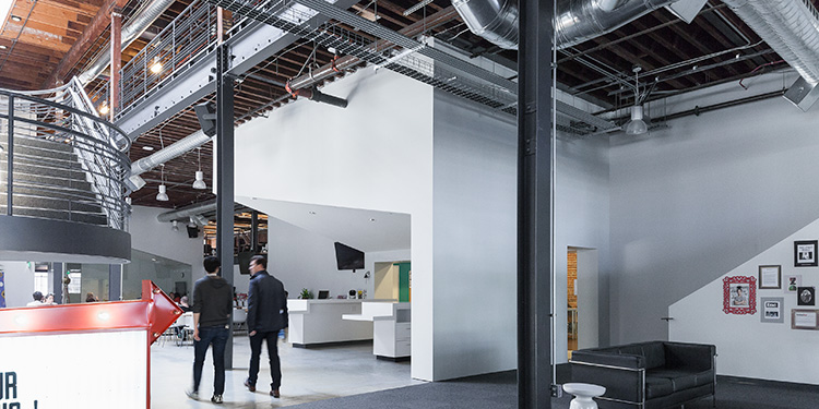
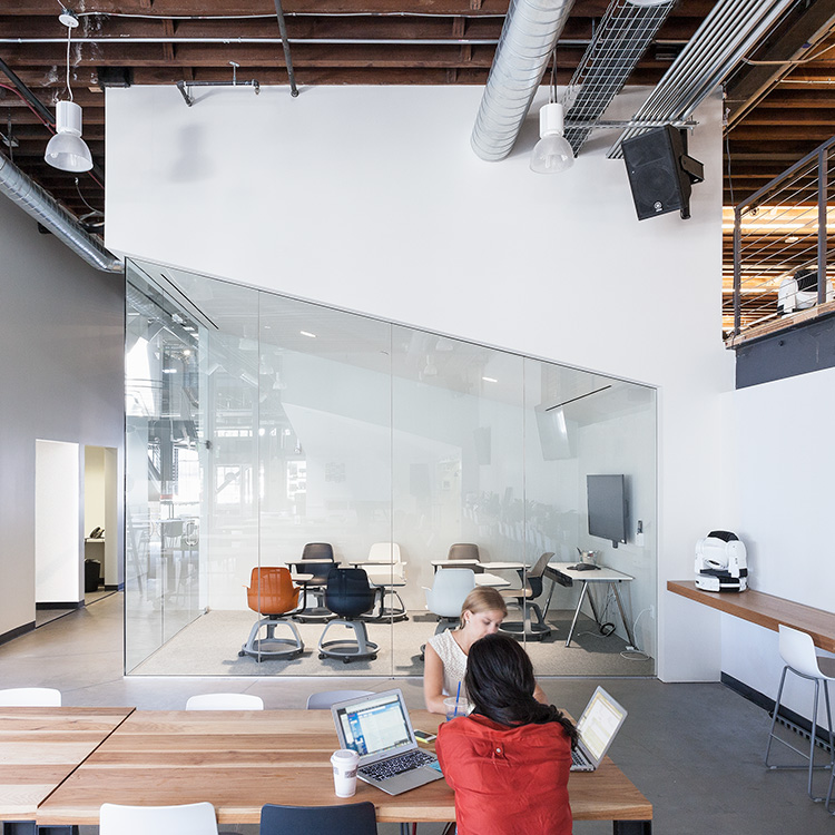
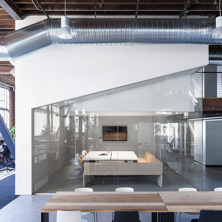
Like Pinterest, we wanted our space to accommodate the most heterogeneous set of occupations possible. Whether you’re comfortable working at a dedicated desk, on your laptop at a communal table, or in a dark corner in the basement, it’s likely that you’ll find a place that works for the way you like to work.
-Pinterest co-founder Evan Sharp
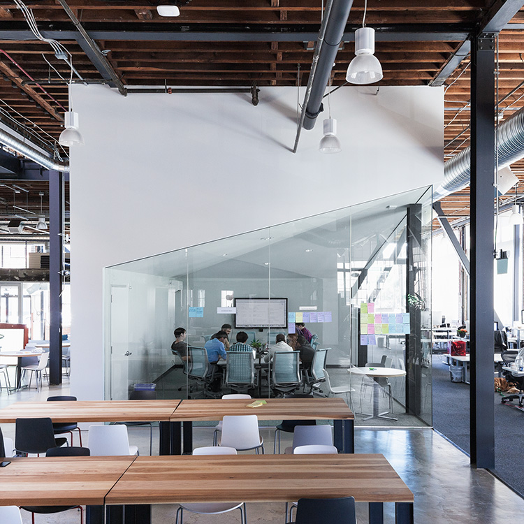
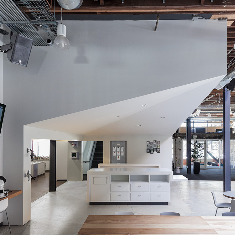
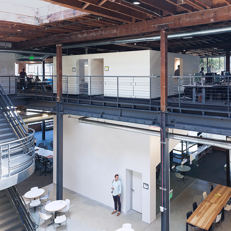
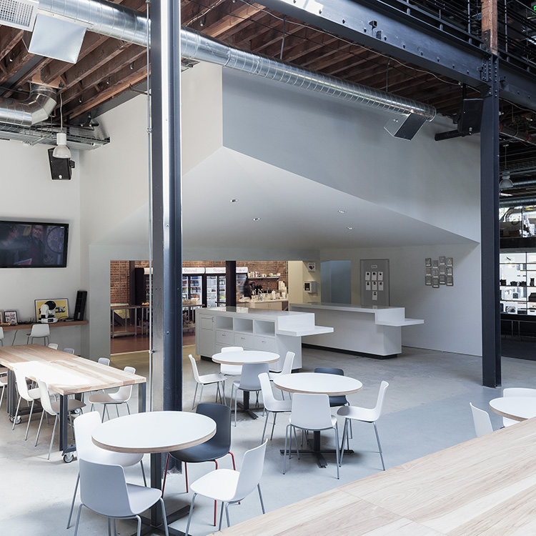
The headquarters tries to cater to everyone’s individual needs while encouraging a team mentality and creative collaboration. Employees can find quiet little nooks that will help them in getting the space they need to come up with the next big Pinterest idea, while large tables and a conference space have been created to encourage sharing of ideas. A dedicated ‘war room’ is for those who need to stay focused and meet the imminent deadlines, while a large kitchen and cafeteria see the fun times unfurl.
Large glass windows, exposed steel and wooden beams, white walls and industrial-styled, focused lighting really give the space a bare and bold appeal. Evan Sharp says that they intentionally tried to keep away from a design that shows “complacency or decadence”. With DIY art projects from the employees hanging from the beams above and fun vintage overtones, this well and truly is a refreshing new take on office design from one of the big boys in cyberspace.
