We at Decoist love a good home tour! There’s something about getting an inside look at the creative interiors of others. These spaces inspire us on our own design journeys. Today we round up 17 stellar living rooms. Some of them belong to talented bloggers, and some belong to our favorite designers. Others are the homes of people like you and me. People who love design and aren’t afraid to take chances. Check out the interesting decor choices below, then tell us about your favorites at the end of the post…
Unique Interior Design Ideas for Your Living Space
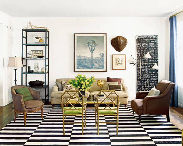
We begin with the living space of interior designer Nate Berkus (back when he lived in Chicago). This eclectic living room features a range of looks, from industrial shelving to gilded chairs. Berkus’ space reminds us that some of the most interesting interiors involve a mix of styles and pieces. [from Elle Decor]
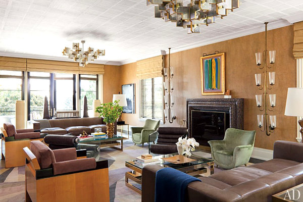
Next we see a living room designed by Kelly Wearstler. One feature that catches our eye: wall lights salvaged from a Roman cinema (currently hanging on either side of the fireplace). Don’t hesitate to incorporate pieces with their own unique stories. It’s items like these that give a place true character! [from Architectural Digest]
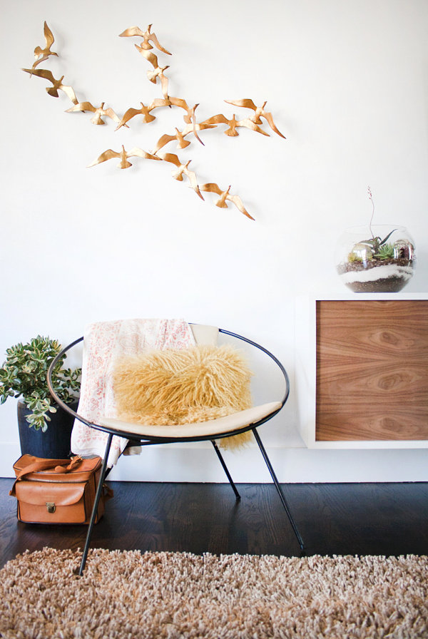
Anyone else a huge fan of home tours a la Apartment Therapy? One such tour features the house of Cass & Carla, which boasts a collection of carefully selected items that are original in their style and design. Check out the layered soil of the terrarium. Note the texture of the pillow on the modern chair. Let the metal wall sculpture help your imagination take flight. Delight in curating your space. It’s a privilege and a joy to have a place of your own!
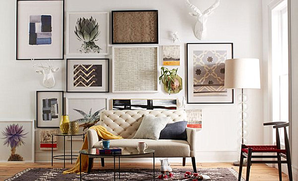
Speaking of curating, don’t hesitate to piece together a gallery wall filled with eye-catching art. This space from West Elm showcases a range of interesting pieces. Let your personality and style guide you in your collecting endeavors, and don’t be too consumed with making each piece fit into a cohesive theme. Go with artwork that you love. If you’re true to yourself, the pieces are likely to blend and make sense.
We’re big fans of the amazing design showcased in West Elm photographs. They are filled with unspoken decor truths, such as the fact that some spaces are unique in the way they incorporate saturated colors. The result: a rich look that gets noticed. We can’t help but revel in the blues and greens of this next featured space:
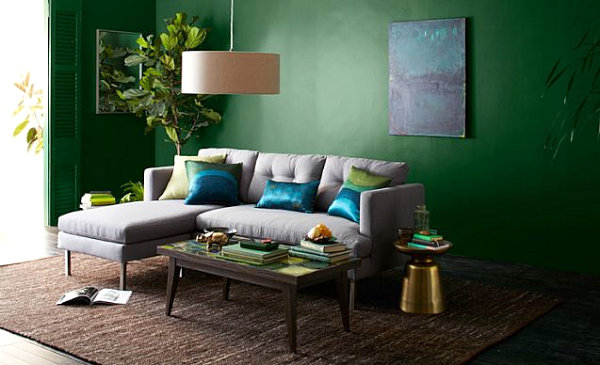
Festive blog Oh Happy Day always inspires us with party themes, DIY ideas and more. We’re equally inspired by the living room tour of blogger Jordan, who went with a bookstore vibe by displaying a range of design and art books. Let your coffee table hold the reading materials that inspire you in your creative endeavors. This strategic design choice will say a lot about you and your style, and it will create a visually interesting space filled with clever ideas and gorgeous images waiting to be uncovered…
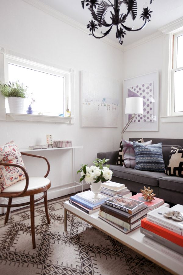
Anyone else blown away by the consistent creativity of spaces featured on Lonny? We’re loving the idea below, which illustrates how artwork can be displayed on bookshelves to conceal excess “stuff” and maximize wall space. We love this image so much, we previously featured it in a Decoist post on living room design ideas…
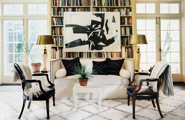
Here’s another one of our favorite living spaces, this time from a previous Decoist post titled How to Decorate a Living Room. In addition to being chic and inviting, this space reminds us that unique artwork and soothing tones can combine to create a truly unforgettable room. [from Domicile Interior Design via Houzz]
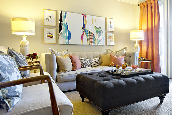
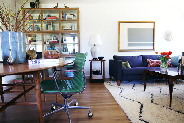
Is your living area an unusual shape? Does it feature a layout that presents a true design dilemma? Why not go with the flow and let the space guide you in your design decisions? Here we see how Sarah of Whoorl made the most of a long living room. She incorporated two seating areas! We love how she listened to the layout of her space and made unique decisions that honored the flow of the room. [photo by Jessie Webster for Whoorl]
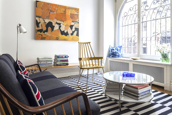
Another unconventional design choice? Arrange your furnishings so they face the window. Yes, the window. Rather than the television! After all, when the windows are as fabulous as the room below, it’s hard to imagine any other layout, isn’t it?! [from Lonny]
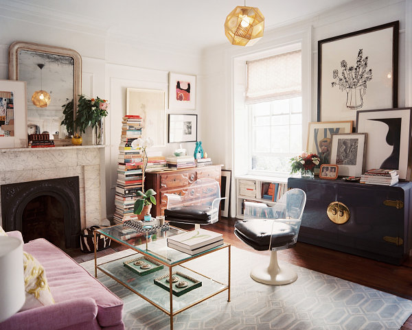
Short on space? No problem. Layering and stacking can make a big difference! This room featured in Lonny showcases techniques such as stacking books and layering artwork by leaning it against the mantel. These strategies make it possible for you to fit more items into your space, all the while adding dimension and depth to the room.
Living Spaces That Creatively Showcase Retro Style
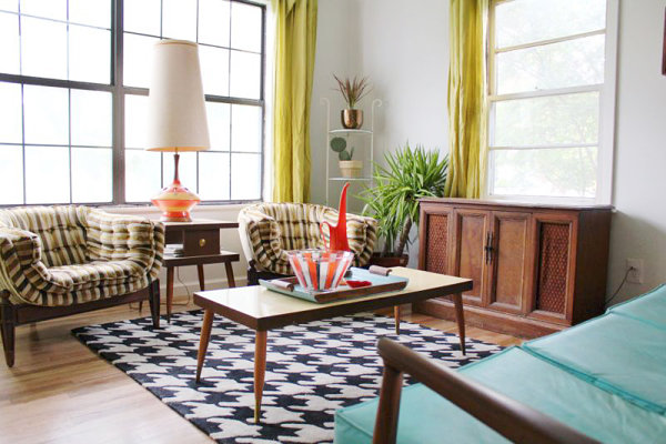
Many of today’s featured spaces (especially the living rooms of design bloggers) tend to feature retro furnishings, specifically Mid-Century modern pieces. One helpful piece of advice: Use what you have. For example, in the room below, we see how blogger Andrea McArdle incorporated retro pieces, most of which once belonged to loved ones. Don’t be afraid to use items from the past. By mixing them in with current finds, we give them new life. [from A Beautiful Mess]
We can’t help but be drawn to the minimalist look of the living room featured in the image below. This home tour of Monique Lavie’s place, originally featured on Apartment Therapy, illustrates the design magic that can happen when a few carefully selected pieces introduce bright pops of color into a modern space. For example, check out the Knoll couch below, reupholstered in a vivid blue. After all, sometimes less is more!
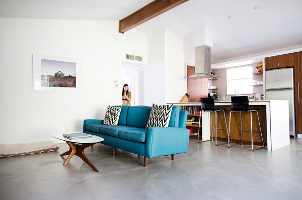
This Adkins townhome house tour from Apartment Therapy features great pics, as well as advice from Lalita Adkins about not rushing into purchases or remodeling projects. Take your time collecting items you truly love. Your creativity will be revealed through each unforgettable find!
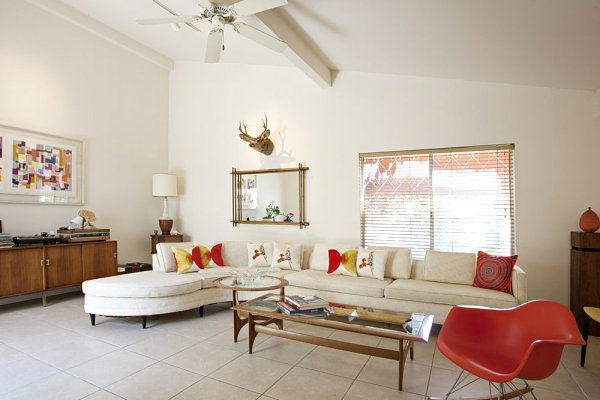
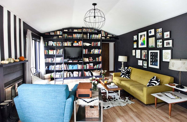
We love following the adventures of bloggers Elsie and Emma from A Beautiful Mess. Below we see the living room of Emma, which boasts black walls that make each feature in the room truly stand out! Don’t be afraid of bold design choices. Sometimes a design decision we’re initially afraid of making can turn out to be the best choice we’ve ever made!
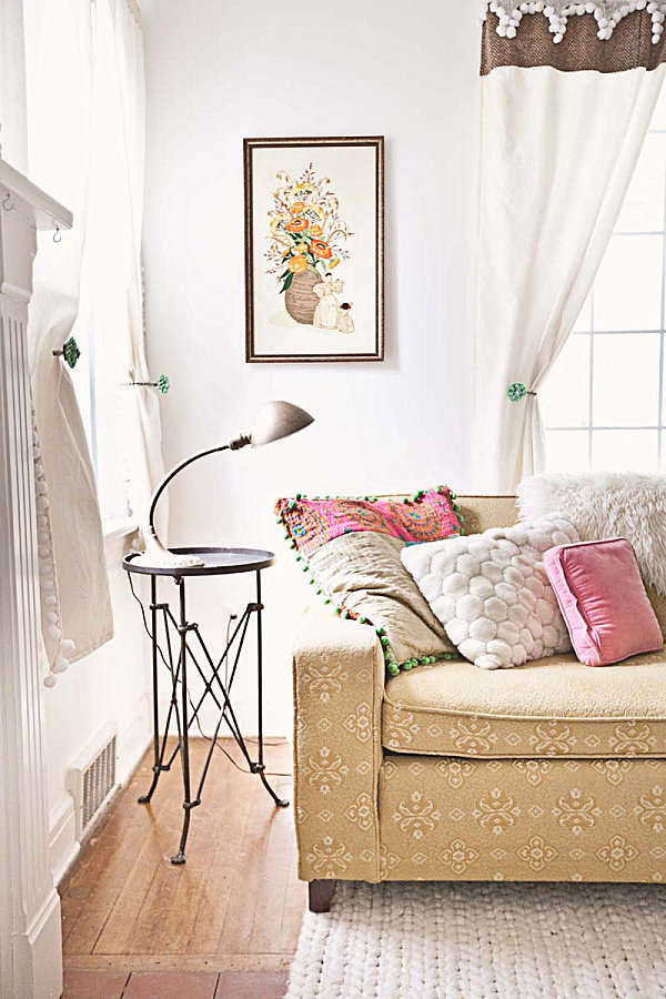
The living room below is a bit more vintage than retro. In fact, this space belongs to blogger Sarah Sandidge, who hit thrift shops and garage sales to find the treasures that grace her living room. Featured on A Beautiful Mess, this space is a great reminder that delicate touches and interesting textures can result in the most creative of interiors. [image by Janae Hardy]
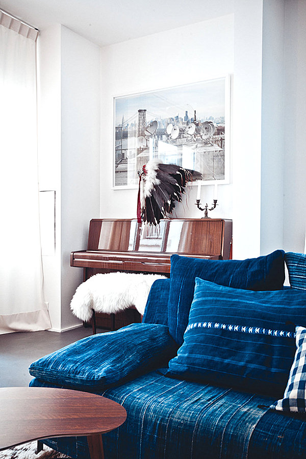
Cristina Cleveland’s Bring It Home series on Camille Styles regularly spotlights gorgeous interiors, then shows us how we can get a similar look in our own homes. If you’ve ever inherited a piece from a loved one and wondered how it will work in your space, the next image is for you. We see a traditional piano jazzed up with a headdress, as well as an industrial photo overhead. Sometimes unlikely choices result in pure design magic. [image from Milk Magazine, photo by Karel Balas]
Did any of the images above inspire you in your own design endeavors? Share your thoughts by leaving a comment below…
