It happens all the time… I’m shopping at one of my favorite stores, and a display catches my eye, giving me true inspiration for the design of a room in my home, a new DIY project, or maybe a special vignette for a shelf! Does this ever happen to you?! Today we focus on store displays that knock your socks off. Let’s harness the energy of a well-crafted retail display and use it to give us the much-needed impetus to say “yes” to creativity. From crafty arrangements and modern spaces to retro statements and plant-filled exhibits, these presentations of unforgettable style are worth checking out!…
Indie-Crafty Creations
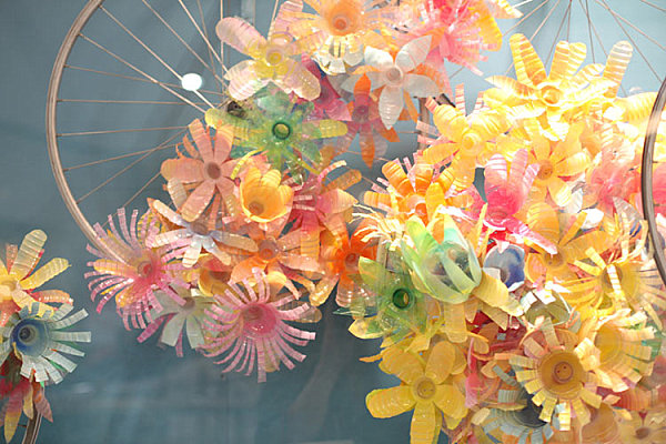
We begin with retail spaces that celebrate indie style with unique displays, often of the crafty nature! One store that captures the essence of “crafty chic” on a regular basis is Anthropologie. Their window and retail displays are epic. Seriously. Bloggers, designers and artists regularly anticipate the next installment. We’re partial to this festive creation (made from plastic water and soda bottles)!!! [from Studioana]
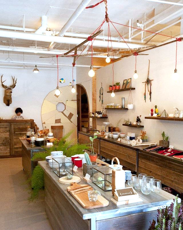
The vibe of Spartan in San Francisco is modern, earthy, tribal and handmade. From interesting plant displays to quirky gifts and splurges, there’s a wide array of goods admire. And you’ll leave with a boost of DIY energy that inspires you to craft a piece of hanging wall art, wrap a household feature in yarn or plant a succulent in your kitchen window… [from Remodelista]
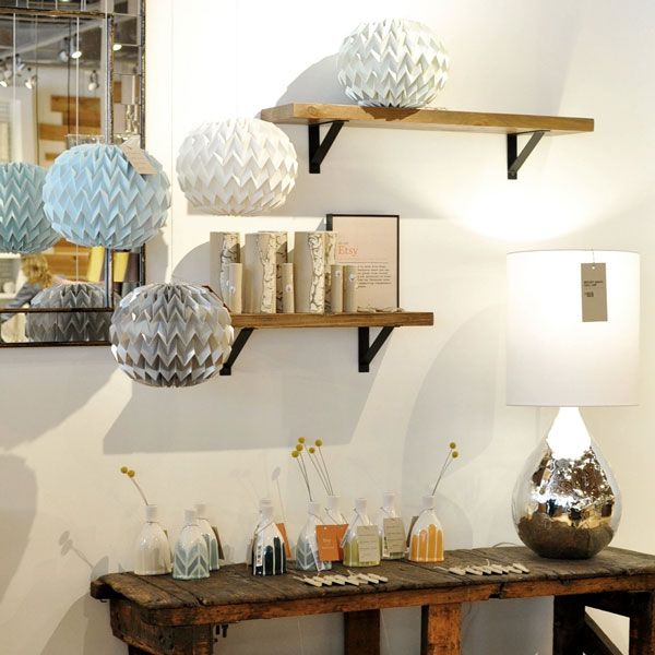
The DIY/crafty vibe is exactly what many large retailers are trying to harness with their displays and merchandise. Some have reportedly ripped off Etsy artists to create their new designs. Others, such as West Elm, are true Etsy allies, partnering with artists to feature their unique work in-store. In fact, partnerships such as Etsy for West Elm show how handmade treasures have true mainstream appeal. Check out the Etsy/West Elm display below: [from West Elm]
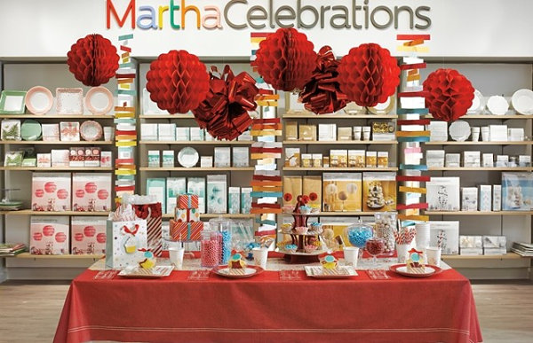
JCPenney has made some major changes in the way it does retail. In an attempt to bring new customers to the store, then-CEO Ron Johnson sought out big names such as Martha Stewart and Jonathan Adler and created in-house shops featuring their upscale goods. The result: beautifully designed spaces curating the latest in stylish products. But unfortunately that didn’t translate into improved sales for JCPenney, as the approach did not connect with customers quite as as hoped. But alas, design lovers can still enjoy the gorgeous displays for a bit longer…until reinstated CEO Myron “Mike” Ullman removes them in hopes of a more effective strategy. [photo by Chris Rupert/JCPenney via Casa Diseno]
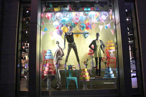
Who doesn’t love a good window display?! And big cities such as New York and London are famous for them… Speaking of London, we’re loving this festive party-inspired display from a London Topshop window. It makes me want to bake a cake, craft a DIY flag banner and fill my dining room with helium balloons! [from Blog of Francesco Mugnai]
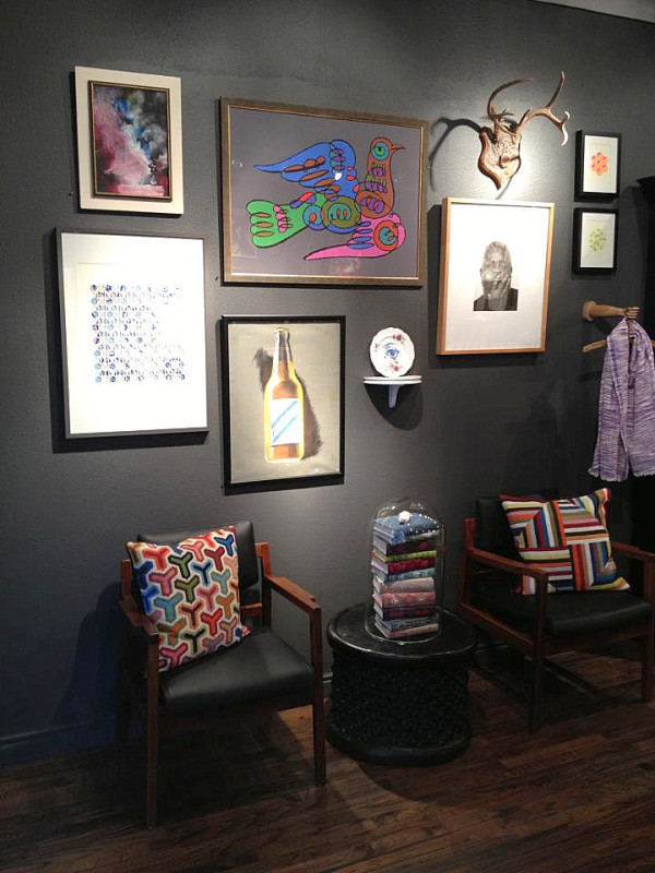
One of my all-time favorite shops is Mercury Design Studio in Austin, Texas. It’s been a real treat to watch this locally owned store evolve as the styles have changed. Mercury effectively introduced Austin to Hollywood Regency decor, then gradually developed an earthier aesthetic reflecting a true eclectic approach to design. As you can see in the display image below, vintage meets modern in the most interesting of ways…
OK, so we know most of us don’t have an orchestra’s share of instruments lying around for our sculptural endeavors. But what’s the harm in taking a little inspiration from this Barneys New York window display? It’s a great reminder that the excess stuff we have in our closets just might make the perfect installation about a living room sofa… [from Blog of Francesco Mugnai]

Sleek, Modern Display Spaces
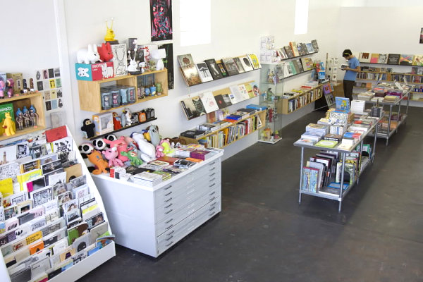
From the crafty to the sleek… It’s hard resist a truly modern space that celebrates clean lines and colorful accents. This image from Domy Books in Austin, Texas reflects the best in contemporary design. Gallery-white walls, display cases and wooden shelving for vinyl toys, a slew of books to inspire creativity… While this location of Domy has since closed, take heart in the fact that the shop is still open in Houston. [from XXX]
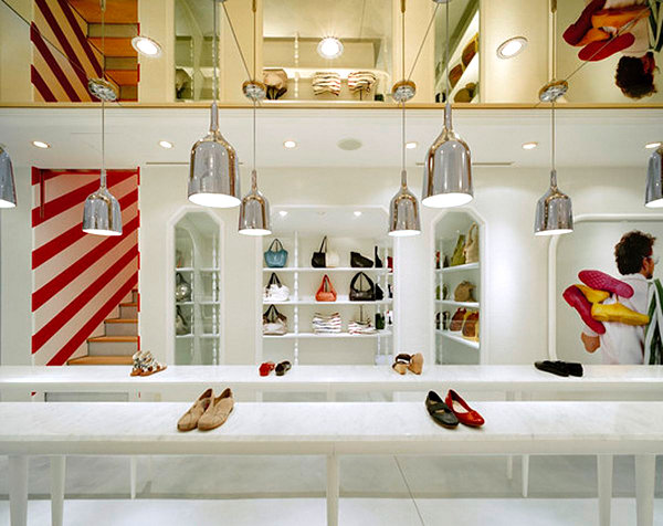
Next we see a shop display that highlights the power of pendant lighting and striped walls set against an all-white backdrop. One key point that modern retail spaces continuously drive home: Don’t be afraid of white walls. They perfectly set the stage for strong decorative statements. After all, who doesn’t love a grouping of chrome hanging lights?! [from Interiordir]
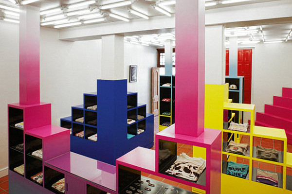
I greatly admire the work of designer Rafael de Cárdenas of Architecture at Large. His residential and commercial spaces are jaw-droppingly fabulous. We’re talking museum-worthy work here! Take the space below… A grid motif meets ombre style at Unknown Union, a clothing store in South Africa. In fact, we loved this retail space so much, we previously featured it in our post on ombre design.
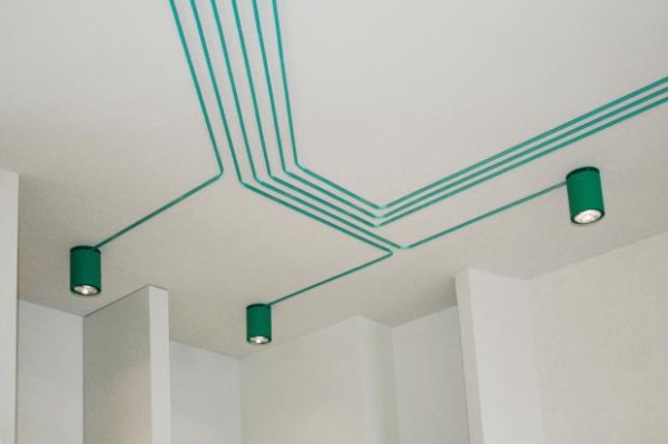
We know this next image is a lighting display rather than a product-oriented one, but we just couldn’t resist… Inspired by computer chips and created for Maygreen, this installation by design trio KINZO is a true work of art. Leaving the cables exposed can be a good thing, as shown below:
Retail Displays with Retro Flair
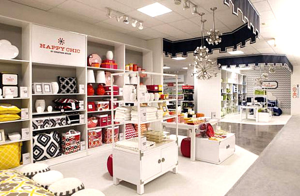
Next we head into retro territory. After all, old is new again, especially when the design is all-encompassing. Remember the Martha Stewart JCPenney space above? Here’s another look at JCPenney’s style transformation, this time courtesy of Jonathan Adler and his retro-fabulous designs. Bold patterns, anyone?! [from The Dallas Morning News]
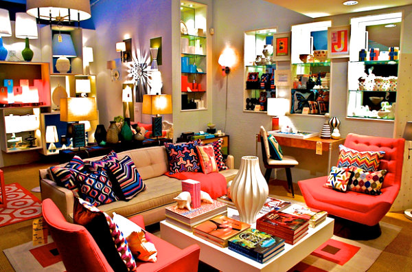
Speaking of Jonathan Adler, here’s a look at his New York City Soho store, complete with vivid colors around every corner. This display reminds us that there are plenty of opportunities to introduce color into our homes. Lamps, throw pillows, upholstery, wall art… the possibilities are endless. Especially when executed this vibrantly! [from ScrapHacker.com]
We are totally smitten with the new look of Darkroom in London. The store is currently featuring decor and accessories honoring renowned Memphis-Milano designer Ettore Sottsass. Sprinkle motifs, marble platters, totem lights and more… So ’80s. So Sottsass! This is what happens when retail meets museum-quality design. [from Trendland]
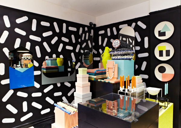
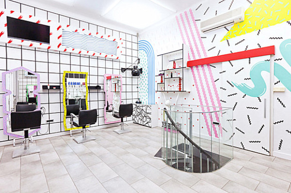
Speaking of Memphis-Milano, this ’80s design movement is experiencing a bit of a resurgence. And why wouldn’t it?! Bold motifs, geometric forms and a color palette that cleverly mixes primary colors with pastels are a few of the signature traits. These elements and more can be found at YMS Hairstyle Salon, thanks to Kitsch Nitsch. A few highlights of their design: vinyl wall decals, a custom-made sofa, and 7 custom-made mirrors:
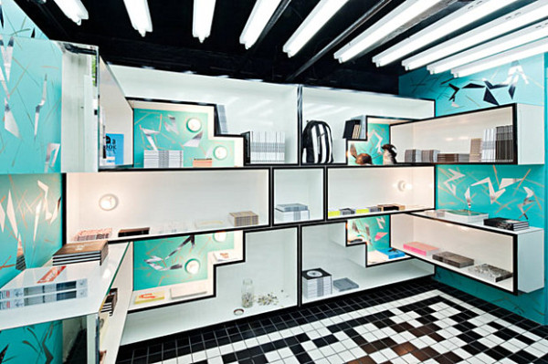
Now a bit more from Architecture at Large… Anyone still having doubts that the ’80s are back?! This time there’s a bit of Art Deco mixed in, thanks to another fabulous design by Rafael de Cárdenas. Have a look at New York’s OHWOW bookstore and gallery:
Outdoor Style at Its Finest
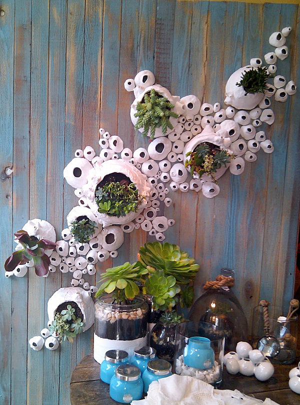
We end with a few displays that focus on plant life, giving us new inspiration for our outdoor spaces. And our indoor spaces! Here’s another gem from Anthropologie. My mind is swimming with ideas for a vertical garden featuring succulents… [from thesmartestfish]
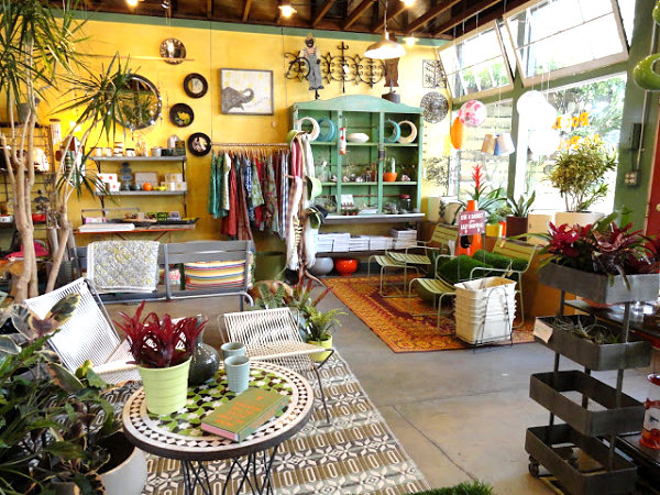
Welcome to Potted in L.A., where unique planters and lush vegetation meet clean-lined outdoor furnishings. With the tagline “Indoor style for outdoor living,” would you expect anything less than the display below? Durable rugs, ample plants, colorful gifts and hanging lights remind us that creating a seamless blend of indoor and outdoor style is a worthy goal for any space. [from Danger Garden]
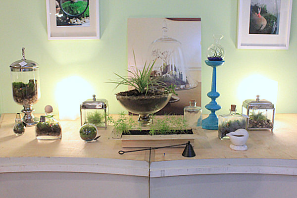
Another store renowned for its unique creations featuring plant life? Twig! This Brooklyn establishment features living sculptures that incorporate vegetation such as moss with a range of figurines to create interesting plantscapes. If only each room in our homes could be as carefully crafted as these stunning little worlds encased in glass… But we’ll settle for the conservatory-like style of the display below, which encourages a grouping of plant life for a green effect. [from UncommonGoods]
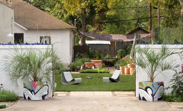
This amazing outdoor space is the site of Big Red Sun in Austin, Texas. We’ve featured the work of Big Red Sun before, but in case you aren’t familiar with this full-service design/build studio specializing in commercial and residential landscape and garden design, check out the image below. Manicured green lawns, lush vegetation and unique planters are a few of their signature traits. It goes without saying that we find their special brand of design to be truly inspiring! [photo by Justin Kasulka via GuidePal]
Any favorites from today’s featured retail displays? These installations, arrangements and vignettes remind us that there’s no limit to creativity, especially when you’re willing to take some chances. Did any of the images above give you an idea for your own DIY project at home? Share your thoughts by leaving a comment below…

