The beauty is in the details… Yet so often when it comes to design, we stress about the big picture and forget to take a look at the little things. In fact, it’s the little things that help us put our own stamp on a space. Today we highlight the power of unique decorating details in every room of the home.
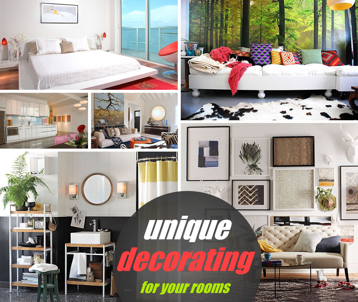
Start by thinking about your favorite items. Perhaps you have a beloved mineral specimen from a childhood collection, or maybe you’ve taken special care to create an interesting assortment of wall art that gives your space true personality. Don’t overlook the importance of details like these. Just as seating and appliances are essential for a comfortable space, well-curated collections and inspiring vignettes make a difference. Check out the images below, then tell us what you think by leaving a comment at the end of the post…
Unexpected Touches
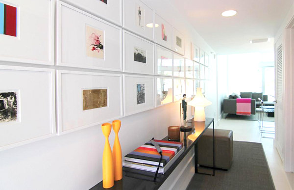
Some of my favorite rooms of all time make special use of unexpected touches–those details that catch you off guard with their powerful qualities. Take the space below by Diego Alejandro Design. A gallery-style wall filled with vivid images is undeniably striking, especially since a monochromatic look is achieved with the use of white frames and mats. The artwork is unified, even though a wide range of colors and looks are represented:
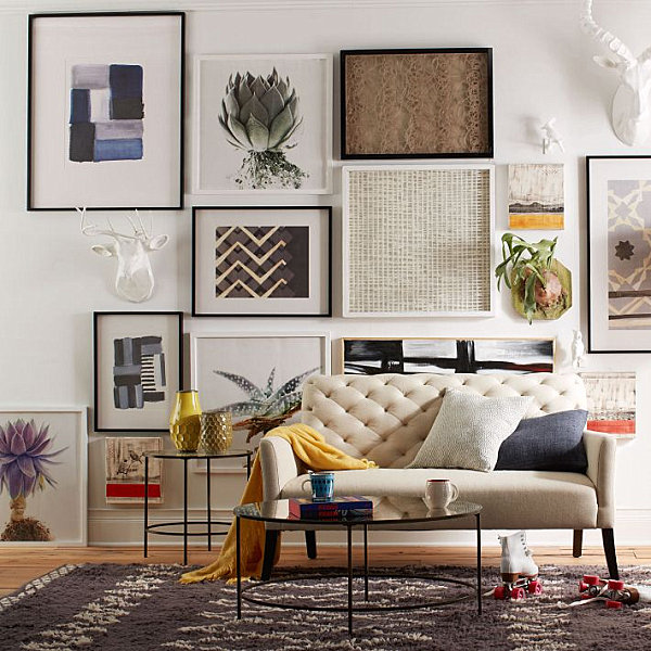
Speaking of gallery-style spaces, the living room below features an array of artwork, but that’s just the beginning. Note how the art hangs from the ceiling to the floor, incorporating unusual details like wall-mounted greenery. This image features the Foxed Mirror Coffee Table from West Elm…
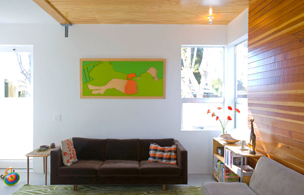
Sometimes the unexpected details can be used to repeat a color scheme, as shown in our next featured space. Note how shades of orange and green appear on special touches such as artwork and flowers. The room’s pillows and rug also help to reinforce the color scheme. [from Jagoda Architecture]
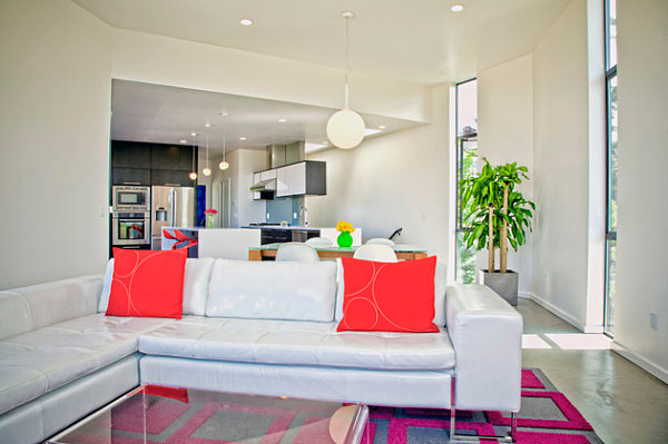
Bring on the bright! In this largely neutral space, we see how intense pops of color can be used to dial up the personality! Hot pink pillows and bar stools are extremely eye-catching, as is the room’s geometric rug. And we can’t forget the floral arrangements that rest on the dining table and kitchen bar. [image by Mel Curtis Photography for Sound Design & Cabinetry, Inc.]
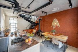
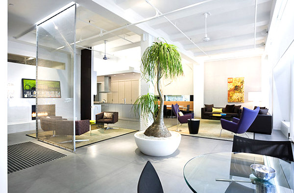
There’s nothing more unexpected than a giant potted plant in the center of the room! In fact, this residential living space has an industrial feel that’s quite refreshing. Ample seating and a transparent room divider also create the vibe of a commercial space, yet comfy details like throw pillows ensure that this interior truly feels like home. [from WXY Architecture + Urban Design]
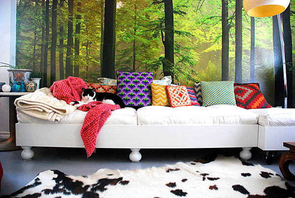
Never underestimate the appeal of an interesting throw pillow collection! And that’s not the only thing going for the living space below… A woodland-themed wall mural is an earthy backdrop to powerful pops of color. [from Desire to Inspire]
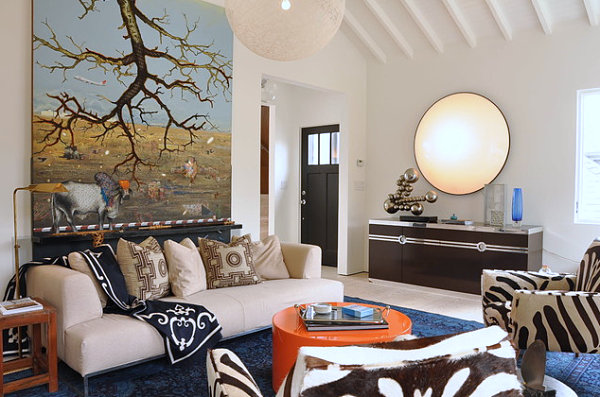
Layering patterns is an effective way to add interest and depth to a space. This living area incorporates pillows, seating and a throw, all featuring a different print. Then there’s the addition of stunning branch-themed wall art. Neutral tones dominate the space, but there’s certainly no lack of variety… [from Ian Stallings]
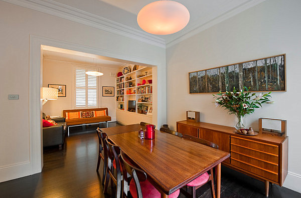
Sometimes it’s the little things that make a big difference… Below we see dining room chairs with colorful cushions. A candle votive in a similar rosy shade punctuates this color choice in a striking way. [from Michelle Walker Architects via Houzz]
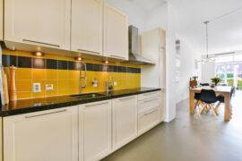
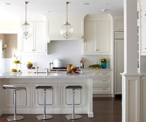
Ah, the appeal of a bistro kitchen! Just as the repetition of color adds flair to the space above, the repetition of fruit and citrus tones in the space below creates a fresh, foodie vibe. And pops of yellow, orange and green are perfect for a space that is otherwise crisp white. [photo by Michael Partenio for Muse Interiors]
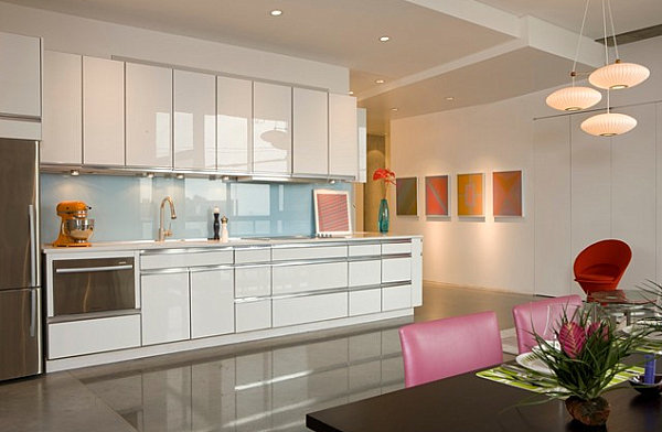
Then there are those spaces that thrive on radiant color… From a bright orange mixer to a powder blue backsplash, there is no shortage of personality in this next featured kitchen. But the real star is the artwork, which appears on counter and wall. Or maybe it’s that raspberry-toned dining room seating, perfectly complemented by vibrant tropical foliage… [from Poolehaus Residential Design]
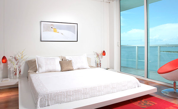
Many an interesting flourish decorates the bedroom below, from unique blooms in bedside vases to low-hanging pendant lights over the nightstands. Modern artwork and a bubble chair serve as other key focal points of the room. When you populate your space with brightly-hued finds, don’t hesitate to keep other large elements simple, as shown by the white embroidered bedding. [from J. Design Group]
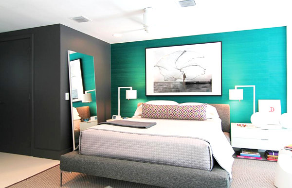
The next featured bedroom is a vision in emerald green! Stunning accent wall color aside, the space boasts other noteworthy decorative details, from matching bedside lamps to a leaning mirror. In addition, striking artwork hangs over the bed, reminding us that true design magic happens when you continue to add special touches. [from Diego Alejandro Design]
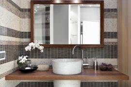
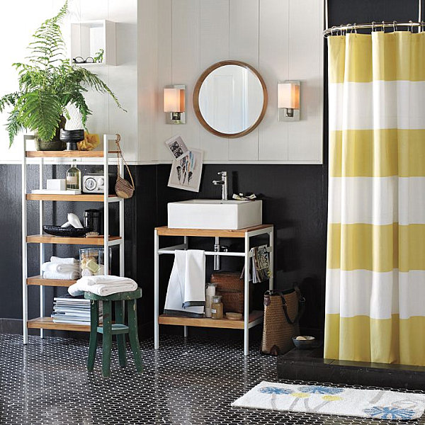
Don’t hesitate to unify your space with similar shades and finishes. For example, below we see Lacquer Bath Accessories in White from West Elm. Other white accents, such as fluffy towels, keep the space looking neat and uncluttered. Decadent bath goods adorn the shelf to the left of the sink, but an overall clean-lined look prevails.
Striking Vignettes
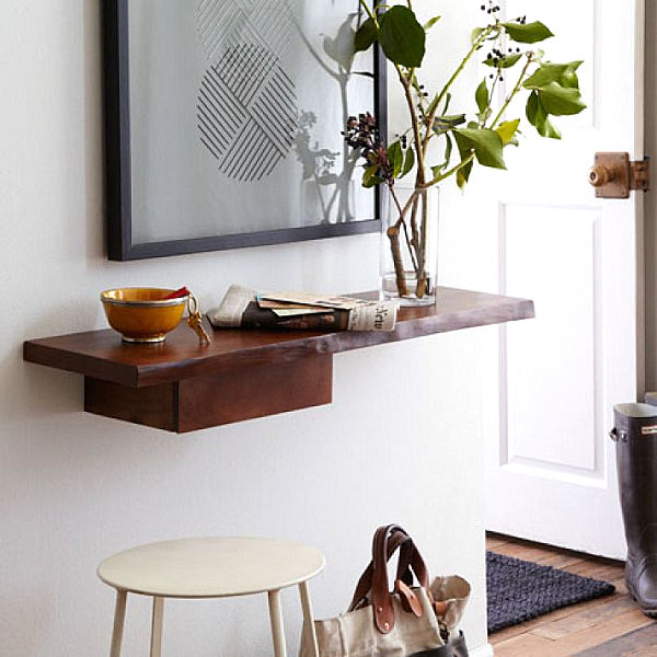
We now zoom in on the delicious details and celebrate the power of a striking vignette. Note that more stuff does not always equal more style. Below we see the Live Edge Entry Shelf from West Elm, crafted of mango wood. Modern wall art, interesting greenery and a lovely bowl for stashing keys are all this space needs. There’s plenty of room for placing the mail and other items that need a resting spot…
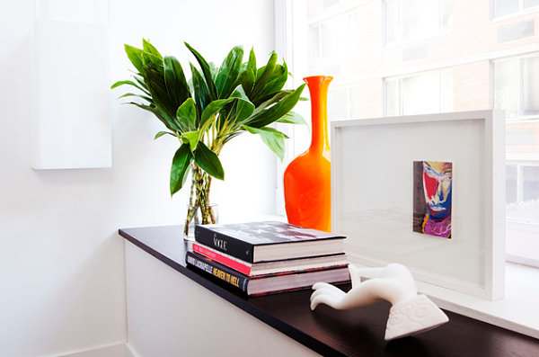
A piece of artwork, a stack of books, a colorful vase and greenery–these are a few of the most popular ingredients for a modern vignette. And how you arrange them is just as important as what you select. Let the process be fun, and don’t get too caught up in the details. Remember: you can always change the configuration! [from Diego Alejandro Design]
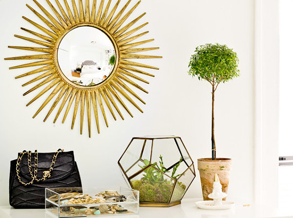
Sometimes it’s the most unusual pieces that add variety to a vignette. The sunburst mirror, classy purse, topiary and acrylic box of jewelry below are all amazing… But it’s that geometric terrarium that really catches the eye! [image by Cynthia Lynn Photography for Danielle Moss]
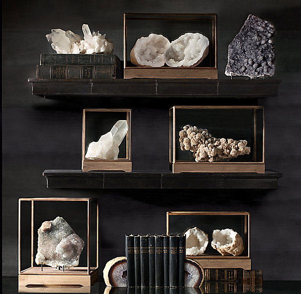
Don’t hesitate to add a curiosity element to your collection of decorative details… Mineral specimens are becoming increasingly popular, as they evoke a sense of science and wonder. If you don’t have a rock and mineral shop in your area, you can always order one of these stunners from Restoration Hardware:
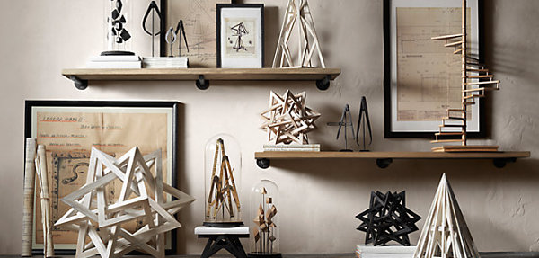
In keeping with the curiosity theme, remember that architectural pieces are inspiring. Below we see a range of sculptural items from Restoration Hardware, including a variety of wood maquettes:
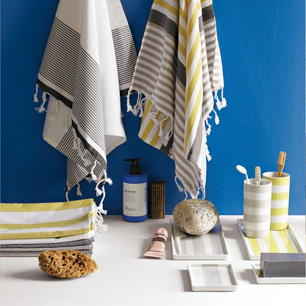
As we’ve noted in a couple of images above, repetition is an excellent way to make a powerful statement in your space. For example, the use of stripes is both classic and modern. Below we see Porcelain Stripe Trays from West Elm, as well as striped towels and toothbrush cups. Note how the stripes range in color from yellow to navy and gray. Yet somehow they all complement each other beautifully, especially when united with a vivid shade such as royal blue.
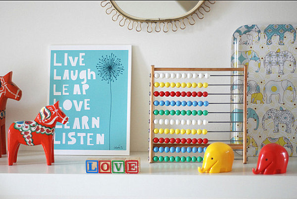
A vignette in a child’s room or nursery is a wonderful way to enliven a space with playful touches. Incorporate details such as artwork, vintage toys and classic letter blocks. Make it whimsical. Make it magical. Make it colorful. You get the idea… [from Ninainvorm]
Now that you’ve gotten a little inspiration from the spaces above, it’s time to add some special decorative details to your space. My personal favorites: unusual greenery, mineral specimens and modern artwork. What are your faves? Share your thoughts by leaving a comment below…
