Many people remember the heyday in the 1990s in Silicon Valley where excess was expected, both in the number of hours of work to the fringe benefits such as five-star chefs providing 24/7 food for the exceedingly well-fed and pampered worker bees. This extended to the office architecture which often included slides between floors and other eccentric designs.
The present-day offices in Silicon Valley are still at the top of the mountain when it comes to design. Modern life-size versions of Chutes and Ladders may not be as common as they once were, but you can still find them. What we have observed is there seems to be a move towards open-area offices where people can gather for brainstorming as well as collaboration on projects.
We have picked a few of the Silicon Valley firms and taken a look at their office designs. Sit back and enjoy our journey among the big, and small companies that dot The Valley.
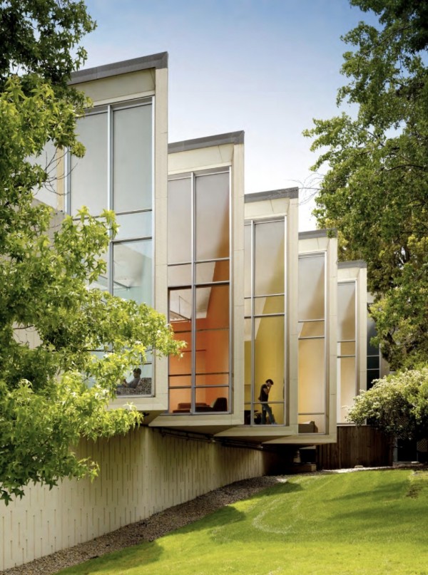
There are some offices at Facebook that have some interesting designs. The designers came up with an exceptional solution to maximize coveted offices with windows. They turned some of the exterior offices at an angle allowing one of the corners to protrude outside of the building’s exterior wall. Now, a lot more people can have a corner office.
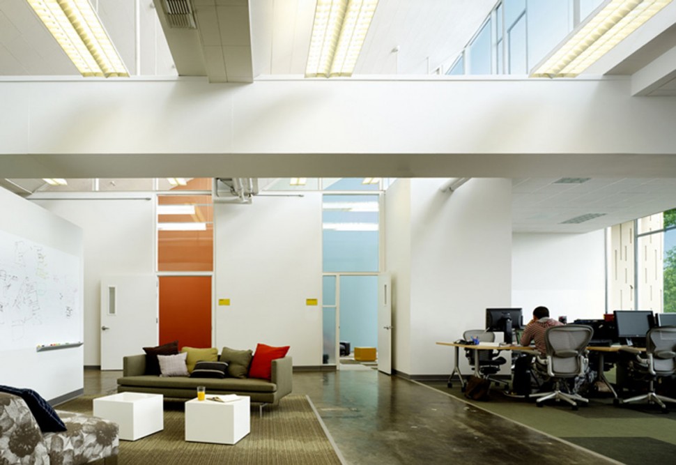
With predominately white furniture, splashes of color would normally be called for. This minimalistic look is not to be had at Facebook as far as colors go. Bright walls of various colors make a bold artistic design statement.
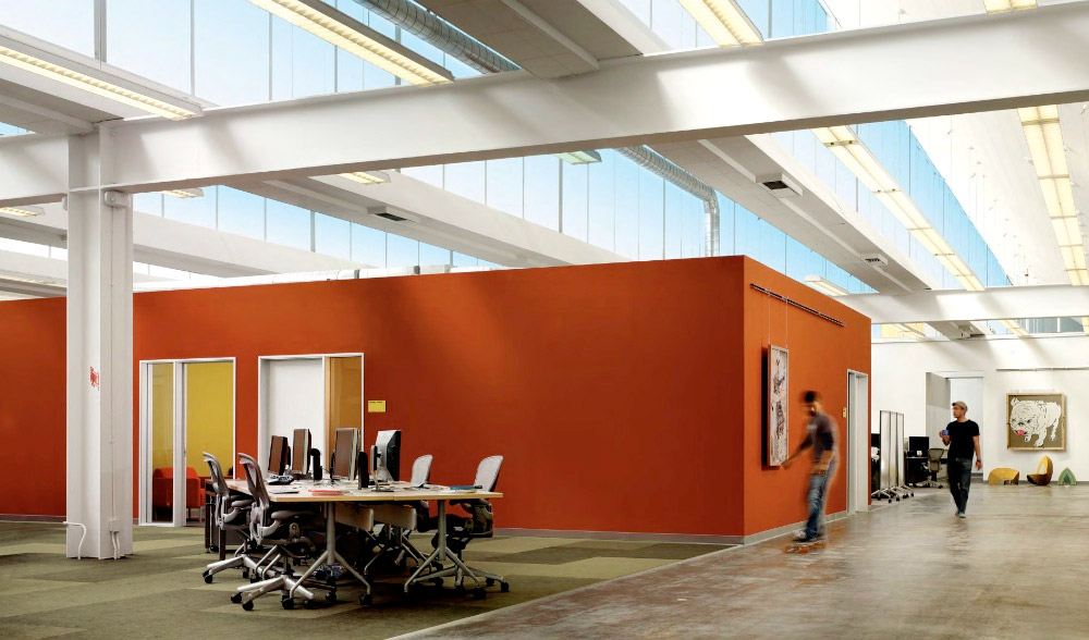
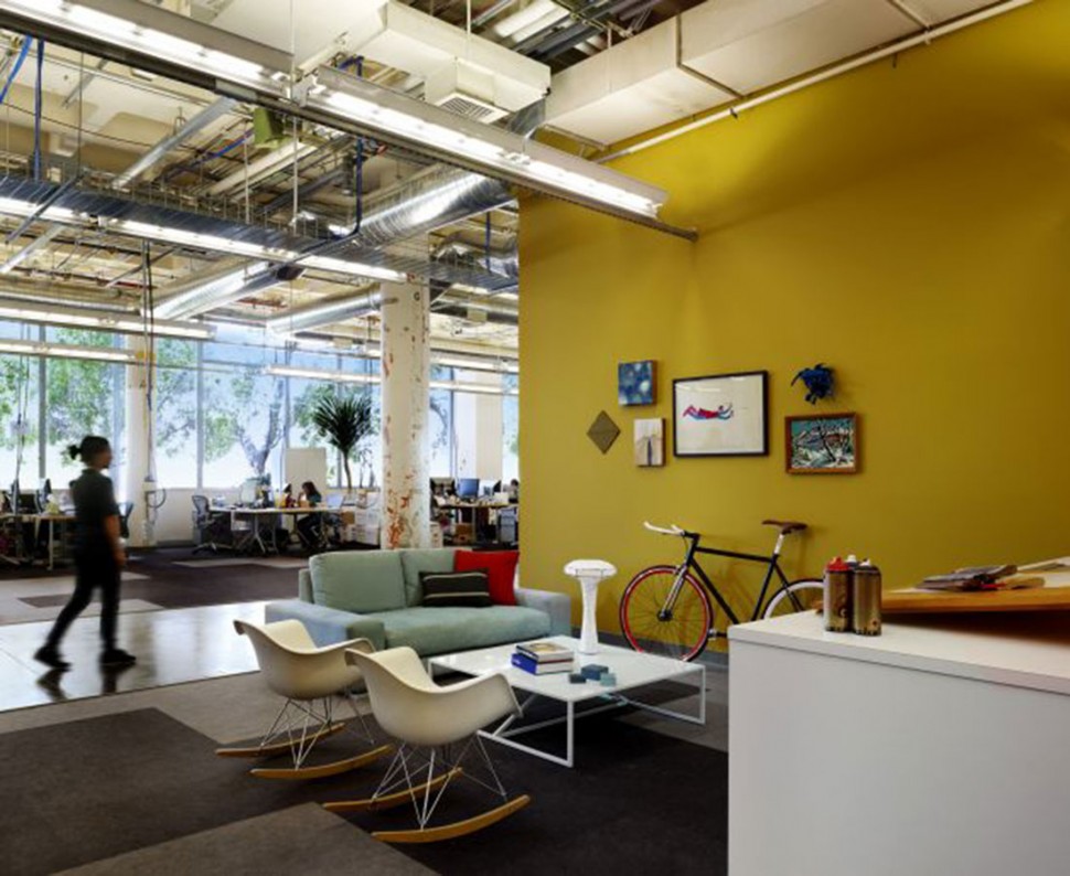
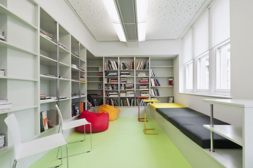
Some open areas and offices do use a minimalist design to balance out other areas of the buildings. Look at these two excellent applications via bs2h.
eBay
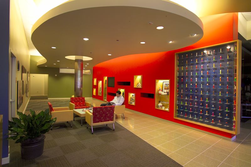
eBay, the popular auction site with headquarters in the Silicon Valley is no slouch when it comes to boldness in their color schemes. Take this open meeting area right next to a bold and bright orange wall. Note the PEZ collection displayed in this shadowbox each with its personal shelf.
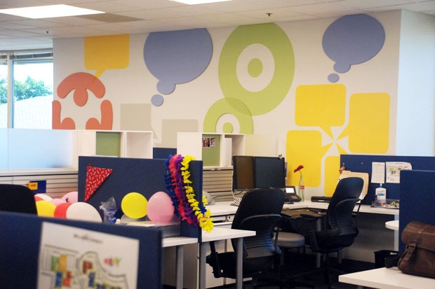
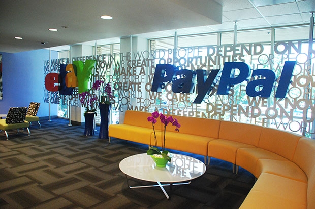
You should recognize this area. Besides a comfortable sitting and working area, it serves as a backdrop for many eBay and PayPal advertisements and photo ops.
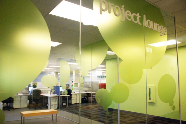
A Project Lounge has a relaxing green ambiance and promotes a comfortable area for your mission.
We don’t know exactly what these padded booths are called. We have christened them “comfy cubes.” They provide a quiet oasis with the padded sound-absorbing material cradling you.
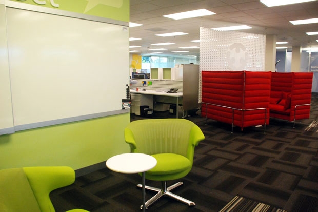
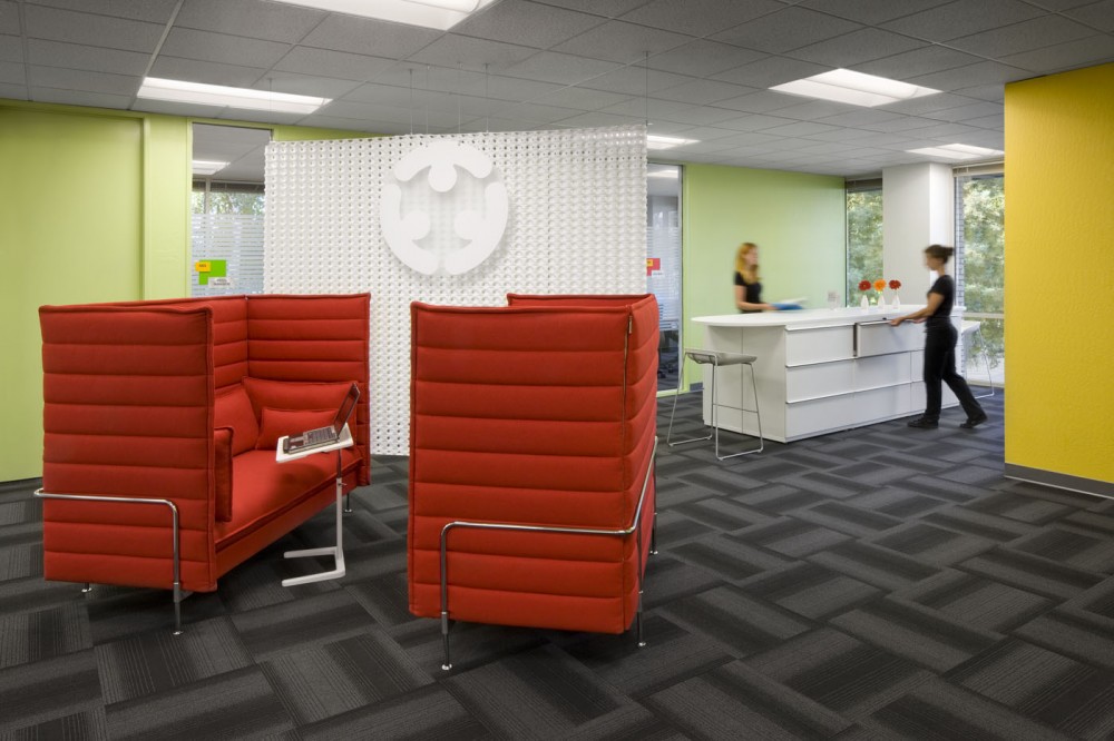
Google is a very colorful place in which to work. Their brightly colored logo was a starting point for the building designers. The bold colors permeate every aspect of the architecture.
From cozy nooks to cafeterias, Google’s culture encourages a family-like atmosphere.
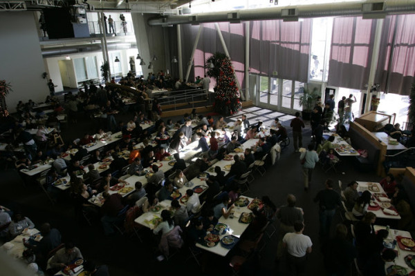
Here are some more enticing pics via Clive Wilkinson, the person in charge with the whole project in Mountain View.
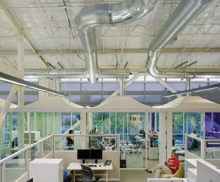
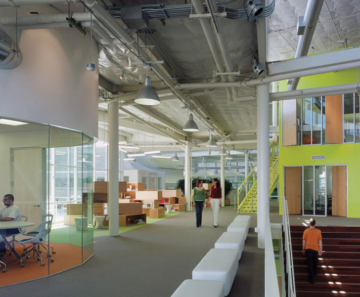
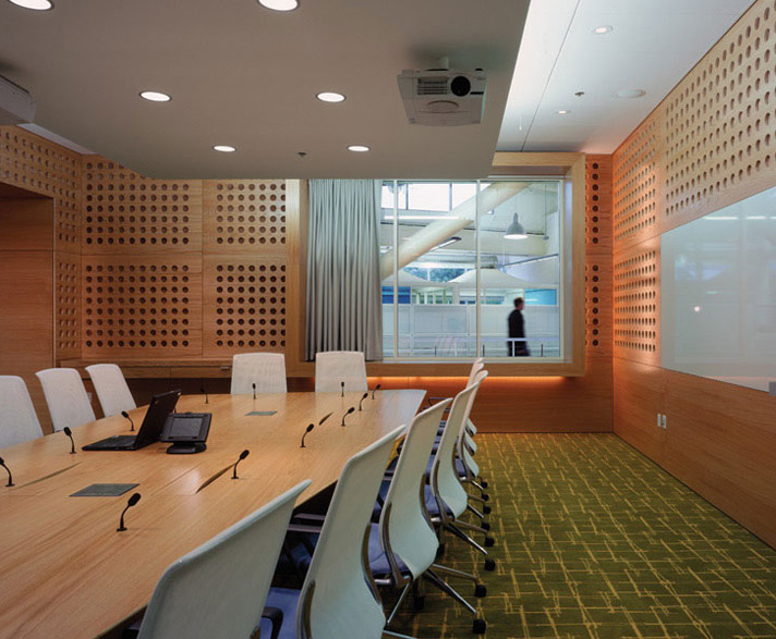
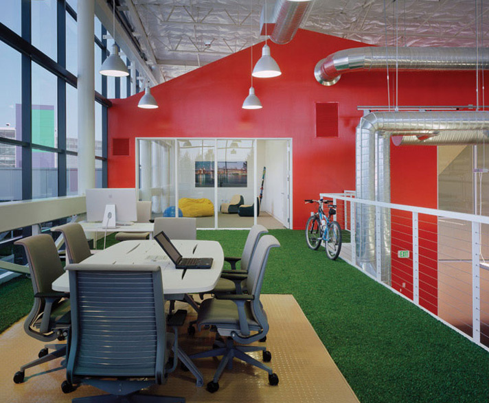
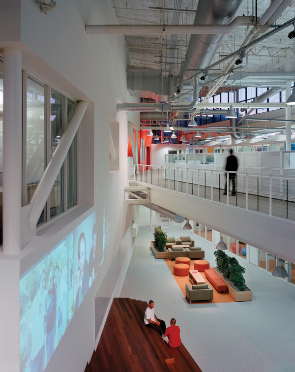
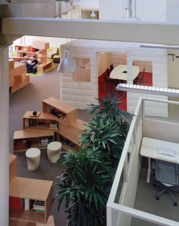
Doesn’t this look like an exciting place to work?
Nokia
The new Nokia offices located in Sunnyvale, has pulled out all the stops in designing their Silicon Valley headquarters. Amazingly, the design team must have had a goal of using just about every color pallet they could get their hands on. And it is tastefully accomplished for an office in which you would love to work.
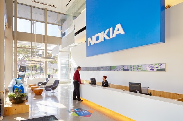
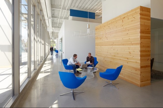
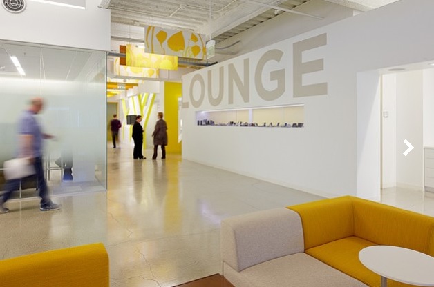
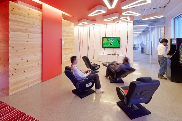
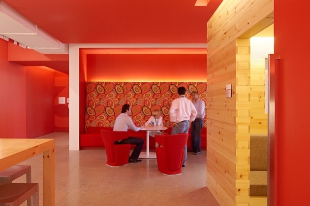
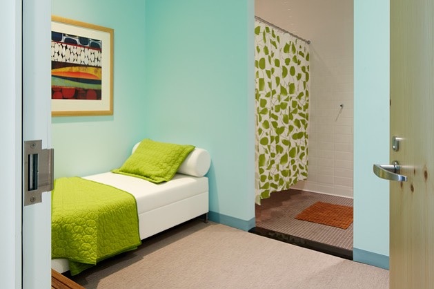
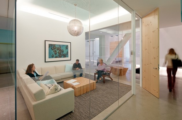
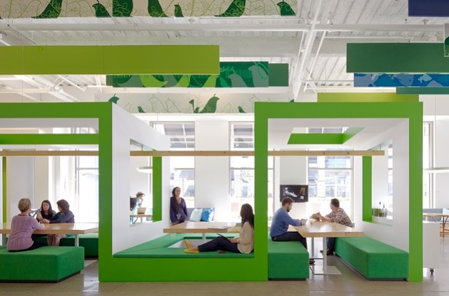
Pictures via Bloomberg Businessweek
AOL
AOL is another giant in the Silicon Valley. It is readily apparent they have not skimped on their designers or materials in providing a comfortable and pleasant place in which their employees work in their Palo Alto office.
The work cubes may appear a bit minimalistic at first glance. What would normally be (if “normal” could be used anywhere in The Valley) plush cloth in the cubes are now replaced with whiteboards.
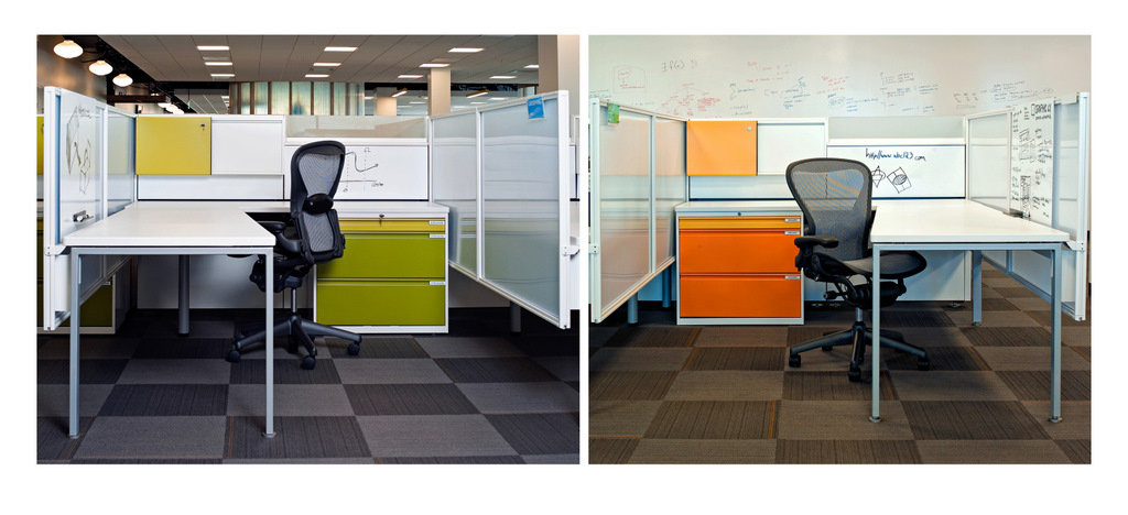
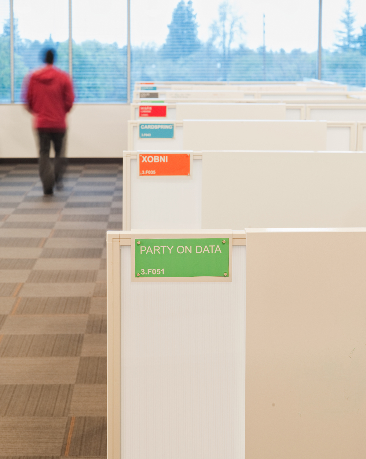
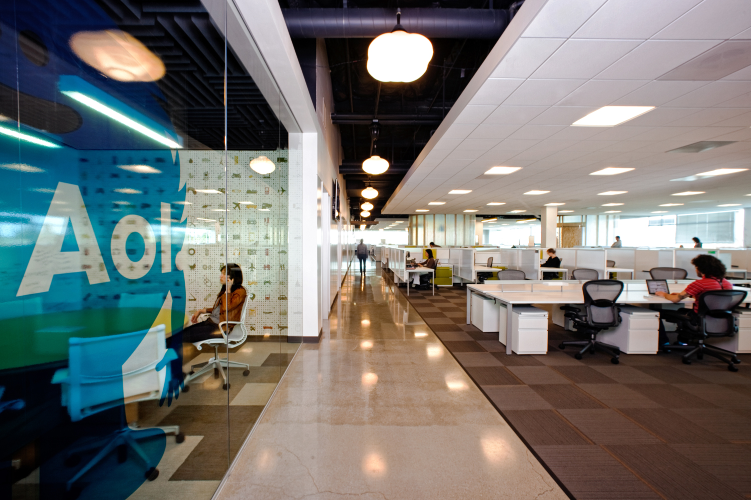
AOL has many areas for small intimate meetings away from your cube environment. It is important to “get away from the office” without leaving the building.
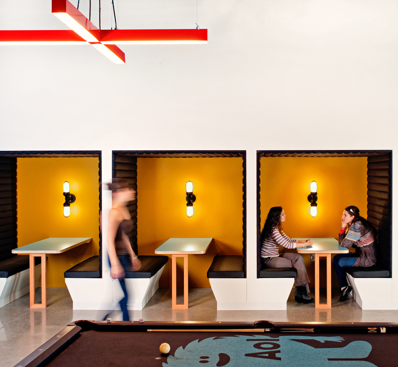
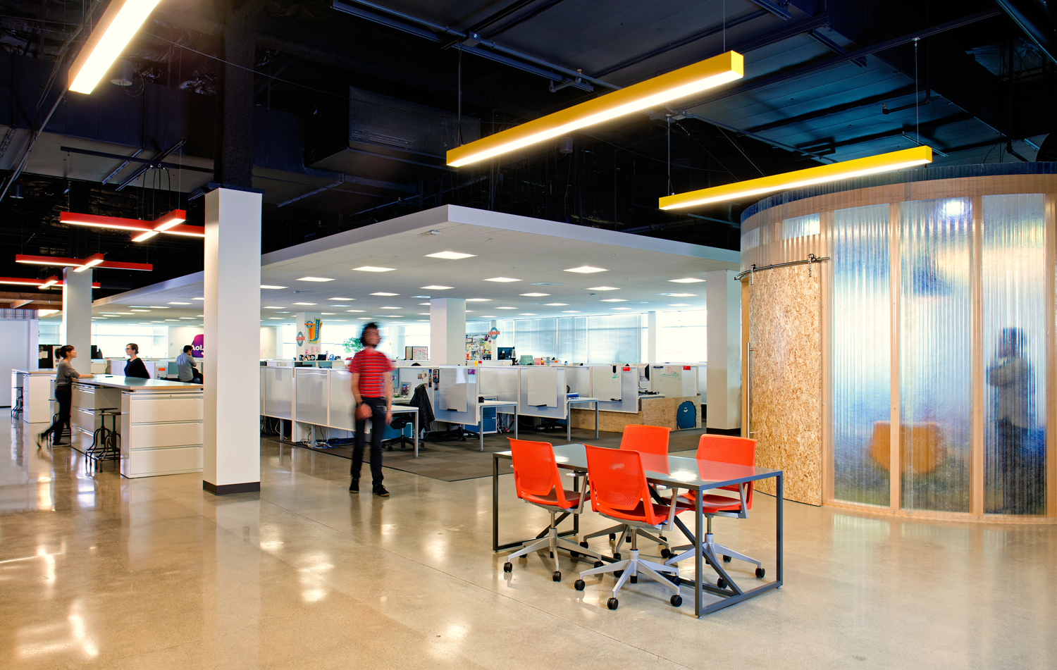
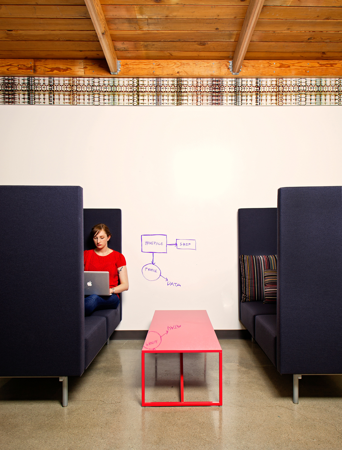
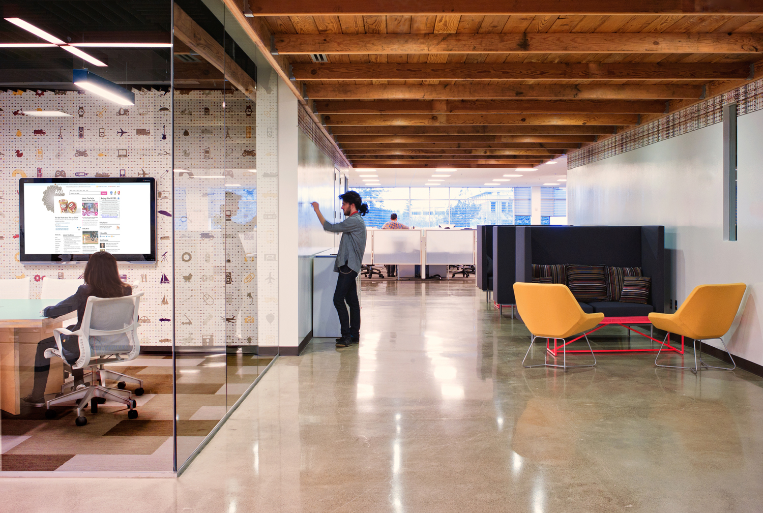
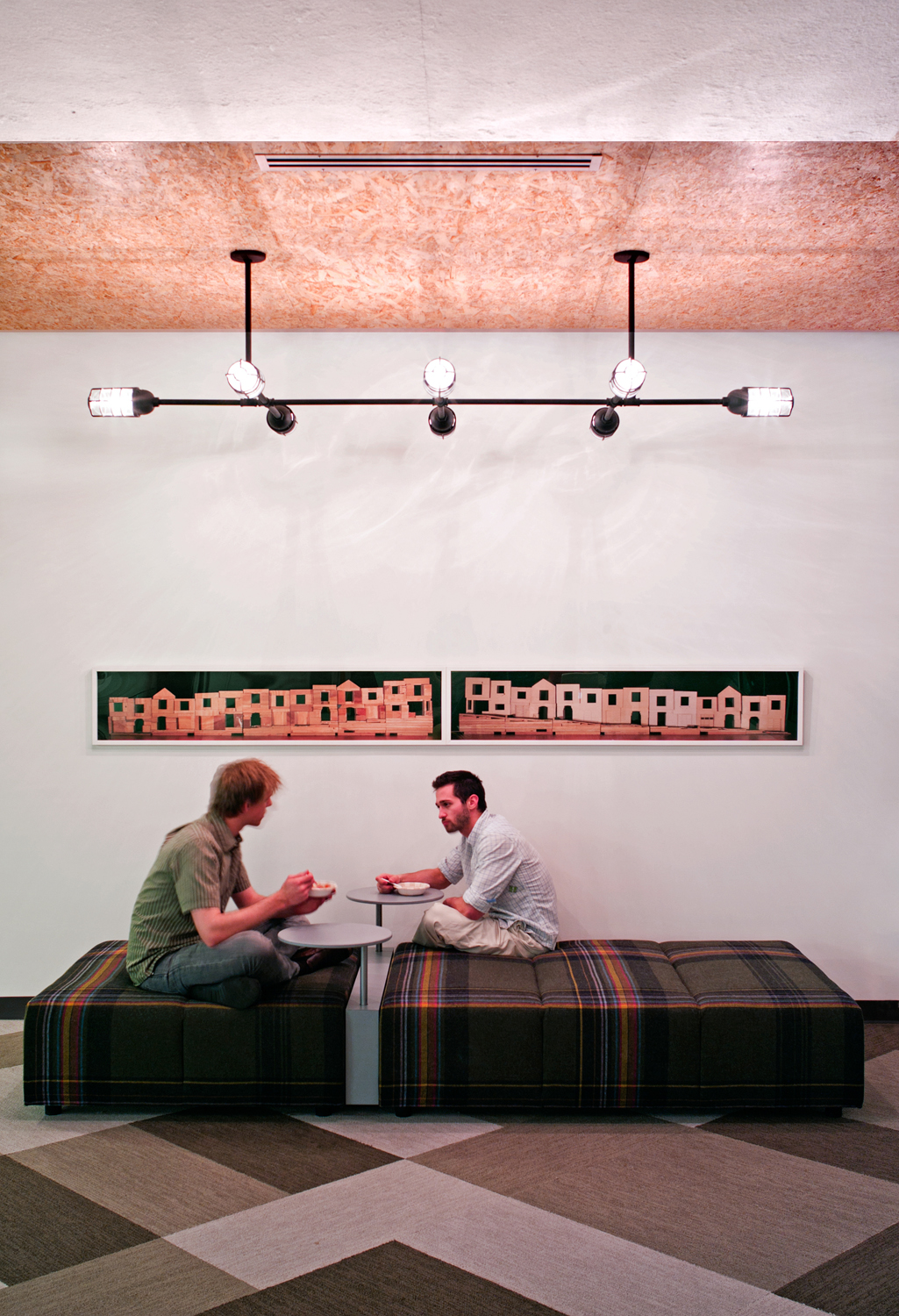
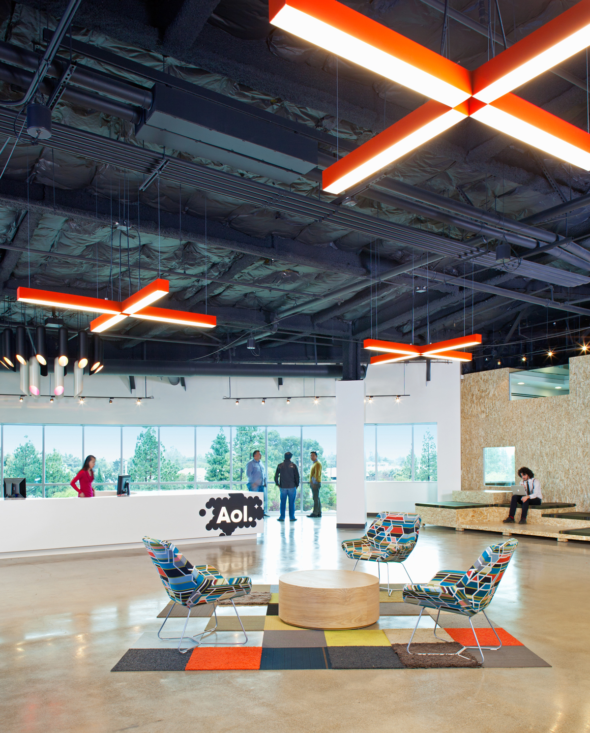
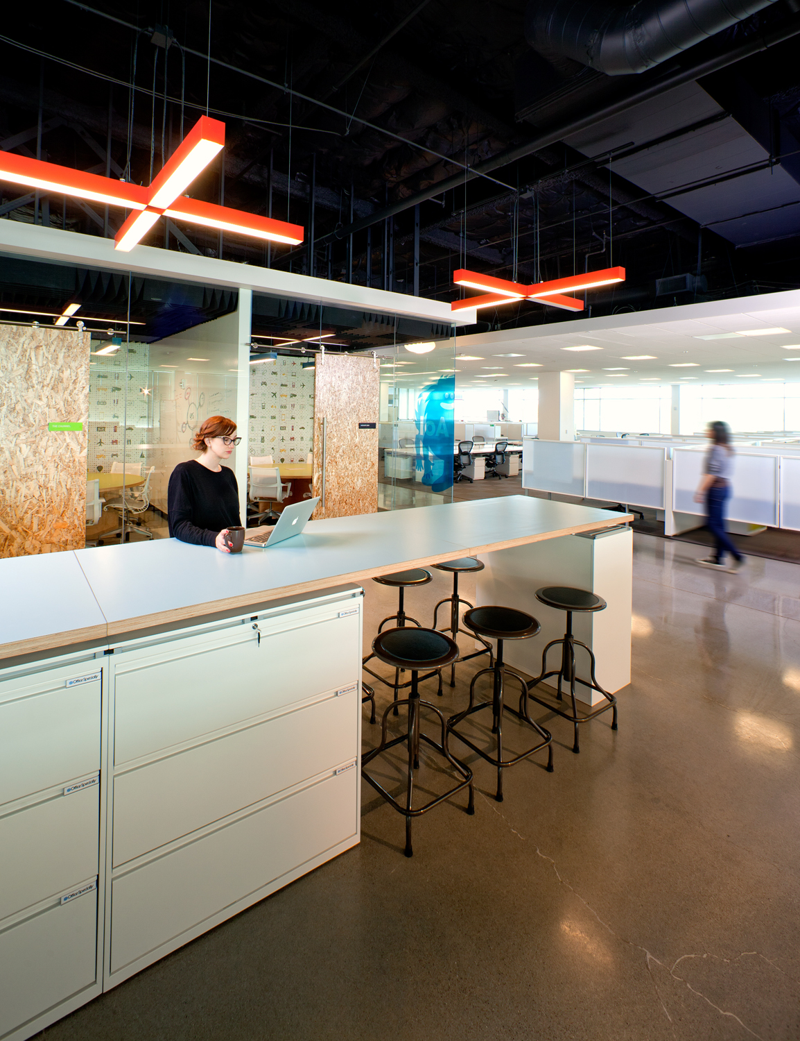
Private conference rooms are available in key locations. This conference room is an interesting modern design with a curved sliding door made of particleboard.
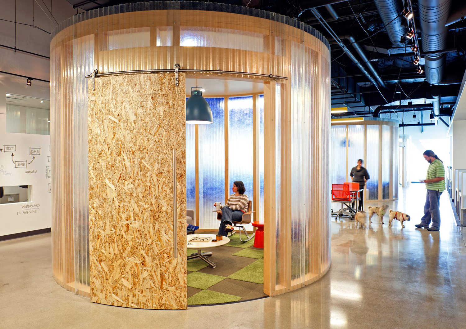
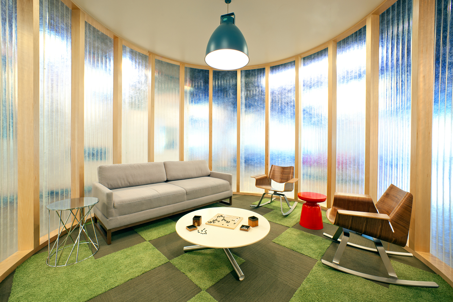
Pictures via Office Snapshots
SunPower
SunPower is a Silicon Valley firm located in San Jose. They use silicon, as well as other materials, to produce solar cells. They have been in business for over 25 years providing power systems for homes, businesses and even large-scale utilities.
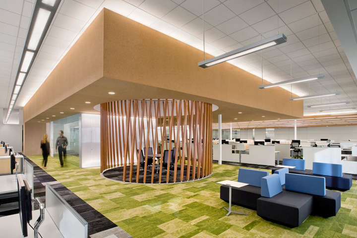
As a successful “green” technology firm that has harnessed the sun’s power, their office design reflects the sun and their greenness. Their carpeting is a mixture of patterned green in areas and a patterned charcoal for contrasting areas.
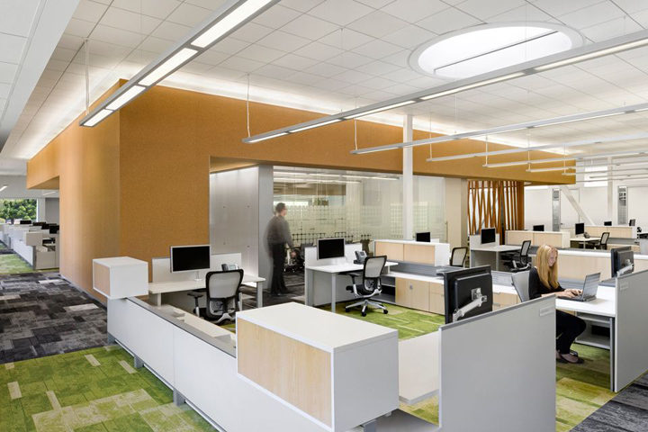
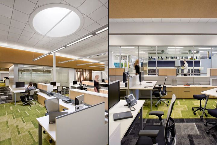
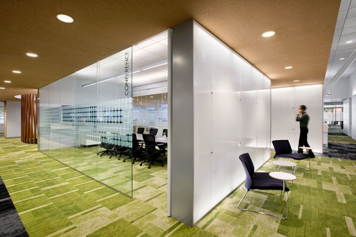
You can see the clean fabrication area through the glass walls in the above right-hand view. The etched squares with rounded corners are the shape of their solar cells.
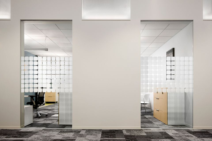
SunPower makes use of skylights to provide natural lighting in some open meeting areas. The creative use of slanted wood mimicking the rays of the sun is a nice added embellishment.
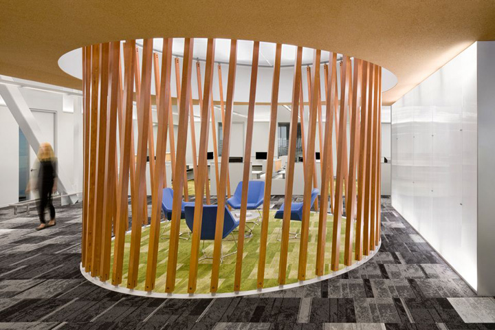
Here is another open seating area at the end of a large conference room. Note the same etched glass solar cell pattern at eye level for some privacy.
Airbnb
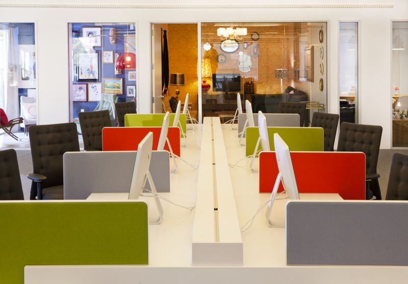
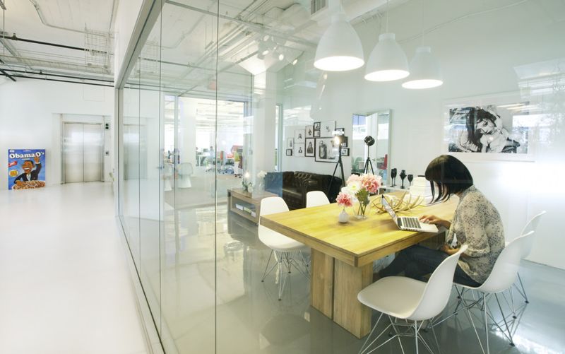
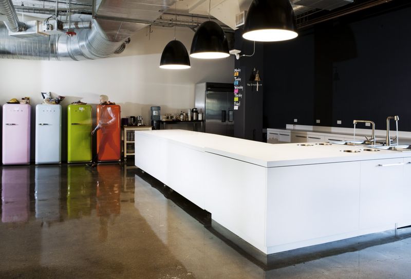
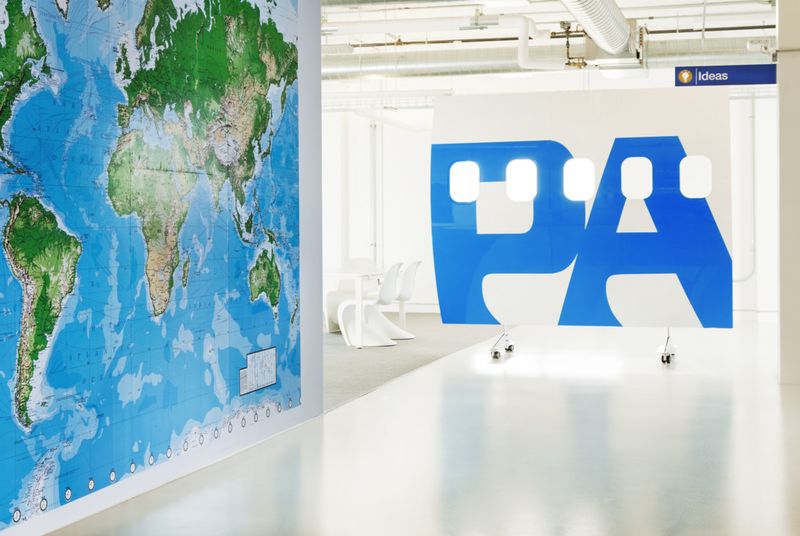
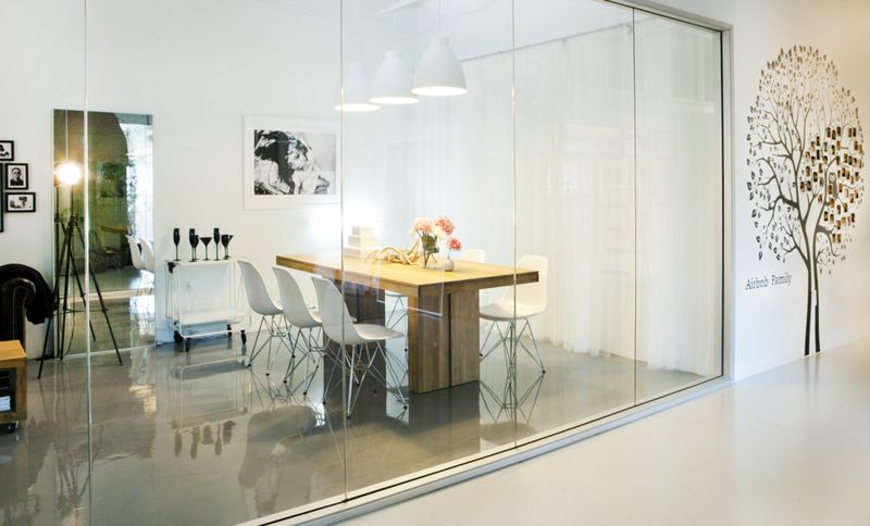
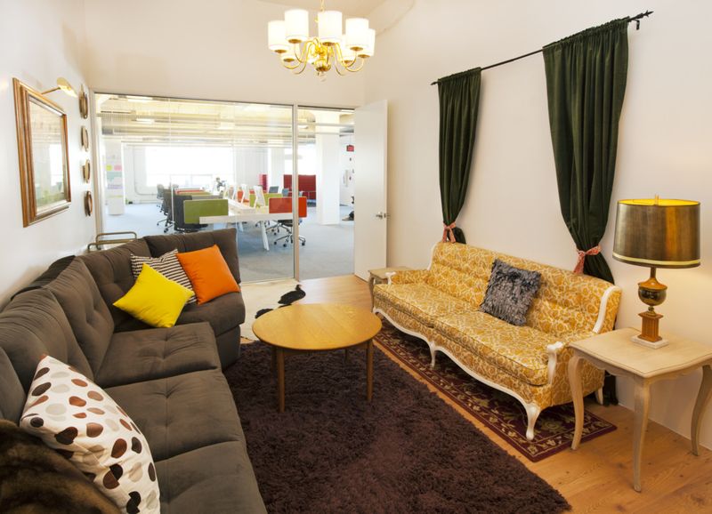
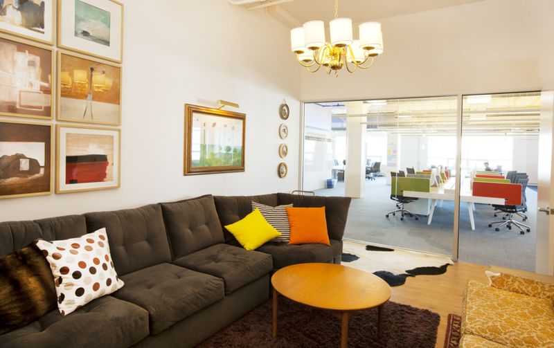
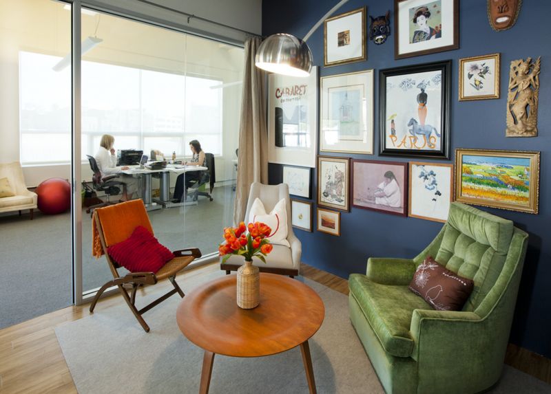
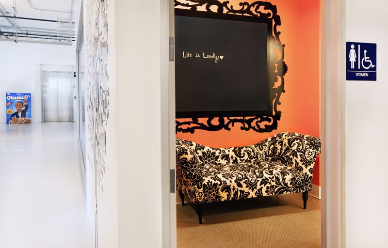
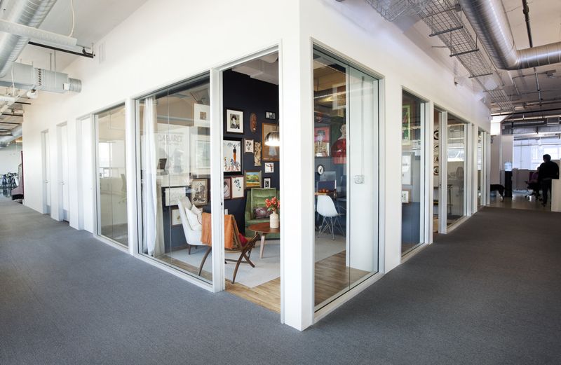
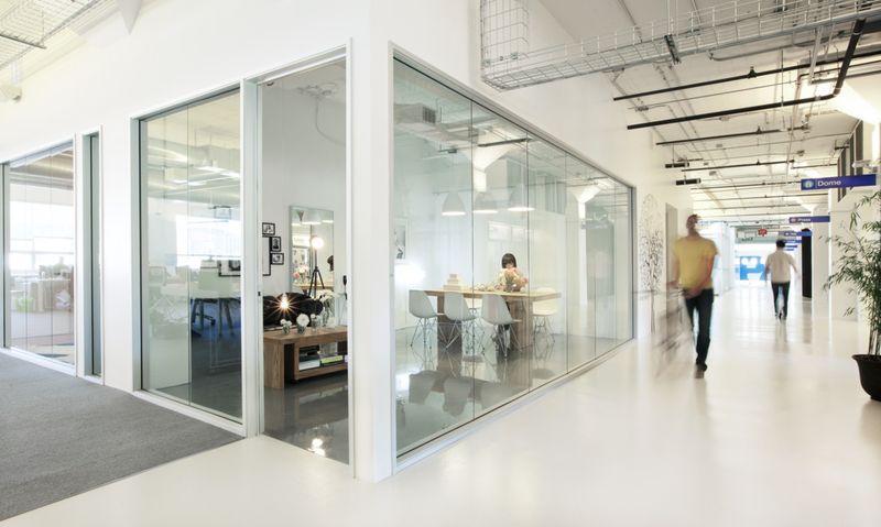
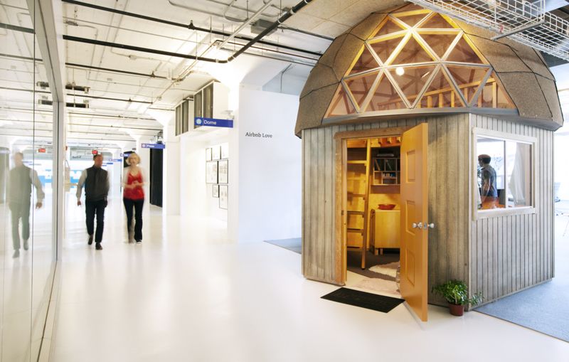
Airbnb is a company that allows you to rent out your home, vacation spot or other real estate through the internet. With over 100 employees and growing, they picked San Francisco as their headquarters. They hired a designer to create meeting rooms that looked like some of their premier rental properties.
Evernote
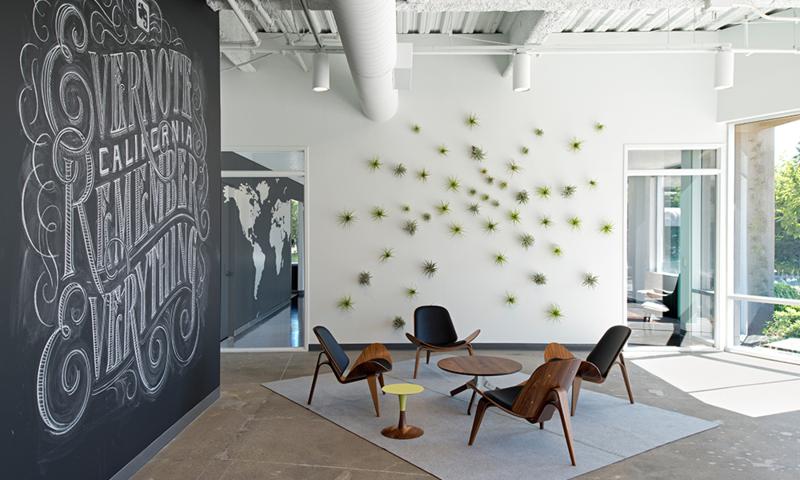
Evernote is a storage and data capture company. Their products will help you to remember everything digital. They even have an elephant, who never forgets, as their logo.
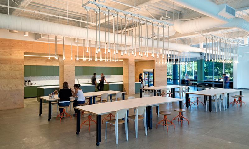
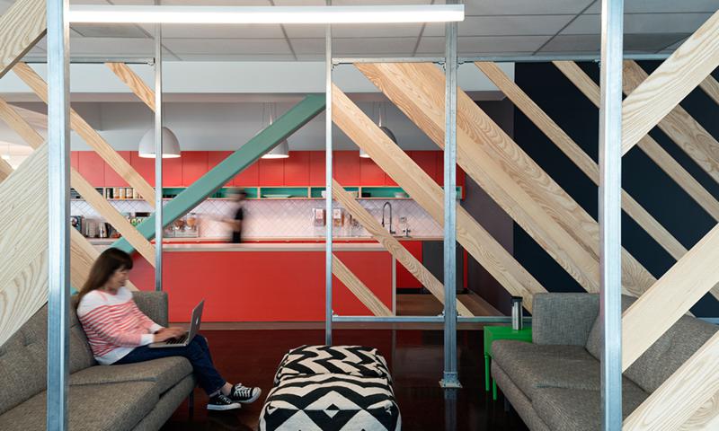
The whole layout of the office is set up to encourage teamwork. The workstations are created using economical tables and small file cabinets on rollers. These file cabinets have padded tops and double as stools for another seat.
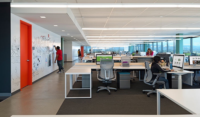
The design of their headquarters in Redwood City has a minimalist feel with the color scheme of predominately white. Bold accent colors appear here and there add to the freshness of the work environment.
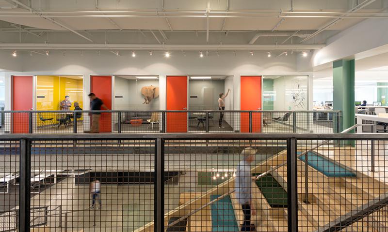
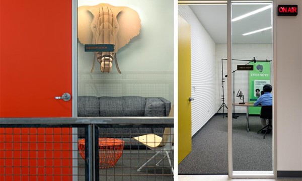
The coffee bar has seating that reeks of minimalism and economy by the use of lab benches on wheels.A mixture of chairs and stools add some wood tones and a touch of orange to add little pops of color here and there.
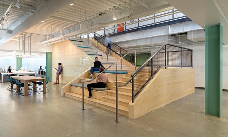
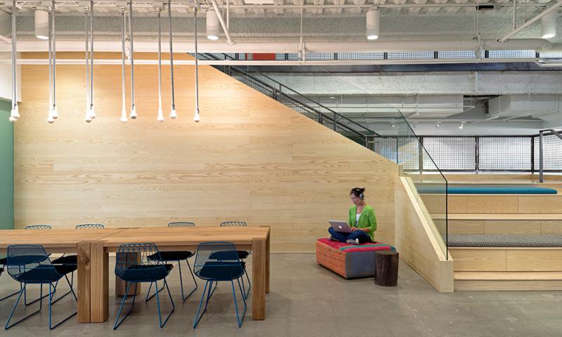
It seems like the rest of Evernote’s headquarters is set up to entice informal get-togethers and promote teamwork. The stairs between floors have a radical design: one half is normal stairs and the other half has steps twice as large.
Pictures via The Design Home
SquareTrade
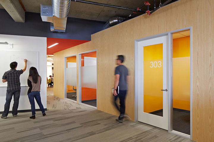
SquareTrade is a growing Silicon Valley company located in San Francisco. They provide 3rd-party warranty for smartphones iPads, laptops and other electronic devices. A lot of earth tones are used throughout the office.
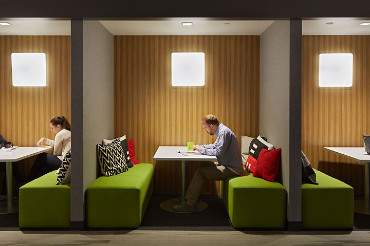
To break this up, furniture in greens and oranges spot their landscape. Take notice of the green and orange color theme in the booth seating. Also, look at the white floating ceiling panels to abate noise from the open seating arrangements.
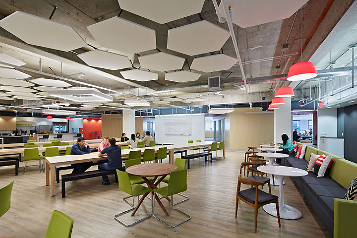
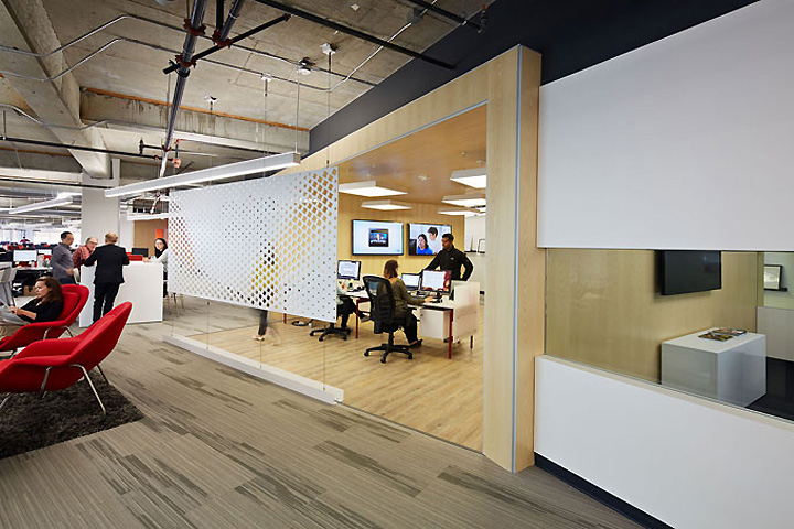
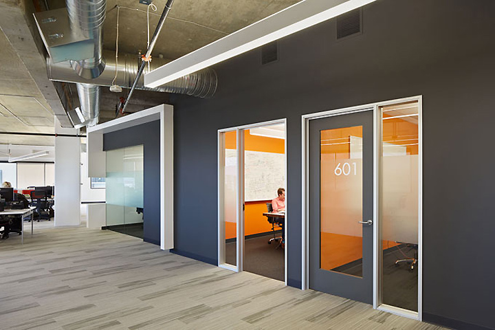
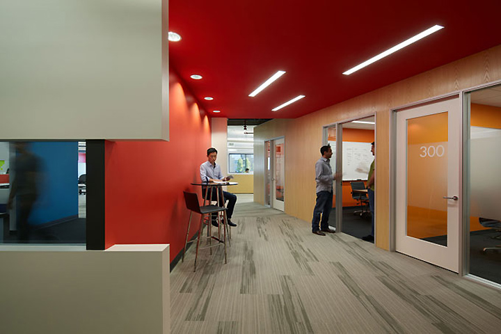
Two rectangles consisting of conference rooms and bright offices are set at offset angles to further reduce noise reflections and provide a loud punch of color.
Pics via Retail Design Blog
Dropbox
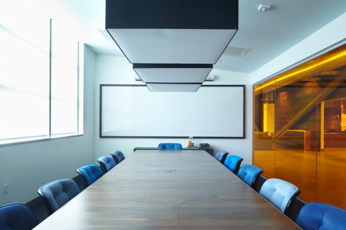
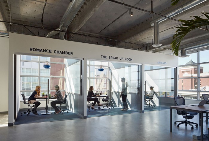
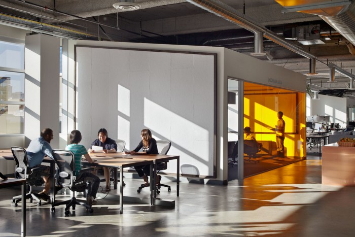
San Francisco isn’t technically in a valley; not by a long shot with all those hills. Anyway, it is considered part of The Valley as firms have expanded into the city by the bay. Dropbox headquarters moved into downtown San Francisco in 2012 and has some great designs with washed black walnut, copper and plenty of LED lighting.
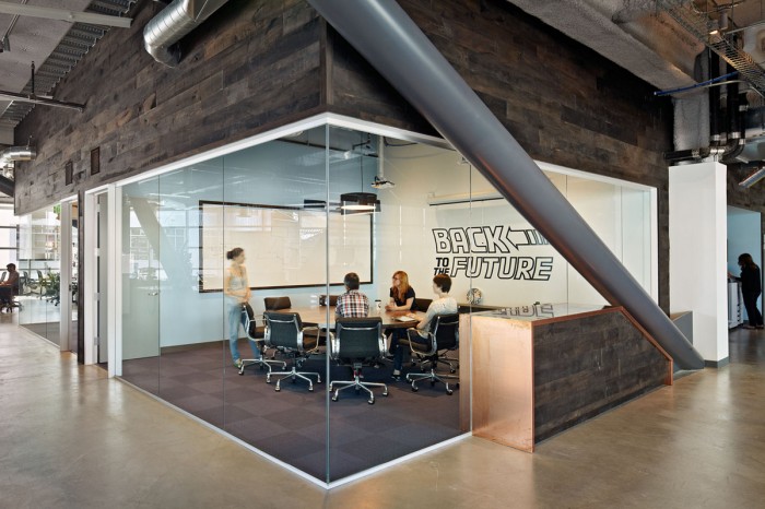
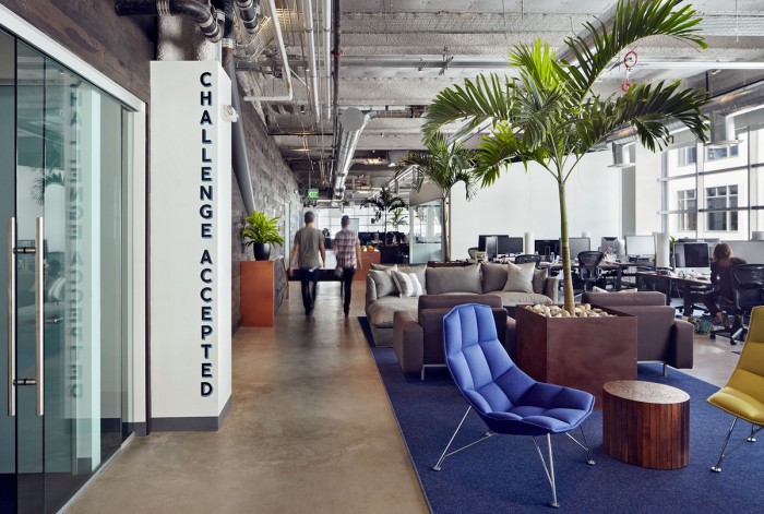
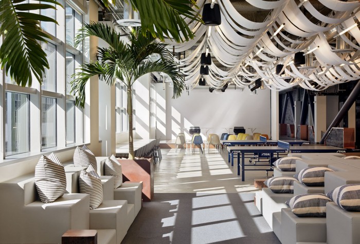
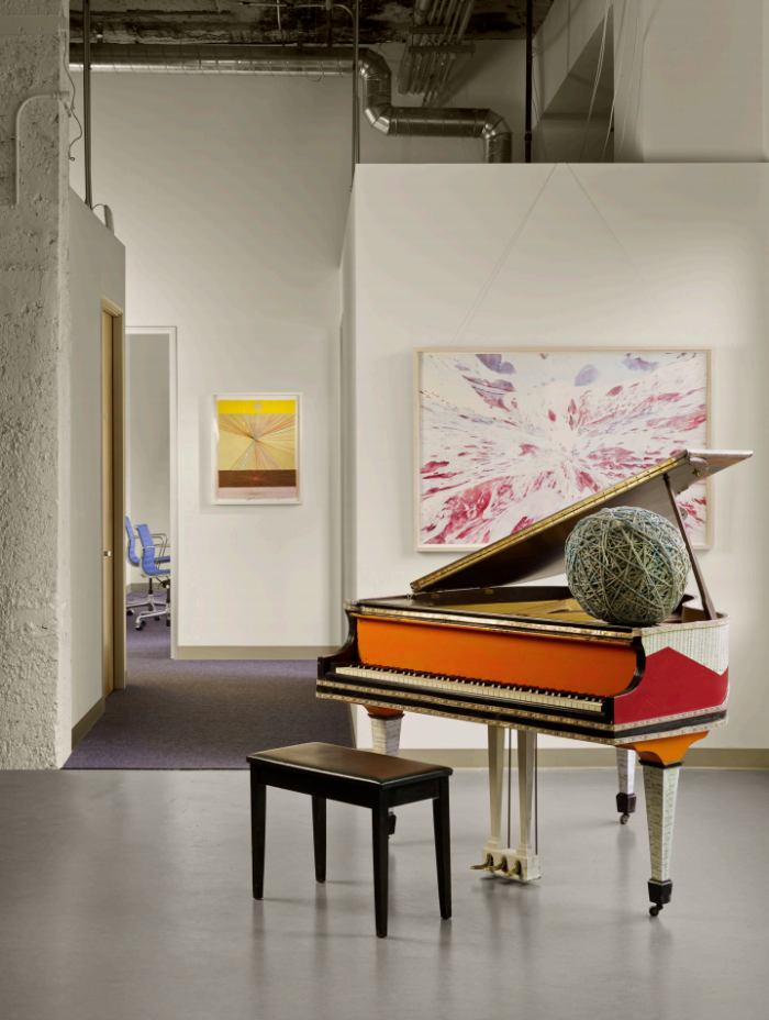
Lounges, wall art and even a music room were part of the plan.
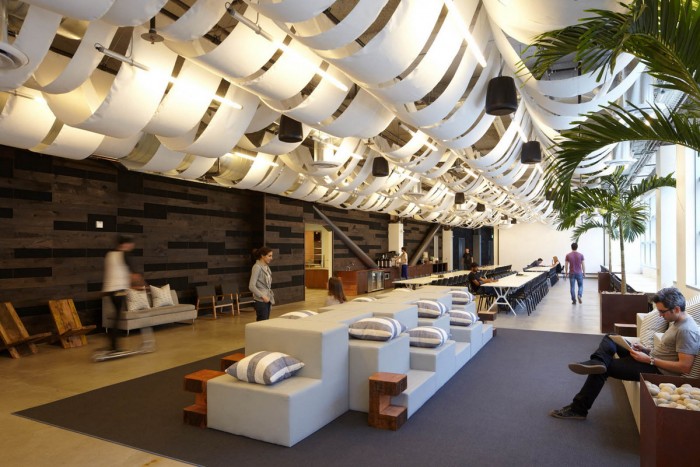
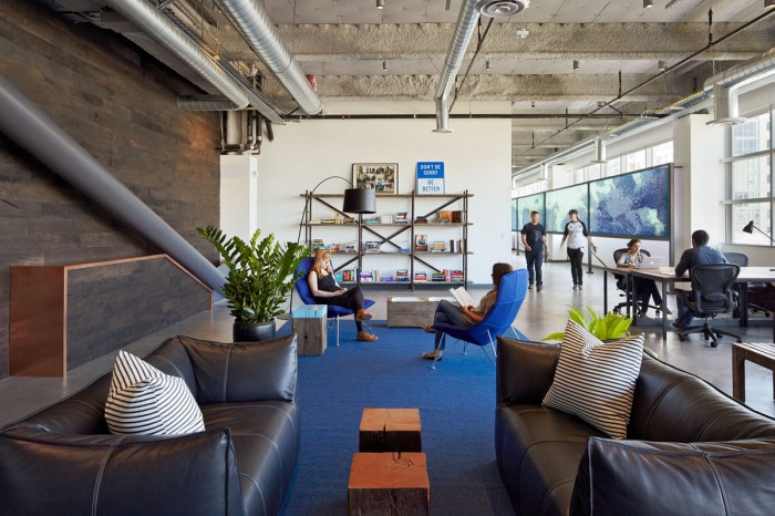
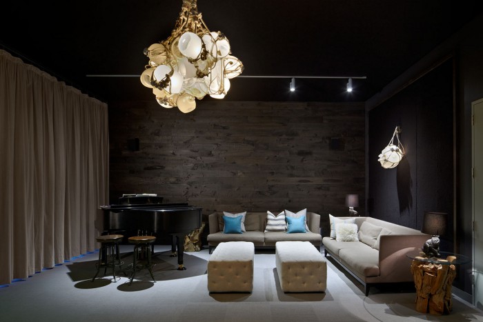
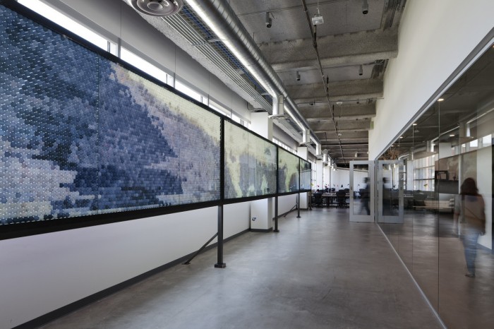
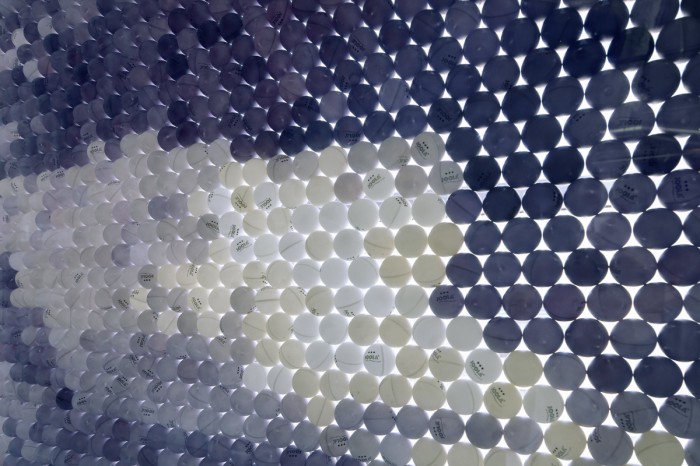
And a touch of a newsroom feel was incorporated into the look and feel.
Pictures via Office Snapshots
Asana
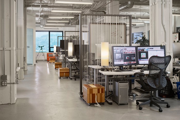
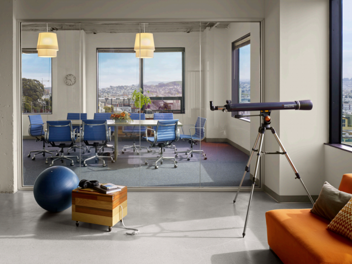
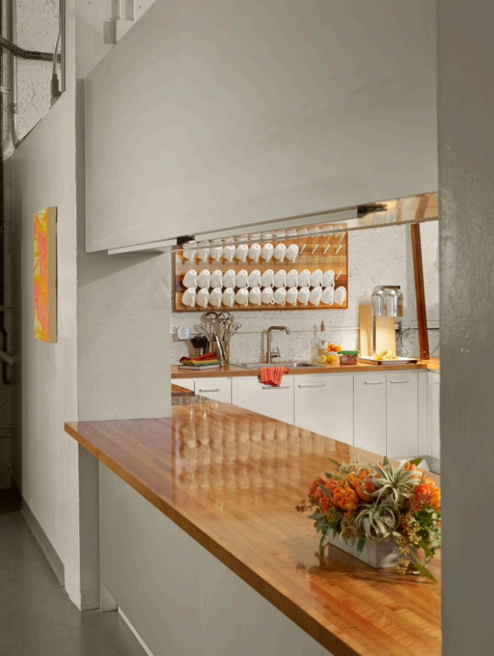
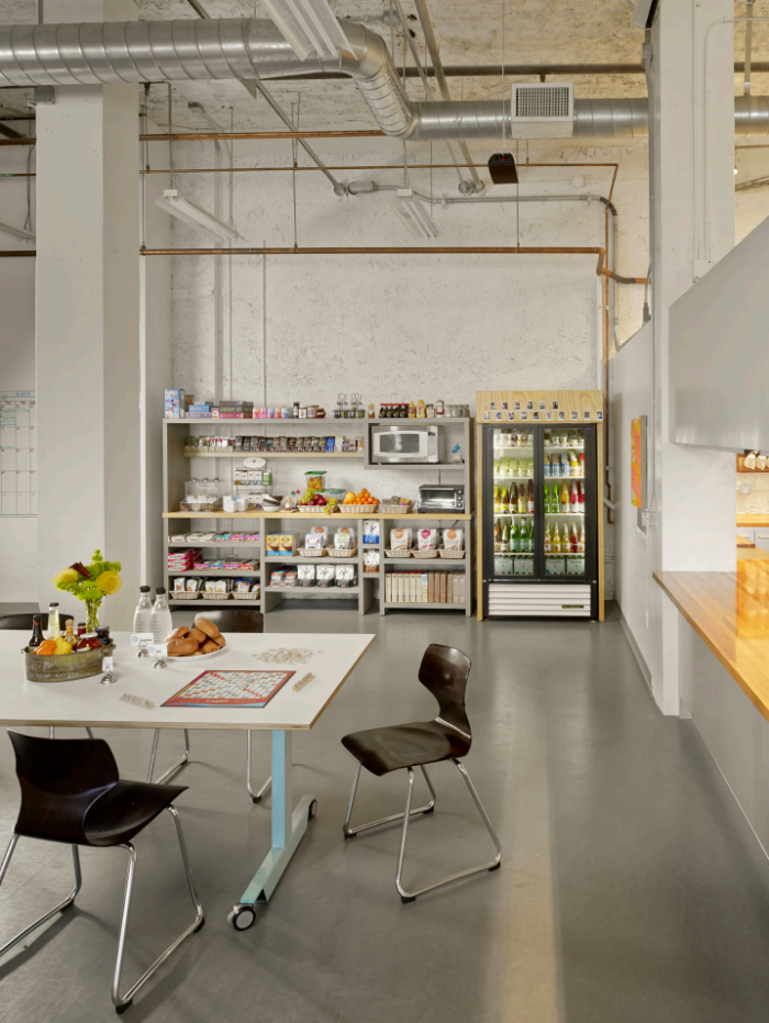
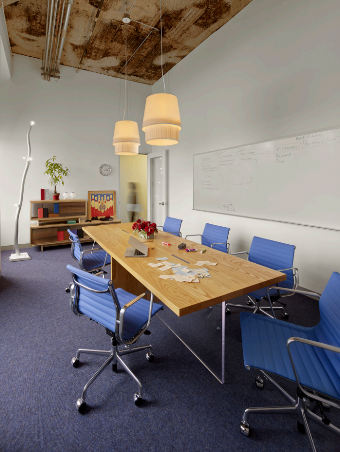
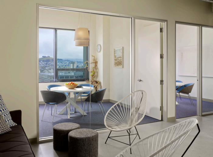
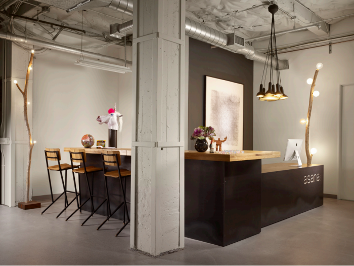
Asana was also attracted to San Francisco. Asana is a task and project management company. Their software allows you to manage your entire project down to the last detail. They have paid attention to details with their office design. Just about everything in this open office environment is easily movable on wheels.
As you can see, we have taken you on a quick trip around the Silicon Valley and just touched on a few of the hundreds of companies. Of these companies, which is your favorite one with respect to the design qualities? Let us know in the comments section below.
