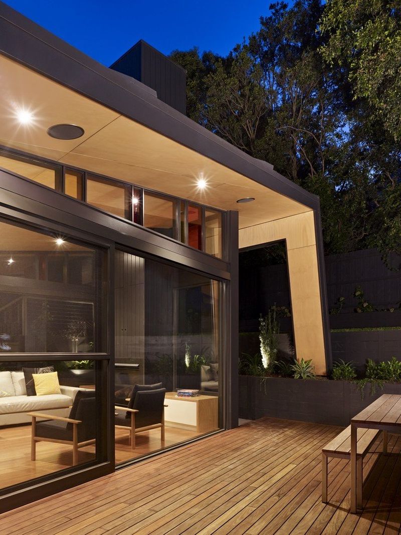
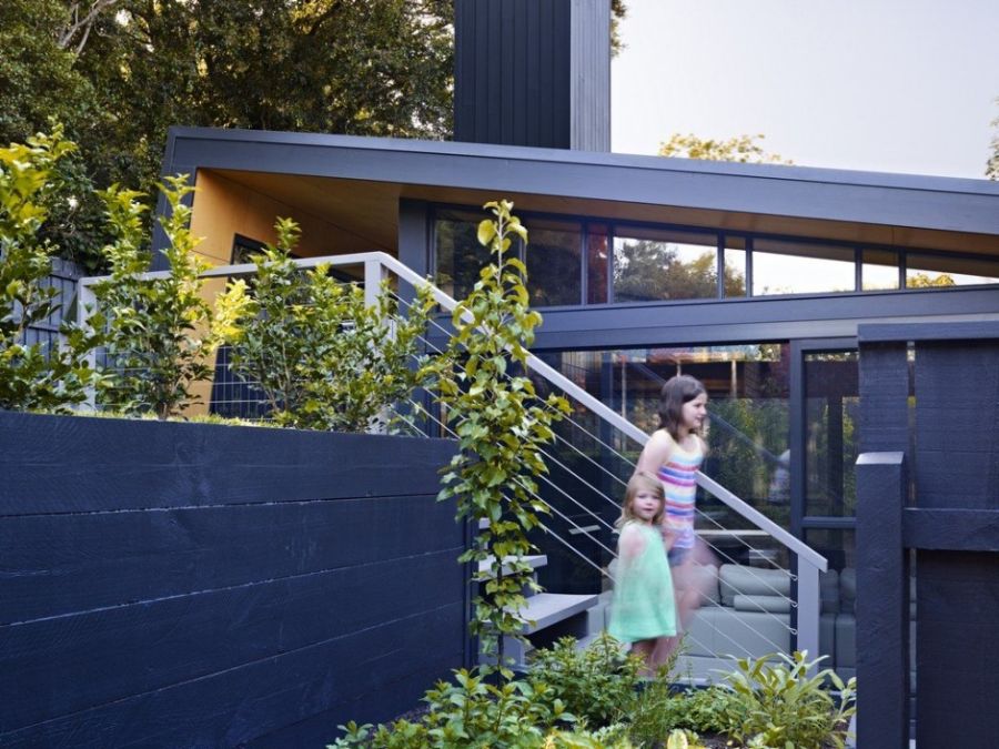
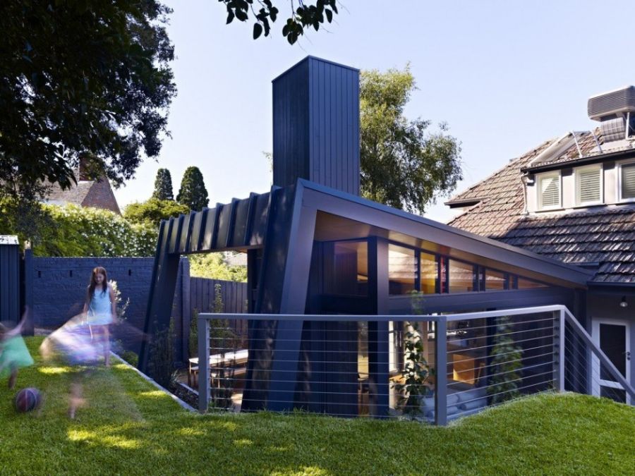
Designed with a twist in conventional geometry by Nic Owen Architects, this fascinating new addition to a classic Kew House in Melbourne steals the show with ease. This audacious extension to an existing home Dow Under was done to provide more space and offer a contemporary hub to the owners. Since the existing façade in the area could not be altered extensively, the new addition was added to the large backyard so as to provide seamless visual connectivity between the indoors and the world outside.
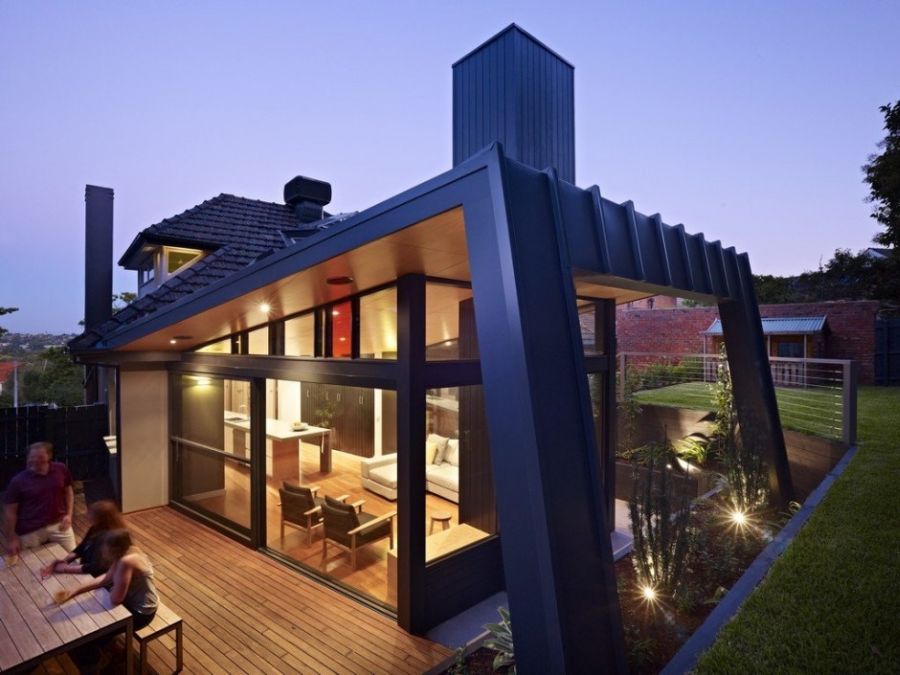
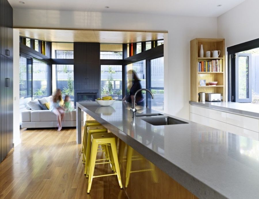
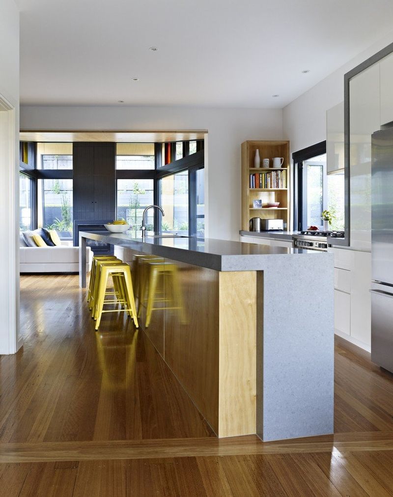
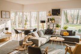
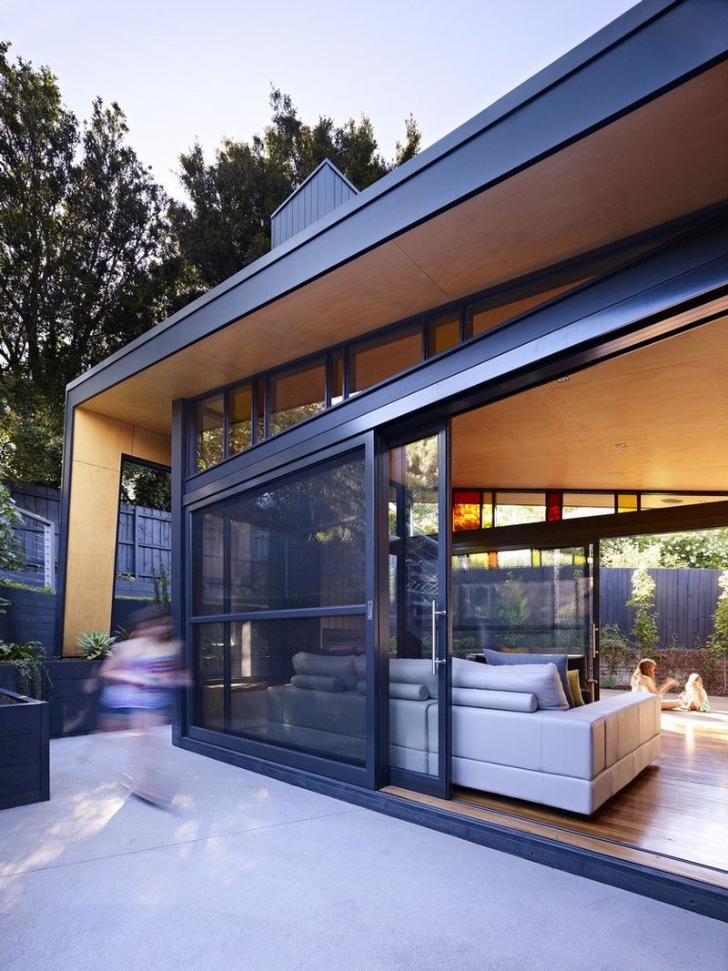
While the catchy new extension of the Kew House looks unusual and daring from the outside, the interiors are kept simple and minimal. A cool color tone in neutral shades is employed with ravishing wooden flooring bringing inviting warmth. Ample use of glass makes sure the interiors feel a lot more spacious than they really are. An open floor plan sees the living area, kitchen and the dining room connected in a natural fashion.
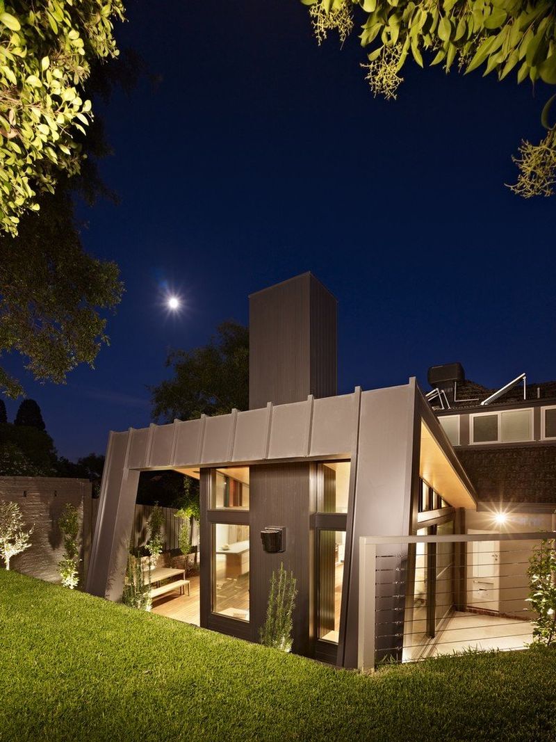
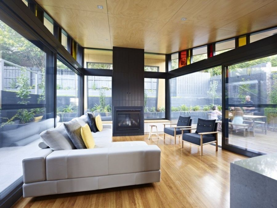
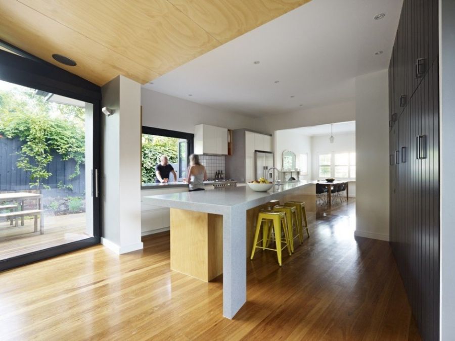
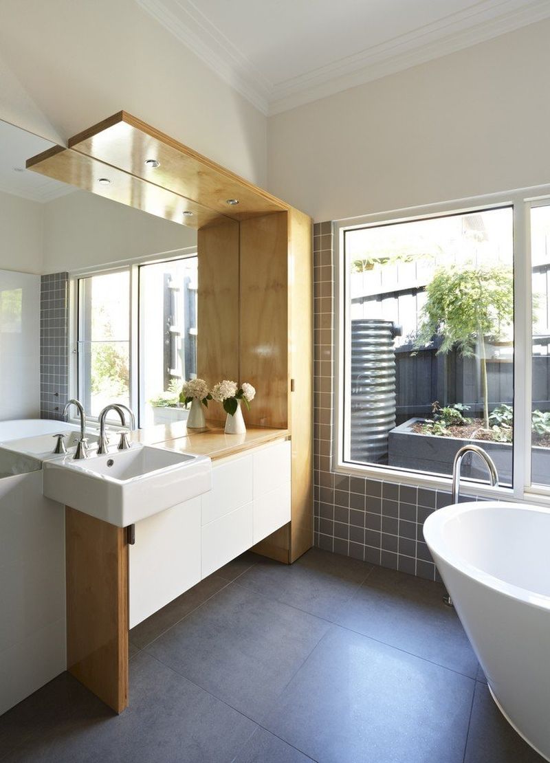
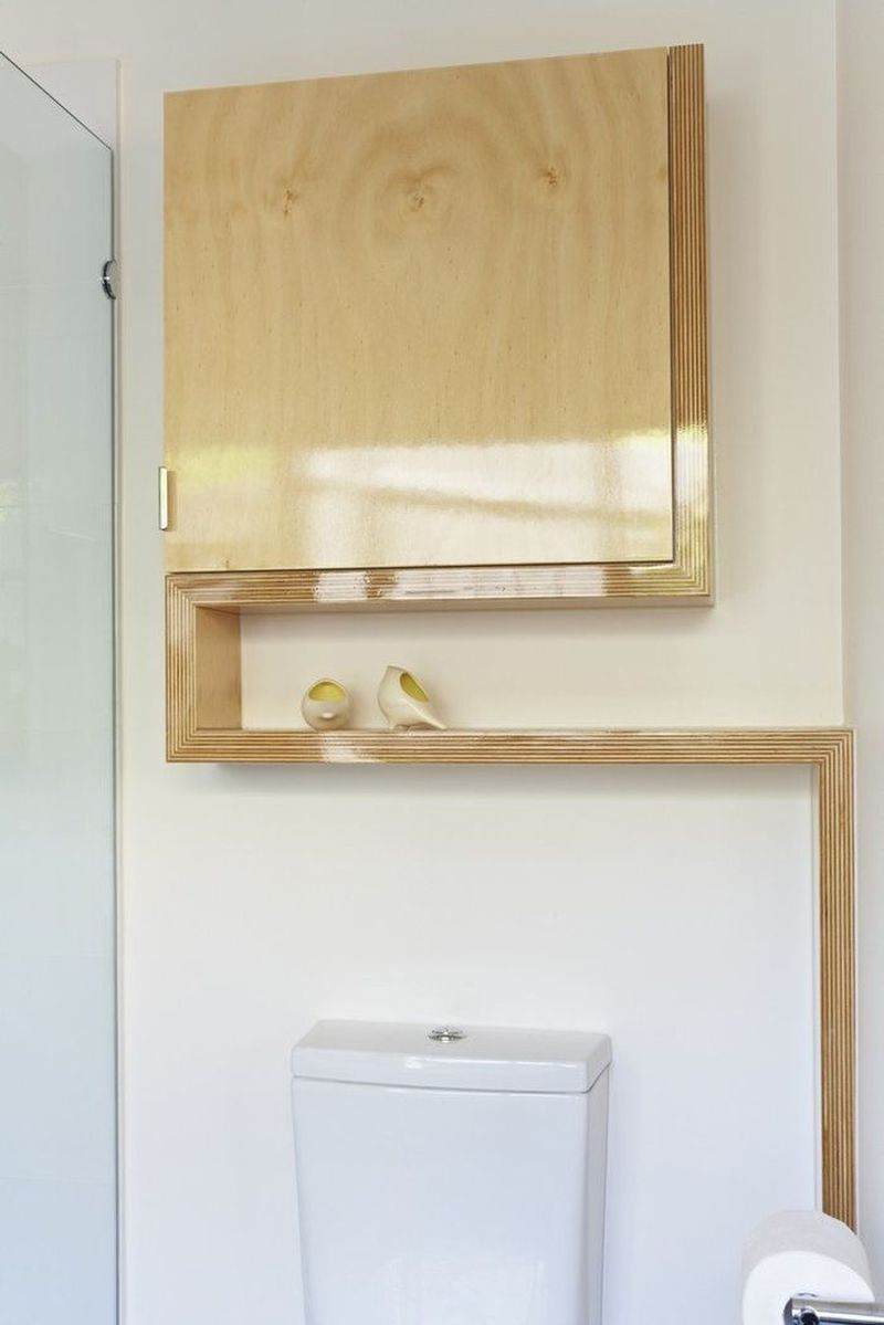
Pops of yellow spruce up the space even as the green outside becomes a part of the visual thanks to the glass walls. Ergonomic shelves and a modern bathroom with wooden accents complete the stylish extension. Just watching the latest addition to the residence standing next to the contrasting old structure presents a lovely picture. Creative and catchy, it shows that renovations and restorations are only limited by the imagination one has!
