There’s nothing more intimidating than staring at a house full of blank walls and wondering how everything will come together. Perhaps you even have a stash of framed artwork and you’re wondering how to group and display the pieces. Is it better to have one substantial item make a grand statement on a large wall, or are groupings of pictures the way to go?
There are no hard and fast rules for the display of artwork, but as with many areas of decor, it never hurts to gather ideas… We at Decoist have previously covered the mechanics of hanging artwork, from positioning the pieces to making sure the wall can handle the weight. Today it’s all about how to display artwork from a decorative standpoint! Check out the images below and see if a display technique grabs your attention. As you’ll soon discover, the creative possibilities are endless. And some of the most impressive wall art statements aren’t framed at all!
One Bold Statement
We begin by exploring the art of one bold statement–because sometimes all you need is one piece of artwork on your blank wall! This is especially true if you’re trying to create a space with an uncluttered look… [from Lonny]
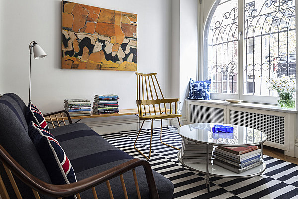
If you’re going with one bold statement, you can reinforce your room’s color scheme with the artwork. In fact, some rooms are inspired by that one amazing painting or that vivid wall art find you just couldn’t live without. [from Lonny]
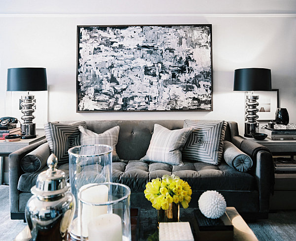
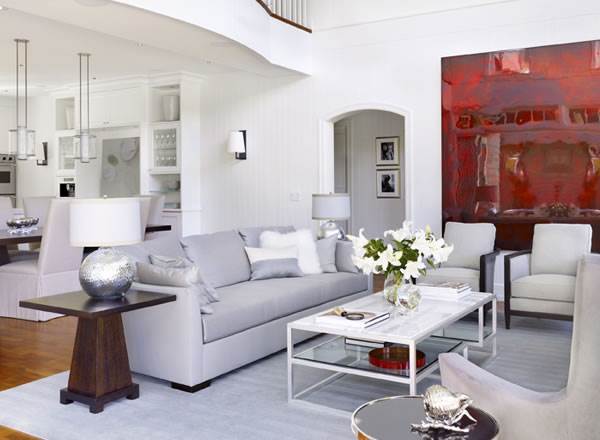
Sometimes choosing one piece of art is the perfect solution to adding a bright dose of color. Below we see glossy red artwork in a neutral room of grays and whites. [from Heffel Balagno Design Consultants]
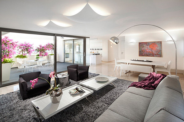
If you do select one piece for your wall as opposed to a grouping, make sure your find adequately fills the space. Otherwise, you create a look that says “What’s missing?” rather than “Wow!” Take your cue from the wonderfully proportioned painting below… [from Segev Photography]
Coordinating Artwork on Nearby Walls
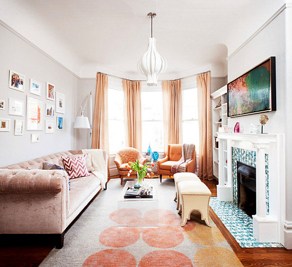
So you have a plan for filling that one blank space, but what if you have a whole room that needs attention? How do you know which pictures will work together when placed on nearby walls? One helpful tip involves choosing artwork with a similar color scheme, as shown in the room below by Coddington Design.
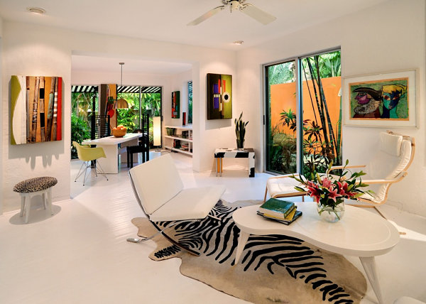
It also helps to select artwork of a similar style, such as abstract pieces. No, you don’t have to fill the space with works from the same artist. But it certainly helps if the pieces complement one another. [from The Art of Space]
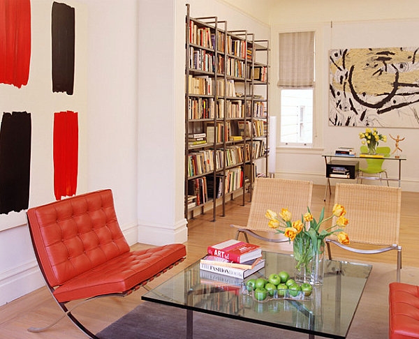
Another helpful tactic for hanging different pieces in the same room? If one item features a bold color, choose other artwork in neutral shades. In the room below, we see black and red art that truly stands out, thanks to a nearby piece in shades of black, white and beige. [from Fougeron Architecture]
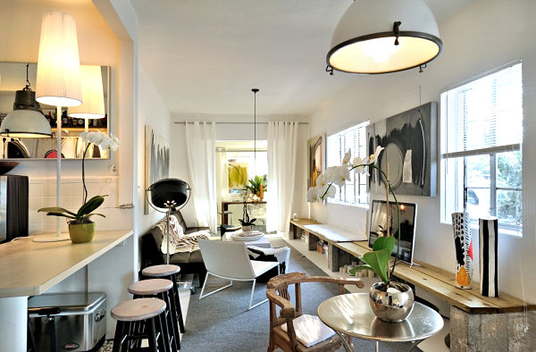
A black and white color scheme is a great way to coordinate artwork. Striking, classy and powerful, black and white pieces make a big statement without fighting one another for colorful attention. [from The Art of Space]
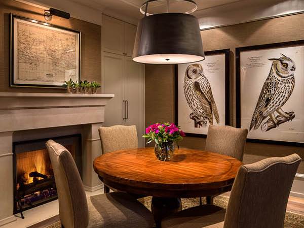
Speaking of neutral shades, the next featured image showcases artwork in black, white and tan. As you can see, neutral colors have the power to unite various pieces in the same room. Not to mention, a map is the perfect complement to two owl-themed botanical-style pieces, don’t you think? [from Heffel Balagno Design Consultants]
Wall Art Groupings
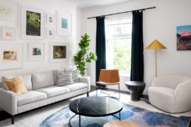
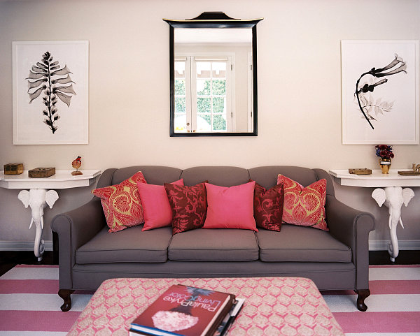
Let’s talk about groupings. Because sometimes the best way to fill the space is to hang more than one piece on the same wall. Below we see an image from Lonny that gives us an idea for another display strategy: hanging two pictures with a mirror in between them!
Once again, The Art of Space helps us illustrate how black and white artwork can perfectly combine with colorful pieces. Yes, especially on the same wall!
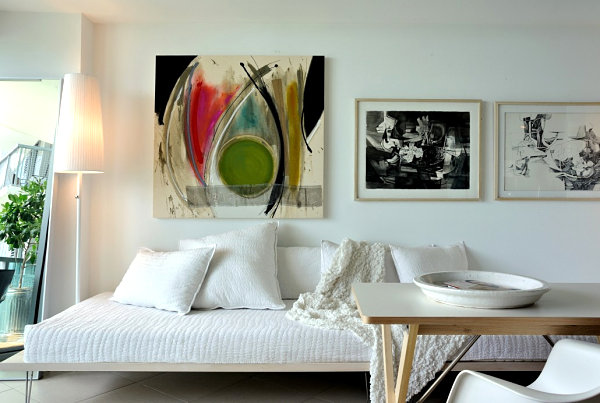
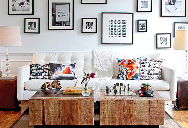
Speaking of black and white, we know the power of this color combo. In the next featured image, the artwork vignette reminds us that there’s nothing quite like a grouping of black and white photographs. This space also includes Map-Art Pillows from Cartoloji:
Uniting artwork in frames of similar colors can also be a helpful strategy, as shown by the eclectic grouping in the space below. We also love how the artwork is combined with other elements, such as a mirror and a shelf of decorative smalls. [from Lonny]
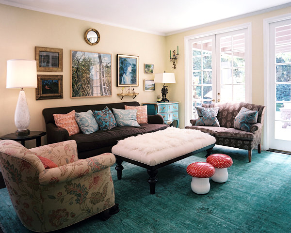
Don’t feel like you have to toss your frames if they don’t all match. In fact, you can find another way to combine them in a dynamic grouping: celebrate the power of vivid colors. Red frames, yellow frames, black frames–they all go together when joined for the purpose of making a colorful statement. [from Etsy shop Handz]
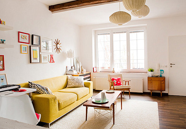
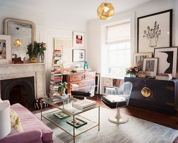
Finally, when it comes to grouping artwork, not all displays require a hammer. You can strategically lean framed art of various sizes to create an eclectic vignette layered with style. [from Lonny]
Unique Wall Art
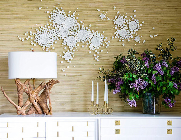
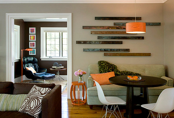
Not all artwork comes in a frame! In fact, some displays evoke the creativity of an art installation, such as the modern wall sculpture below. Wall sculptures add a 3-D element to an interior, and they have the power to make an expansive statement. [from Amy Lau Design]
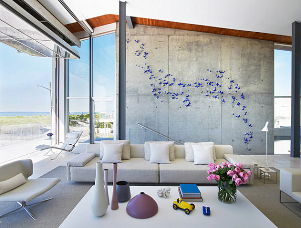
Not sure where to start? Luckily there are folks who are willing to give you a hand! In fact, below we see how modern style can be added with the help of a wall art decor kit. This one comes from Etsy, and it spreads its blue butterfly style across any wall it inhabits. [from West Chin Architect]
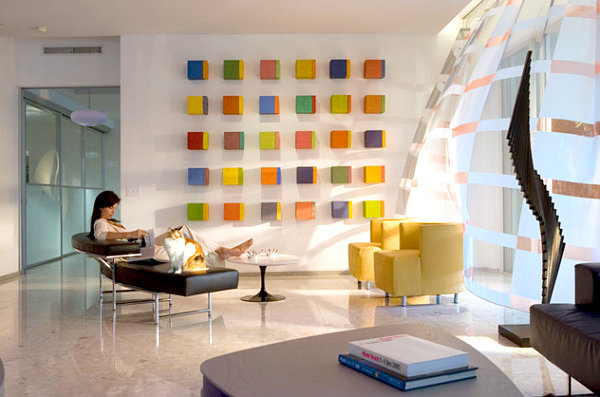
There is power in numbers. Which is why this grouping of colorful blocks is the ultimate in wall art style. A vibrant display is created from floor to ceiling, and you can’t help but examine each piece, searching for similarities and differences. [interior design by Oscar Glottman via Houzz]
Next we see metal wall art from CB2, which was sold in sets of 3 but is unfortunately no longer available. However, it reminds us that beauty can be found in the most simple of wall art forms! [from LDA Architecture & Interiors]
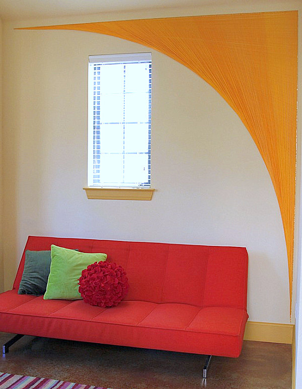
Don’t forget that you can always enjoy a little DIY fun… Remember this amazing creation from our recent post on yarn art? It stylishly spans the wall from floor to ceiling, forming an arch that helps define the space. What’s truly impressive about this piece is the amount of yarn used to create a thick 3-dimensional statement that celebrates texture and color. Check out all the DIY details at June Cleaver Nirvana:
Do you have any wall art display strategies you’d like to share? Tell us about your picture-hanging endeavors by leaving a comment below…
