It’s where you fall asleep and where you wake up. It’s where you keep your clothes and where you take refuge after a long day. Sure, there are plenty of items that could fill the space. But how many really should? Today we take a look at bedroom basics!
What are the essentials? What are the decorative elements that make the space special? How do you balance the two without making the room seem sparse or cluttered? With the help of the images below, we’ll show you how to create a bedroom that’s as functional as it is stylish. Hopefully you’ll get some decor ideas in the process. Enjoy browsing…
Bedroom Basics
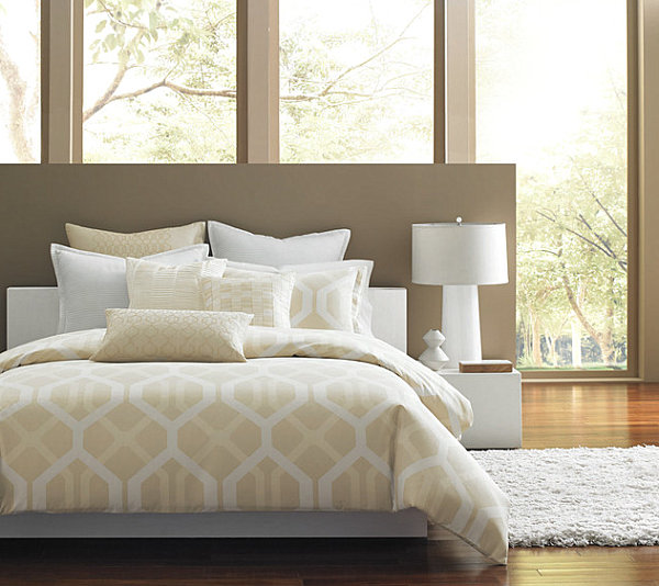
Let’s start with the basics. What are the necessities? What are the luxuries? You can’t have a bedroom without a bed. And comfy, stylish bedding can make a big difference. Below we see a crisp geometric selection from Hotel Collection, which is both soothing and sleek at the same time. When choosing bedding, go with something you love. Your bedroom is your sanctuary–surround yourself with things than calm and inspire you! [via Houzz]
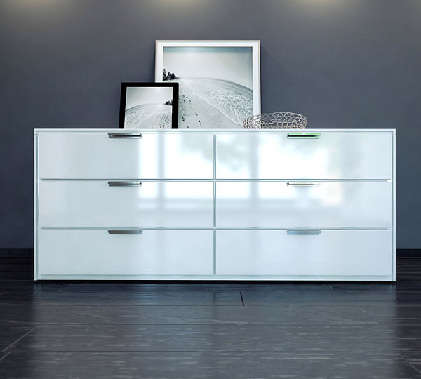
Then there’s the dresser. After all, most bedrooms hold clothing, and for folded items there’s nothing quite like a dresser that makes a stylish statement while keeping your garments organized. A dresser is a great excuse to solidify the look of the room, be it a clean-lined contemporary space or glamorous, decadent one. Below we see the Thompson Contemporary & Modern Dresser by ModLoft from Cressina:
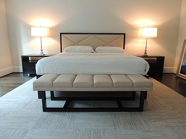
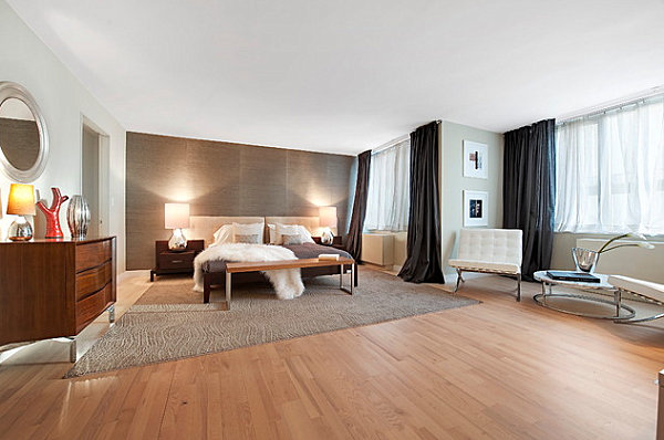
…And you probably need a nightstand if you’re planning on reading a good book before falling asleep. Great for holding lamps, magazines, novels and decorative items (see below), nightstands can also add symmetry to the space. In addition, check out the bench at the foot of the bed below. Many bedrooms feature these decadent pieces, which add a sense of luxury. [from Fusion Home]
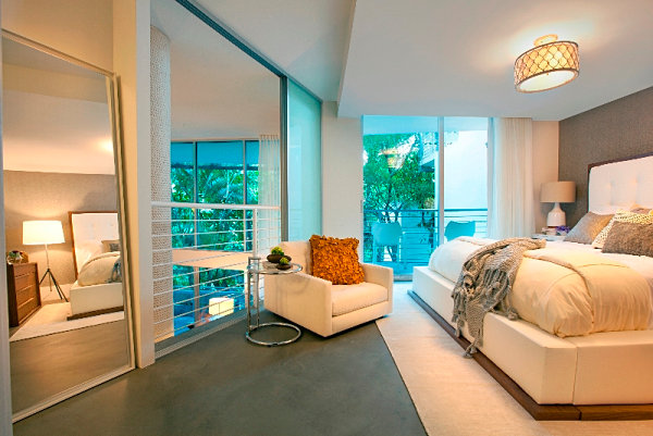
Other fun bedroom basics that may appear from space to space: a mirror, comfy seating and interesting lighting, such as the drum-shaped lamp hanging from the ceiling in the next featured room. [from DKOR Interiors]
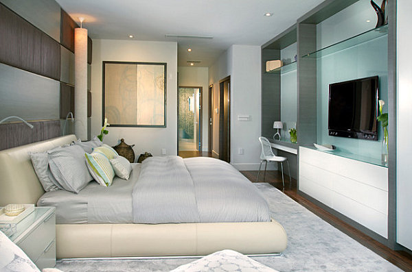
Some bedrooms also feature desk space, as well as a television. How do you know what will be best for your space? In many cases, it depends on how much room you have. Some bedrooms allow space for little more than a bed, a nightstand and a dresser. Others have built-in features such as drawers and desks. And a third group of bedrooms feature enough space to accommodate everything from extra chairs to decorative tables! [from DKOR Interiors]
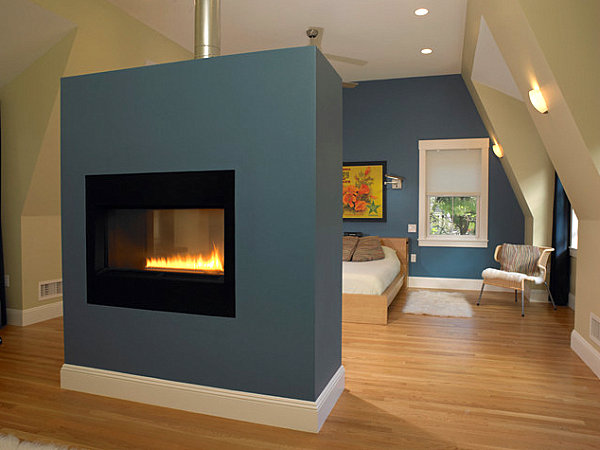
Not only does the space below stunningly combine smoky blue and artwork in shades of mustard yellow and hot peach, it houses a fireplace for a warming effect on a chilly day or evening! Okay, so not every bedroom can have one of these… But it’s fun to dream, isn’t it?! [from Michael Kim Associates]
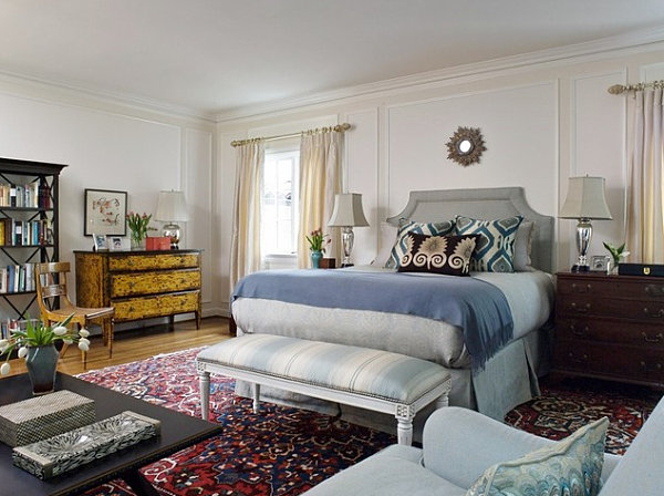
We end this section with a truly irresistible space. In fact, this bedroom reminds us that sometimes you need one large statement to anchor the room. And that’s what the rich-hued rug below is for! And don’t think that if your rug has a pattern, you have stick with solids for the rest of the space. As the room below shows, mixing patterns can be effective. And attractive! [from Coddington Design]
Surface-Top Decor
Let’s turn our attention back to the “what goes” and “what stays” departments. Because let’s face it–one sure-fire way to add clutter to the bedroom is to cover each surface top with too many items. But keeping it simple can go a long way in the decor department. Check out the space below, which has a luxury feel yet doesn’t pack in too many items. Nightstands hold lamps and a couple of small pieces in this room designed by Celerie Kemble. [from Lonny]
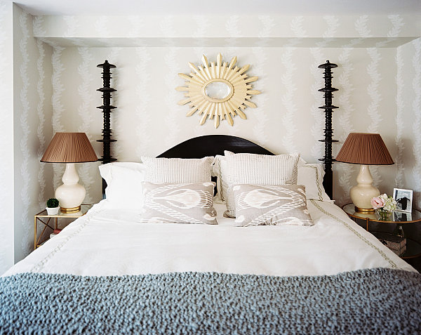
Another hint: not everything has to be perfectly symmetrical. That’s right–you can have a piece of artwork on one nightstand and a shorter, flatter item on the other side of the bed. Sometimes varying the height of your decorative statement is just as interesting as making sure each piece has a perfect match, as shown in the room below by Estee Stanley. [from Lonny]
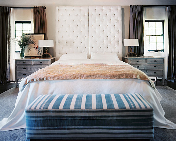
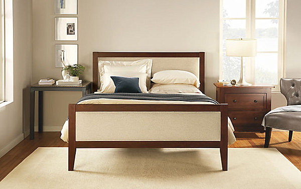
We’re loving the way the space below features two mismatched pieces on either side of the bed. On one side is a table. On the other side is a nightstand. From plants to a modern lamp, the decor is carefully selected to add interest without being overwhelming. [from Room and Board]
The emerald green vases below are the perfect way to add a bright pop of color to this neutral space. Don’t forget that one or two surface-top items can be the punctuation mark you’ve been looking for as you create the bedroom of your dreams. [from KBC Developments]
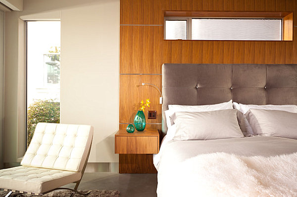
It’s not just about nightstands. What will you place on your dresser? What will you set on the table in your bedroom? From vases to lamps, the possibilities are endless. Check out the next featured space, which highlights the value of focusing on big statements rather than groups of small items. [from AQ Interior Design]
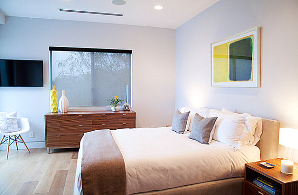
Another trick: Place items on either side of a flat surface, but leave the middle free. The low dresser in the space below keeps the center of its top clean-lined and smooth. The result: visual interest without the clutter. We’re also loving the way bright bursts of yellow reinforce the color motif that’s set by the artwork hanging above the bed. [from SHARPlife]
Special Details
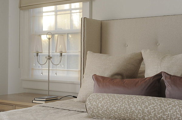
We end our post with a reminder that it’s the special details that truly make a space. Thoughtful touches like a few extra throw pillows or lighting with decorative flair can really set a stylish tone in your bedroom. Below we see a room with glass teardrops hanging from the bedside lighting, and an array of cushions urging inhabitants to rest their weary heads. [from Interieurs]
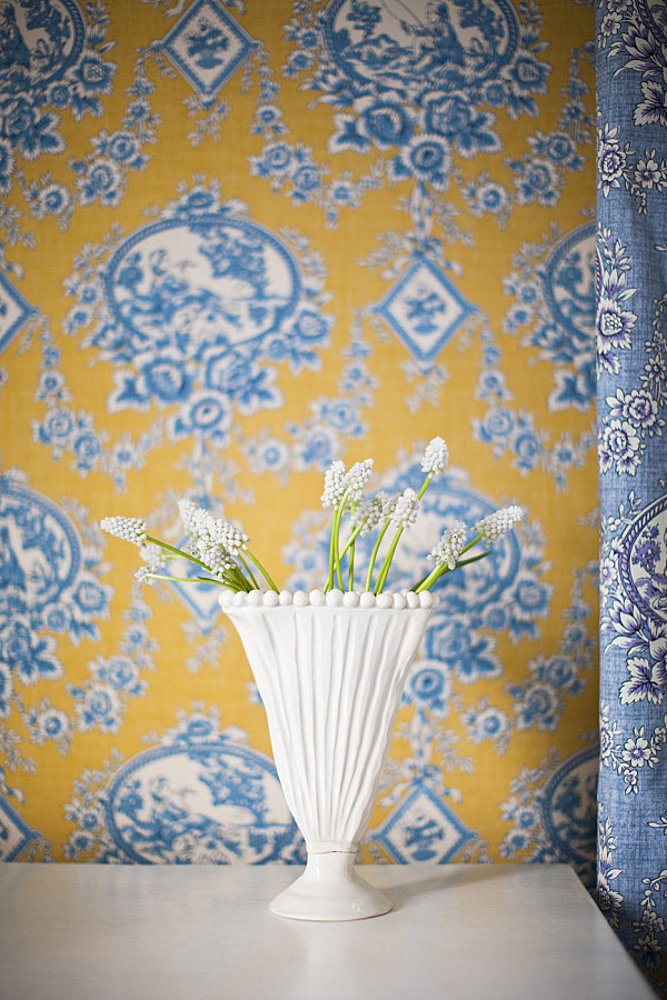
A decorative vase thoughtfully filled with blooms stands out against toile wallpaper in this space designed by Brittany Asch. Quirky blooms + intriguing vase = design perfection! [from Lonny]
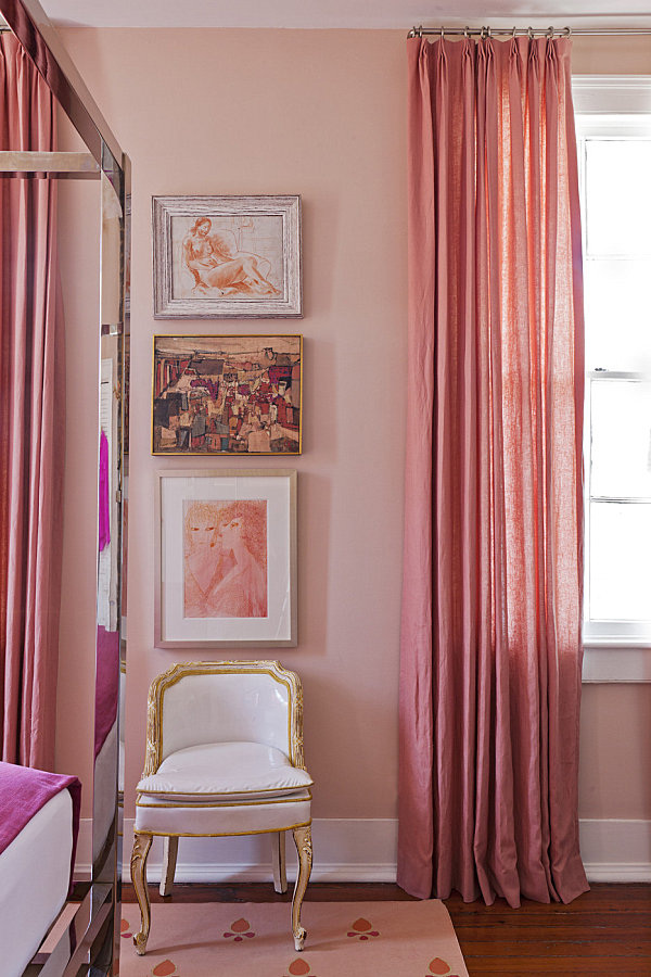
A trio of pictures graces the wall above a carefully placed chair in this next space, designed by Angie Hranowsky. Note how the hues of the artwork celebrate the pinky-peach tone of the bedroom as they mix artistic styles in a way that makes perfect sense. [from Lonny]
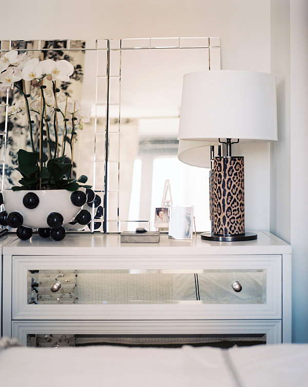
Check out the vignette below in this room designed by Michelle Adams. Do you want to take a closer look? Are those spheres decorating the bowl that holds the orchids? Is that a leopard print on the cylindrical lamp with the drum shade? Are the drawers of the dresser mirrored? If you want to wow with your design choices, make people take a second look at your space and inspire them to yearn for the details that give your room its allure. [from Lonny]
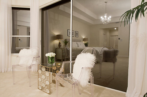
When it comes to unforgettable details like the acrylic seating, fuzzy cushions and geometric table below, all we can say is wow! Design mission accomplished! [from Inspired Interiors by Wendi]
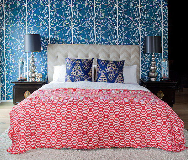
We close our post with a space that can’t help but make every detail count. From the mix of patterns to the cloches that hold figurines, this bedroom begs to be studied. Yet it doesn’t take itself too seriously. Folksy prints and a woodland feel created by tree-themed wallpaper result in an earthy vibe, yet the room’s elegant details help achieve a truly eclectic space. [from California Home Design]
Which of the bedrooms above is your favorite? Did any of the spaces give you an idea for a design strategy that can streamline your space? Share your thoughts by leaving a comment below…
