After almost two weeks of being back from Design Camp in Seattle, I have finally had time to think about and process all of the incredible information I was given. While a lot of it was focused on the business aspects of being an interior designer, there were certainly a million creative tips I was able to take away. I have managed to condense it all down to the top 10 tips for designing a space, whether you are a professional designer or someone who is designing their own home.
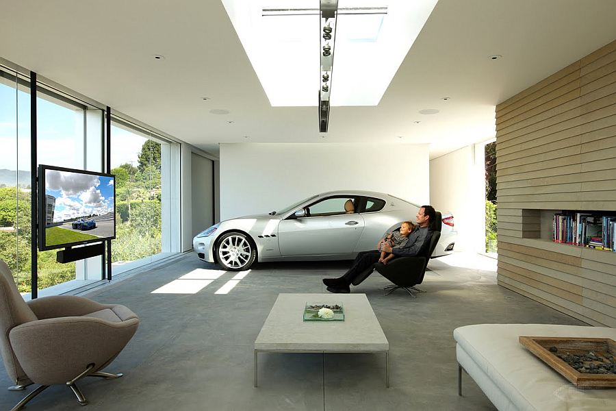
1. Look around you for inspiration.
As they say, inspiration is everywhere! The first step in designing a space is to get inspired. By opening your eyes and your mind to potential inspiration, you will be surprised how often you find inspiration when you are least expecting it.
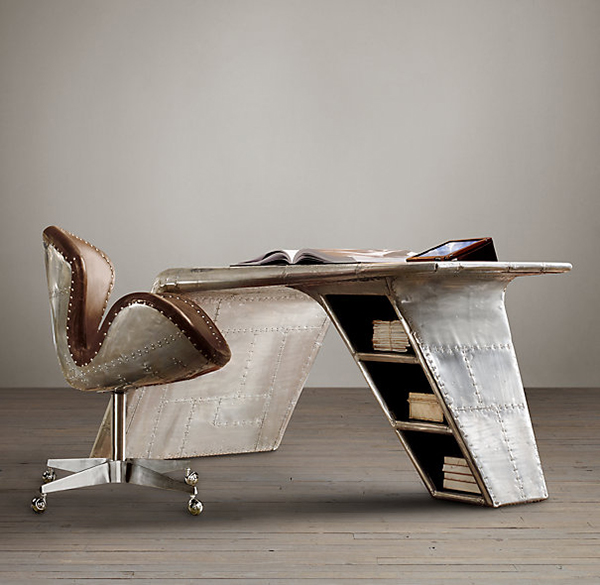
Look at objects, buildings, clothes, etc. in new ways… would the decorative column on that building look amazing as a table leg? Would that woman’s scarf be the perfect color scheme for your new space? Like this Restoration Hardware desk inspired by an airplane wing, inspiration comes in many forms and ways, so open yourself up to the possibility of receiving it and always document it when possible!
You may not have a use for it now, but you may look at a photo of that lovely building column a few months later and realize is is perfect for the legs of a dining table for your new space.
2. Something good is not always something right.
You just found the most amazing sofa. It took your breath away with its beauty. You are tempted to buy it on the spot, but take a moment to think, “I know this is good (very good!), but is it right for the space?” Well, as Robb Whittlef of Historic Studio taught us at Design Camp, you may find that looking at it with this approach allows to realize the piece could be the wrong style, wrong size (umm… it has to fit through the door. Measure your doorways is tip 2.1) or scale in the room, wrong material (would you put a silk chair or a sharp glass table in a space with a 2-year-old?), wrong color, wring price, or any number of things that people tend to overlook when they fall head-over-heels for a lovely item. Be smart and look at each potential design element as objectively as you can to avoid disappointment in the future.
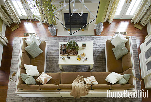
For (a very obvious) example, I love the shape and size of the sofa in this family room featured in House Beautiful. Would it work as well in my 1 bedroom apartment? I think not.
3. Design with an awareness for who uses the space.
I touched on this subject quite a bit last week when talking about the future of universal design, but I will happily emphasize again how important it is to be conscious of who will be using the space you design.
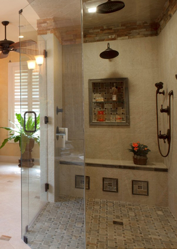
Being smart and thinking ahead about not only your current situation, but also your future situation (i.e. do you want to retire in your home sometime in the relatively near future? Are you looking to have children and expand your family?), when designing a space will lead to a much happier and more functional home, such as this shower design by H. Stern Interiors that takes into account aging clients.
4. Design a space you will still love years from now.
I spent some time last week talking about design trends for 2013 and 2014 so you should have a decent idea of what to expect to see in your favorite magazines, stores, and blogs. However, there is something to note here: if you don’t love it, don’t incorporate it into your room! You shouldn’t force something that isn’t your style into a space simply to join a trend because you will want to ditch it as soon as the trend is over (which is fine for a $30 vase but not for a $3,000 sofa!).
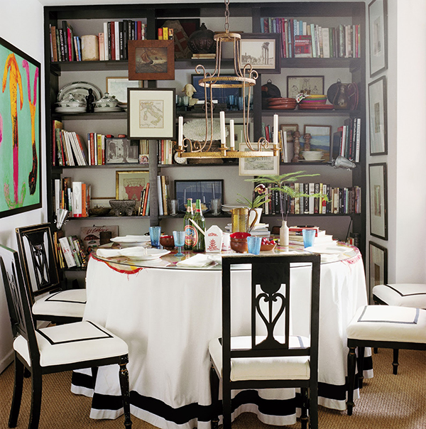
Avoid trendy items and styles if they aren’t something you love now and will continue to love in several years. Nothing will make a room more outdated than if it houses a collection of passed trends that do not fit in with your style. Aim for a timeless base with some fun, interchangeable small items, like pillows and accessories, to keep things fresh, like this spectacular dining room by Design Camp speaker Nathan Turner.
5. Make it personal.
This is my decorating mantra. Sure catalog pages are lovely, but I want to walk into a space and know who inhabits it. As I say on my blog, “What makes a place ‘home’ is not only comfort and familiarity, but also the personality of the space, the way a space makes one feel, and the memories it contains. The reason ‘home’ feels so wonderful is because it is deeply personal and is the physical manifestation of one’s experiences, dreams, feelings, and outlook on life.” Therefore, the best way to create a room that is personal to you is to invest in pieces you truly adore.
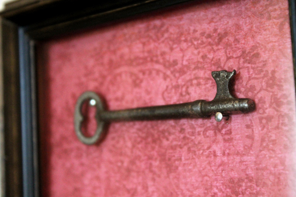
Surround yourself with photos, memories, collections, and mementos of your favorite people, things, experiences, or feelings. For example, I was looking for a piece of artwork for my living room and decided to frame a gorgeous skeleton key my Nana had given me that unlocked the door to her childhood home. Guests see a beautiful framed key, but when I look at it, I am reminded of Nana. Make your space a reflection of yourself, for your benefit and for the benefit of other people getting to know you though your space.
6. You have 20 seconds to make an impression.
This was originally a tip given to the Design Campers by Seattle real estate extraordinaire, Cassie Daughtrey, in the context of how the design of a home affects resale value and speed. However, I think Cassie’s great advice can apply to the design process in any scenario.
What is the first impression you want to give your guests about the space? When you walk in the entrance of the room, what are the first things you see? What DON’T you see? How does the space feel? By seeing the space objectively through the eyes of others and designing with the mindset of making an immediate impact, you can make sure that your space is giving out the impression you intended.
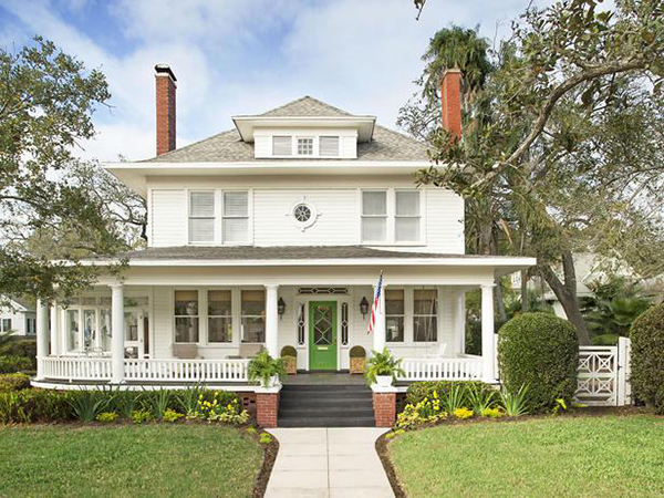
This house from HGTV Magazine instantaneously hits you with a lovely, welcoming first impression from all the way across the street!
7. Make a plan and stick to your budget.
Yes, money is typically a factor for most of us when designing a space, so there is no sense in dancing around this topic. Design is an investment and can add value to your home, as Cassie mentioned above. However, it is so important to make a plan from the very start and make smart financial decisions as you go. Sometimes that means being creative or finding alternative options for pieces that are out of your budget.
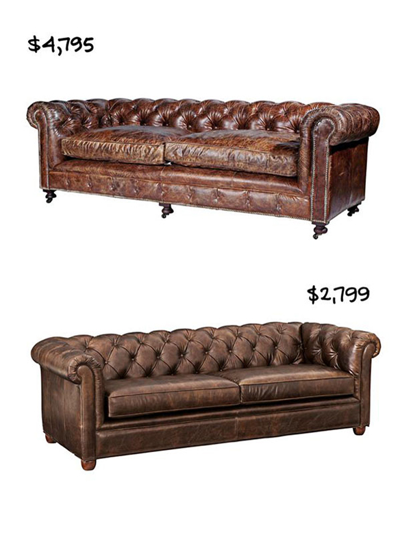
Whether that means you get your hands dirty and give some DIY projects a whirl or do a bit of research to find inexpensive pieces similar to the expensive ones you are swooning over (like these two Chesterfield sofas in HGTV Magazine), creativity and research can go a long way in stretching a budget. Planning ahead and making intelligent financial decisions will ensure that you can creatively complete the space you set out to design.
8. Light your space well.
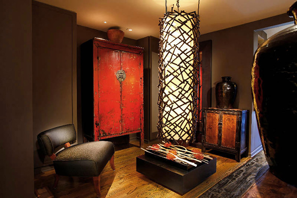
I mentioned last week how incredible lighting design is to an interior space. Sure, all of our rooms look gorgeous in the bright sunlight! But properly lighting a space so it looks just as amazing on a gloomy day or at night is crucial. Lighting designer Randall Whitehead says the best way to light a space is using light layering, which is comprised of four types of light: Decorative, Accent, Task, and Ambient. Decorative lighting is the “architectural jewelry” of the room and does not have to have a purpose beyond looking fantastic (i.e. chandeliers)!
Accent lighting defines drama and creates areas of interest or dimension, such as on track lighting on artwork or landscape uplights. Task lighting does the heavy lifting and actually provides the lighting for work areas, such as reading lamps and under-cabinet lighting. Finally, ambient lighting fills in the gaps and gives the room an overall soft glow.
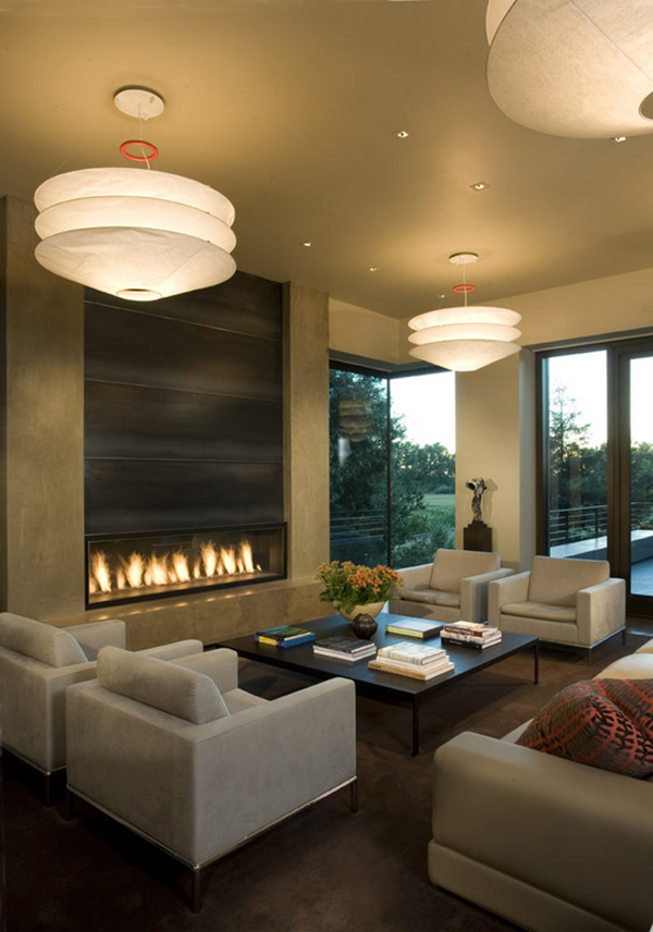
By layering these four kinds of light, you will be amazed at how much of a positive impact proper lighting has on the space you are working so hard to design (like these amazing designs by Randall! Photos via Marin Home and Garden Expo)!
9. Take photographs.
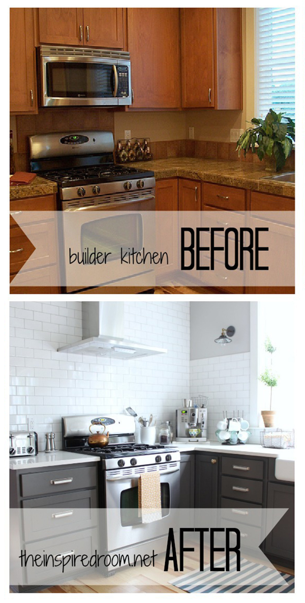
Everyone loves before and after shots, like this amazing kitchen remodel by The Inspired Room! But beyond that, it is always nice to have pictures of where you started, photos of the process, and lots of nice (well-lit — see above!) pictures of the final product. Whether they are just for personal use or for a website/blog, great photos can come in handy! Photos can also help you better understand your personal design process so things are even easier the next time you design a space.
10. Have fun!
This one is the most important one! Enjoy the process and take pride in your hard work.
Now, get designing! Have any other great design tips? Please share them with us in the comments section below!
