Have you ever made a special purchase that elevated the style of your interior, then made you rethink everything else inside of it? Sometimes that one amazing piece inspires you to de-clutter and carefully choose each item that you showcase in your home. Welcome to the world of minimalist interior design, where every detail counts.
While it may seem that carefully choosing each piece is limiting, those who swear by minimalism in the interior realm actually find the style to be liberating. Fewer items on display means a less crowded space–one in which architecture and form are appreciated in all of their glorious simplicity (or complexity). Today we showcase ten minimalist spaces, each one inspiring a different design tip. Enjoy…
Minimalist Living Rooms
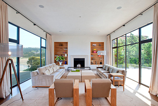
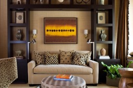
We begin with a series of minimalist living rooms that celebrate a less is more philosophy. Our first room is anything but sparse. Yet surface-top clutter is kept to a minimum, reminding us of a key minimalist design tip: Let the furniture speak for itself. After all, when the furnishings are this good, why detract from them with excess “stuff”? [from Butler Armsden Architects]
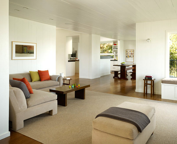
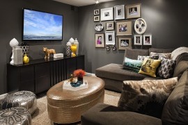
It can be difficult to decide what to display on tabletops and shelves in the minimalist space. After all, if less is more, should surfaces remain clear? Not necessarily. It doesn’t hurt to get creative in your displays. One approach: Go abstract with surface-top decor. For example, we’re loving the look of the geometric forms protruding from the coffee table below. [from Cary Bernstein Architect]
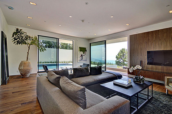
Go green! That’s right–the perfect complement to the minimalist space is greenery. The more interesting, the better, as shown with the floral arrangement and potted tree below. [from Meredith Baer Home]
Minimalist Kitchens and Dining Rooms
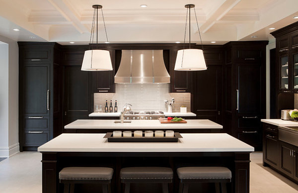
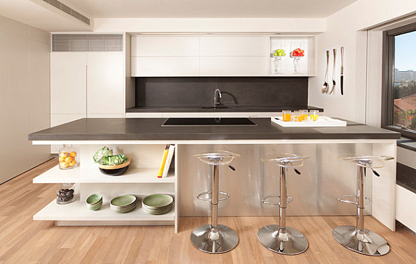
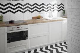
When food is involved, it can be tempting to pile counters and tabletops with containers and edibles. Yet sometimes clean surfaces and a few strategically placed foodie items can be equally enticing. As you check out the kitchen below, note how multiples can make a statement, as shown by the bottles on the back counter. For the most part, surface tops remain clear. Which calls even more attention to the delicious fresh ingredients on the center island! [from Tamara Magel Studio]
In fact, it doesn’t hurt to make it all about the food. Especially in spaces with neutral tones, the colors and forms of fresh produce can be decorative statements in themselves. Which is why glass containers are used to hold the edible items in the kitchen below. The result: radiant pops of color. [from Segev Photography]
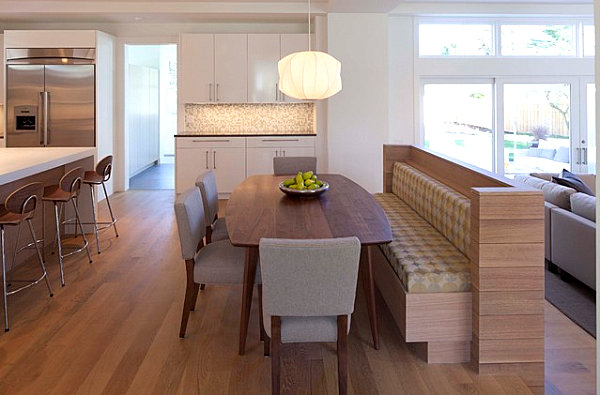
It doesn’t hurt to focus on one or two bold statements to anchor your minimalist space. After all, every detail counts. We can’t take our eyes off the pendant light and bowl of produce below. Stately, colorful and eye-catching, don’t you think?! [from Charlie & Co. Design]
Minimalist Bedrooms
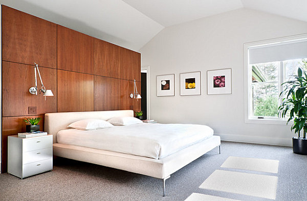
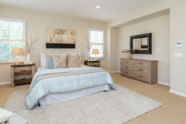
When it comes to the minimalist bedroom, it’s hard to deny that less is more. Less clutter means more tranquility, which is ideal for a space that’s supposed to inspire rest. One rule of thumb: Practice symmetry. For example, in the bedroom below, task lamps and greenery rest on each side of the bed. [image by Daniel O’Connor Photography via Kimberly Demmy Design]
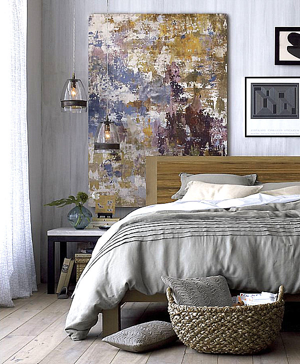
Minimalism is as much about clean forms as it is about clean spaces. You don’t have to be sparse to be minimalist. For example, below we see pendant lights hanging in front of an abstract painting. A modern bedside table holds several items in this image featuring the Pietra Bed Linens from Crate & Barrel. Note the clean lines of the items in the space…
Minimalist Bathrooms
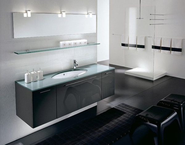
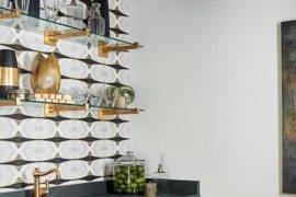
We end with two minimalist bathrooms that prove a spa-like atmosphere doesn’t have to involve oodles of bath products. In fact, the space below reveals that you can utilize matching containers to create a clean, pure aesthetic. Place soaps and lotions in contemporary bottles that glorify good design rather than plastic pumps and brand names. [from See Materials]
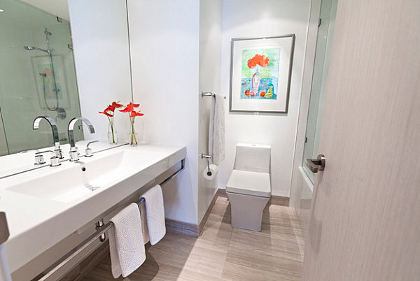
Our last featured bathroom illustrates the power of bold colors. Don’t hesitate to choose one or two bright hues and repeat them in the space, as shown below. Even more interesting is the repetition of blooms on painting and countertop. If only every work of art could come to life in your interior… [from BiglarKinyan Design Partnership]
Are you a fan of a less is more approach, or do you enjoy a home with a layered, lived-in look? Perhaps your home features a little bit of each strategy. Share your thoughts by leaving a comment below…
