It’s no secret that green is a natural fit for spring! As part of our spring color series, we at Decoist are profiling a range of powerful hues, and today we head into verdant territory with a slew of green shades for your interior. This isn’t the first time we’ve focused on the color green. But it IS the first time we’ve featured this shade since Pantone declared “Emerald” the Color of the Year for 2013!
As you check out the shades of green below, take time to note the array of hues available to you as you refresh your interior, but also pay attention to the accent colors that pop against a green backdrop. It’s also fun to consider the possibilities that come with mixing pure green with colors such as yellow and blue. That’s right–there’s a shade of green for every preference! Would you expect anything less from a color that evokes nature, growth and fresh starts?!…
Green Meets Yellow
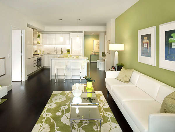
We begin with shades of green that have varying degrees of yellow mixed in. The light olive green living room below is heightened by a coffee table accent we couldn’t help but love–a plant in a yellow-green pot! The effect is a green-on-green feast for the eyes, especially when juxtaposed with sleek white furniture and a pair of mirrored coffee tables. Interested in the wall color? It’s Sherwin-Williams SW6423 Ryegrass! [from Gacek Design Group]
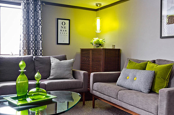
There are many variations of olive green. We take it a tad more yellow with the image below, complete with coffee table glassware, puffy sofa pillows and a hanging light in this wonderful golden-green hue. [from Rikki Snyder Photography]
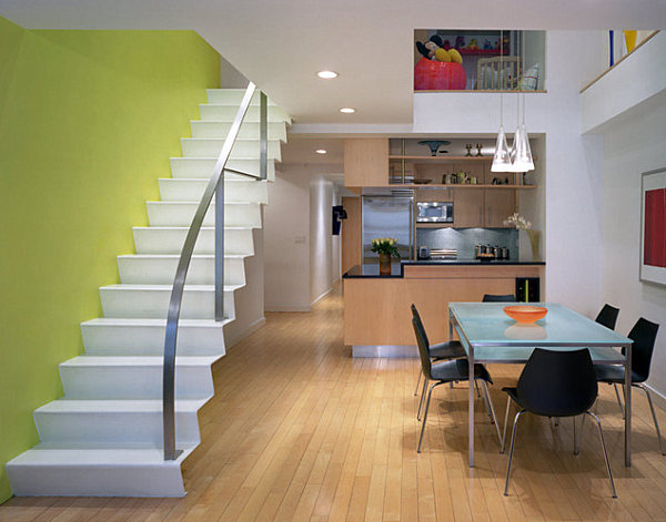
Next we feature a shade that’s almost pure yellow. We love the way it blends with other accent hues in the dining room, such as orange and red. [from Chelsea Atelier Architect, PC]
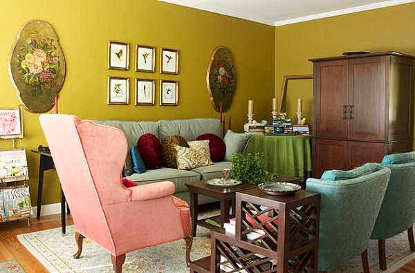
The golden glow coming from this olive living room has an undeniable vintage vibe. Which is why it’s the perfect choice for a space filled with items in rich shades like burgundy, deep teal and aquamarine. A collection of framed bird prints helps set an old fashioned vibe. The effect: a lovely storybook-style space. Which is fitting, given that the room was designed by Story & Space!
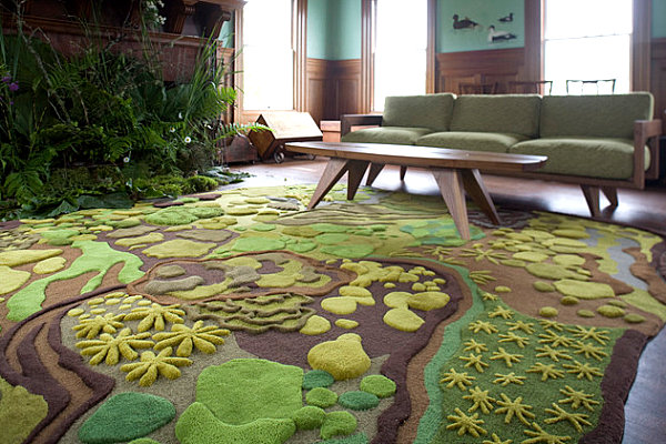
There’s nothing like mixing olive shades, as shown in the room below featuring the Woodland Hand-Tufted Wool Rug from Angela Adams. Note how greenery in this living room enhances the space, giving it a true forest-like feel! [via Houzz]
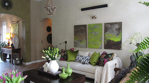
We couldn’t help but love the violet accents in the next featured space. An assortment of plants and accents in olive shades combine to create a room that is eclectic and earthy with a conservatory feel. [from Houzz user Koolbeanzzzz]
Pure Emerald
Now it’s time to spotlight shades of green that are deep, rich and jewel-like. In fact, some of the images below bring in tones of blue! But first we start with this space from Sally Wheat Interiors, complete with malachite-pattern curtains that evoke the depth and detail of fine minerals…
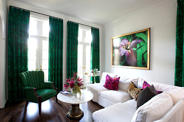
Next we spotlight emerald green, Pantone’s 2013 Color of the Year! Note how emerald has a touch of blue–just enough to add an interesting layer of elegance. In this space by Maya Williams Design, emerald green accents create a contemporary feel. Note how this hue pops against neutrals such as taupe. [from Tirage Fine Art Gallery]
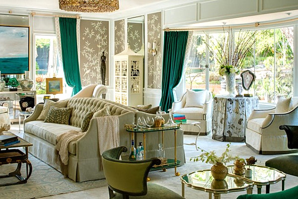
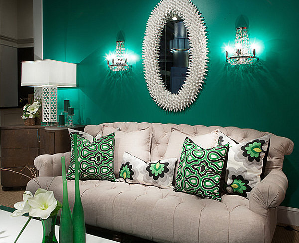
Emerald accents are fabulous, but don’t hesitate to completely deck the walls in this jewel tone. Heighten the shade with crisp white decor and bold patterns, and you can’t help but create an elegant haven with a fresh look. [from Larry Hanna Photography]
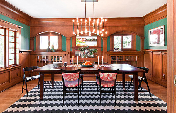
Emerald green can even combine with warm wooden accents to create a modern space. For example, while certain aspects of the room below have an earthy, Craftsman-style appearance, others channel contemporary style. Note the lighting that hangs over the dining room table, as well as the modern chairs upholstered in a fire-red chevron pattern. Emerald green walls tie it all together with a timely, unexpected shade. [from Taylor Jacobson Interior Design]
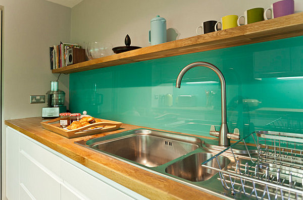
Some shades of emerald have a softer (but no less bold) look, such as the color featured on the backsplash of the modern kitchen below. We’re loving the mugs that rest on the wooden shelf–note how shades like black, yellow, olive and violet stand out against our featured jewel tone. Delicious! [from Dittrich Hudson Vasetti]
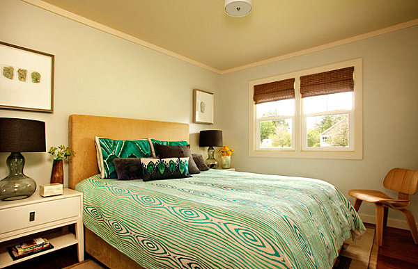
In the next image we see shades of emerald green in a modern bedroom. Pattern is the word here, as shown through a wood grain-print bedspread and detailed pillows that celebrate this radiant hue. Soft gray walls and warm wooden accents are the perfect backdrop 2013’s Color of the Year! [from Garrison Hullinger Interior Design]
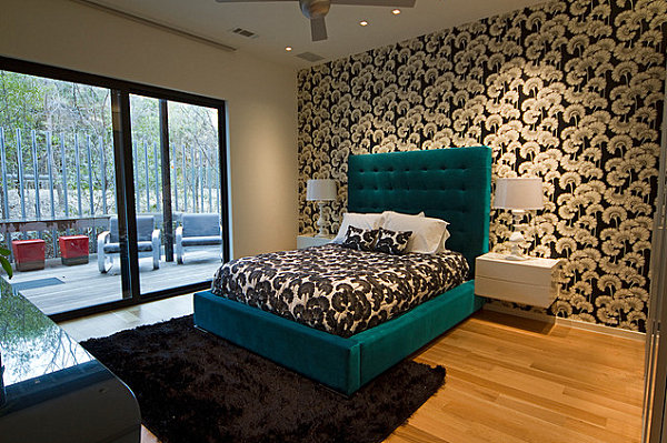
We now veer further into blue territory with this plush teal green bed, the perfect decadent focal point in this modern black and white bedroom. Since the wallpaper and bedspread speak volumes with their mirror image patterns, one dash of vibrant color is all that’s needed. We think teal was the perfect choice in this project by Josh DeLaFuente & Elizabeth Lewis. [photos by David DeLeon, from Cantoni]
A Hint of Mint
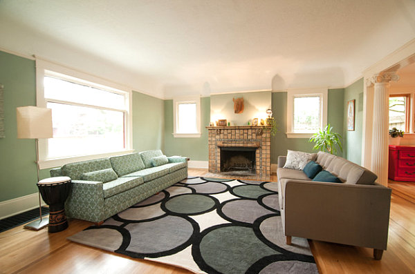
We had to end on a refreshing note with a selection of rooms that celebrate minty goodness. There’s nothing more crisp than mint in a space with white trim. In the room below, we see a variety of tones that complement this minty room, including gray and slate blue. [from Encircle Design and Build]
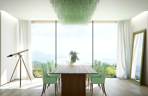
One way to make green truly shine? Take a minty hue in an unexpected direction. Unusual modern lighting and contemporary seating defy the retro stereotype that often accompanies mint tones. Here it’s all about the avant-garde… [from Slim 69]
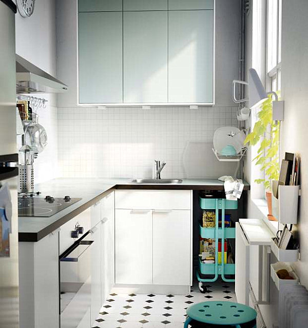
Speaking of retro, there’s no shame in going with the classic style evoked by shades of mint. In the kitchen below, soft mint cabinetry pops against a backdrop of black and white, while minty aqua accents further brighten the old-meets-new theme in this IKEA kitchen. [from Vertical Launch]
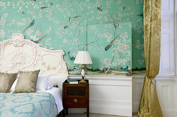
We end with a space that celebrate the richness of ornate design. Flowers and birds reign on Chinoiserie walls. Brocade bedding and draperies in shades of blue and gold provides visual and textural interest. [from Chinoiserie Chic]
Tell us about your favorite shade of green! Do you like this hue best when it’s mixed with yellow? Or perhaps you’re a fan of blue-green tones. Share your thoughts by leaving a comment below…
