How many times have you found yourself entertaining at home, only to be surrounded by your guests in the kitchen? They never sit on the sofa and eat the appetizers you put out on the coffee table, do they?! That’s because in many cases, the kitchen is the heart of the home. And you’re the heart of the party when you invite guests to your place. Doesn’t it make sense that they’d want to be where you are? Which bring us to our next point… space.
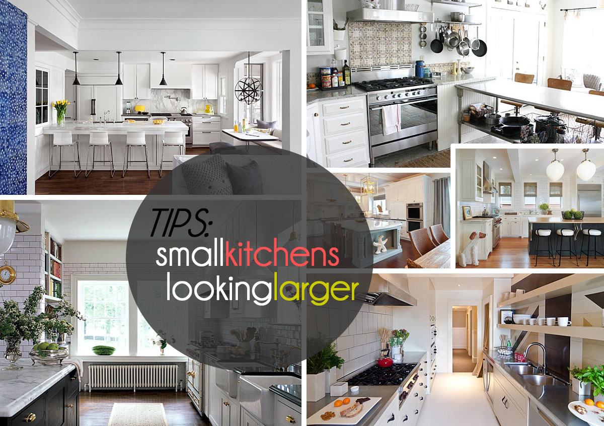
That’s right–the kitchen is a place where you do a substantial amount of work in the meal preparation department. You need room to chop, dice and puree. Filling your countertops with decorative clutter just won’t do, especially if you currently live in a place with a small kitchen (much like the writer of this article). Knowing what to store in cabinets, what to leave out and how to enhance your space with is key, especially if you are dealing with a compact kitchen. Today we feature a range of decorating ideas for kitchens of all sizes, from large layouts to tiny galley spaces. Let the images below give you some delicious ideas… Enjoy!
Stick to the Necessities
We start with the basics, exemplified by the kitchen below from Kristi Will Home + Design. What do we see here? Bottled water, a vase of flowers, fruit, spices and cooking equipment. Yes, many a modern kitchen sticks to the essentials, displaying only what is necessary, yet playing up the design-worthy elements of these necessities. For example, a clear bowl of lemons is an eye-catching statement. Plus, the produce is ready to grab right when you need it!
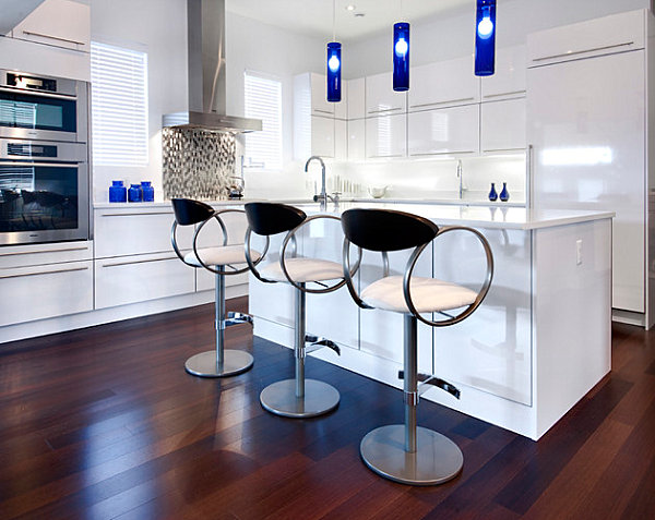
Another fun way to keep it basic is to display useful items in stylish containers, such as the cobalt blue receptacles below. Note how they match the pendant lighting that hangs overhead, perfectly contrasting the hi-gloss cabinets of this sleek kitchen. [from Handwerk Interiors]
Why keep it simple? Because it frees up counter space and results in a clean, uncluttered look, as shown in this next featured kitchen. A bowl of red apples is the perfect focal point in a room filled with neutrals, glass and stainless steel. [from Seed Interiors via Houzz]
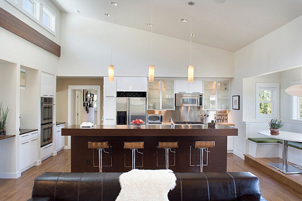
Next we see a close-up of a kitchen designed by Vanessa De Vargas. Note how soothing clean counter space can be, especially when accented with colorful fresh produce. In fact, the clean look of the room becomes a crucial part of the design, don’t you thin?! [from Jeri Koegel Photography]
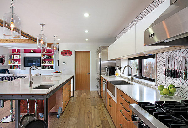
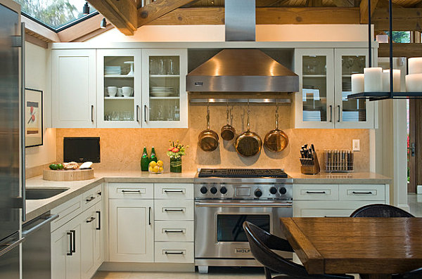
Just because you display essentials doesn’t mean your countertops have to be clear. In fact, this may not be realistic in some kitchens, especially if counter space is scarce. In the kitchen below, we see a range of items at the ready, from ingredients to pots. The look may not be as minimalist, but nothing beats having everything you need within arm’s reach. [from KitchenLab Design]
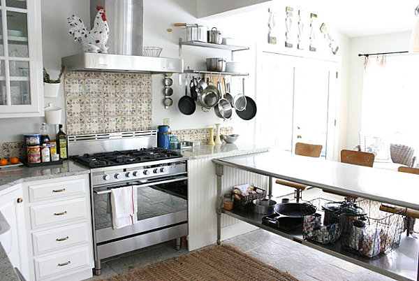
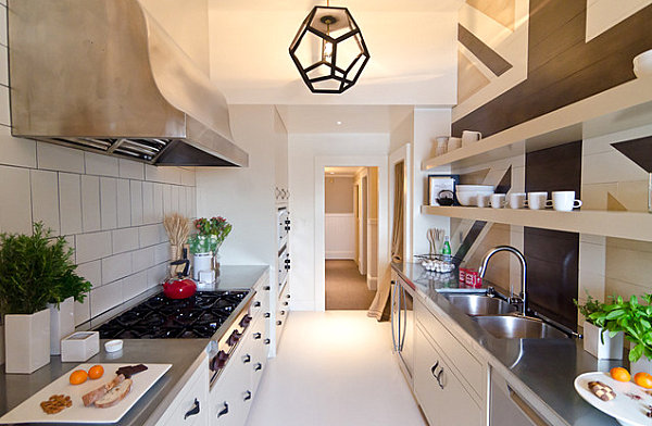
In the galley kitchen below, it’s all about the fresh ingredients. Herbs and produce are on hand, and you can see how the greenery is an important part of the design. Also note the geometric pendant light that hangs overhead–love it! [from Alex Amend Photography]
Display Decorative Items Away From Essential Counter Space
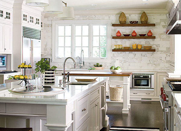
What if you want to display more than the necessities in your kitchen? More power to you! But we caution you against cluttering your countertops with all things pretty. It can be overwhelming (and impractical) to fill your kitchen with as many decorative items as your living room would hold. In this next kitchen designed by Ian Cairl, the decor is kept off the counters, thanks to the help of floating wooden shelves. [photo by John Gould Bessler via Houzz]
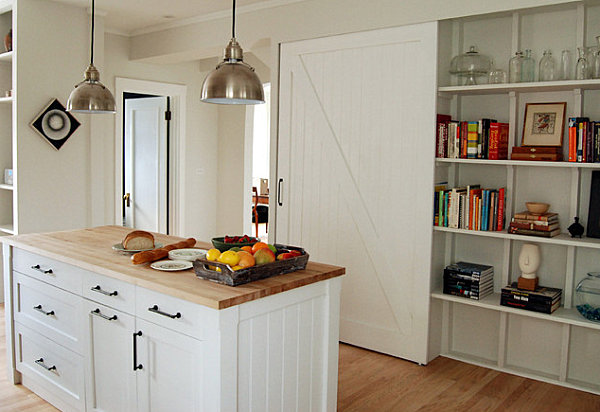
In fact, if you have shelving in your kitchen, this is the perfect place to add interesting decor, along with practical items such as cookbooks. In the next featured space, containers and books are mixed with objet d’art on the built-in shelves, freeing up the counter space for food preparation possibilities… [from KitchenLab Design]
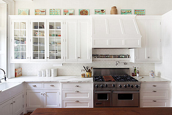
No shelves? No problem. Find another out-of-the-way spot to put your decor on display. The tops of cabinets can be the perfect place for items such as artwork and plants. That way, the counter space below is free for culinary matters. [from Houzz]
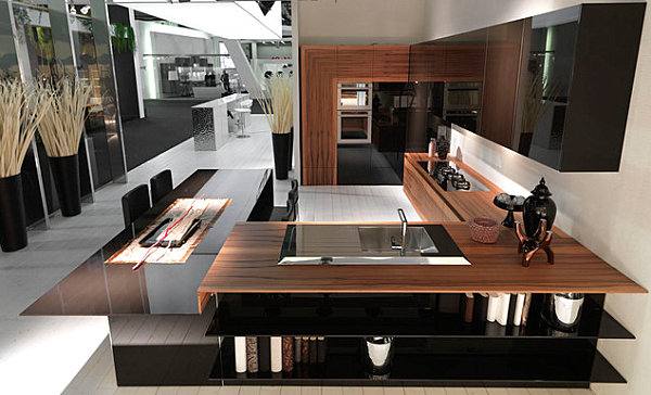
Sometimes the best spot for your decorative items is that one counter spot you’re least likely to be utilizing. In the kitchen below, we see a grouping of interesting items in the corner of the counter. The spot is prominent and a bit out of the way, leaving more crucial surface-top space for chopping and dicing. [from Aster Cucine]
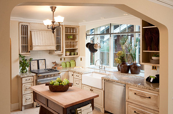
Note how the biggest statement in this kitchen–a grouping of greenery in jug-like pots–does not interfere with the counter space, thanks to its placement on the kitchen windowsill. Not only is this spot generous in room, it is tall, leaving plenty of space for the plants’ height. [from Homeland Design]
Go With One Bold Statement
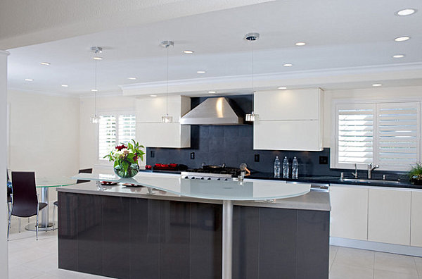
If you want to bring your decor to the counter, one key useful strategy involves highlighting one bold statement. Note how the large vase of flowers below sets an exotic yet modern tone in this contemporary kitchen. [from Danberg Design]
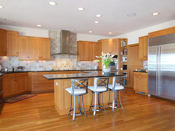
A similar effect is achieved below with the vase of calla lilies resting on the kitchen island. They serve as a dramatic counterpart to this uncluttered space with brushed and stainless steel accents. [from Design Results]
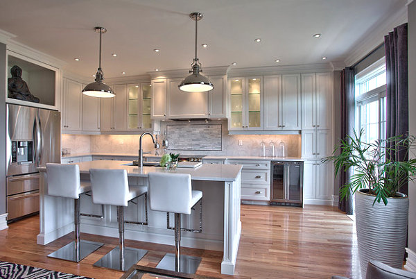
Your bold kitchen statement doesn’t even need to be on the counter! Check out the large potted plant in the room below, which packs a powerful punch from its resting place on hardwood floor. [from Darlene E. Shaw Interior Concepts via Houzz]
Embellish the Space with Fancy Fixtures
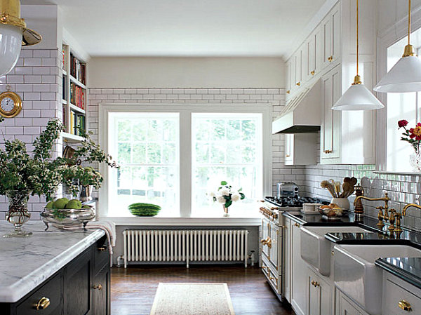
Just because you aim to maximize your space doesn’t mean you can’t have a little bit of fun in the process. While this fancy kitchen keeps it simple by limiting counter items to fresh details, such as fruit and flowers, note how the space is embellished by other flourishes. For example, gold-toned knobs, pulls and light fixtures complement sink fittings by Newport Brass and a pair of pendant lamps by Rejuvenation. [from Elle Decor via Houzz]
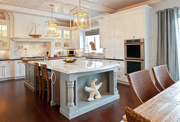
Check out the sailboat on display above the stove, as well as the boxy pendant lights that draw the eye upward in the kitchen below. Did we forget to mention the starfish that rests in the side of that large kitchen island?… [from Town & Country Kitchen and Bath]
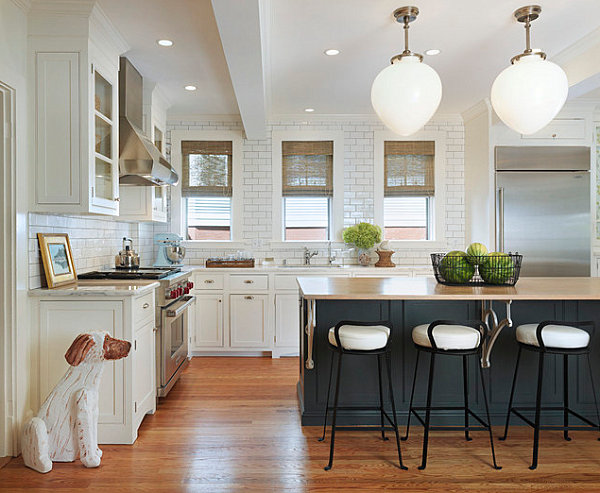
Speaking of pendant lights, the egg-shaped lighting above the island in the space below makes a strong statement, serving as a true focal point in the room. This takes the pressure off planning out every countertop detail, although this kitchen doesn’t suffer from a lack of interesting items… [from Taste Design Inc.]
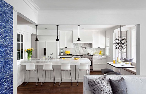
We’re loving the lighting in this next featured space, especially the atom-like pendant light that hangs over the breakfast nook/window seat. Dark metal offsets the room’s lighter tones. And of course, yellow accents pop against this crisp contrast of dark and light. [from Tim Cuppett Architects]
What is your kitchen decorating style? Do you like to keep it clean and simple, or do you prefer to have a hefty number of items on display where everyone can see them? Are countertops the place for decor, or should decorative items be kept out of the way so the cooking comes first? Share your thoughts by leaving a comment below…

