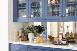
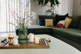
Color schemes of two colors are considered to be modern and bold, especially if they’re pairs of inverted colors such as red and green, yellow and purple or orange -blue. Such a color scheme needs to be planned carefully and is meant to be enjoyed over a longer period of time. Many design lovers would gladly decorate their homes with vivid colors if they knew the right way.
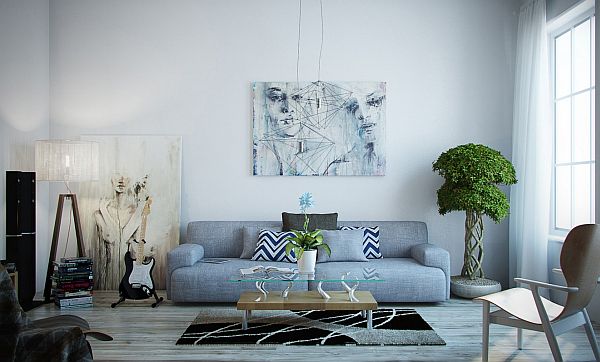
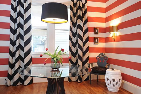
by Blount Architectual and Interior Design
If you’re insecure about the right color to choose, chromatic preferences can be revealed through a color psychology test. However, the known effects of certain colors on the nervous system also provide a few valuable guidelines, in addition to personal preference.
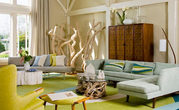
by Amy Lau Design
One of the best ways to bring color to your home is by painting walls or wall accents, whole areas or maybe color accents in abstract shapes. If you’re afraid that the result may be a sheer tone, remember to make color probes – from a good paint manufacturer – on the wall on small spots, or on a canvas held to the wall. It is best to have a can of white to mix with for color brightening (because you should take our advice — it’s fun to mix it yourself).
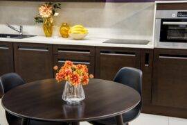
The key to successfully pairing 2 colors is to make one of them – the dominant – a very light pastel and introduce the other in intense, but small accents.
Usually, it is indicated to pair a warm and a cold color. Some rooms, like the bathroom or bedroom, which are relaxation areas, are best to be designed in cooler hues which stimulate the vagothrope nervous system. Even so, it is good to pair a dominant cool color with an accent of warm color for stimulation and in order to give our eyes an alternative.
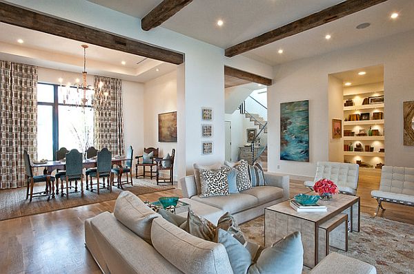
by Cornerstone Architects / Photography by Bryant Hill
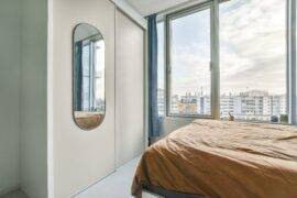
A modern combination growing in popularity is a gentle turquoise paired with brown, maybe dark brown wood. It is both elegant and youthful and can make for a very enjoyable bedroom.
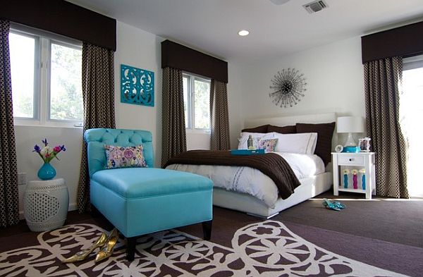
by Georgette Westerman Interiors
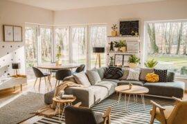
For the living or dining room, colors that stimulate conversation and a welcoming atmosphere are most suited. Orange is known to be a communicative color. A pastel apricot tone for one central wall or for the floor, with accents of powerful violet will result in a trendy and joyous atmosphere.
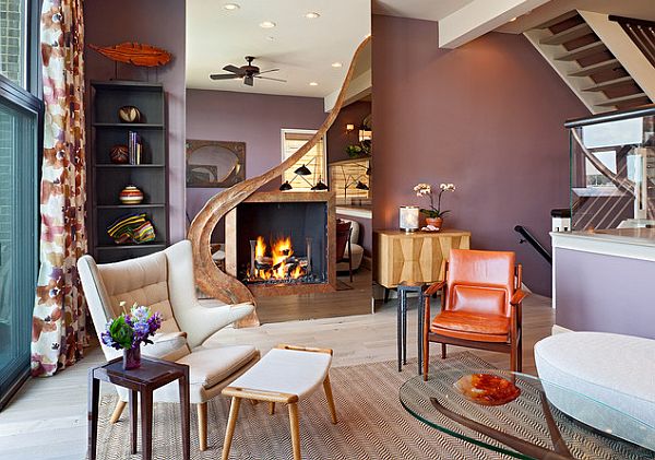
by Bruce Palmer Interior Design
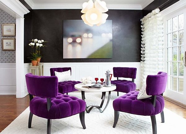
by Last Detail Interior Design
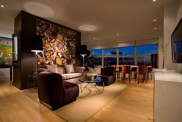
project by Miguel Fernandez / Photo by Craig Denis
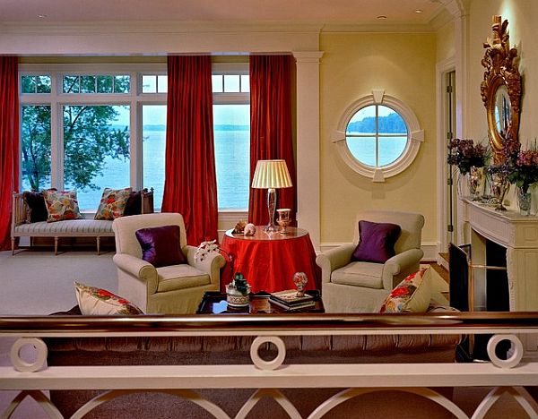
by BROWN DAVIS INTERIORS
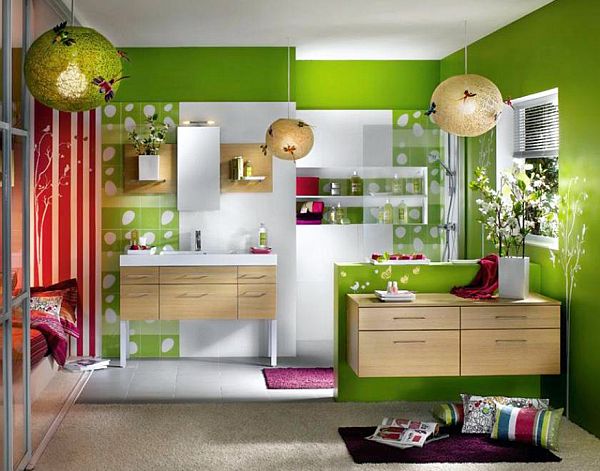
I personally love going with green and red. Both are fundamental colors and have strong personalities, so it’s a little complicated to make them get along. However, a very gentle light green and an intense darker red toward burgundy make a fantastic combination.
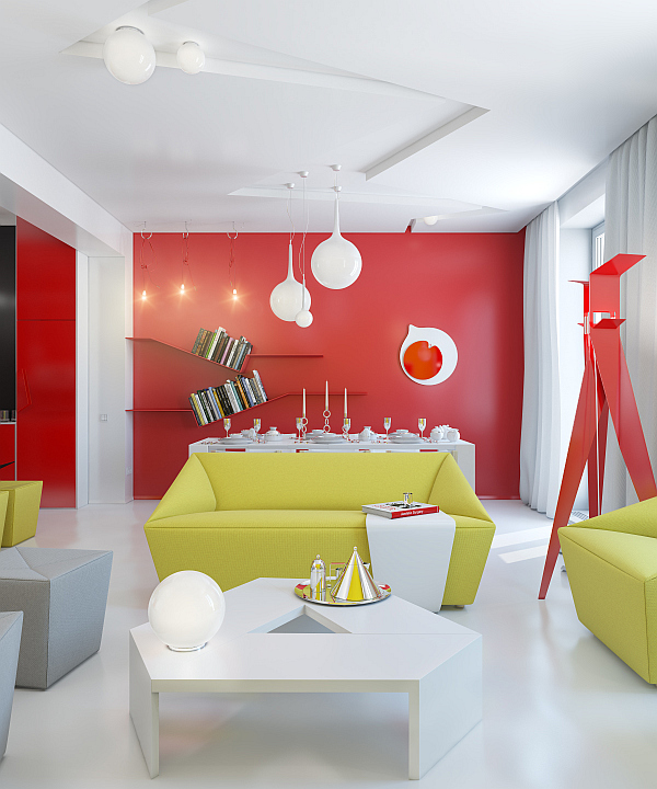
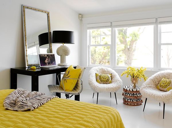
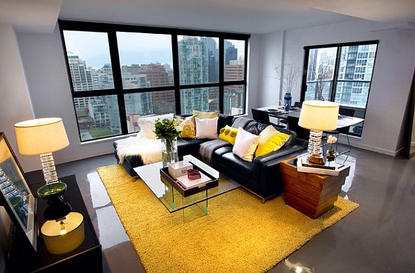
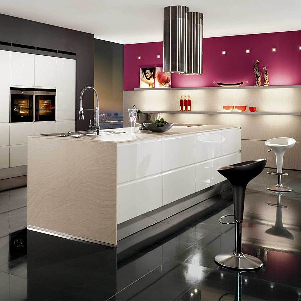
Black can be added to a color layout for a stylish touch, but indeed just a smaller touch, you don’t want it to get depressing. Black and yellow/orange can add up to a really trendy, web-design-style color scheme, while black and pink – but not a sheer girlish pink! – have a stylish and fascinating effect. It s better not to mix black and violet, since violet is known to be a color tone inspiring introspection and even depression. Alternate violet touches with a mint green or a light yellow.
by Tara Seawright
by Treoma Design / courtesy of Kate Hillier Photography.
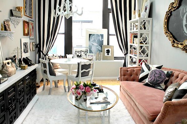
by Nichole Loiacono Design
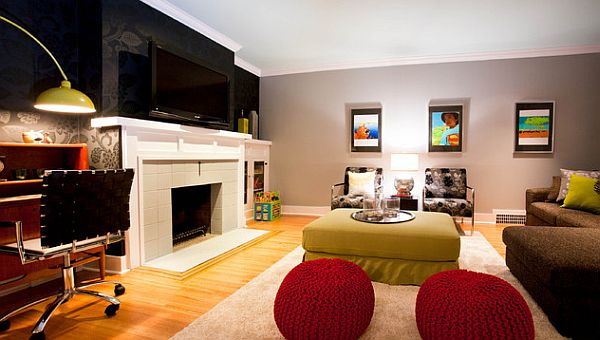
by A Good Chick To Know
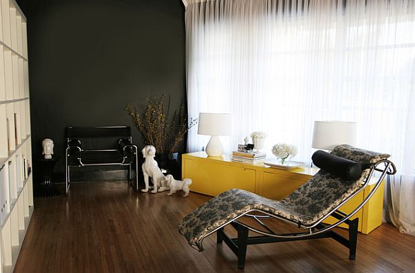
by Product Bureau
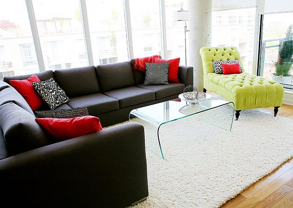
by Pure Bliss Creative Design/ Photo Credit: Meghan Liddle Photography
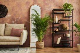
Don’t forget about natural materials – they have their own colors and textures, and there’s many rich ones to go with, like wood, rammed earth, marble and cultured stone.
If you enjoyed our article on color pairings, be sure to check out these related articles:
- Colors That Go with Brown: How to Decorate with Brown
- Colors to Pair with Blue: 30 Best Ideas and Inspirations that Lead the Way!
- 30 Gorgeous Photos and Ideas Showcasing Colors that Go with Yellow
