Pantone has had a long standing tradition of choosing a Color of the Year that they feel will define what lies ahead and will best offer what the world needs the most in that year. Instead of just looking at the visual and aesthetic aspects of it, Pantone actually analyzes the psychological side of things and the implications a color has on individuals and their mood.
That is precisely why Pantone has picked Emerald for 2013 as they believe that unlike last year, when they opted for Tangerine Tango which signified change and movement, the world needs stability, prosperity and harmony; something that Emerald perfectly epitomizes.
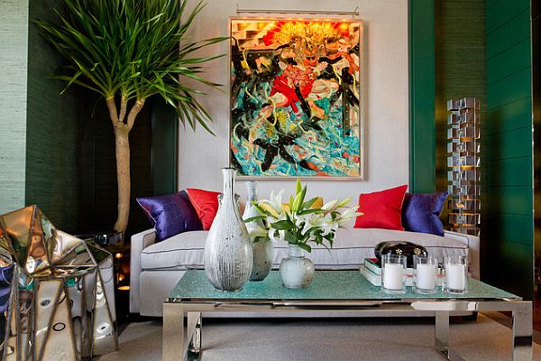
by Rikki Snyder /via Houzz
One cannot really underestimate the impact of color on human minds and while we often talk about nice pleasant shades for our interiors to create a soothing and relaxing atmosphere at our home, the same can be said for other occasions and places as well. According to Leatrice Eiseman, executive director of the Pantone Color, the reasons for choosing Emerald were that it signifies balance, well being and richness; but the choice was also based on the composition of Emerald.
Since it is a combination of blue and yellow, there is a wonderful blend of tranquility and warmth and considering the current volatile political and economic situations, it is hard to argue against the message that Emerald conveys.
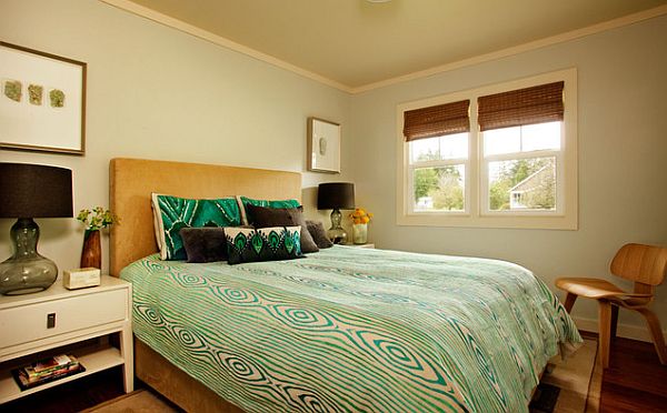
by Garrison Hullinger / photo credit: blackstoneedge.com
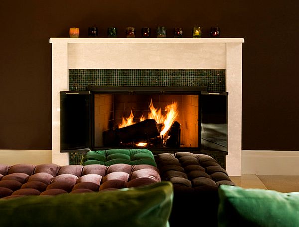
by Interior Design by id 810 design group / Alexander Johnson Photography
Like always, we’re sure designers and experts are ready to wrap up Emerald in various little nuggets so that you can embrace it and invite it into your own homes.
As you probably know, Pantone picked Tangerine Tango in 2012, Honeysuckle as its color of the year in 2011, and Turquoise in 2010. Which is your favorite color?
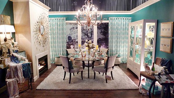
“Dinner at Tiffany’s” – urban i.d.
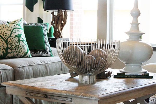
by Cristi Holcombe
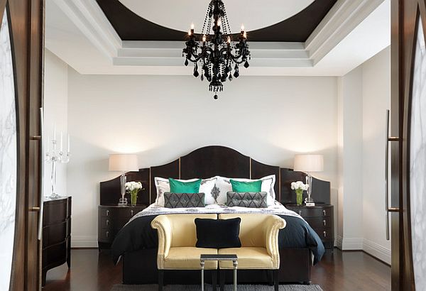
by Edwin Pepper Interiors / Photo by: Alise O’Brien Photography
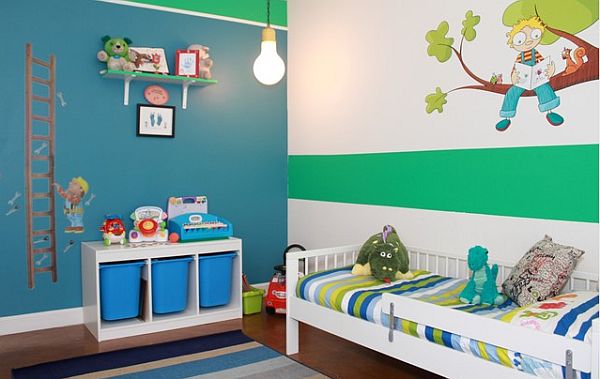
by Natalie Younger Interior Design
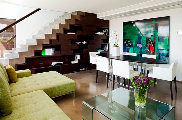
by capsuledesigns / Lucas Finlay Photography
