One of the greatest moments of childhood is when mother dear displays our amateur works of art for the whole family and guests passing through to see. Collages, pressed flower collections, even report cards hung proudly up with a magnet strategically placed in the corner, so as not to distract from our famous breakout piece. The older we get the less inclined we are to share our progresses-unless its on the wall of Facebook or feed of twitter- blame it on a abashment of our unrecognized talents, but deep down the feeling of being recognized never dwindles.
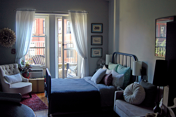
For Michelle Konar, she not only gets to hang up her original work she has the opportunity to share it with others as well. All this takes place from her tight yet inspiring 300sq ft. quarters. She is design extraordinaire, she is Etsy shop owner, she is SpacesTV Tiny Amazing Eclectic Spaces latest contribution to small space living!
Though many miles may separate all of us from Michelle she was kind enough allow me to take advantage of technology and email all those DIY and Design Q’s we’ve had. Now it is with great pleasure I reveal the A’s to my fun and informative Q&A with Michelle Konar!
Q: As an Etsy storeowner and designer it’s clear that you have a passion for design and infusing your space with abstract art. What advice would you give to someone updating their current or new space that will enable them to have a wow factor art piece or element without overpowering or being understated?
A: Creating a great piece of art does not have to be complicated! There are three things to consider when deciding on art for a wall– scale, color, and arrangement. By playing into these three concepts, you can turn your wall into a great conversational starter…. or into more of a whisper.
First, scale: really consider the amount of wall space you have. Nothing is more sad than a small framed picture on a big empty wall, so go large!…painting canvas in bright colors, framing beautiful fabric or papers, blowing up old family photographs or everyday items at kinkos, etc.
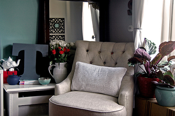
Second, color: this can make the biggest or the smallest statement. In my apartment, I decided to keep my paintings to two colors to not subtract from the accent wall. However, if you aren’t comfortable with a large piece of art, use color instead to create that wow-factor.
Finally, arrangement: many people will place one piece of art on one wall…Don’t be afraid to have three or five pieces that go together or create a gallery wall by scattering frames in a collage.
Q: In small spaces we often have to compromise on privacy. You’ve found a unique way to incorporate your jewelry and purse collection as a décor showcase. What are some other ways small space dwellers can regain their personal belongings in an accessible fashion, but give a welcoming ambiance to guests?
A: In a small apartment, you don’t have space for unnecessary items and storage is always an issue. A great solution is to create an open storage solution that highlights the items you love most. Purses, jewelry, perfume bottles and shoes tend to be beautiful items that can easily be displayed…displaying baseball hats or whiskey bottles can be fun. In the kitchen, show off your grandmother’s antique dishes; highlight your collection of bake ware, or, my favorite, use fruits and vegetables to add color. By displaying the items that help describe who you are add visual interest to your space that your guests will always appreciate.
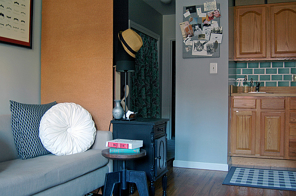
Q: When working on the interior of a small space that has an open floor concept what are some strategic elements to use to create the impression of designated areas without diminishing the flow?
A: For me, the main consideration within a space is color. To create a visual flow in an open floor concept, pick a color palette for the entire space and sprinkle items from that color palette throughout. This will allow the eye to continue from one corner of the room to the other without any visual interruptions. If you opt to use a particular color for one section and designate a different color for another area, your eye will abruptly stop when looking across the entire space.
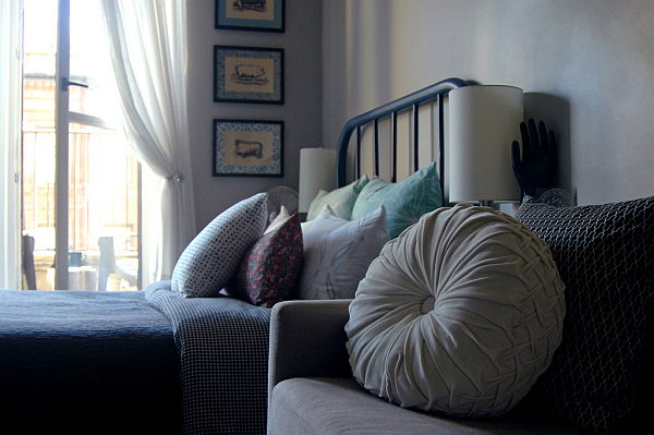
Another key consideration is furniture selection and placement. in small spaces– studio apartments–or loft apartments, many people will try to separate the bed from the rest of the space with the use of a bookshelf (Ikea expedit shelf, anyone?) or curtains. This can be great design decision depending on the layout and size of the apartment; however, in my apartment, this would not be have been an ideal solution. It would have blocked the view of the windows from the living area and kitchen, and made the two separate spaces feel much smaller; therefore, in my opinion, it would ruin the flow of the entire space.
Lastly, the simplest tool to create the impression of a designated area is a rug. Visually, a rug will anchor surrounding items to a particular area. So, throw a rug in one corner by an armchair and bookshelf to create a reading nook and place another rug under your table to signify the dining area. It’s the easiest way to designate a space within a larger space.
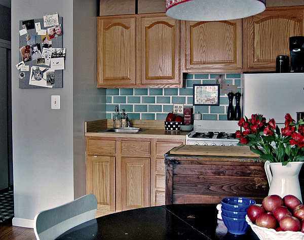
Q: What are the best colors to use as a foundation pallet that will enlarge the perception and reflect any available light, be it natural or artificial? In correlation what’s the best wall in a small space to choose as the accent wall?
A: Color is a great tool when decorating a small room; though, many people are fearful of what a bold or dark color might do to that space. Personally, I think any color can work within any space and you should never shy away from picking the color you really want to put on your walls. The challenge is that you must always create a balance between light vs dark or vibrant vs subtle. For that reason, an accent wall is a great solution in a small space because you can insert that vibrant color and surround it with more subtle tones to create a balance.
The accent wall is the first wall you see when you enter the main living area and most of the seating areas (couch, dining chairs, bed) face that direction. If you’re lucky enough to have unique architectural details, an accent wall can be used to highlight it, or if you’re lucky enough to have exposed brick, use that as your accent wall. From there, select lighter neutral tones–like whites, greys, or tans–that play up your accent color for your remaining walls. Finally, use mirrors and additional lighting to reflect light throughout the space.
Not only will these design tricks and tips from Michelle’s intimate look in her home help with small spaces, but are great tools to carry on into any home improvement project you are preparing to tackle. I’ve already taken to heart her sage advice and just as Michelle shared her advice, take this good news and share with friends in the good name of DIY!
Here’s the video.
