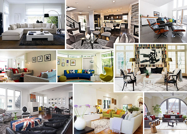
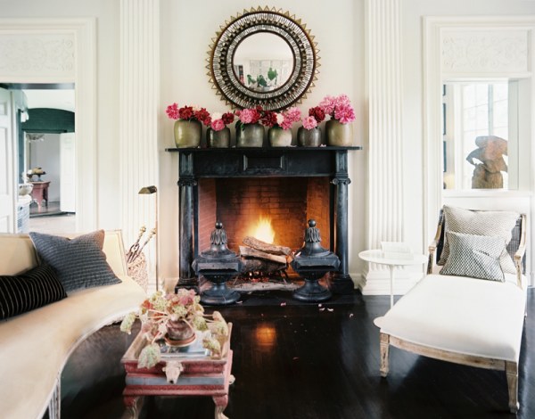
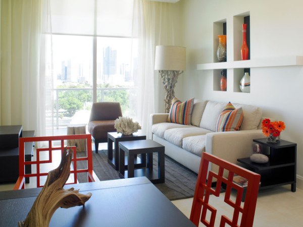
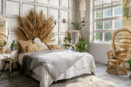
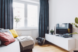
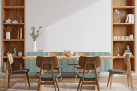
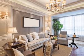
Living room layout is a fascinating area of interior design, because the living room is the place where we spend time entertaining, relaxing, and visiting with others. One of the most visible areas of the home, your living room can set the tone for the entire dwelling. The fact that this part of the house is so much fun to decorate is both exciting and potentially problematic. Why problematic? Because we often cram all of our favorite belongings into the space without considering how the pieces fit together.
Today we feature a wide variety of living room images as sources of inspiration. Not only are these pics a great way to get innovative design ideas for your own home, they shed light on some tricky layout dilemmas: how to seat guests, how to divide the room from the other areas of the house, where to hide the TV and how to maximize space. Take a look and see what inspires you!
Sensational Seating
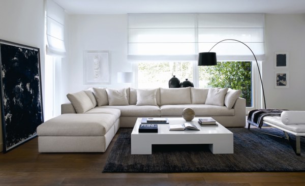
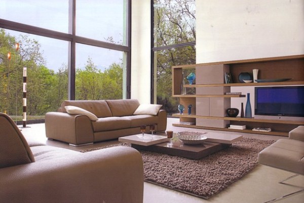
Oh, the joys of seating strategy! If your living room is spatially challenged in any way, shape or form, you know how difficult it can be to find a seating arrangement that is both comfy and accommodating. If you have plenty of space, a roomy couch is a great place to start. The living room below features a modular sofa from Usona:
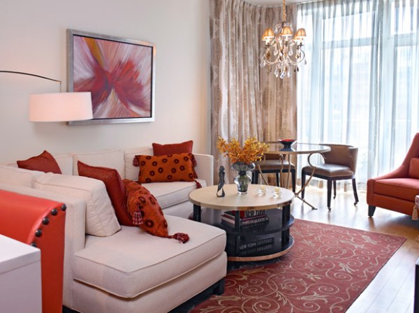
To make the most of a corner, try an L-shaped sofa, as shown in our next featured space. [from Alan Kosa Interiors]
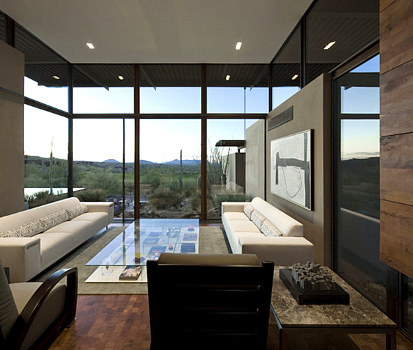
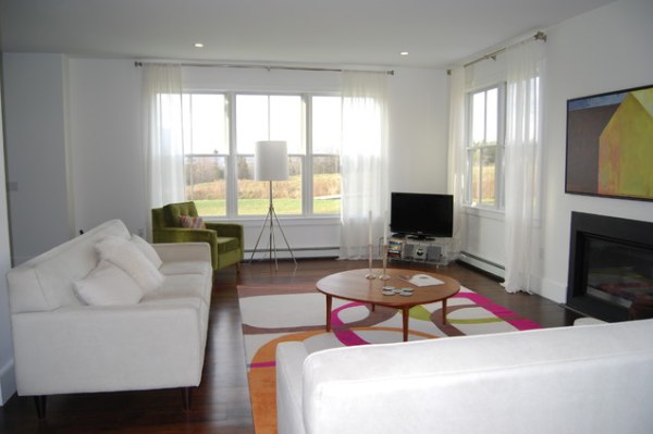
Or double the fun with a pair of matching sofas! Below we see a living room from the Brown Residence, designed by The Construction Zone. Two lean sofas add symmetry while creating the ideal face-to-face seating arrangement. [from Houzz]
Your matching sofas don’t need to be ultra-long to get the job done. And don’t hesitate to add pops of color with vibrant pillows. [from LLI Design]
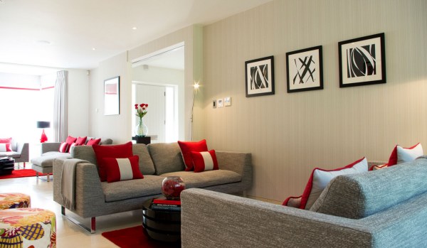
If your space isn’t ideal for the placement of sofas across from one another, try arranging seating in a perpendicular formation, as shown in the next image. [from Studio M Design via Houzz]
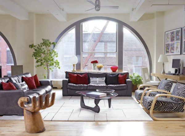
Next we see a New York City loft living room, which reminds us of how 3-sided seating can be perfect for large spaces. In other words, create a U-shape with your sofas and chairs, moving them away from the wall if necessary. Add a fun touch here and there, like the 1960s Pedro Friedeberg Hand chair and Alvar Alto lounge chairs shown below. [from Alan Kosa Interiors via Houzz]
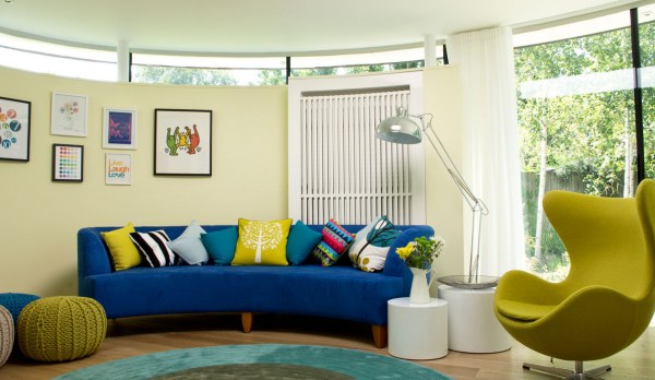
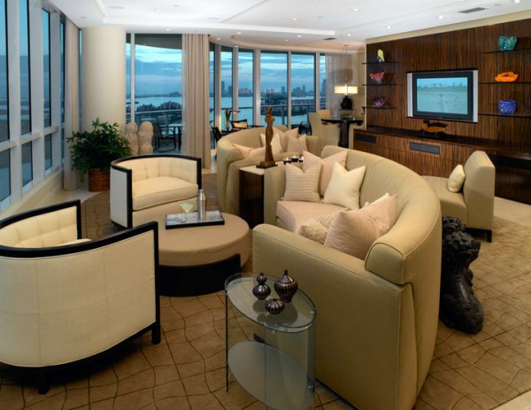
Sofas don’t have to be modular to be expansive. For example, a curved sofa adds spacious seating and geometric interest. Throw in a swivel armchair, and have some floor poufs and cushions on hand for those nights when large-group entertaining is a must. [from LLI Design]
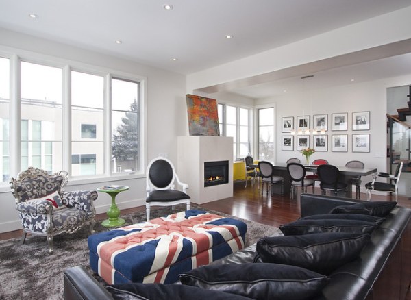
Who says your coffee table can’t double as seating while you host a gathering? Below we see a tufted coffee table/bench that can easily be moved to accommodate a group. [photo from K West Images via Houzz]
Our last image serves as an important reminder to keep your layout interesting! Curved sofas and chairs are arranged at an angle, and because of the linear arrangement of the couches, two different seating areas result. [from Causa Design Group]
Room Dividers
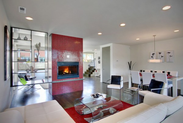
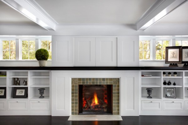
In small spaces and wide open spaces alike, delineating room from room is another design challenge that can’t be ignored! How do you divide your space with style? If built-ins are an option, why not use the fireplace as a functional screen? Below we see a Brio Clear Red tile fireplace from Modwalls. [photo by Playhouse Design Group via Houzz]
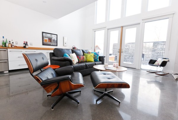
Sometimes the answer is as simple as relying on the furniture you already own. In the next image, a sofa distinguishes a living room from a bar area in a chic family home. [from Six Three Furnished Suites via Houzz]
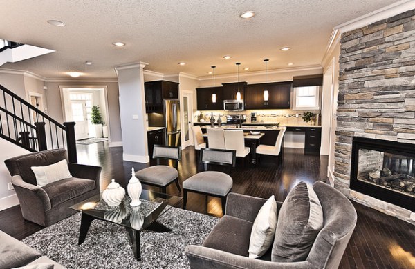
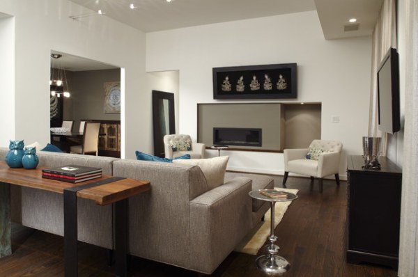
The divider doesn’t even have to be a sofa! A pair of chairs gets the job done, as shown by the gray and black chairs that separate living room and dining room below. [from Marcson Homes via Houzz]
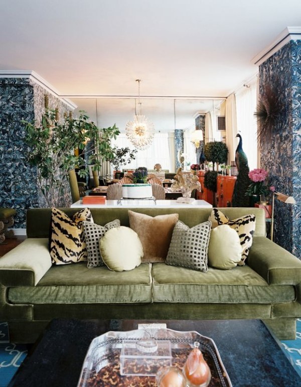
What if the color of the walls set the stage for a room change? In the next image, a wallpaper pattern sparsely introduced in the living room completely covers the walls of the dining room in an interior designed by Celerie Kemble and Anna Burke. [from Lonny]
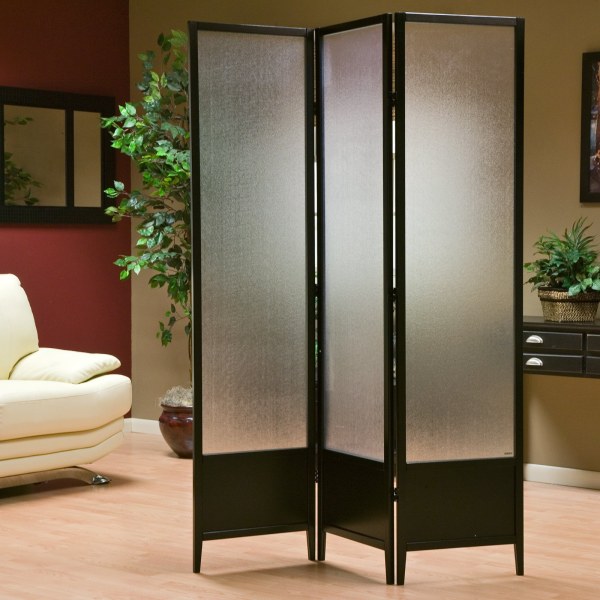
Looking for height as well as a clear separation of spaces? Go with a divider screen, such as a frosted Plexiglass selection that lets in the light while doing its job. [from How to Build a House]
TVs in Disguise
There’s no beating around the bush: hiding a living room television can be tricky, even if it’s a slender flat-screen! Do you need to cover it completely? Then again, watching TV is a totally acceptable pastime, so why hide it? The degree of disguise is up to you, but if you’re looking to conceal your television in any way, here are a few helpful ideas… Going with a custom solution can be very classy. In the room below, an all-white picture lifts to reveal the television. [from LLI Design via Houzz]
Or just hide the television in the cabinets across from the couch, as shown in the space below. Do you see the TV? That’s the point! [from DiGiacomo Homes & Renovation, Inc. via Houzz]
Let’s say you’re not set on completely hiding your television. Try including the TV in a large shelving unit that displays a range of stylish items. Why not let it become a part of the decor? [from Moshir Furniture via Houzz]
Even if you’re not looking to conceal the TV in any way, sometimes less emphasis can be placed on the television by strategically avoiding making it the focal point of the room. In the space below, designed and built by Epic Development, the sofa faces the fireplace. A TV on the side wall goes largely unnoticed. [photo by Brian Gassel, from Epic Development via Houzz]
If your seating faces the TV set, try placing it to the left or right of the room’s focal point. A chair can always be swiveled to better align with the television when it’s time to watch your favorite show. [from Lonny]
Small Space Solutions
Even if your living room poses no spatial challenges, the small space tips below can make your dwelling even roomier! One of the oldest tricks in the book: go with a small coffee table. Below we see a square wooden piece in a room designed by John Dransfield and Geoffrey Ross. Notice how the space has an open feel thanks to an absence of large furnishings in the center. [from Lonny]
Another helpful hint: use side tables as coffee tables. They can easily be moved to open up the space when it’s time to entertain. [from Causa Design Group via Houzz]
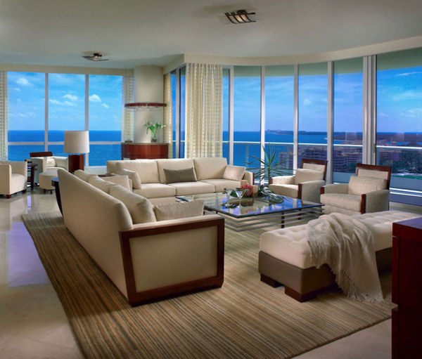
Don’t forget that clear furnishings create the illusion of space. The living room below is obviously not a small interior, but a glass coffee table enhances the open feel created by floor-to-ceiling windows. [photo by Barry Grosman for Causa Design Group]
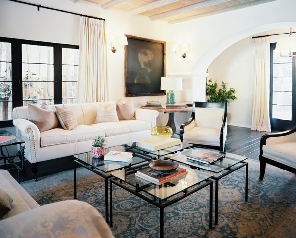
Why not combine the modular coffee table idea with see-through style? Try grouping four clear side tables to create a large coffee table that can store a variety of items, as shown in the room below, designed by Estee Stanley. When company arrives, move the tables to the side if necessary. [from Lonny]
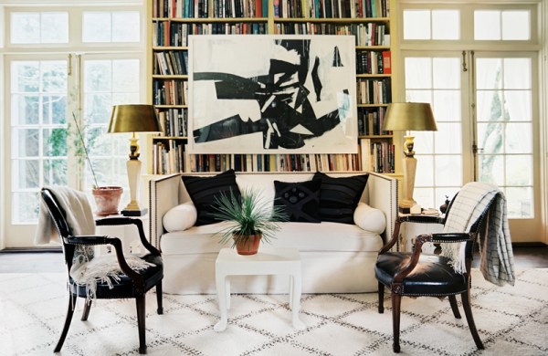
A bookshelf can look cluttered. If you don’t need to access its contents on a regular basis, hang a large piece of art from the shelves, as shown in the next space designed by John Dransfield and Geoffrey Ross. Not only is this technique a great way to maximize limited wall space, it stylishly hides the shelf’s contents. In fact, try placing paperwork or other unsightly items behind the canvas! [from Lonny]
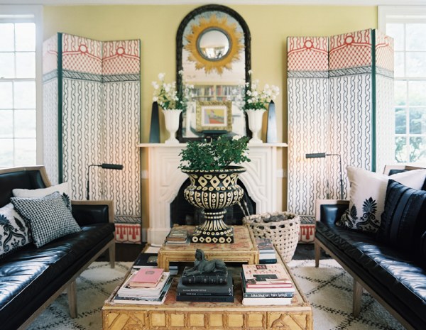
Speaking of unsightly items, nothing conceals them quite like a screen. The decorative screens in the room below add an artistic element to the space. [room designed by John Dransfield and Geoffrey Ross, from Lonny]
Whether you’re stumped by a living room layout problem or you’re looking for ways to change up your space, don’t forget the value of strategically placing your furniture. Not to mention, if you’re looking to buy a new piece or two, consider the needs of the room before making that purchase. A little forethought can go a long way in creating a living room that is both stylish and functional. Happy decorating!
