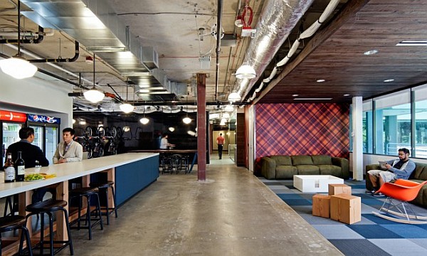
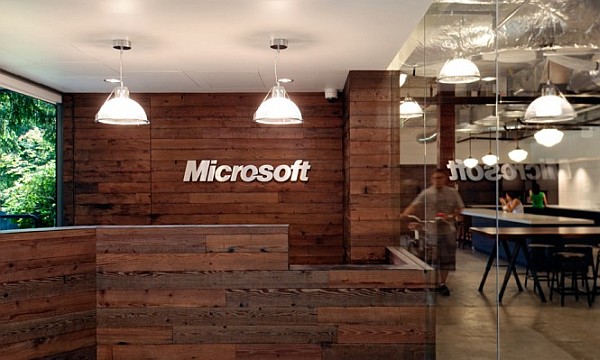
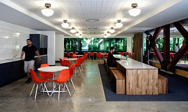
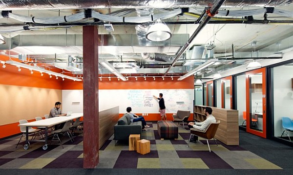
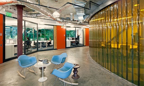
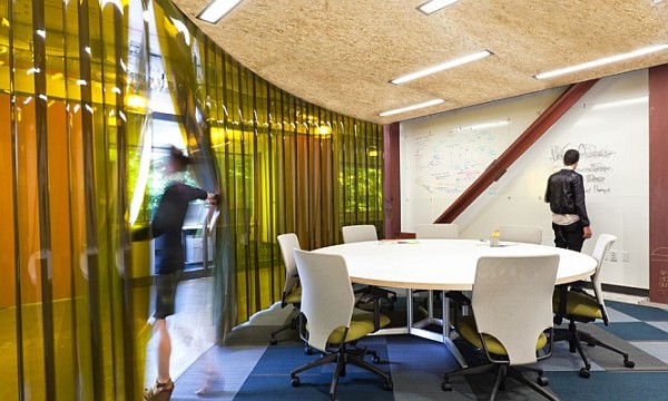
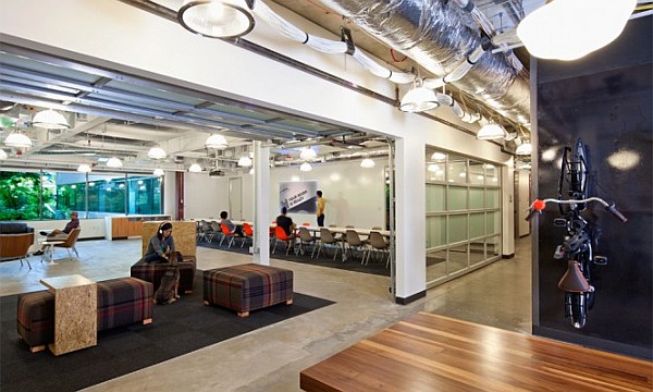
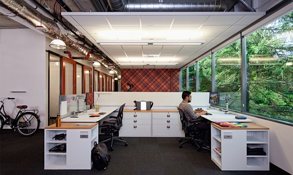
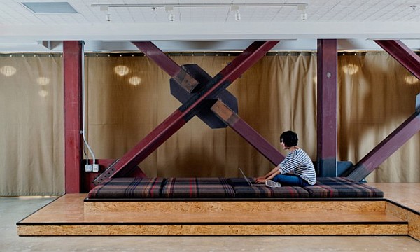
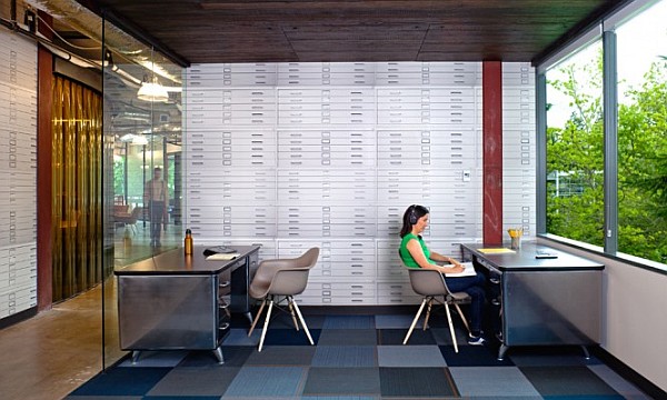
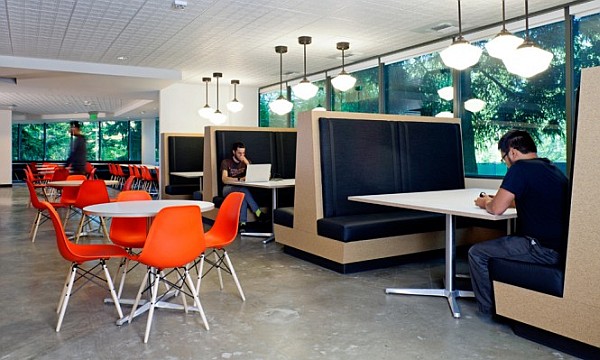
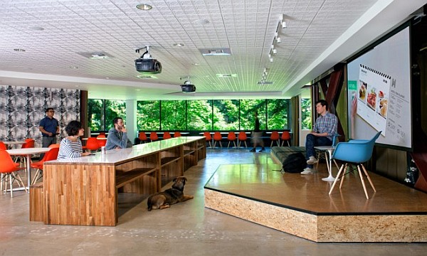
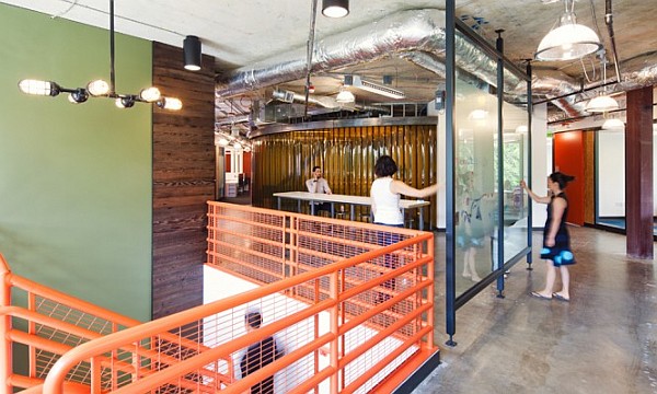
The challenge presented to Studio O+A was to design an office interior for Microsoft’s Building 4 in Redmond Campus, which will reflect what works paces would look like a decade and a half down the line. In a world where modern interior spaces are changing by the minute and décor, both home and office, getting revamped each season, that is a task filled with enormous creative challenge. But Studio O+A have not disappointed with the outcome as they crafted up interiors which merged the serious with the casual and personal creative space with flowing conference rooms.
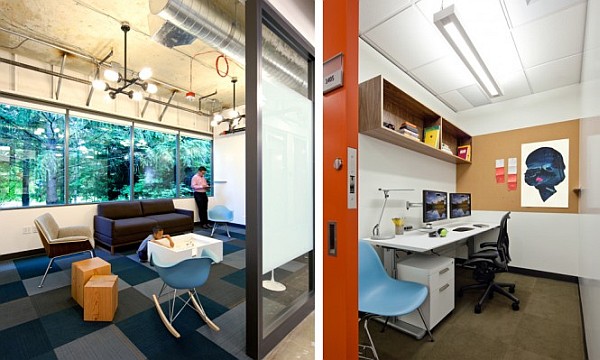
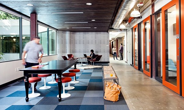
One of the major themes adopted in the design was Microsoft’s long and rich history in the Pacific Northwest and this has been translated into surfaces that sport bright checkered patterns, which have been effortlessly mixed with cool blues and stylish oranges to ensure a sense of playfulness and casual freshness. While this brings a relaxed tone to the office, the more formal appointments can take place in the conference spaces which have a serious corporate look and employ neutral shades along with minimalistic trend to bring in the feel.
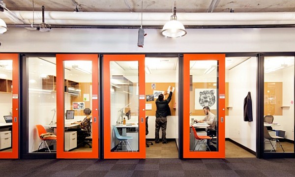
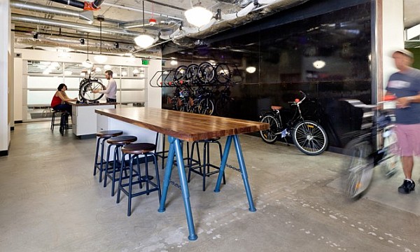
The smart design of space also includes ‘personal pods’, which act as isolated areas for work that demands singular concentration, while large meeting rooms are present in plenty to ensure flowing exchange of creative ideas. A bicycle workshop that rents a ride and a few cool spots to relax, complete the office of the future. (found on home-designing)
