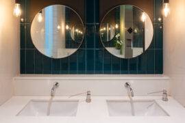
Metal has been a major element of decoration since time immemorial, and so are metal frames when it comes to decorating the interiors with framed art works. Well, it’s not just about decorating the room. The beauty and nature of the metal frame also adds to the aesthetics of the art work too.
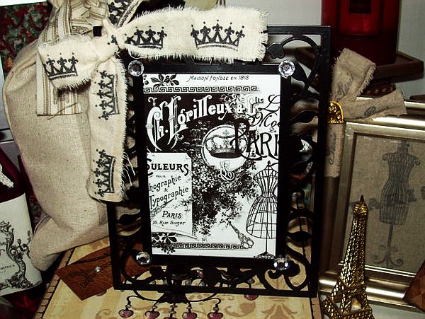
An artist usually decides the boundary of the work through efficient composing. A frame projects this composition, and helps the art work to establish a connection with the place it is exhibited. This is the basic logic that decides if one has to select a metal picture frame or farming while exhibiting art works.
Metal, by it aesthetic nature, makes bold, subtle statements to the viewer. It is often dynamic and
aggressive, unlike other framing materials like wood or plastic. Due to this, modern art works unless dealing with antiquity or rustic subjects, often, prefer to have metallic frames. So is the case with interior decoration.
For a vintage styled room, you may better go for wooden picture frames, since the metal picture frame may seem a little too harsh for the ambiance. However, in other cases, to keep the room lively and dynamic, a cleverly arranged set of art works with brilliant metal frames will do it more than anything.
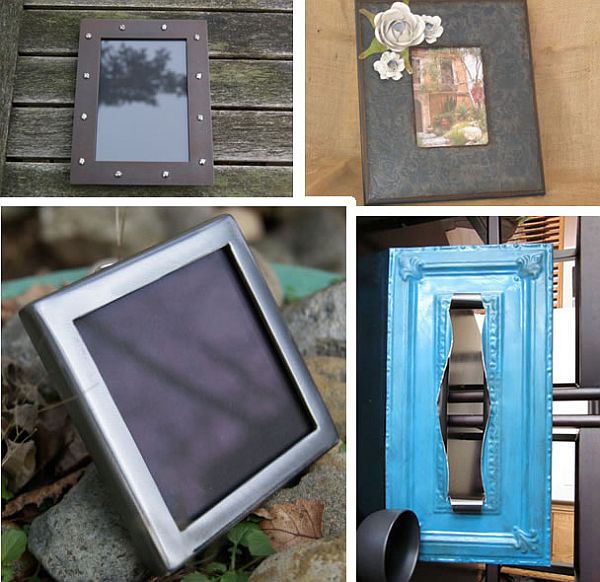
Going by the Feng Shui lessons, metal is a major element of creativity and having metal picture frames or other metal articles in a room will help the flow of creativity in the structure.
When it comes to selecting from different types of metal picture frames, the size of the art work and the nature of the place it is hanged are all important factors. If the art work is large, better to go for a light weight one or the work along with framing will make it too heavy. If you are planning to use more than three art works of same size, uniform metal picture frames will be beautiful.
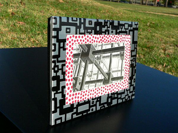
Ready-made metal picture frames are available in the market, but make a creative decision based on the aesthetic merit of the art work before running for them. The beauty of a metal picture frame should be like a balance, it should not project itself too much visually, at the same time, and it should make a mark in the eyes of the viewer while pointing more to the art work.
