The Pantone Color Institute has released its picks for trending colors for the fashion industry in 2023. The palette was inspired by the desire to try something new.
The color experts invented the colors, intending to match the new era. Moreover, the vivid colors feature a high contrast that brings individualism. The hues range from bold energizing choices with a few calmer picks to help you tone them down. This post shares the ten trending colors featured in Pantone’s 2023 Spring/Summer Color Trend Report, so do not miss them!
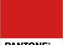
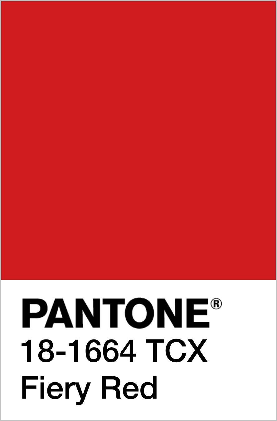
PANTONE 18-1664 Fiery Red
Fiery Red is an energizing red tone that makes a statement. It is perfect if you’re looking for a luxurious red with a cool undertone. With its elegant appeal, we can envision Fiery Red as a brave sofa color choice.
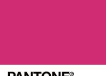
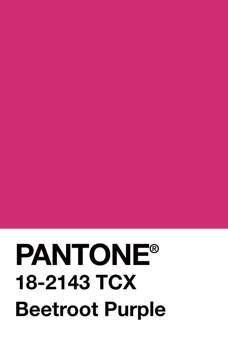
PANTONE 18-2143 Beetroot Purple
Beetroot Purple is an intriguing purple tone, ideal for setting the mood. It is an energizing color but maintains a peaceful aura at the same time.
As seen at the New York Fashion Week, the gorgeous beetroot purple dresses fluttered over the runways. In the same way, this color will make it to mood boards. A statement wall painted in this exquisite tone will add character to a room.
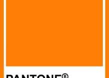
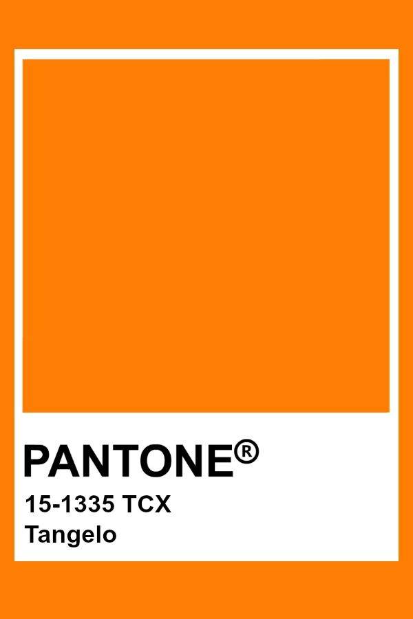
PANTONE 15-1335 Tangelo
Tangelo is the perfect resemblance of a tangerine skin, bringing fresh vibes to the space. A pair of vibrant Tangelo armchairs will freshen up your conversational area creating an inviting spot for recharging after a long day. It follows the idea of the color collection, introducing joy and happiness.
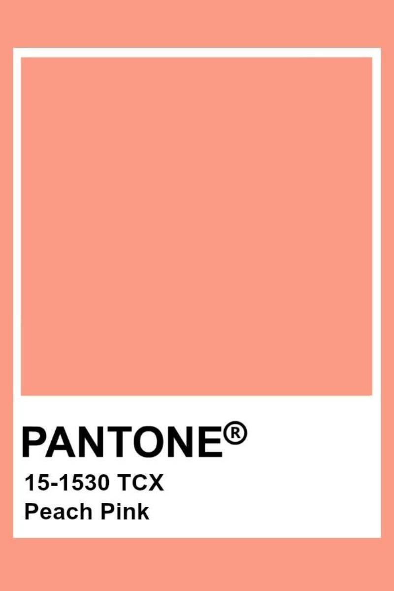
PANTONE 15-1530 Peach Pink
With the perfect balance between pink and orange, this tone will make its way into modern and fresh interiors. We can envision it as the ideal wall paint choice when you wish to create a serene ambiance. You could also tie it into a room with a mostly neutral pallette, to add a pop of color through a few accent pillows, wall art, or even curtains.
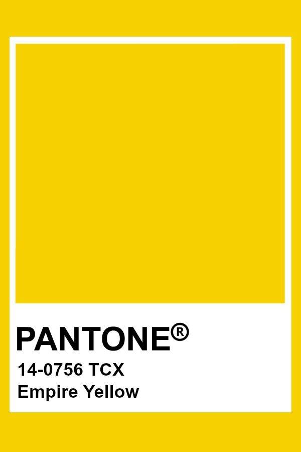
PANTONE 14-0756 Empire Yellow
Empire Yellow is a vibrant tone that boosts energy. The cheerful vibe of this color is ideal for setting up a focal wall in the home office or creating an informal dining setting.
If you’re looking for further inspiration on how to incorporate Empire Yellow (or any other shade of yellow) into your home, check out these color combinations.
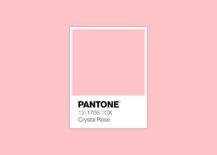
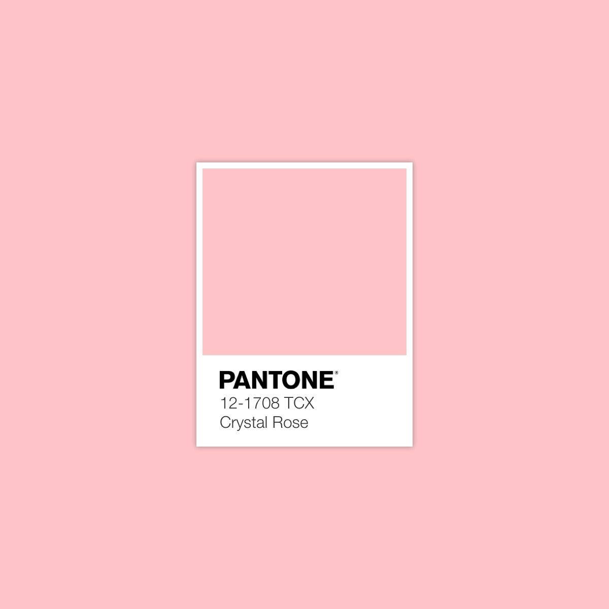
PANTONE 12-1708 Crystal Rose
Crystal Rose is a romantic tone that conveys a feminine vibe for the space. Its serene nature is ideal for a nursery or a bedroom. Or, pair it with pale blue to set a tranquil mood.
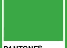
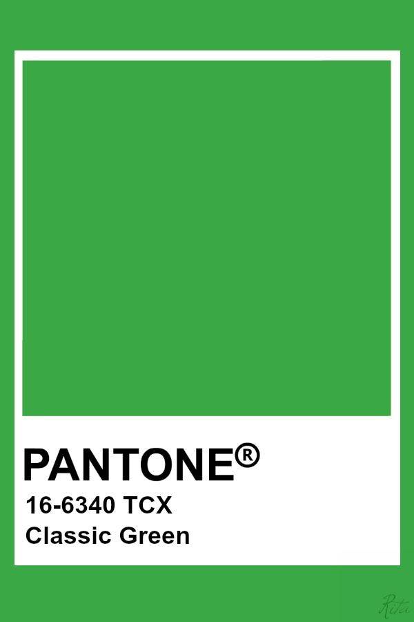
PANTONE 16-6340 Classic Green
The classic green brings freshness to your space. Curate a color scheme consisting of classic green, light green, beige, and creams to bring nature to your home. If you want braver choices, introduce a green focal wall in the living room.
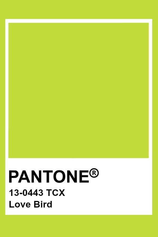
PANTONE 13-0443 Love Bird
The vibrancy of Love Bird brings exotic vibes to the space. Implement in the form of an area rug and throw pillows and let its courageous spirit elevate the room.
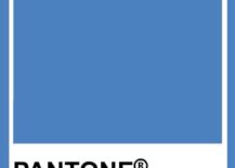
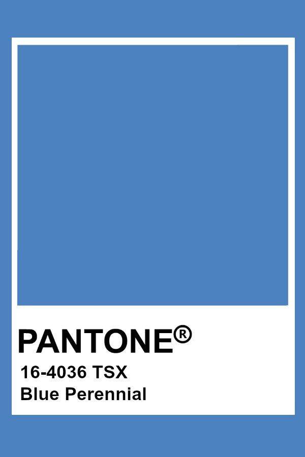
PANTONE 16-4036 Blue Perennial
The calm yet outstanding tone depicts the beauty of the perennials. The tone will ideally suit a peaceful and relaxing vision board, ready to add style to a bedroom.
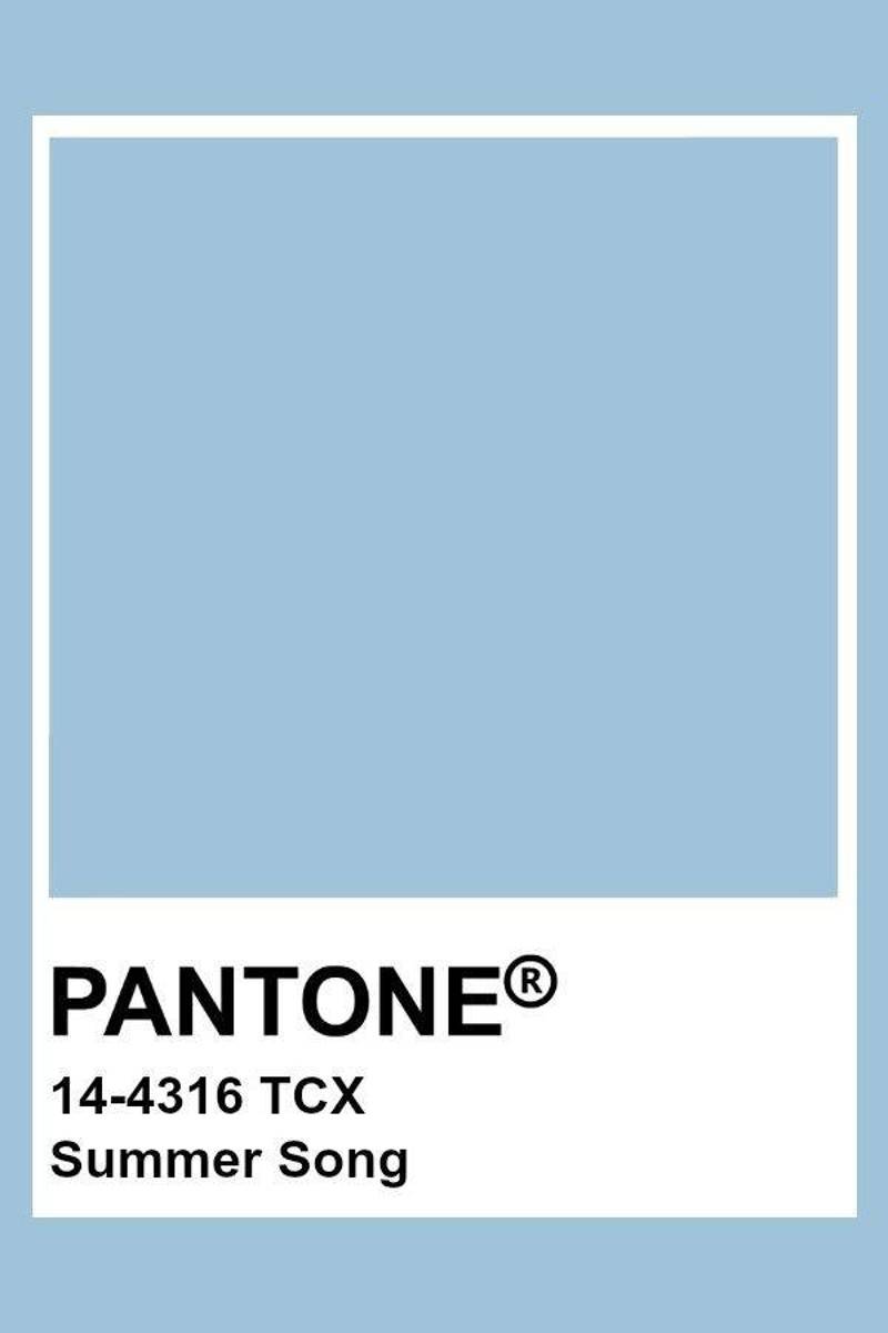
PANTONE 14-4316 Summer Song
Summer Song is a clean blue tone that feels so relaxing. You can complement it with Blue Perennial if you wish to create a monochromatic color scheme that conveys tranquility.
Spring/Summer 2023 Core Classics
The Spring/Summer 2023 Core Classics is a carefully selected collection of calm tones to help you curate a color scheme and calm the contrasting hues. Macchiato is a gorgeous brown with a neutral undertone, which will help you create a mood board with an organic feel. But also, Vanilla Cream is a beautiful cream with a neutral undertone.
