A change in season often brings with it an entirely different take on colors, styles and patterns. For design aficionados, it offers a chance to tinker with the color scheme of their house in a subtle and elegant fashion. Yet most of us are put off by the idea of having to drastically shift between colors every two to three months. This also means that you need to rethink your entire design theme at times. While having a neutral backdrop with bright pops of color is a wonderful alternative, one still needs to pick the right accent colors to pull off this look.
by Laura U
Today we shine the spotlight on three beautiful colors that are currently among the hottest shades doing the rounds in both the worlds of fashion and interior design. Cutting across the barriers of varying seasonal trends, this trio gives your interior a trendy look all year long and makes sure that you are never caught off guard!
Cheerful and Versatile Coral
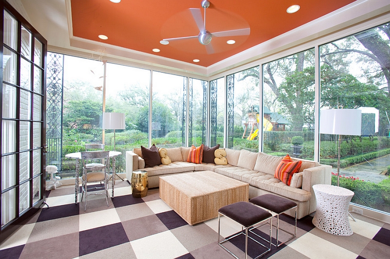
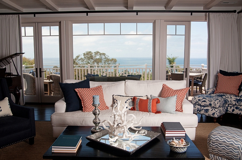
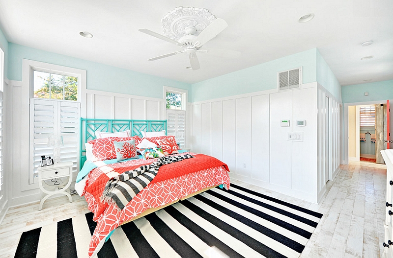
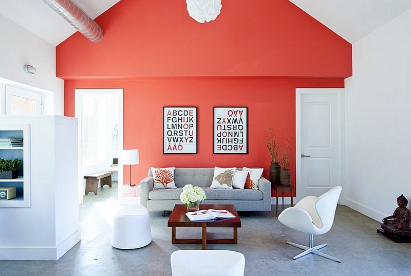
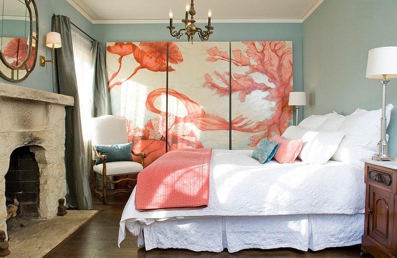
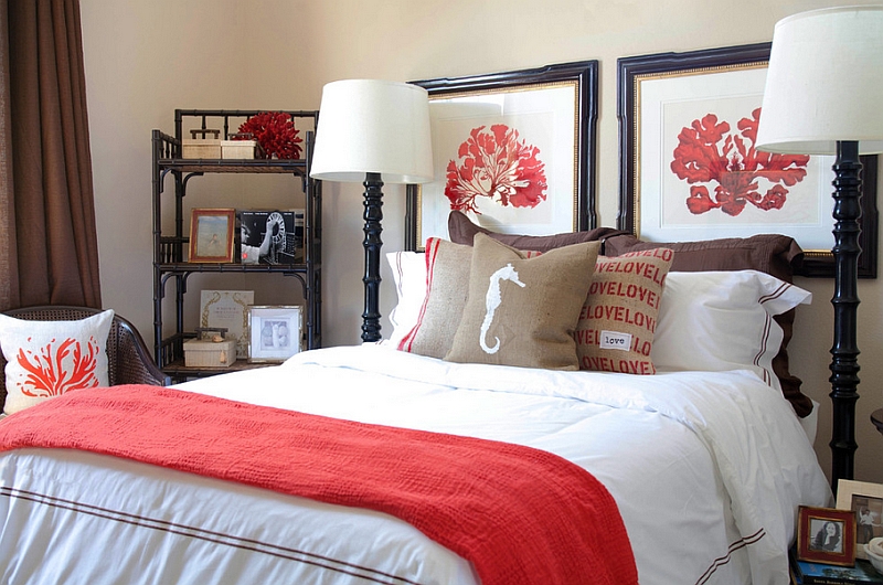
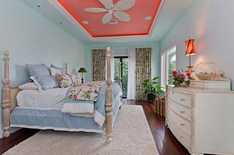
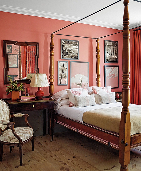
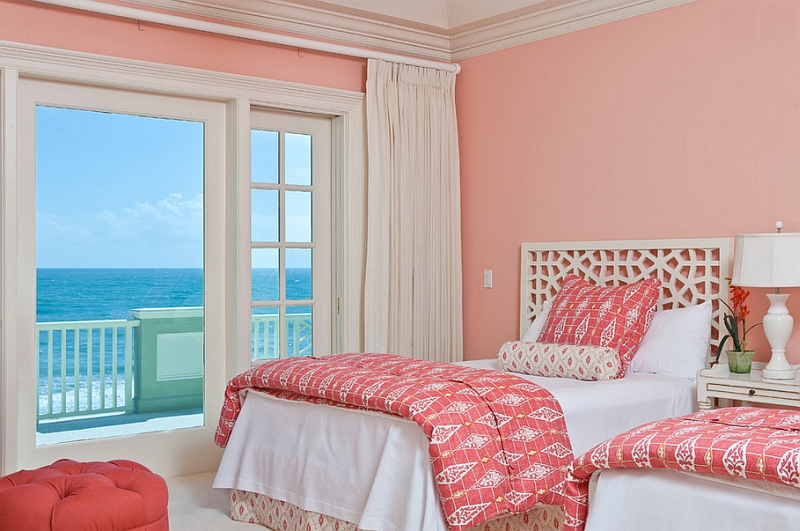
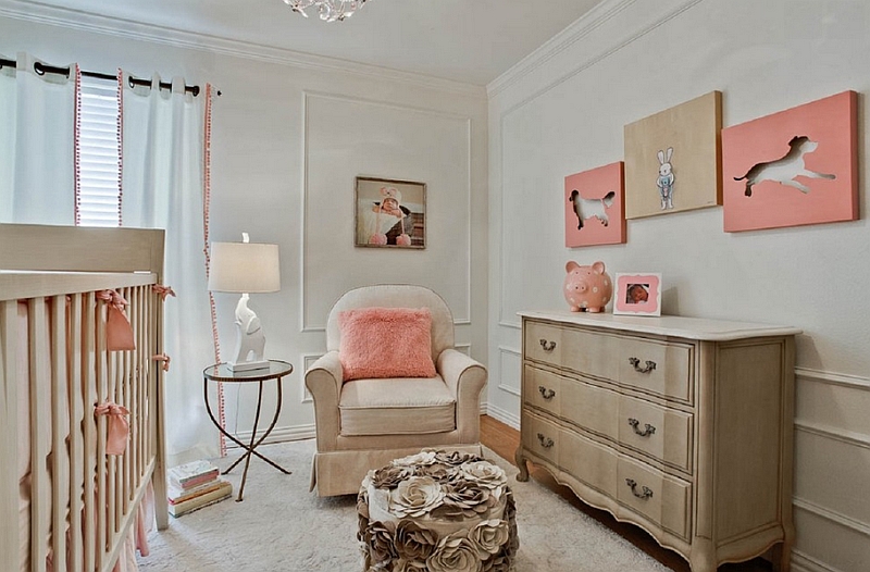
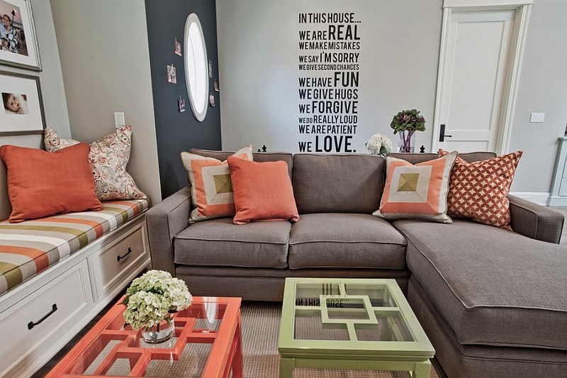
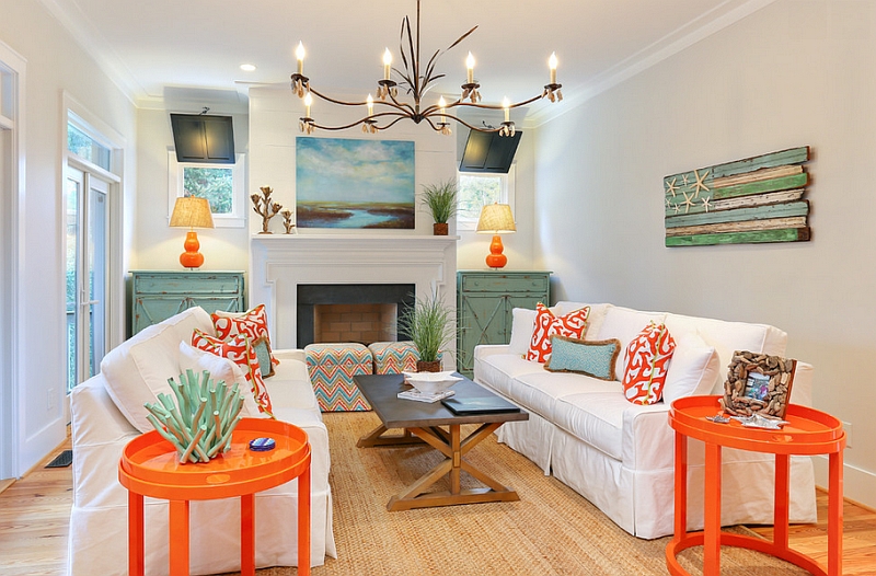
If you have an interior that seems drab and even mundane, then just add a pinch of coral and you will see it spring back to life! With bright oranges making a grand comeback in 2014, coral is the ideal color for those who wish to join in on the trend and yet dare to decorate with a difference! While bubbly Tangerine has been dubbed the in color by some, coral is a refreshing alternative that is far more elegant and equally vibrant. Instantly adding glamour, simple coral accents in the form of throw pillows and stylish drapes can easily change the entire appeal of your living room or bedroom
by Darci Goodman Design
by Echelon Custom Homes
by ZeroEnergy Design
For those looking to incorporate coral in a more permanent fashion, we suggest a blend of beautiful, light aqua and luminescent coral accents for a fresh, Mediterranean style. This is a style that seems perfect for both spring and summer, and a dash of lime green along with fresh yellows makes it even more engaging. Just swap out these light shades for dark chocolate and deep browns, and corals look equally appealing once cold winter days arrive.
by Lori Smyth Design
by Jere Bradwell
by ABRAMS / Photography by Eric Piasecki
by Page 2 Design
by RN Interior Design
by Jill Wolff Interior Design
The Vibrant Magic of Teal
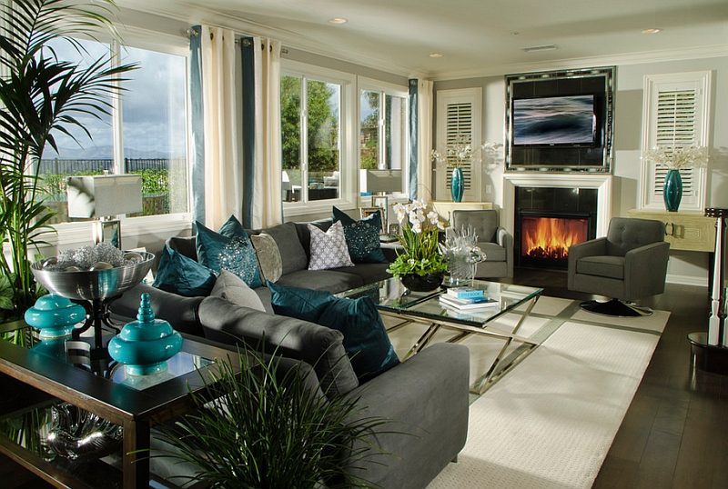
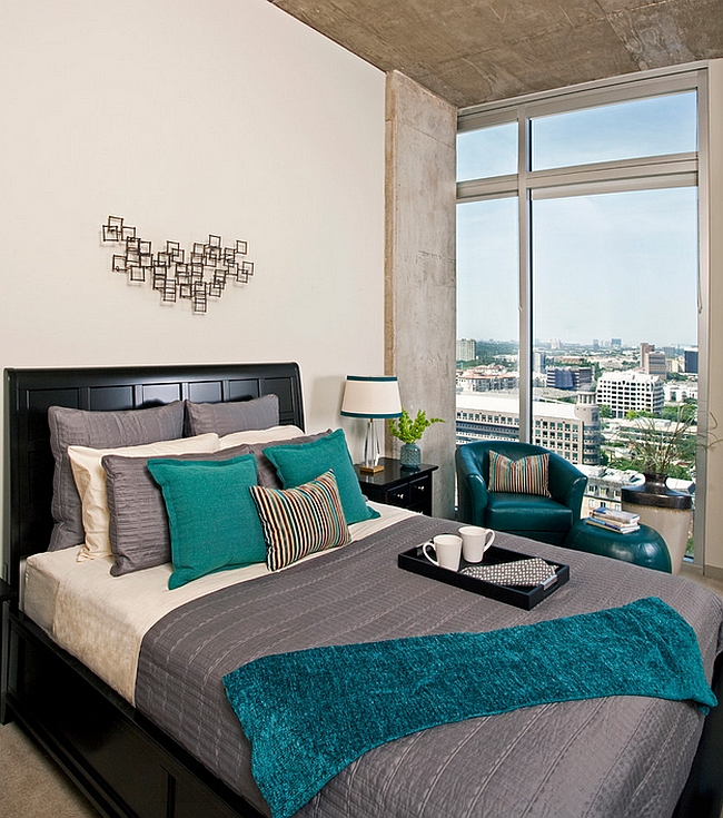
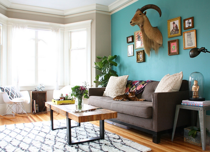
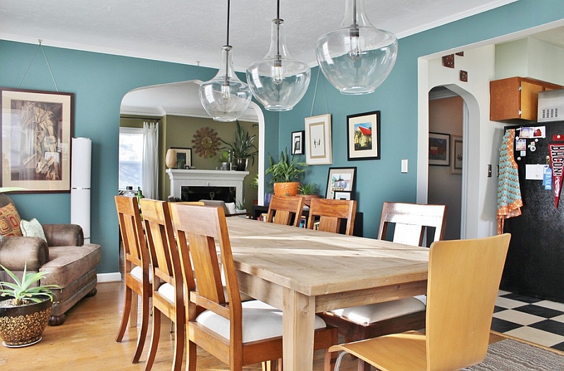
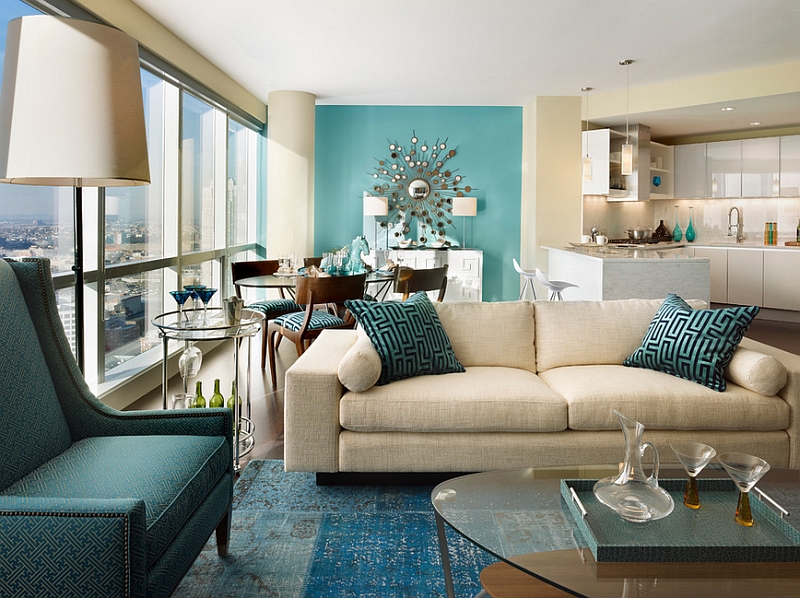
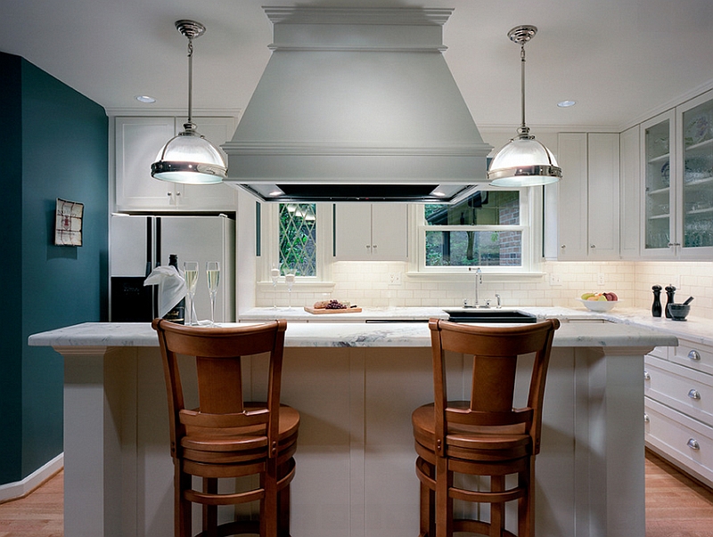
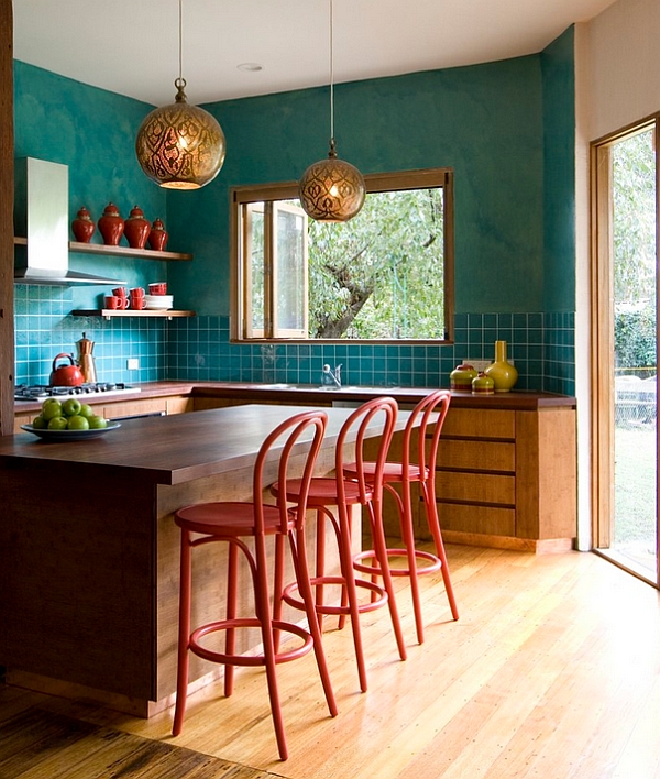
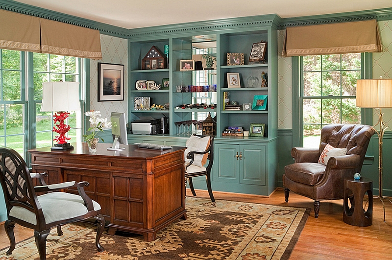
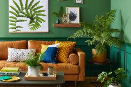
Here is a color that not only works well on its own, but seems to complement coral beautifully! Teal is a mixture of blue and green and comes in a wide variety of shades and hues. With a change in its intensity and the amount of white or grey that is mixed with it, teal can paint a picture varying from the radiant to the refined! As versatile as coral, the many shades of teal make it as much a part of the summer home makeover as the winter overhaul. And it is this adaptable nature of teal that has made it so popular in the last few years.
by Erin Williamson
by Possibilities for Design
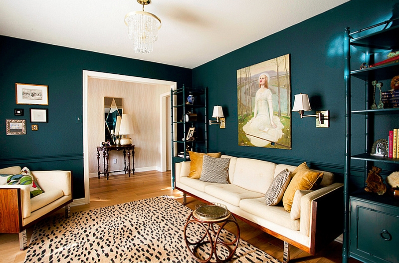
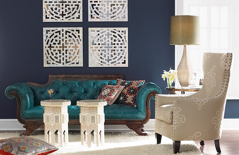
Below you see four lovely inspirations that show you how gorgeous teal looks as a summer hue. Sometimes closely resembling turquoise, teal can even alter the appeal of a room by simply changing the intensity of lighting around it. White, teal and bright pops of orange are a perfect blend for a living or dining room with coastal or Mediterranean style. Capturing the informal appeal of summer and fall flawlessly, lighter tones of teal evoke images of a sunny day on the beach.
by Kimberley Bryan
Sometimes we stumble upon the most uncanny color combinations, and navy blue and dark teal is one such duo. Bold and modern, teal also works well with gold, yellow and warm earthen colors. Teal accents make a big impact visually even when used sparingly, making it easy to incorporate this color without committing to it fully.
by Horchow
by NW Home Designers
by Rachel Bauer Design
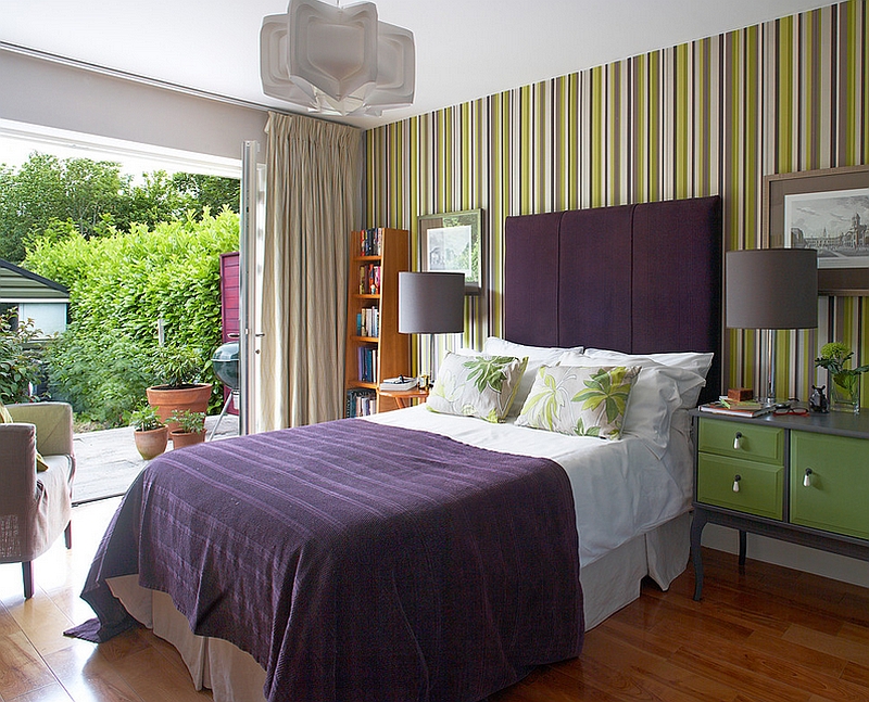
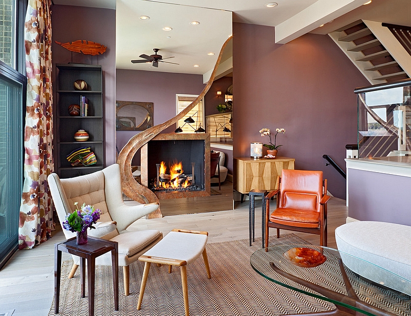
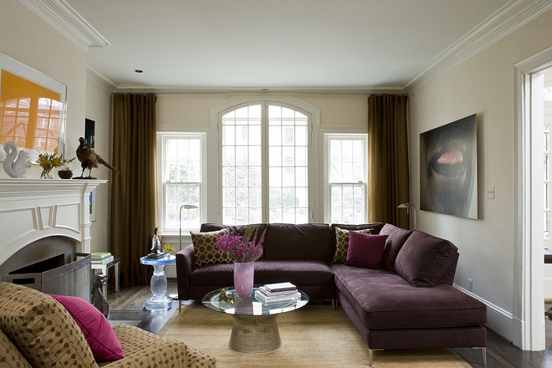
Posh and Majestic Eggplant
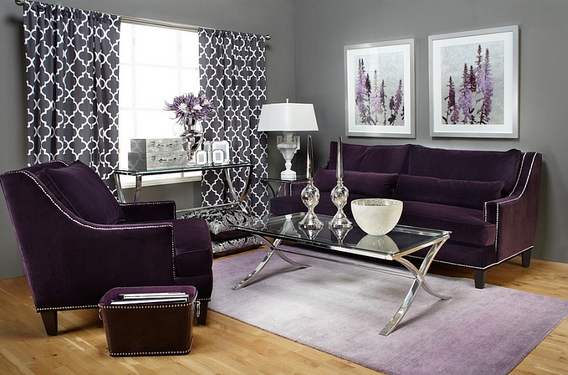
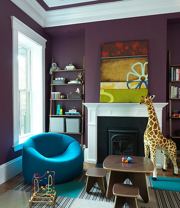
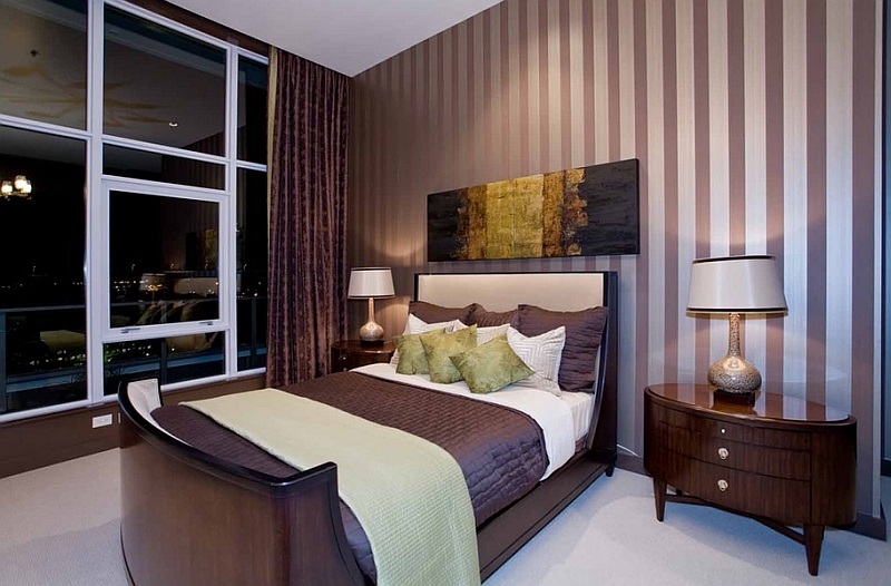
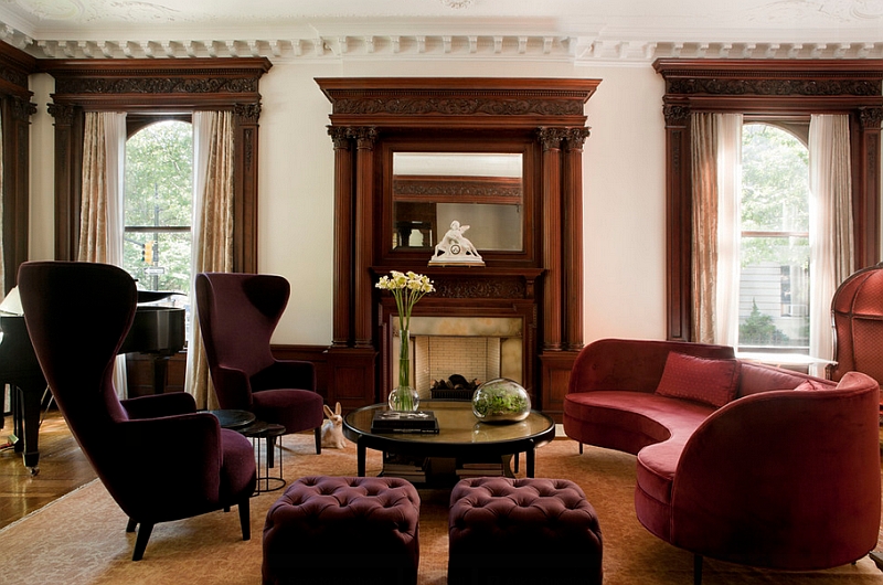
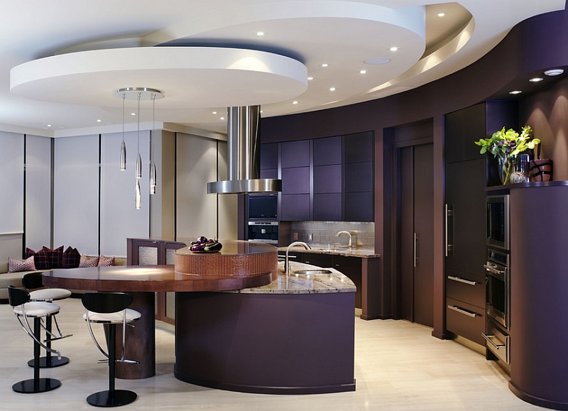
The world around us has a huge impact on the colors that we choose, and exotic purples have once again taken over from steely grays since the day the world economy found its footing again. (Or so say the experts!) Regardless of the reason behind it, eggplant is a color that you want to use around your house in the next few years. Sophisticated and stunning, this color is admired by may. In fact, the latest research suggests that even infants prefer this regal shade in their nursery! Much like teal, you can pick between the many shades of eggplant to alter the overall vibe of your home.
by Z Gallerie
by Rachel Reider Interiors
by Angela Todd Designs
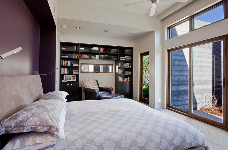
Deeper tones of eggplant are ideal for living room accent walls and decor additions. Bedrooms benefit from a lighter shade of eggplant, as it helps create a more relaxed atmosphere. Since the color is so rich, be careful not to fill the room with too much aubergine. A couple of plush accent chairs or a gorgeous couch in brinjal is often enough to give the room a touch of class!
by David Howell Design / Photography by Peter Margonelli
by XTC Design Incorporated
by Think Contemporary / Photography by Barbara Egan, Reportage
by Bruce Palmer Interior Design
by Wicked Shade
