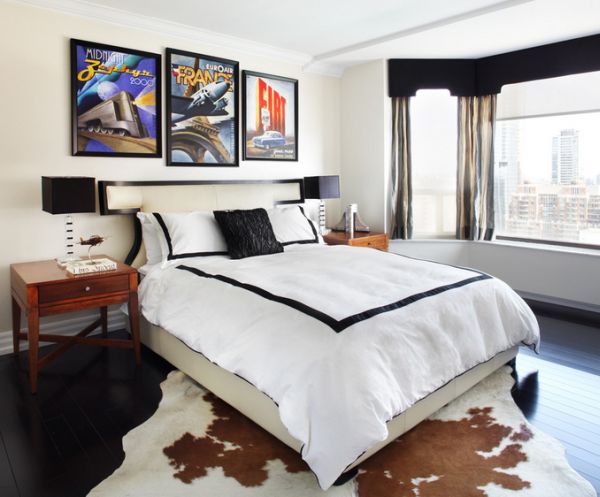
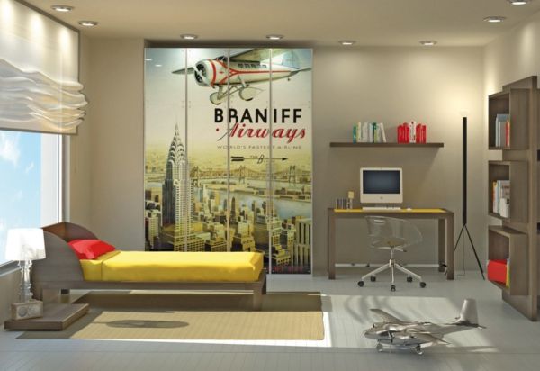
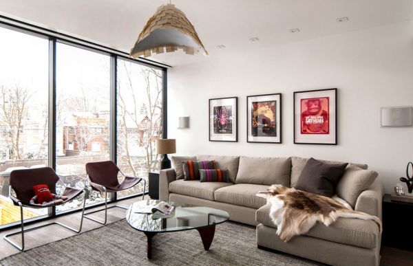
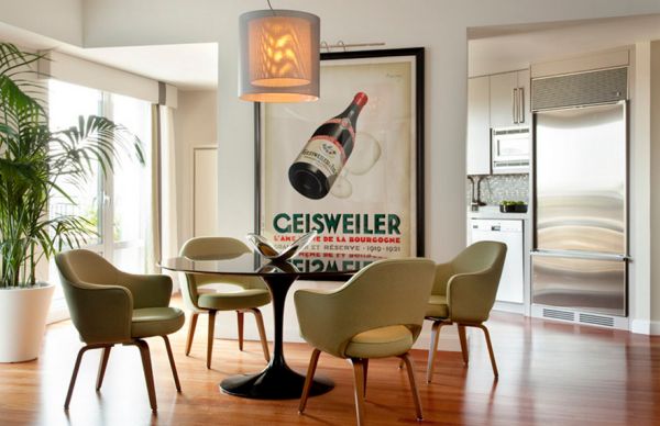
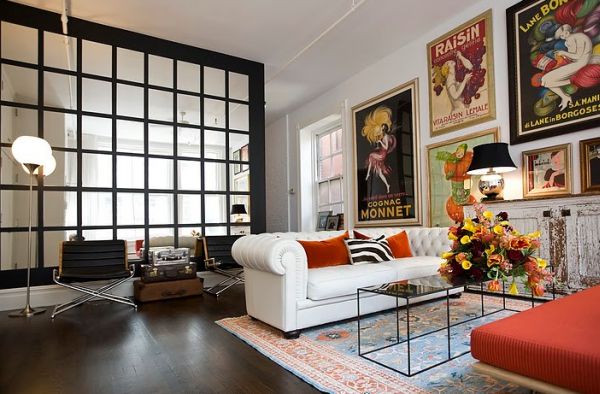
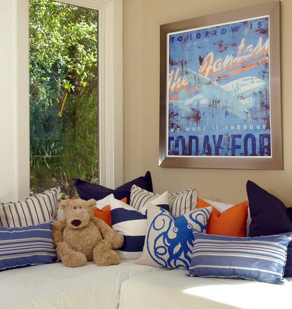
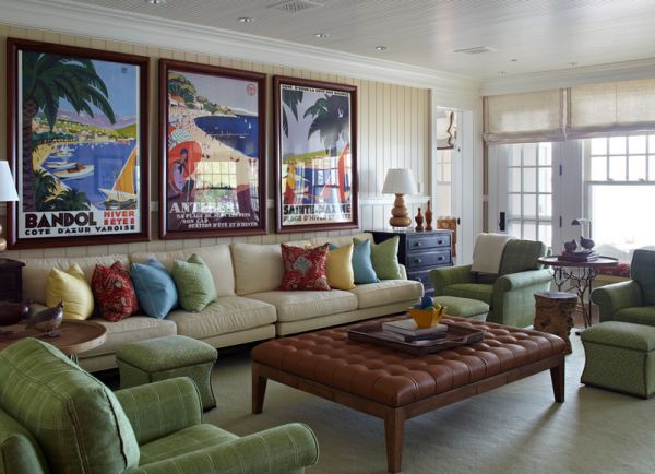
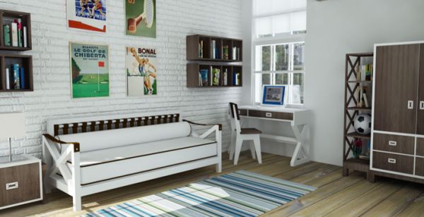
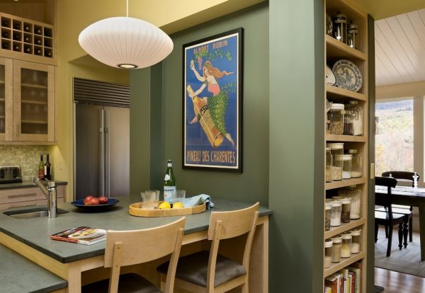
Most of us tend to outgrow our fascination for posters as soon as we step out of college and into the real world. Yet, posters are not just additions relegated to kids’ rooms and college dorms. They can be meaningful part of modern interiors bringing in color, contrast and exclusivity.
One of the first instances when posters caught the eye of yours truly was when watching the sitcom Friends in the late 90s. The vintage French poster advertising a rocking horse in Monica’s apartment and a less attractive one in Chandler and Joey’s apartment regularly caught the eye.
by Lisa Petrole Photography
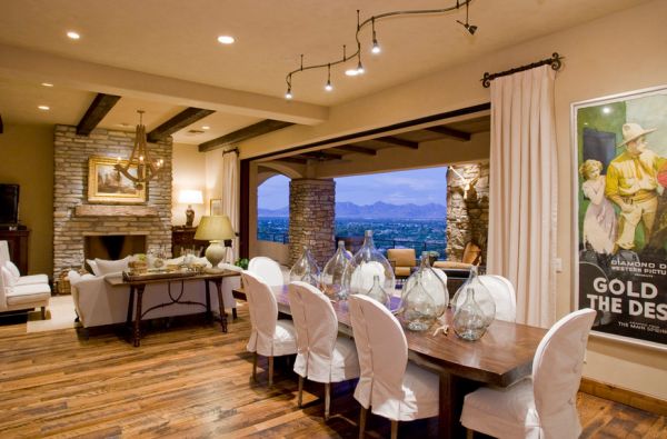
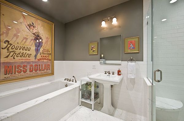
Poster of Les Mystères de New-York and the Jouets poster of Aux Buttes Chaumont were an integral part of the famous sets that have been replicated in parts, world over. Posters have this innate ability to steal the show and give any interior a unique sense of individuality. Here are a few contemporary homes that use them with style and sophistication –
by Moody Design
by Shirley Meisels
by Eleven Interiors
by John Goldsmith Photography
by Lori Smyth Design
by Viscusi Elson Interior Design
by ABCD Design
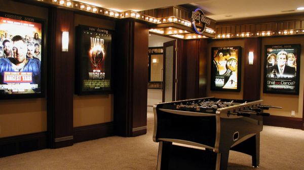
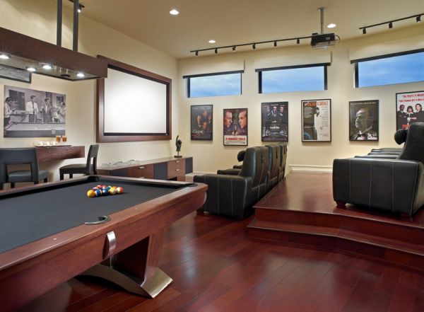
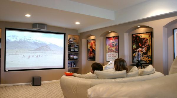
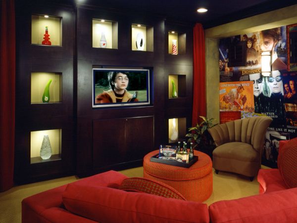
A Must have for the Modern Media Room
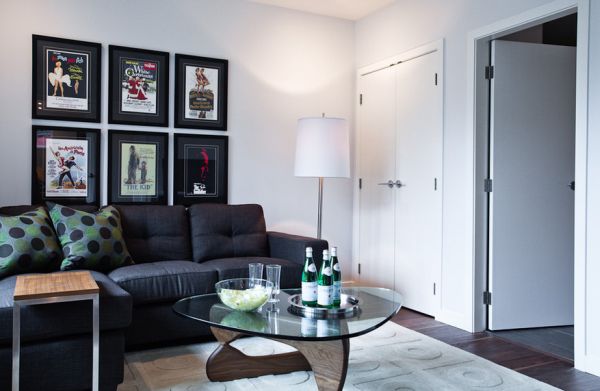
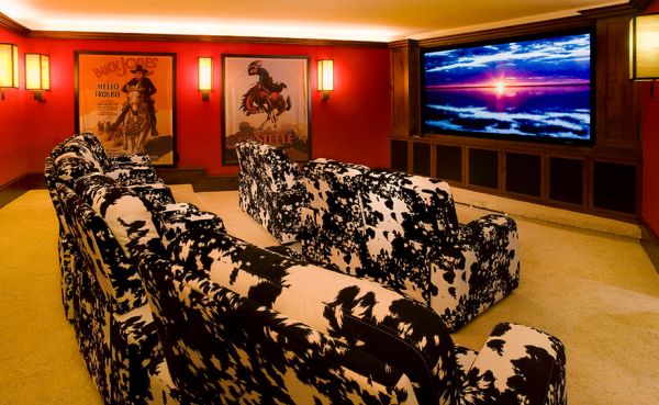
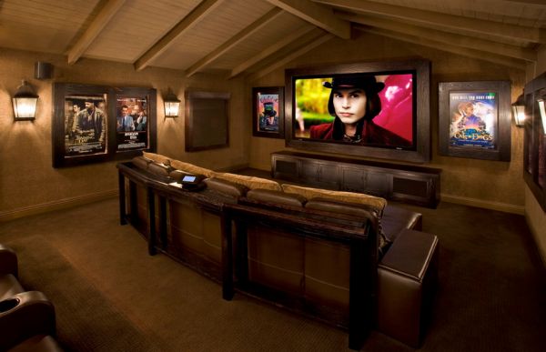
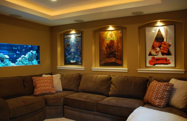
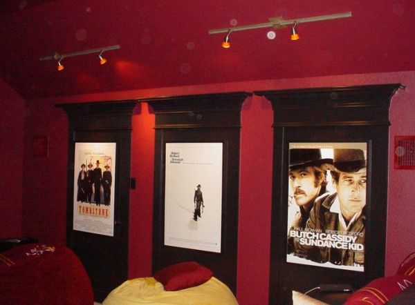
Designing a modern home is much more than just the basics. Media rooms and elaborate home theaters are now far more common than ever before. A vintage poster of a classic from cinema’s golden era or a dazzling poster from the latest blockbuster is a perfect fit here. There are several different ways in which you can use movie posters in media rooms. Illuminated poster boxes clearly create an ambiance that is as close to a grand theater as possible.
by Designtech Custom Interiors
by Billy Beson Company
by Bliss Home Theaters & Automation
While some of your favorite posters might be easy to find, replicas of others could be far more difficult and pricey to bring home. But once you do have them, custom crafted niches highlight them in an elegant and effortless fashion. Add to this simple recessed lighting or elegant lamps and your fabulous media room is complete.
by Jeffrey King Interiors
by M.J. Whelan Construction
by Level Design Studios
by Michael Trahan Interior Design
Positive Space Staging and Design
Framing and Lighting to Perfection
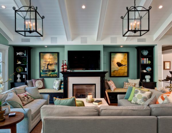
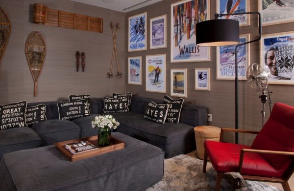
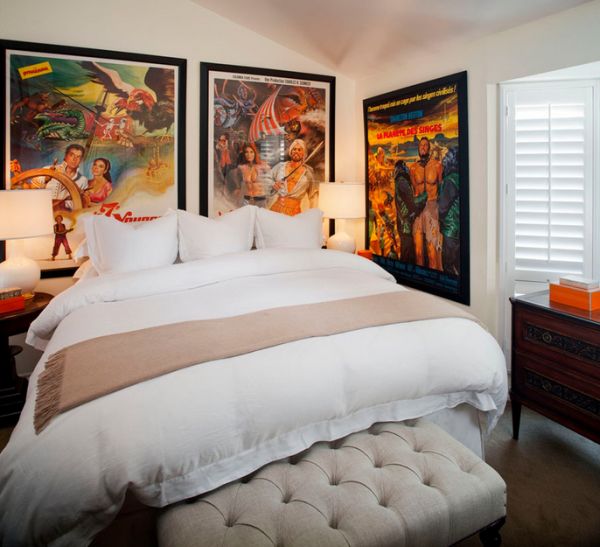
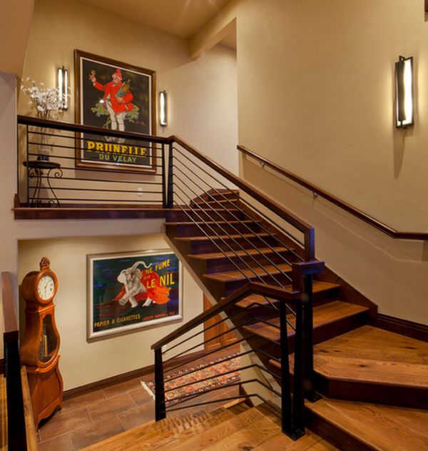
It is not just important to find the right poster. Framing it and using proper lighting play a crucial role in placing the necessary emphasis. When decorating with more than one poster, maintain uniformity in size and style to paint a pretty picture. The size of posters that you choose should depend on the dimensions of the room and the décor that is already in place. Place emphasis on proportion and balance. Lighting options most often vary between track and recessed lighting. It is advisable though to use track lighting only when can lights are hard to incorporate.
by Hillis Bolte
by Casey Design/Planning Group
Do not spray around your posters in an eccentric fashion. Repetition lends emphasis to any collection. This is precisely why posters need to be placed and arranged in proper fashion. They can be a bold expression of one’s own personality, choices and thoughts. No matter what you select, make sure that the walls of your house are a reflection of your individual taste and persona.
by Salinas Lasheras
by Laura Manning Bendik
by Clayton&Little Architects
by Shannon Malone
Accentuate Existing Themes and Colors
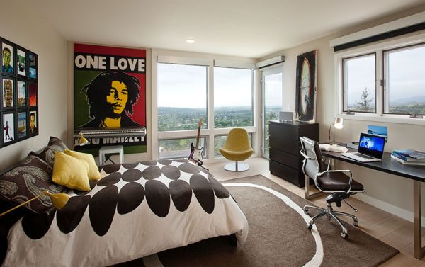
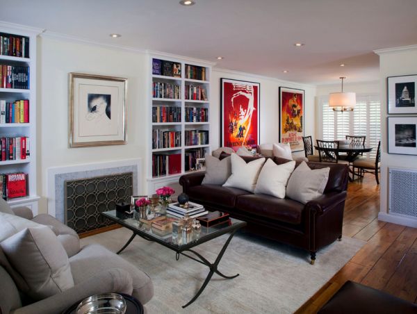
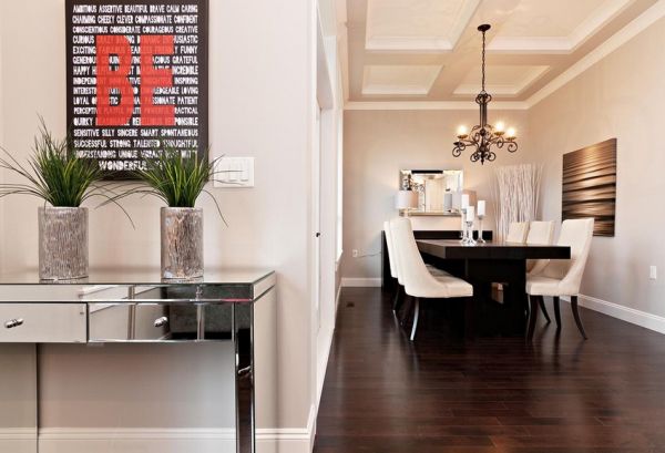
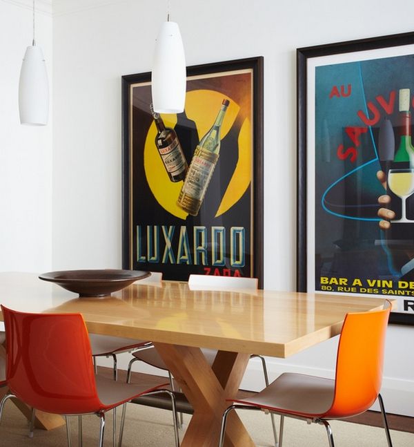
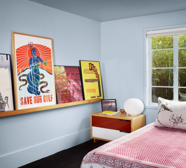
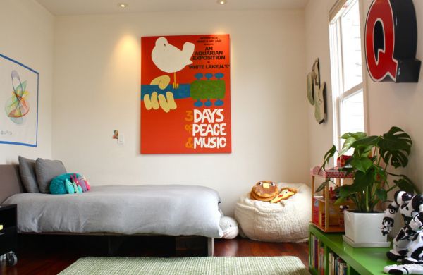
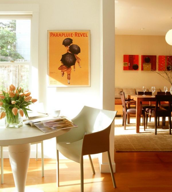
Posters are not just for homes with traditional and vintage interiors. They work equally well in semi-minimalist and contemporary spaces. Key is to ensure that the print does not disturb or interfere with your existing color scheme. A lovely poster in dashing red and bright orange brings much needed color and contrast to a neutral setting. On other occasions you can pick a print that seamlessly blends with the room’s color scheme and enhances the already present shades. They are also wonderful conversation starters and tend to add a warm and inviting charm to any area they adorn.
by Elizabeth Gordon
by SÜZA Design
by Kelly & Stone Architects
Once you have made up your mind on where to place them, posters are not very hard to work with and often take little time in putting up. They make a bold and exclusive statement in an exceptionally fun and playful manner. From Rock and Roll to memories of an exotic foreign land and from Gone with the Wind to The Godfather, posters capture a multitude of worlds and moods in a few framed delights!
by Lisa Benbow of Garnish Designs / Photography by Vince Valdes
by Tom Stringer Design Partners
by Cary Bernstein Architect
by ducduc
by Smith & Vansant Architects
