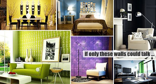
Have you ever stopped to take notice of how many homes are splattered with white washed walls? Maybe even your own? The living room, dining room, family room, den, three and half bathrooms, four bedrooms, and-even-ironically the mudroom. They are crisp, they are clean, they are efficient, but they can be equally boring.
I will not diagnose this dilemma as lack of imagination but rather the fear of embracing the millions of shades that surround us, both those of nature imparted origins and those generated by man (like tickle me pink!) This palette offered to us in many shades comes in the form of paint, throw pillows, area rugs, frames, lampshades, and the list goes on. Spoiler alert: Your pot of gold that mythically waits at the bottom of the rainbow is the rainbow itself. The colors that stretch across the sky after the rain can be just as beautiful in your home. The foremost bit of advice I can offer is GO FOR IT!
Every color has a story. Every color signifies something much more than its respective place in the crayon box. We frequently adopt colors as part of our personality dossier and from an early age our new classmate verbal interrogation begins with, “What’s your favorite color?” Over the years our tastes mature, expand, change until we find perfection in the colors that speak most vividly to us. But only you can know what color means to you.
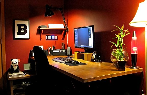
Red Walls
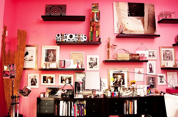
Red is symbolic to intense emotions. Emotions of love, energy, desire, power, danger and strength. It is derived from blood and fire yet the differentiating shades depict another story. Light red can represent joy while pink speaks of romance and friendship. Brown denotes masculine qualities and reddish brown is the color of harvest and fall.
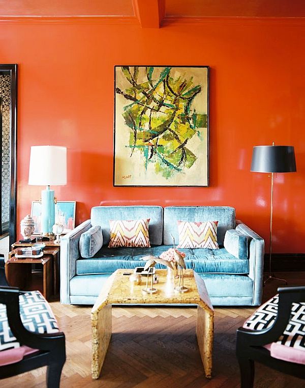
Orange Walls
Orange is a combination of red and yellow and therefore borrows the energetic vibe from red and happiness from yellow. Orange is a color that embodies heat, enthusiasm, creativity, determination, encouragement and stimulation. Its counterpart gold arouses prestige and high quality.
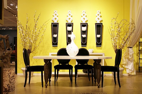
Yellow Walls
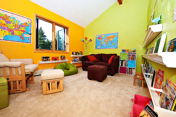
Yellow springs forth with spirits of energy, joy, intellect and happiness. Its color is emulated from the sunshine and thus promotes cheerfulness. Light yellow brings out the same emotions of joy, intellect and freshness.
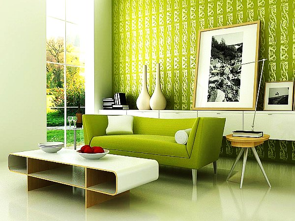
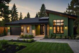
Green Walls
Green originates from nature and exemplifies fertility, harmony and growth. Its variation of sage green is traditionally steeped with the mindset of peace.
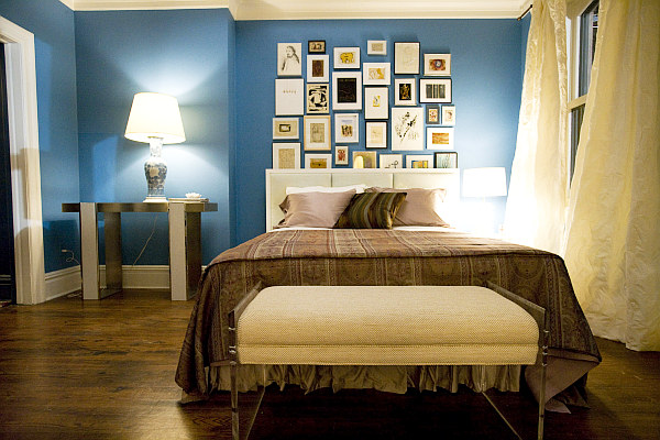
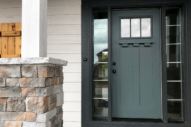
Blue Walls
Blue is derived from the sea and the sky. It communicates depth, stability heavenliness, wisdom and faith. In light blue there is light and healing, in darker shades integrity and seriousness.
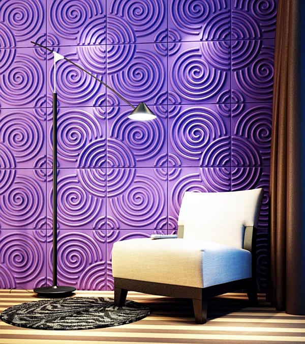
Purple Walls
Purple is another color that mixes and associates with red and blue. Royalty is found in purple as well as luxury, dignity, mystery and magic. Romance and nostalgia are resembled by light purple.
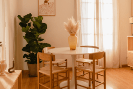
White Walls
White. While I said earlier it can be boring, in the right atmosphere it translates into purity, light, goodness and perfection and connotes a positive message as opposed to it’s opposite…
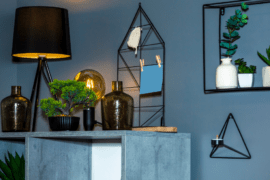
Black Walls
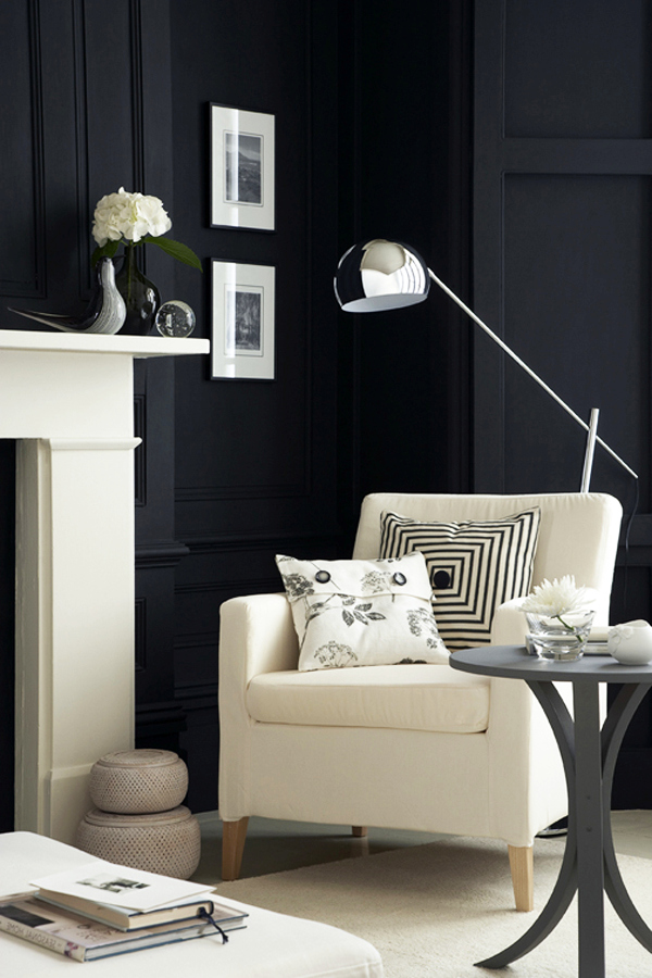
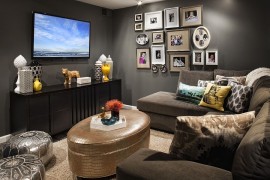
Black is an absorbing color that is recognized by formality, mystery, power and elegance. The last being one of the best ways to incorporate it into our homes.
Accordingly uniting the era of your home, style and genre of your furniture and the big picture you want to emulate, picking color doesn’t have to be that hard when you understand its history.
A very distinctive way of incorporating color into your home and making it look intentional and purposeful without just throwing a throw pillow is by creating a continuing theme in adjoining rooms. For example let’s say a wall with an open doorway separates your dining room and living room where you can see clearly from one room to the other.
To begin, paint the walls sage green in the dining room but accentuate with colors other than sage green in the dining room, perhaps a soft butter cream yellow and vivacious geranium. As you proceed to add elements of decor in the living room-the adjoining room-animate the room with the same shade of sage green; Pillows, vases, rugs, all bearing touches of sage green. This will create a sense of connection and give a feel of space extension, yet at the same time leave a bit of mystery as to what’s to come in the next room. It’s fun, quirky and it’s taking left over colors in unexpected ways and making bold statements.
So toss away the voice in your head that demands everything has to be matchy-matchy. Chartreuse is a real color, polk-a-dots and stripes do go together and with that in mind your walls can now fluently speak the language of color.
